
YDP is a non-profit project space for Asian and Asian diasporic contemporary art, founded by arts philanthropist Yan Du. Based in a historic house on London’s Bedford Square, YDP supports artists through exhibitions, residencies and collaborative projects.
We designed a playful type family that reflects the boldness and diversity at the core of YDP’s mission. A bespoke display typeface works alongside a modified cut of APFEL Type’s Friedel Regular, creating a flexible typographic scheme that is unique to YDP.
London, UK, 2023–25
Display typeface and body typeface in two styles


YDP Display
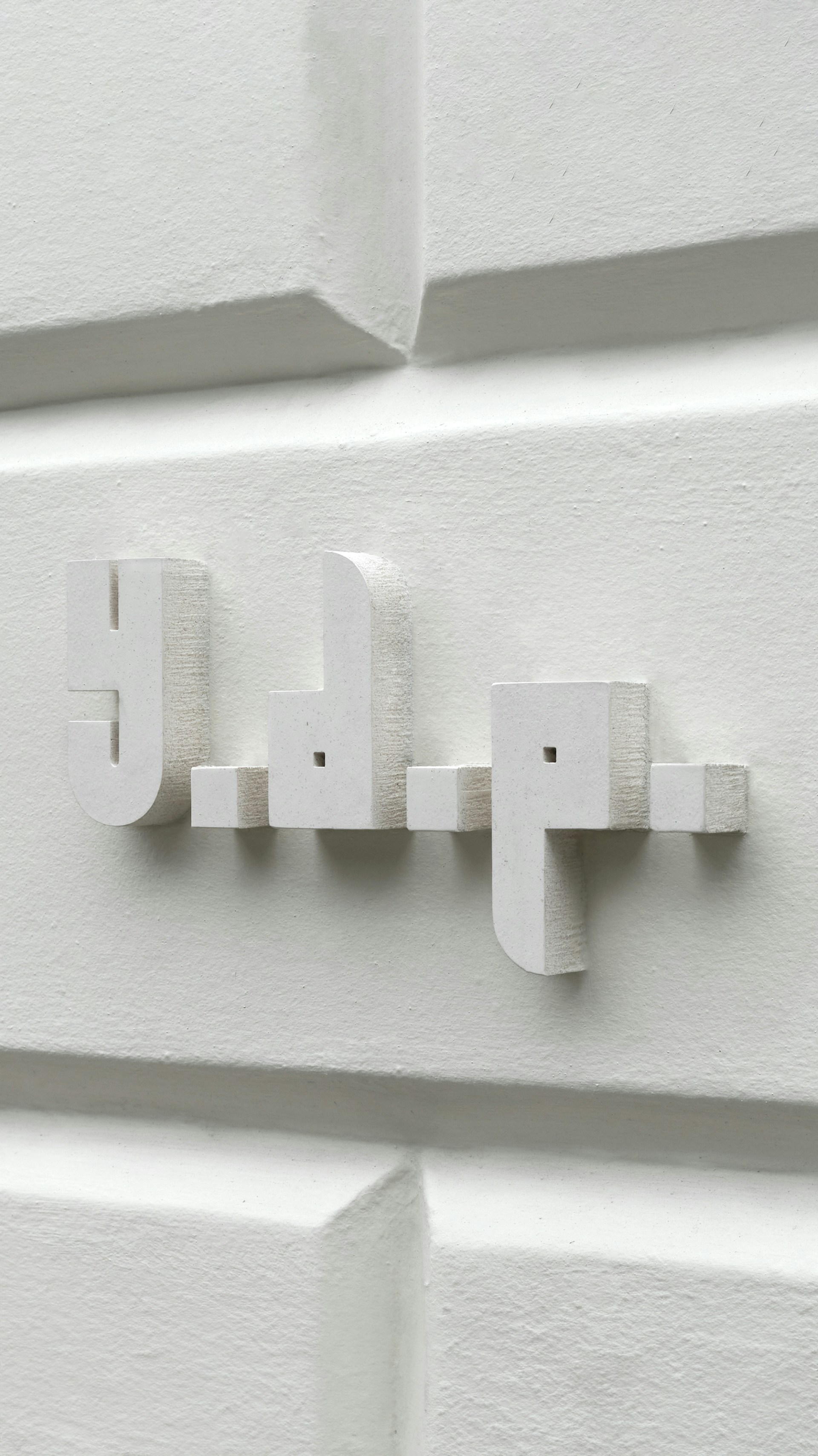
YDP’s bespoke headline typeface is built from simple geometric forms. It plays with convention through mixed case letterforms, oversized periods, and alternating round and square counters.
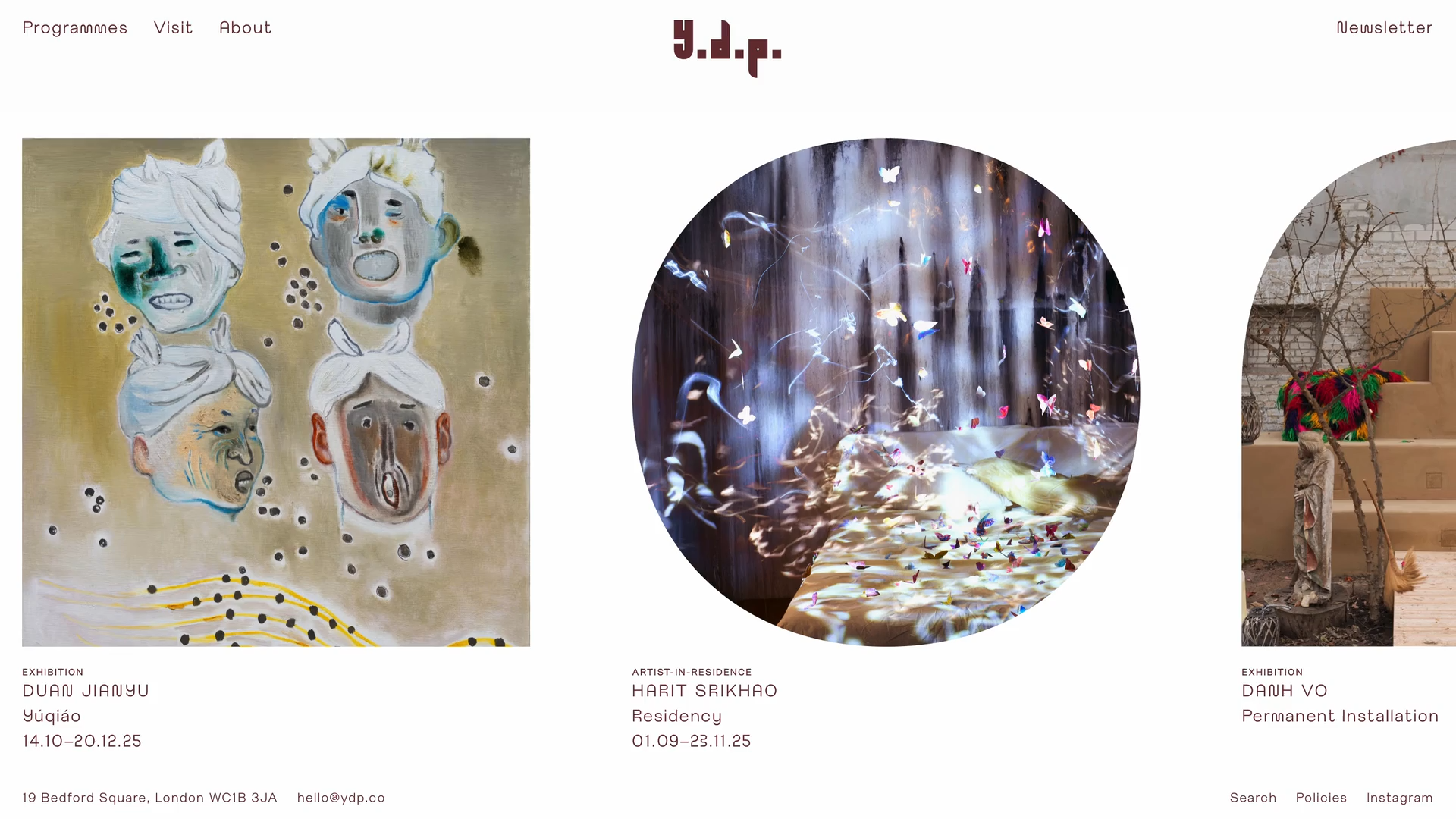
The unexpected detailing of the typeface creates a bold identity for YDP. The letterforms extend into geometric frames for imagery on the website, positioning custom typography at the core of the organisation’s visual language.

Character set
Unicode 0041
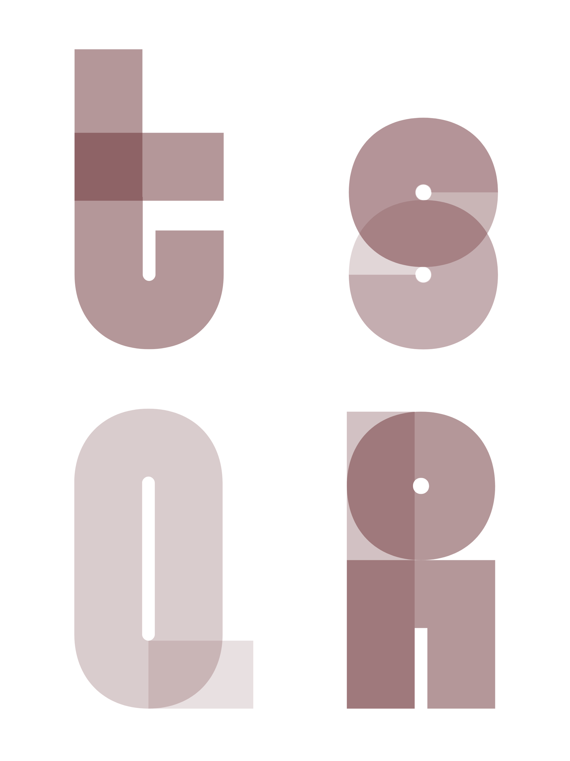
Friedel YDP
Alongside the bespoke headline typeface, we designed a modified version of APFEL Type’s Friedel Regular for body text. Its curved letterforms respond to the modular structure of the headline style and reference details from the cornices and ironwork of YDP’s Grade I-listed Georgian architecture.
Photography: Thomas Adank, Ed Park
Website Build: Simon Rogers


Character set
Unicode 0041