
The Hepworth Wakefield is a David Chipperfield-designed museum in the heart of Yorkshire. Alongside exhibitions of leading international contemporary art, it presents displays dedicated to Barbara Hepworth, the influential British artist after whom it is named.
Ahead of its opening in 2011, we developed a bespoke typeface as the foundation of the museum’s brand identity. The Hepworth family includes three weights across styles.
Wakefield, UK, 2008–11
Three weights, six styles


Barbara Hepworth, Orpheus (Maquette 1), 1956 (detail). Photo: Studio St Ives © Bowness.


Barbara Hepworth was born in Wakefield in 1903 and gained international recognition in the 1930s for her abstract sculpture. Her formative years coincided with the emergence of British modernist typography and the rise of humanist sans serif typefaces. These sans serifs draw their proportions and rhythm from classical Roman inscriptions and traditional serif forms. Johnston (1916) and Gill Sans (1928) came to define the period, combining modern clarity with humanist warmth.
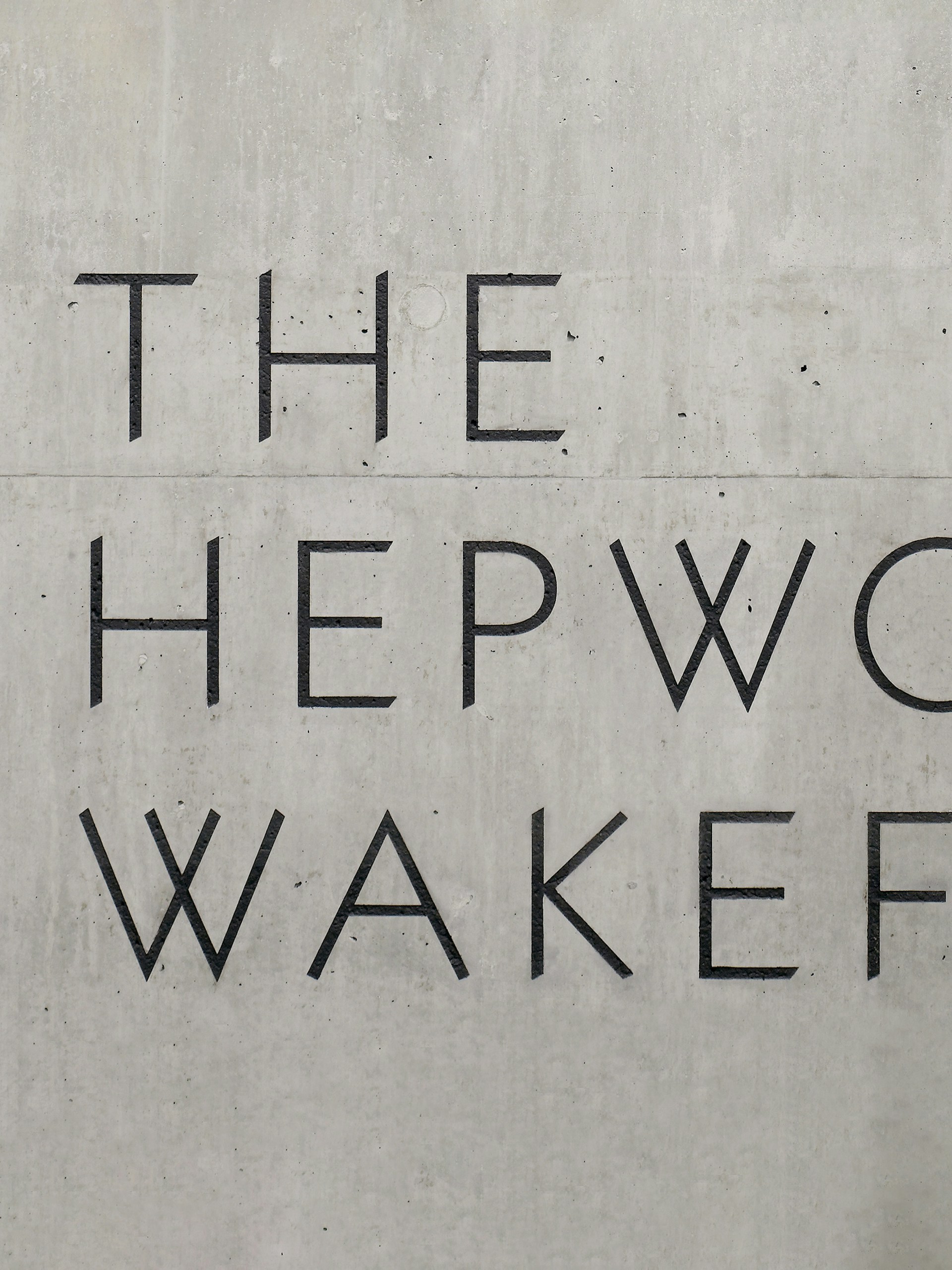
The Hepworth typeface family is grounded in this specific history of British humanist and modernist typography, while also responding to the character of the building and surrounding dockside. Its foundations draw on historic modernist precedents, with finer details echoing the angular geometry of David Chipperfield’s architecture.
Hepworth’s sculpture also informs individual letterforms. In particular, the rounded volume of the O and the crossed strokes of the W draw on the spherical forms and tensioned wires that recur throughout her work.


Typography plays a central role in The Hepworth Wakefield’s brand identity, acting as both a unifying framework and a counterpoint to the building. The typeface family is deliberately drawn with an unusual lightness and restraint, allowing it to sit confidently across brand and architectural contexts without overpowering the content. This softness balances the building’s materiality and contributes to an identity that has remained assured and consistent for over 15 years.
Typeface design: A Practice for Everyday Life
Type development and engineering: Emma Williams
Photography: India Hobson and Kilian O’Sullivan


An annotated type specimen showing the development of Hepworth Regular.

‘Typography with reason and ideas can be rare, but in this case the results are restrained, confident and simple. A great design which echoes the work of the sculptor herself, making something that feels timeless.’
Creative Review

Character set
Unicode 0041