
As part of a major editorial redesign of ELLE UK, we developed a bespoke headline typeface titled ELLE Play. Designed to sit alongside the iconic masthead and Futura as the body typeface, the high-contrast sans serif introduces a more playful typographic character to the fashion and lifestyle title.
First appearing in ELLE UK’s September 2017 issue, ELLE Play was adopted by twelve international editions.
London, UK, 2017
Display style
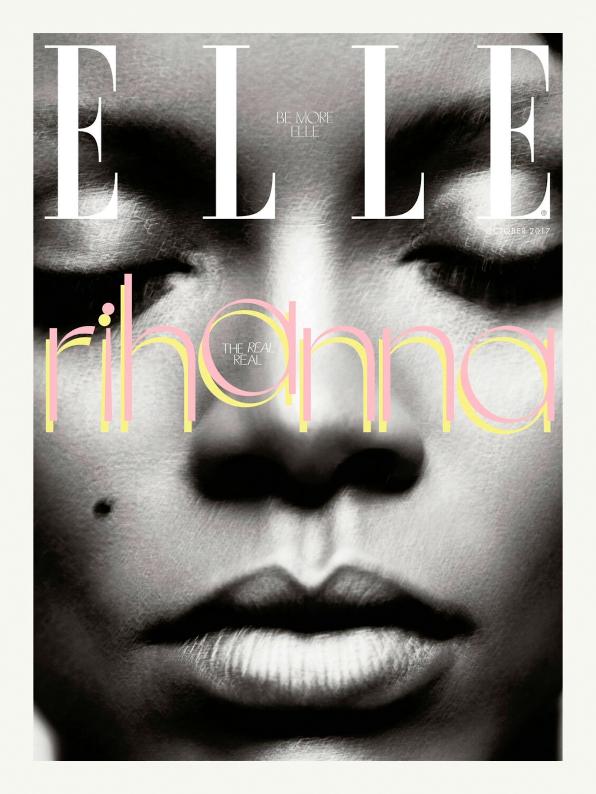


Inspired by Futura’s sharp apexes and the crispness of the ELLE masthead, one defining characteristic is the pointed terminals, which often project beyond the baseline. Rather than echoing the condensed proportions of the masthead, the typeface is built on Futura’s geometric structure. This allows for more generous proportions, carrying through the clarity of Futura’s forms, particularly in characters such as the O and M.
The spirit of the typeface draws on the playful and colourful graphic language found throughout the magazine’s history, especially the work of art director and photographer Peter Knapp in the 1960s. To bring this sense of dynamism into ELLE Play’s design, we developed a diagonal weight axis that adds movement.
Photography: Ed Park


Character set
Unicode 0041