
Marking twenty years of Erdem, we have collaborated closely with Erdem Moralioglu to create a new visual identity, redesign the brand’s packaging, and design a large-scale monograph published by Rizzoli.
The identity draws inspiration from Erdem Moralioglu’s literary and artistic interests, as well as the house’s unique duality of beauty and subversion.
The bespoke logo is characterised by its sharp wide serifs and low-contrast strokes. Its elegant forms are accented by calligraphic idiosyncrasies, drawing influence from the work of the pioneering typographer and designer Elizabeth Friedlander (1903–84), who exercised restraint in her designs in contrast to the more exuberant work of her contemporaries. The logo is complemented by an updated typographic scheme, applied across packaging, campaign communications and the website.
London, UK, 2025
Identity, Packaging, Campaign, Digital, Publication


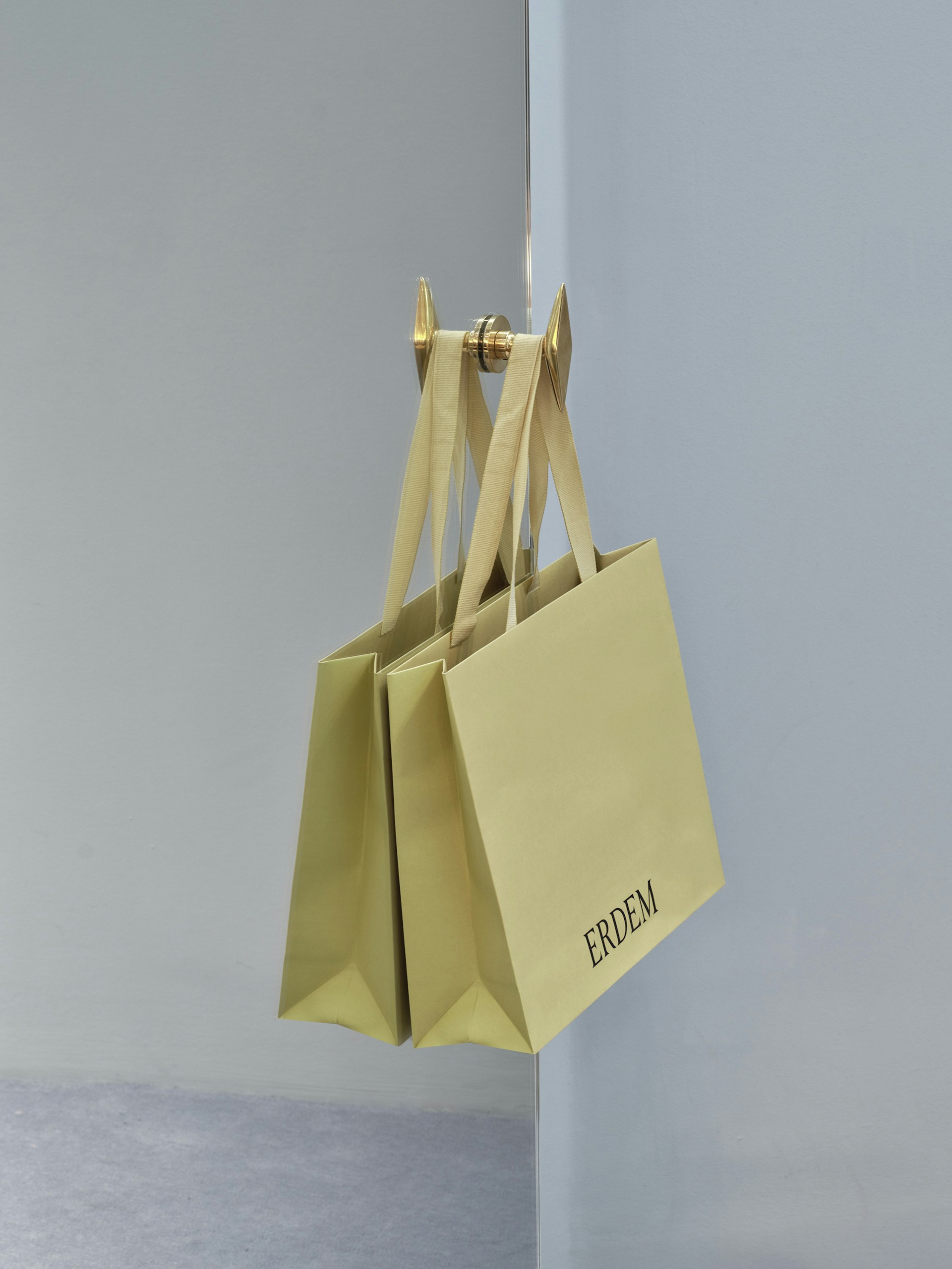
A singular and bold approach to colour defines the packaging, using an unexpected tone inspired by Moralioglu’s personal book collection as well as classical interiors. It reflects the language of archival and conservation materials, continuing the concept across all materials.
Garments are wrapped in glassine paper, a material more commonly used to preserve artworks. The paper features a self-portrait by artist Ilse Bing (1899–1998), in which she is both photographer and muse. Influenced by Erdem’s layering of historic and contemporary inspirations in his designs, the packaging also includes quotations by Emily Dickinson (1830–86).


Ilse Bing, Self-Portrait in Mirrors, 1931.


We introduced a new marque for Erdem as a core element of the identity. It appears across garments and accessories, and extends into packaging and digital communications. As part of his creative process, Moralioglu often draws on historical figures, or ‘muses’. Building on this approach, archival material from The London Library shaped the marque, with its form informed by the work of the engraver, artist and typographer Reynolds Stone (1909–79).
The marque was introduced as part of Erdem’s Autumn Winter 2026 collection, appearing as printed silk bookplates on the sleeves of tailored pieces and on the cover of a large-format zine. We developed the zine to mark twenty years of the house, bringing together inspirations and muses in a dense collage of imagery.


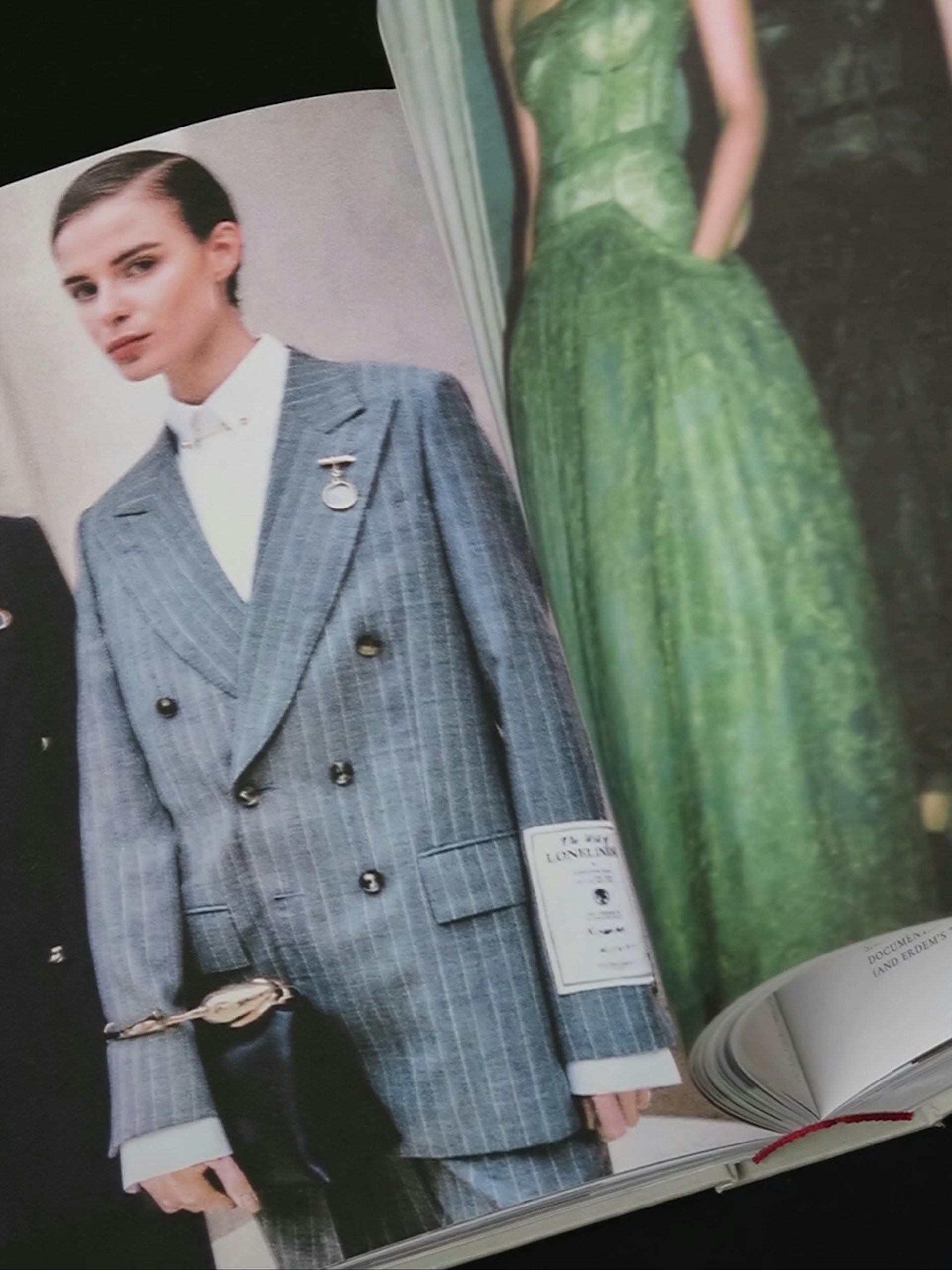
Published by Rizzoli, Erdem is the first book to celebrate the creative world of designer Erdem Moralioglu and two decades of the independent fashion house. Echoing Erdem’s own layering of historical references and cultural touchstones, the eponymous book interweaves primary source material, artworks and photography.
It brings together short stories, scripts, recipes, interviews and contributions from figures including Anna Wintour, Christian Lacroix, Andrew Bolton, Hanya Yanagihara, Glenn Close and Ruthie Rogers. Alongside these, archival looks appear in a portrait series by Paul Kooiker, with Guinevere van Seenus embodying the multiple, mercurial characters of Erdem’s female muses.


‘One of the charms of Erdem is the way it offers a deep dive in the designer's creative processes [...] a book as magical as the designer’s clothes.’
Vogue →
The book’s design draws on classical typography with a contemporary literary touch, treating text like poetry or prose to echo Erdem’s connection to storytelling and craftsmanship. The ongoing relationships between classicism, beauty and subversion are drawn out through the placement of Erdem’s reference material and photography, generating unexpected encounters between looks.
The use of a textured paper, bound with cloth, creates a tactile and generous, large-format experience. Poetic interventions throughout hint at the literary inspirations which have underpinned Erdem's collections to date.
Photography: Ed Park and Thomas Adank


‘Marking twenty years of his independent house, Erdem Moralioglu turns the page with a monograph that reads like memory – and looks like poetry’
The Impression →


