
For the 59th International Art Exhibition of La Biennale di Venezia, we were commissioned to design the identity, publications, exhibition graphics, signage, merchandise, and the digital and print campaign.
Curated by Cecilia Alemani, The Milk of Dreams takes its title from a book by Leonora Carrington. Drawing from themes within the exhibition, the graphic identity explores ideas of fluidity, identity, the human and the non-human, re-enchantment and fragmentation.
The 2022 edition of the Biennale saw record attendance, with more than 800,000 tickets sold, a 35 percent increase on the 2019 edition.
Venice, Italy, 2022
Identity, Campaign, Exhibition, Merchandise, Publication


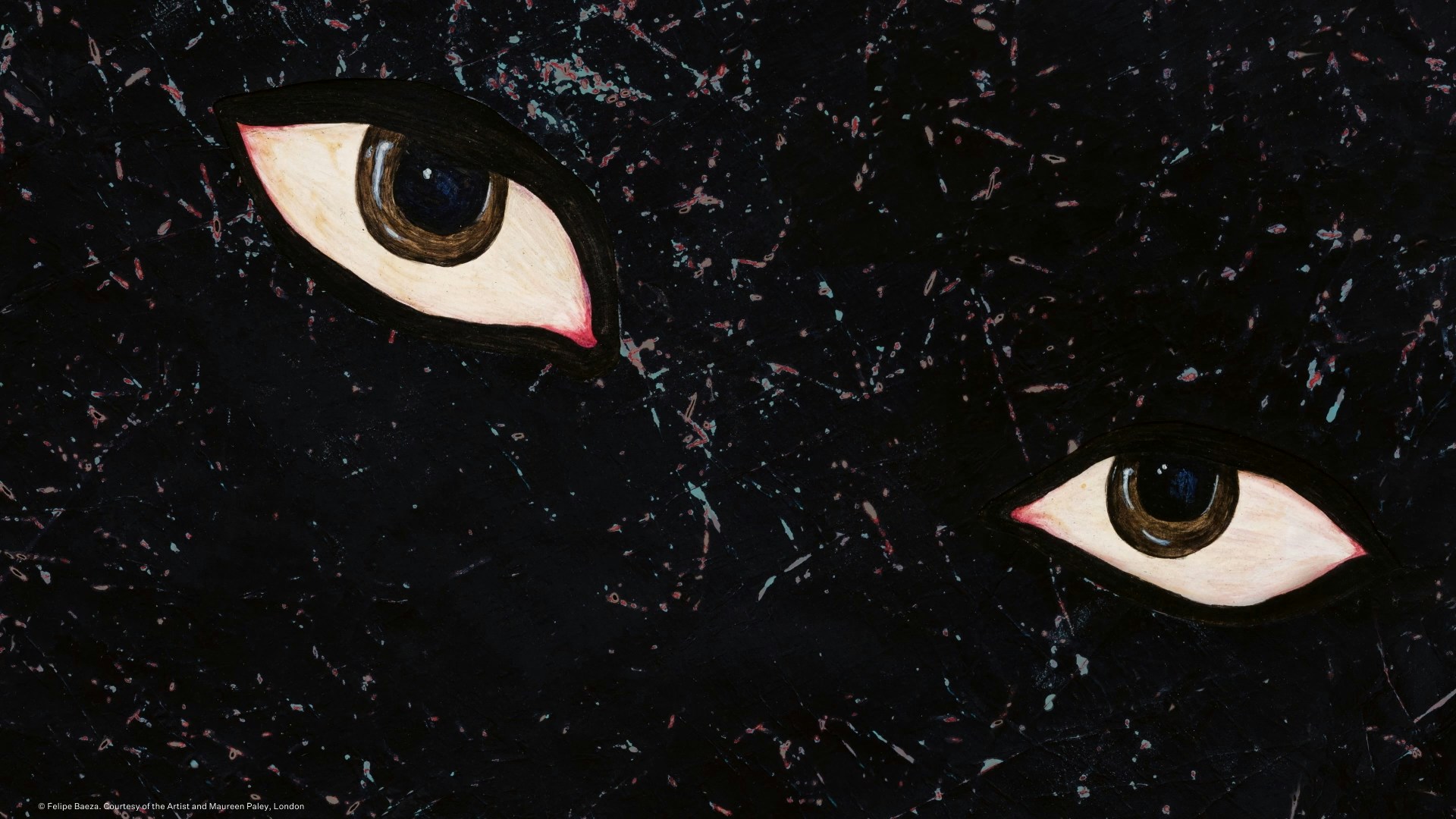
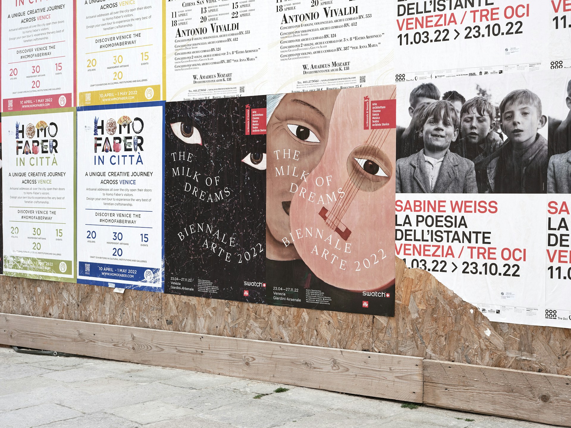
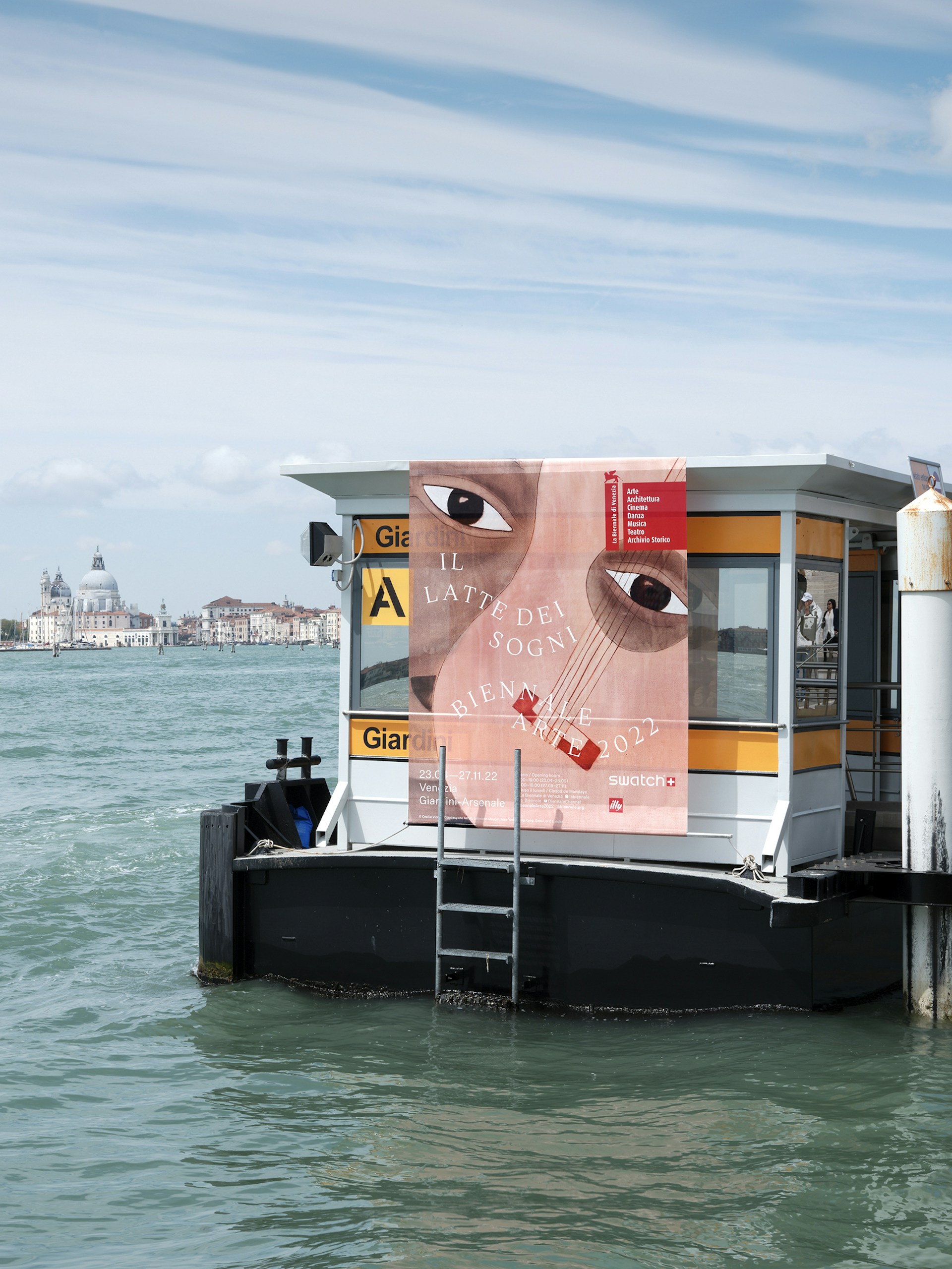
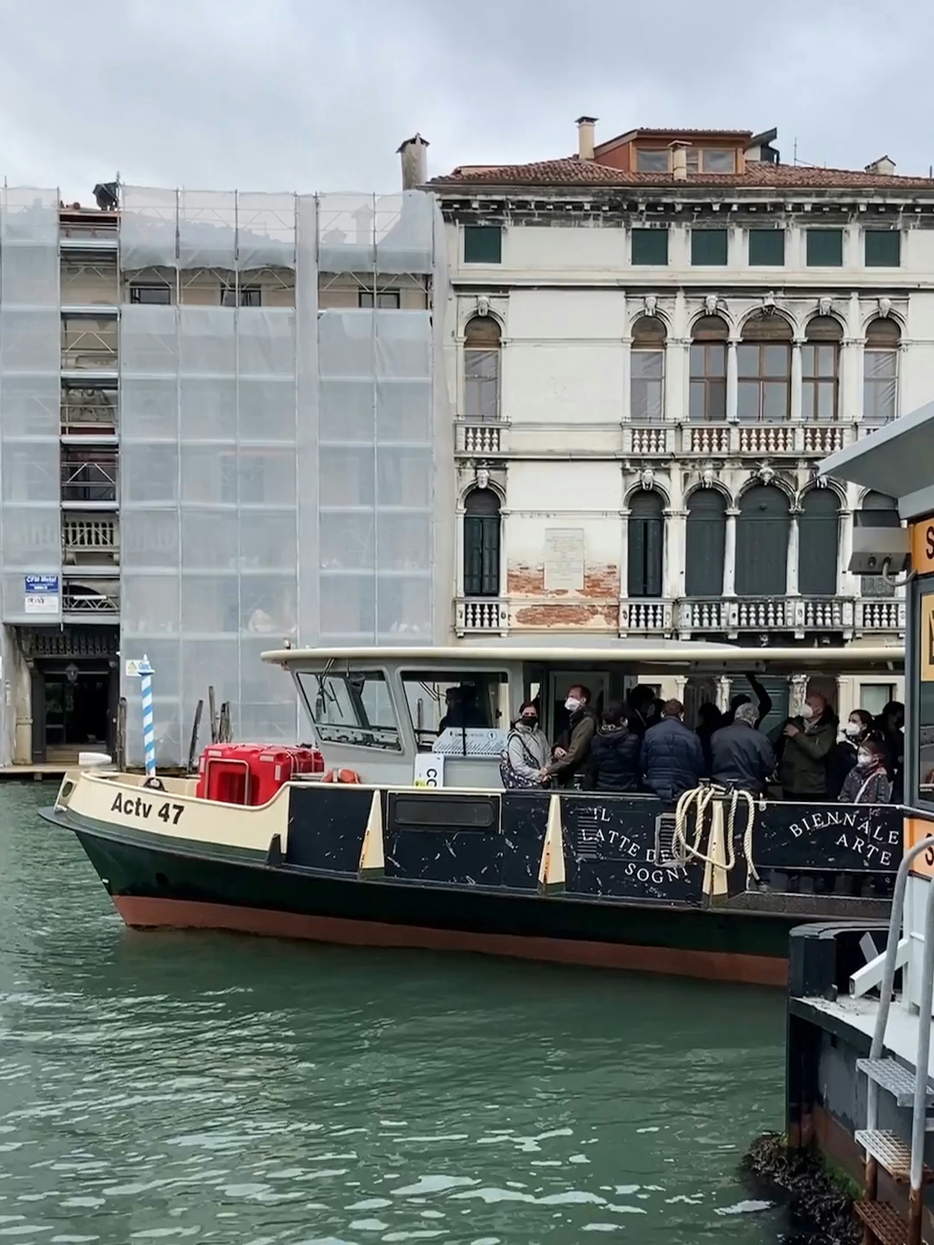
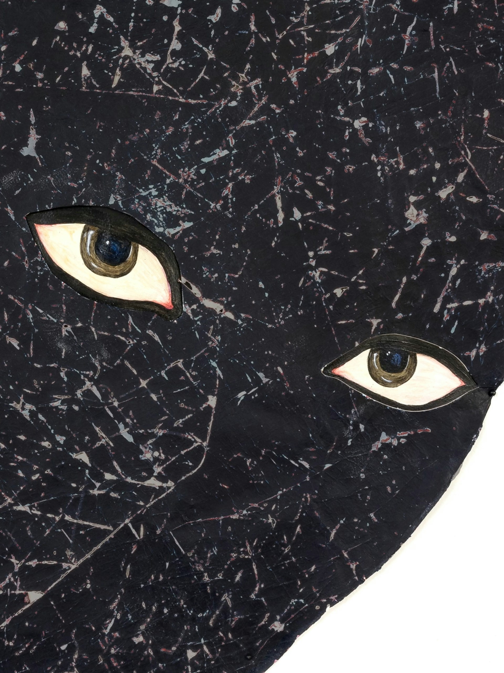
The identity positions artists’ works at its forefront, featuring details from artworks by Belkis Ayón, Felipe Baeza, Tatsuo Ikeda and Cecilia Vicuña. These varied artworks are united in their representation of eyes, which are symbolic of important ideas running through the exhibition: dreams, identity, the body and reflection.
Posters, banners and billboards show mysterious characters looking back at the public, bringing walls, bridges and boats to life across Venice.

‘If you visited Venice, you might have noticed pairs of wandering eyes following you around. These graphics and accompanying typography were the creations of A Practice for Everyday Life, a London-based agency whose work is making waves far beyond Venice’s canals.’
Monocle →
The typographic design of the title is metamorphic: classical lettering is transformed into something more hybrid, organic and dimensional. The text weaves organically across multiple mediums, including digital animations and pin-mounted metal letters at the exhibition's entrance.
The dynamic approach to classical typography continues across marketing materials, books and merchandise. Playful contemporary layouts are combined with the classicism of a serif roman typeface, referencing the historical reflections within the exhibition.


‘APFEL has adeptly managed the spatial challenges of the biennale, along with the dense accompanying narratives. Fluidity is one of the defining themes, and central to the studio’s graphic treatment are artists’ works, making this one of the rare occasions when exhibitors have also been featured in the biennale’s identity.’
Wallpaper*

The accompanying catalogue spans over 900 pages and consists of two volumes. The first is dedicated to the exhibition curated by Cecilia Alemani, while the second focuses on national participants. The slipcase and book covers feature details from artworks by Felipe Baeza and Cecilia Vicuña, united in their representation of eyes.
The exhibition includes five capsules that explore the themes within a historical context, which are translated into the catalogue through denser image and text layouts with distinct coloured backgrounds. Historical texts are set in playful arrangements, inspired by the concrete poets featured in the exhibition, on cut-short pages to help readers navigate the book.
Exhibition Design: Formafantasma
Photography: Thomas Adank, Ed Park


