
Noah Davis’s fluid approach to painting combines elements of representation and abstraction. Drawing from both historical and contemporary influences, the late American artist depicts everyday Black life in a manner that transcends specific periods of time.
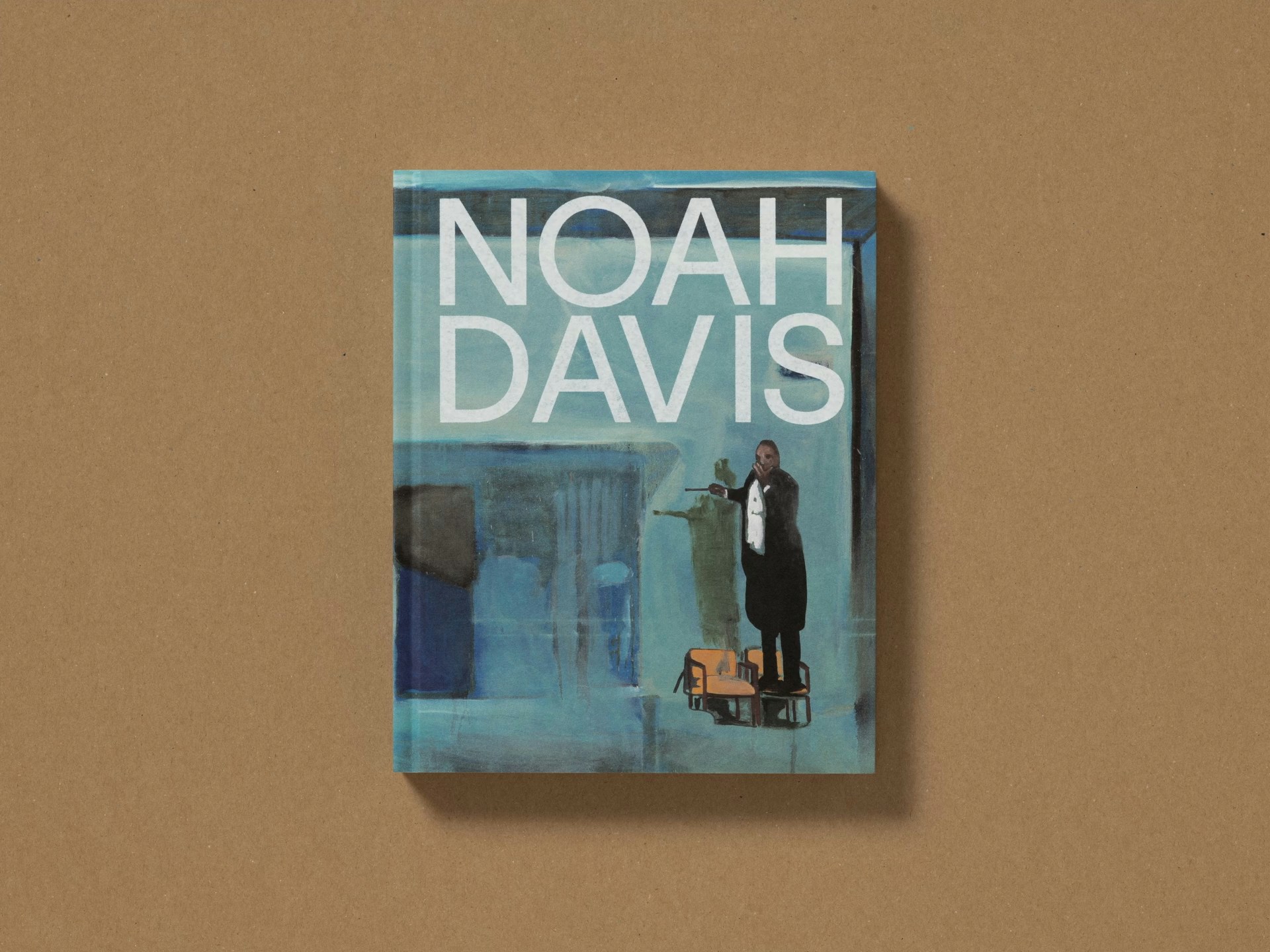
We designed the graphic identity for Davis’s first institutional retrospective. The exhibition and accompanying monograph survey the breadth of his practice, not only as a painter, but also as a curator and co-founder of the Underground Museum in Los Angeles.
The exhibition travels to four institutions between 2024 and 2026: the Barbican Centre, Das Minsk, the Hammer Museum, and Philadelphia Museum of Art.
London, UK; Potsdam, Germany; Los Angeles and Philadelphia, US; 2024–26
Exhibition, Publication


Noah Davis at the Underground Museum, Los Angeles, 2014. Photo: Rhys Gaetano.


The exhibition design embraces a handcrafted, materials-conscious approach, creating an atmosphere that reflects Davis’s own sensibilities. Solid walls dissolve into a translucent gauze framework, echoing the shifting light and open skies of Los Angeles, where Davis lived and worked. The show opens with a projected slideshow of personal images, mirroring the way in which Davis used ephemera and familial source material to explore both personal and collective narratives in his work.
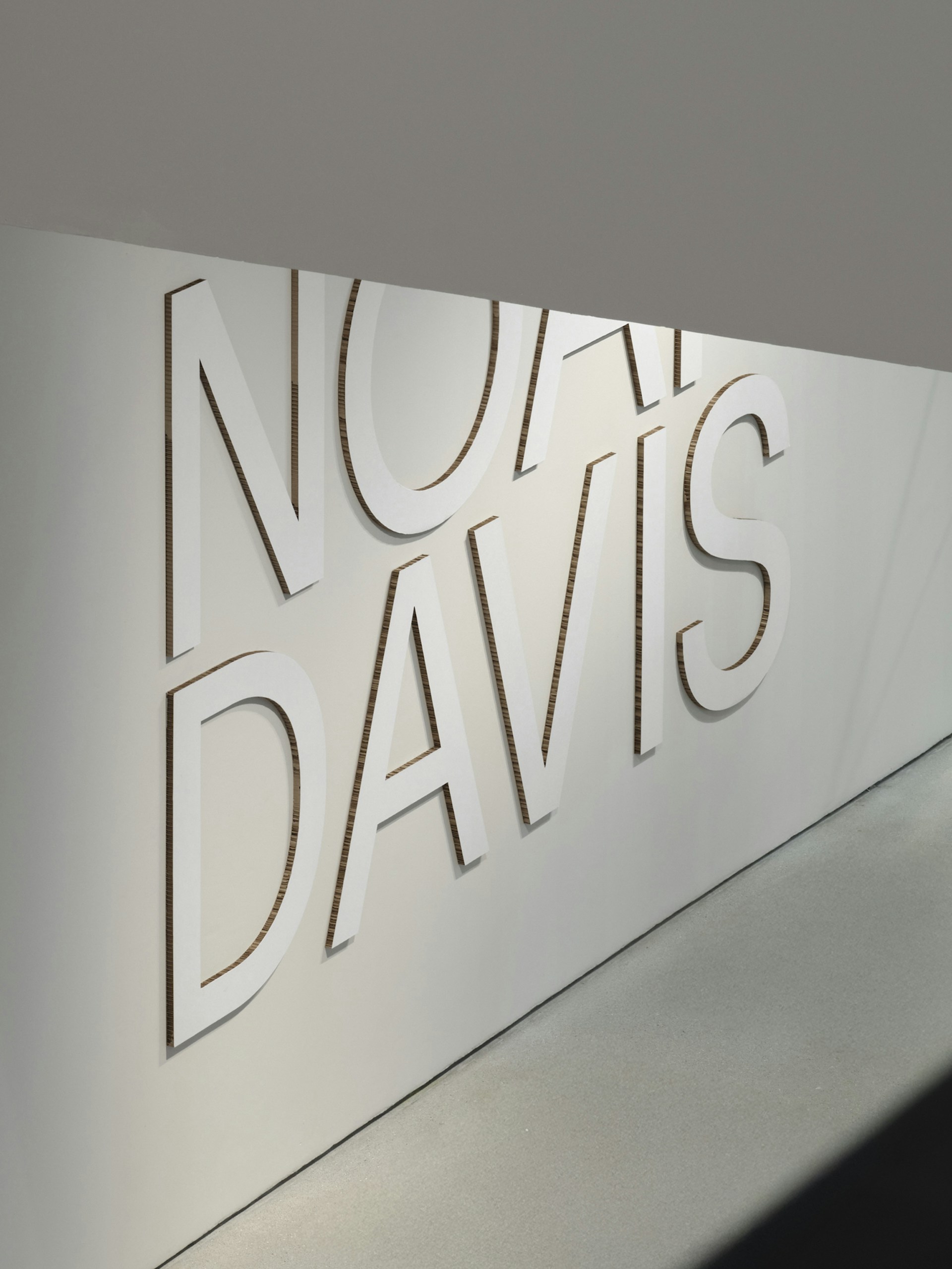
The entrance title, constructed from large, cut letters of white-faced cardboard repurposed from recycled boxes, nods to the DIY ethos of the Underground Museum. Exhibition texts are screen-printed directly onto the walls, lending a tactile quality that echoes the human touch behind Davis’s work.


The publication includes scrapbook-style sections of personal images, handwritten notes, sketches and collected ephemera, arranged in densely layered compositions.
These contrast with the more structured layout of the plate sections, which combine painting and works on paper with sculpture. The sequencing reflects Davis’s practice: deeply engaged with art history yet determined to challenge its limits and expand its perspectives. The interplay between reverence and disruption is also echoed in the book’s typography, which juxtaposes a blocky, contemporary sans serif with a more traditional serif.
Exhibition and campaign photography: Thomas Adank
Book photography: Ed Park


‘I wasn’t prepared for the thoughtful design [...] by Freehaus and A Practice for Everyday Life. It brought Davis’s practice to life and delicately portrayed his ideas, adventures and artwork. I will always sing about his work to the rooftops, but less is said about the power of great exhibition design.’
The Guardian, Best of Design & Architecture 2025 →