
Leonor Antunes gathers references to overlooked figures within twentieth-century architecture, art, and design. Often focusing on women, her artistic practice is concerned with specific forms of craft and with the bringing together of styles to define an identity.
We have developed a series of projects with Antunes as part of an ongoing dialogue since 2017.
Book photography: Ed Park, Sanda Vučković
Installation photography: Nick Ash


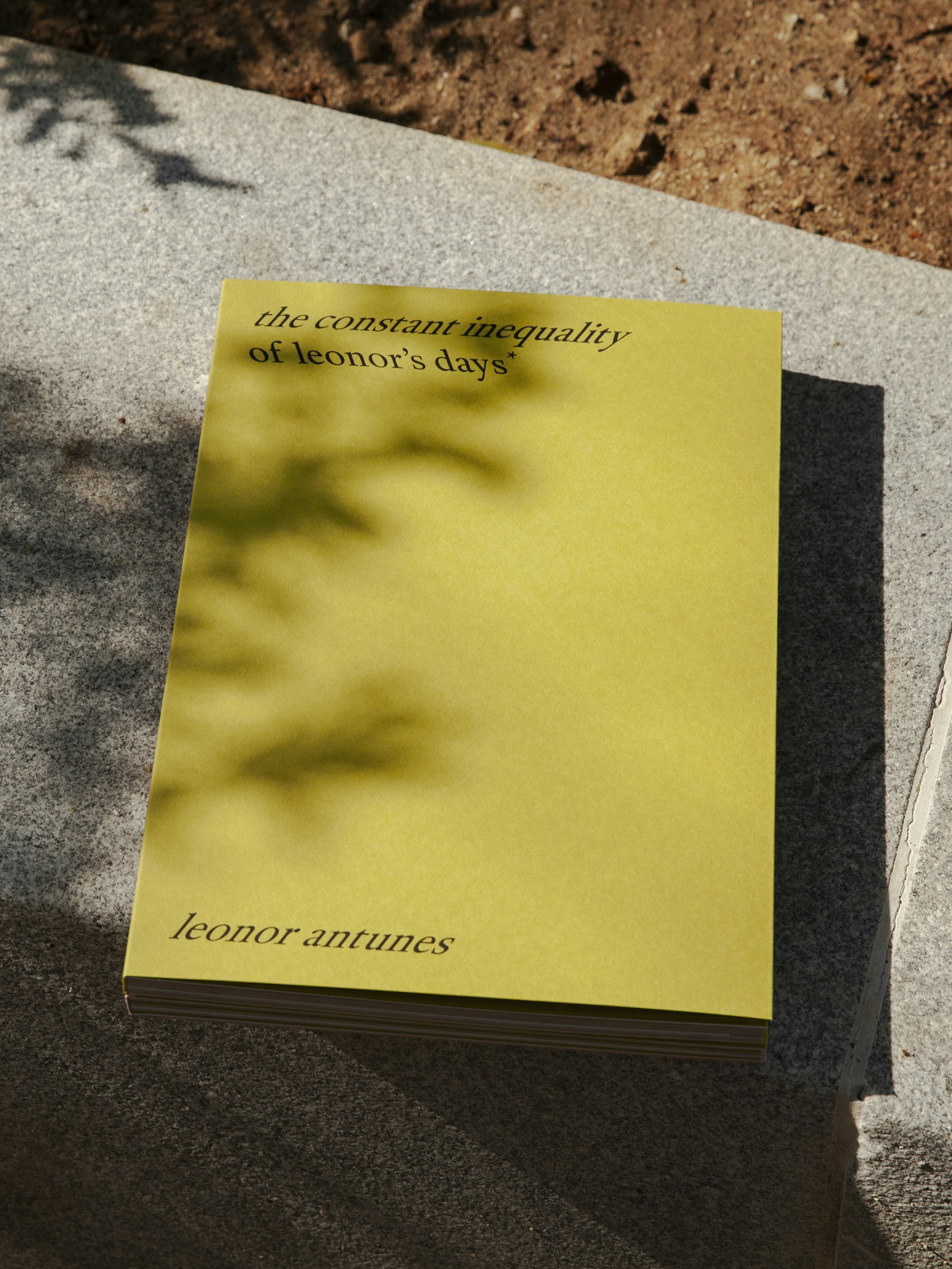
the constant inequality of leonor’s days*
This publication builds on an exhibition at CAM – Centro de Arte Moderna Gulbenkian, where Antunes created a layered dialogue that interweaves narratives and practices. Across two levels, her sculptures reshape the gallery architecture using cork, wood, glass and leather. Works from CAM’s Collection are presented within bespoke structures inspired by women designers including Franca Helg, Charlotte Perriand and Lina Bo Bardi.
The book’s design takes inspiration from The Flat Book (1939) by Sadie Speight and Leslie Martin, architects of CAM’s historic building. Its colours, grid and format anchor the publication within the lineage of modernist design. Italic serif typography draws on archival language and references. By alternating between forward and backward slanted italics, the design points to both past and future, mirroring how the exhibition spans from the 1930s to the present day. When stacked, the layered italic glyphs form a visual weave that references Antunes’s sculptures. Inside, spliced pages echo her woven works and extend the interplay between artworks.
Lisbon, Portugal, 2024
Publication


a seam, a surface, a hinge, or a knot
We developed the graphic identity for the Pavilion of Portugal at the 58th International Art Exhibition – La Biennale di Venezia in 2019, for which Antunes created an installation shaped by extensive research into key figures in Venice’s cultural history. Working with traditional makers from the region, Antunes brought these histories together in an installation incorporating craftsmanship from Italy, Japan and Portugal.
Venice, Italy, 2019
Identity, Campaign, Publication


‘I am interested in the dialogue that a specific craftsmanship establishes within a certain perspective of modernity – particularly how architects and designers engaged with the vernacular – revealing not a nostalgia for a world before modernism, but rather a legacy regarding a belief in the artwork as representing an ongoing engagement in a process.’
Leonor Antunes


Our approach drew upon cultural and historical details specific to the context of Antunes’s installation at Palazzo Giustinian Lolin in Venice. Across the scheme, text is typeset in Recta – chosen for its relationship to the same period of Italian history that Antunes was referring to in her work.
The catalogue’s form responds to the idea of a seam, surface or hinge of a book. Texts are gathered within the central pages, and the tinted papers reflect the raw leathers used in Antunes’s works. Two die-cut sheets reference cut leather and woodwork, and echo architectural apertures within the exhibition space. An accompanying booklet takes the form of a poster that folds down like a knot, drawing on ideas within Antunes’s installation.


the last days in galliate
For Pirelli HangarBicocca in Milan, Antunes created an installation shaped by research into the city’s history, its cultural scene, and the work of Italian architects Franco Albini and Franca Helg.
The publication’s format draws on early issues of Pirelli magazine, with typographic layouts inspired by an edition from the early 1950s. Sections of glossy paper and inserts, in colours informed by Antunes’s work, further reinforce this connection.
Inside, Antunes’ research is given equal prominence with documentation of the exhibition. Alongside installation images of her finished works, photography by Heinz Peter Knes is featured throughout. Taken at Galliate Lombardo, Settimo Torinese and Lurago d’Erba, these images offer atmospheric insights into the research and material development of the installation.
Milan, Italy, 2018
Publication


discrepancies with F.H.
In close collaboration with Antunes, we designed an artist edition that documents a sound piece based on six sculptural brass works created for the last days in Galliate at Pirelli HangarBicocca.
The lavender colour, which is consistent across the sleeve, the inner case and the pressed vinyl itself, is derived from a tone within the musical composition. The use of white space and asymmetrical typography on the cover responds to the composition of the artworks themselves. A portrait of Italian architect Franca Helg by Heinz Peter Knes is attached to the sleeve with a paper staple. The handwritten note from Antunes inside includes a small edition number, emphasising the materiality of the edition.
Milan, Italy, 2019
Print


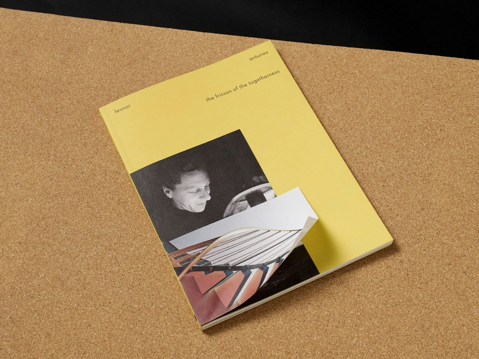
the frisson of the togetherness
Antunes’s site-specific installation at the Whitechapel Gallery was informed by, and incorporated aspects of, the work of two artists who lived in London: Mary Martin and Lucia Nogueira.
The layered references within Antunes’s installation are carried into the book’s design. Small-scale, loose-leaf materials relating to Martin and Nogueira are bound into the publication. These are enclosed in an acetate jacket that recalls an archive sleeve, while colour and typography draw on Martin’s artistic practice. To document Antunes’s works, title pages and spreads from her earlier catalogues are reproduced at 1:1 scale, giving the book a deliberately ephemeral character.
London, UK, 2017
Publication


‘The engaging, often complex nature of the subject matter APFEL works on is a product of their longstanding relationship with independent artists.’
Eye Magazine

Mary Martin in Environment for This is Tomorrow, designed by Mary Martin, Kenneth Martin and John Weeks, 1956.


