
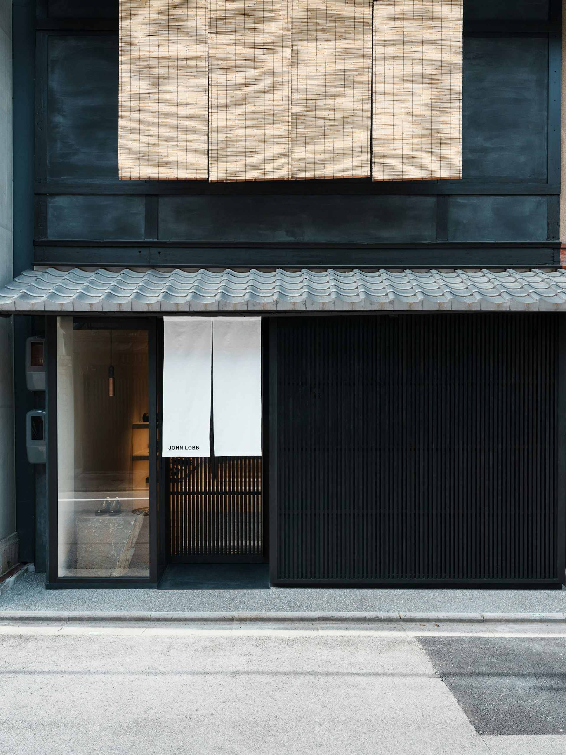
Founded over 150 years ago, British bootmaker John Lobb is defined by expert craftsmanship and artisanal techniques. We developed a visual identity and packaging system informed by this heritage, during Paula Gerbase’s creative direction in 2014, to establish a more contemporary positioning for the brand as part of the Hermès group.
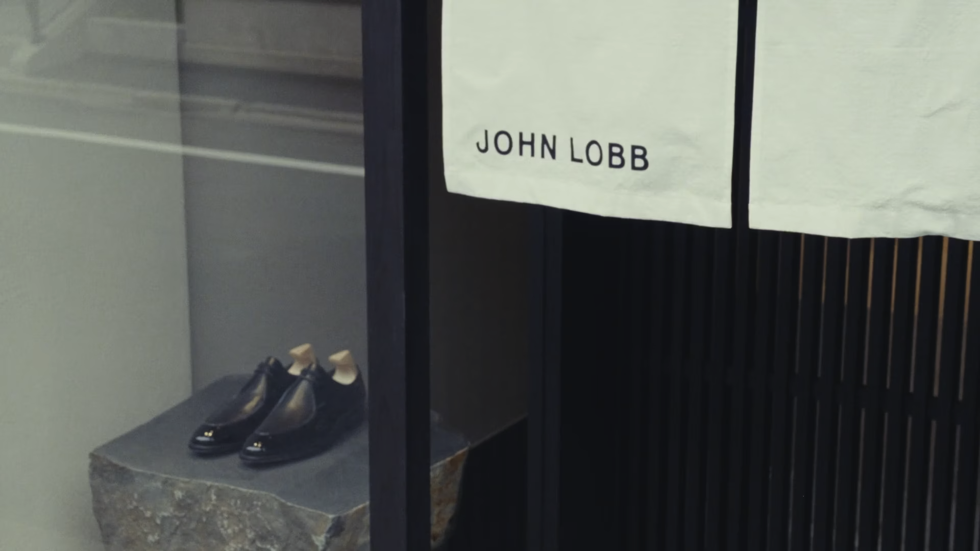
The new logo is redrawn from a historic version found on a 1937 shoebox label and sits at the centre of a considered graphic system that distinguishes between John Lobb’s core arms: Ready-to-Wear, By Request and Bespoke. A new primary typeface, Domaine Text, was also introduced. A low-contrast Latin serif, it blends traditional French and British typographic genres into a contemporary aesthetic, which subtly connects with the history of John Lobb and its shoes.
Paris, France, 2014–17
Identity, Packaging, Campaign, Digital


Case Study Section
We developed a range of packaging using uncoated papers and textured embossings, in a russet tone drawn from the brand’s historic packaging.
Surface finishes reference the physical processes of shoemaking, while embossed textures echo the rasps used to soften leather. Fine flecks printed across tissue papers recall fragments left behind during making, acknowledging the hand-finishing behind John Lobb’s artisanal footwear.


The updated John Lobb logo strips back the kitsch flourishes of the historic mark. The original proportions are retained, forming a contemporary logotype rooted in the brand’s history.


‘Owned by the high-fashion brand Hermès, John Lobb is a French brand that was founded by an English bootmaker more than 100 years ago. APFEL produced exquisite results through extensive research into the John Lobb archive, absorbing all of the details and coming up with an array of ways to use them.’
Communication Arts →

‘A Practice for Everyday Life’s new visual identity for luxury bootmaker John Lobb combines contemporary design with a look at the company’s 150-year heritage and Cornish roots.’
Creative Review →


In 1851, the young apprentice bootmaker John Lobb walked from the Cornish coast to London, a journey that informs the design of the packaging and communications. Abstract patterns and photography of nature are interwoven throughout the printed materials, drawing on the organic tones and textures of the British coastal landscape and the brand’s designs.
Photography: Max Creasy, Ed Park, Mitsuru Wakabayashi
Video: Yuki Onishi


The brand’s primary typeface, Domaine Text, is designed by Klim Type Foundry. Its curvaceous detailing draws on the Latin genre, while its underlying structure is rooted in Scotch Roman.
