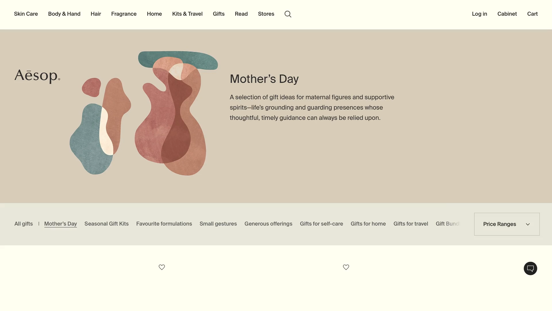
For Aesop’s annual Gift Kit, we designed and art directed the packaging and campaign, coinciding with Mother’s Day celebrations across the globe.
Moving away from a gendered focus to celebrate wider forms of caregiving, our direction and visuals extended across a graphic and photographic campaign featured online and in Aesop stores.
Worldwide, 2022–23
Identity, Campaign, Packaging


Someone who protects and watches over.
mimamori. (Japanese noun).


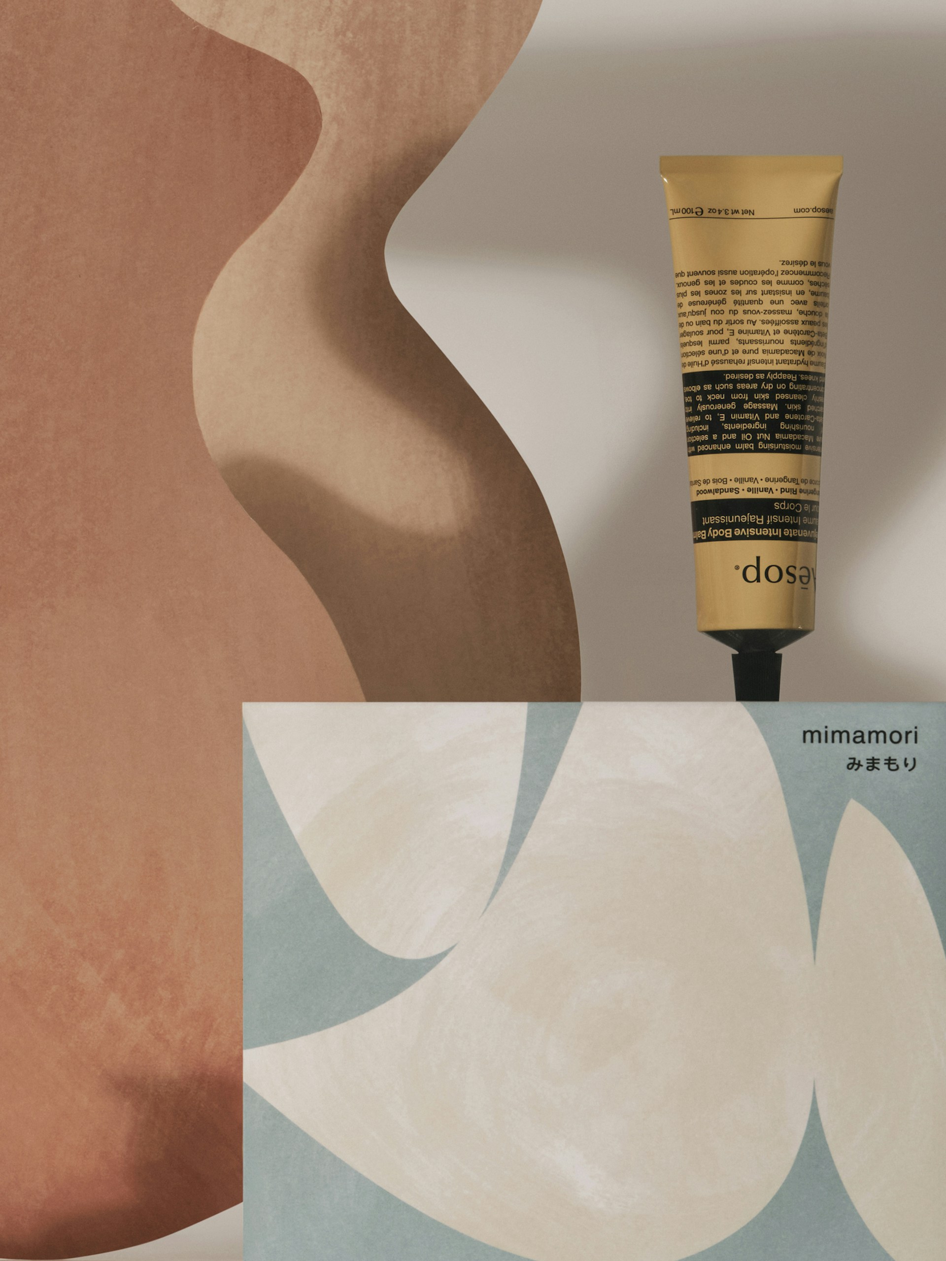
Drawing visual reference from Alexander Calder’s mobiles, the graphic forms are developed from abstractions of hands and eyes as symbols of protection.
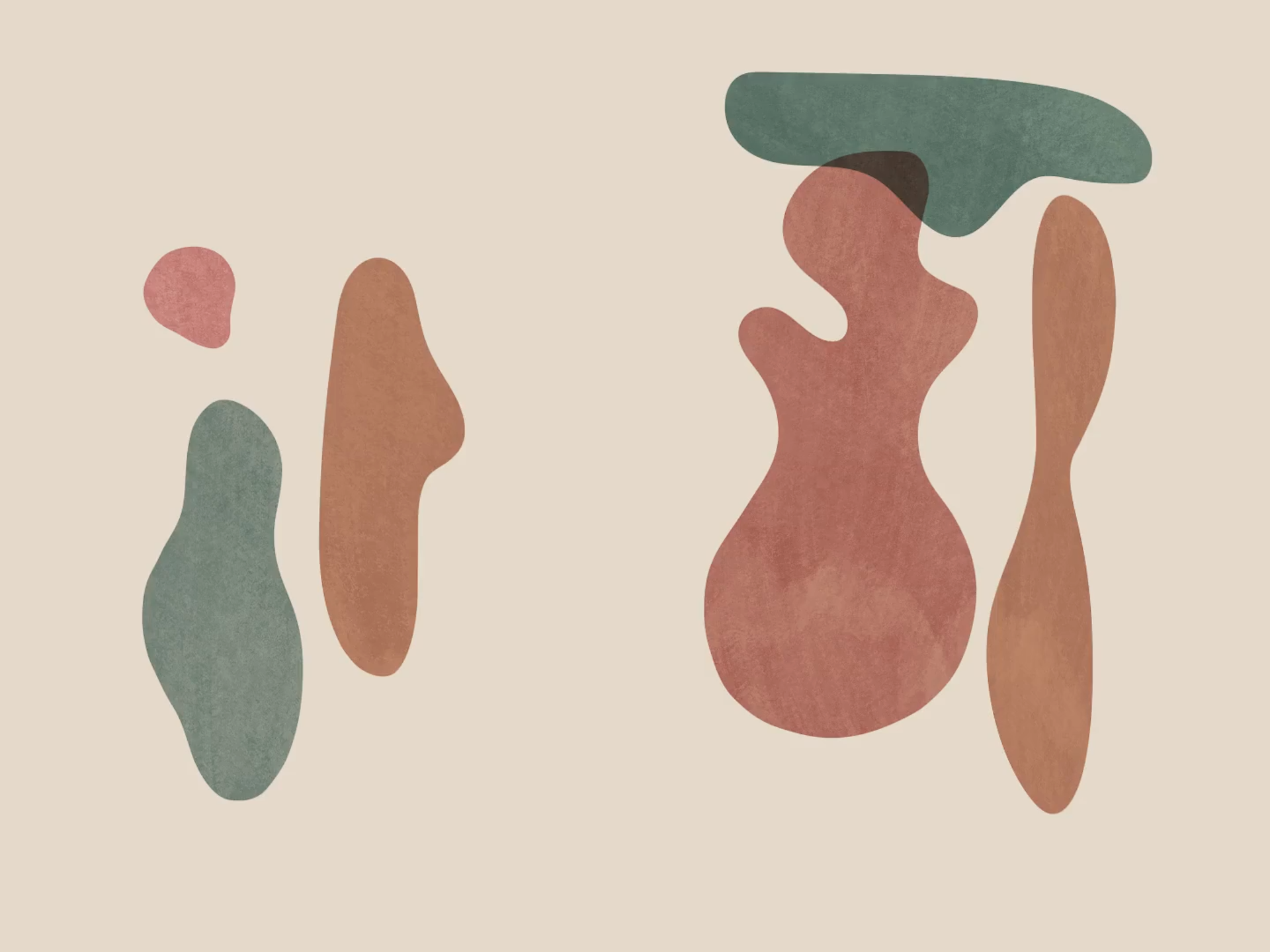

Our artwork is inspired by the sound and meaning of ‘mimamori’, formed from the Japanese words for ‘watch’ and ‘guard. Across the packaging and photographic campaign shot by Ivona Chrzastek, organic forms bleed off the edges, fill the space and interact with one another, evoking a network of support and strength.
The ambiguity between forms and counterforms, positive and negative, and subject and background is reinforced by a minimal colour palette, while a textured background adds warmth to the compositions.
Campaign photography: Ivona Chrzastek
Packaging photography: Ed Park


‘If good graphic design is about bringing the best aspects of a brand's personality into form, APFEL does this more delightfully than anybody else.’
Nolan Giles Design Editor and Consultant, formerly of Birkenstock and Monocle