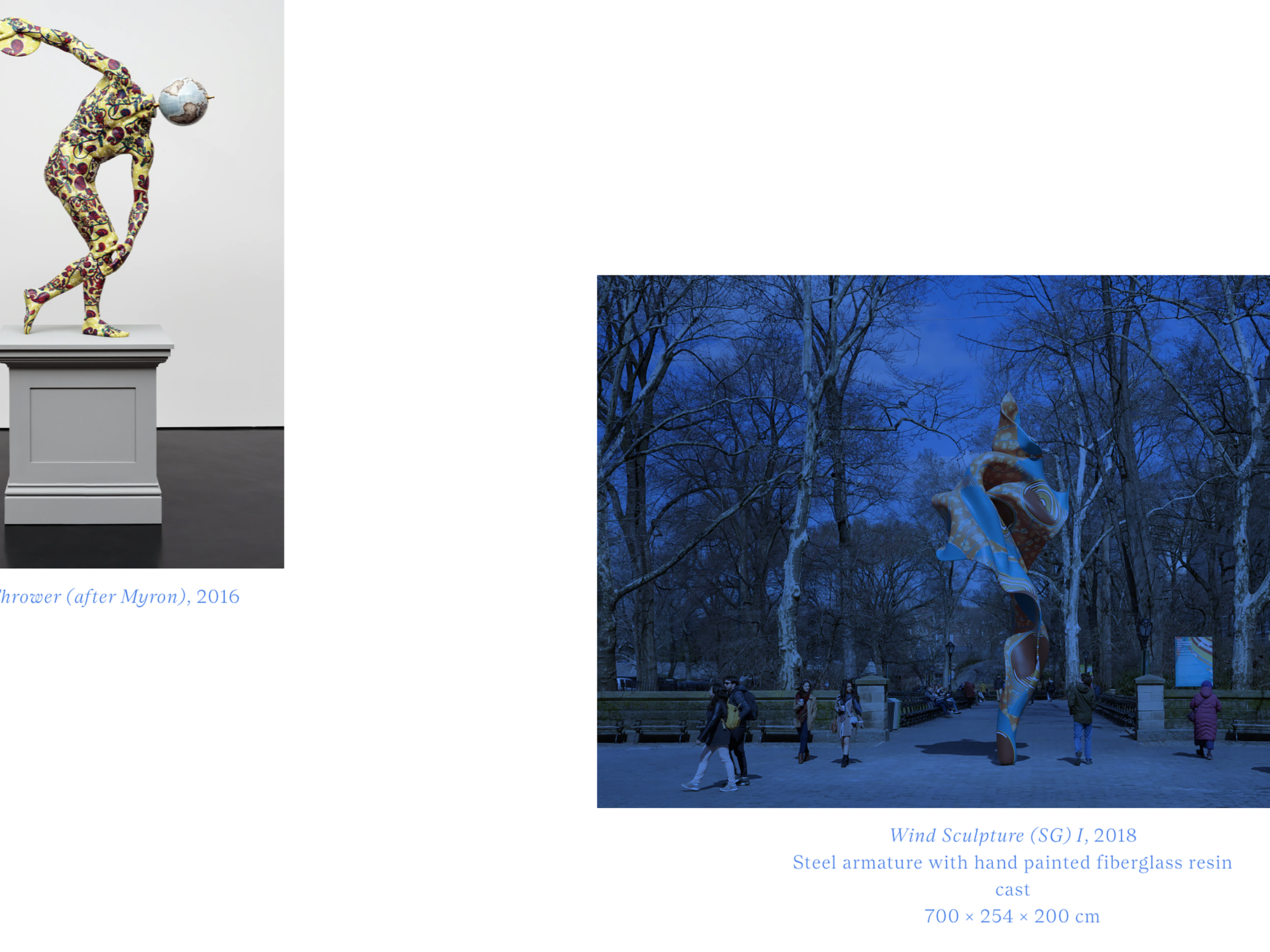
Yinka Shonibare CBE (RA) commissioned us to create a new visual identity and website to offer a more substantive overview of the artist’s career to date. Shonibare's interdisciplinary practice examines race, class and cultural identity through sculpture, painting, photography, film, textiles and public works.
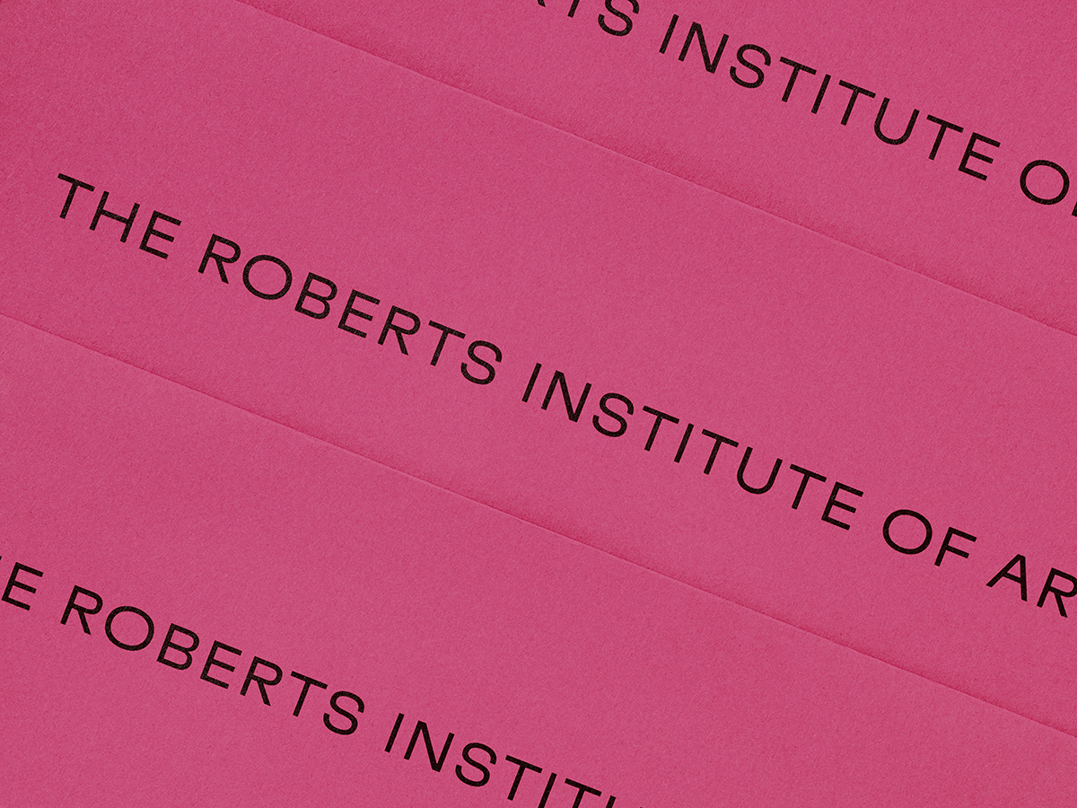
The identity is inspired by the artist's practice, which is informed by both historical and contemporary contexts, as well as a strong focus on textile. The logotype runs vertically on the site, borrowing from the language of the textile industry, especially the lettering found on selvedge. We chose the typeface Nantes Book, a serif that draws on early English Latin types and pairs its historical character with modern typographic styling. The typographic setting references the classical printed page, while the use of colour and image placement subverts the more rigid framework.
As colour is a distinctive element of Shonibare’s practice, we made it a key part to the identity – developing a bold colour palette drawn from the work, which is used throughout the website as an aid for navigation and to categorise the rich content.