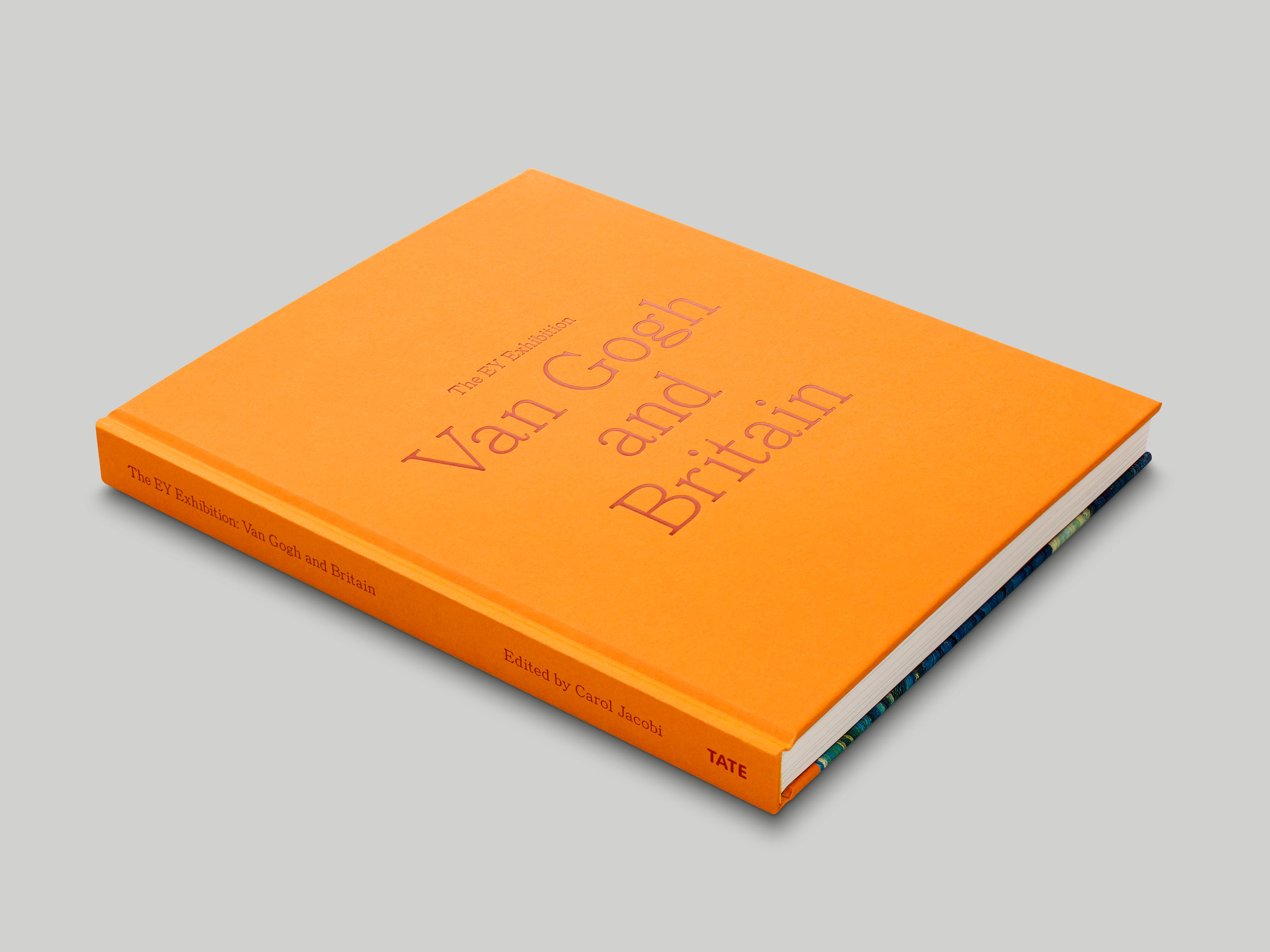
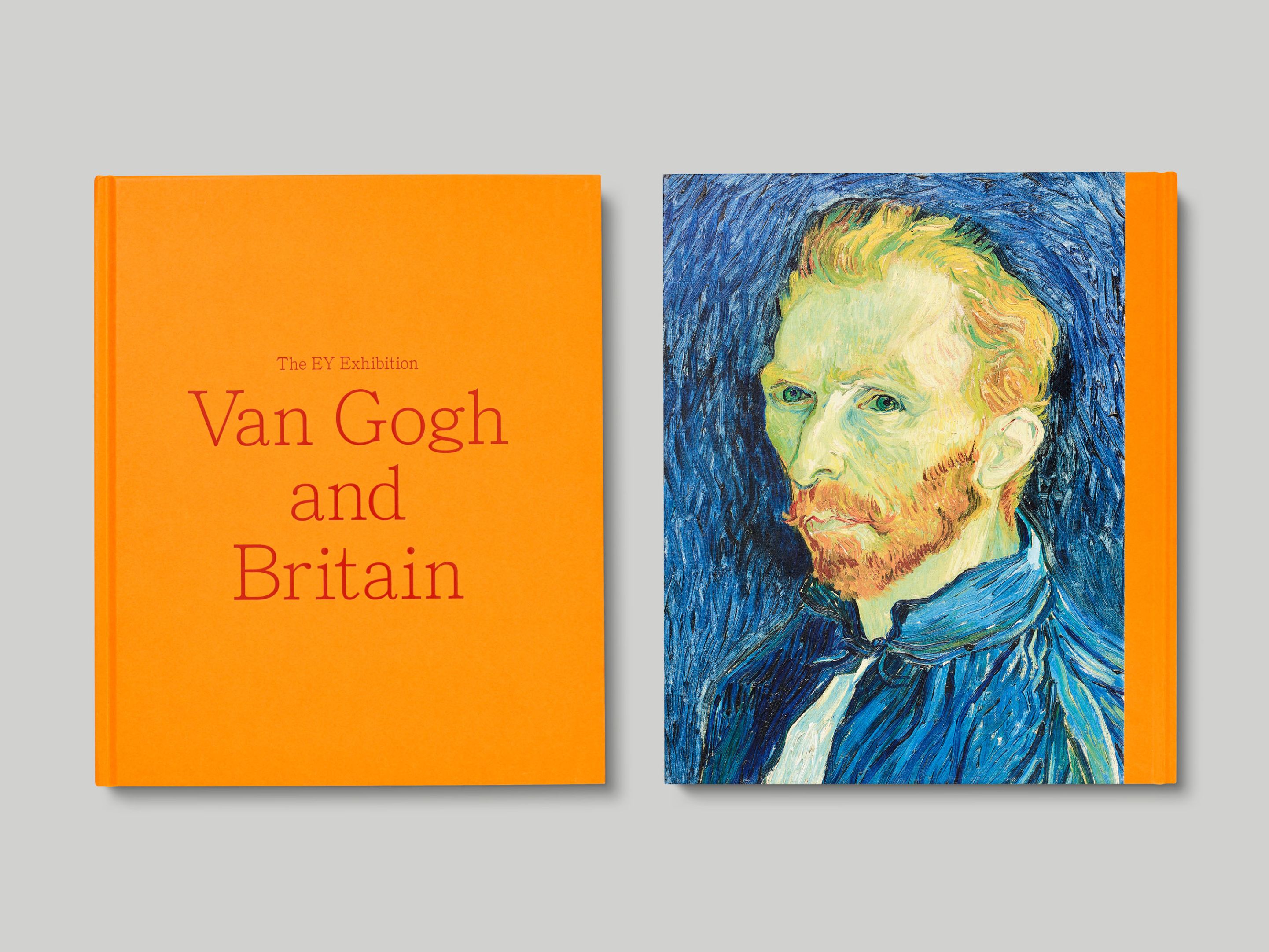
Published alongside the Tate Britain exhibition of the same name, Van Gogh and Britain explores the influence of British art and culture on Van Gogh’s practice, and the impact of his work on a range of British artists including Francis Bacon, David Bomberg and the Camden Town Group.
The publication is typeset in DTL Haarlemmer, a typeface initially designed by Jan van Krimpen for use in the Dutch Staten Bijbel in 1938 – an oblique reference to the time Van Gogh spent in pursuit of a career in the clergy. Titles on the cover and throughout are set in a contemporary re-drawing of a Clarendon typeface, which we further adjusted to emphasise its existing optical idiosyncrasies. The colour palette chosen for the covers and endpapers is derived from autumnal tones that feature in Van Gogh’s works. Inside, the layout uses a double margin-width system that allows for flexibility and variety in the placement of images and text.