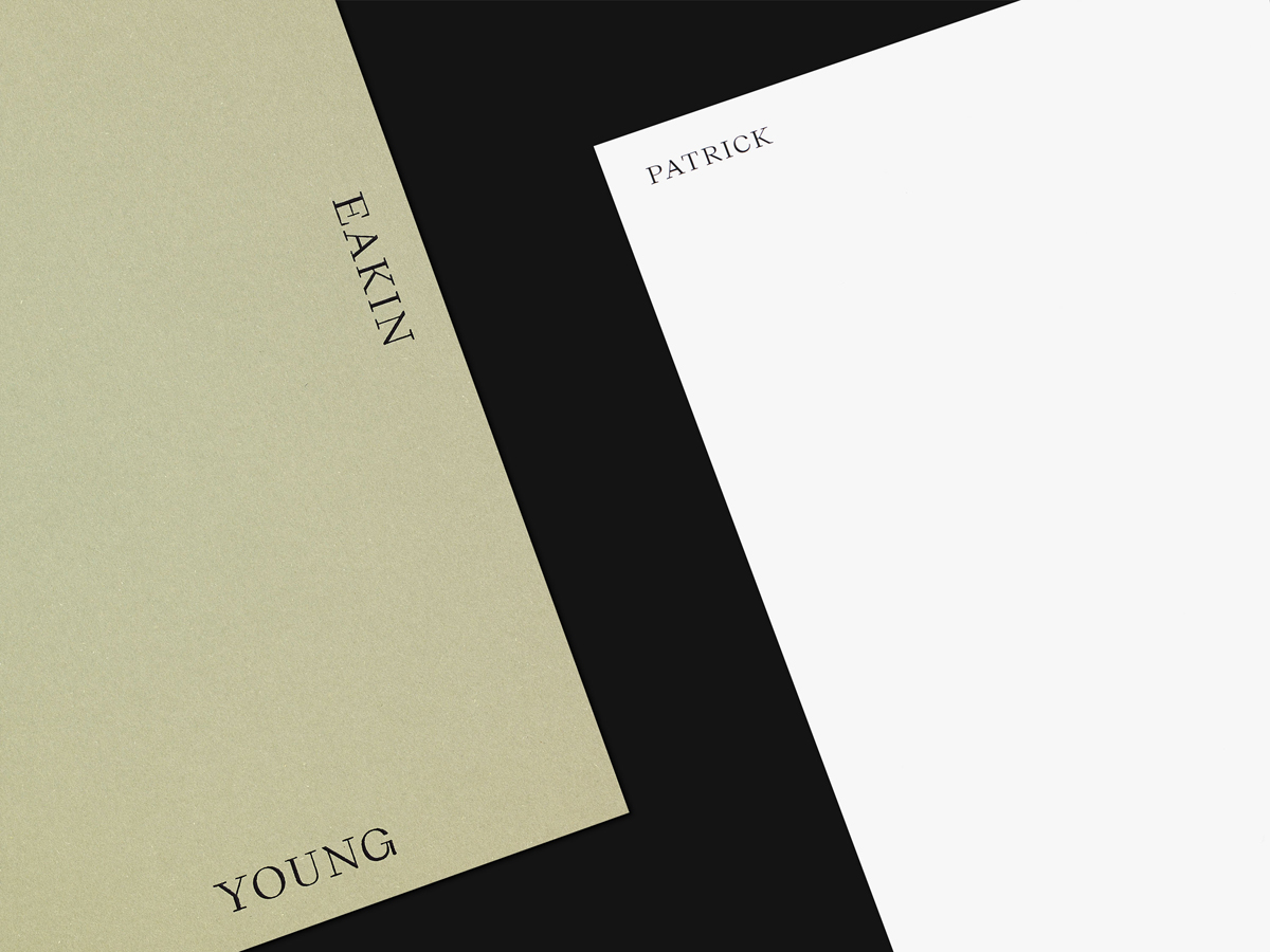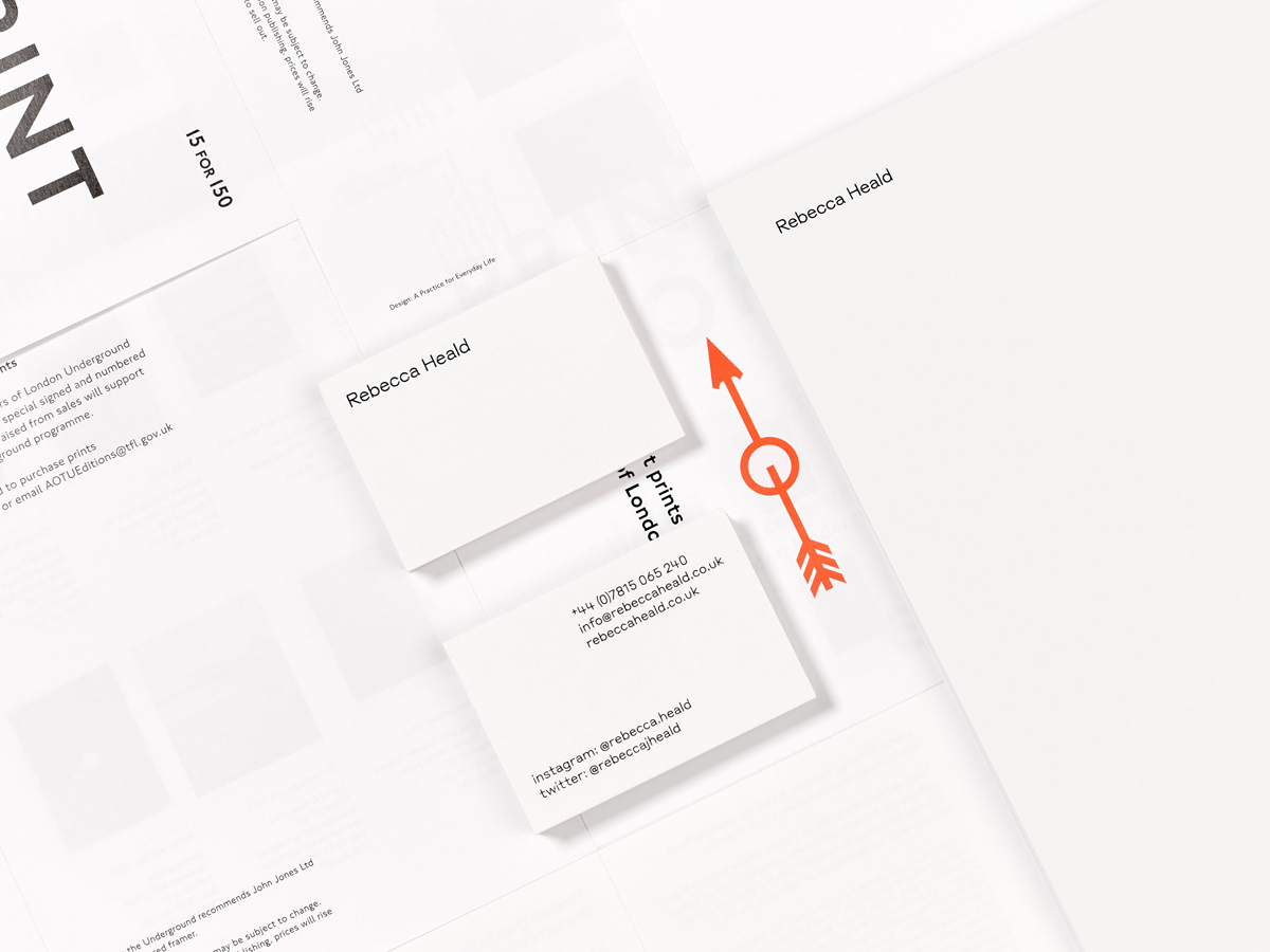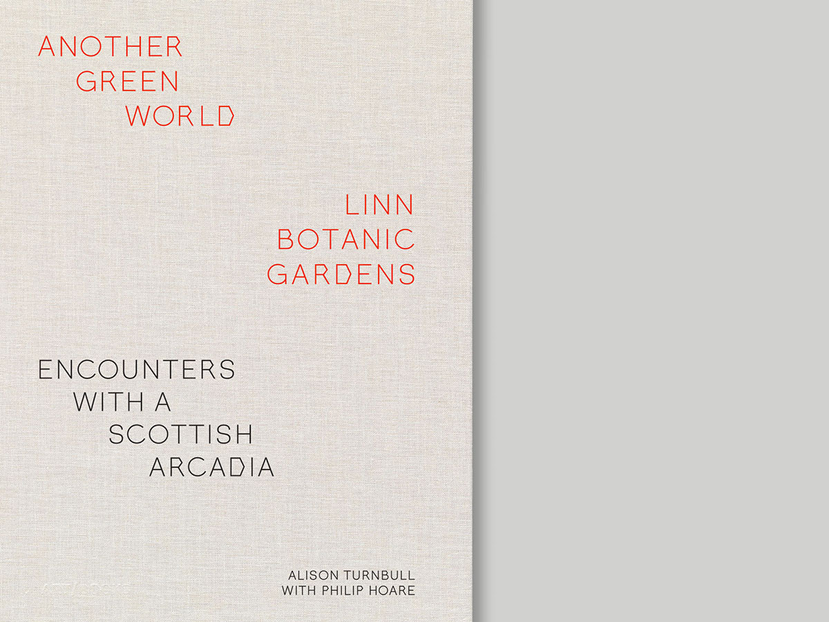
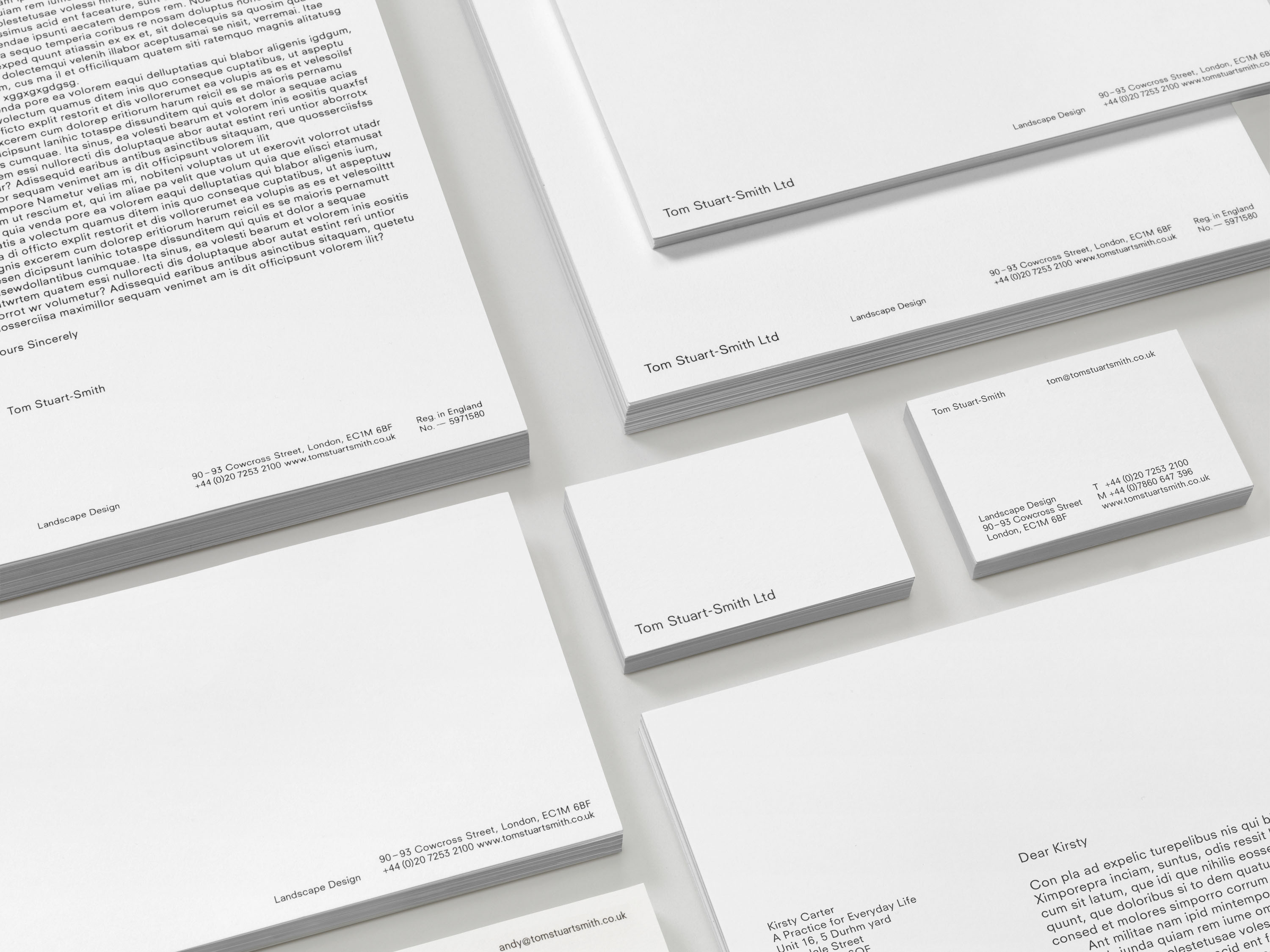

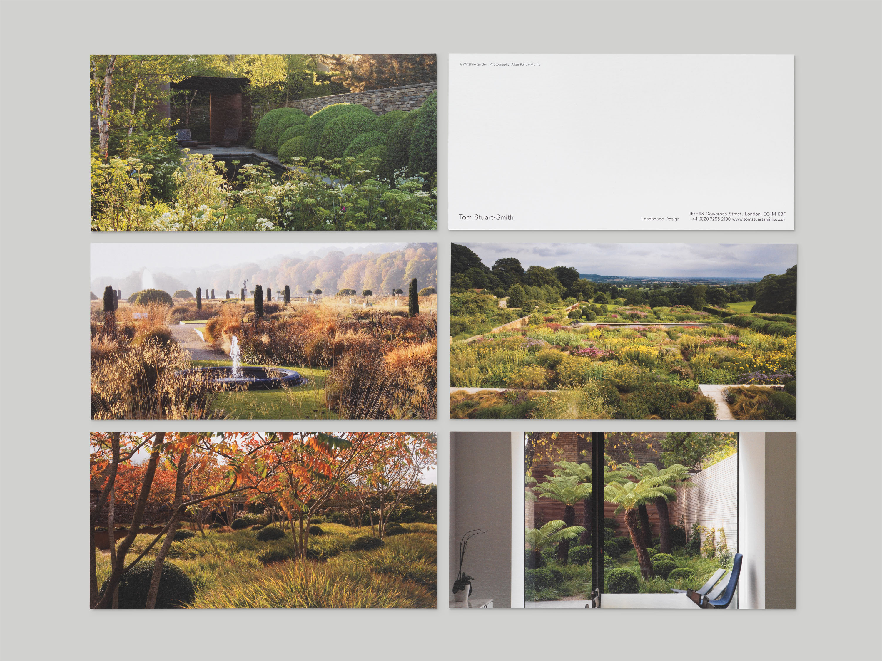
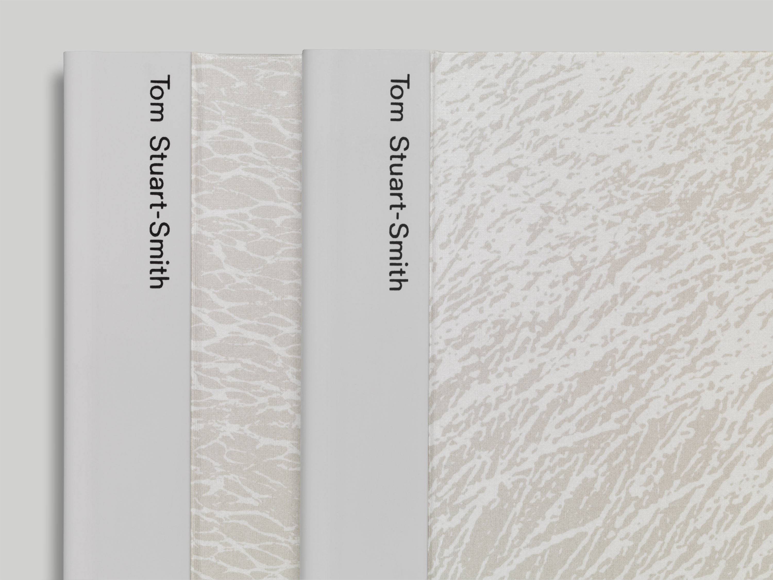
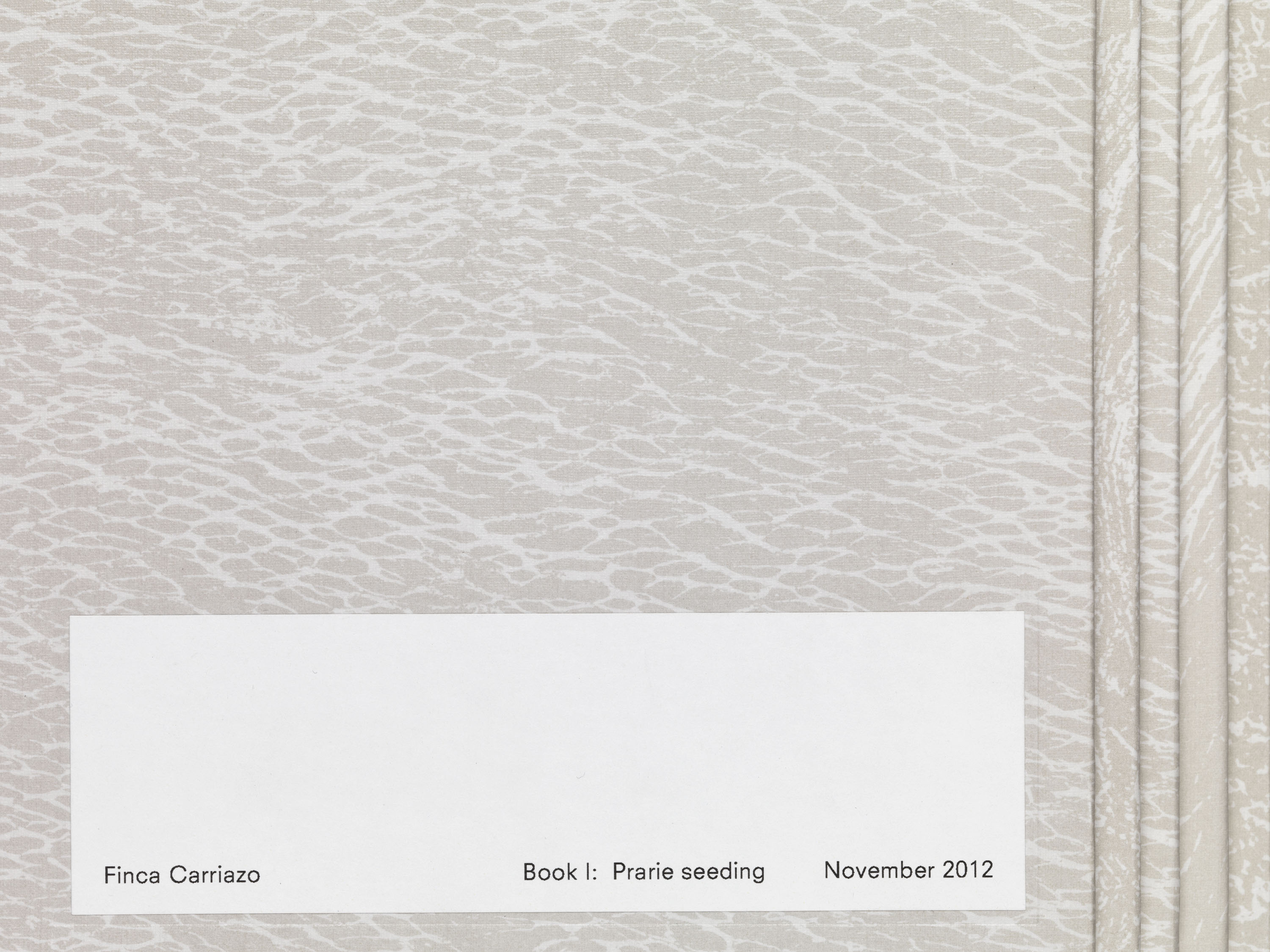
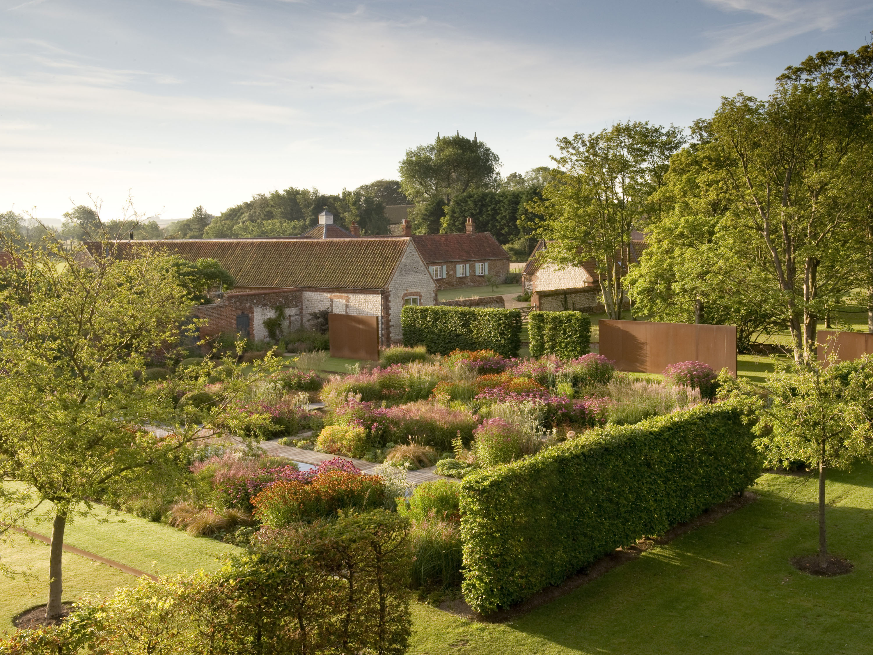
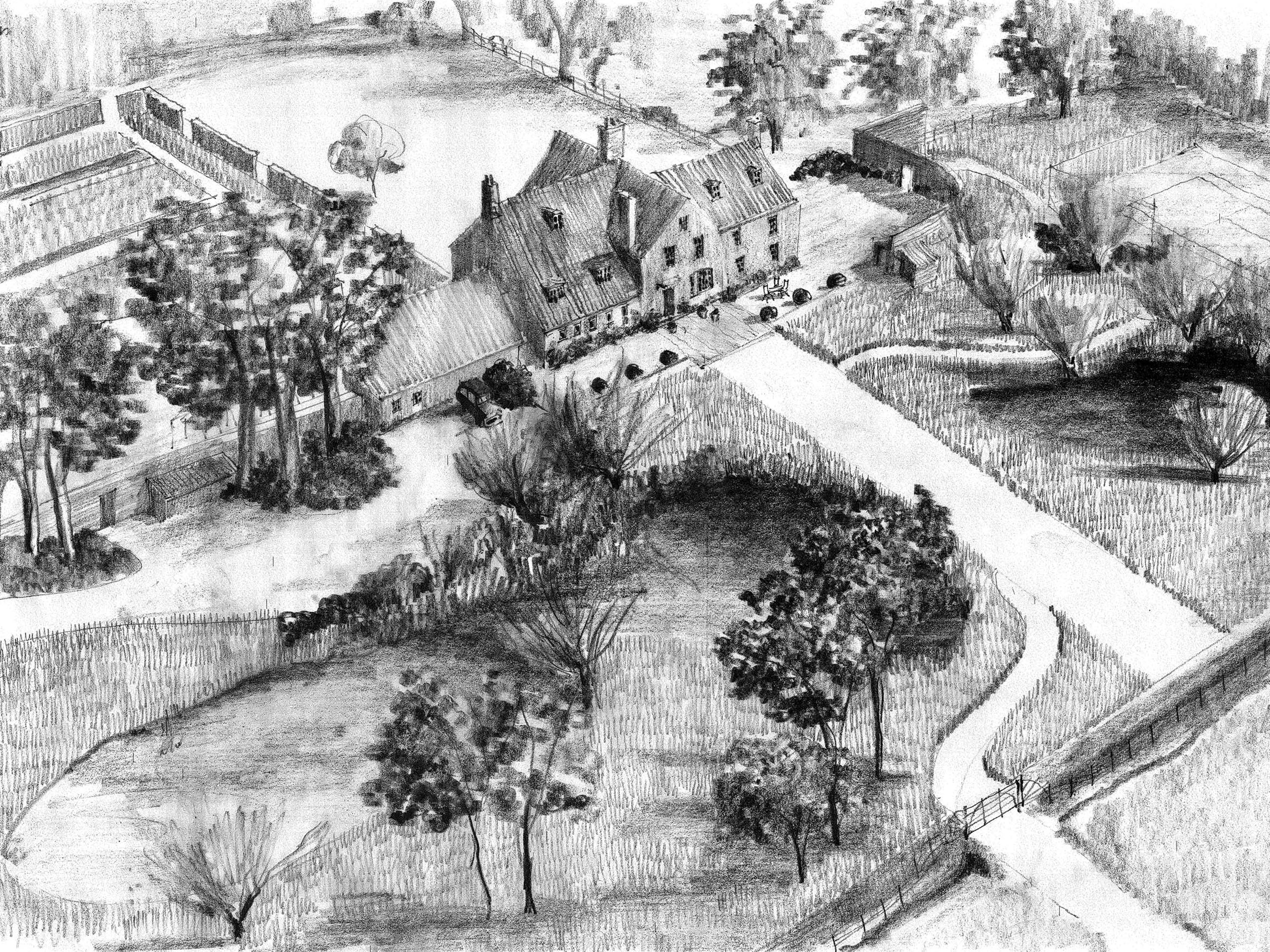
Tom Stuart-Smith is a landscape design practice whose approach combines naturalism and modernity. We were commissioned to design a new identity and range of presentation materials for the practice, which intends to echo the minimalism and texture within the landscapes they create. All of the information on stationery is anchored to the bottom edge of the page, and used as a ground to build upon.
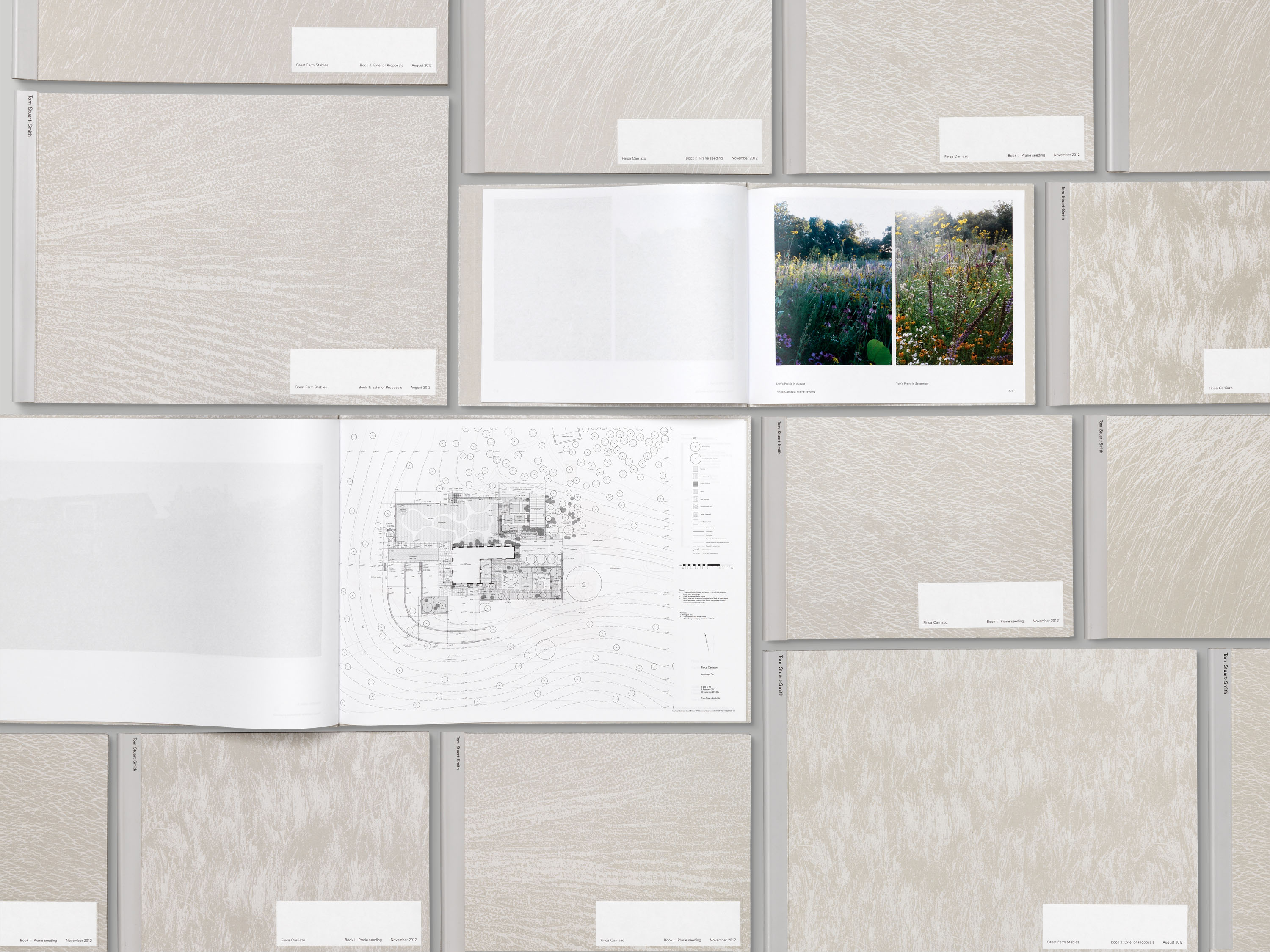
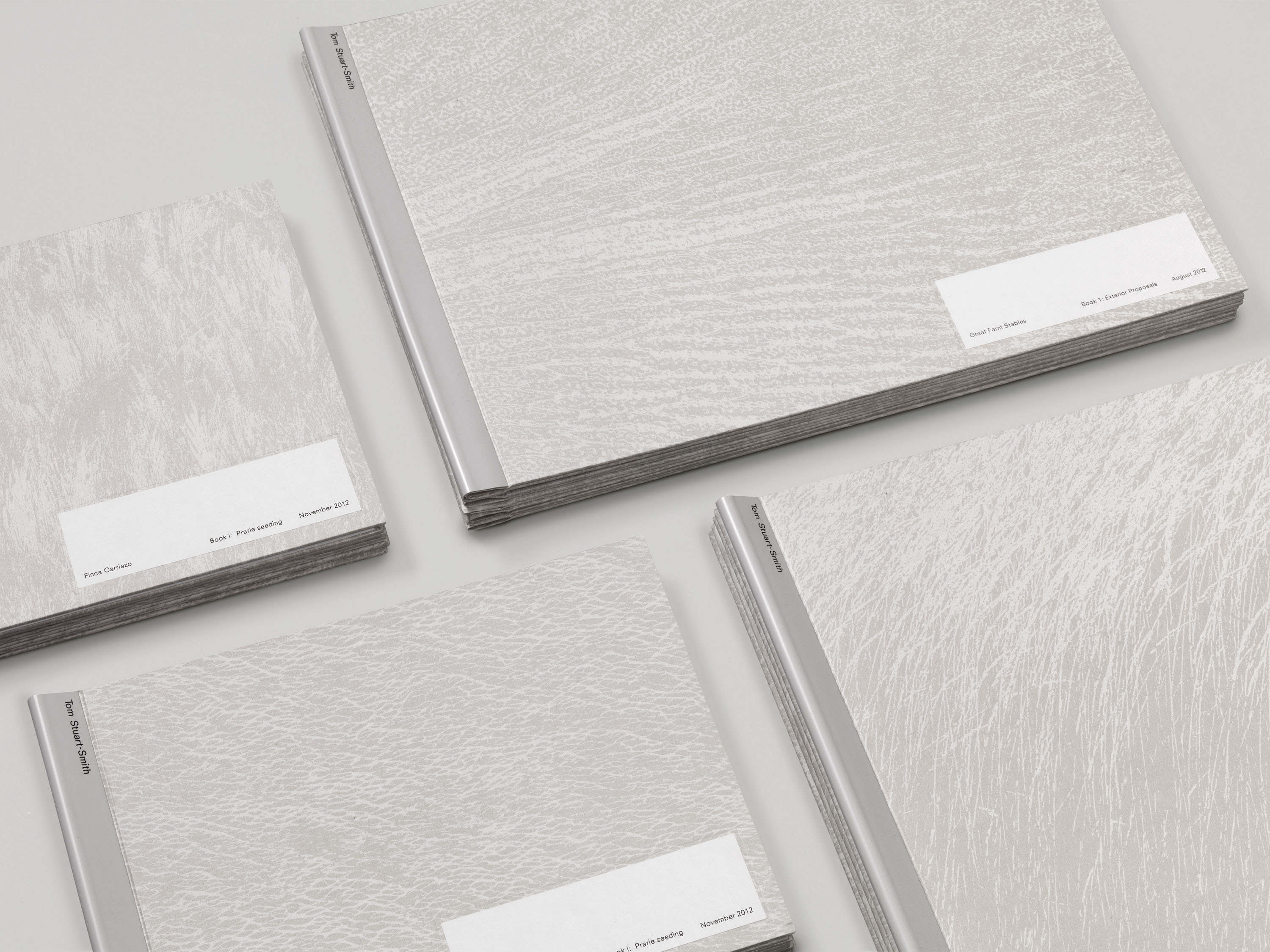
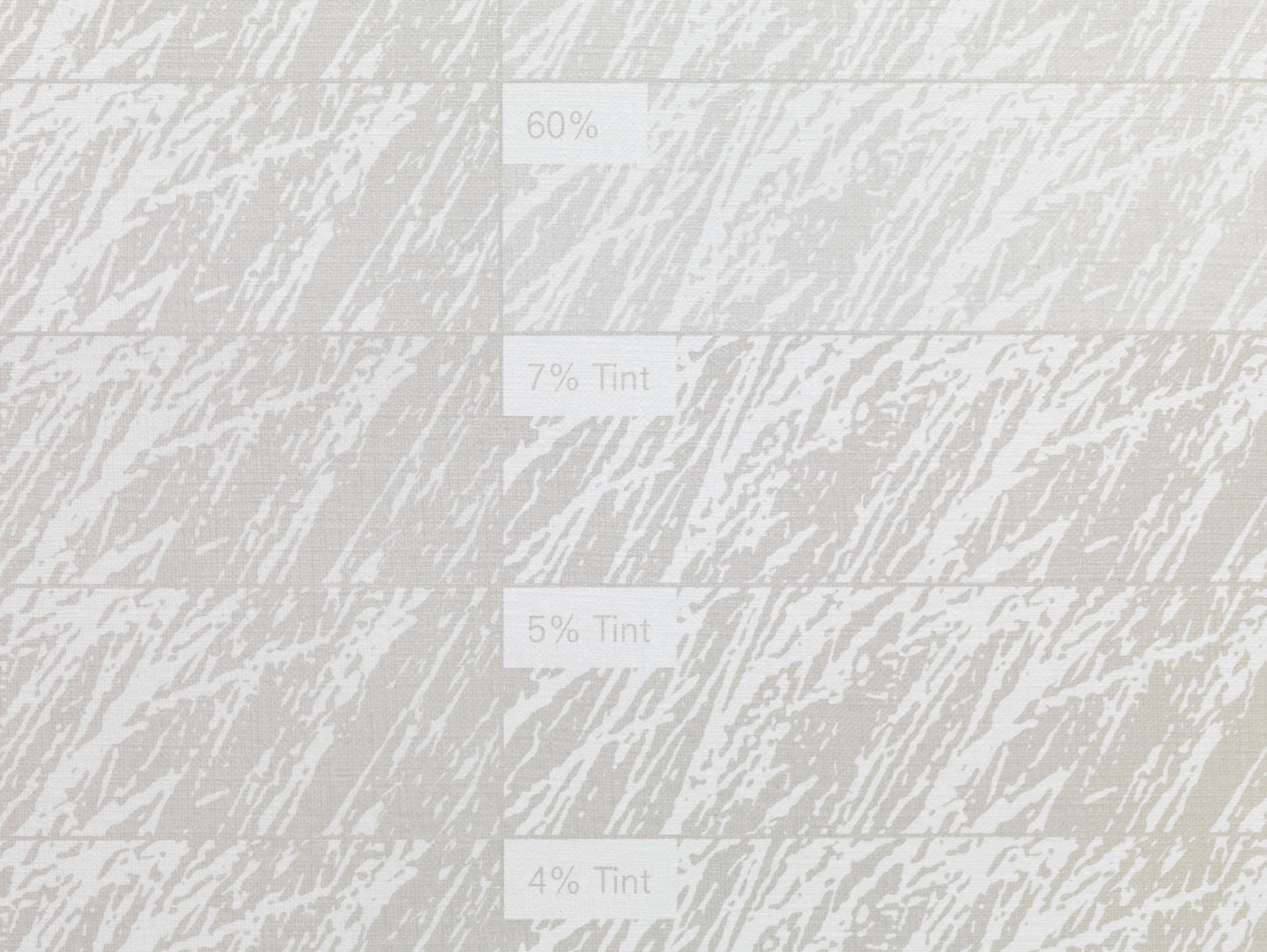
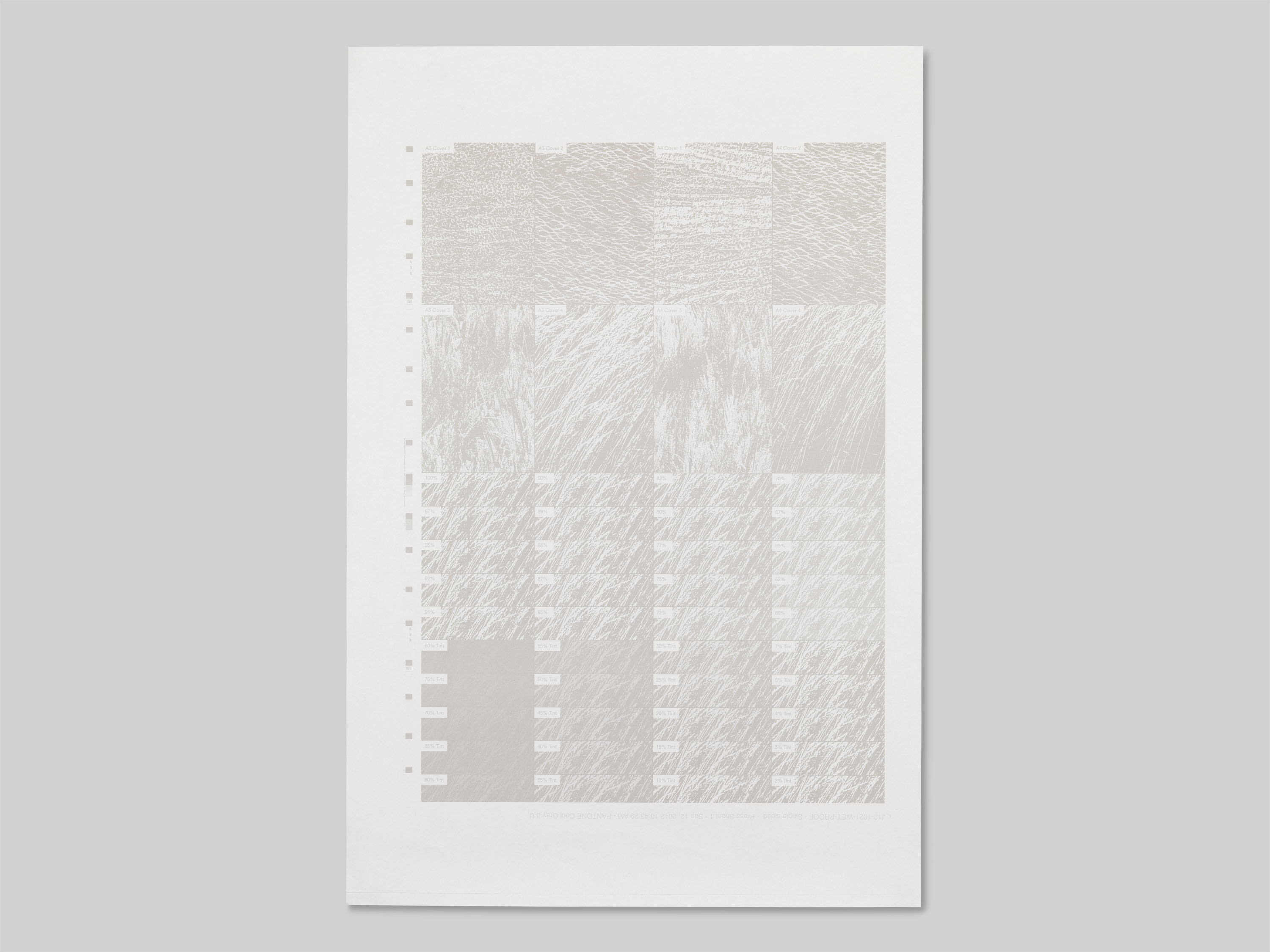
To balance the minimalist qualities of the identity and its core print items, the presentation folders and portfolio books use a warmer palette, taking textures from leaf veins and grasses and screen-printing them over greyboard. Using a bespoke binding system, the folders allow the practice to easily modify presentations and have quick access to plans and planting documents on site.


