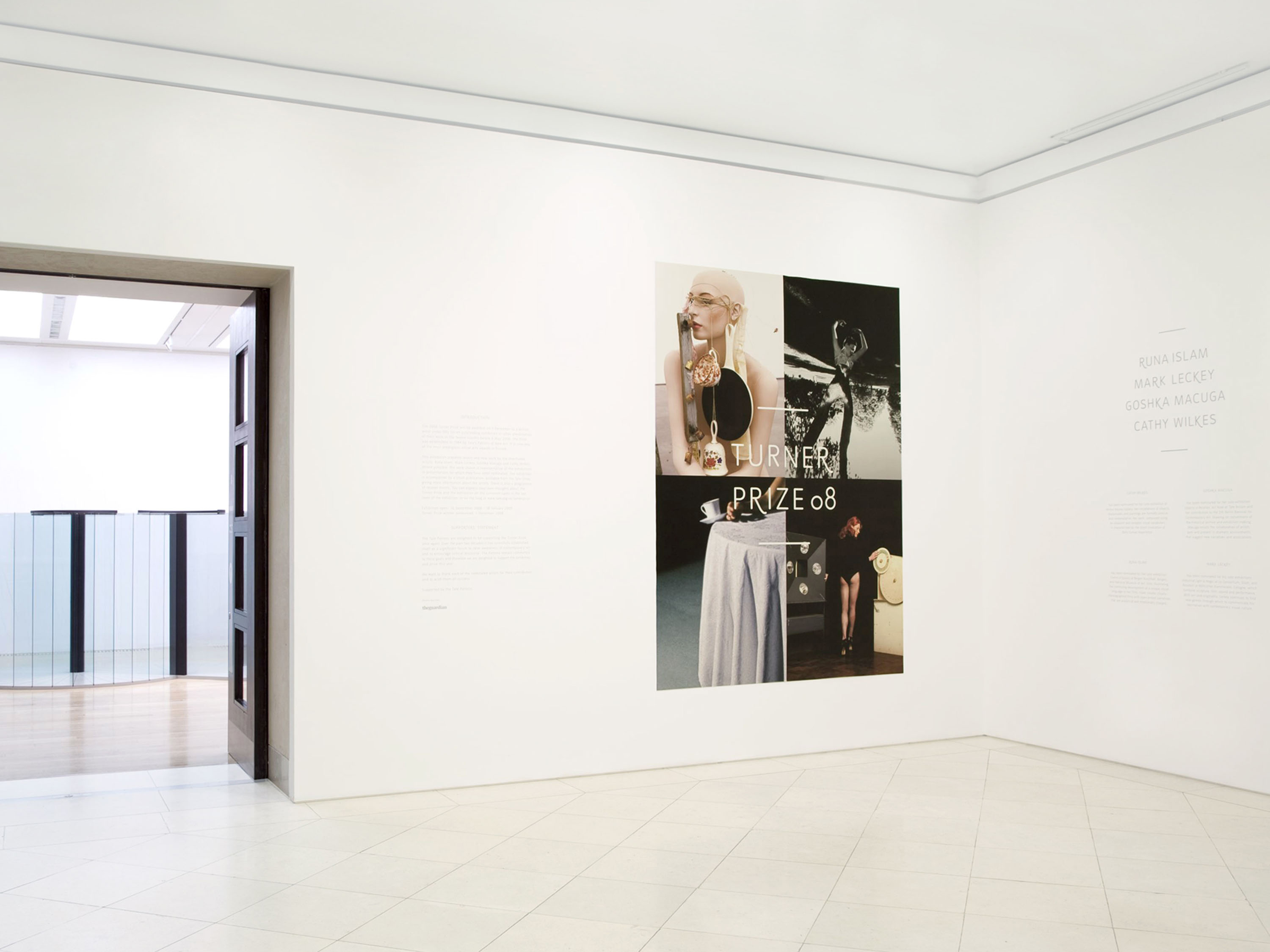
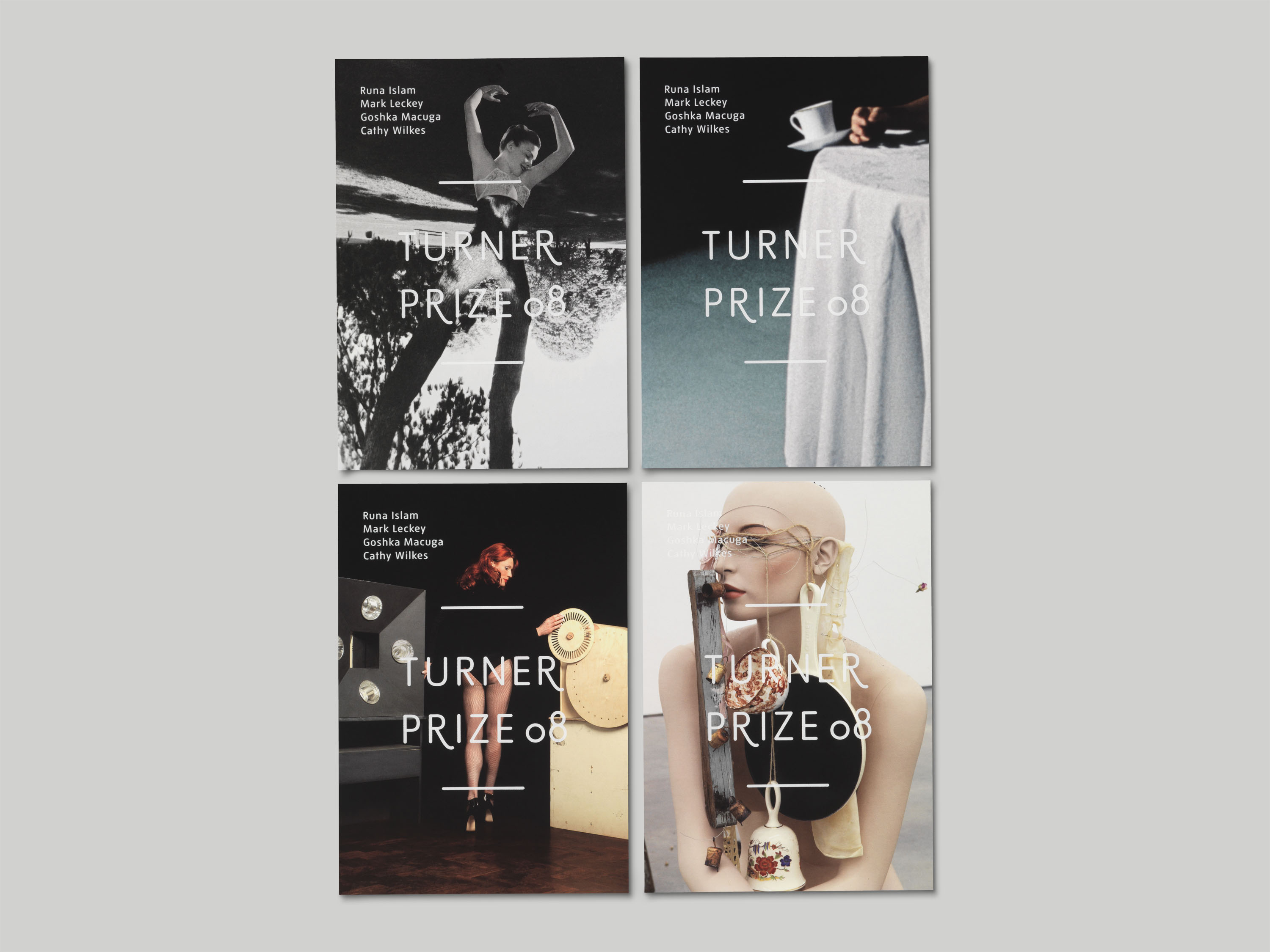
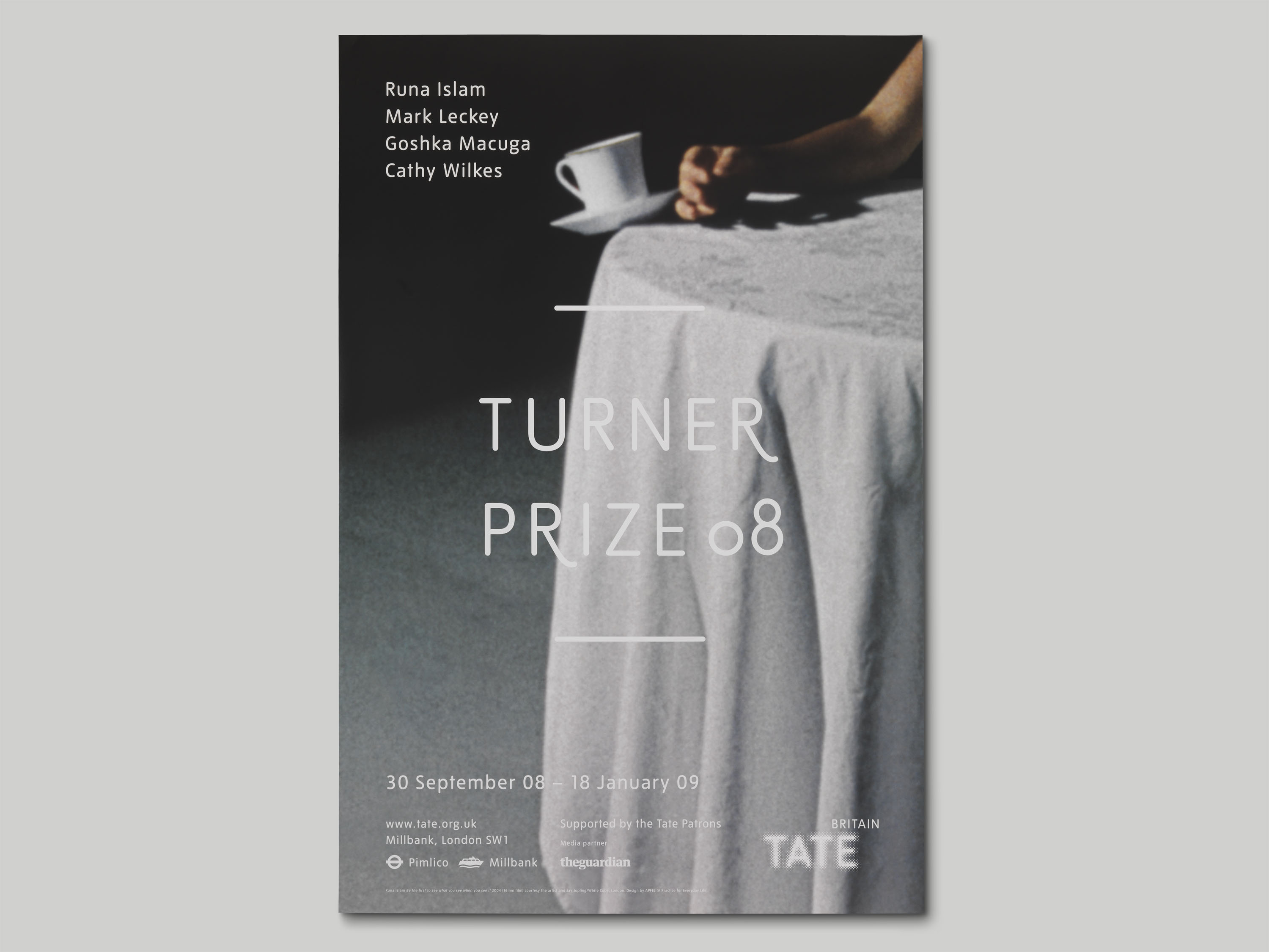
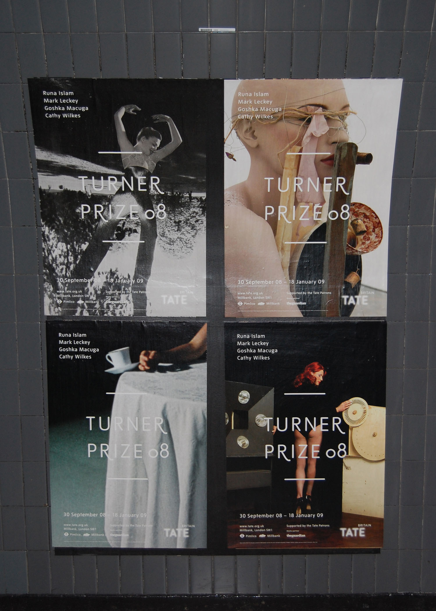
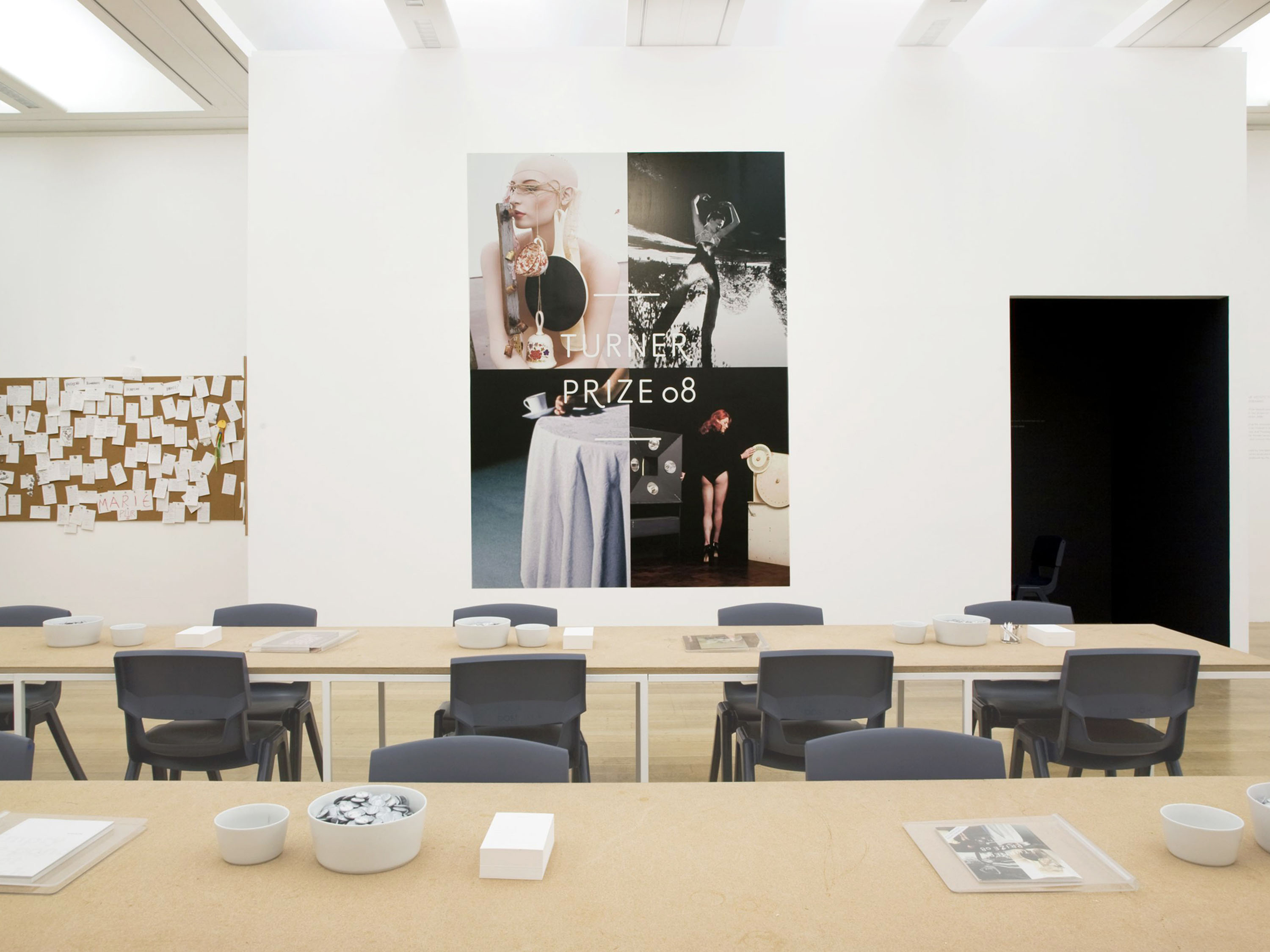
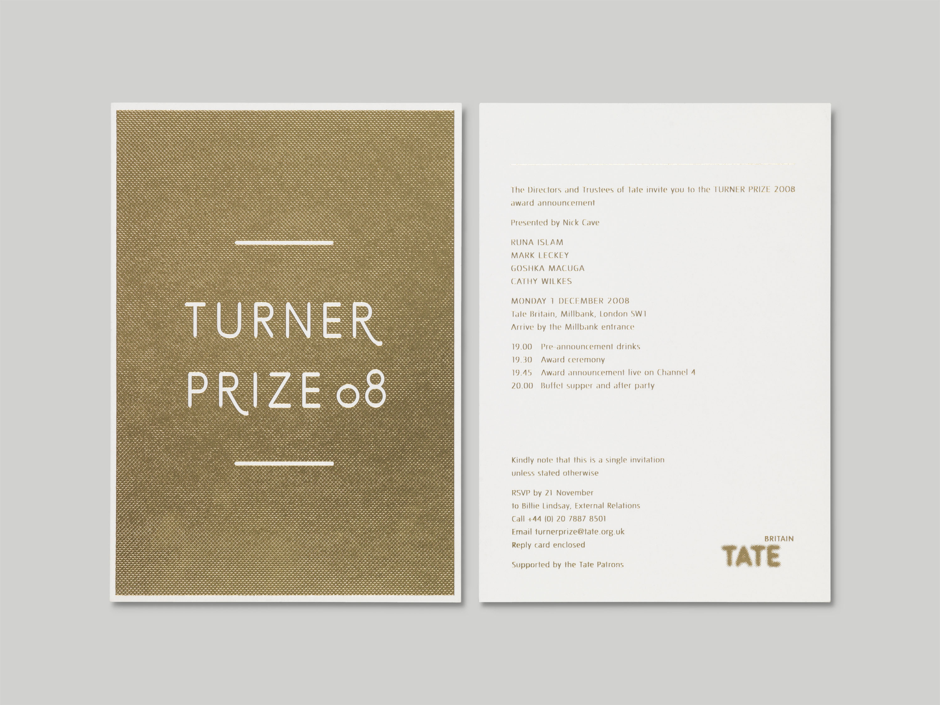
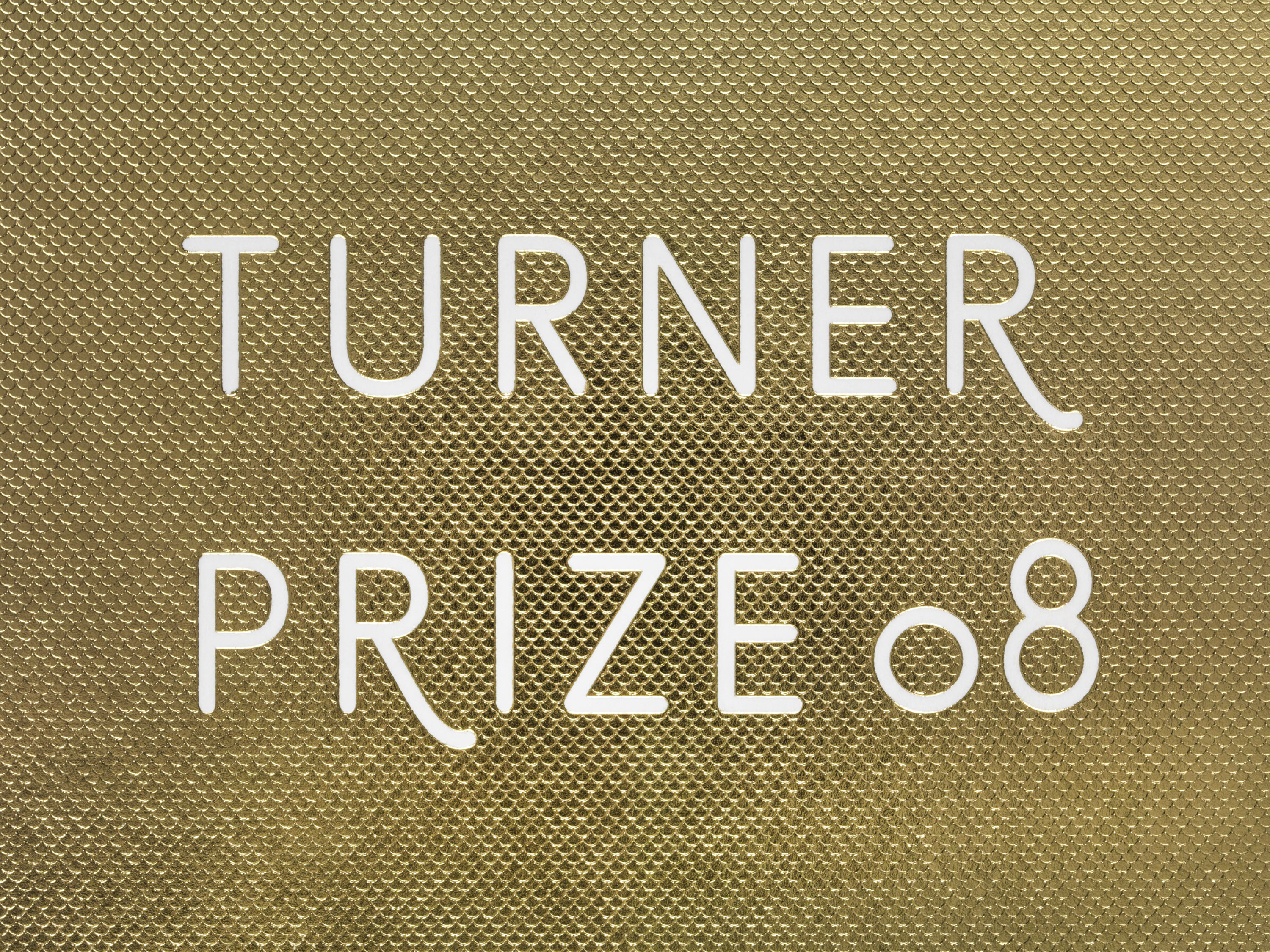
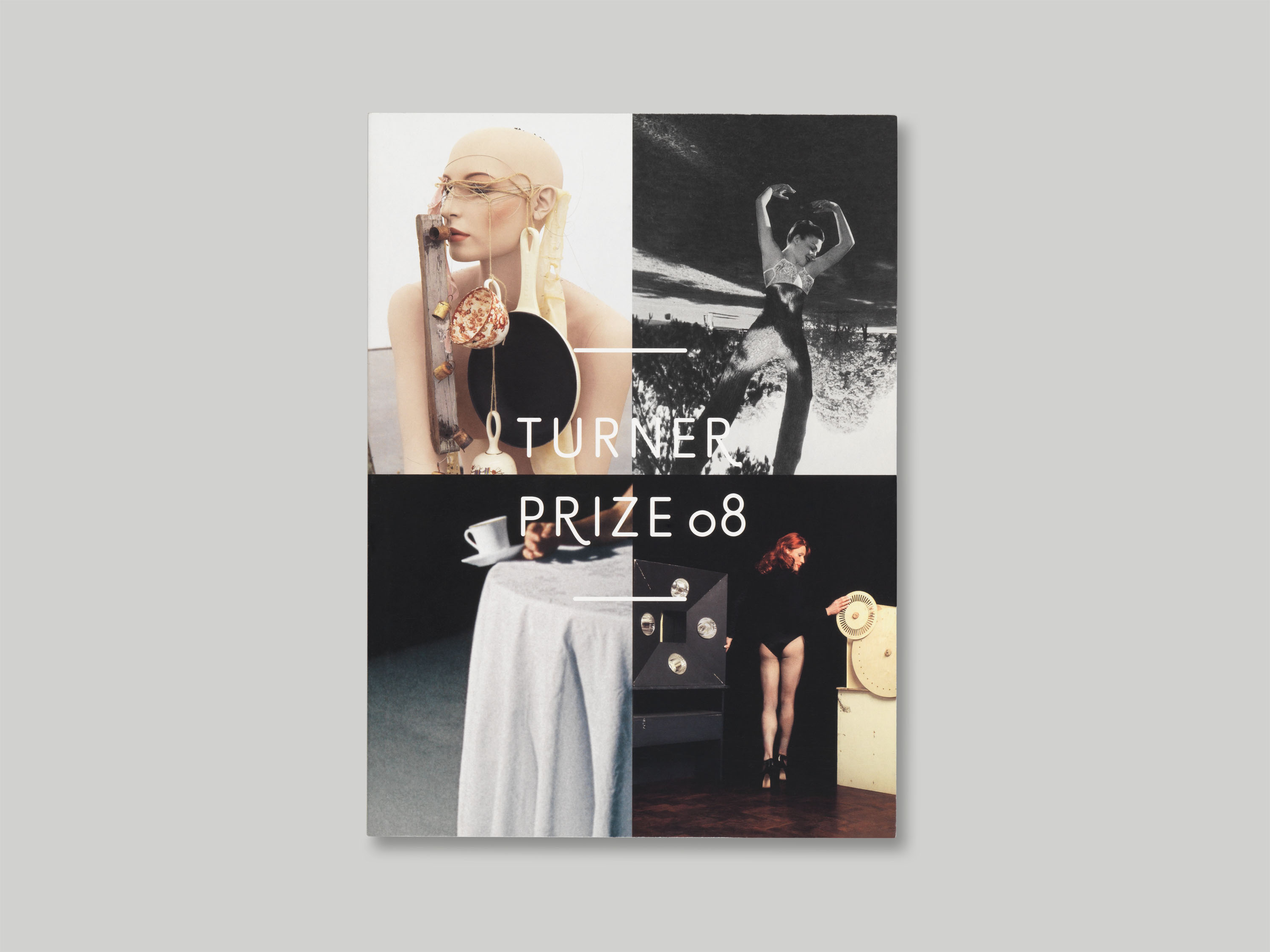
In the 25th year of the Turner Prize, Tate felt it was time to update its visual identity to better represent the nominated artists’ work and reflect its reputation as the foremost contemporary art prize in the UK. To achieve this, we created an adapted Prize style of the Tate typeface with swashes, and from this derived a new logotype. This is used in combination with images of the four nominees’ work throughout the marketing materials, to create a consistent, distinctive and assuredly simple identity system.
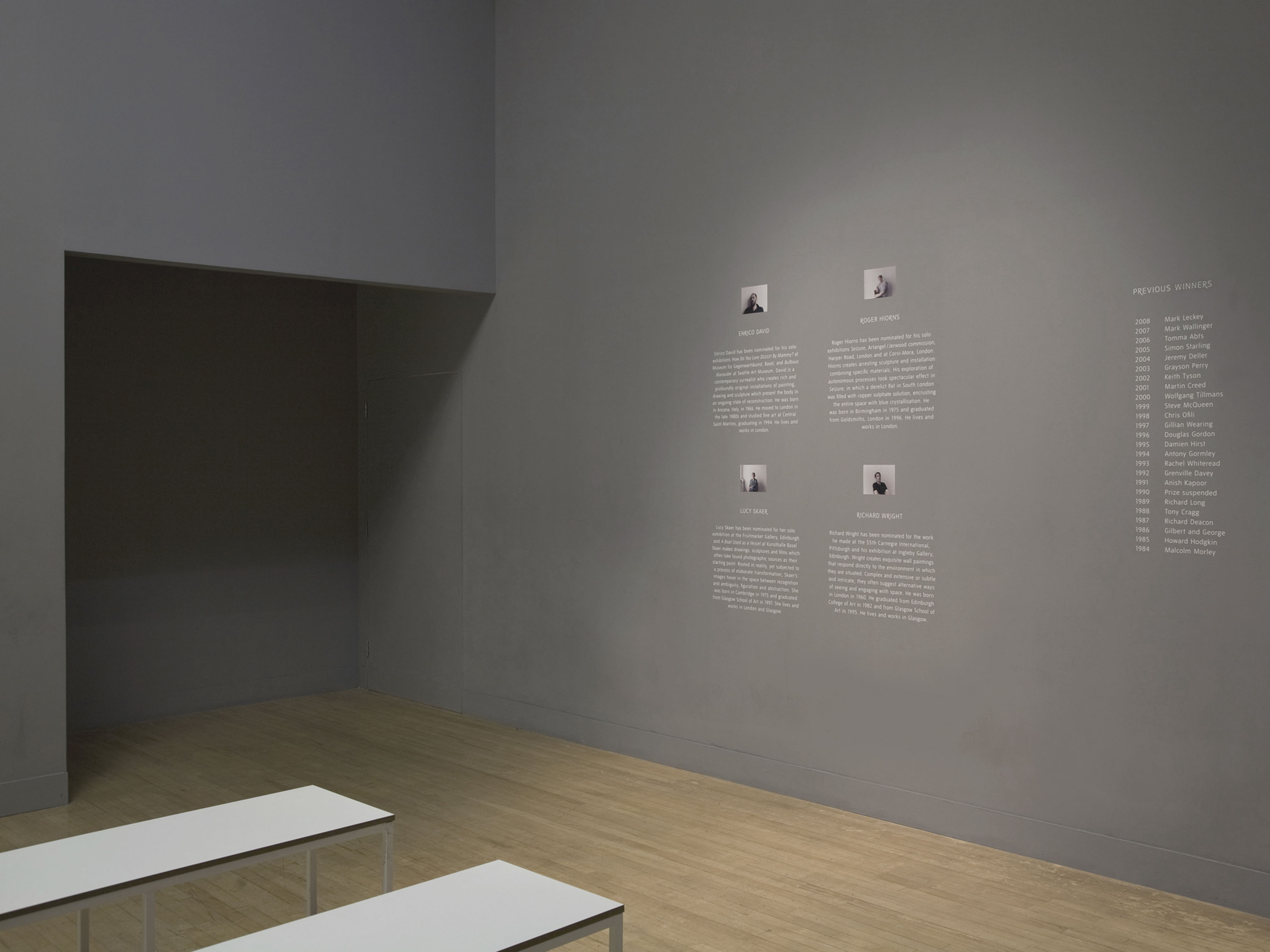
We worked with collaborators including Michael Marriott and Hellicar & Lewis on the design of the Turner Prize exhibitions from 2008–2010. Within the exhibition, a comments room featured cork walls for visitors to post their comments, and badges featuring the name of each artist were available free in the exhibition so the public could take their favourite as a way of casting their own vote.