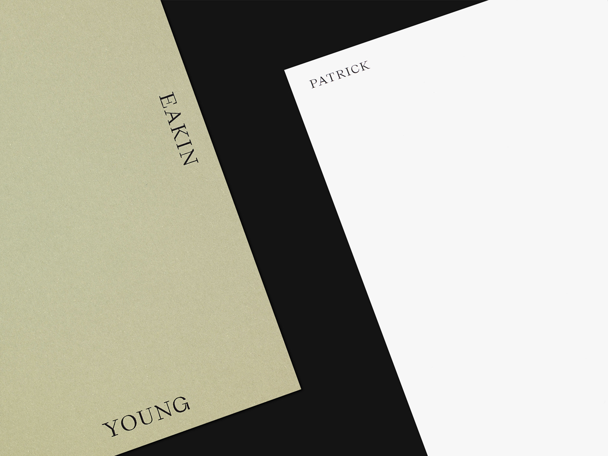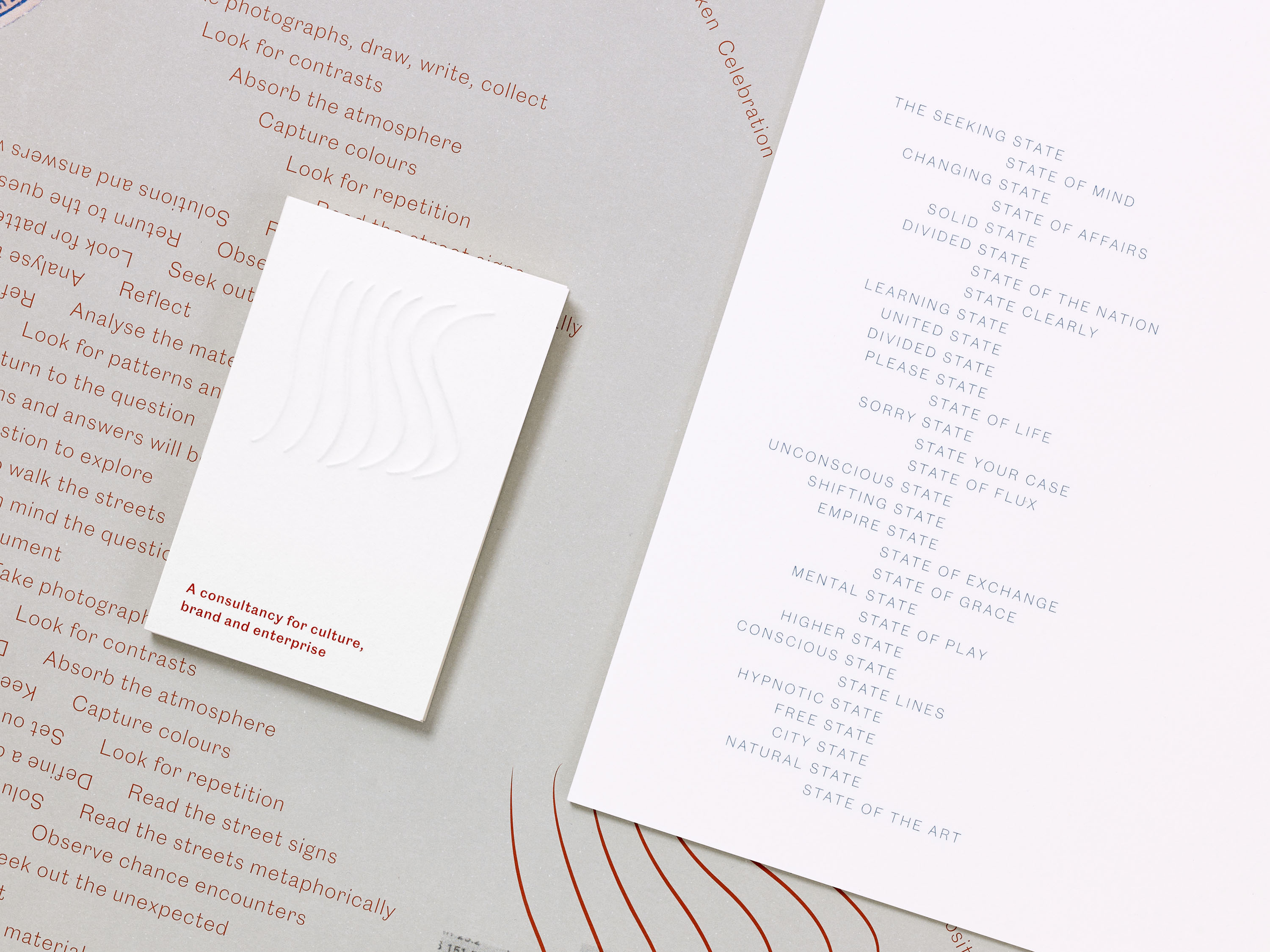
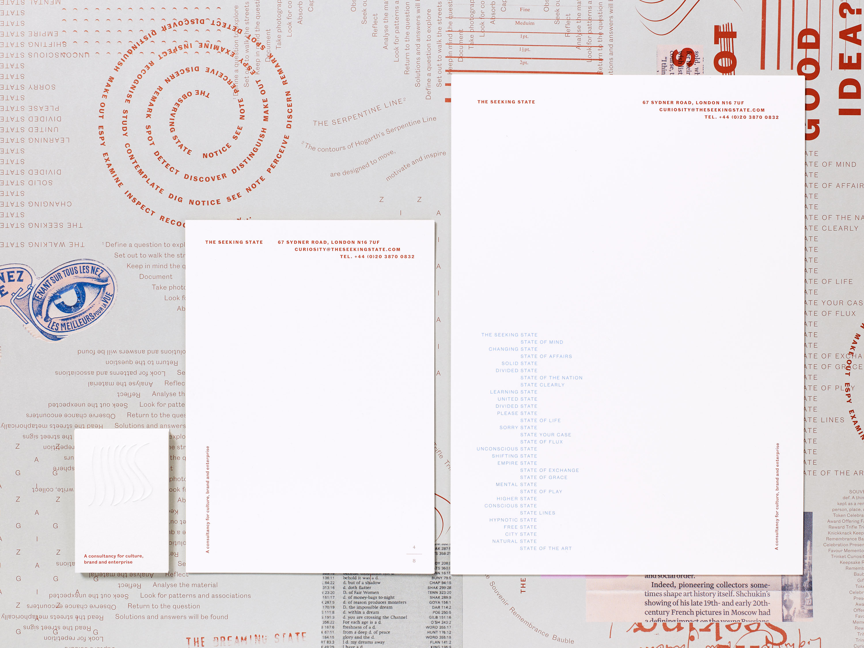
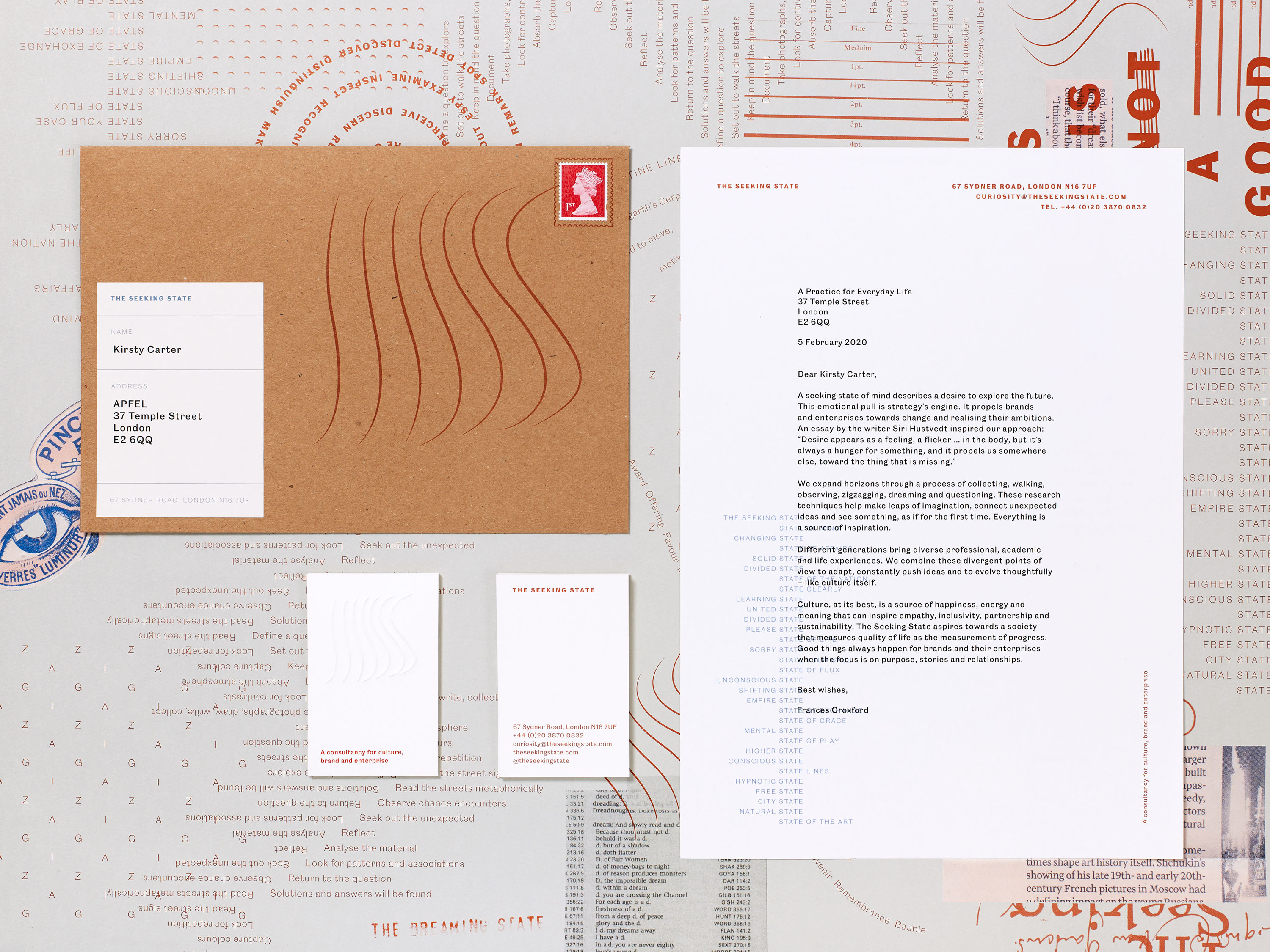
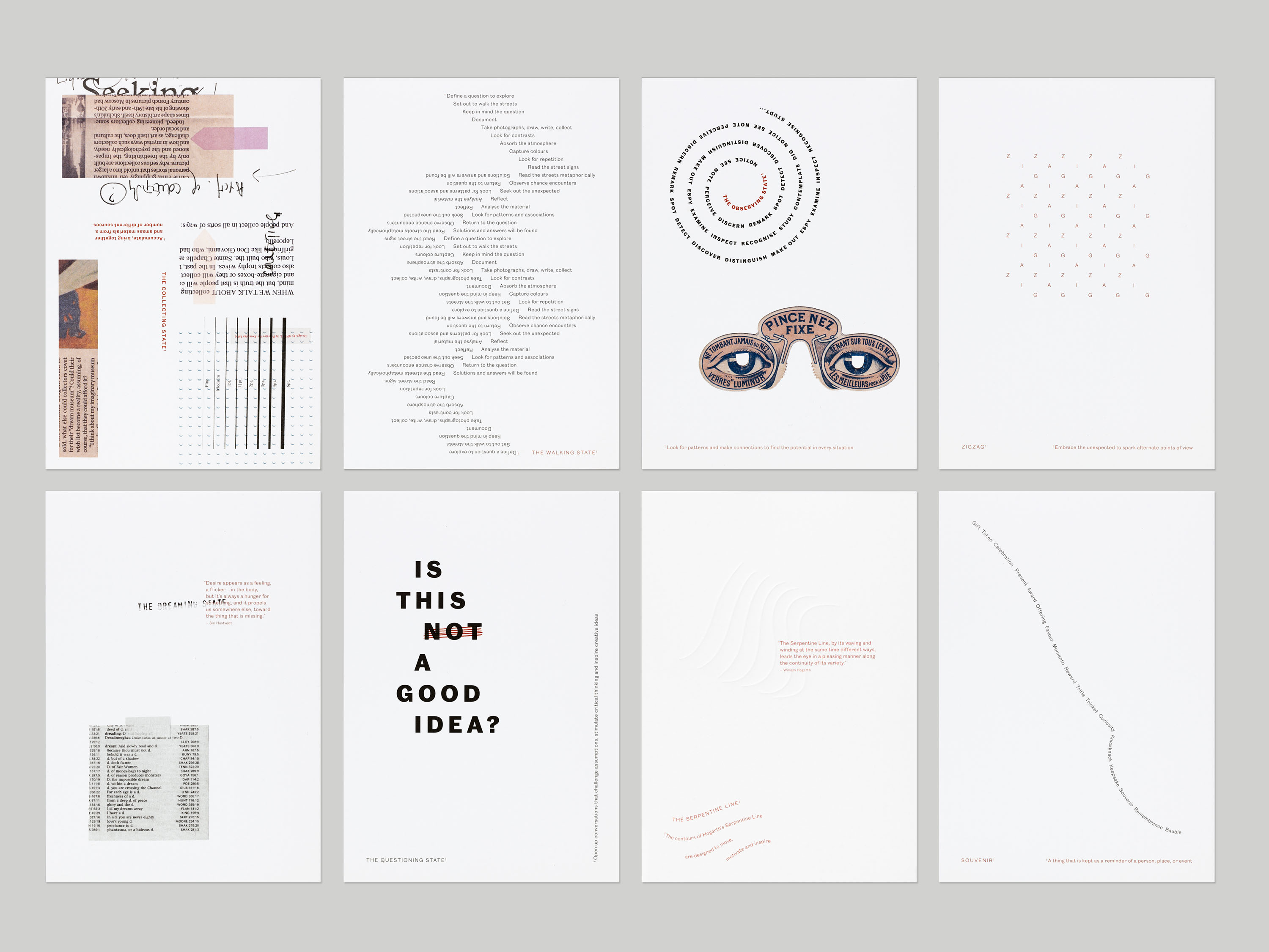
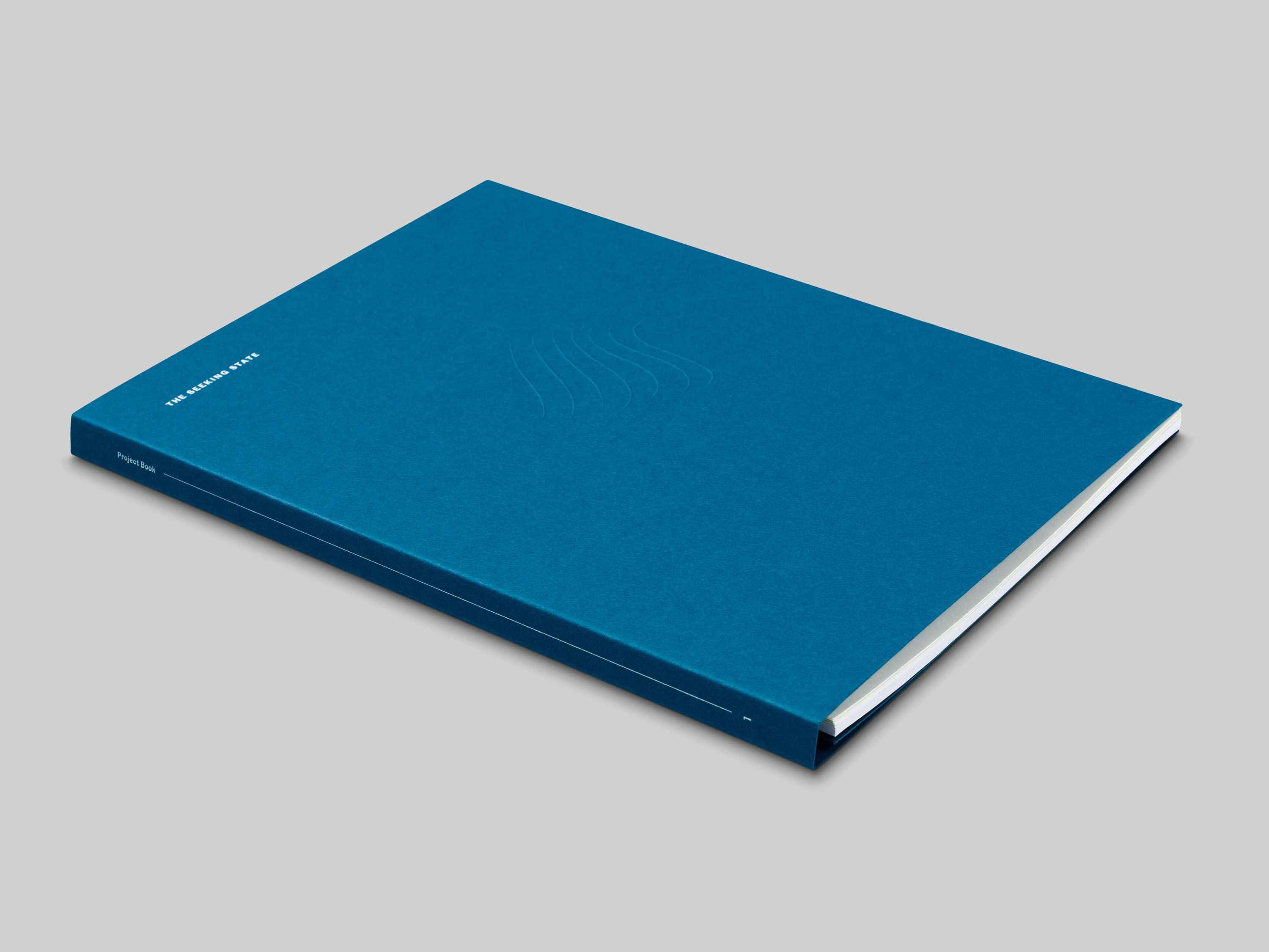
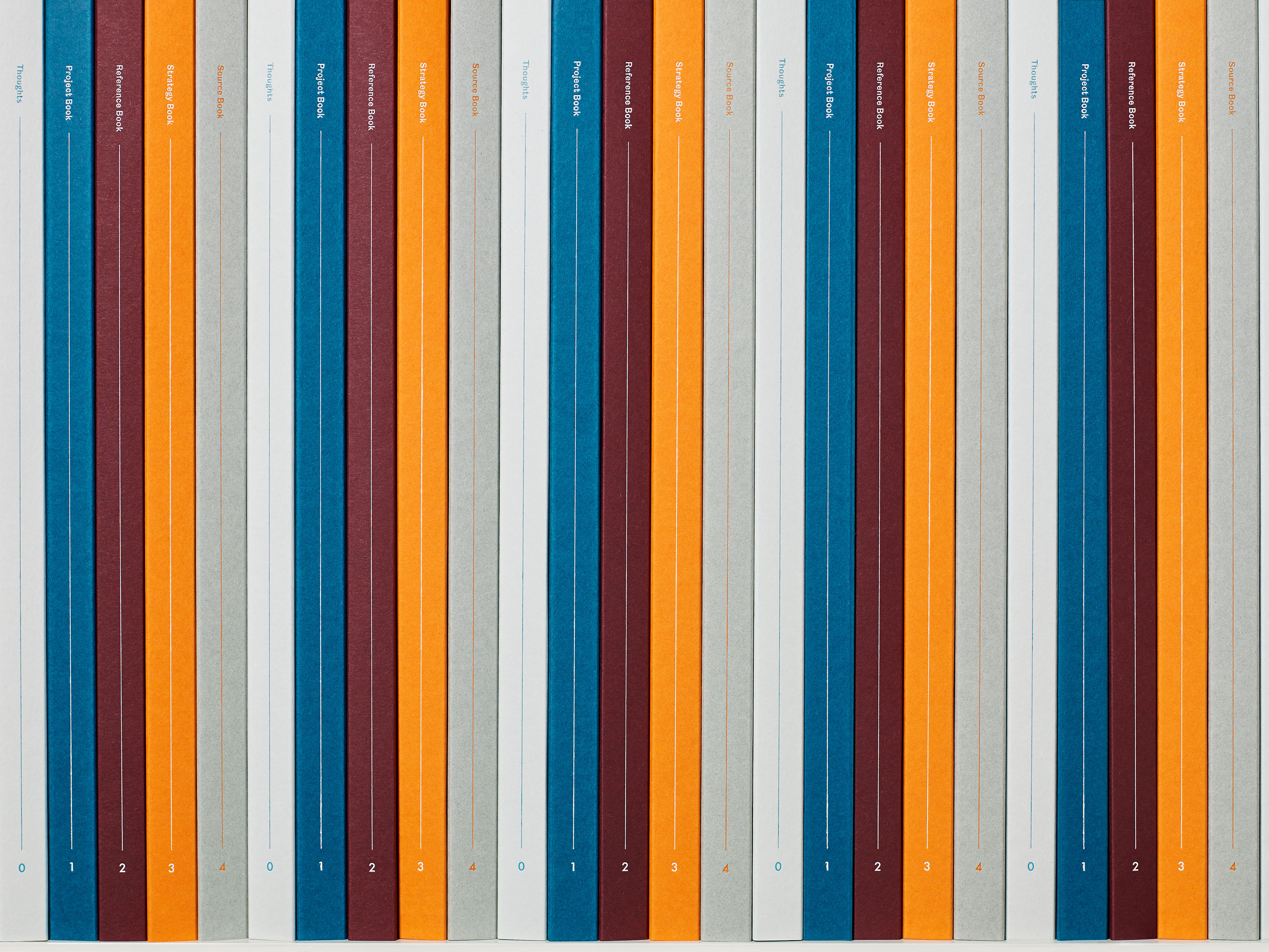
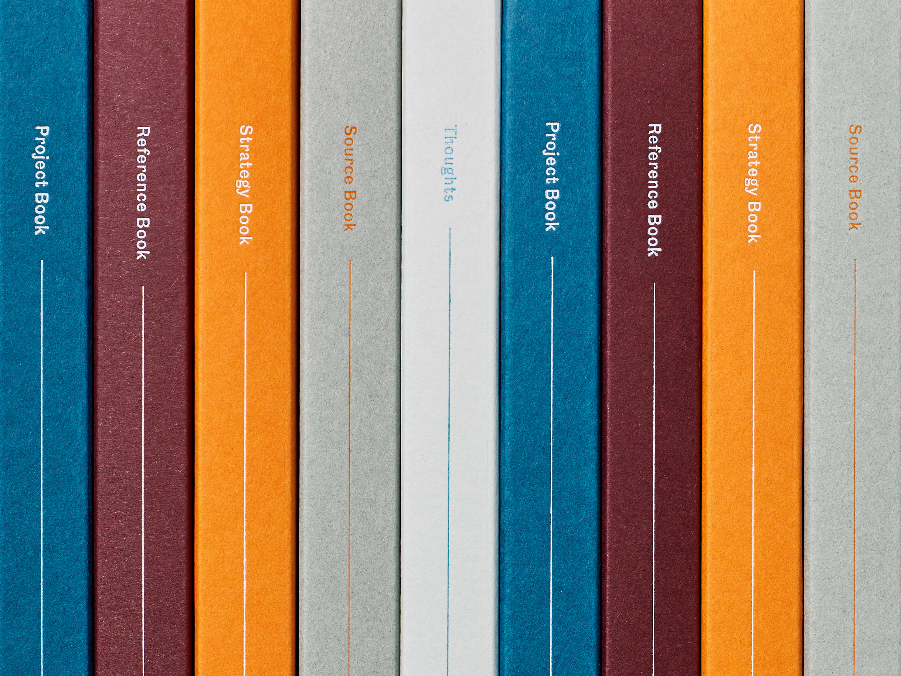
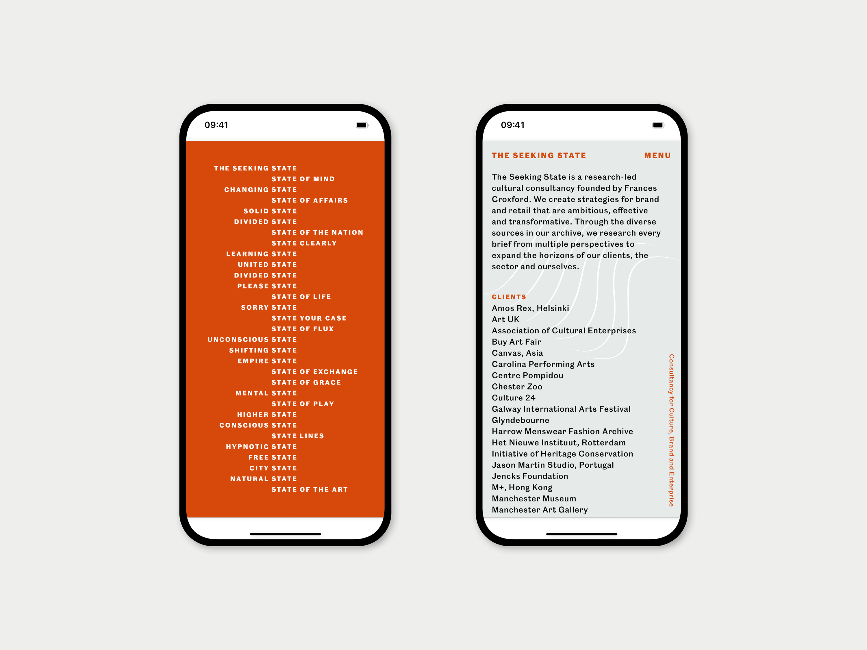
The Seeking State is a research-led creative consultancy for culture, brand and enterprise. We were commissioned to design a new identity for The Seeking State which would visualise the research techniques central to their approach, and reflect the importance of language within their work.
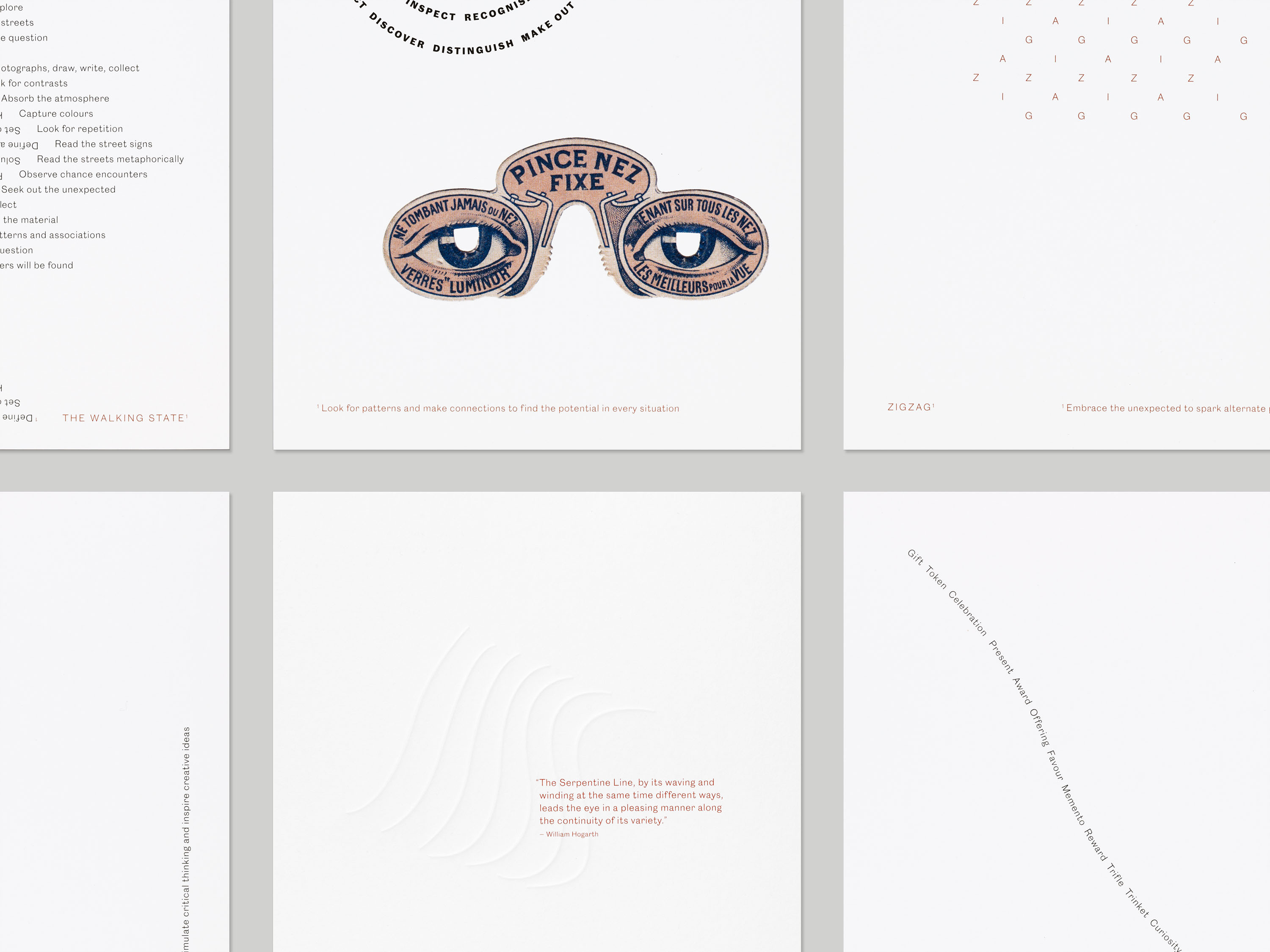
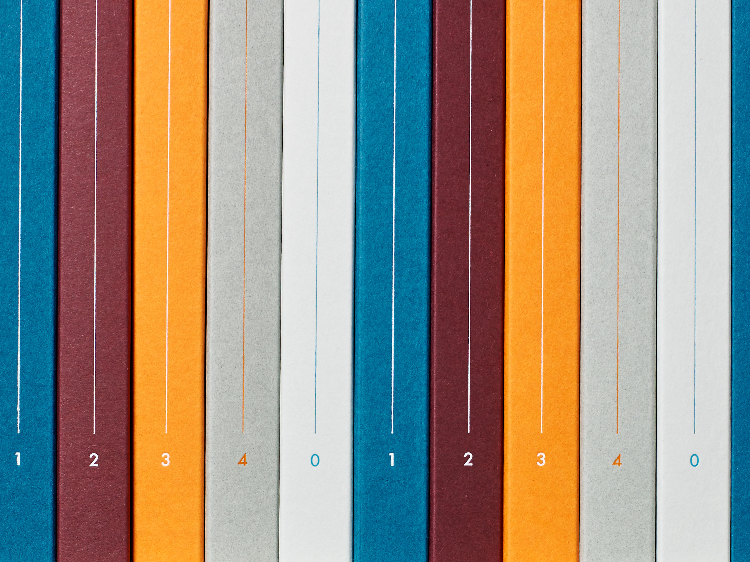
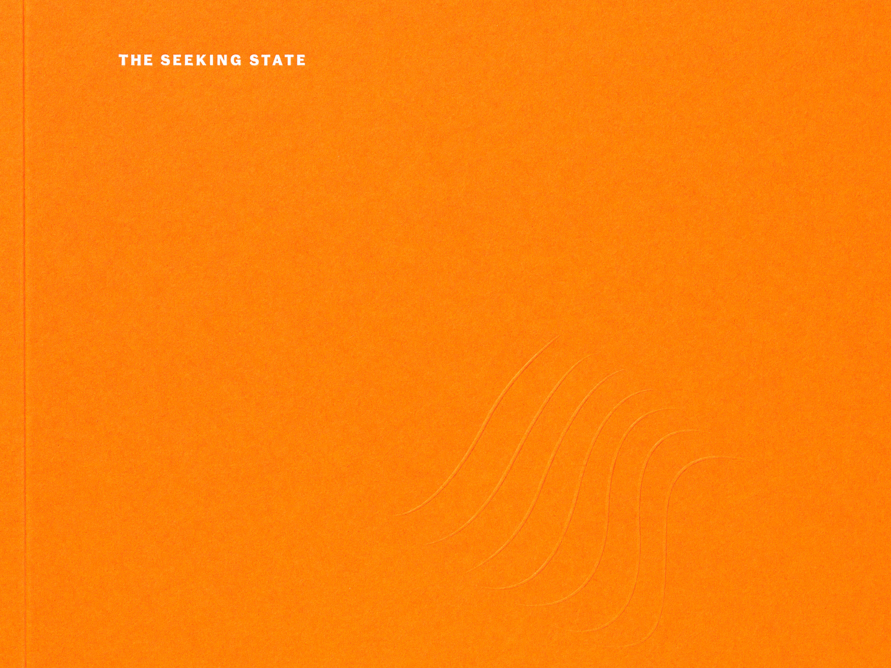
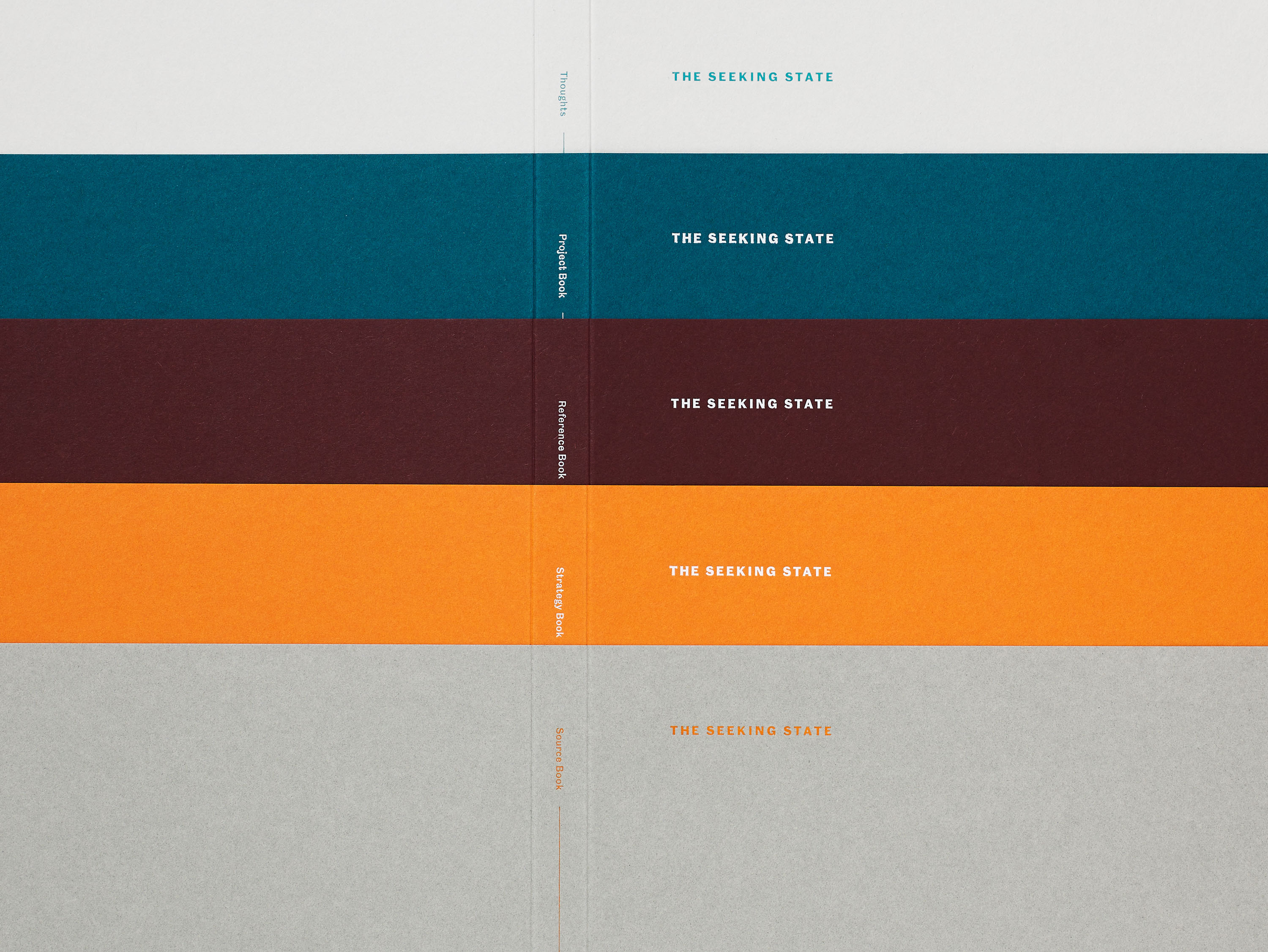
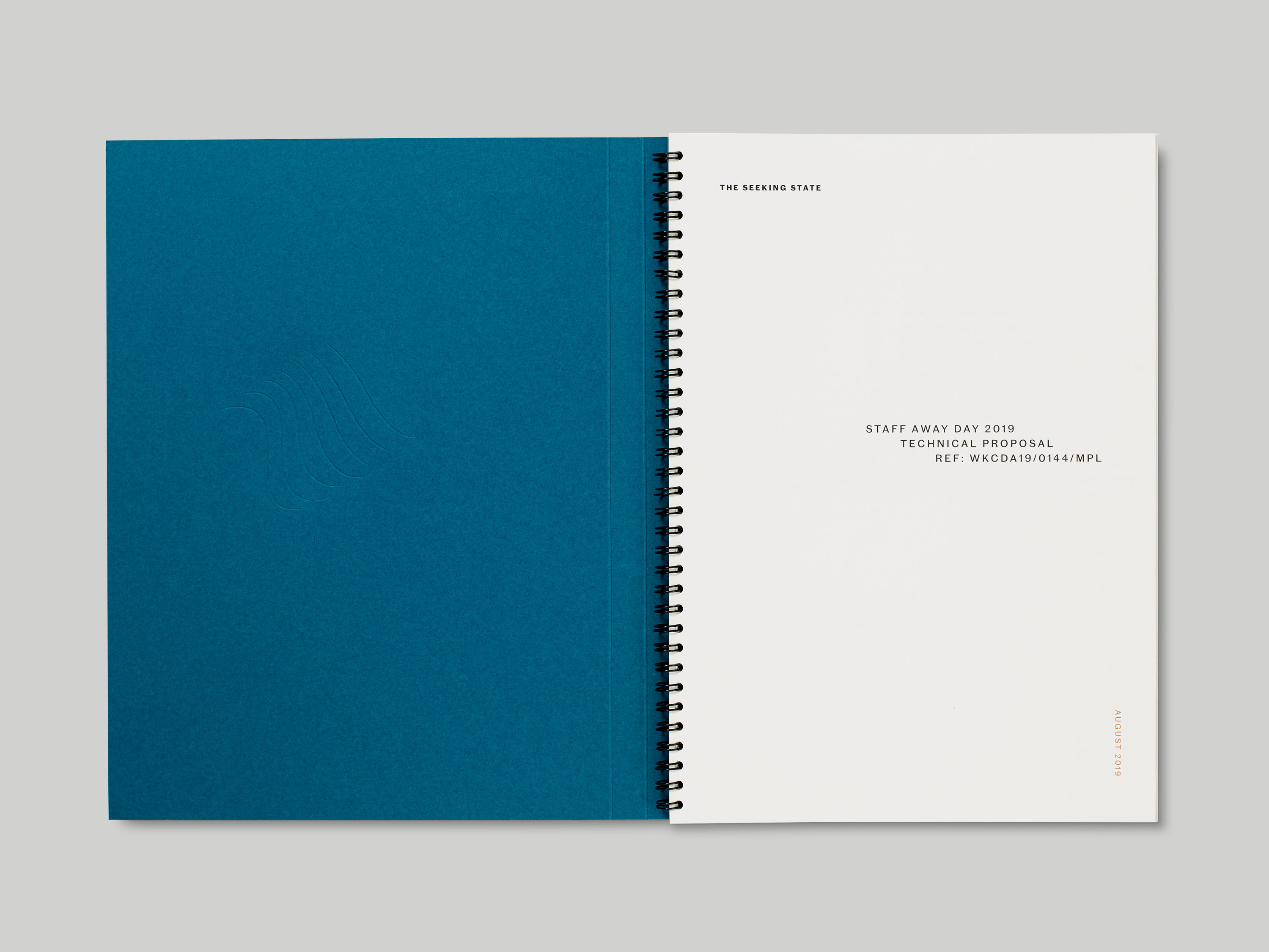
Our research focused on Mail art, concrete poetry and the visual history of written correspondence, as letter-writing is central to The Seeking State’s practice. We created a series of typographic illustrations celebrating the primacy of language, which reflect of their interest in typographic detailing. These illustrations are combined with reproductions of ephemera sourced directly from the consultancy archive, embedding stories and histories within the identity and throughout the collection of printed materials we created for the company. A line motif is repeated within many of these materials, referencing the serpentine Line of Beauty that is central to William Hogarth’s theory of aesthetics. The typeface Caslon Doric is used within all these materials, and a simple colour palette references commonly-used colours in early movable type printing. We also designed a website for The Seeking State, translating the central concepts explored within the identity into a responsive digital context.
Caslon Doric is part of a new collection of typefaces from Commercial Type that are drawn from original Caslon Foundry specimens held by the St Bride Library. It is in the grotesque style, which originates with some of the first examples of sans-serif typefaces, the earliest of which was cut in 1748 by the foundry of William Caslon for the Oxford University Press.