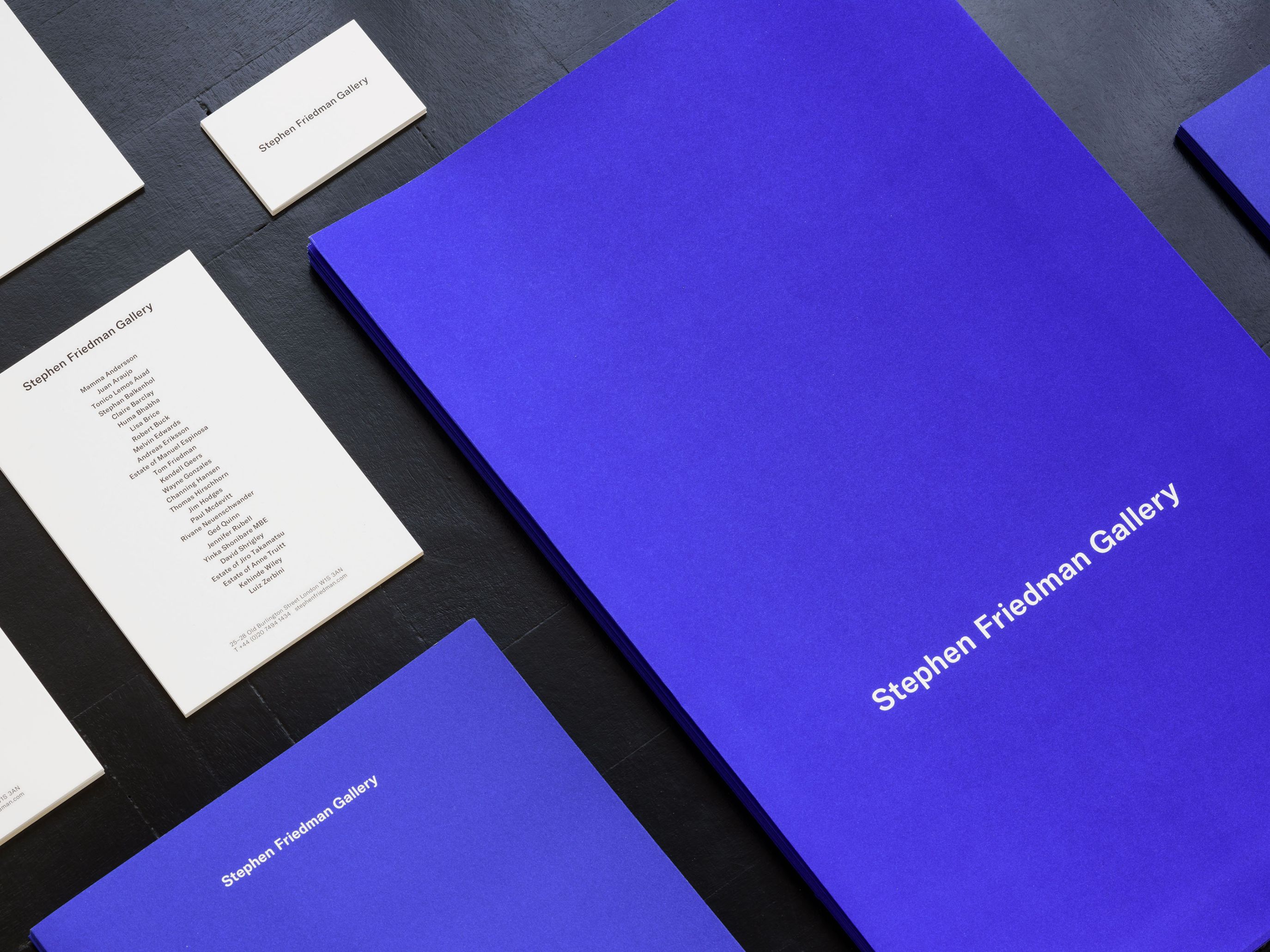
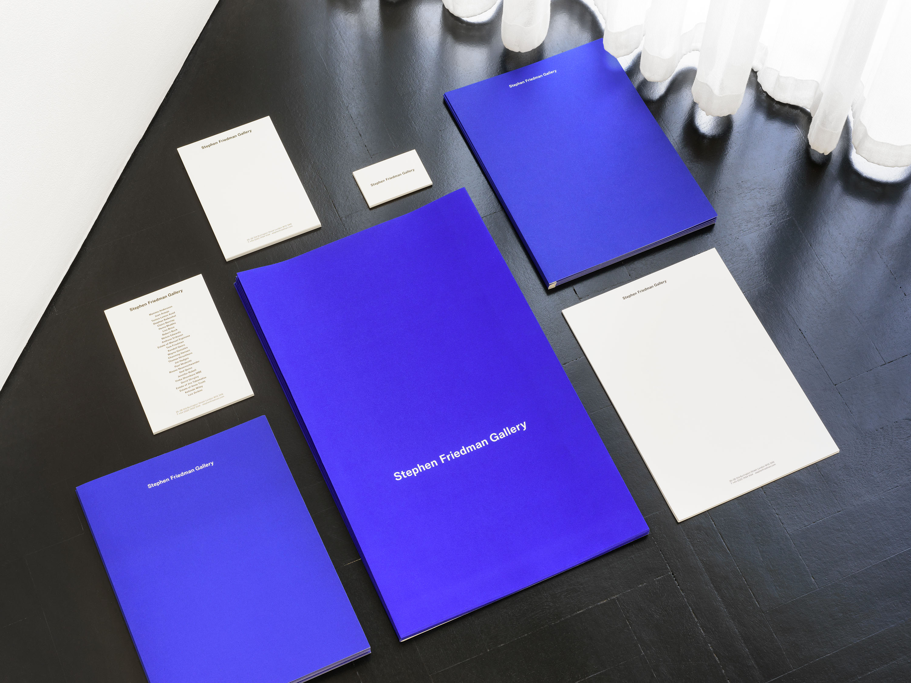
Stephen Friedman Gallery represents established and emerging artists working internationally, and is recognised amongst the world’s leading galleries in the field of contemporary art. We were commissioned to design a new visual identity for the gallery, and drew inspiration from the beauty, conceptual rigour and playfulness of the artists they represent.
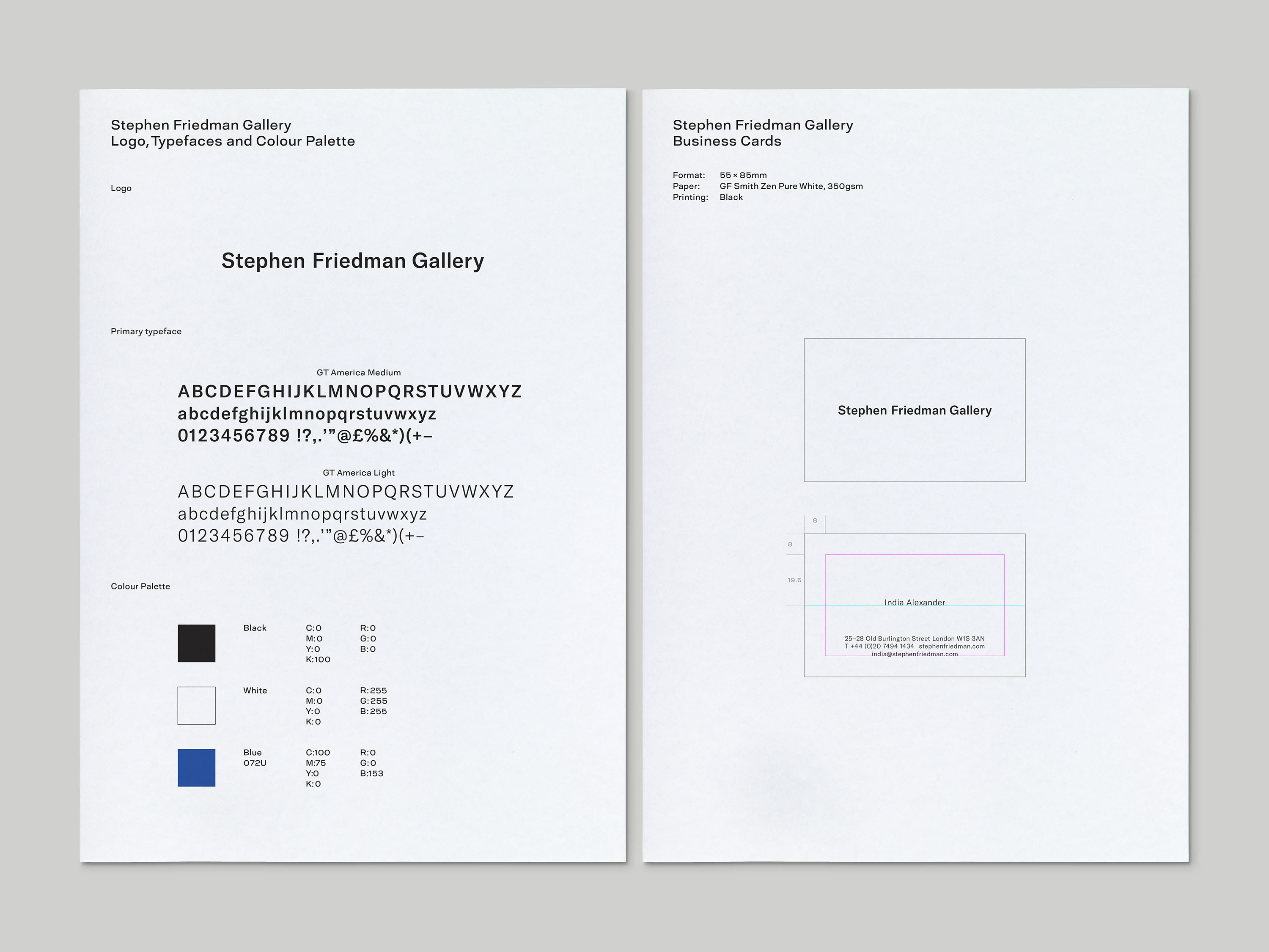
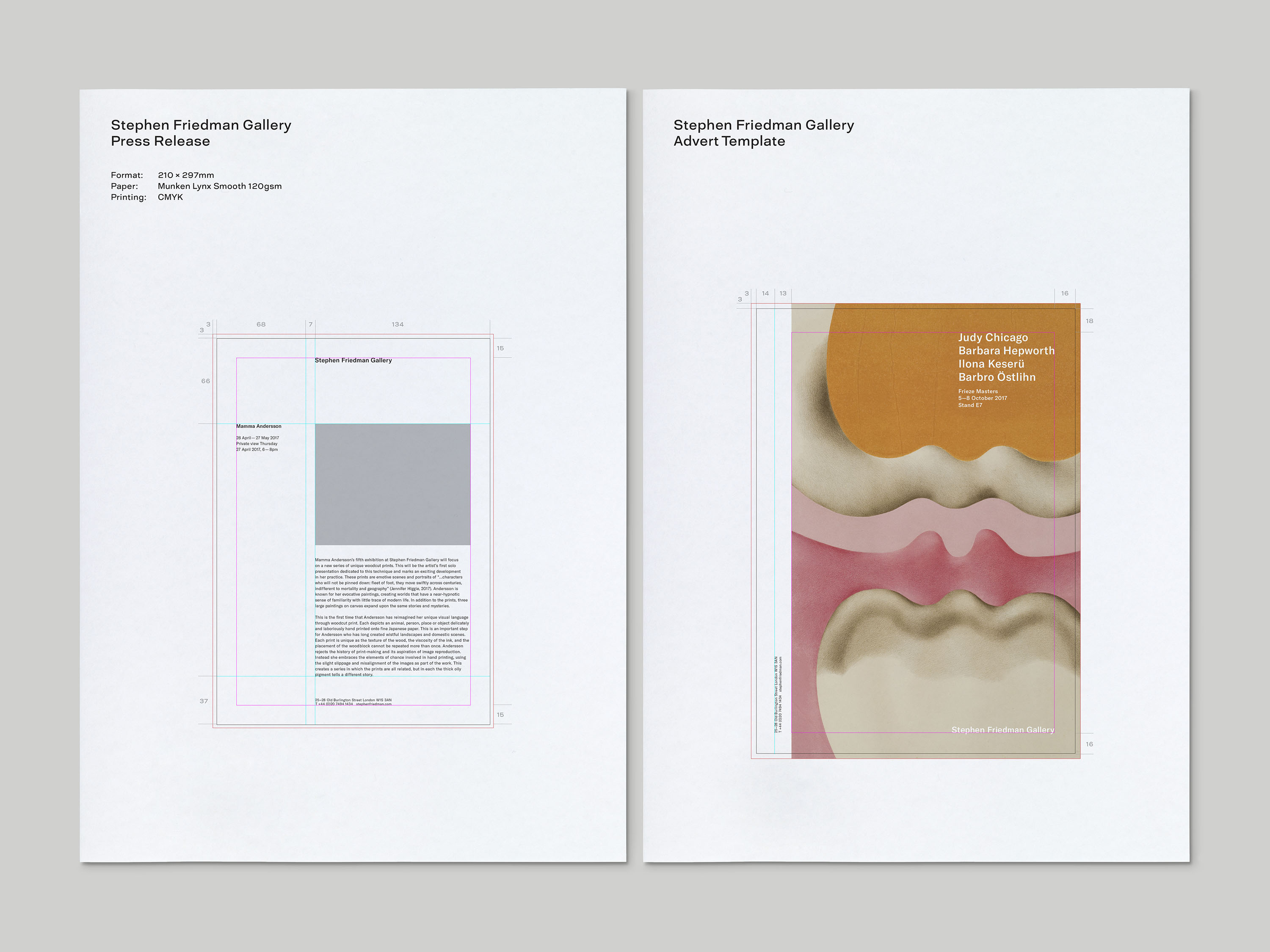
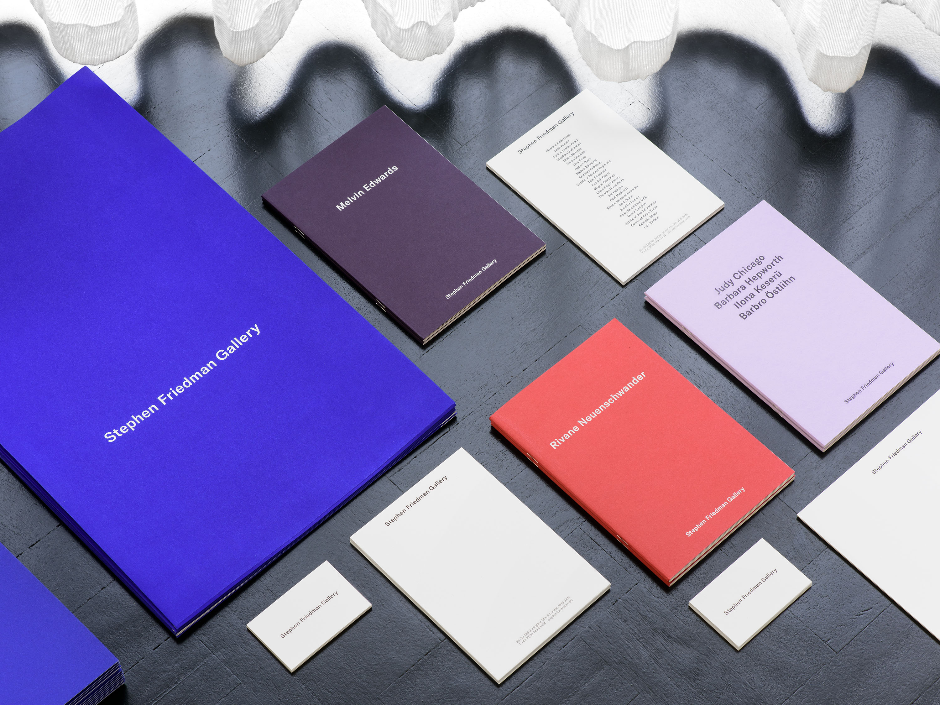
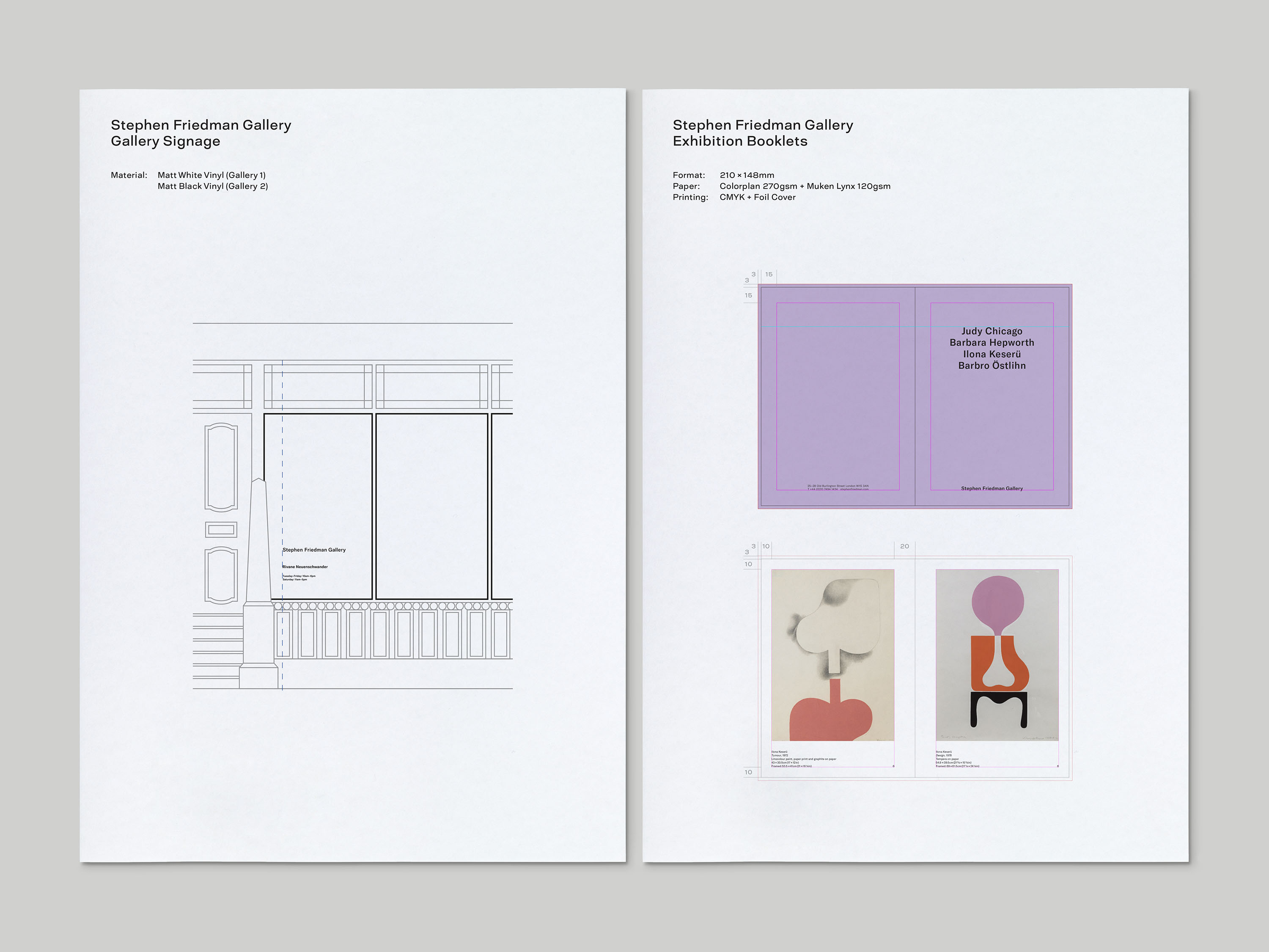
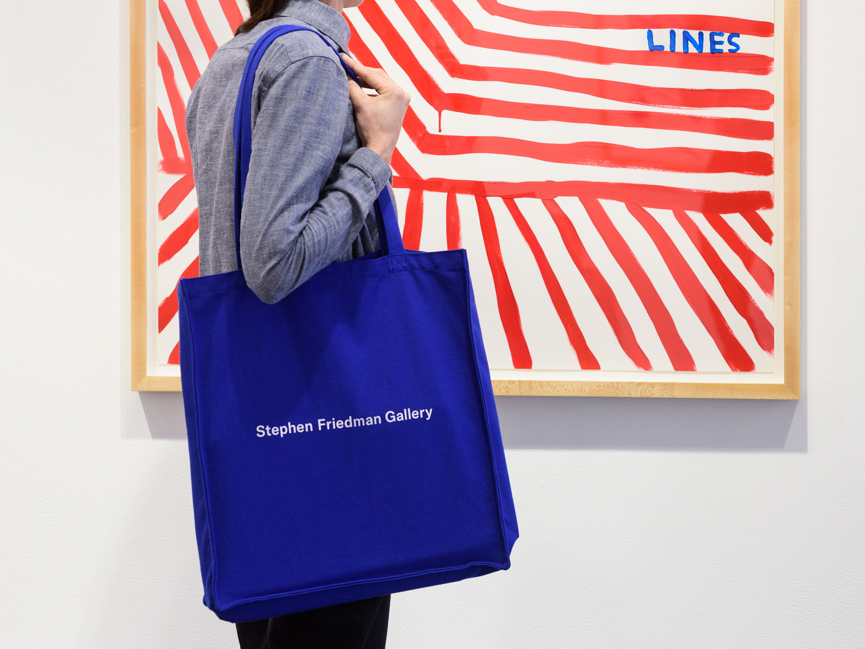
The new visual identity is precise and pared-back, prioritising the work of the artists throughout. The new logo references the International Style of graphic design that was prevalent during the mid-20th century, through its use of title case and a sans-serif typeface, GT America. The bright blue that appears on key items such as totes and paper book bags provides a distinctive brand colour, and is a key identifier for the gallery and its printed materials.
GT America is a contemporary typeface that bridges the gap between 19th century American Gothic and 20th century European Neo-Grotesk typefaces, utilising the best design features from both traditions. For the logotype, it has been adjusted slightly, with the dot of the lower-case i changed to a circle, and a wider upper-case G.