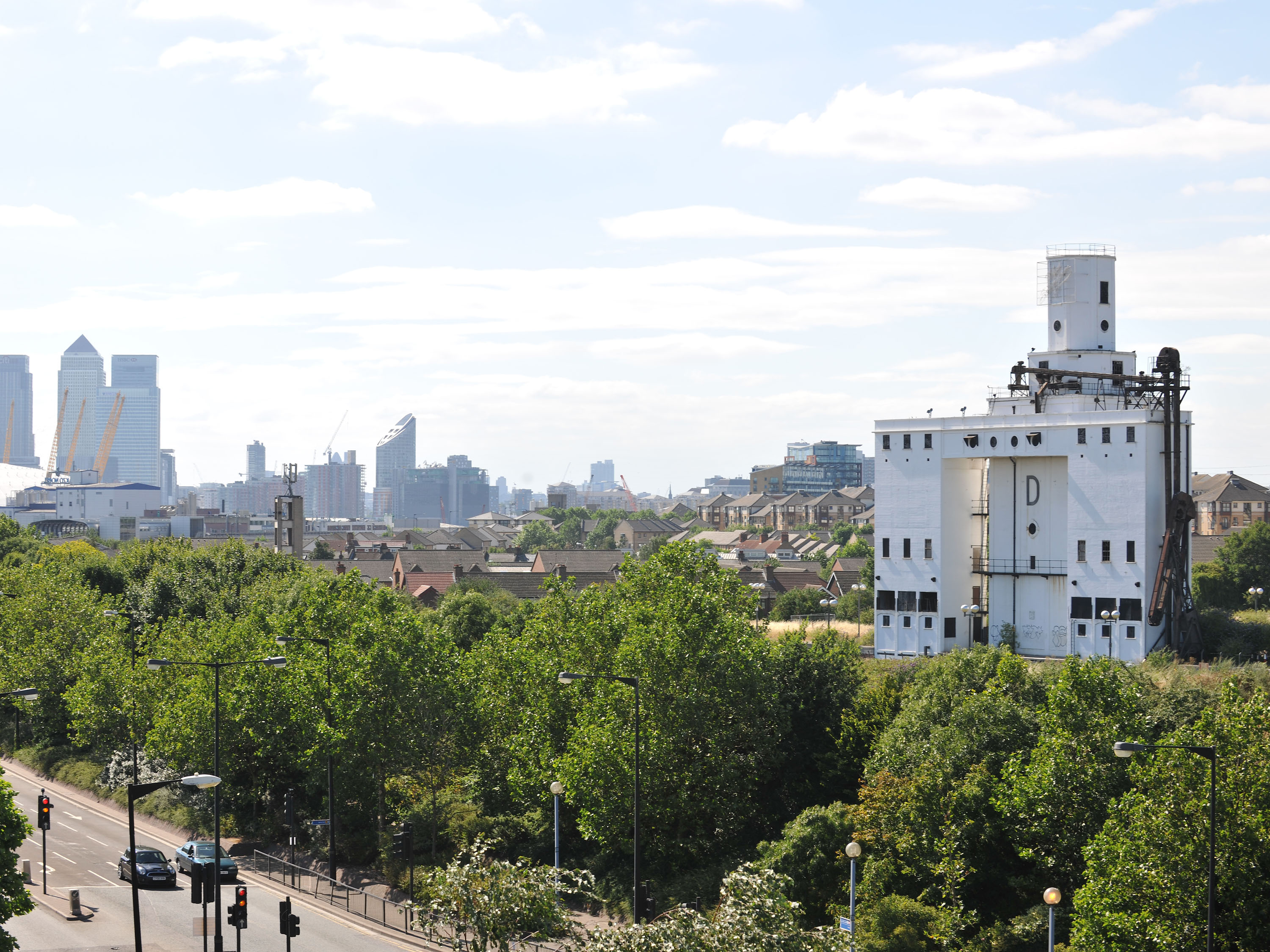
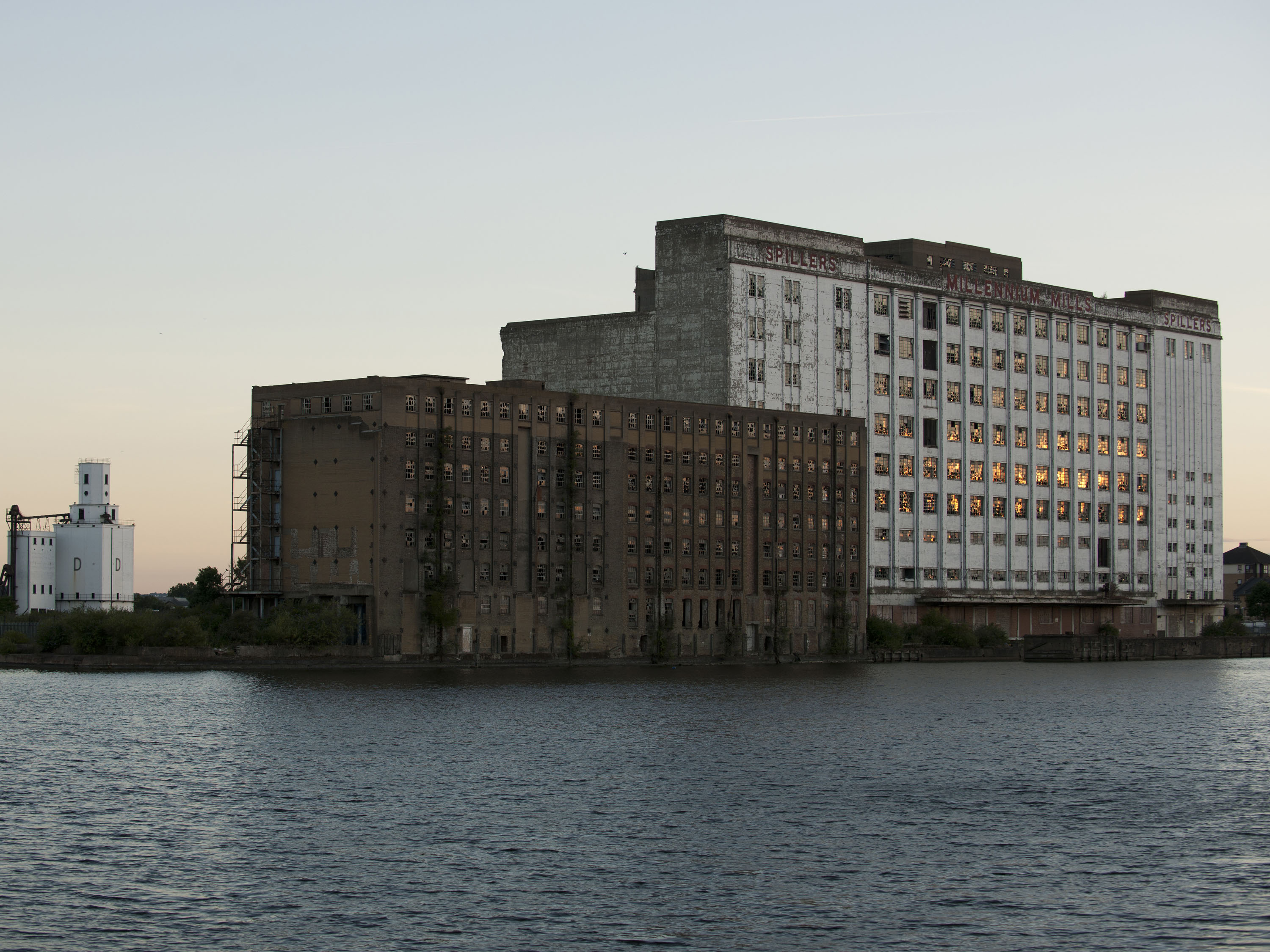
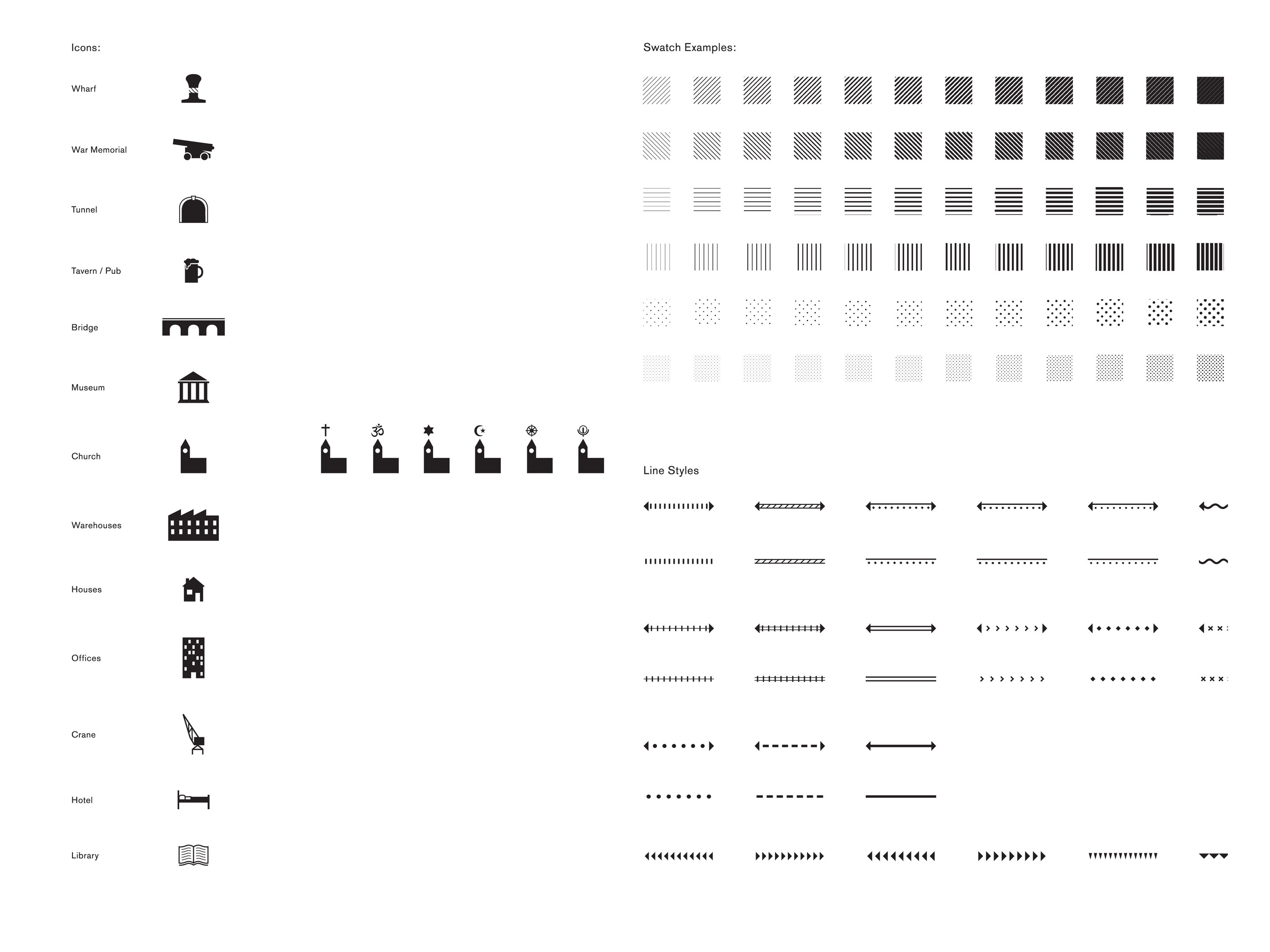
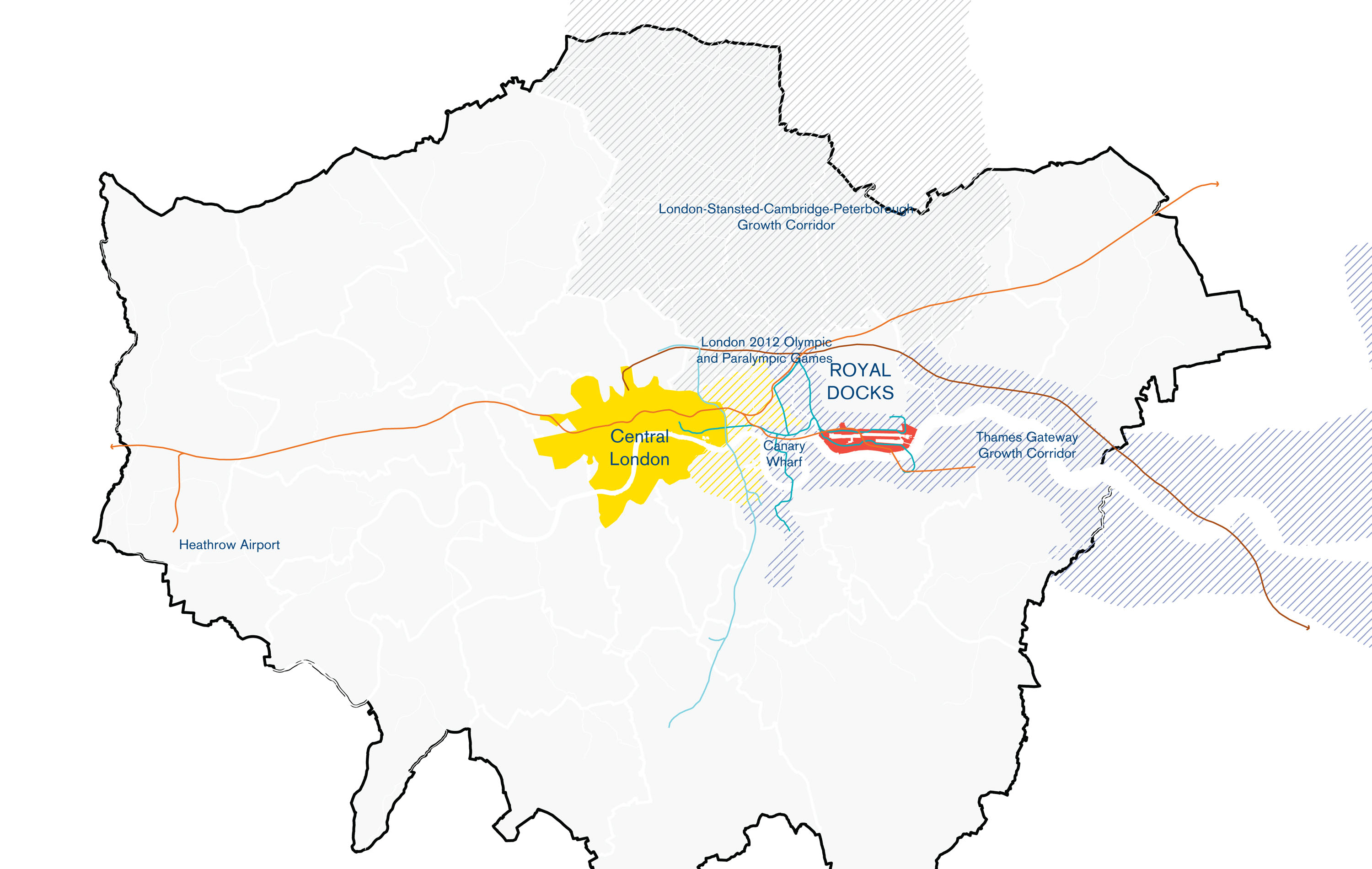
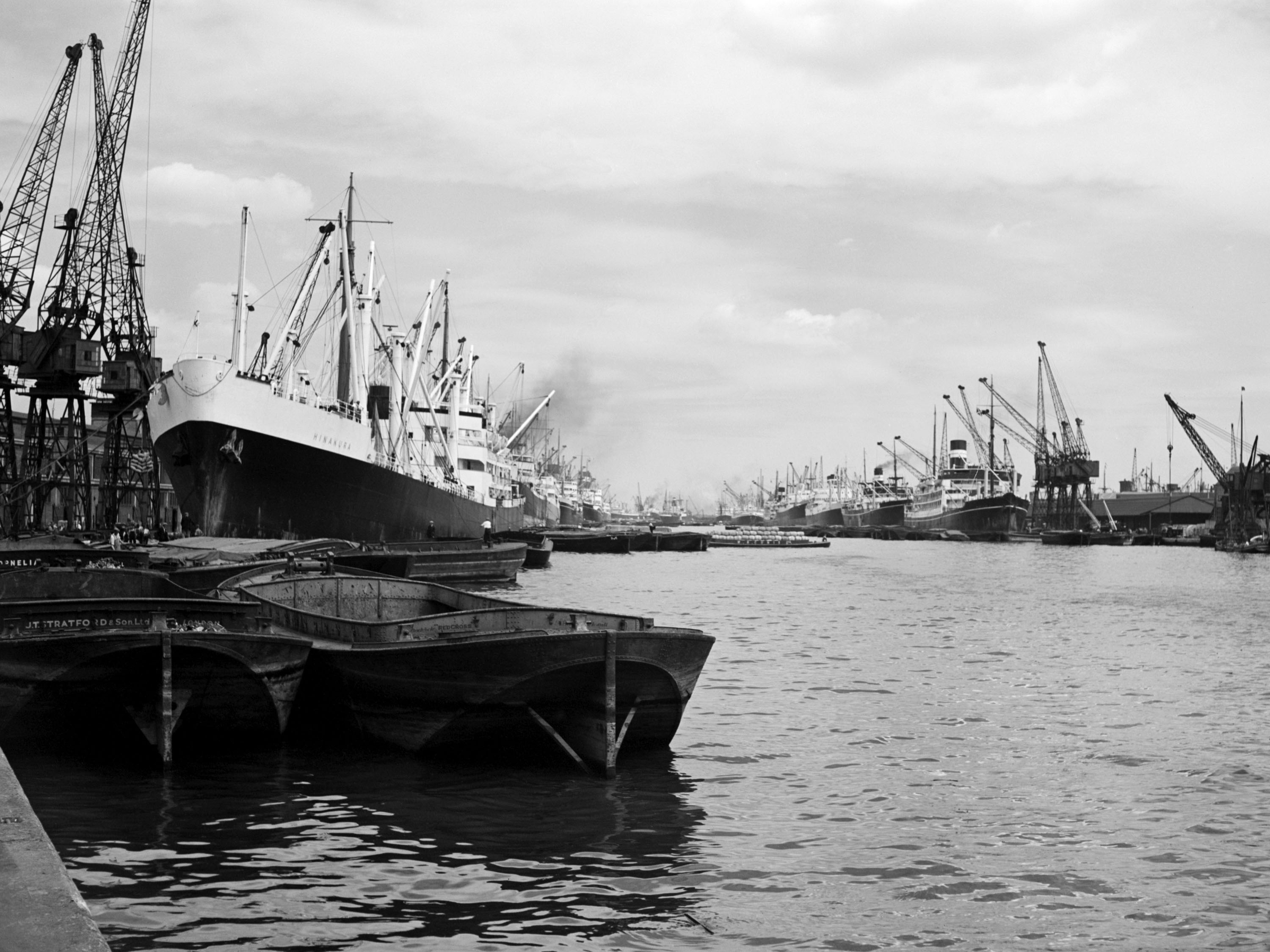
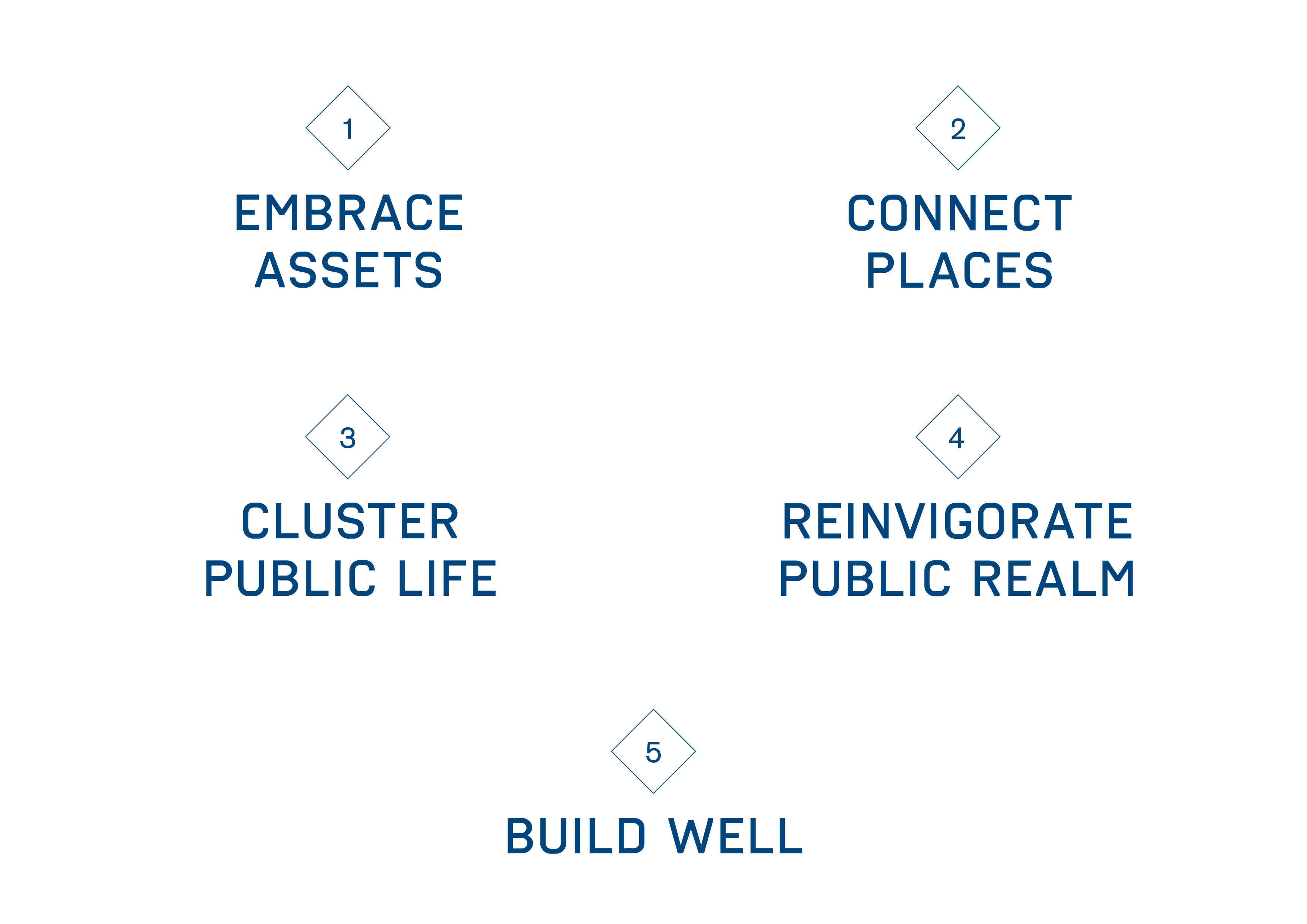

This project presents a vision for the regeneration of the Royal Docks, an area in east London encompassing three industrial docks and a large surrounding expanse of land, which offers significant potential for future redevelopment. We worked with Design for London on the identity for the project, beginning with research into the history of the area, existing vernacular signage, lettering and the architecture of the dock buildings.
A bespoke Royal Docks headline typeface was the product of this research. Its letterforms reference the plate metal lettering seen on shipbuilders’ works, cast iron bridge plates, and the Stothert and Pitt Cranes that line the docks. To extend this graphic language, we developed patterns and maps, and commissioned photography of the area to highlight its character. Together, these elements formed an identity for both the project and the Royal Docks themselves, which informed the design of three publications that set out the project’s key objectives and presented the area as rich in opportunity for regeneration. The identity has also been used on signage and exhibition graphics, on screen for animated presentations, and in 3D models used for presentations, with the intention that any future development of the area would maintain some of its essential historic character.
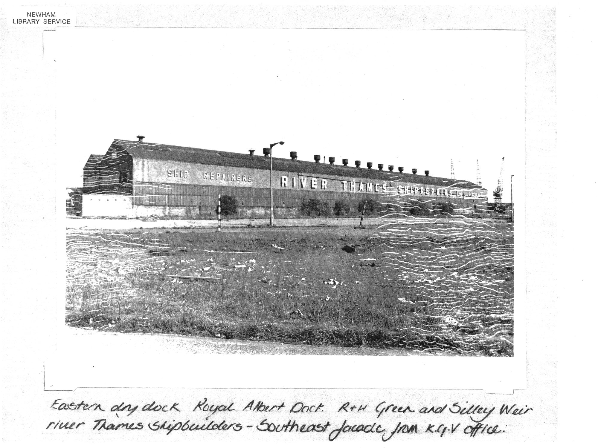
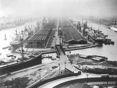
This took us to Stratford Library and the Museum of London Docklands to explore their extensive archives, which document the development of the docks and the communities that grew up around their industry.
Typeface design by A Practice for Everyday Life. Type development and engineering by Alice Savoie.