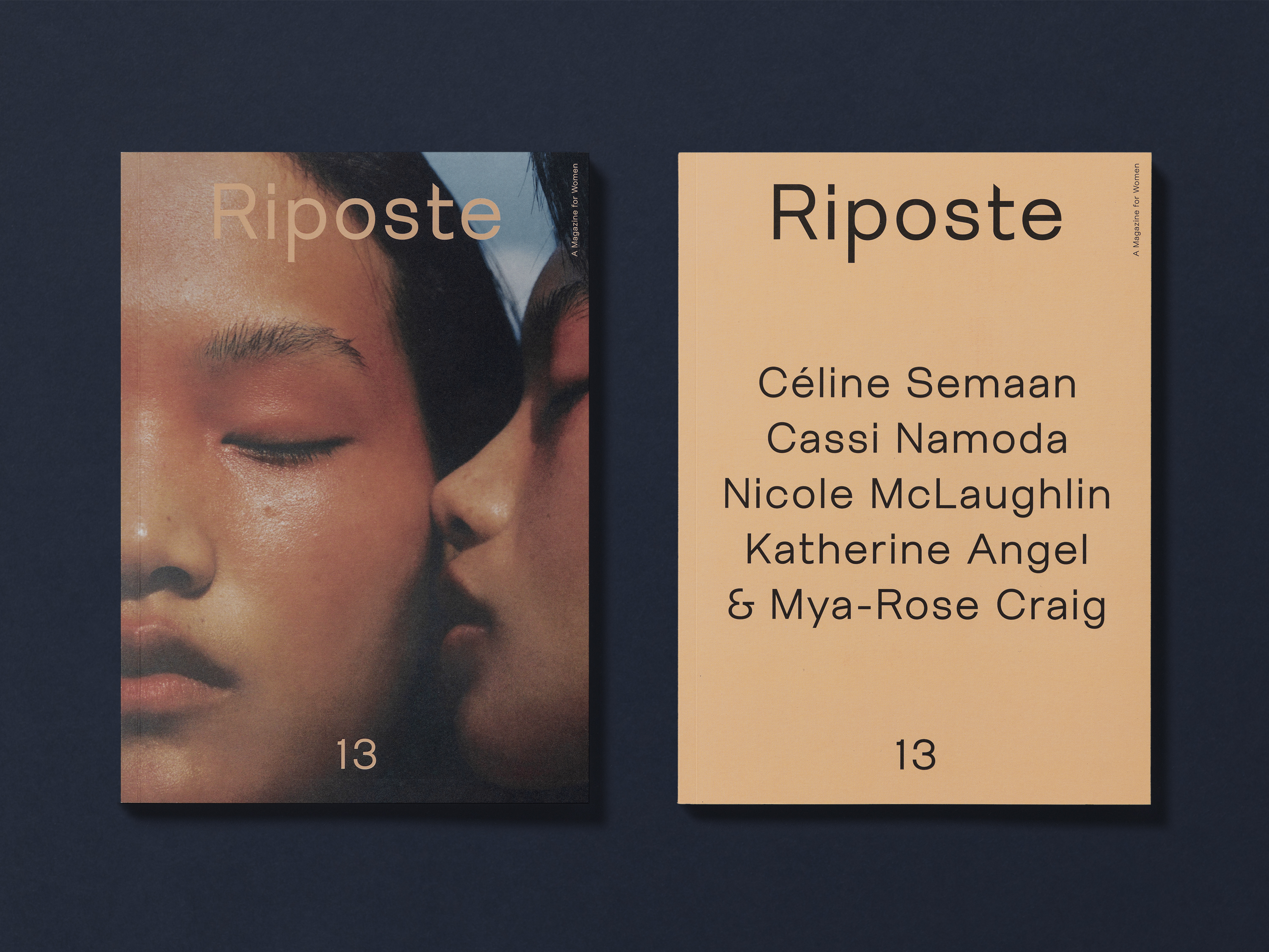
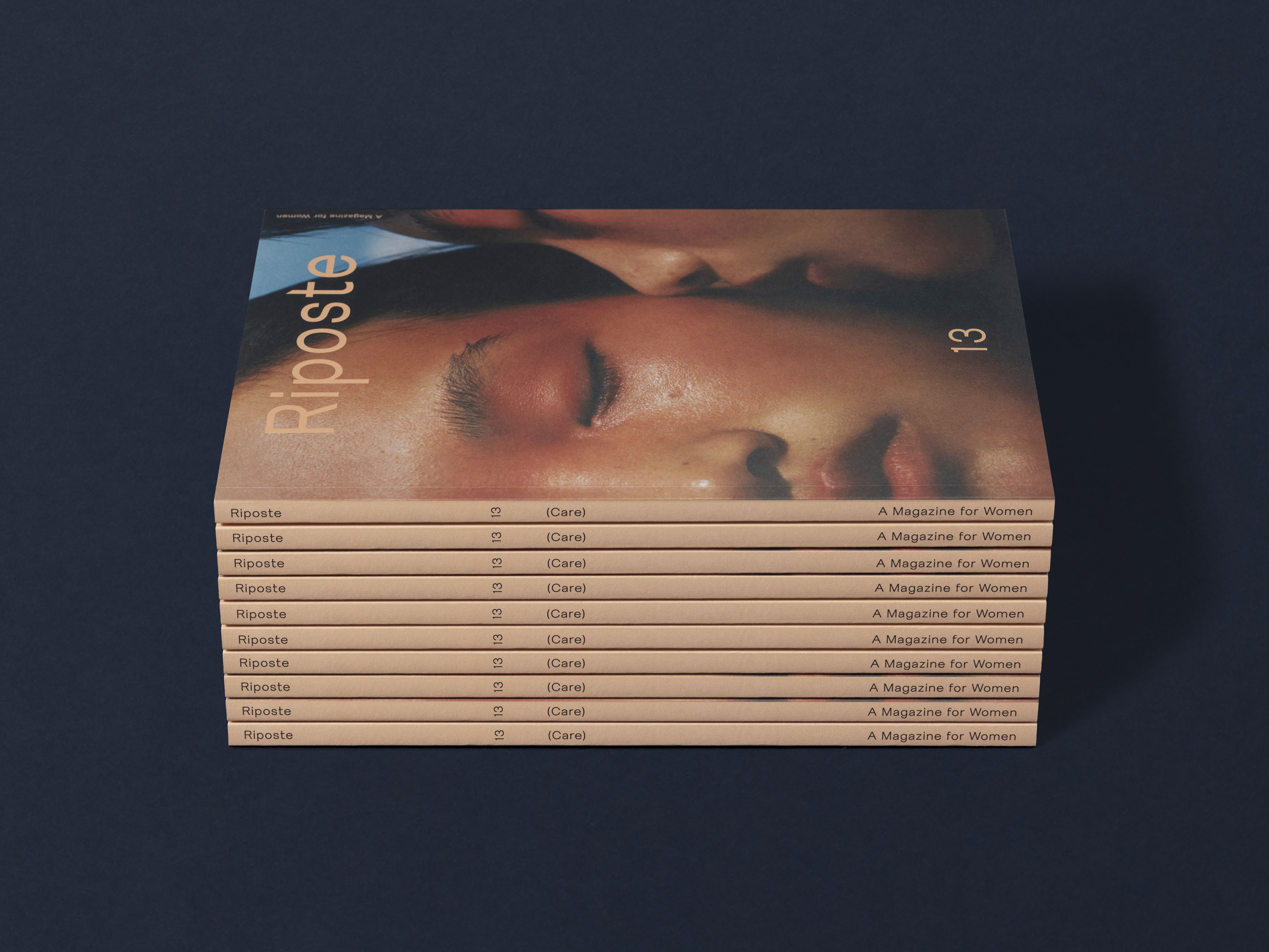
Riposte is a magazine focusing on all those who identify as women. Marking the magazine’s return to print after a hiatus, as well as a special partnership with Uniqlo, we developed a new direction, masthead and layout design for Issue 13.
Friedel, a typeface by the APFEL Type Foundry, is used throughout. Its design was based on a 1960s specimen from an early phototype compositor machine, which would have been used to create the first critical journals and magazines. For the masthead, we developed a bespoke bolder version with an adjusted letter ‘t’: its choppy sharp angles reference the idea of ‘riposte’ as a sharp retort, and its elongated crossbar nods to the swoosh of the fencing sword.
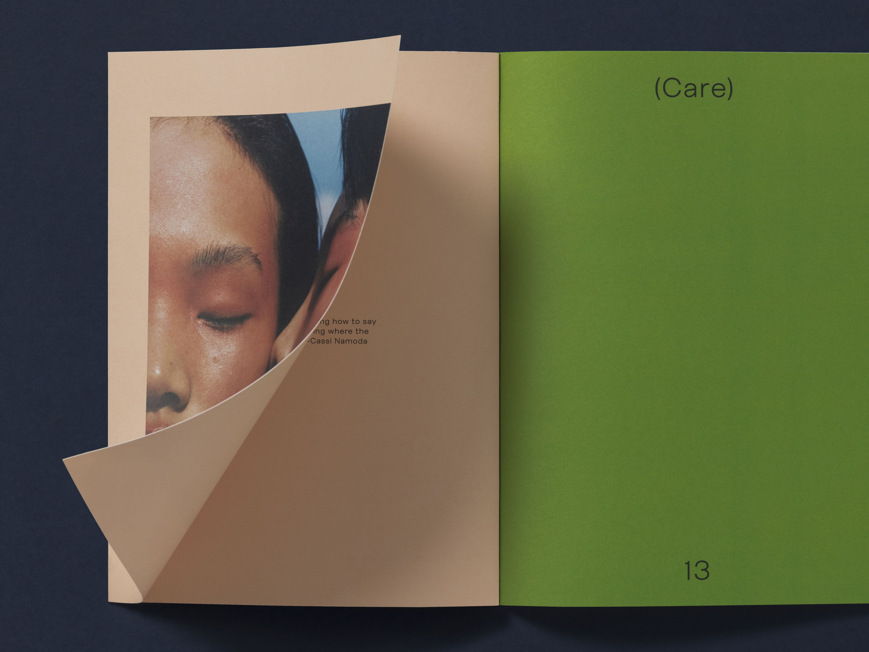
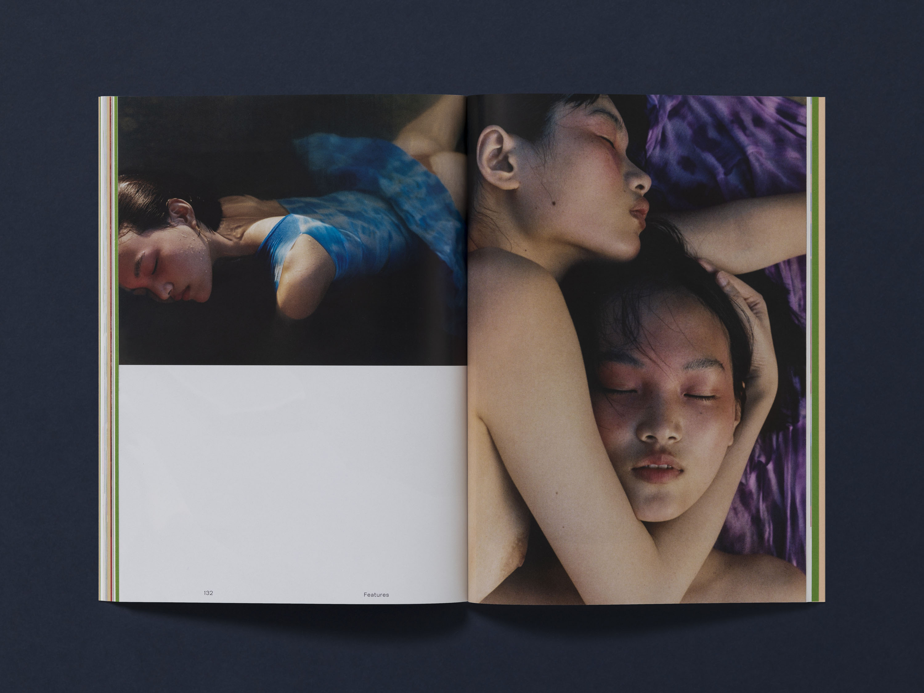
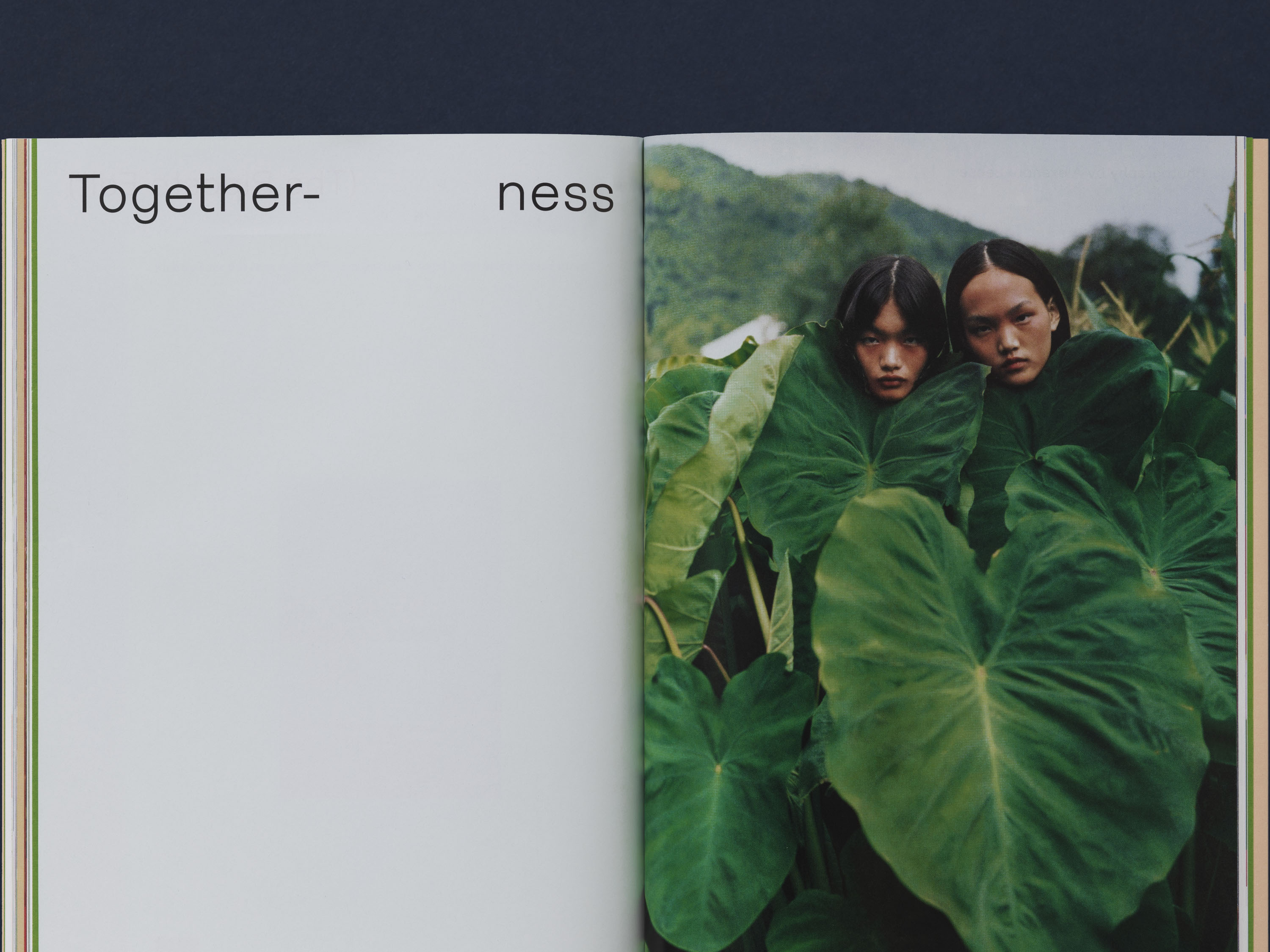
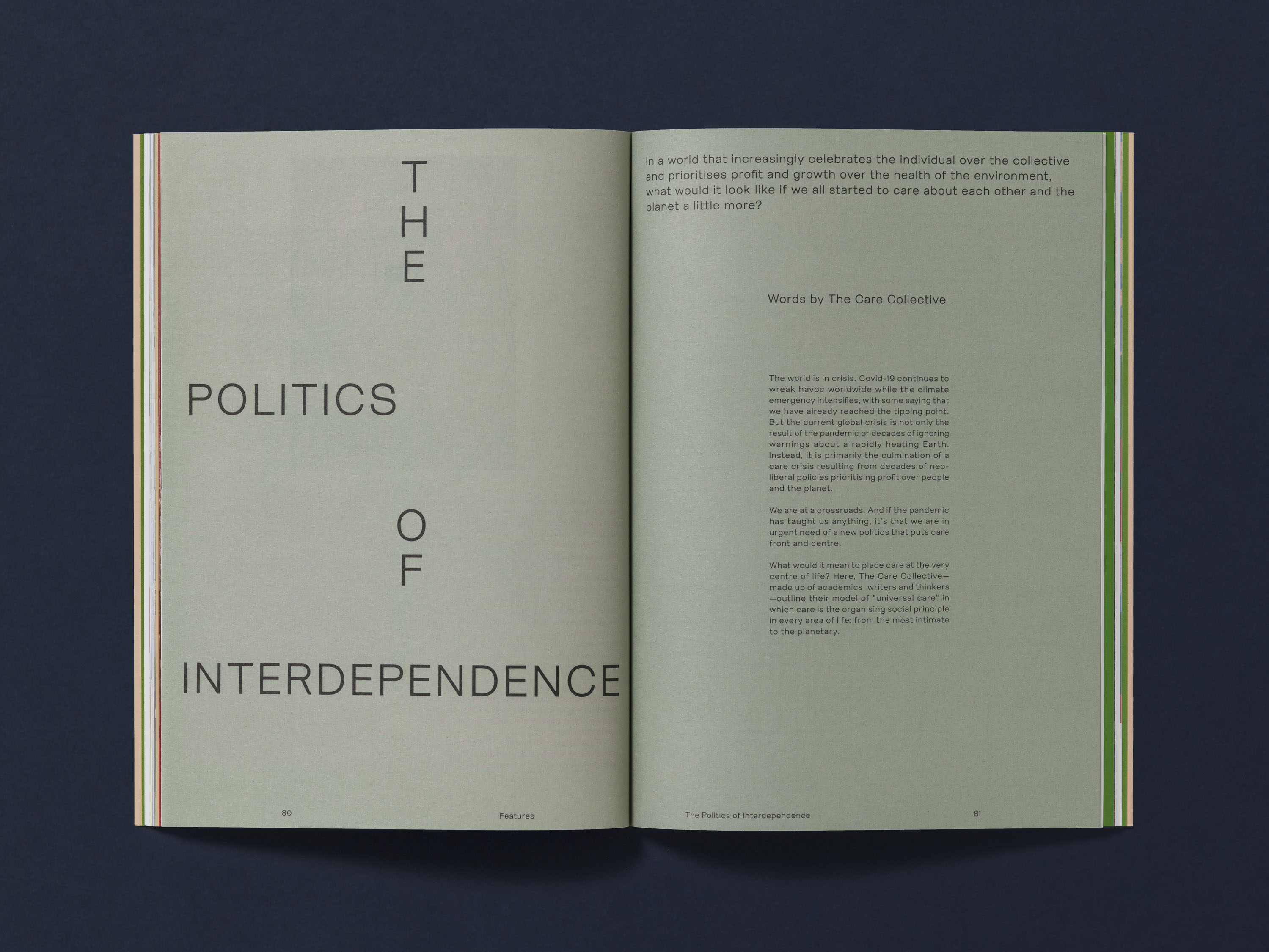
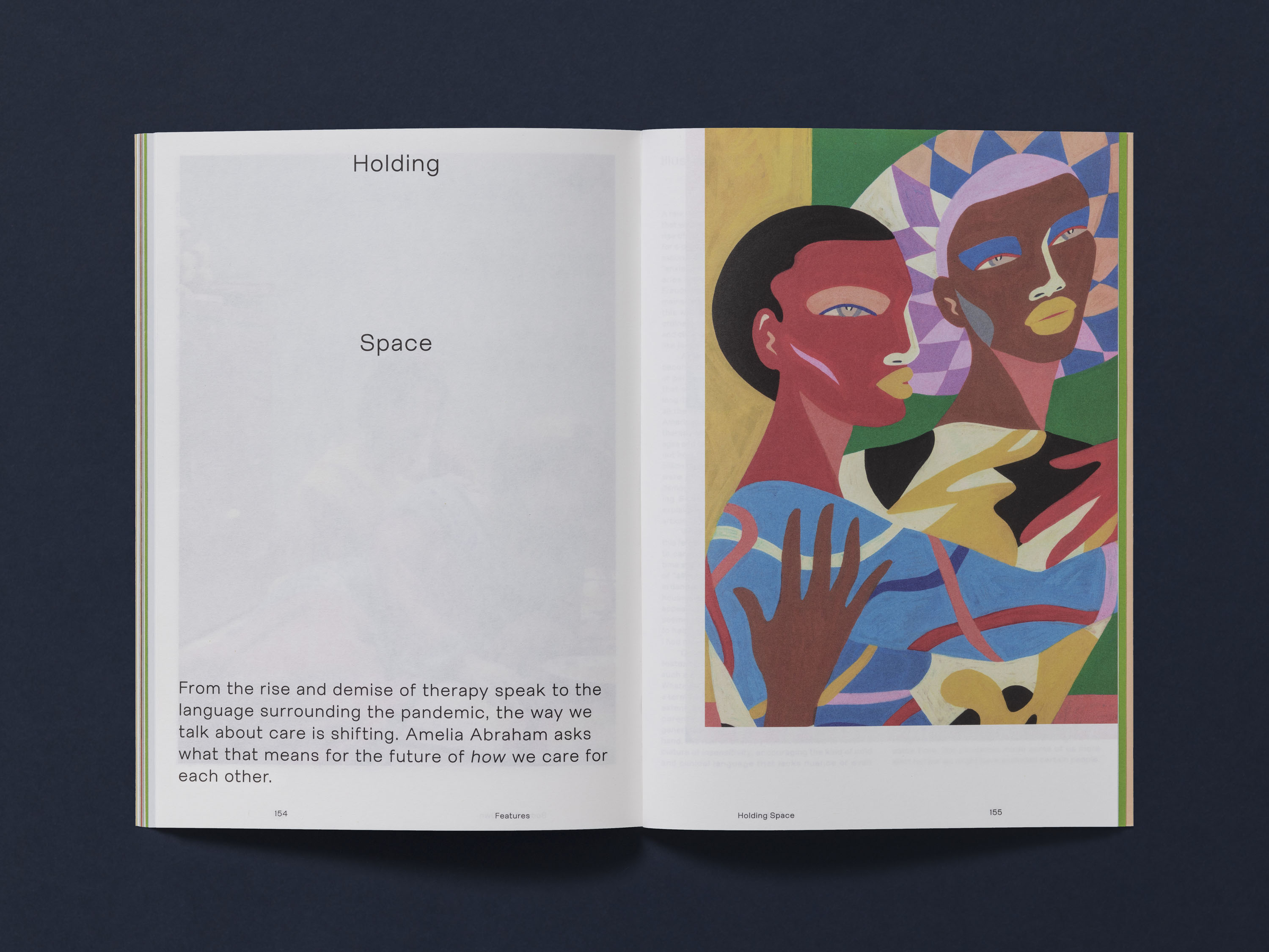
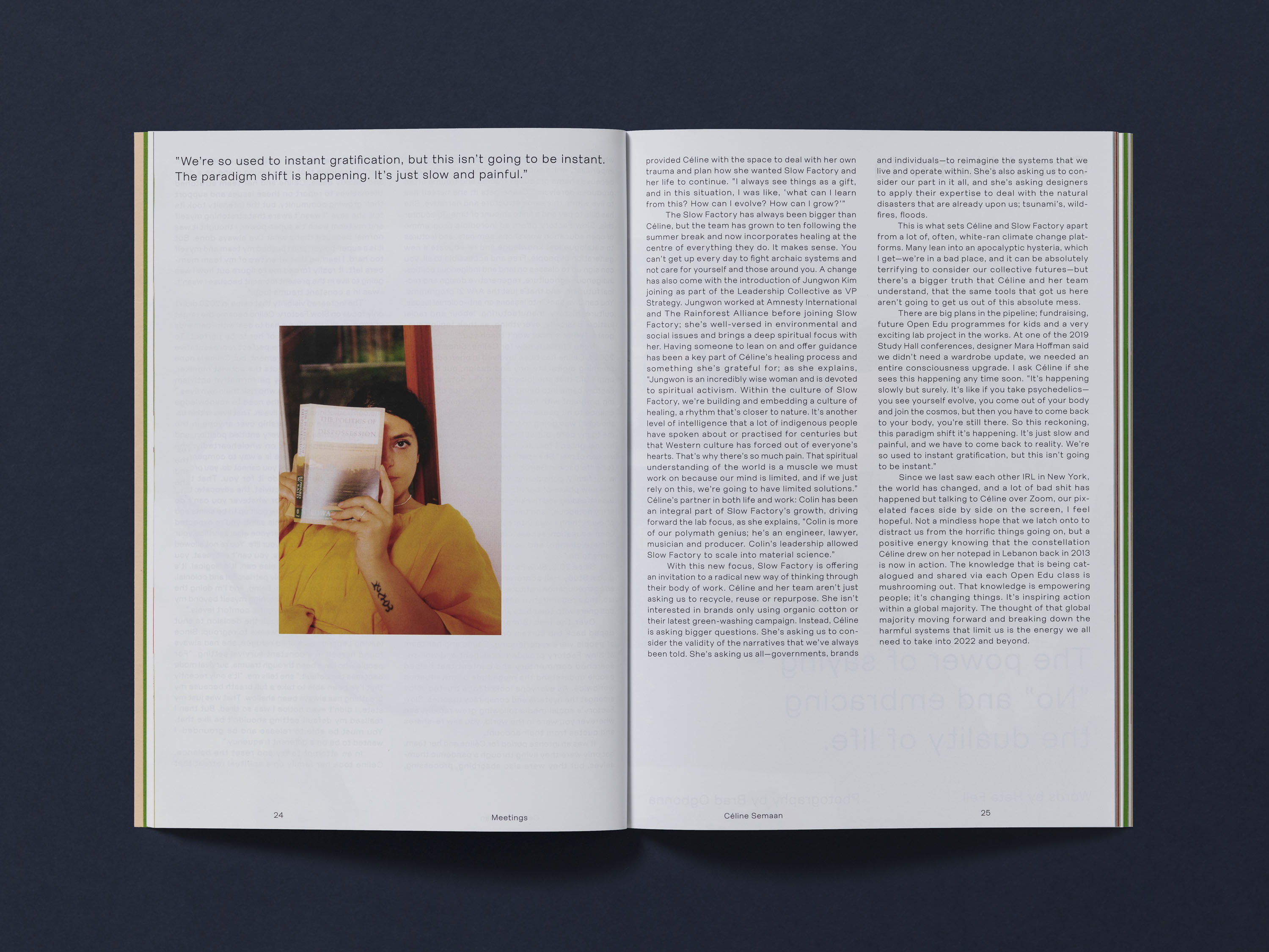
The typographic interior layouts evolved from our references of non-fiction journals and publications, with imagery bleeding off the pages at odd angles and bespoke header treatments. Each is designed specifically to the article it sits with, in order for the magazine to represent the different voices with the same direct and maverick character as Riposte’s contributors.
Photography: Ed Park