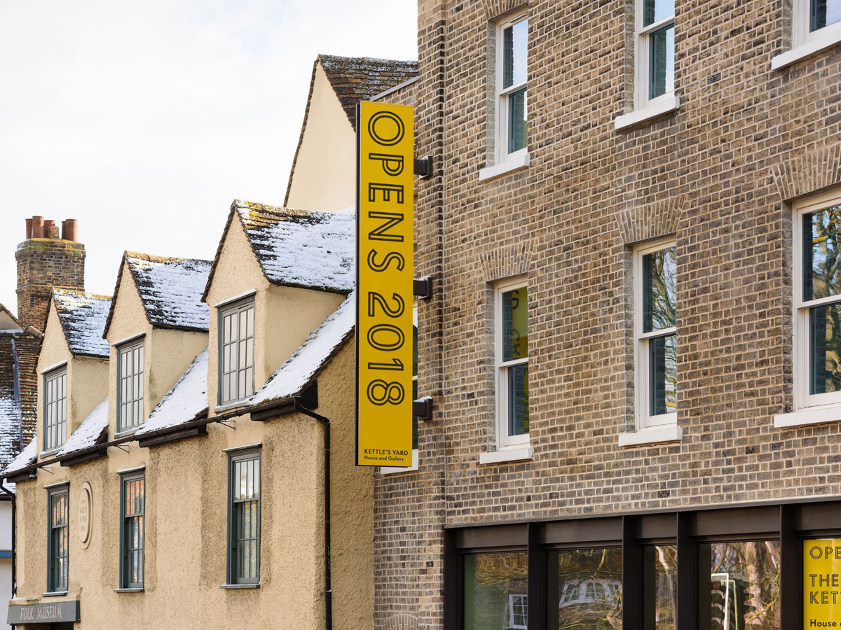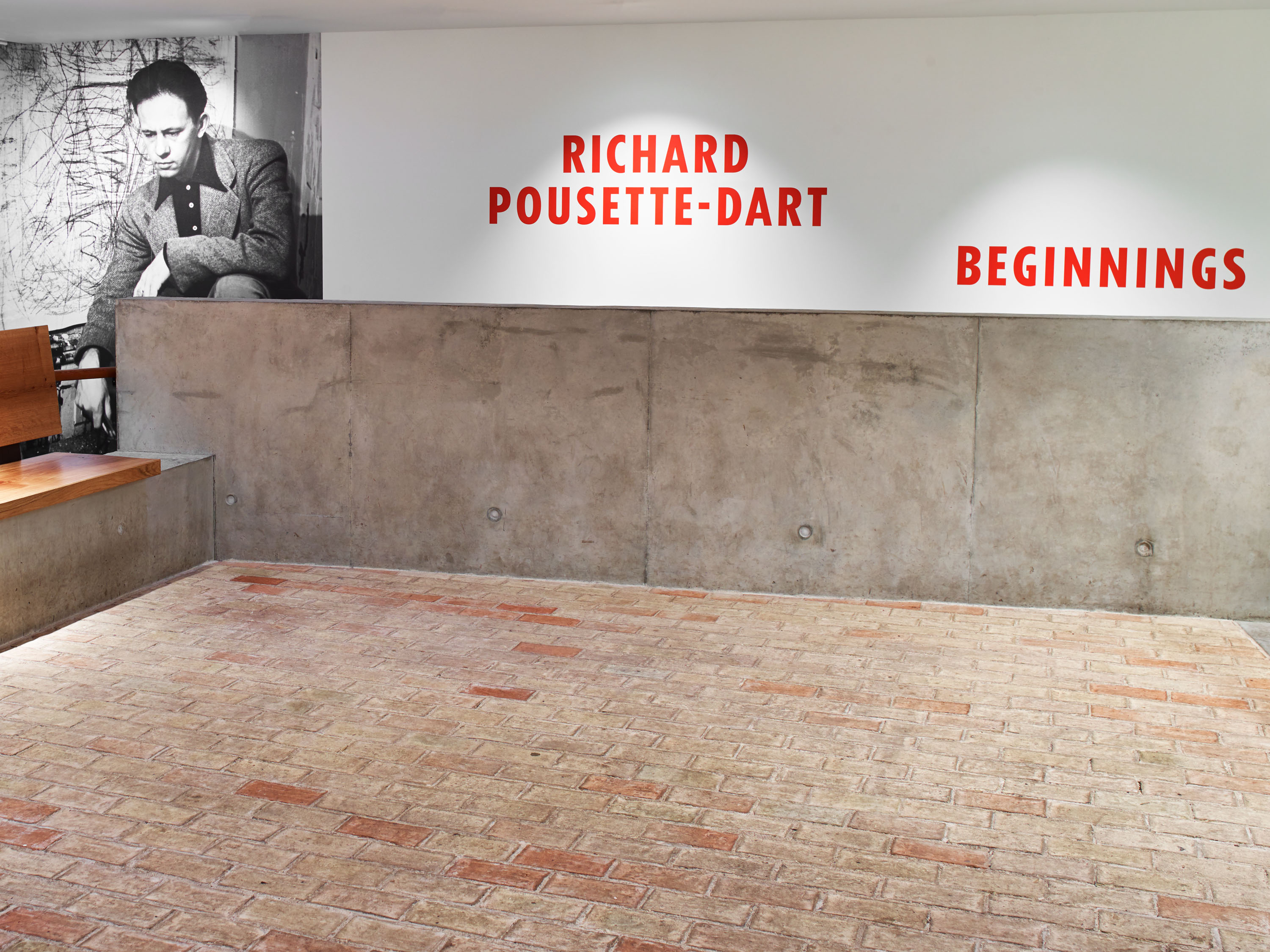
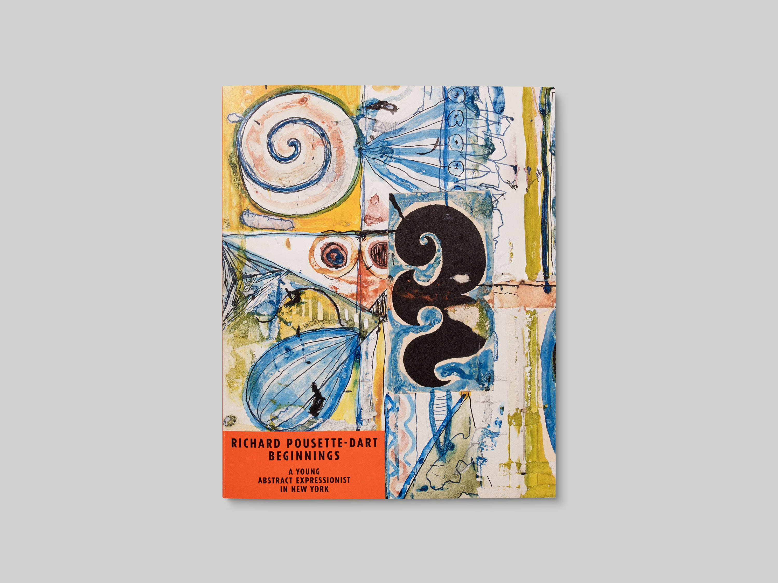
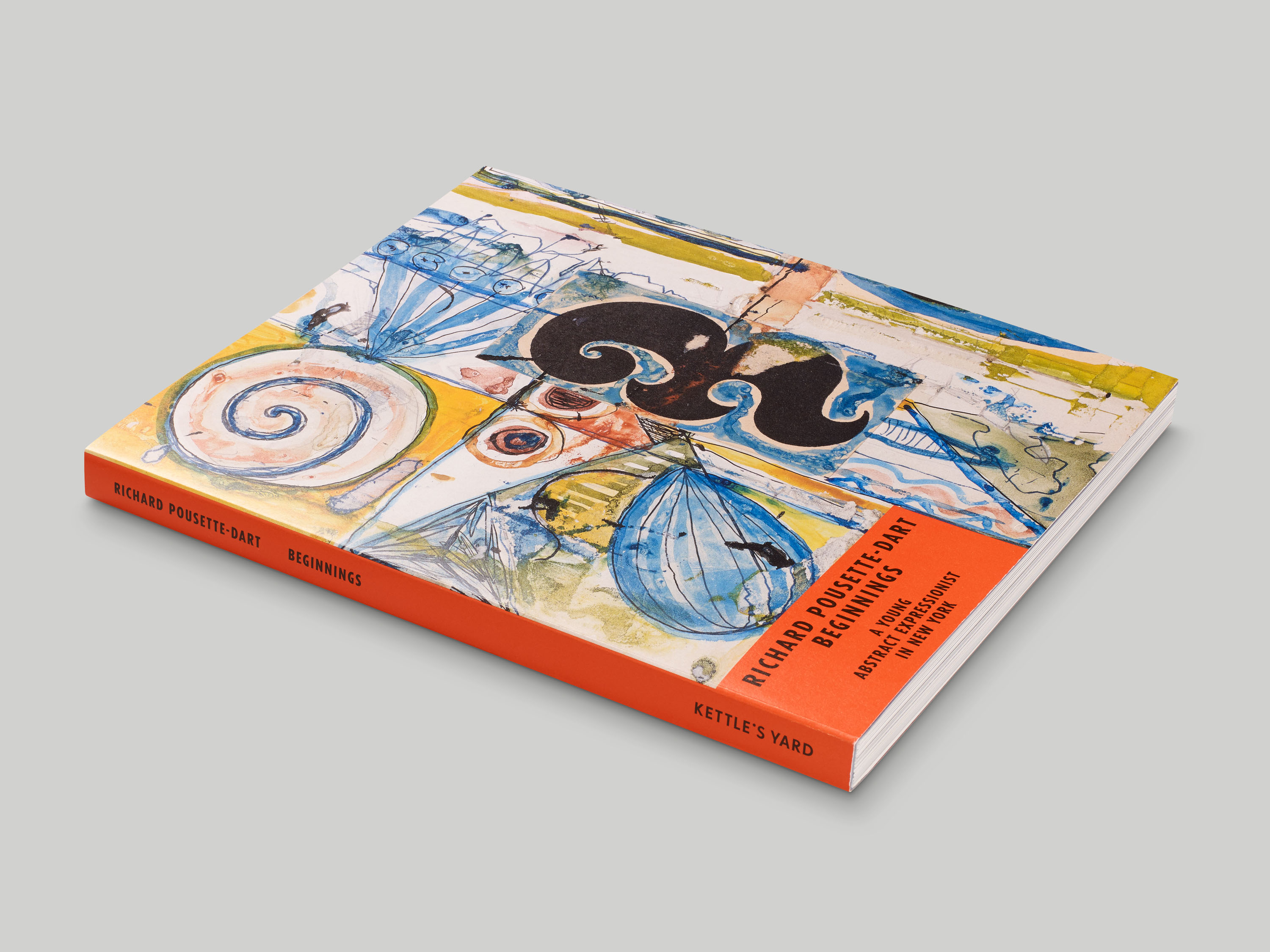
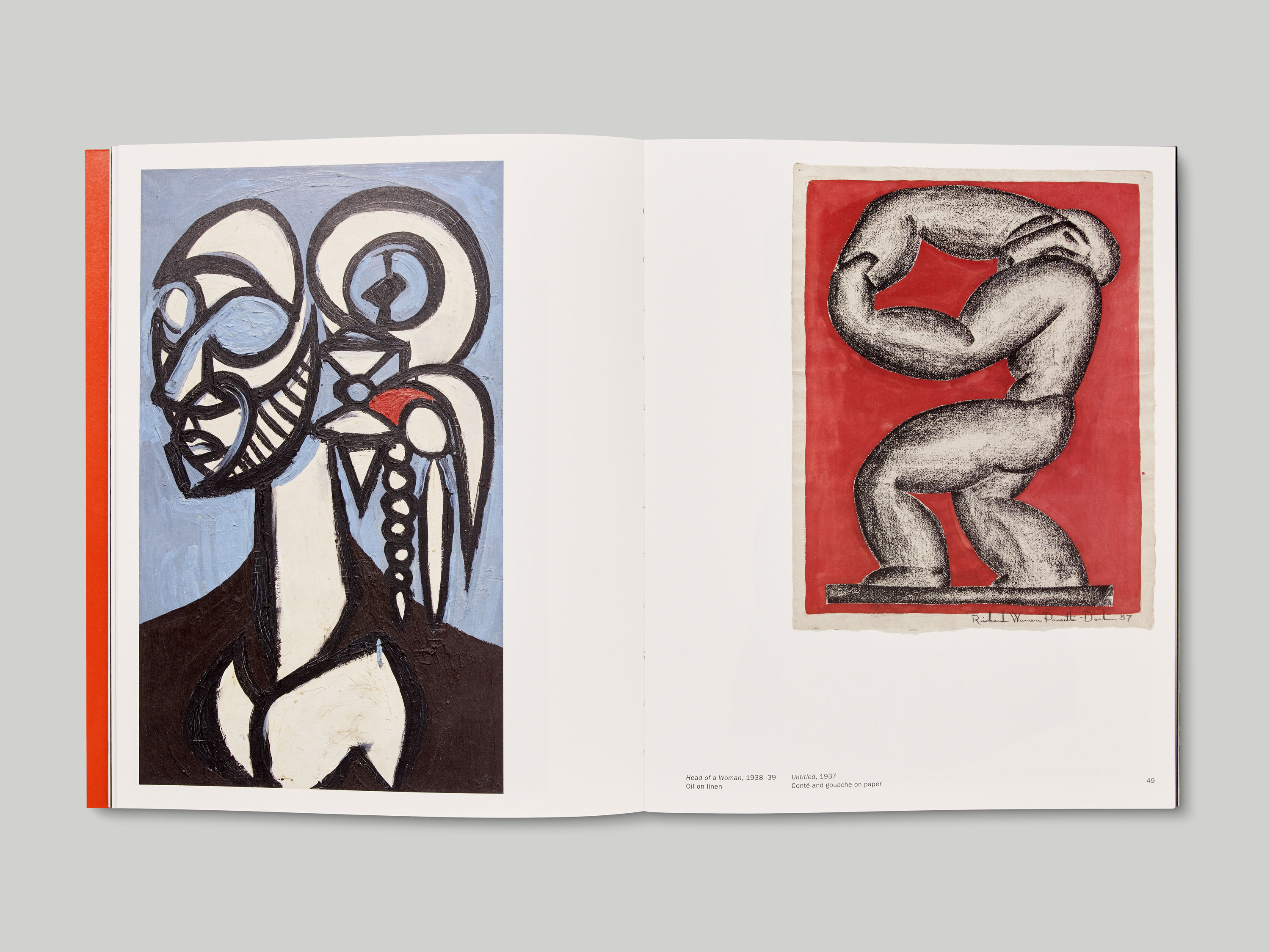
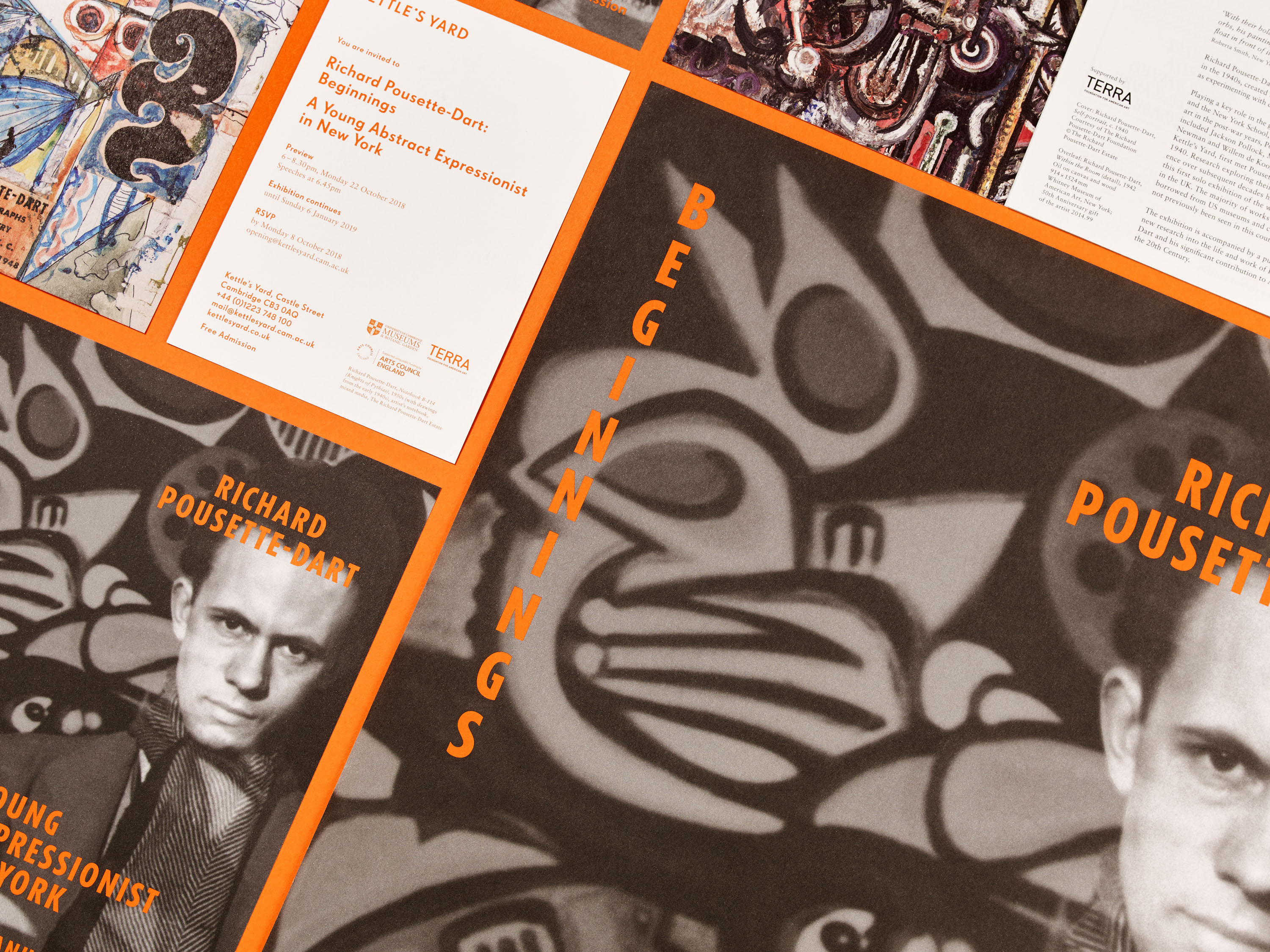
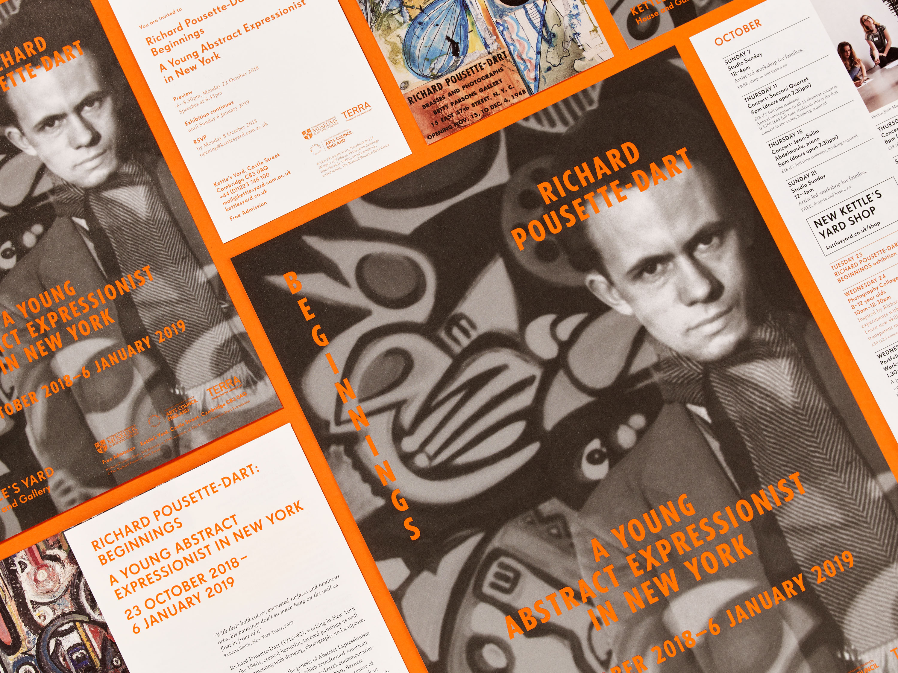
An important figure in 20th century American art, Richard Pousette-Dart played a key role in the development of Abstract Expressionism and the New York School. His work included paintings, sculpture, drawing and photography, and he corresponded frequently with Kettle’s Yard founder H. S. ‘Jim’ Ede, following their first meeting in 1940. Richard Pousette-Dart: Beginnings, held at Kettle’s Yard in autumn 2018, was the first solo exhibition of his work to be held in the UK.
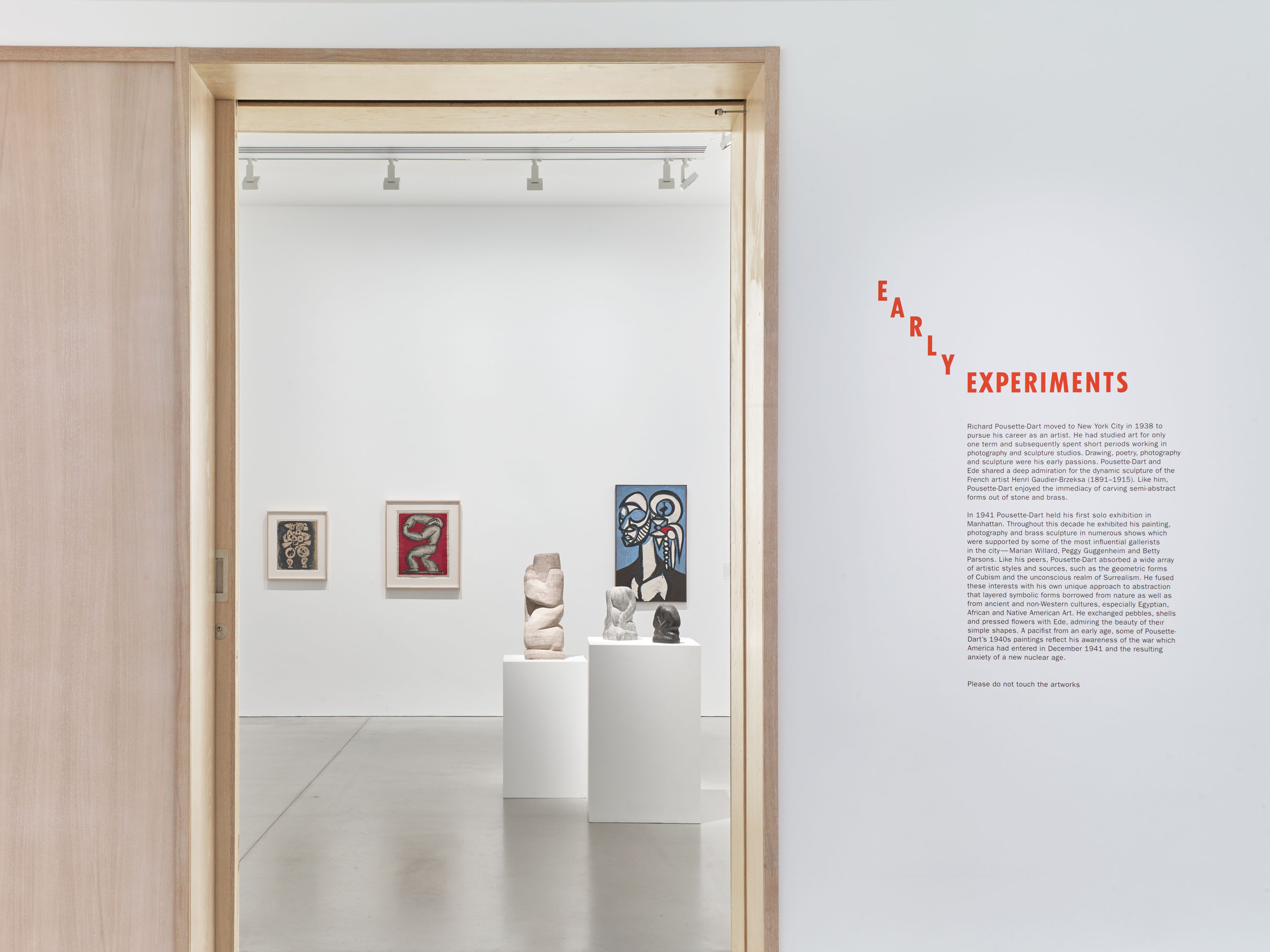
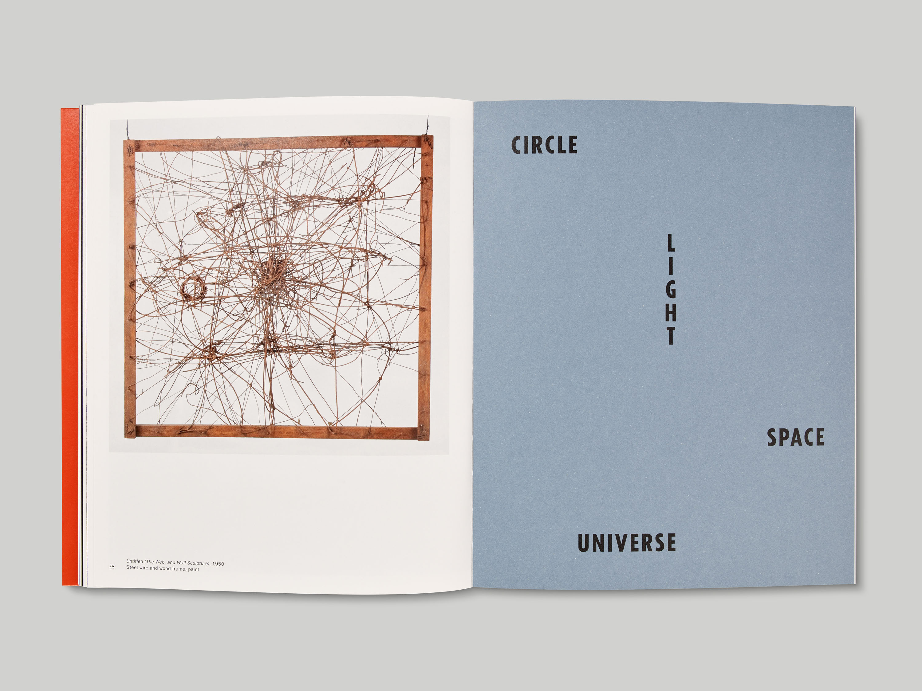
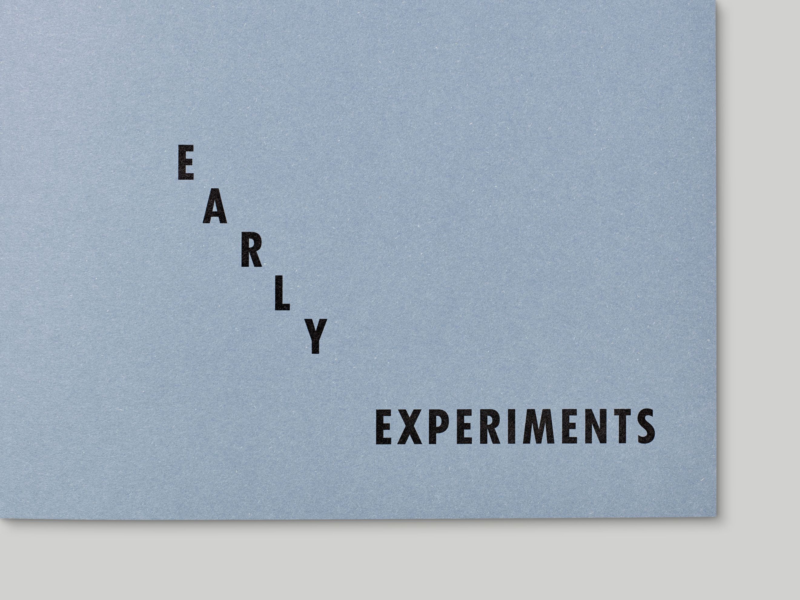
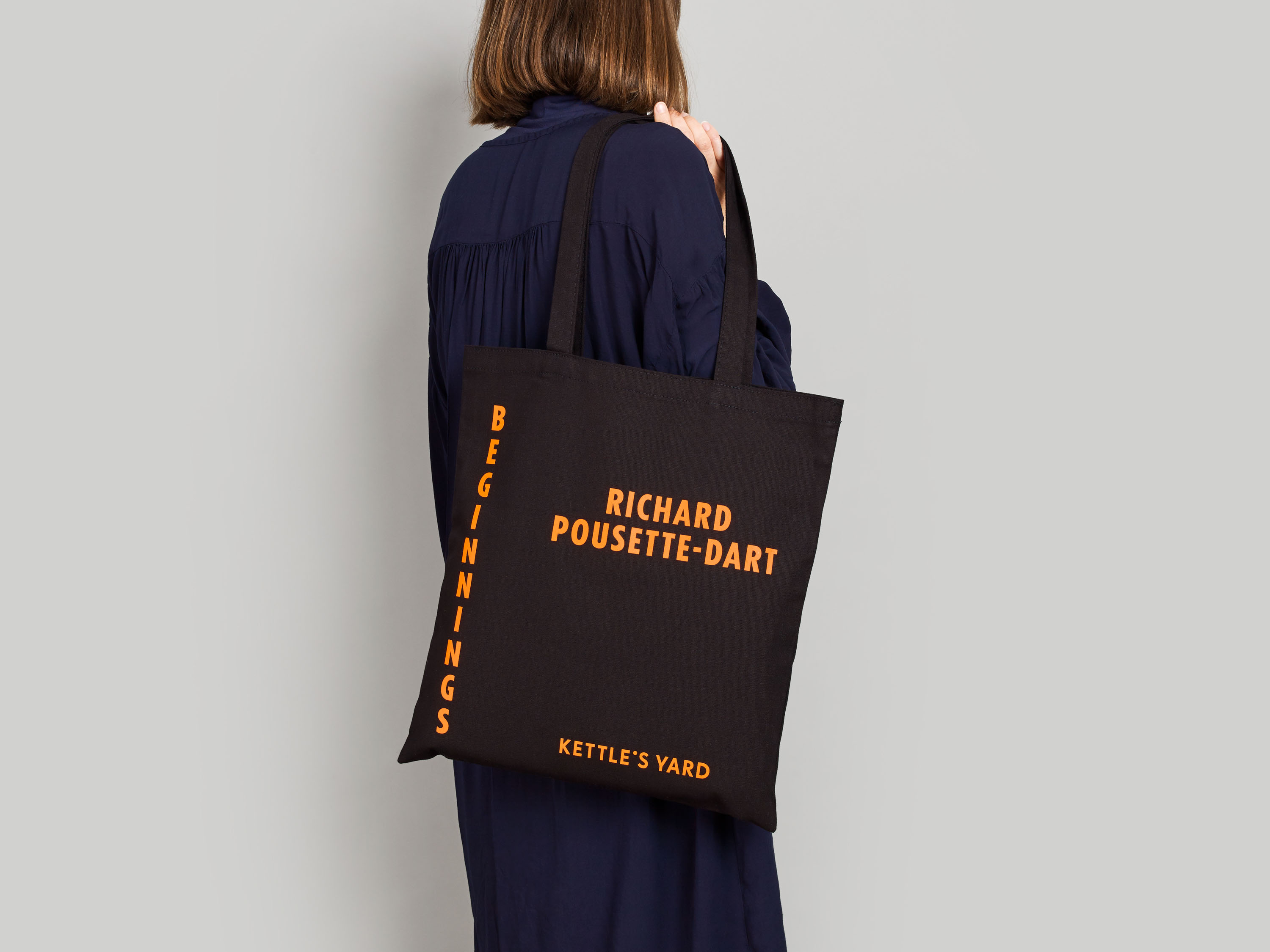
We designed the exhibition identity, marketing materials, and publication for Richard Pousette-Dart: Beginnings. Headline type was set in Tempo, a geometric, condensed sans serif which featured on several of Pousette-Dart’s exhibition invitations from the 1940s. For the exhibition texts, signage and printed matter, type was set in a bright orange derived from Pousette-Dart’s works, which he frequently used as a highlight colour.
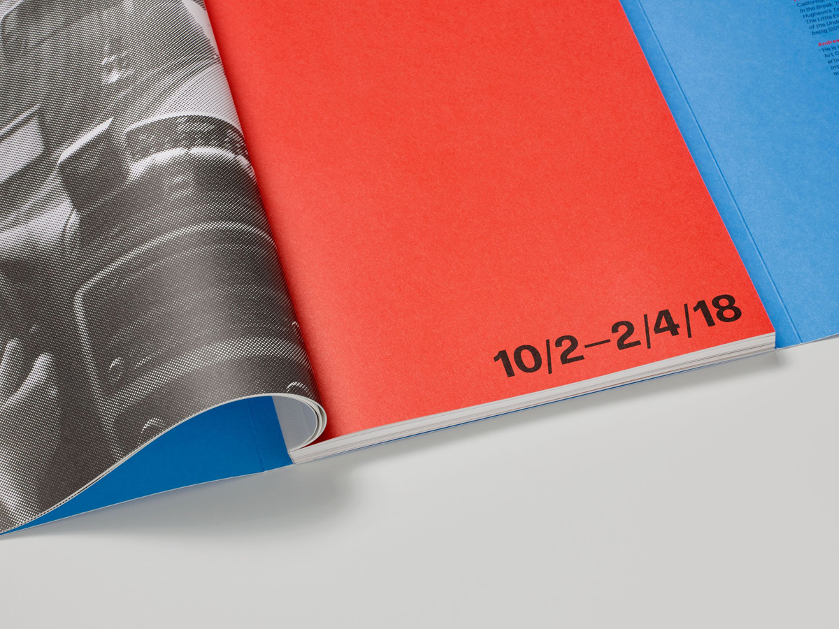
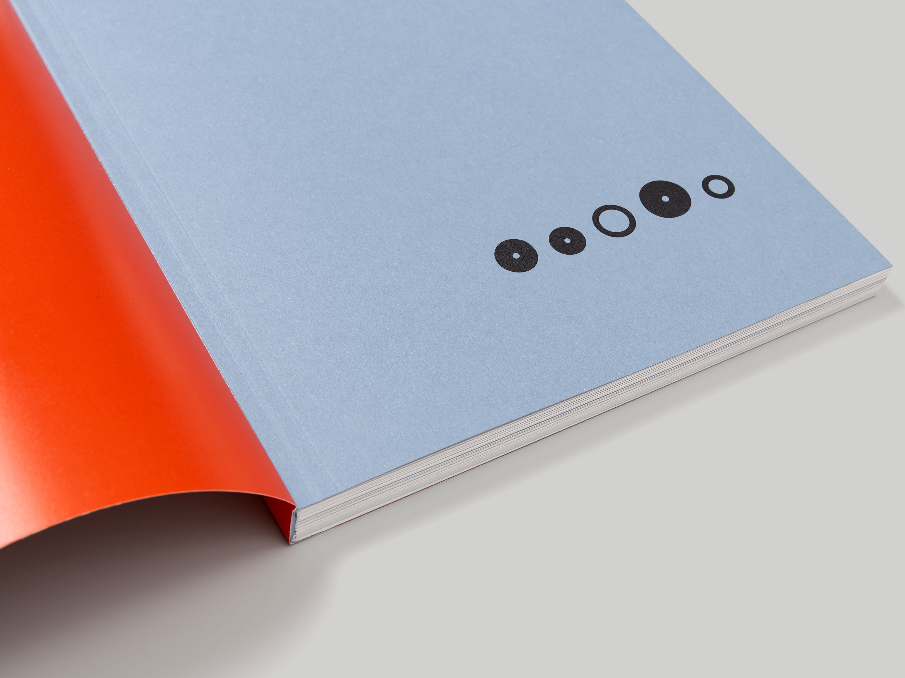
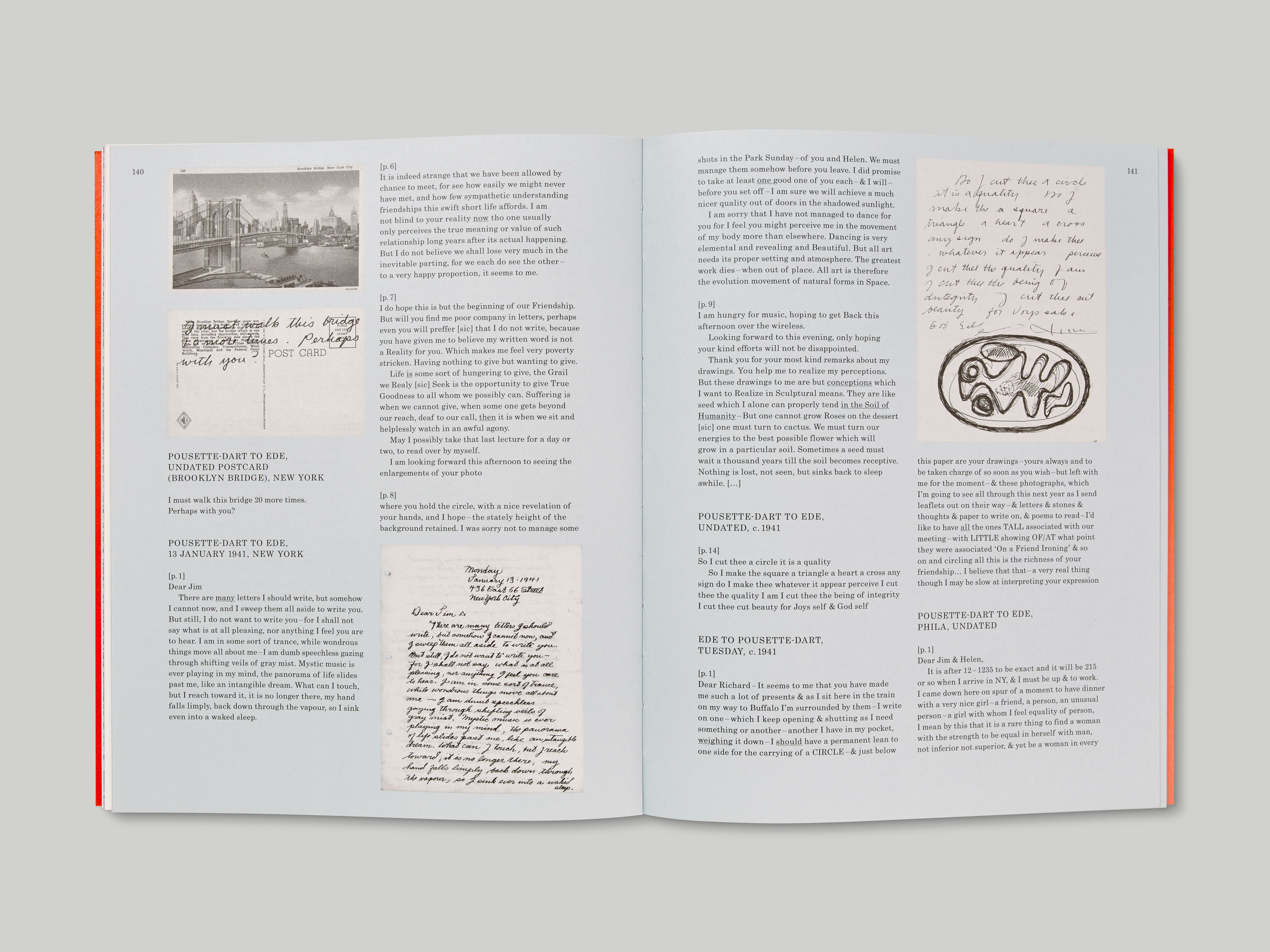
The publication is Otastar-bound, with the jacket affixed to the spine of the book block. Different papers delineate the sections within – a textured blue kraft board for chapter openers, with playful typographic titles, and textured uncoated paper for the section in which correspondence between Pousette-Dart and Ede is transcribed in facsimile.
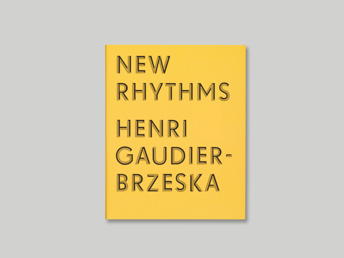
Designed by R. Hunter Middleton, Tempo was published in 1930 as the Ludlow Typograph Company’s answer to Futura, Paul Renner’s geometric sans, which proved extremely popular upon its release in 1927. A distinctive design in its own right, Tempo was expanded to encompass a broad range of weights in the years following its release, yet to this day its complete family has still not been fully digitised.