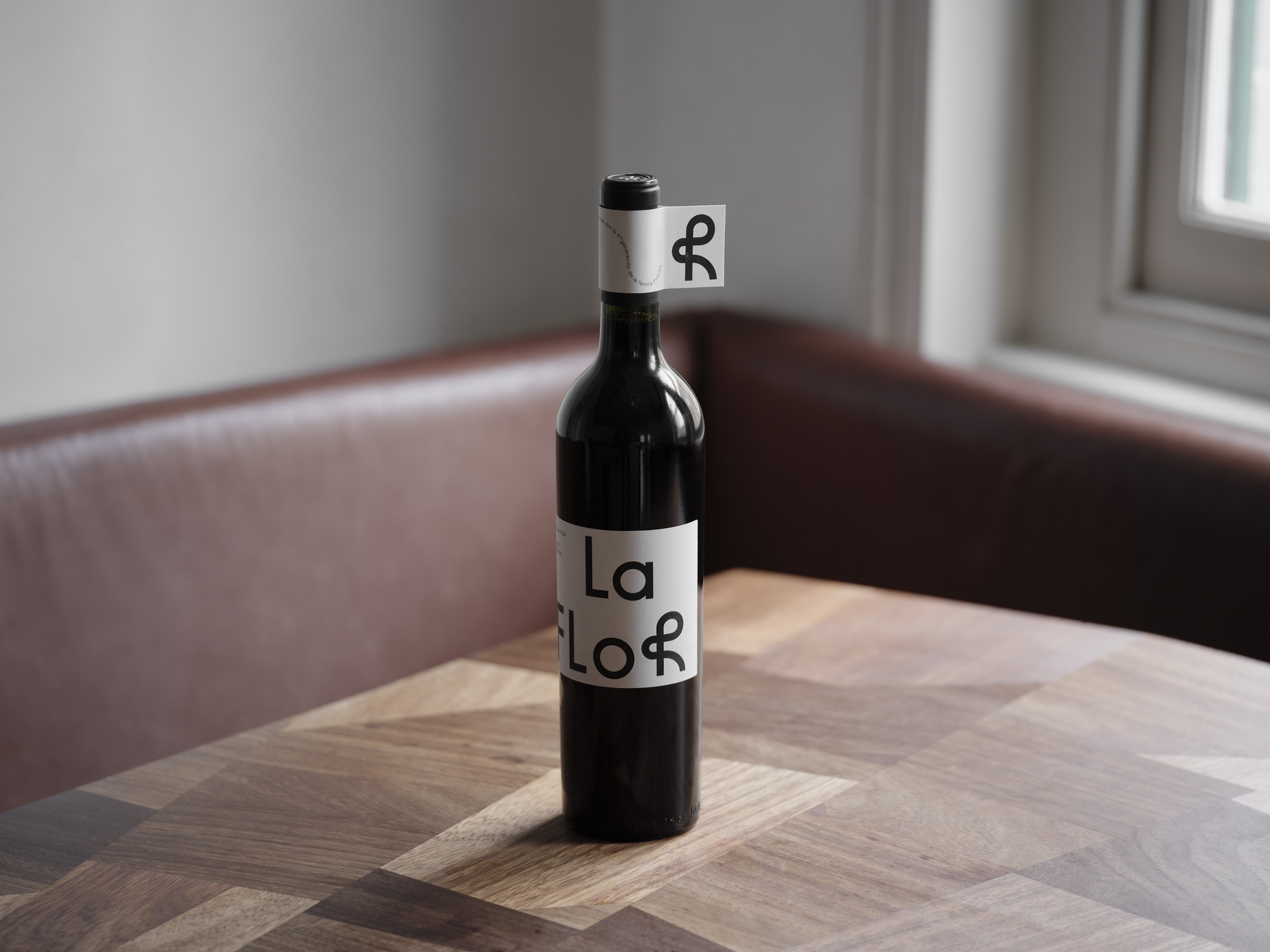

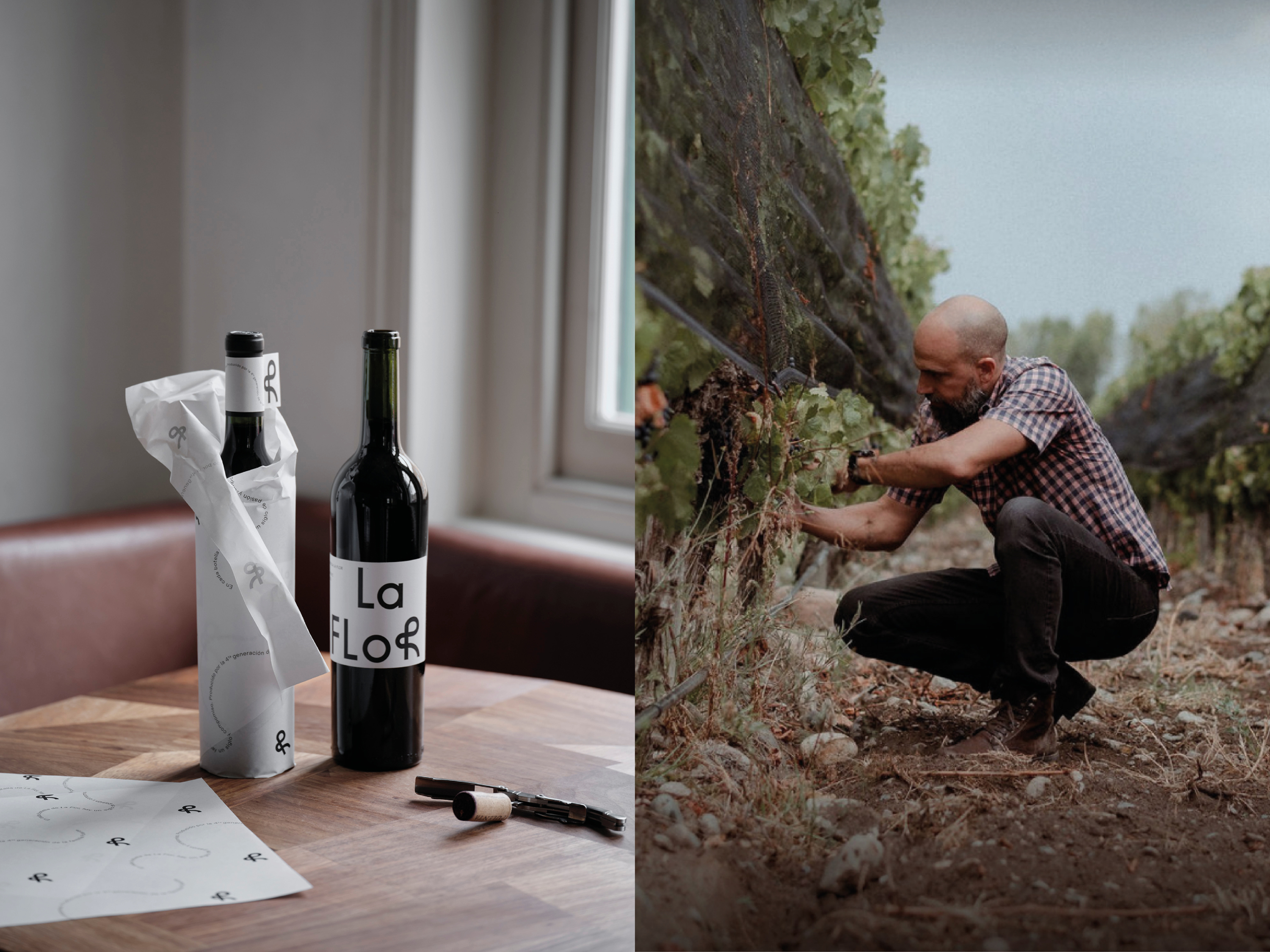
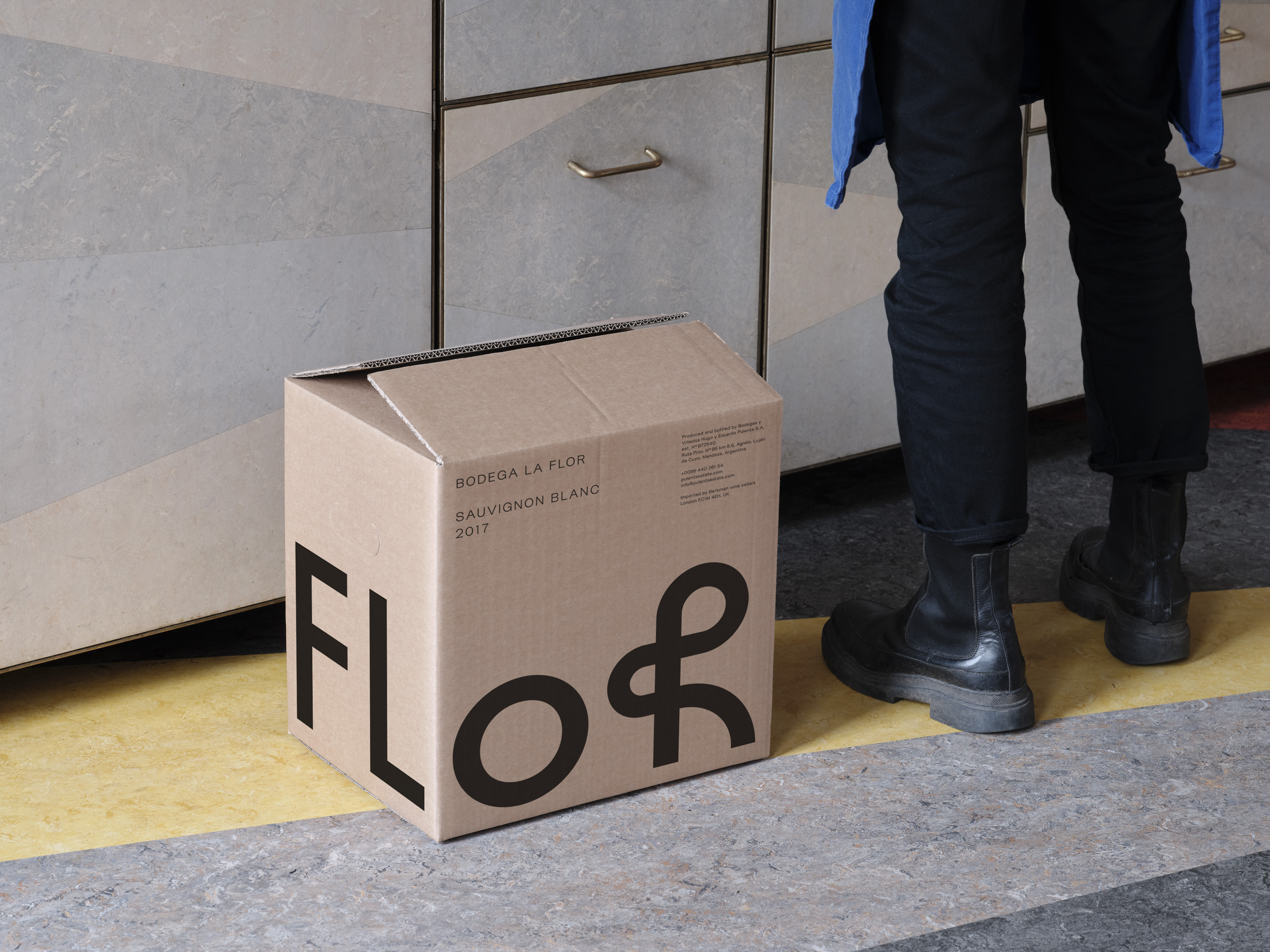
The Pulenta family has been an integral part of Argentine viticulture for four generations, creating modern wines of distinction. We developed a new identity for Pulenta Estate’s La Flor brand to reflect the wines' youthful and convivial nature.
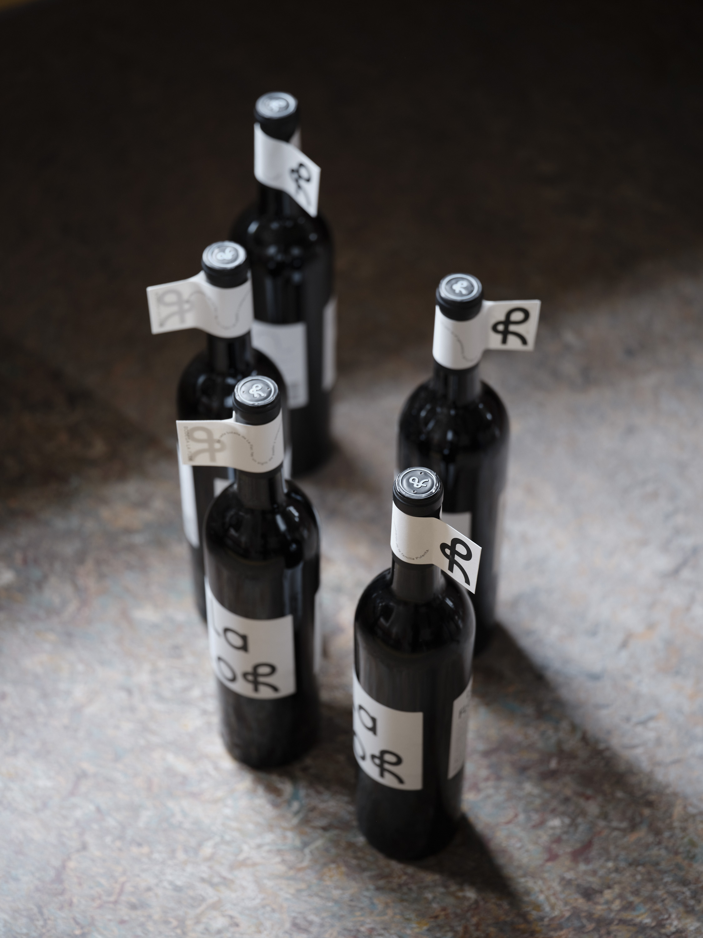
La Flor’s identity centres around a custom-drawn logo and signifier. The monoline treatment of the strokes is offset by the organic curves and playful overlaps of the ‘R’, hinting at the brand’s name – ‘the flower’. This liveliness is further expressed by the typographic treatment of the brand motto which wraps around a serpentine line of semi-circles.
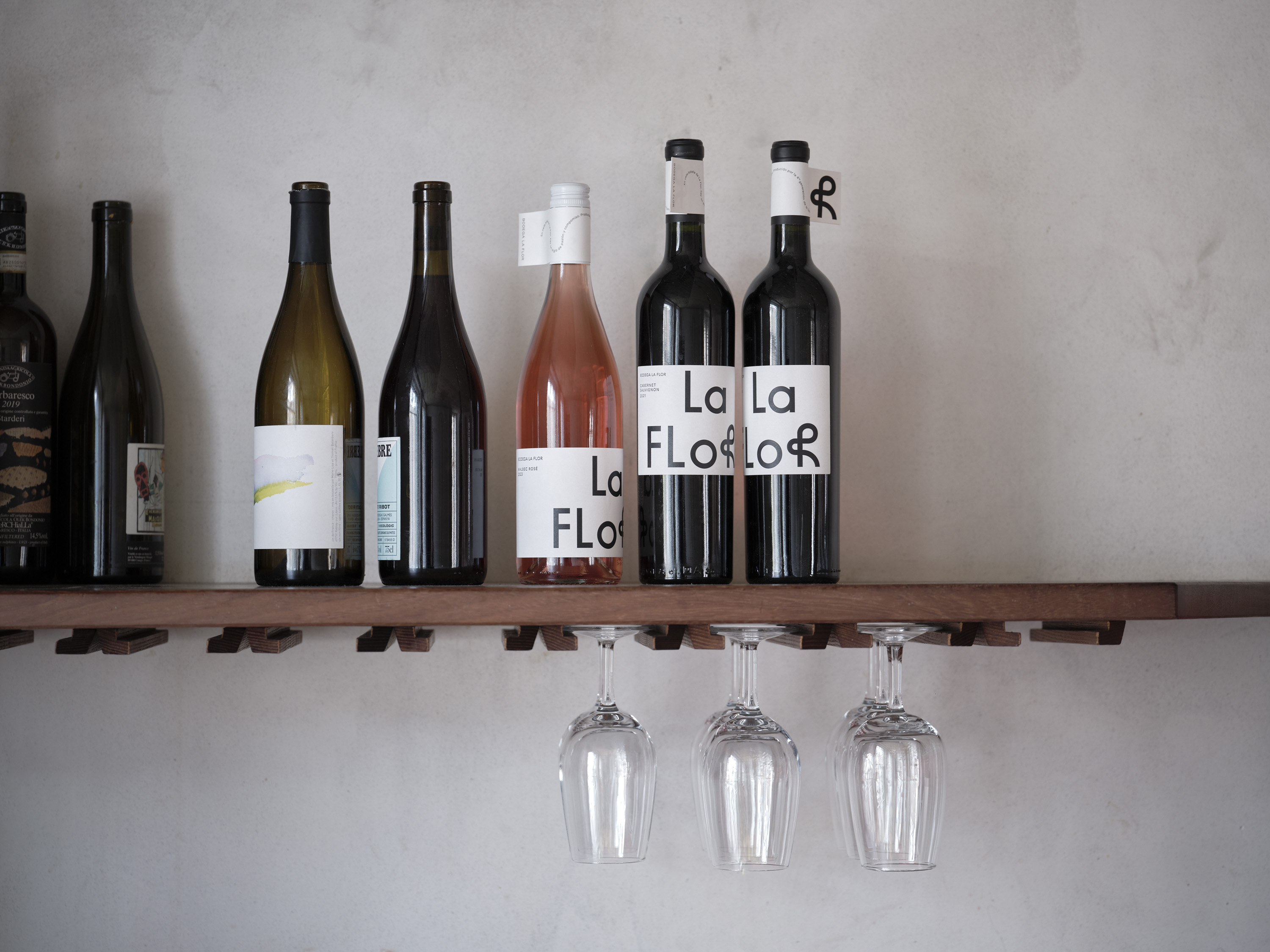
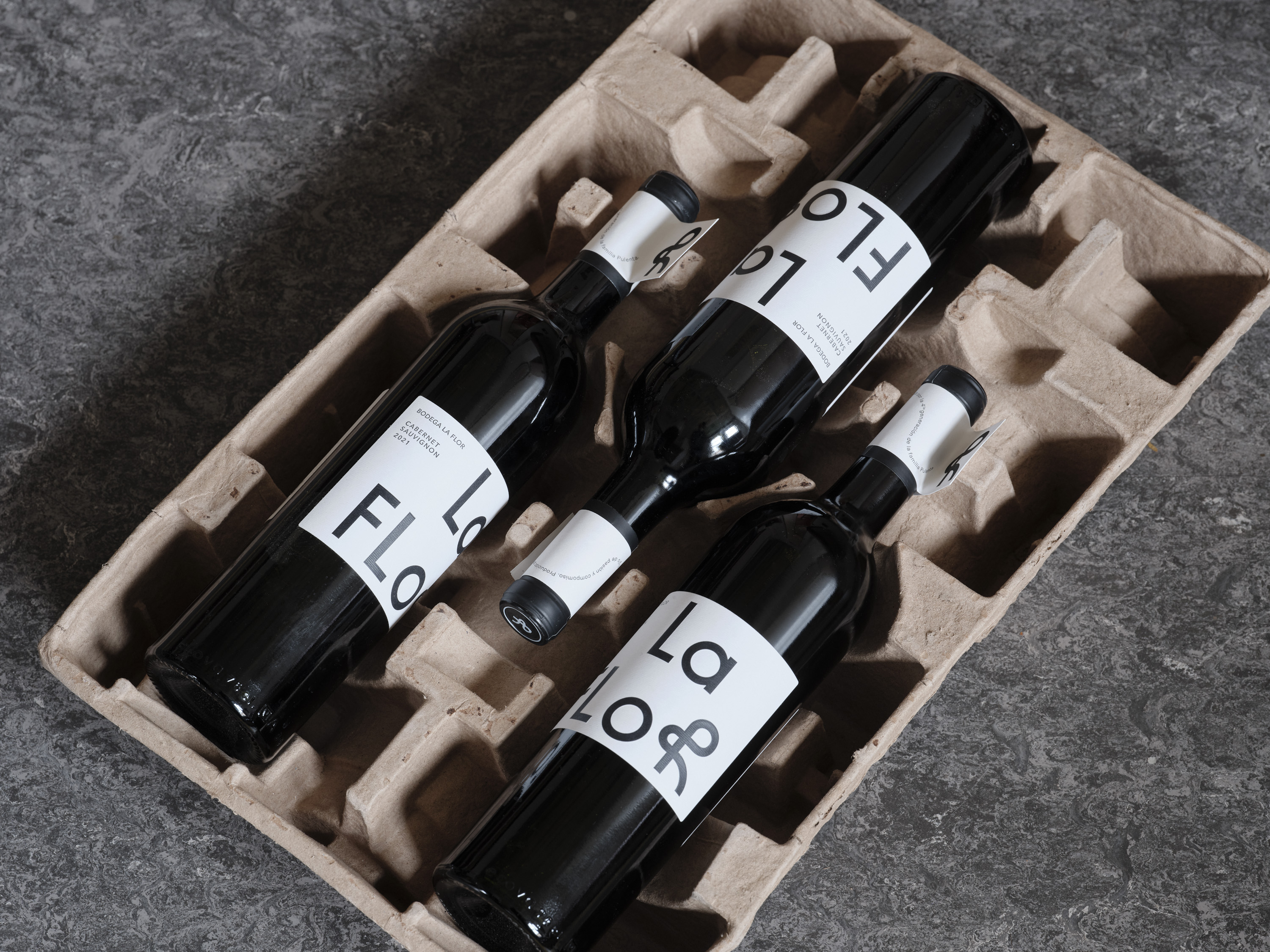
The large-scale La Flor logo is used alongside a monochromatic colour palette and refined typographic scheme, as seen on the bottle's main label. Accompanying this, a distinctive smaller label featuring the brand motto wraps around the bottles’ necks, making each bottle recognisable when stored in racks.
Photography by Thomas Adank. With thanks to The Marksman.