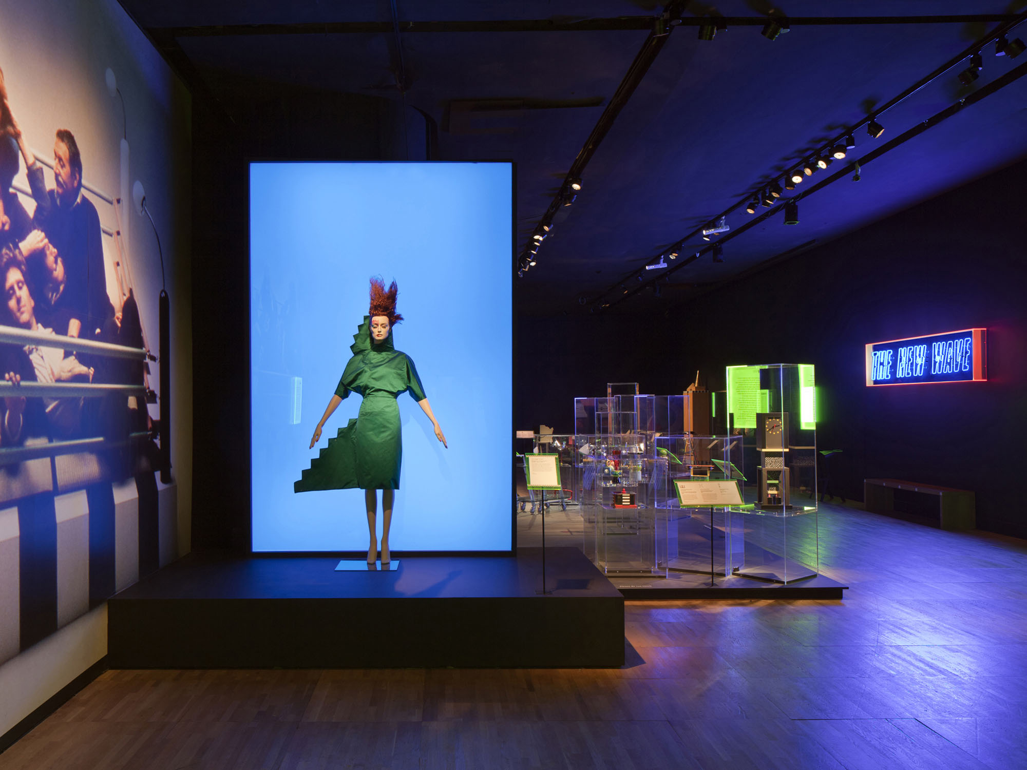
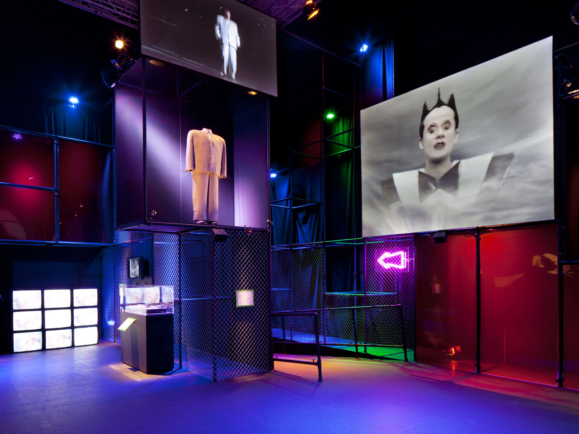
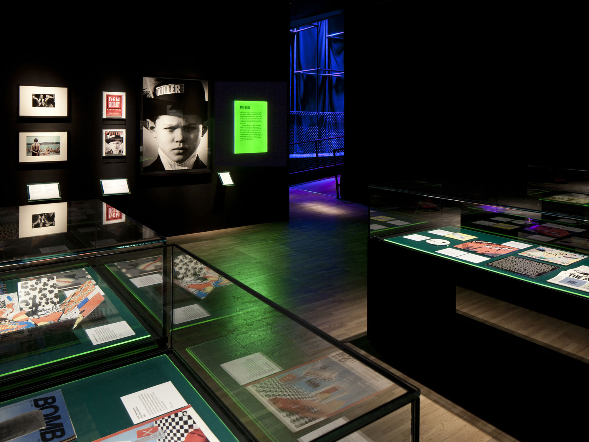
The exhibition Postmodernism: Style and Subversion 1970–1990 charted the dominant aesthetics of the 1970s, '80s and early '90s. It was part of a series of large-scale shows at the Victoria & Albert Museum exploring the grand narratives of 20-century style: Art Nouveau, Art Deco and Modernism among them. This particular exhibition was an important and challenging project within the series, due to the complex and elusive nature of Postmodernism, and the strong reaction that its ethos and aesthetics can provoke.
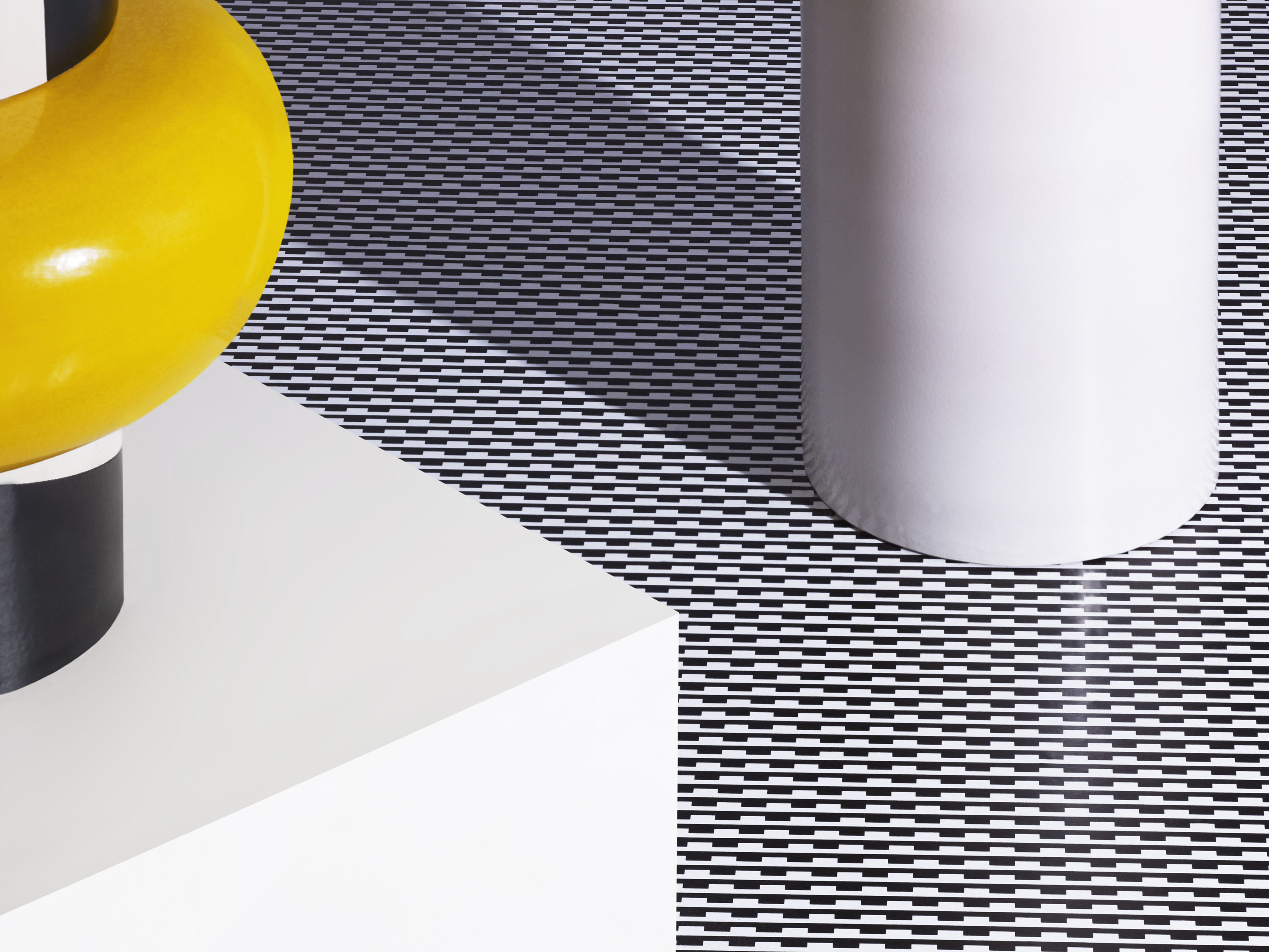
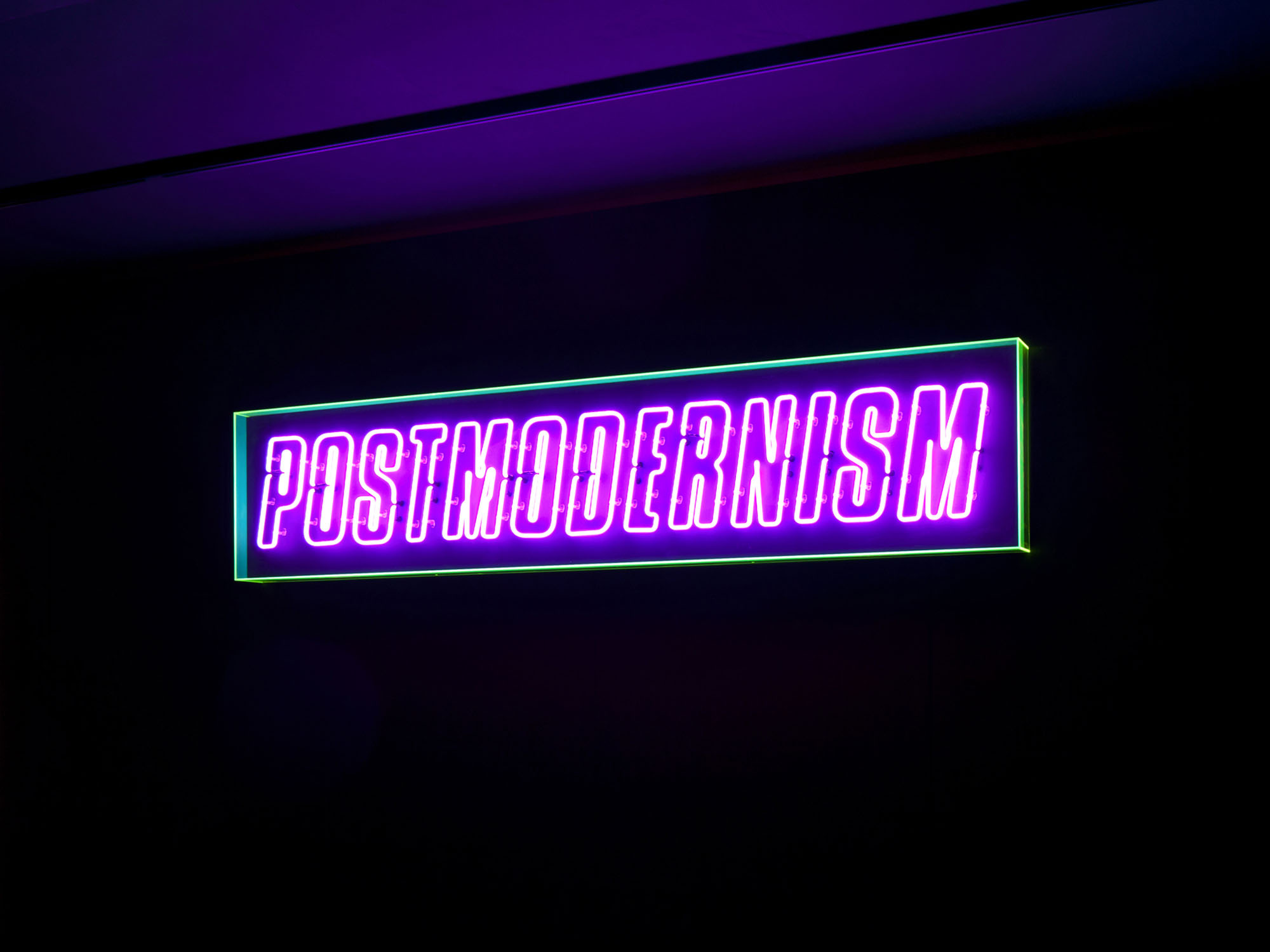
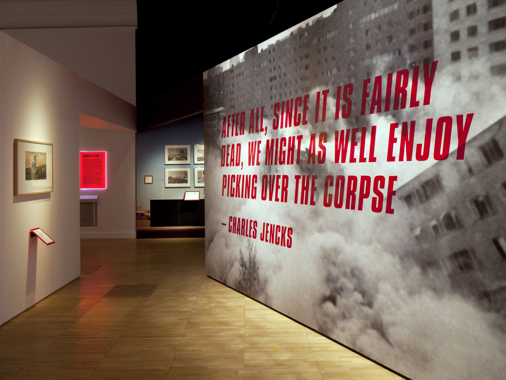
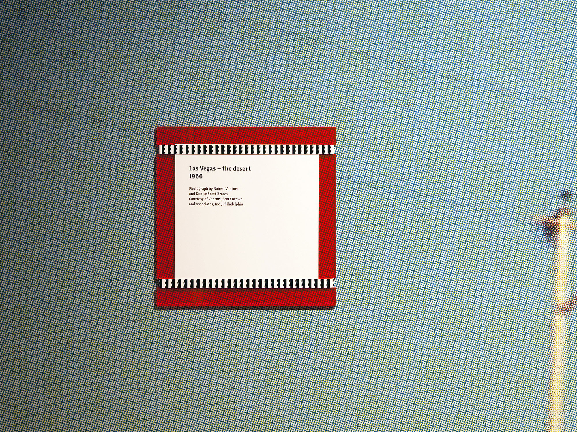
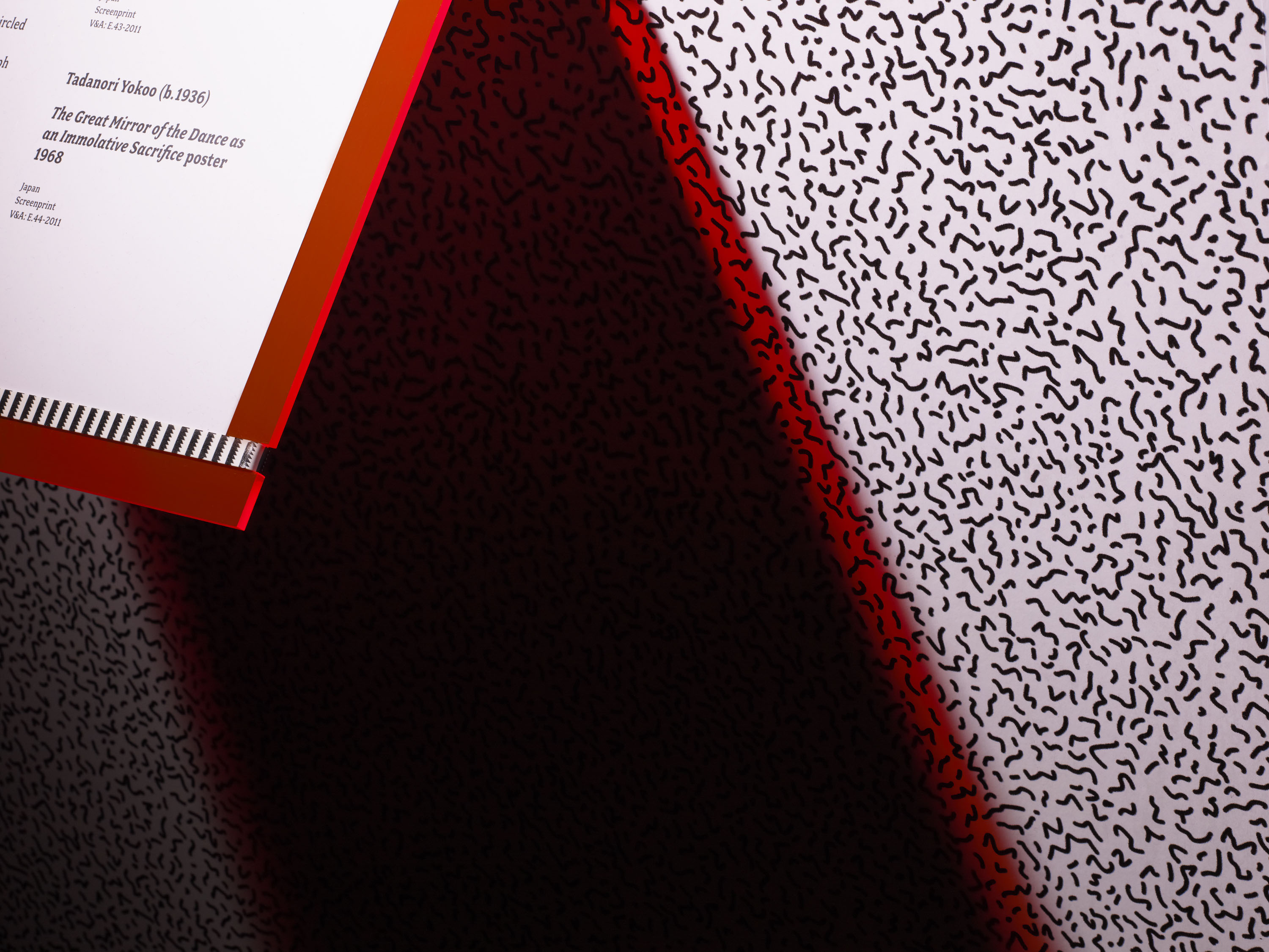
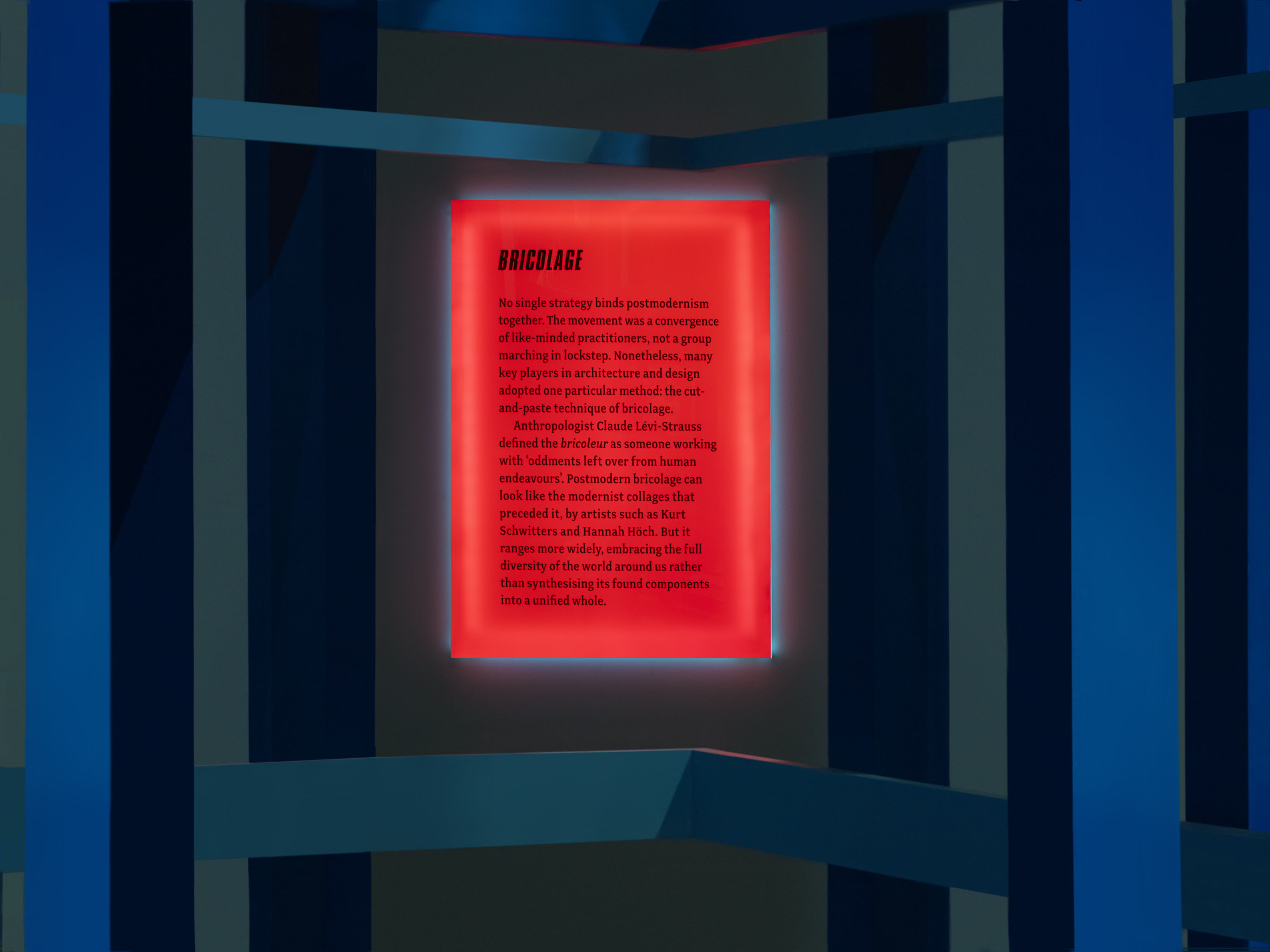
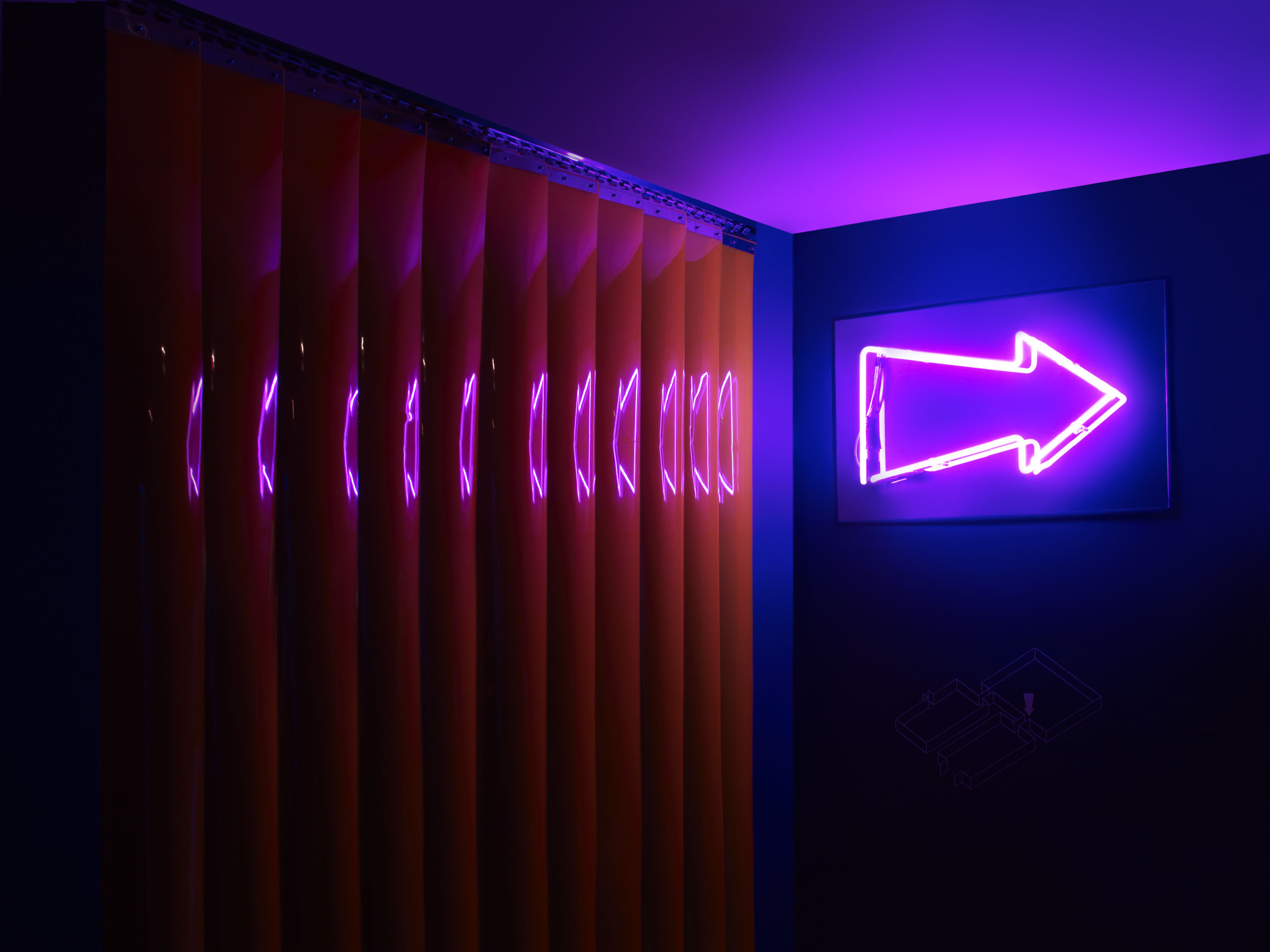
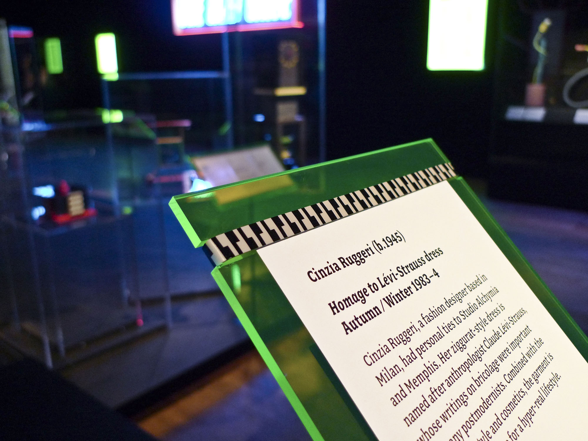
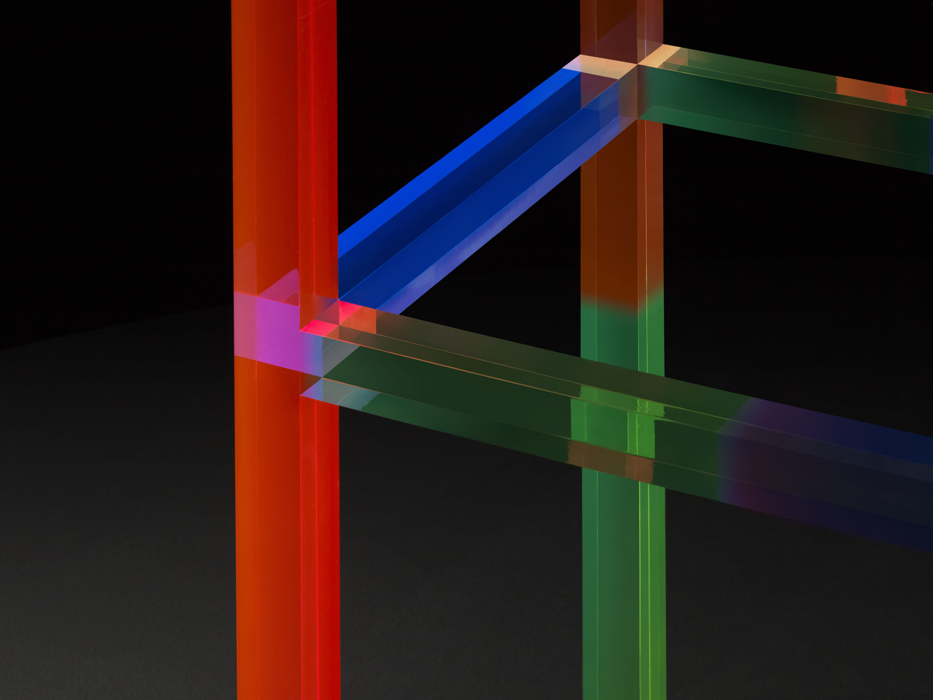
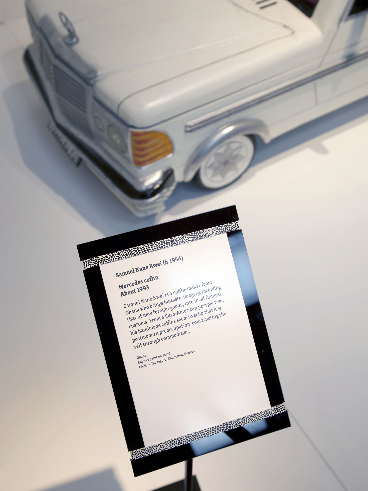
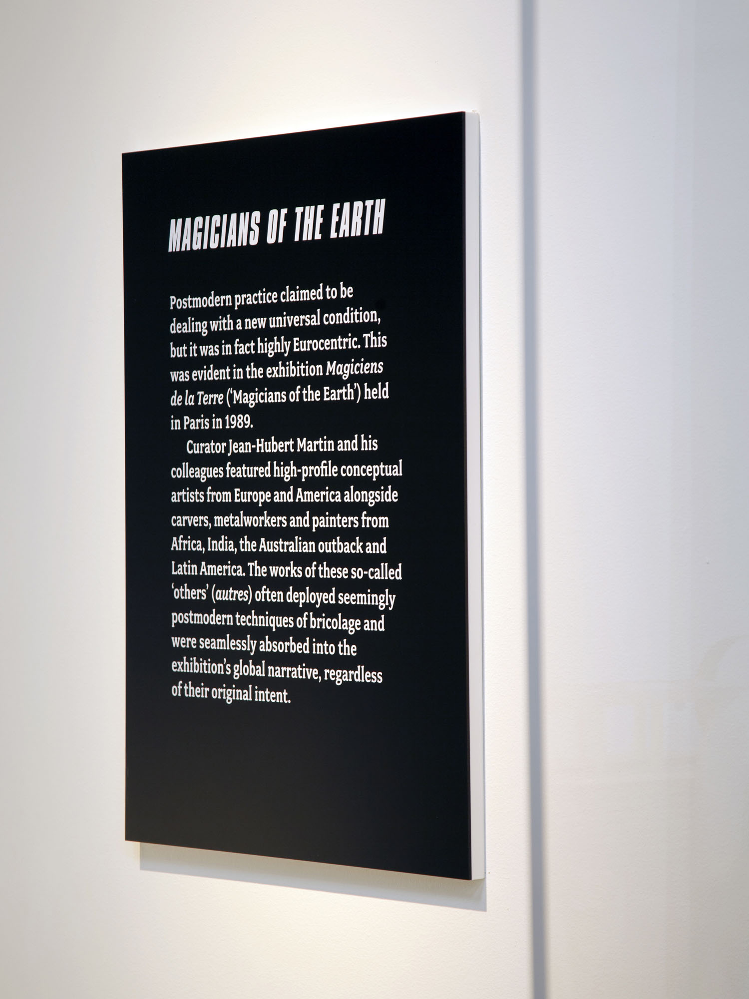
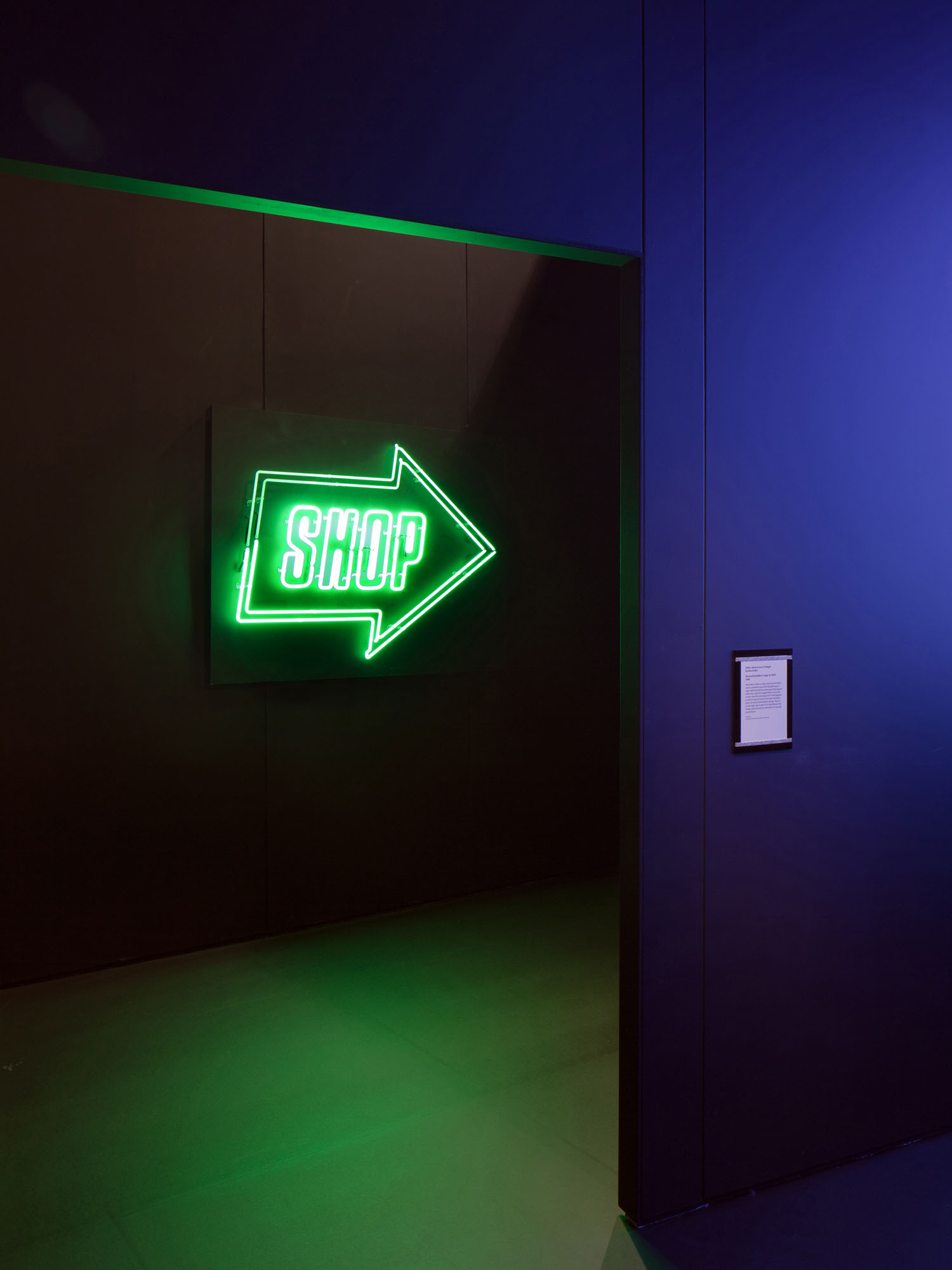
We collaborated with architects Carmody Groarke to create a unique exhibition experience, transforming the existing galleries into a series of rooms representing the three decades that the exhibition spans, and the postmodernist themes within them: Presence of the Past, The New Wave, and Money. These spaces were intended, by turns, to be energetic, dark, loud, tacky, decadent and fun: Las Vegas cityscapes were reproduced at supergraphic scale, and illuminated neon Perspex used for signage and labels. Our intention was to create a postmodernist exhibition, where the exhibits would become a memory and an experience.
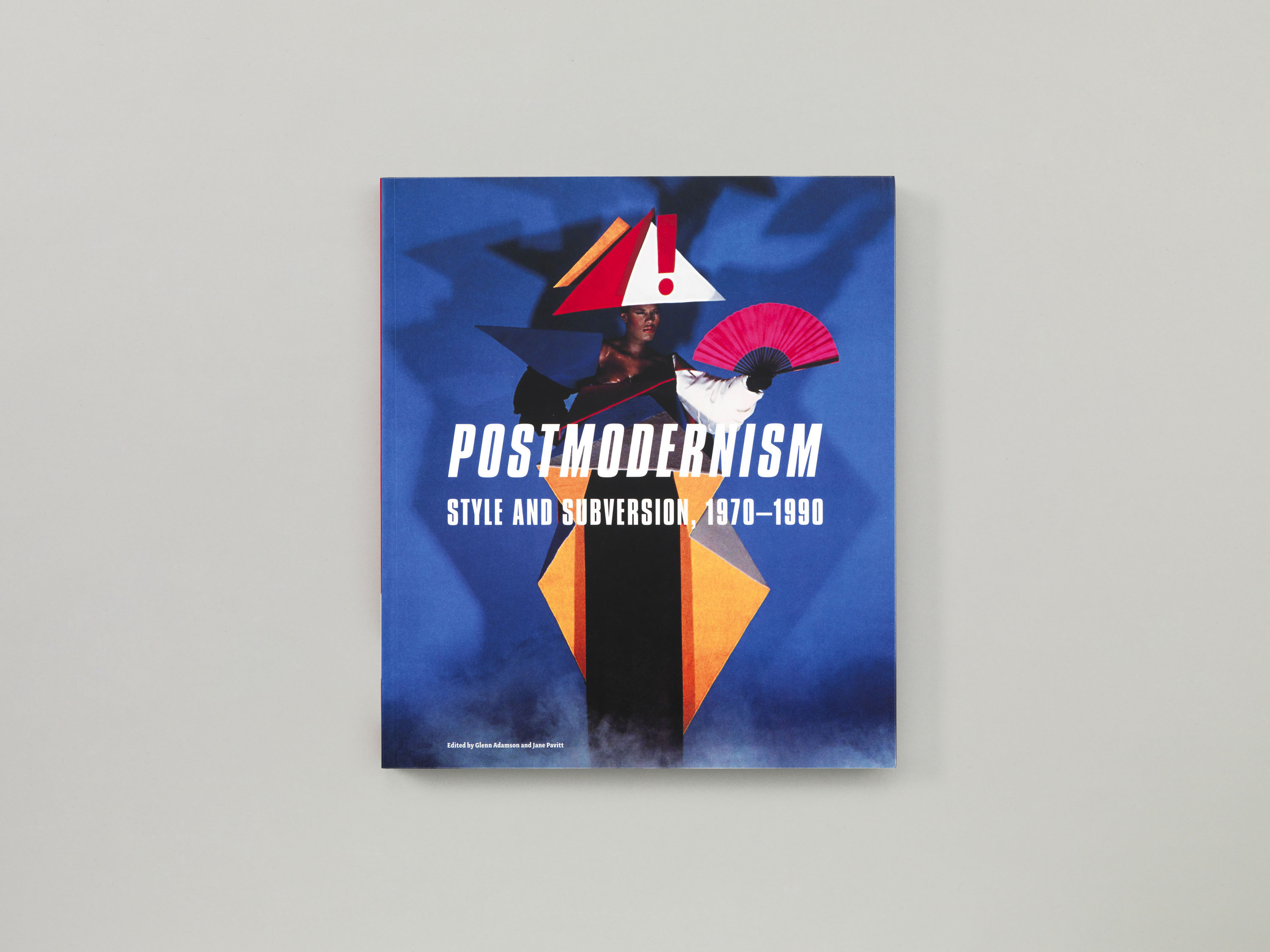
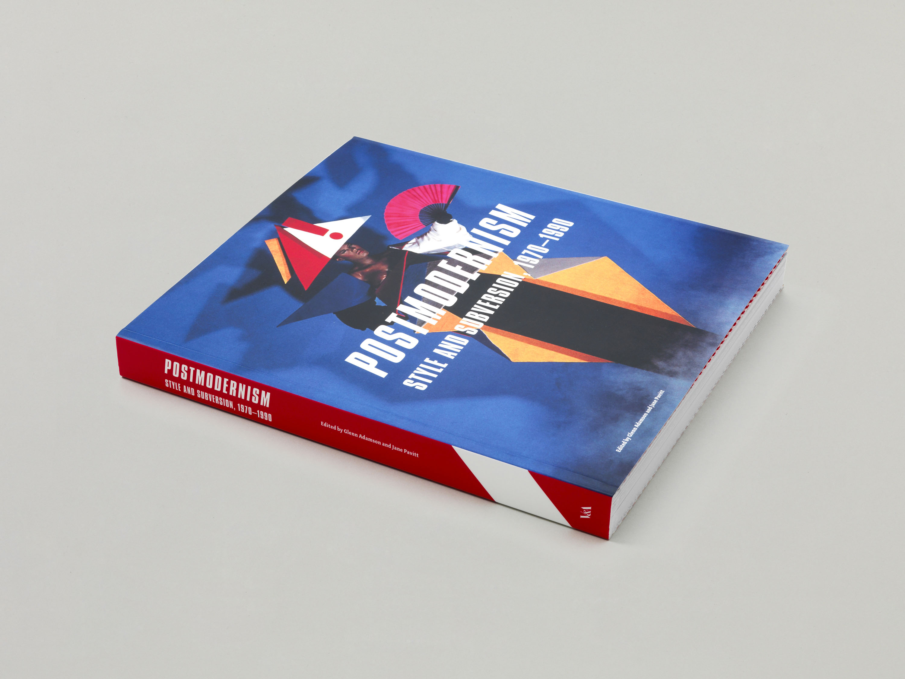
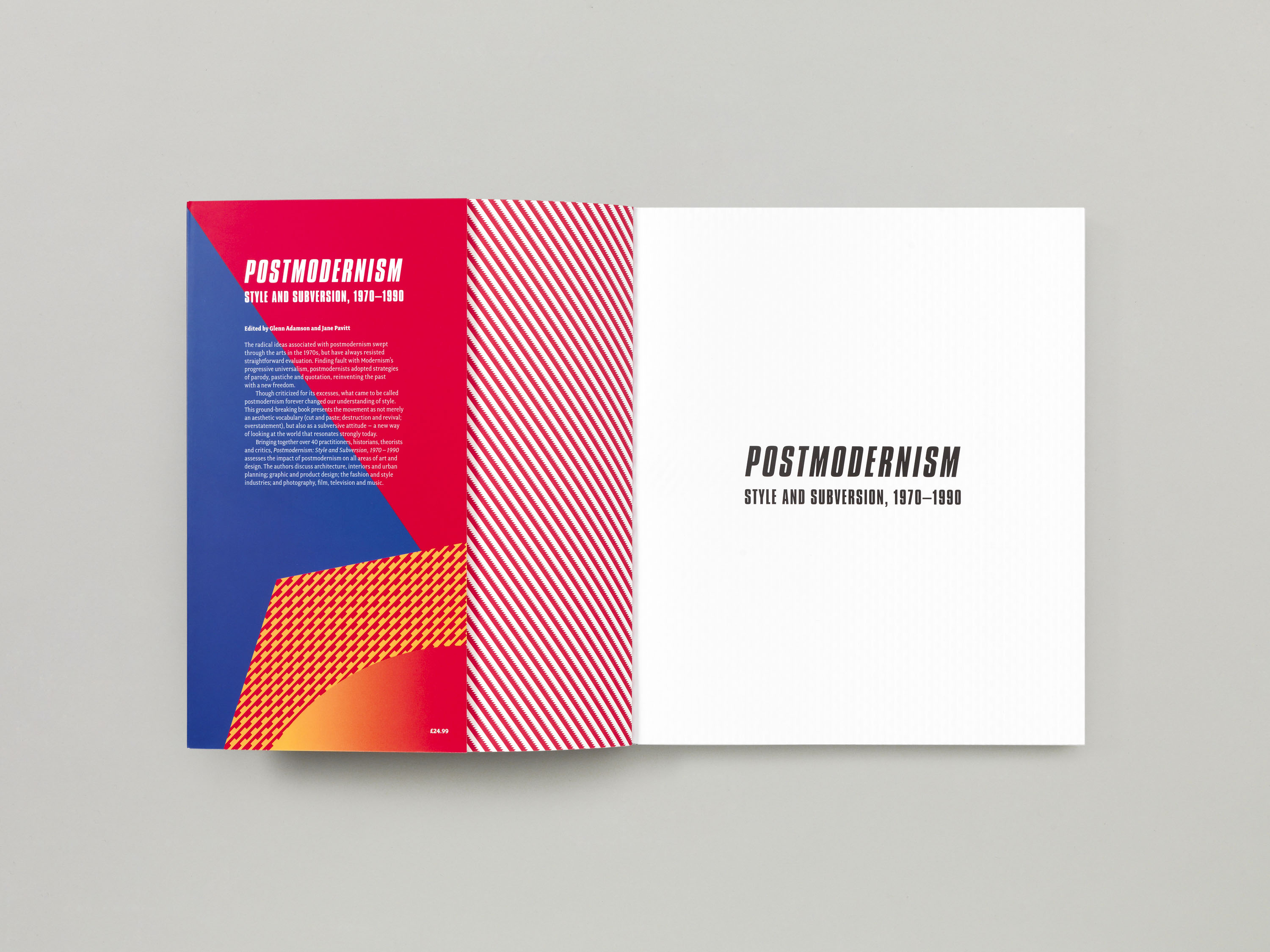
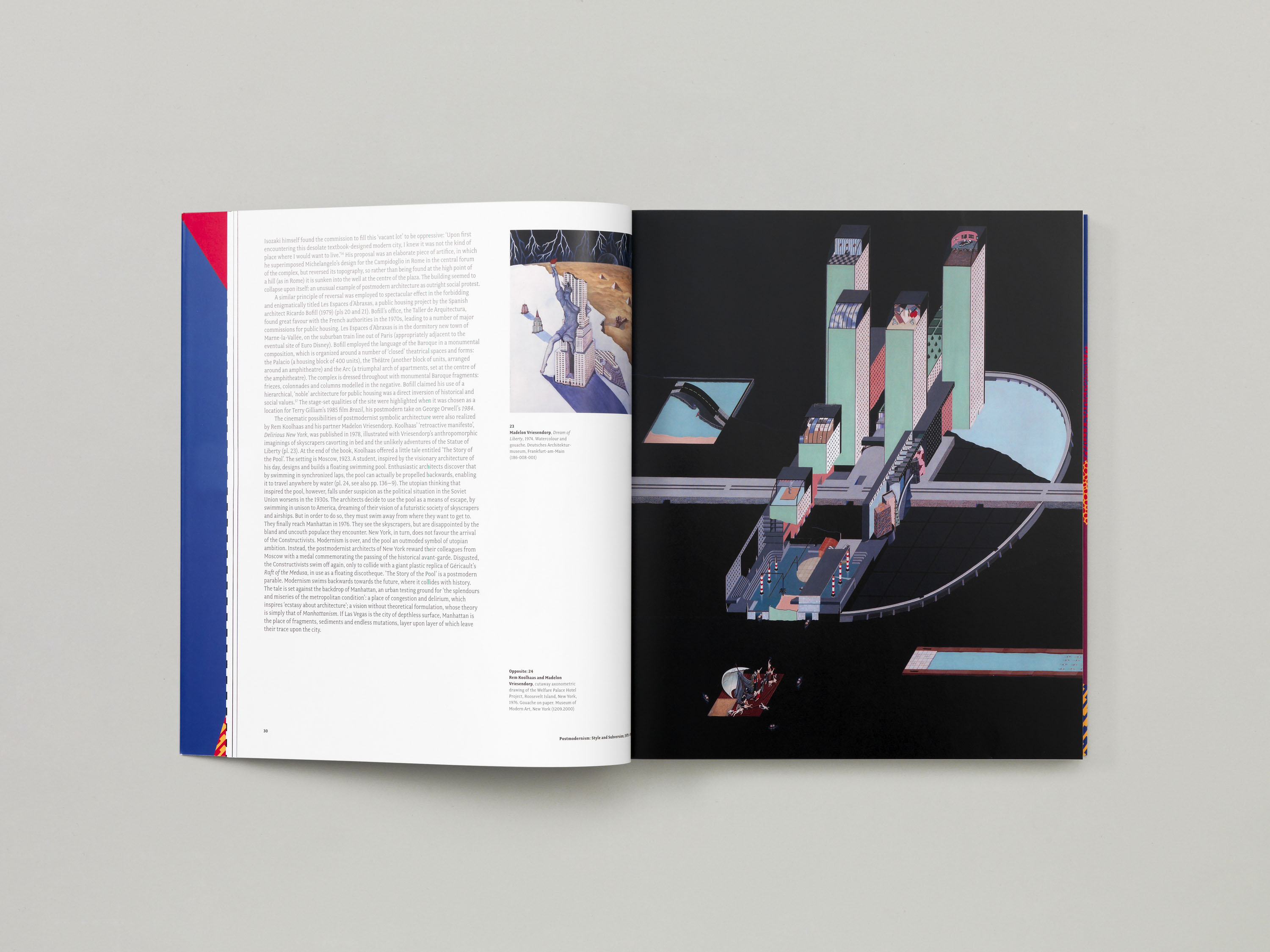
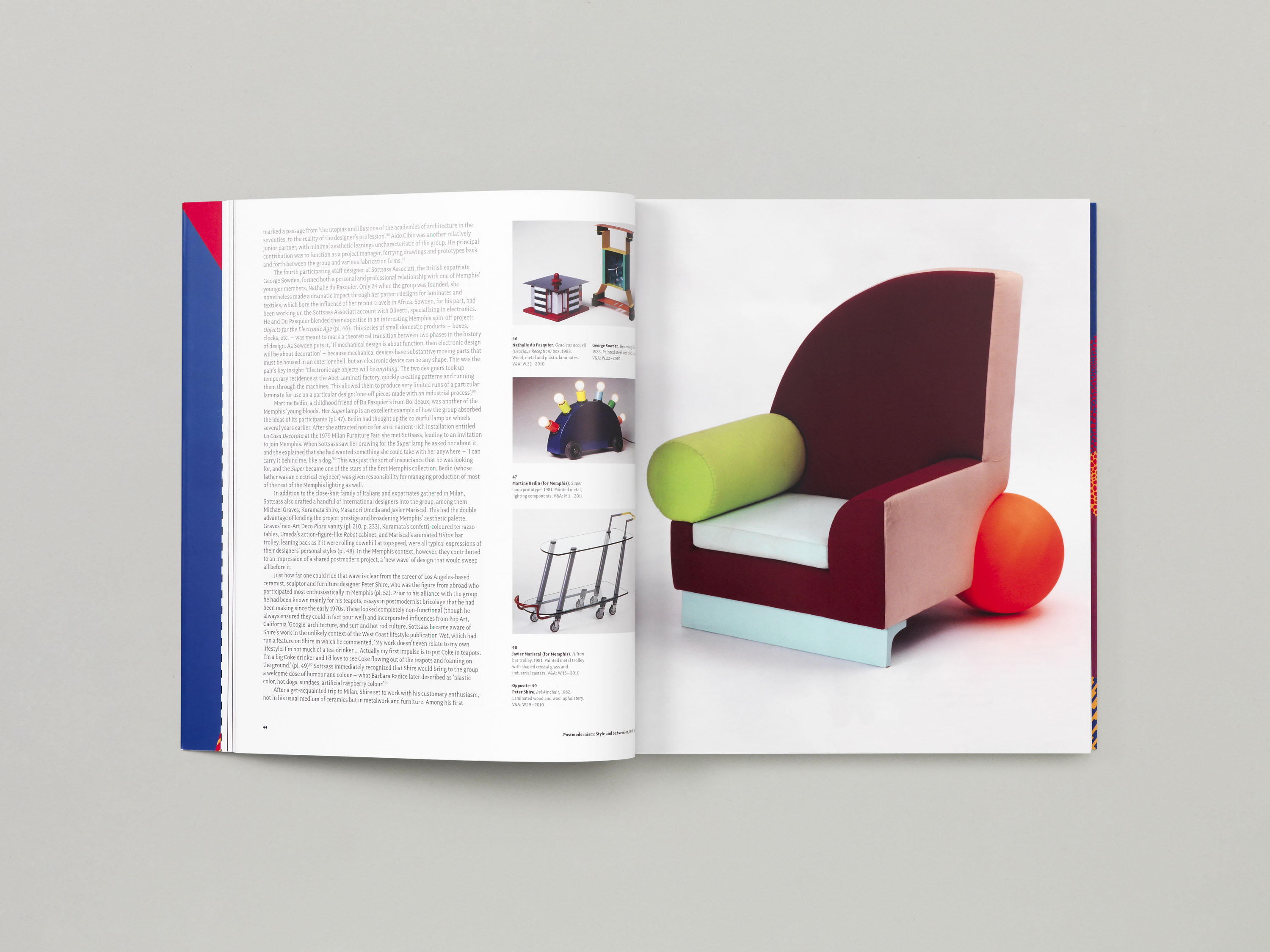
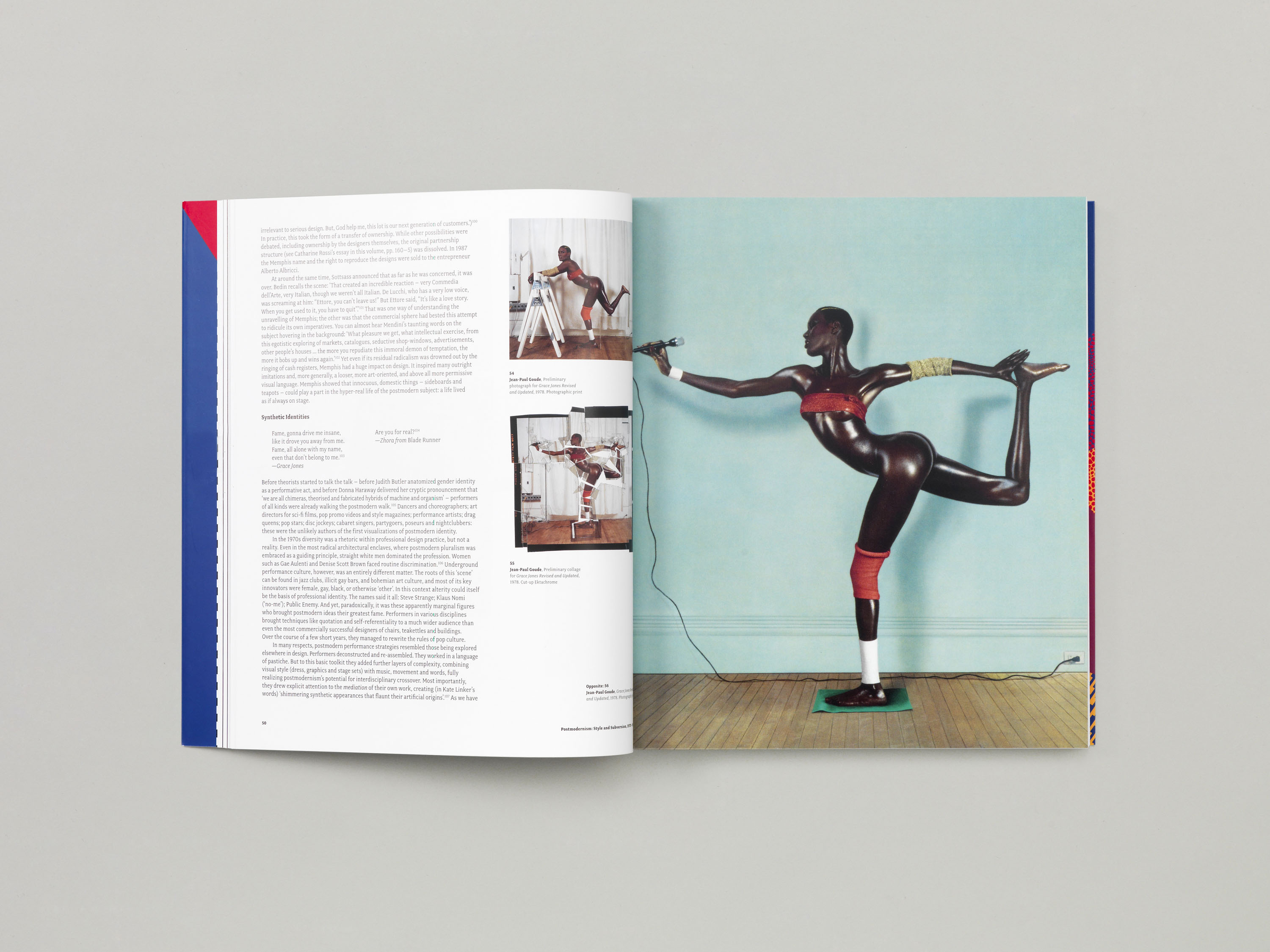
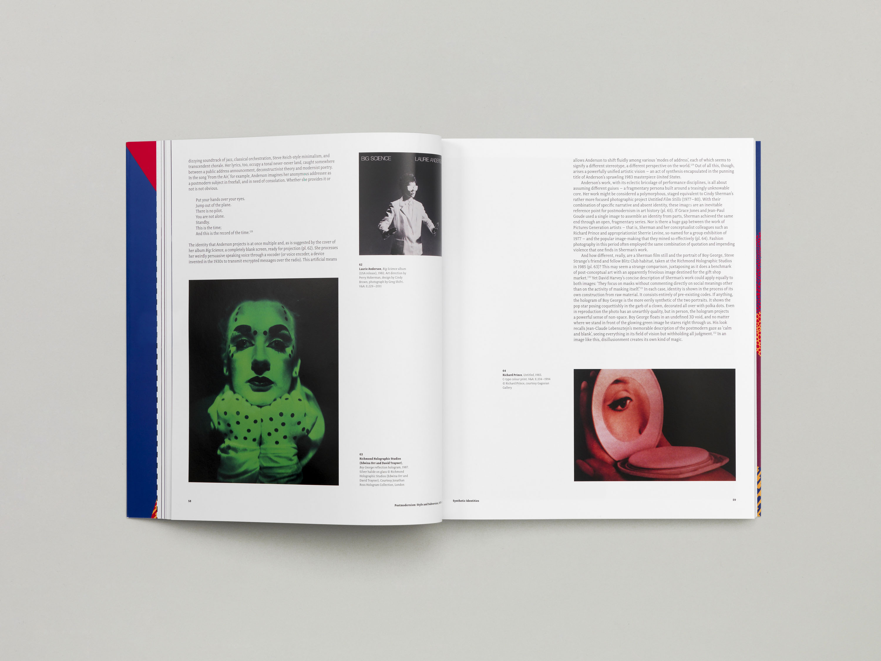
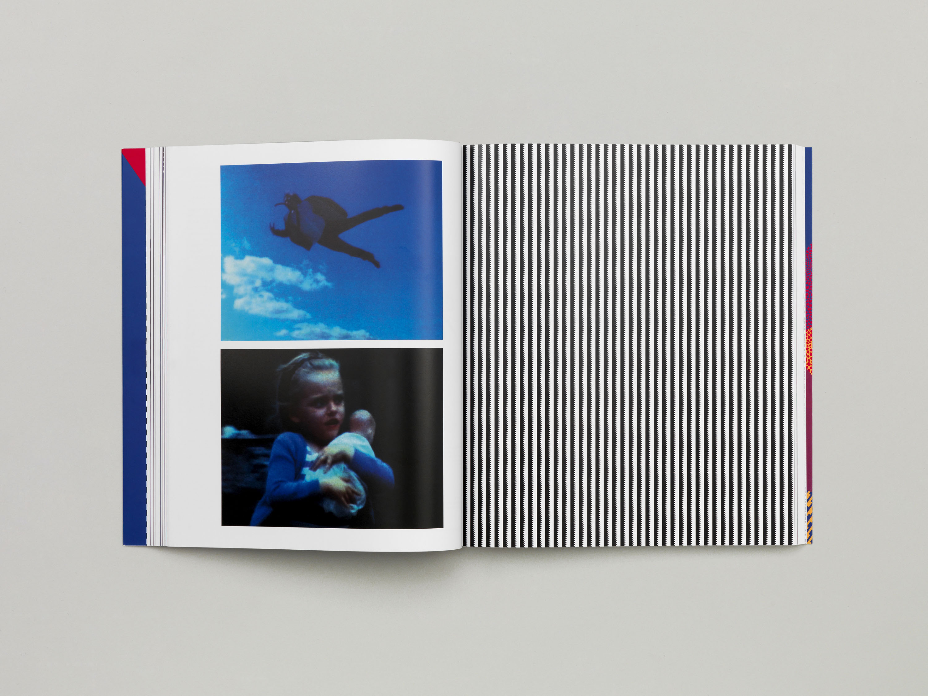
We were commissioned to design the catalogue that accompanied the exhibition Postmodernism: Style and Subversion 1970–1990 at the Victoria & Albert Museum, London. This built further upon the ideas we explored within the exhibition's design, extending the use of pattern and vibrant colour and using the same three Memphis patterns that were reproduced for the exhibition as section breakers within the book. The catalogue is set in the same typefaces as the show – Fairplex by Emigré for the body text, and Compacta for titles – and is based upon a two column grid, allowing images to sit at a variety of sizes and also to accommodate extensive source material, from product details to contextual photography.
