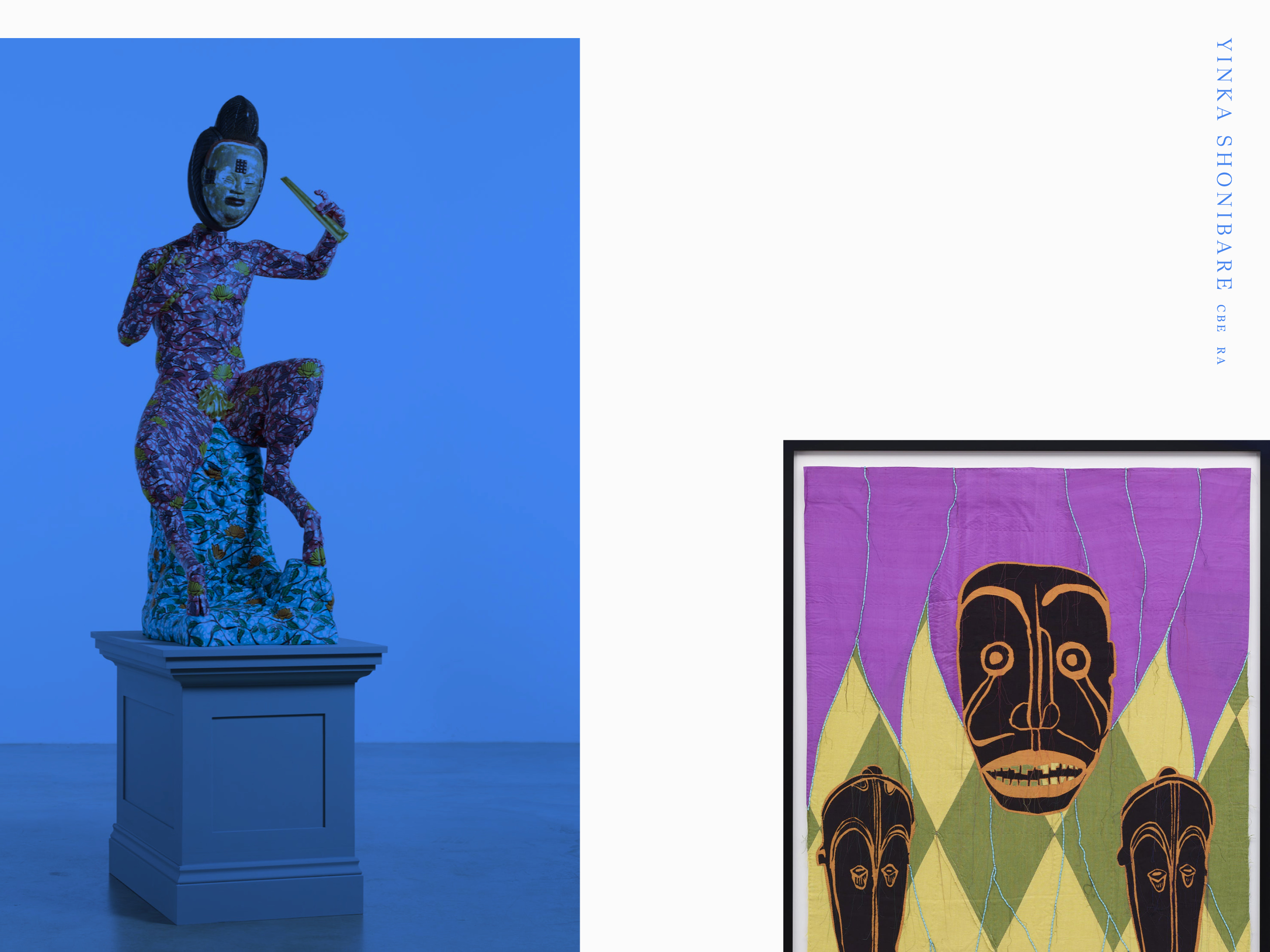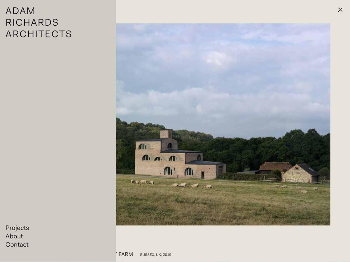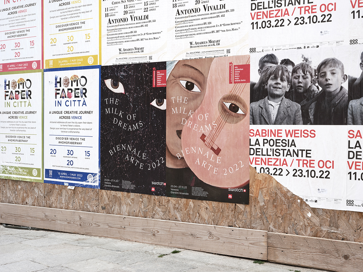


Established in 1972, Momart provides specialist fine art storage, transport and installation for artists, collectors, galleries and museums worldwide. We developed a new brand identity and website to reflect Momart’s long-established reputation and expertise.
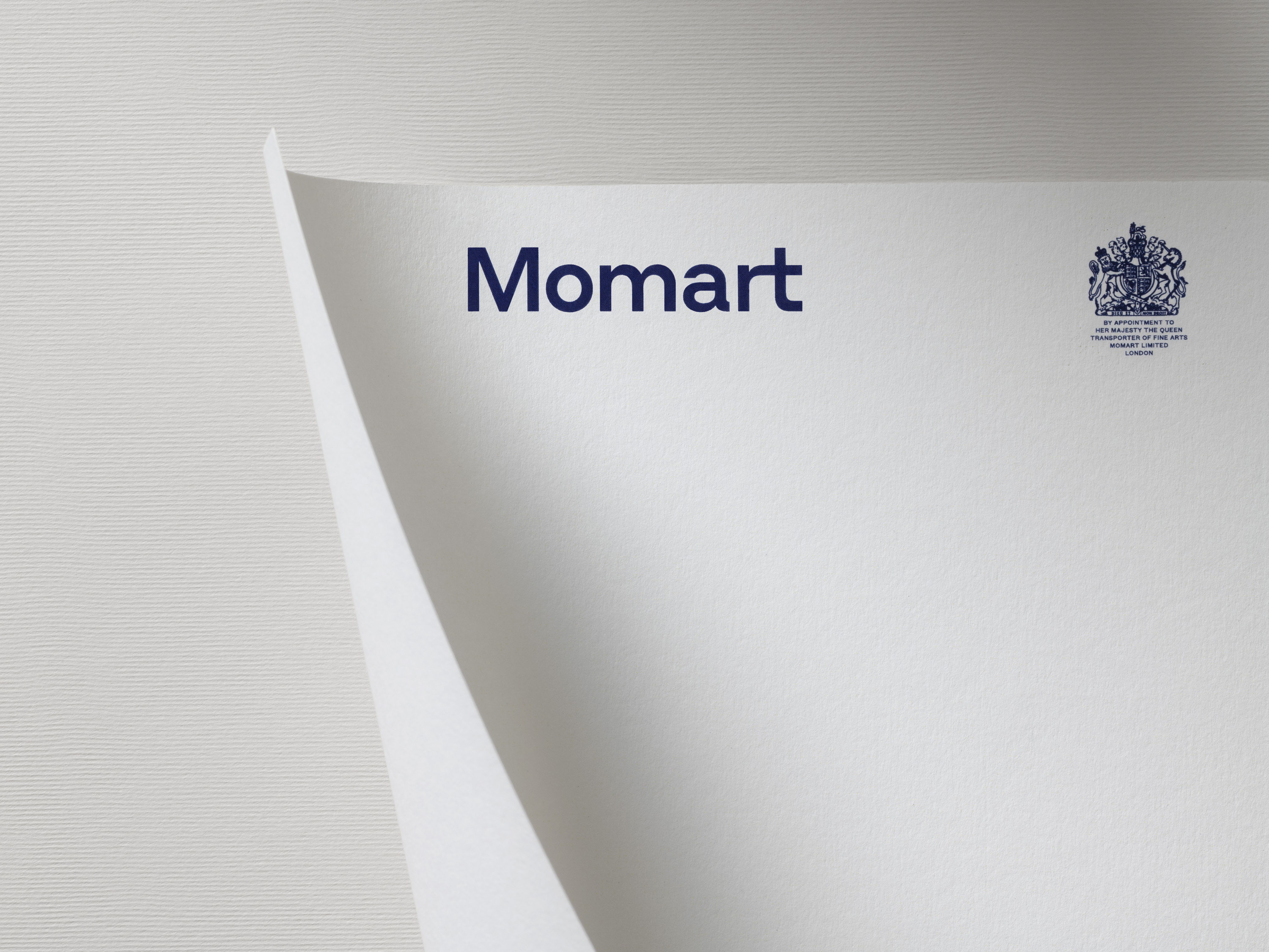
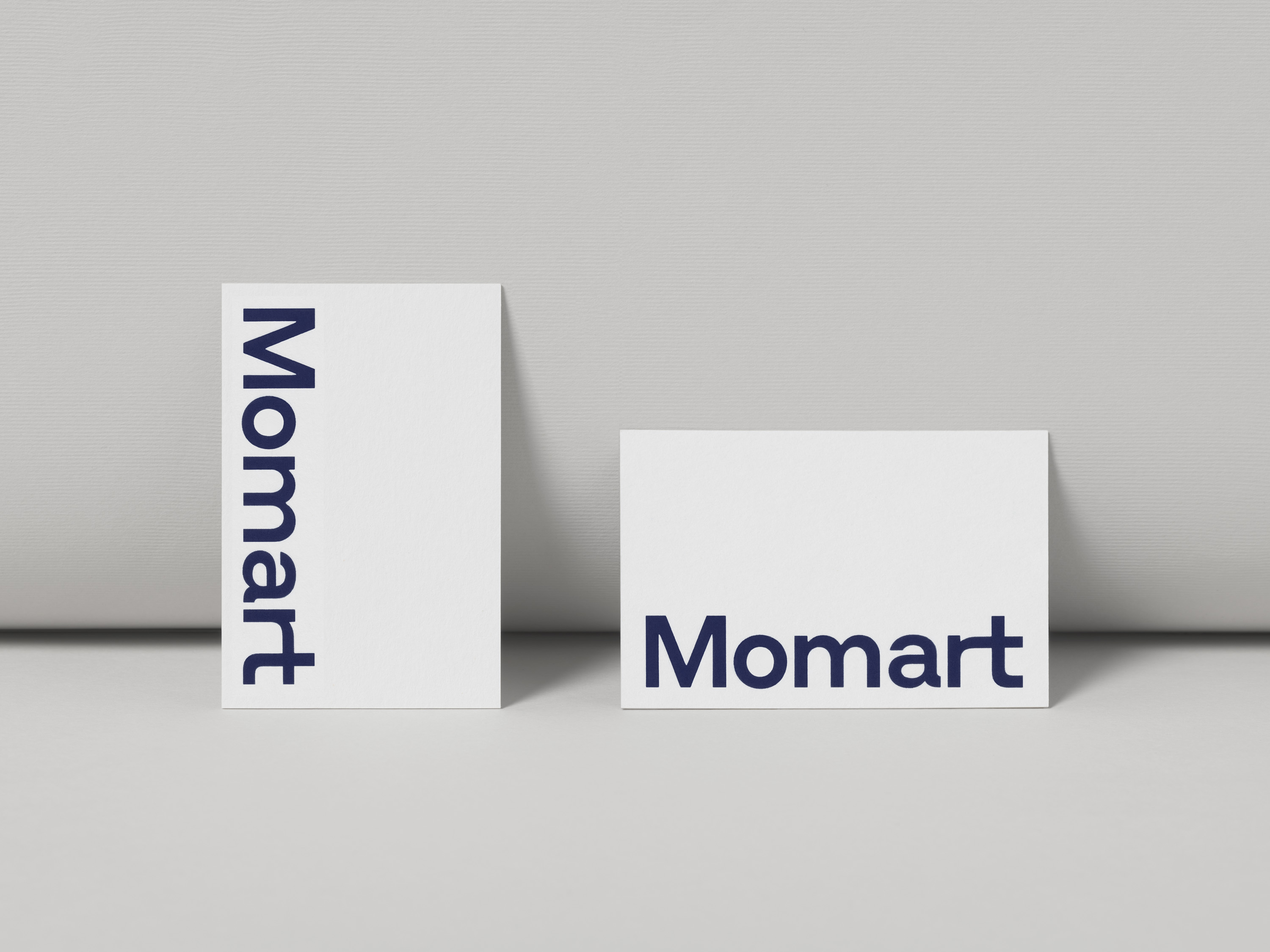
The logo draws inspiration from Momart’s archives and reinterprets the original lettering designed by Gordon House. The design is clean and bold, with bespoke details bringing character and fluidity to the brand identity. The ‘r’ and ‘t’ are connected with a bespoke ligature – a piece of typographic furniture designed specifically to fit these letters – reflecting the craftsmanship of Momart’s bespoke artwork cases.
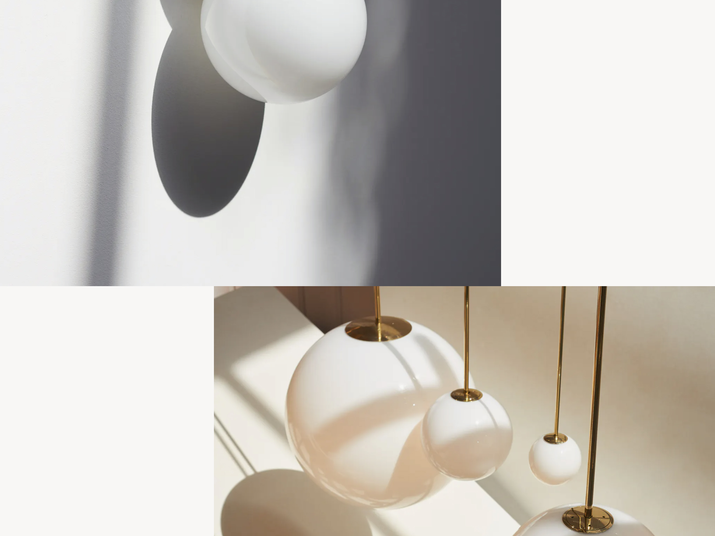
The new website uses a clear hierarchy, guiding viewers through its various content in order to showcase the breadth of Momart’s expertise. New, engaging imagery is displayed at a large-scale to communicate the thoughtful and caring ethos underlying the brand’s logistics services. The signature blue colour seen across the website evolves from the previous identity, reflecting Momart’s sustained commitment to its long-standing partners.
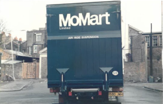
Photograph from Momart's archive.
Build by Simon Rogers