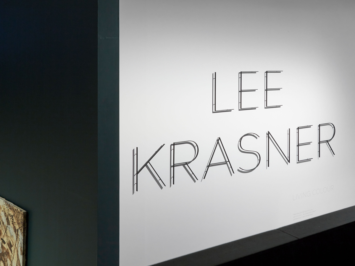
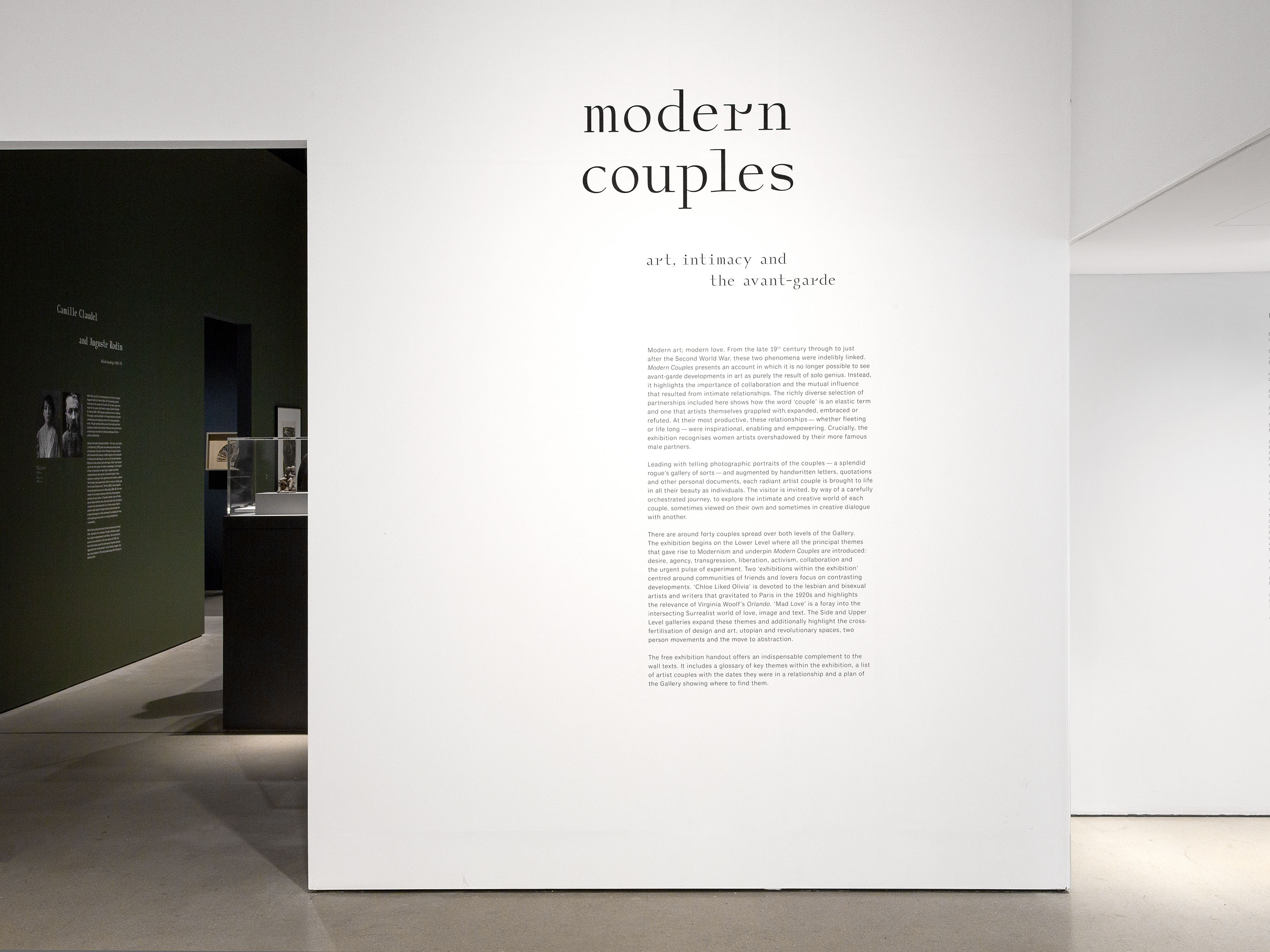
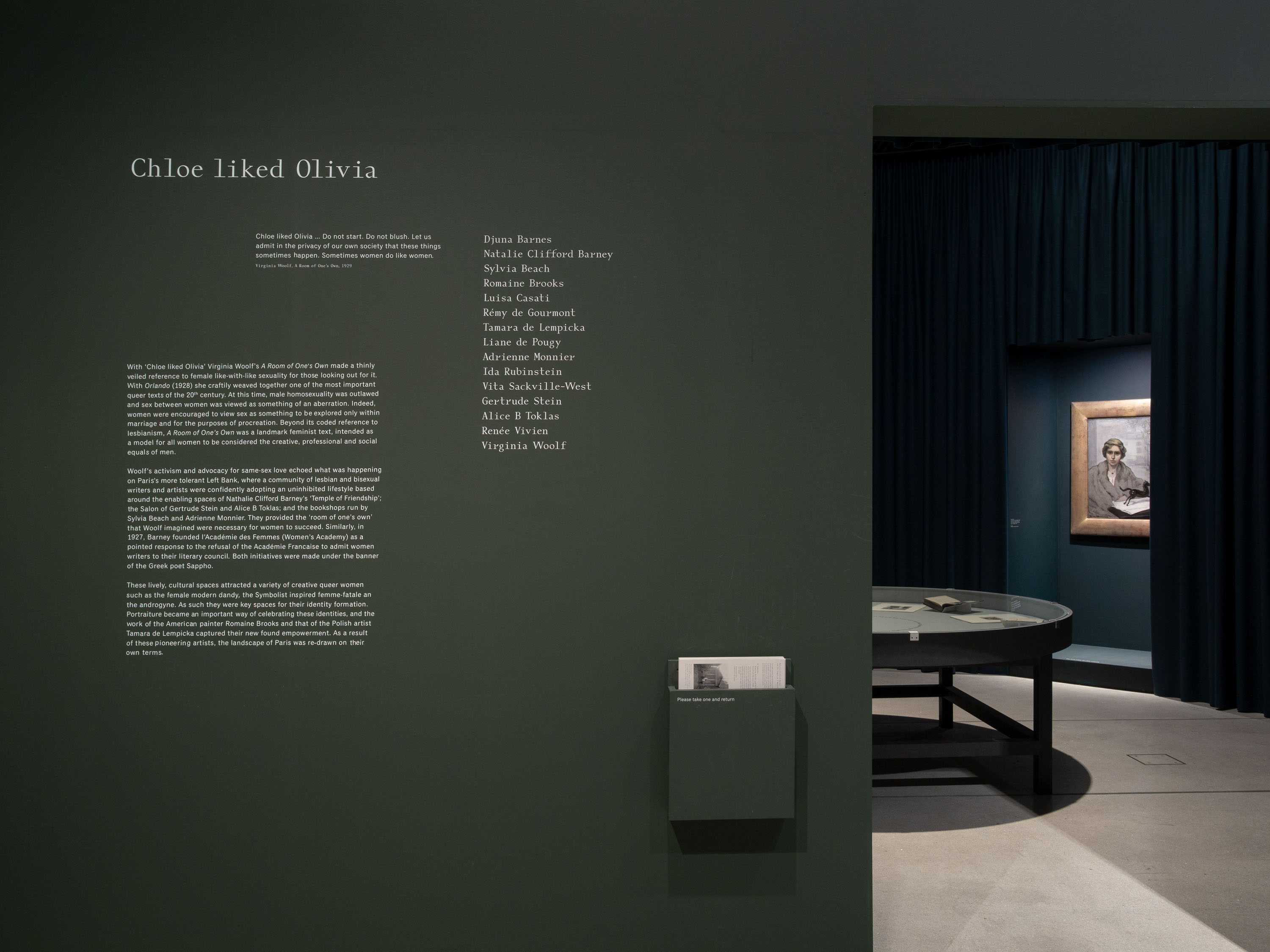
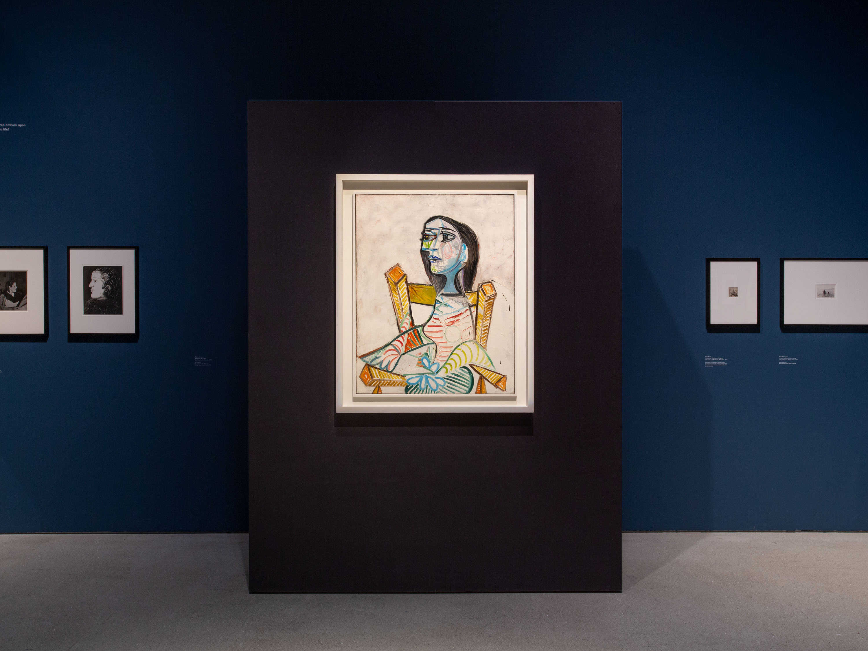
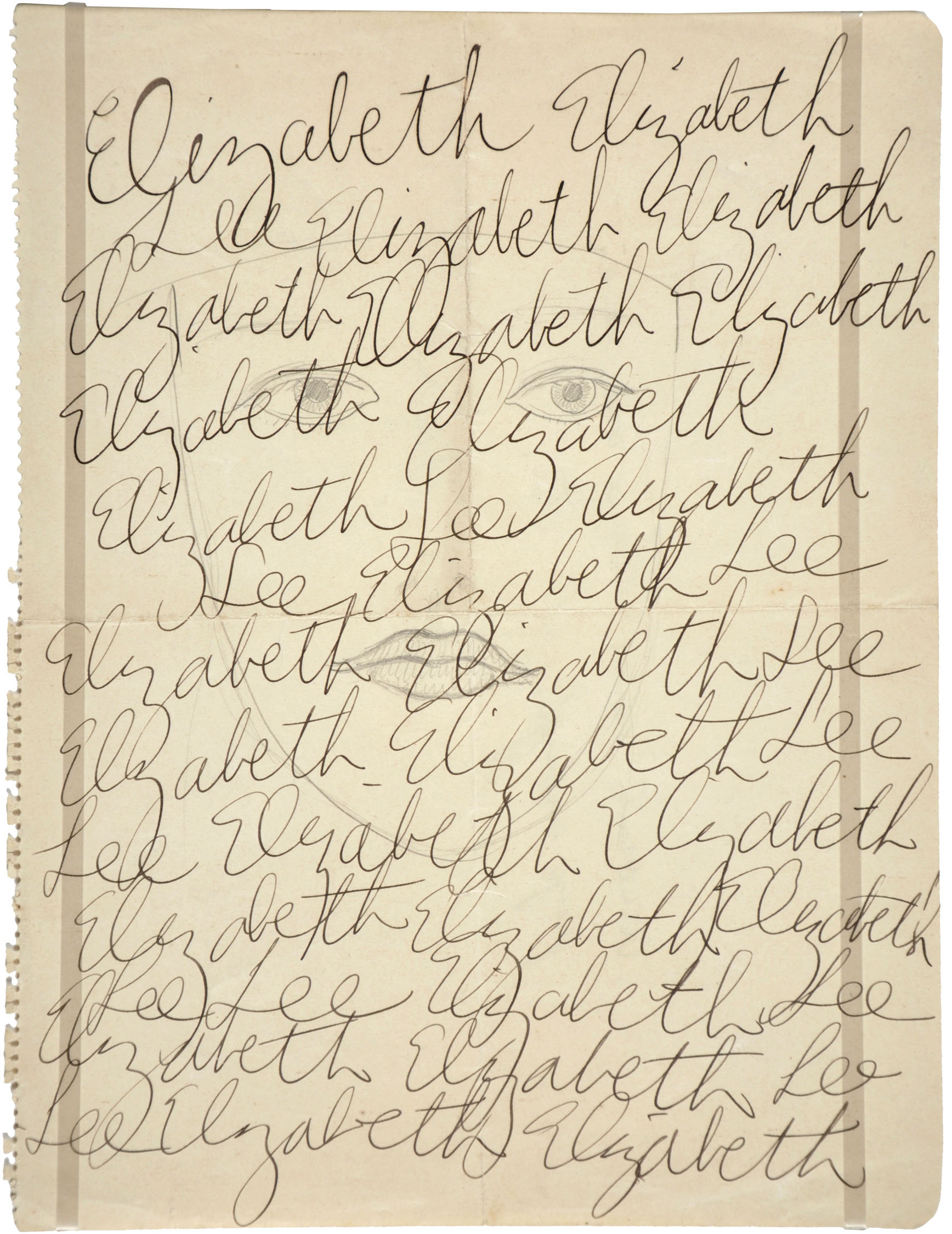
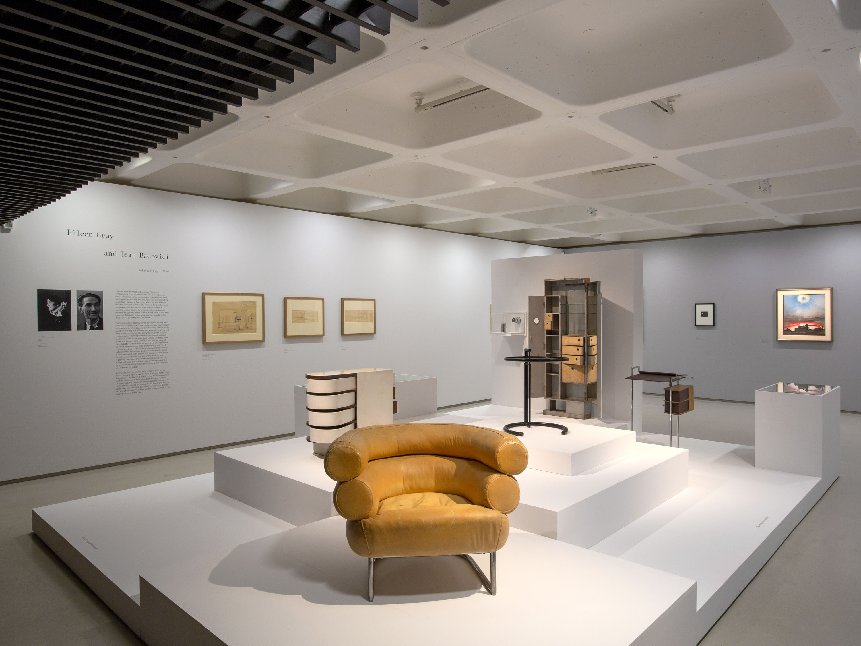
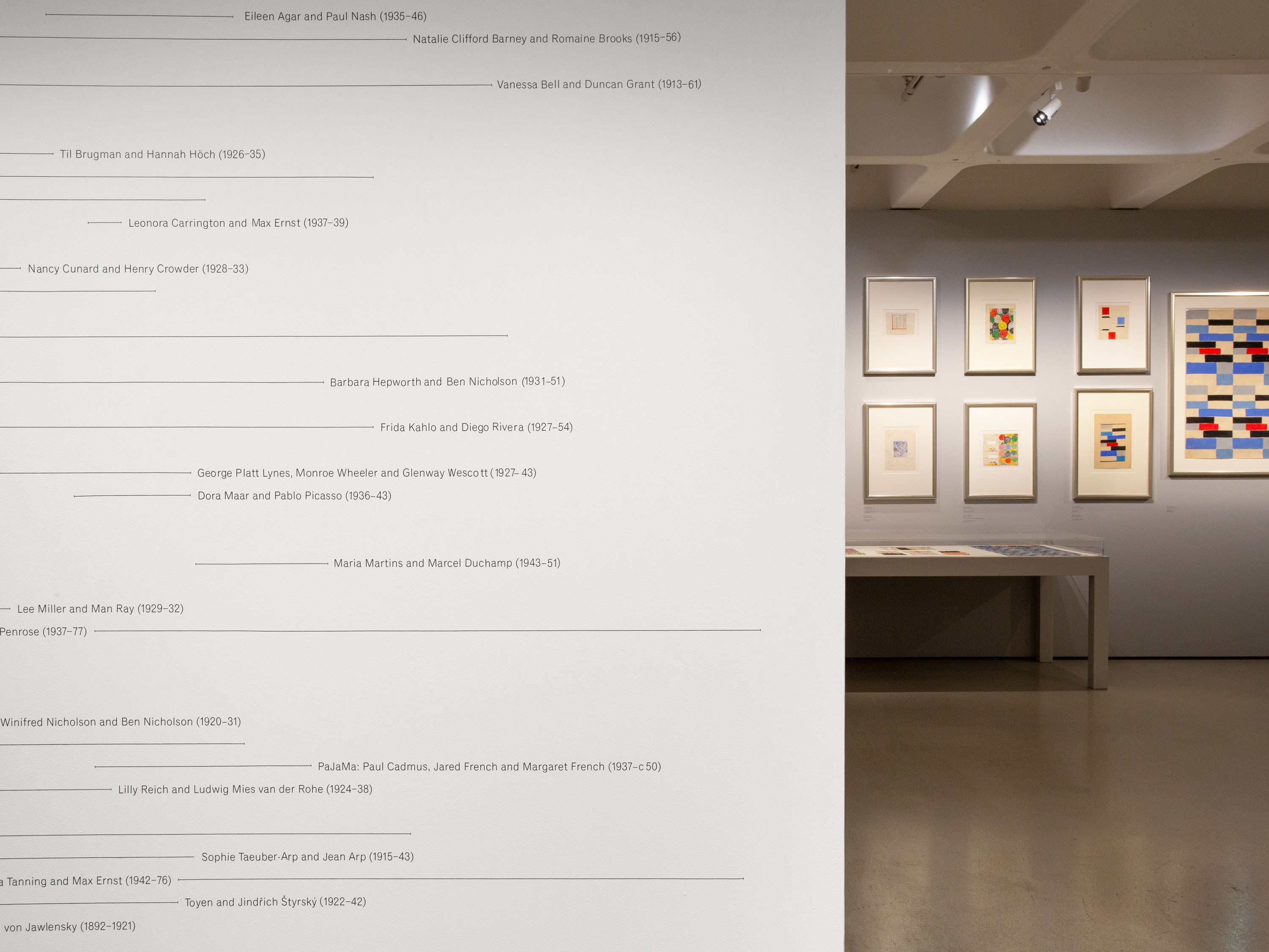
Held at Barbican Art Gallery in autumn 2018, Modern Couples: Art, Intimacy & the Avant-garde showcased the work of over forty creative couples working in the first half of the 20th century, encompassing sculpture, painting, drawing, photography, design, architecture, writing and performance. The exhibition explored the diverse ways in which interpersonal relationships can influence and enrich creative practice.
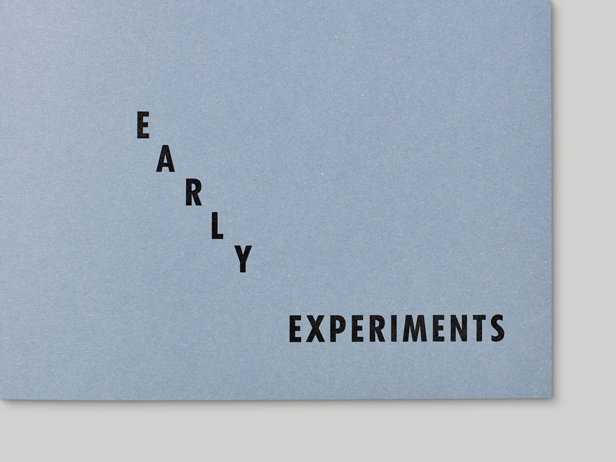
Our design for Modern Couples draws upon the visual language of ephemeral traces left by the featured couples: photo albums, letters and correspondence, diaries, journals and other paper-based artifacts; we also referenced a number of developments in typographic style and technology within that period. Headlines were set in GC16, a contemporary monospaced typeface inspired by modern typography of the early 20th century; we made small adjustments to certain characters to add further interest and personality. Body text throughout the exhibition was set in Classic Grotesque.
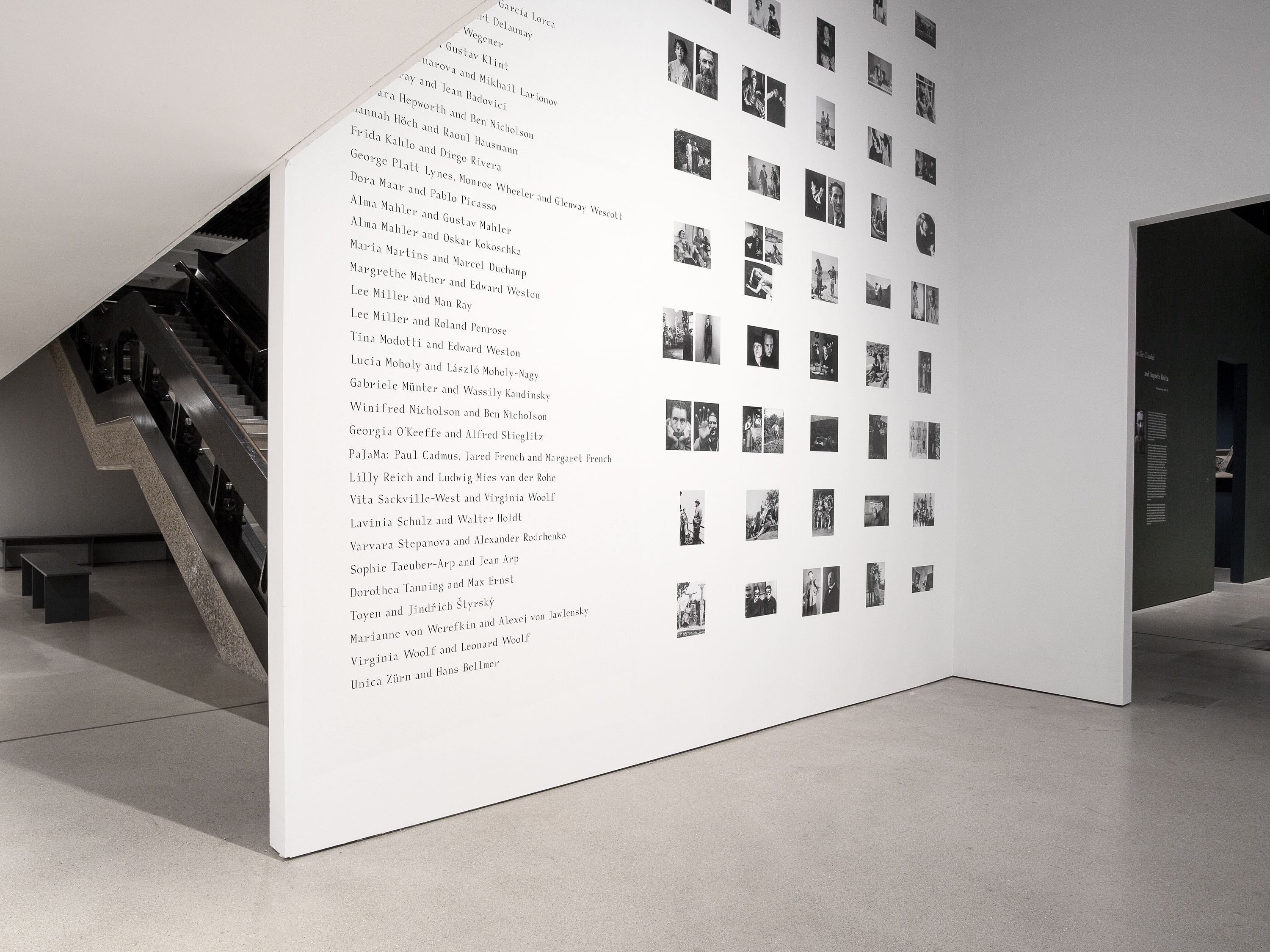
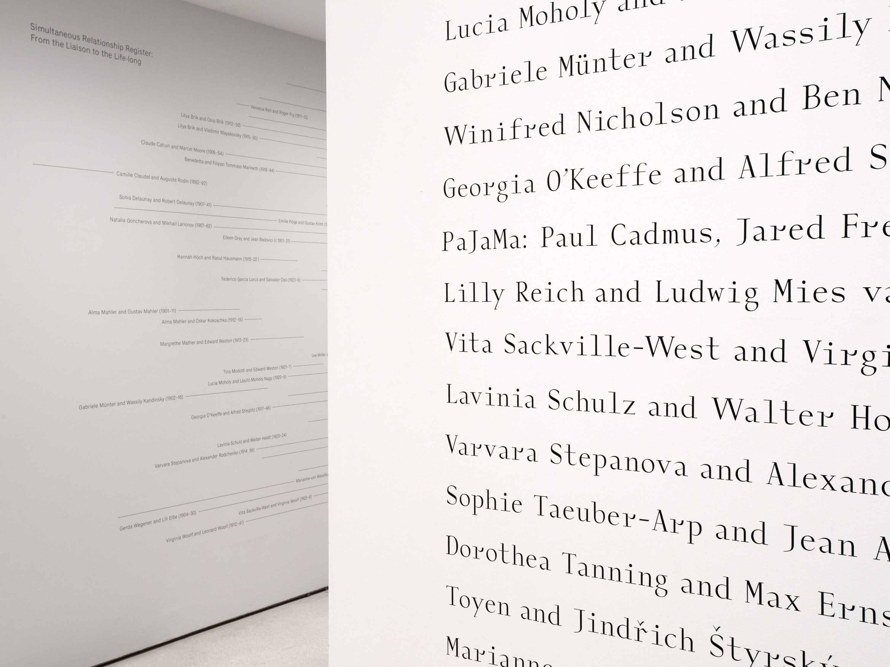
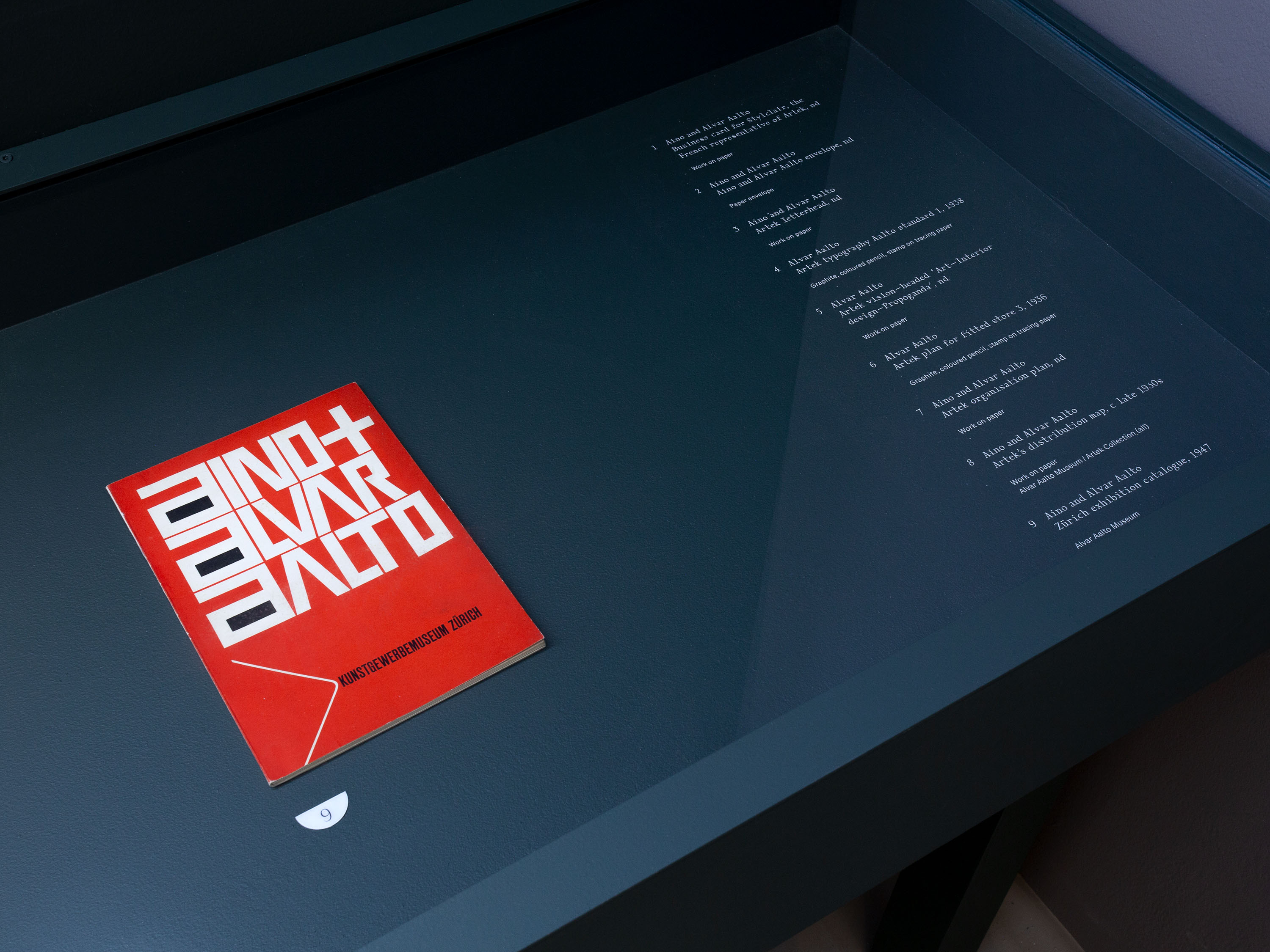
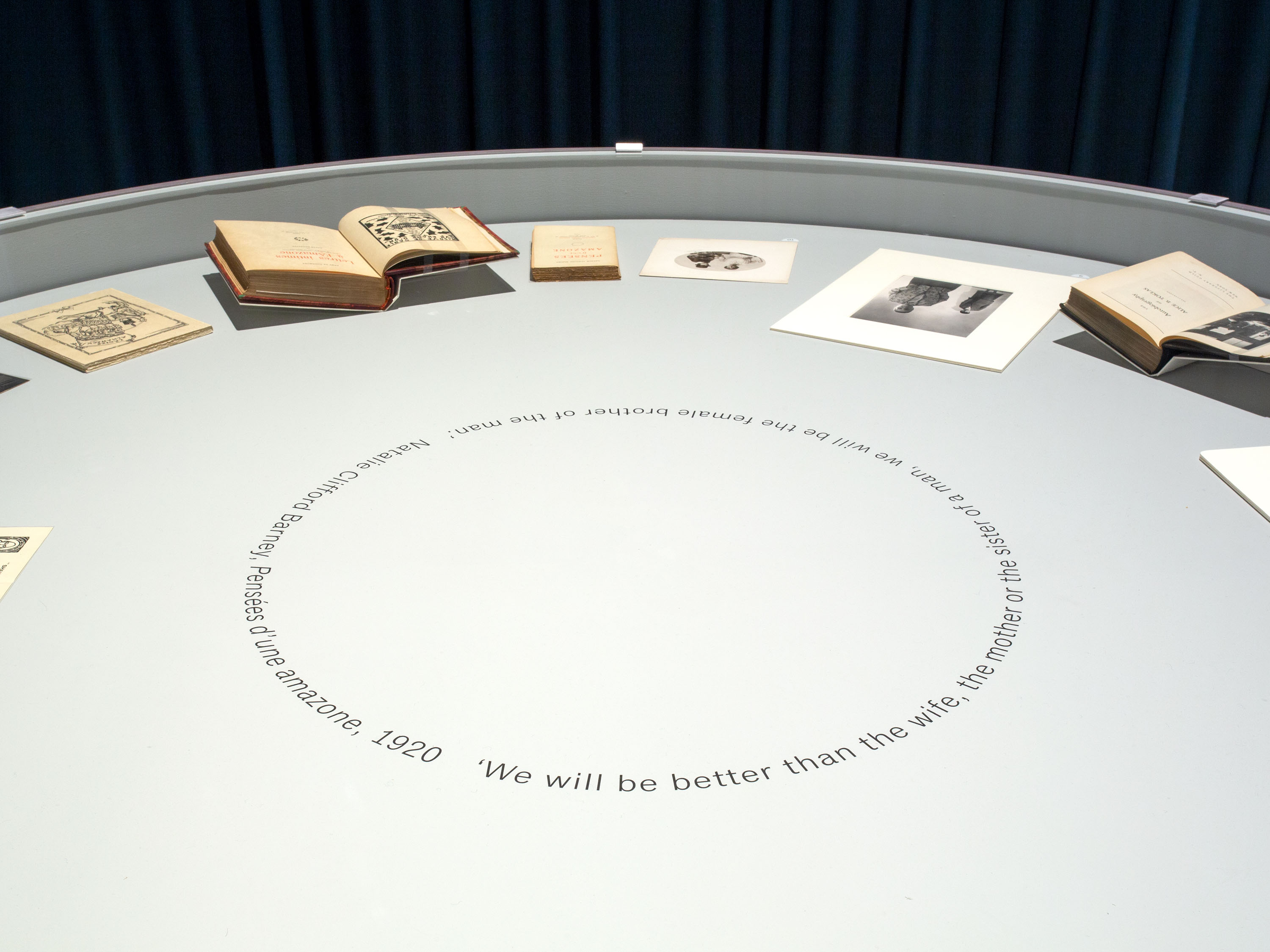
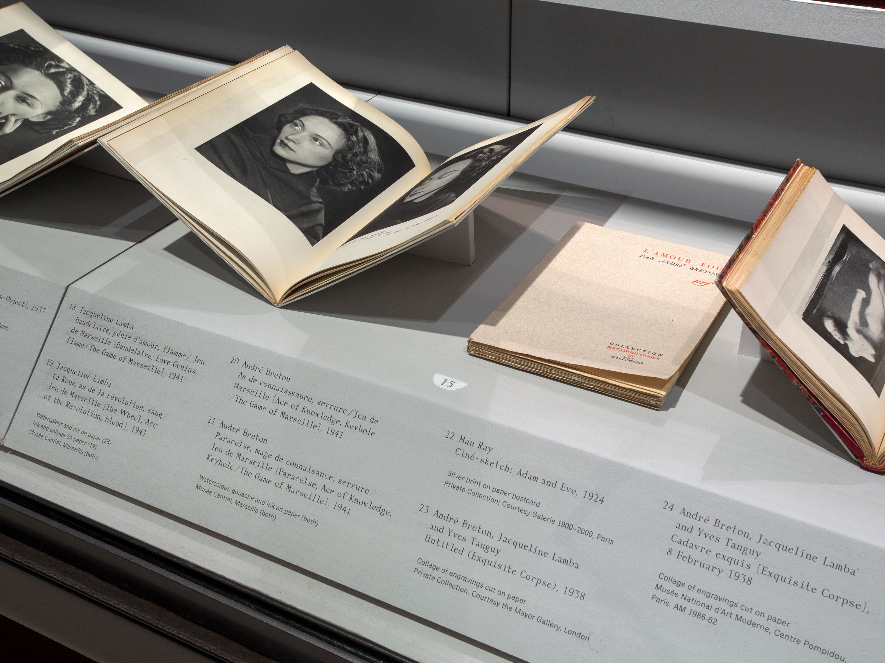
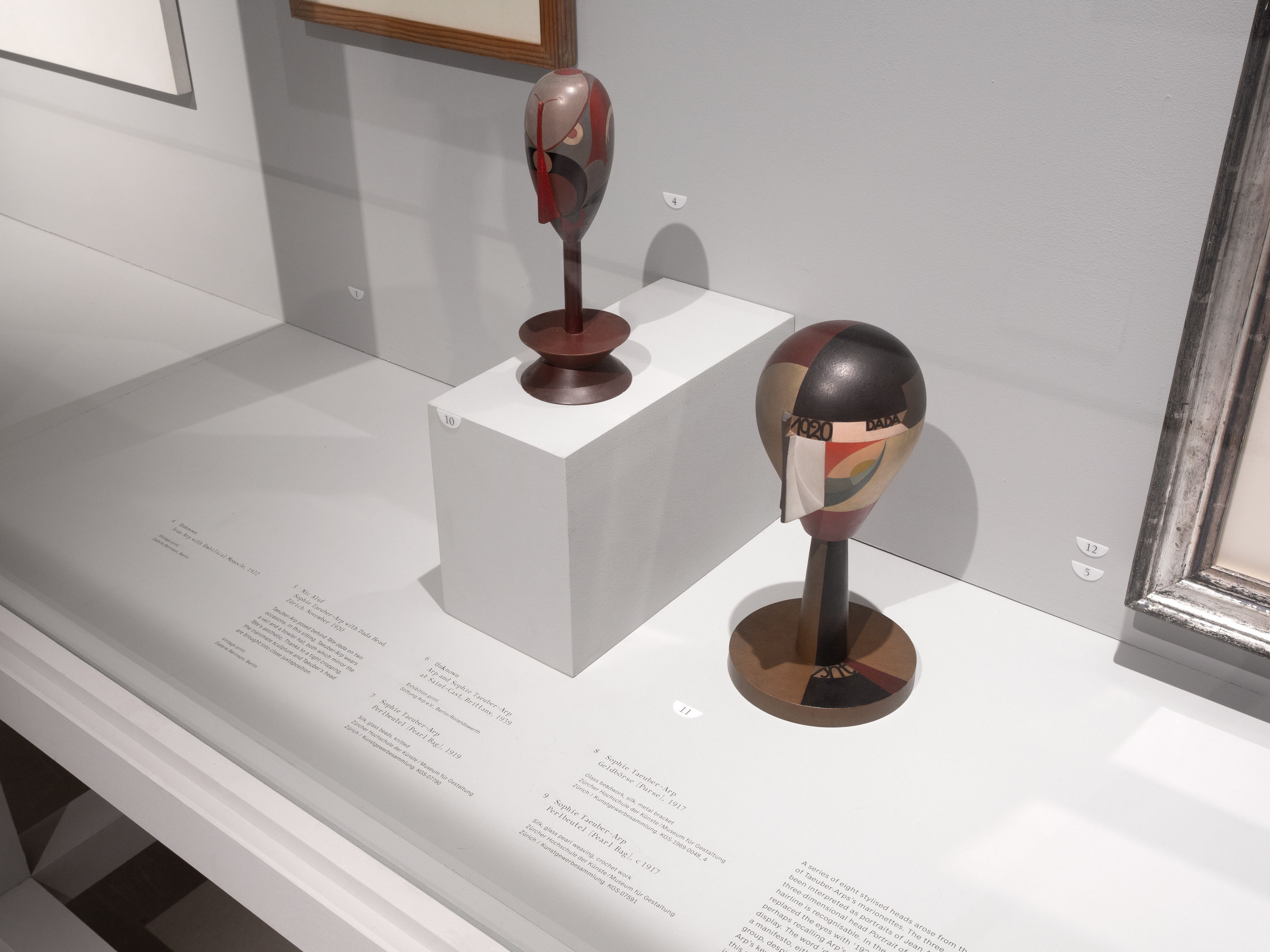
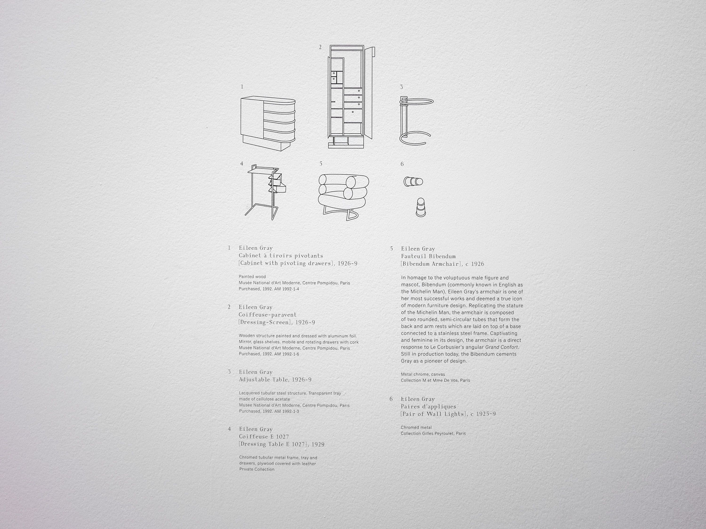
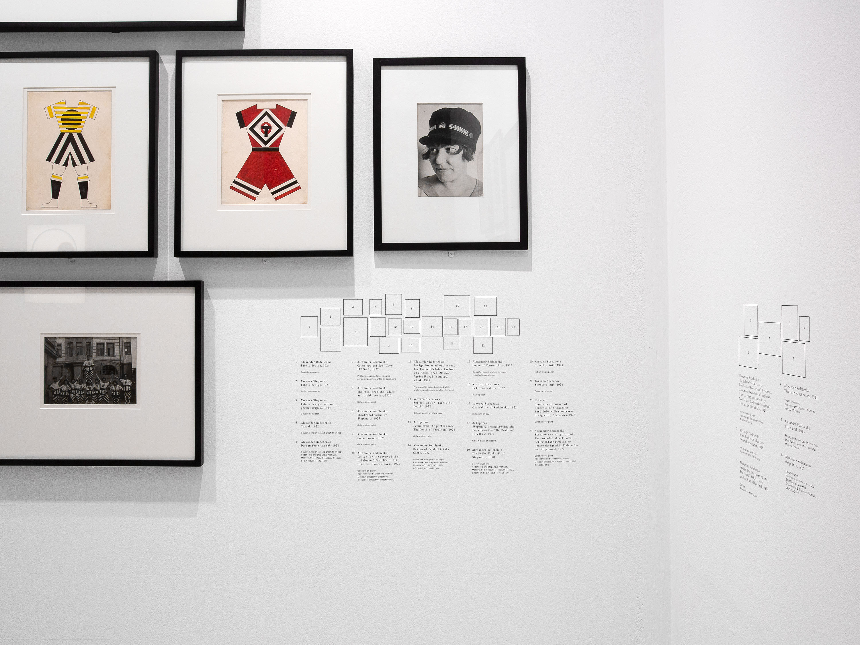
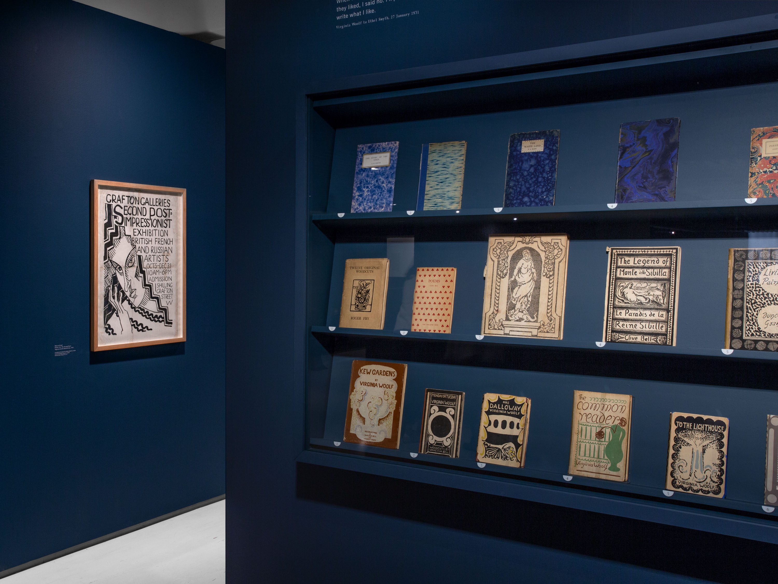
We devised a simple graphic language for captioning and displays within the show to compliment its extensive and varied exhibits. Artist quotes within the various rooms were reproduced at small sizes, conveying an intimate tone of voice, and objects were numbered with semicircular markers derived from the circular motif used frequently within the three-dimensional design of the exhibition.
Classic Grotesque is a revision and expansion of Monotype Grotesque, which was first published in 1926 as one of the first typefaces designed with automatic typesetting, an emerging technology during the Modern period, in mind.
Exhibition photography: Thomas Adank
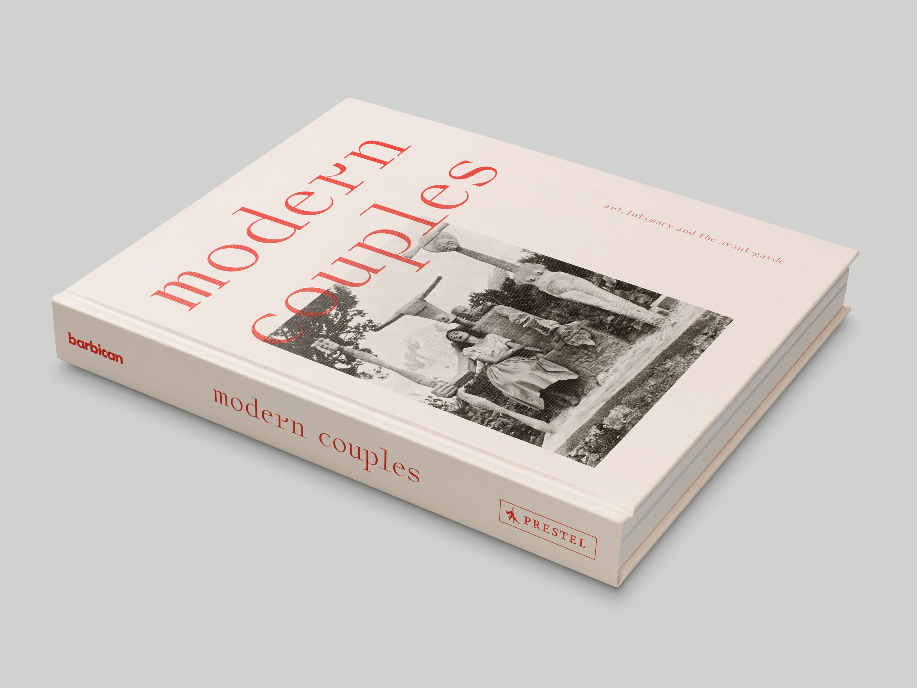
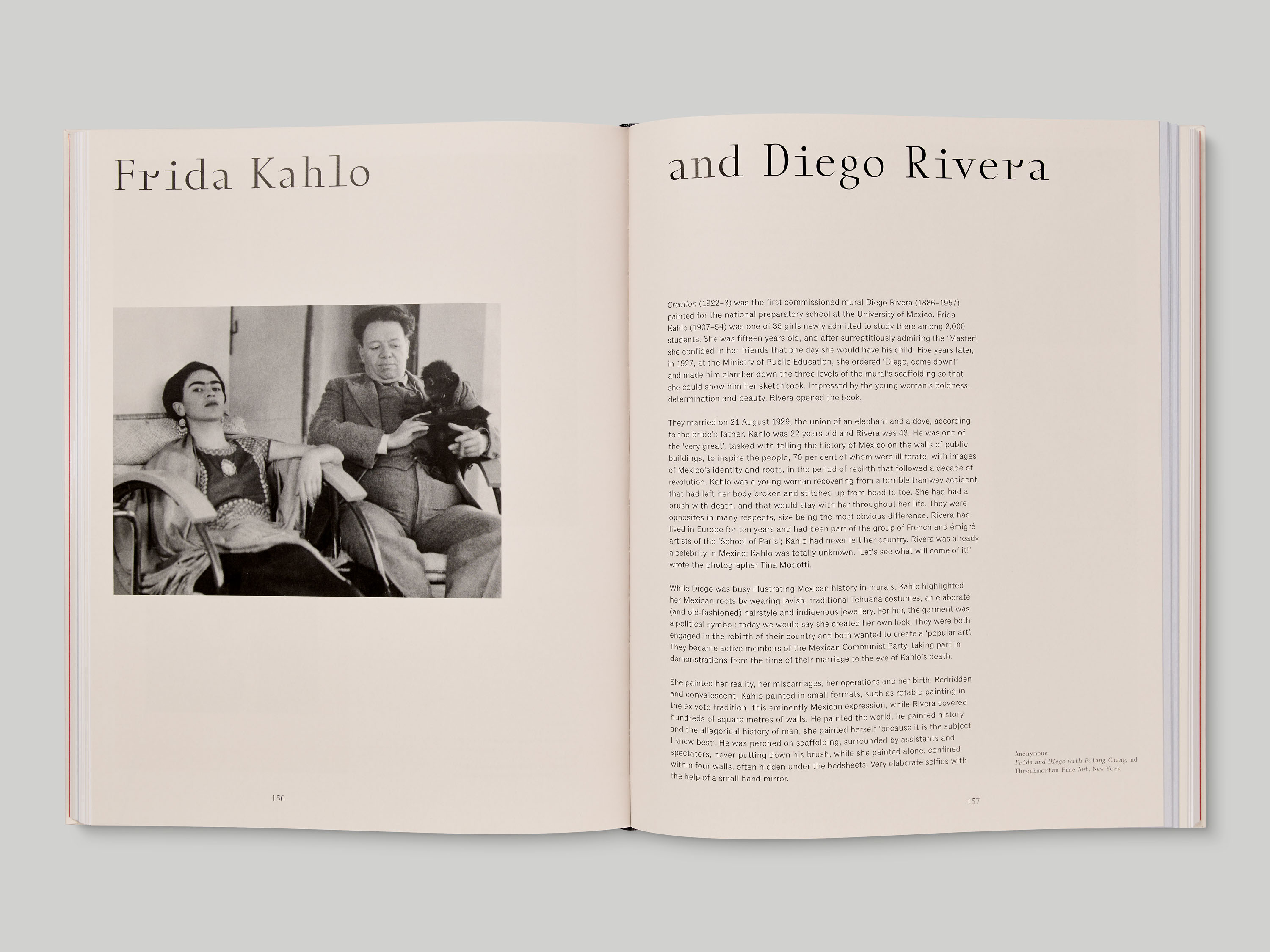

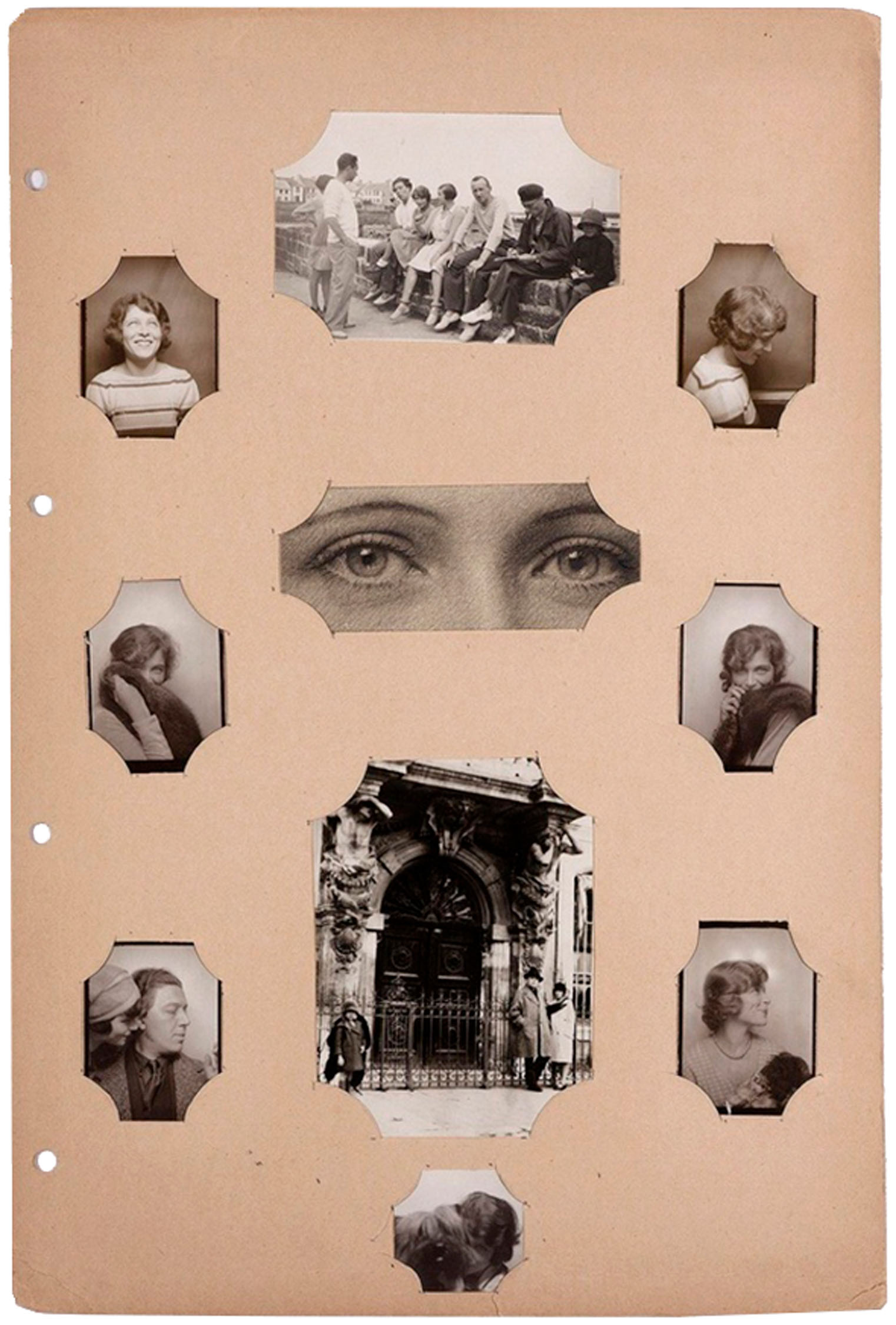
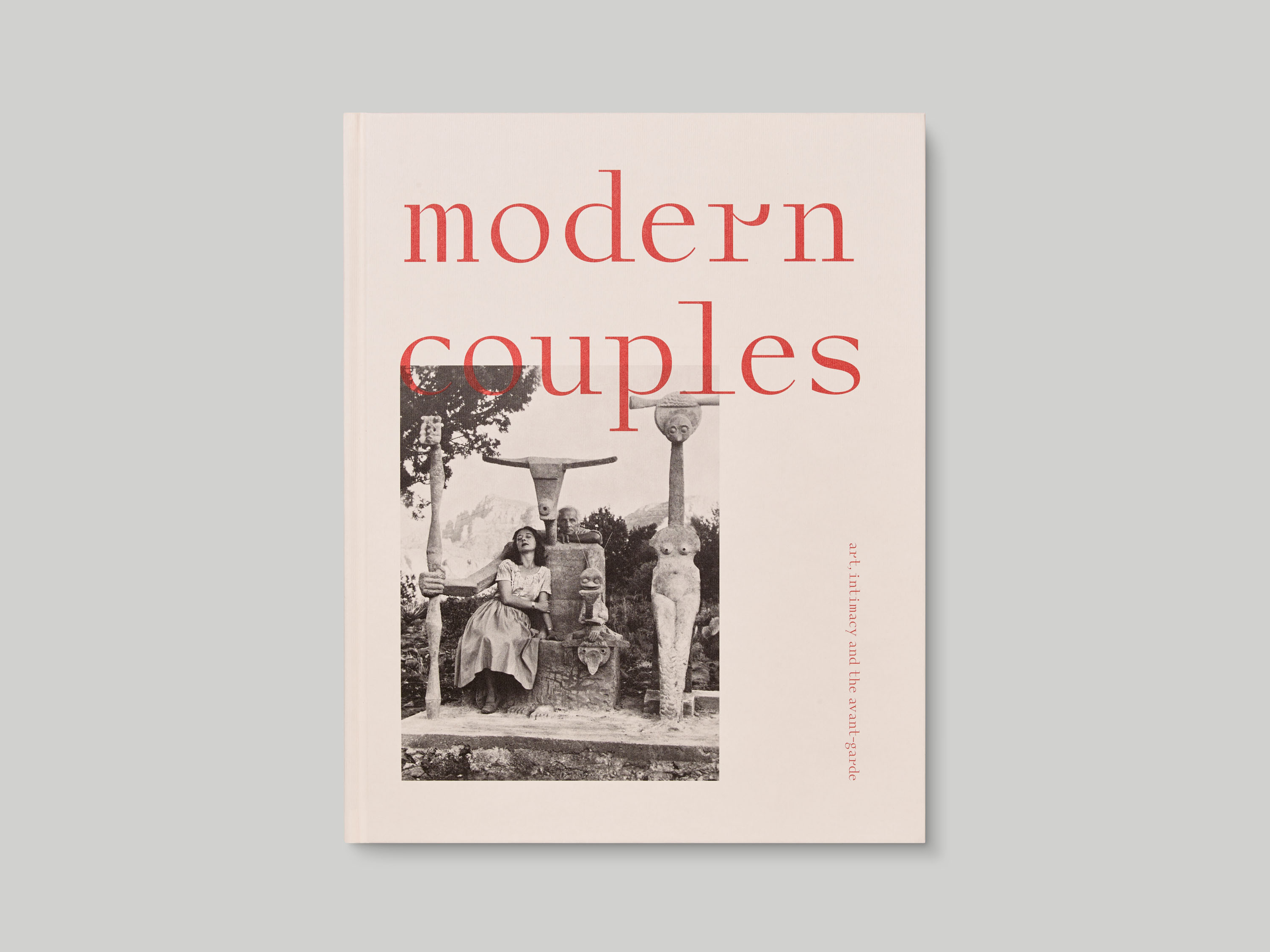
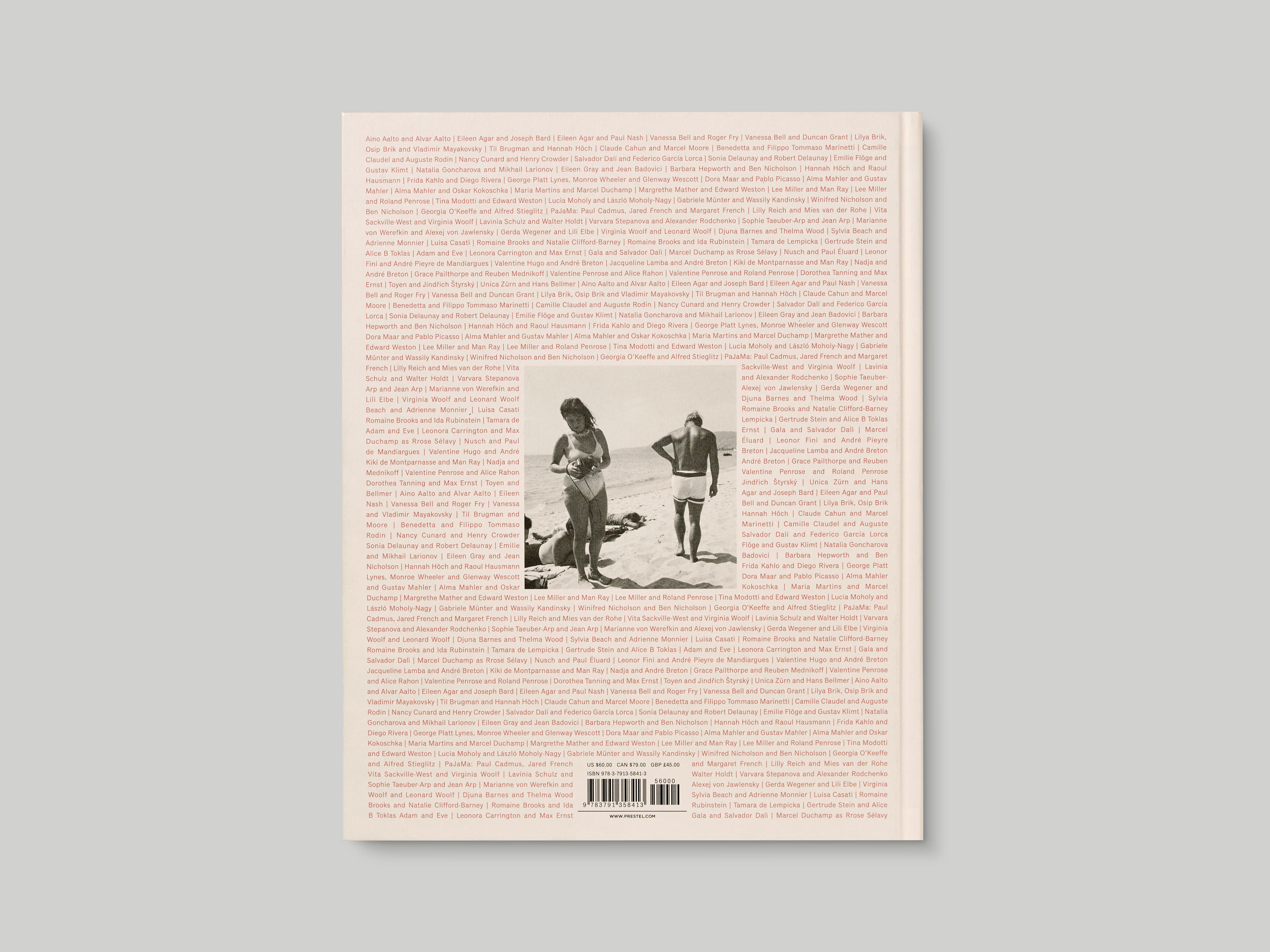
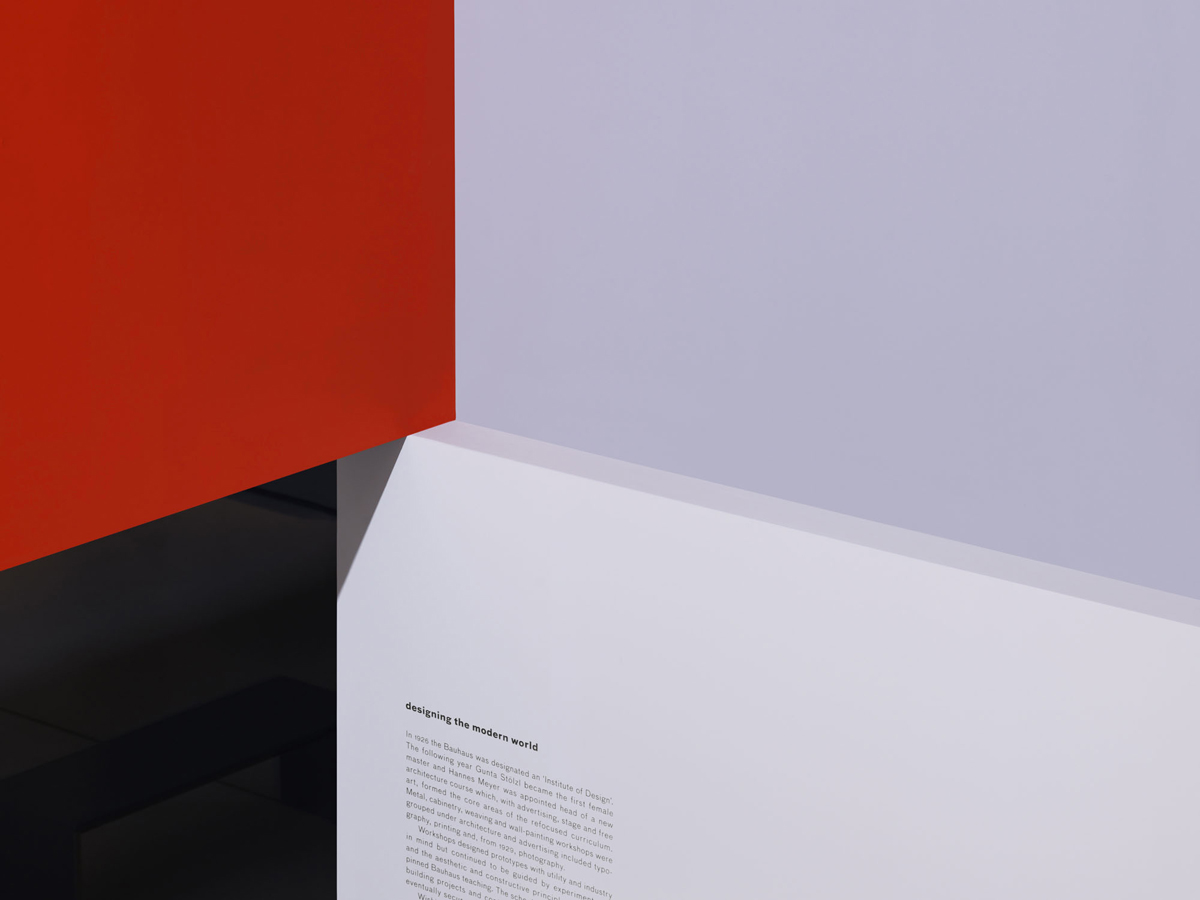
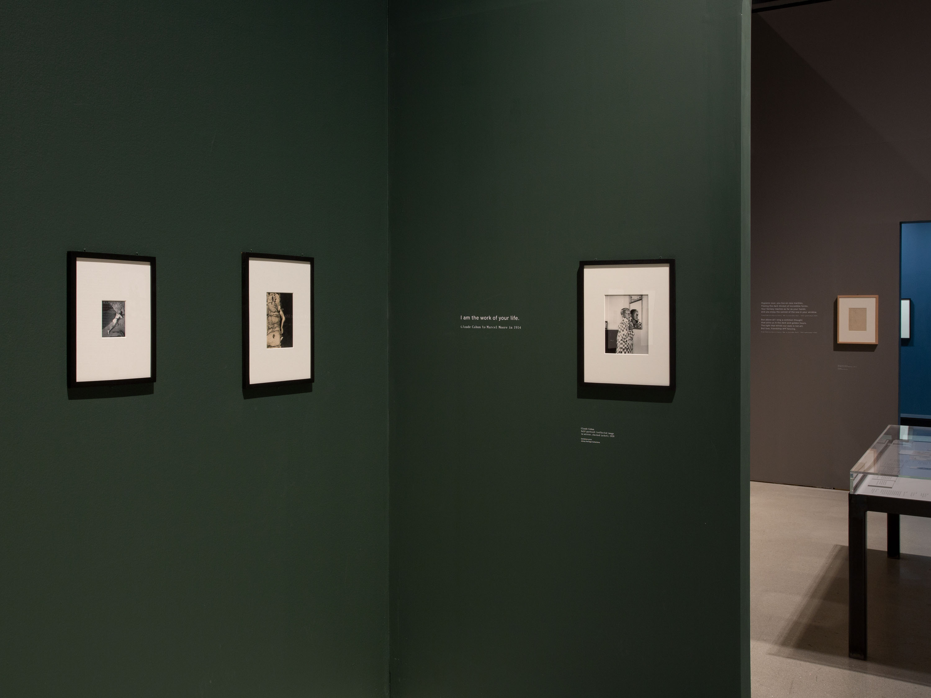
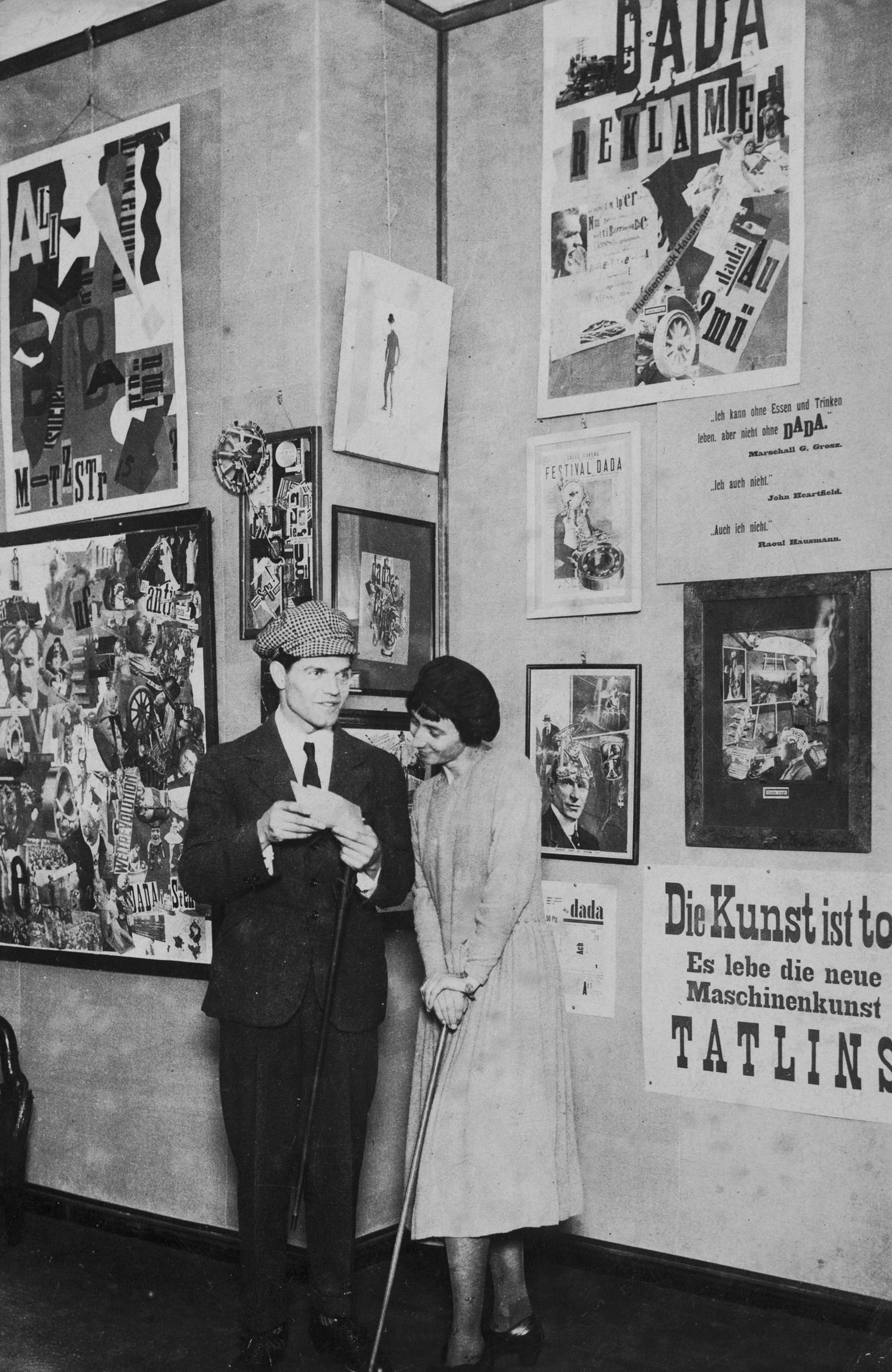
Modern Couples: Art, Intimacy & the Avant-garde’s muted colour palette was derived from the many paper-based works included in the accompanying exhibition at Barbican Art Gallery; this is echoed by the use of textured laid paper for the book cover and selected sections within. The red used on the cover provides a visual connection to Surrealism and Russian Constructivism – both movements are represented extensively within the exhibition – and the back-cover design was inspired by a magazine cover featuring Marcel Duchamp’s alter-ego Rrose Sélavy, which is included in the show. Where photographic images are incorporated into the exhibition and publication design, they are reproduced at varied sizes without the use of a rigid grid, referencing the layouts found in photo albums within the exhibition.