
Modern Art in America traces the emergence and trajectory of Modernism in the United States, from the beginning of the twentieth century to the late 1960s. Written by William Agee, it contains over 270 colour illustrations.
The design concept for the book reflects the ideas highlighted within the text: the balance in early modernism between classicism, craft and purity. We took a fresh look at Modernist typography in America – in particular, the earlier period where the Arts & Crafts movement was still a big influence on Modernism. The use of the typeface Koralle on the cover, which we created from early 20th-century type specimens, reflects this early lesser-known Modernism. The layouts reflect the asymmetry and harmony of modernist design, leaving enough white space to allow contrasting images to sit on the same spreads and at multiple sizes.
A renowned authority on Modernism in the US, Agee holds degrees from Princeton and Yale and is Professor of Art History at the City University of New York (CUNY). He has held directorships in museums in Houston and California, and curatorships at The Museum of Modern Art and the Whitney Museum of American Art.
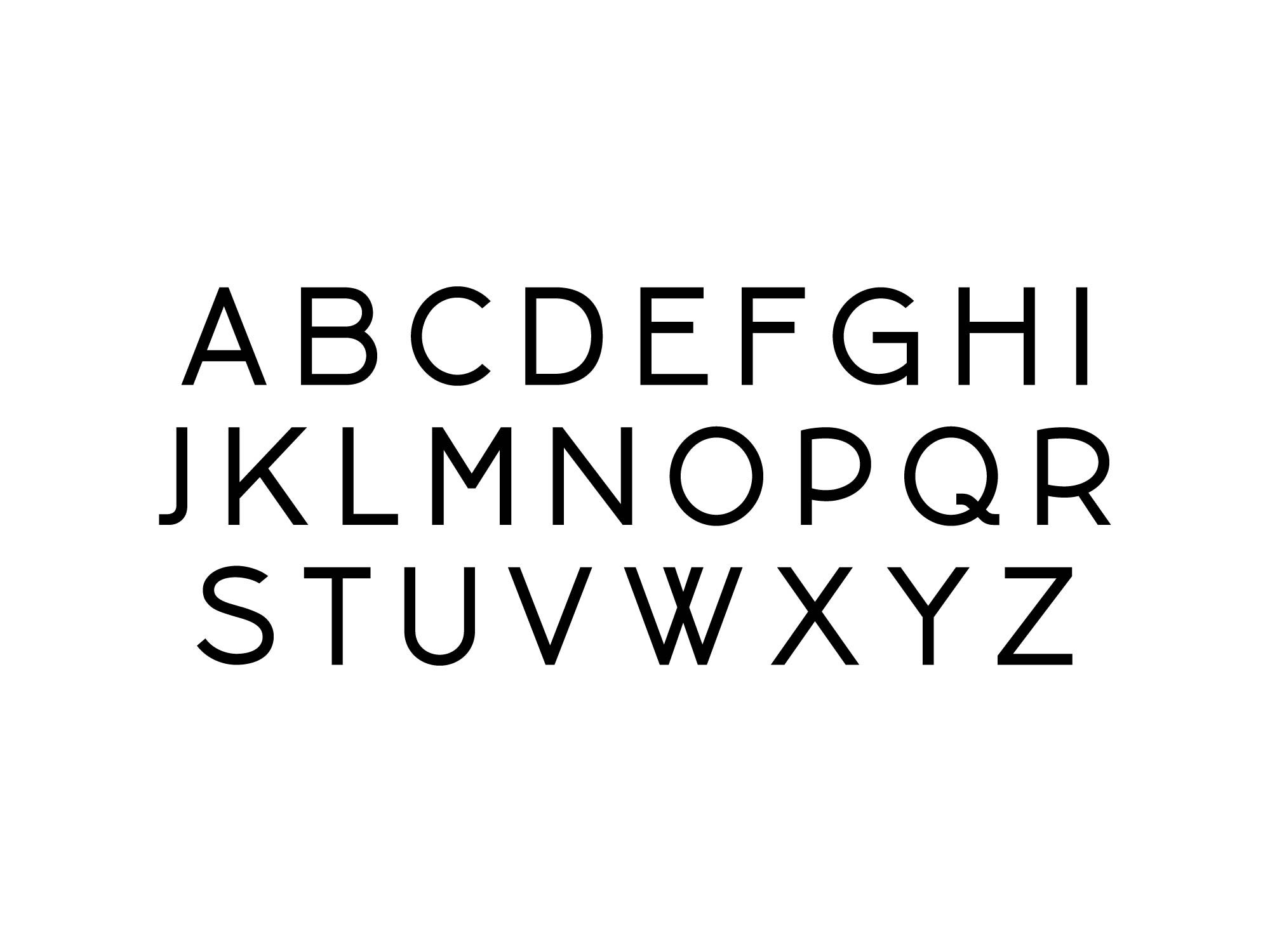
The geometric letters are recognisable as modernist – a move away from the more decadent or serifed typefaces, toward a simpler and purer letter with a continuous line weight. Characteristics such as the raised bar on the E or the large counter in the R reflect an earlier modernism, echoing the balance and harmony of a slightly earlier era.