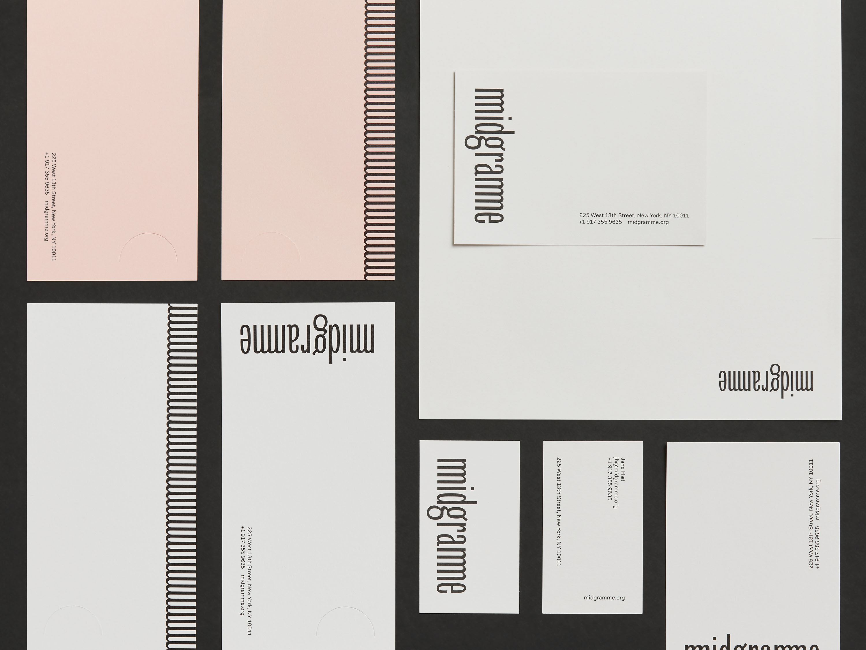
Midgramme is a non-profit arts publishing initiative based in New York. It was envisioned as a press that would provide meaningful representation and new scholarship for artists that are often under-represented within the commercial art world.
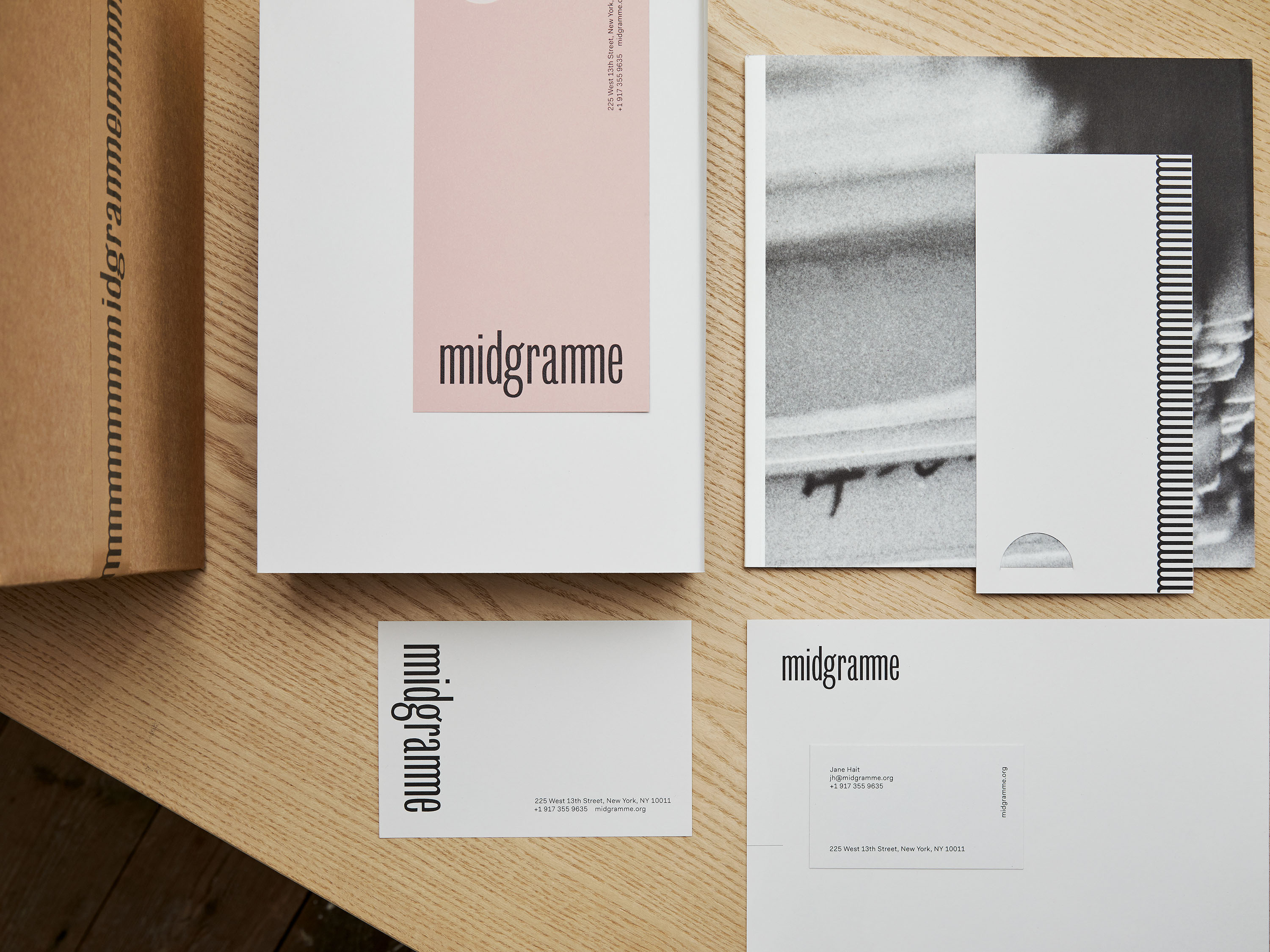
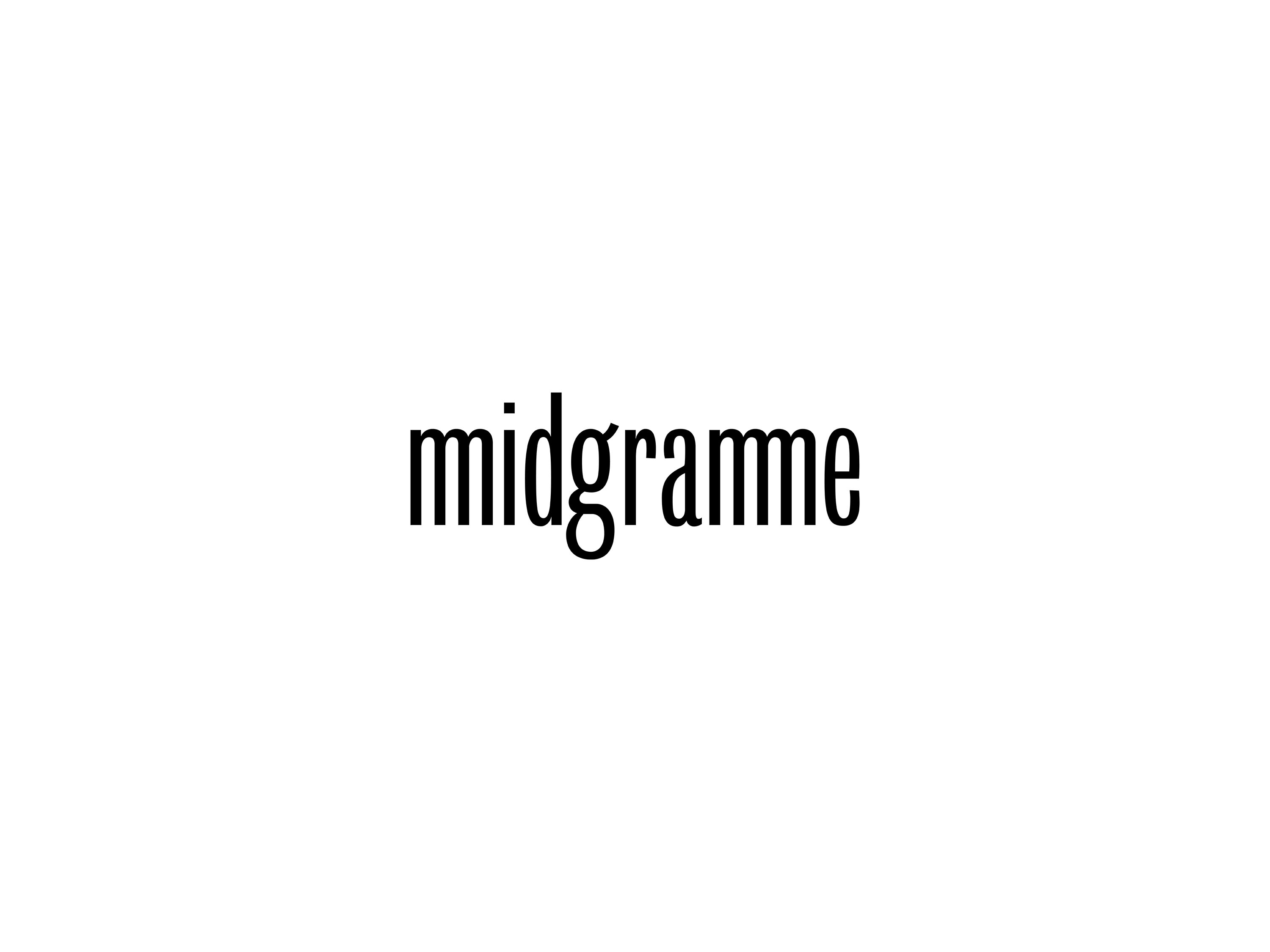
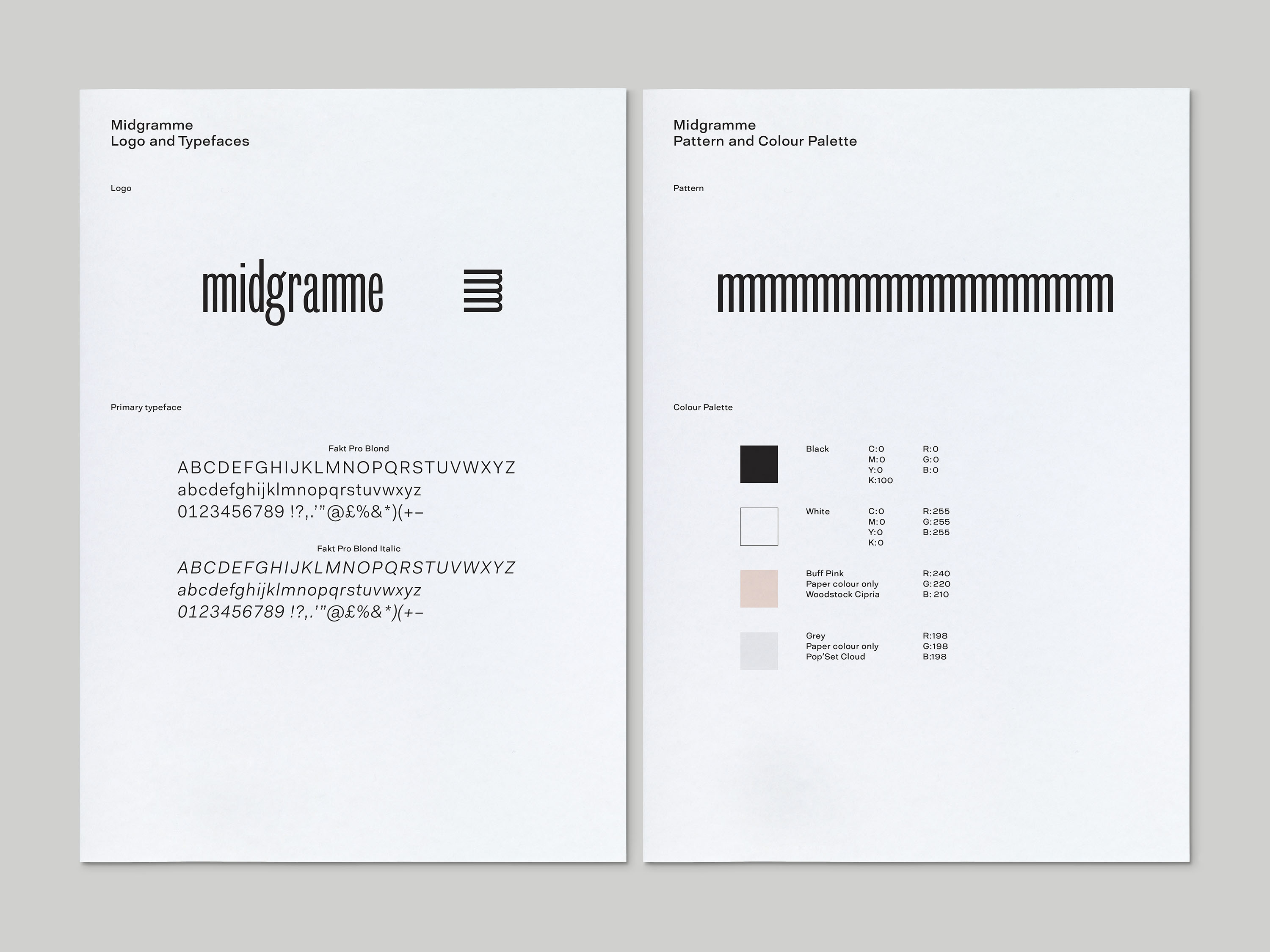
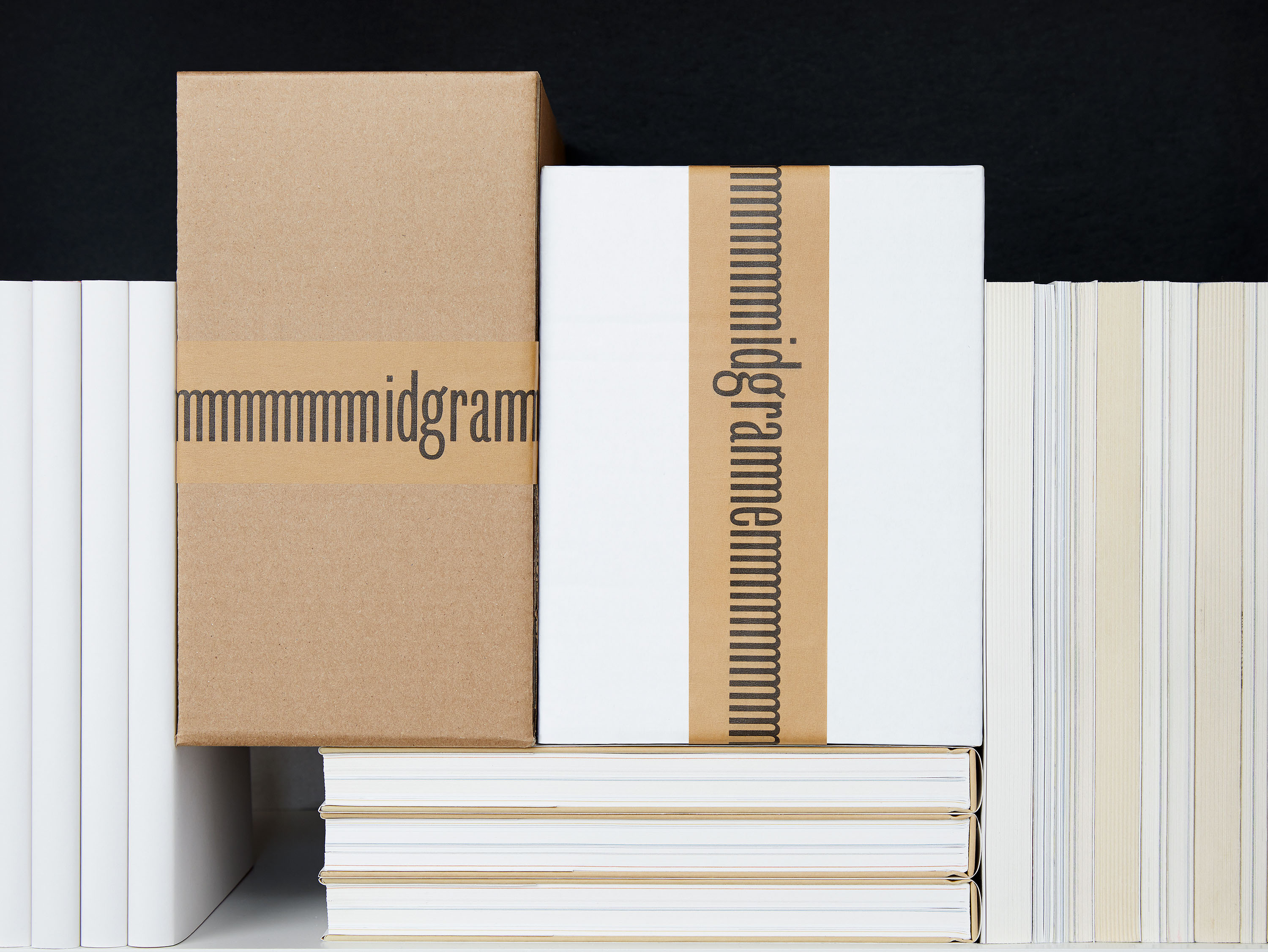
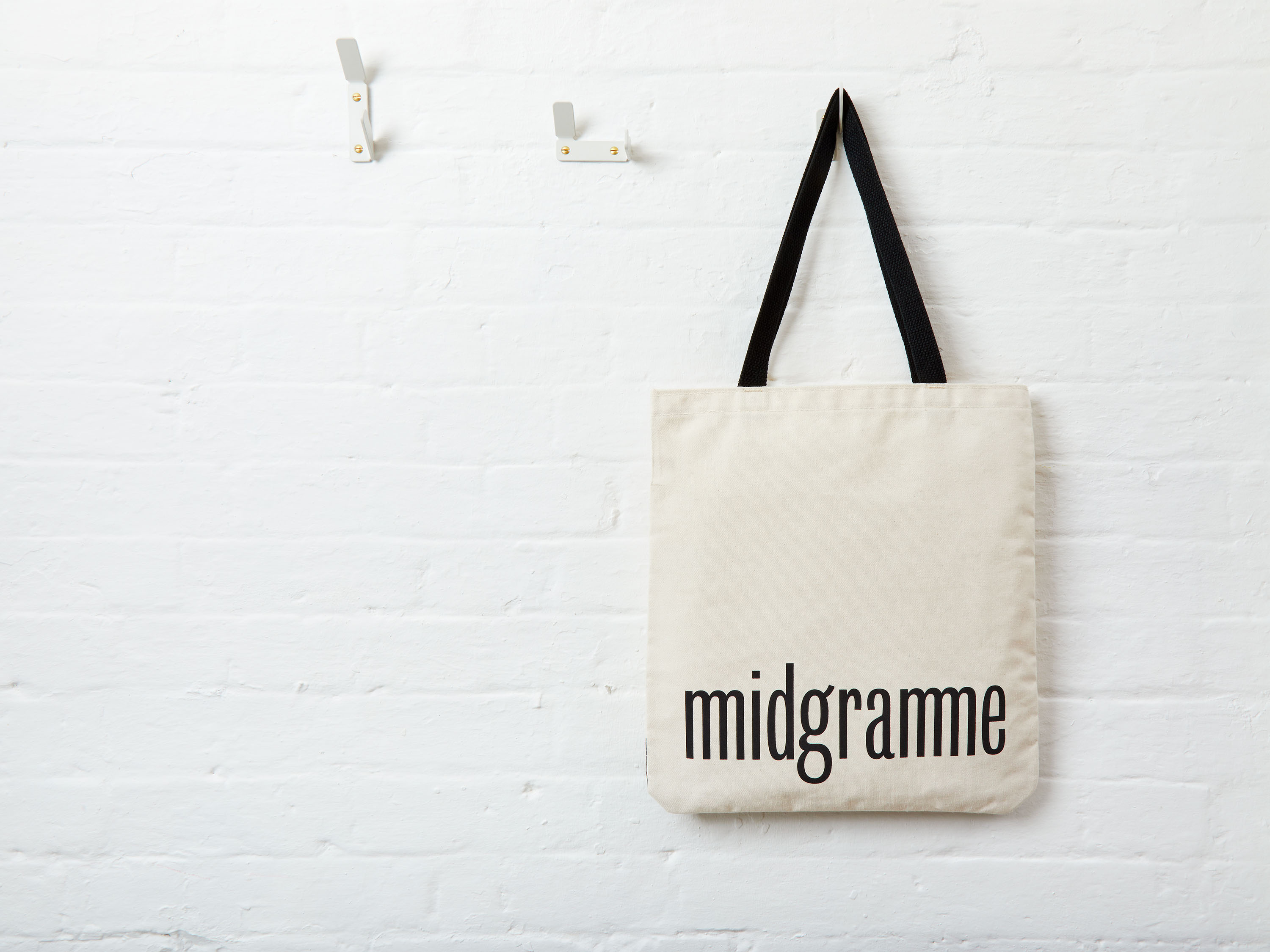
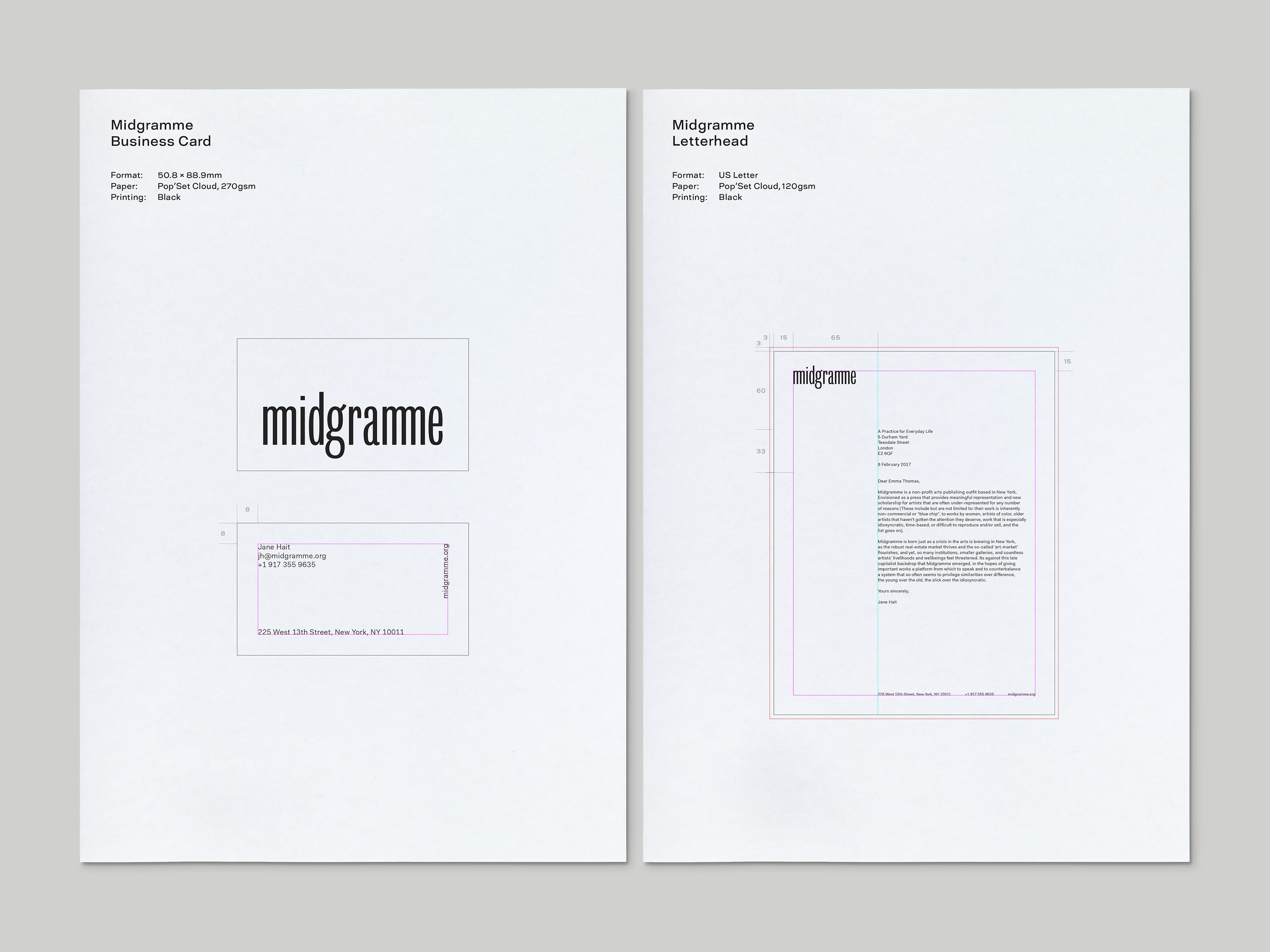
We were commissioned to design an identity, stationery, packaging and a website for Midgramme. The logo is inspired by ephemera from the New York art scene in the 1970s, when characterful Grotesque typefaces – originally designed for advertising – were prevalent in printed materials due to their widespread availability. The double ‘m’ of the Midgramme logo adds a playful graphic detail which, when placed on its side, resembles a stack of books. This motif then multiplies and extends to whatever medium it is used for, from tote bags and bookmarks to stickers and stationery. The website we designed includes e-commerce capabilities with animated details, and a layout that splits the page in two like the pages of a book.
This was a time when artists fought against the backdrop of capitalism, political turmoil and soaring real estate costs in the city, with campaigns to save the SoHo loft spaces, movements such as Fluxus, and Gordon Matta-Clark’s experimental restaurant run by artists, FOOD.


