
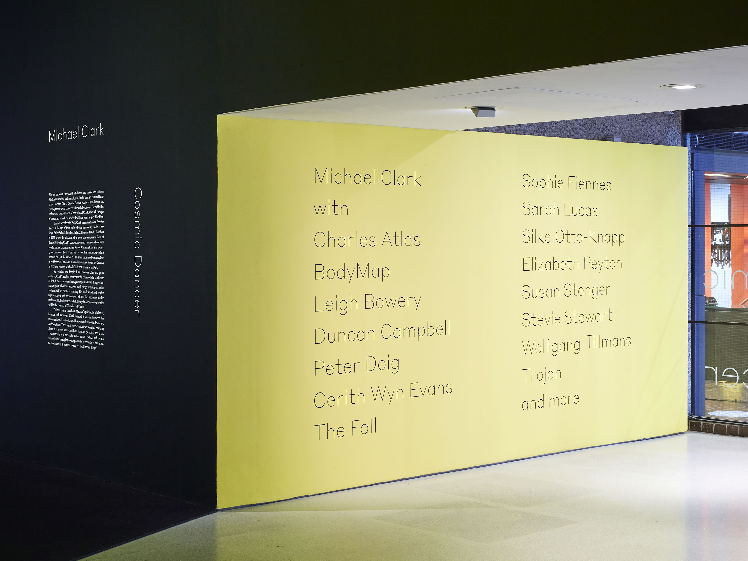
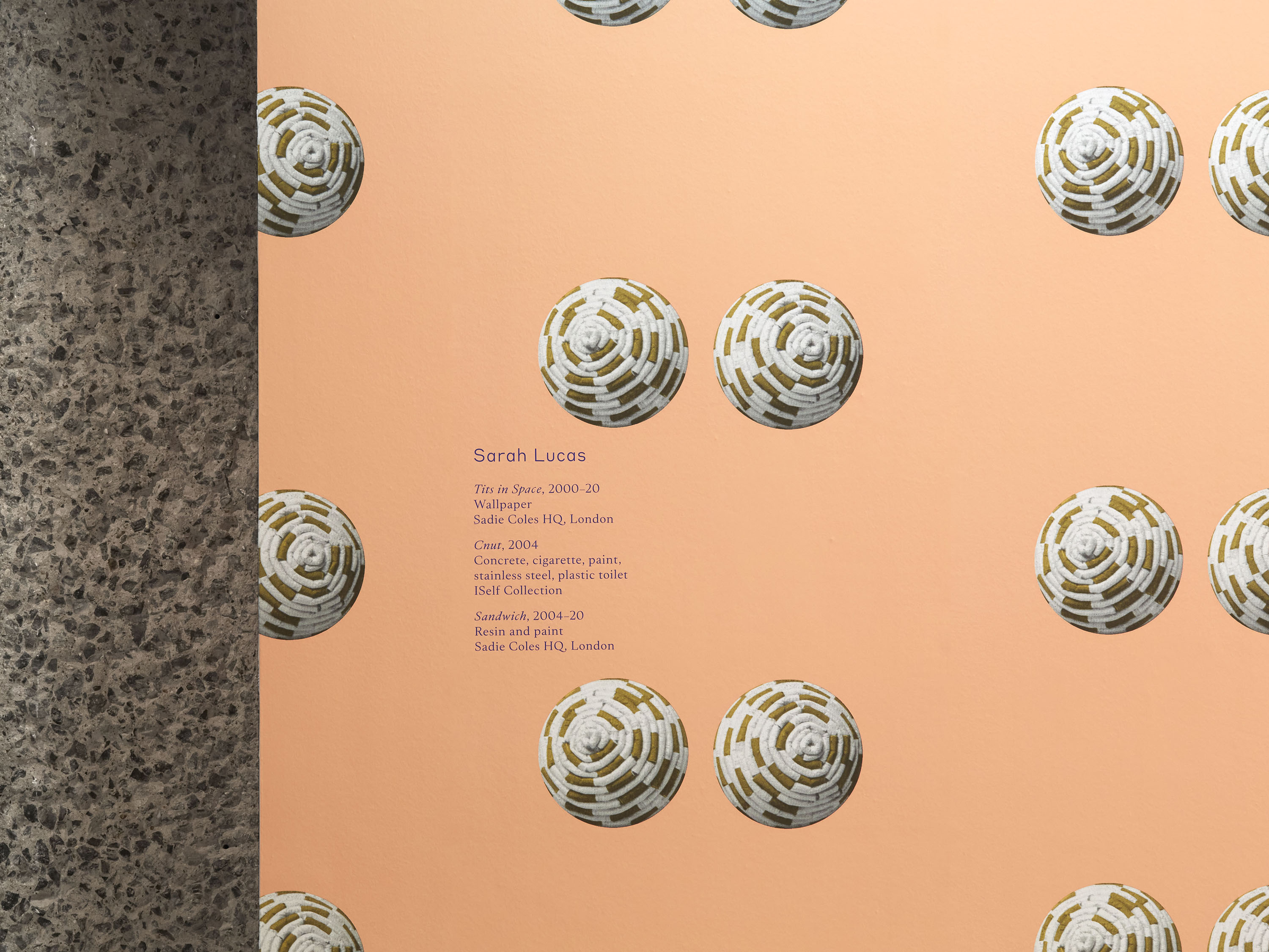
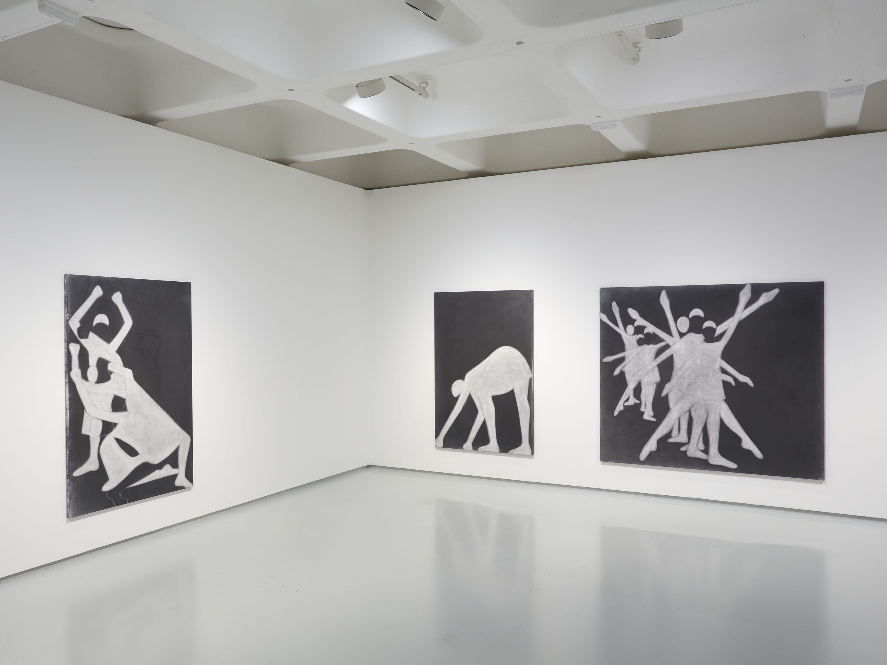
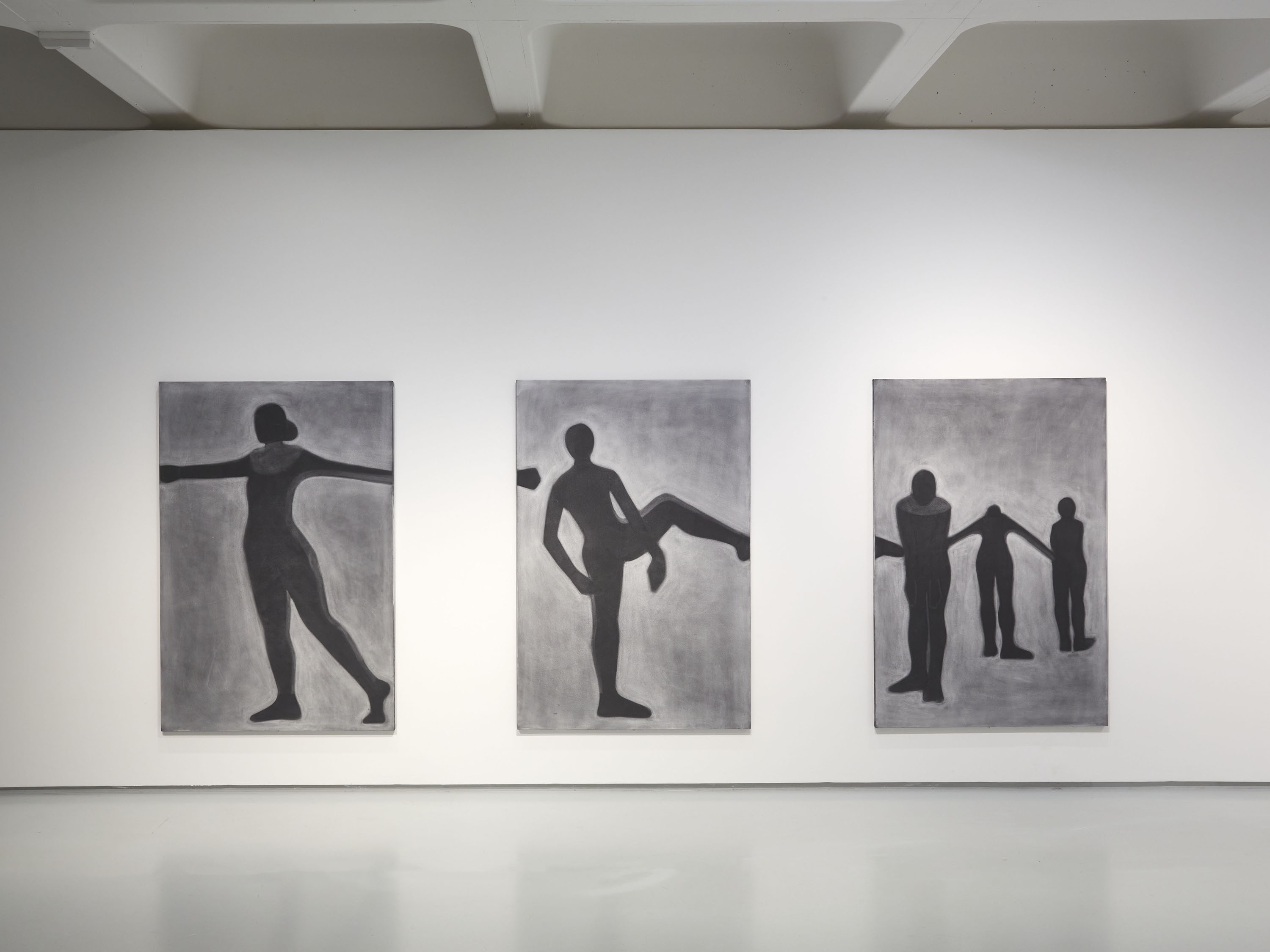
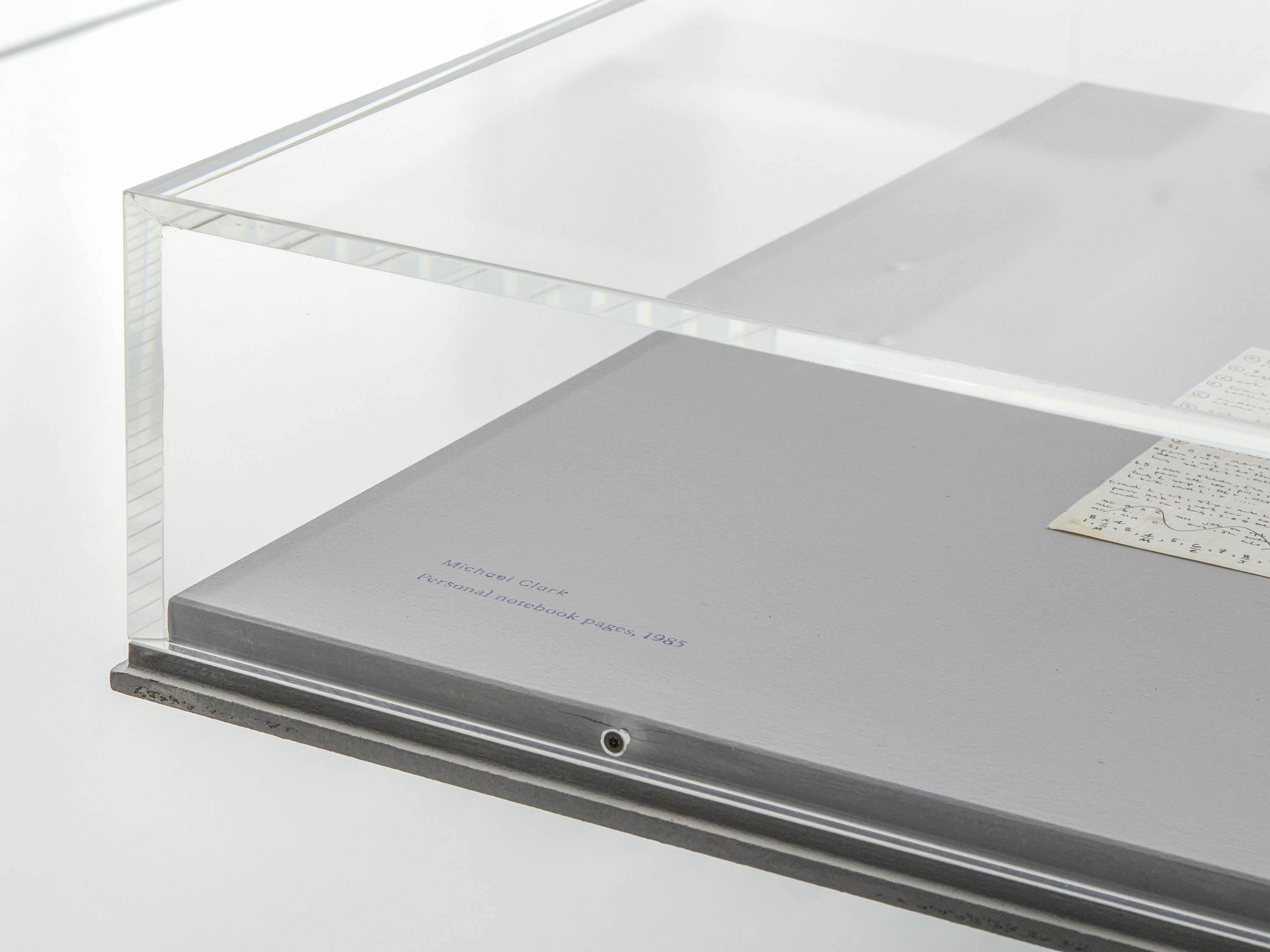
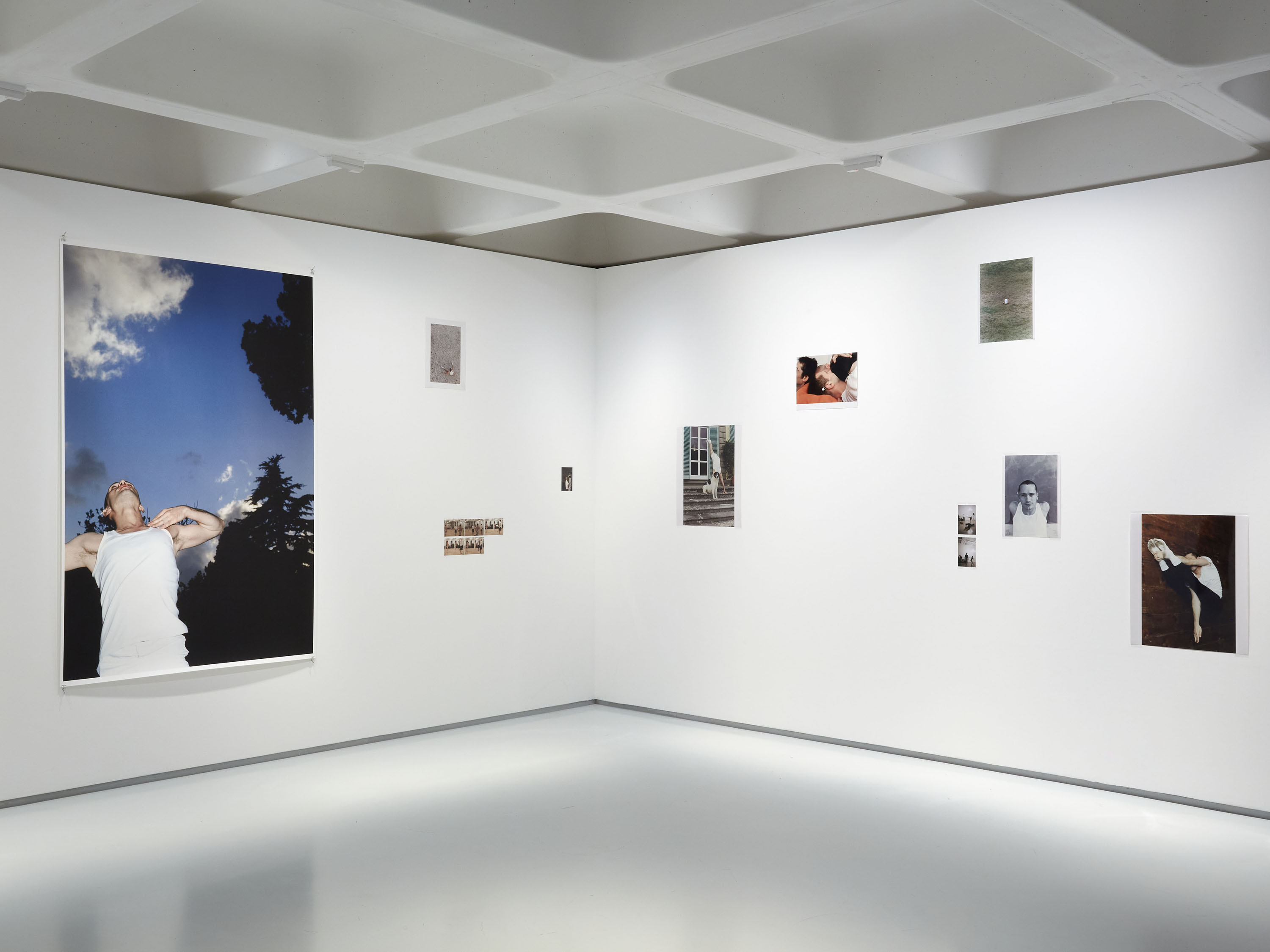
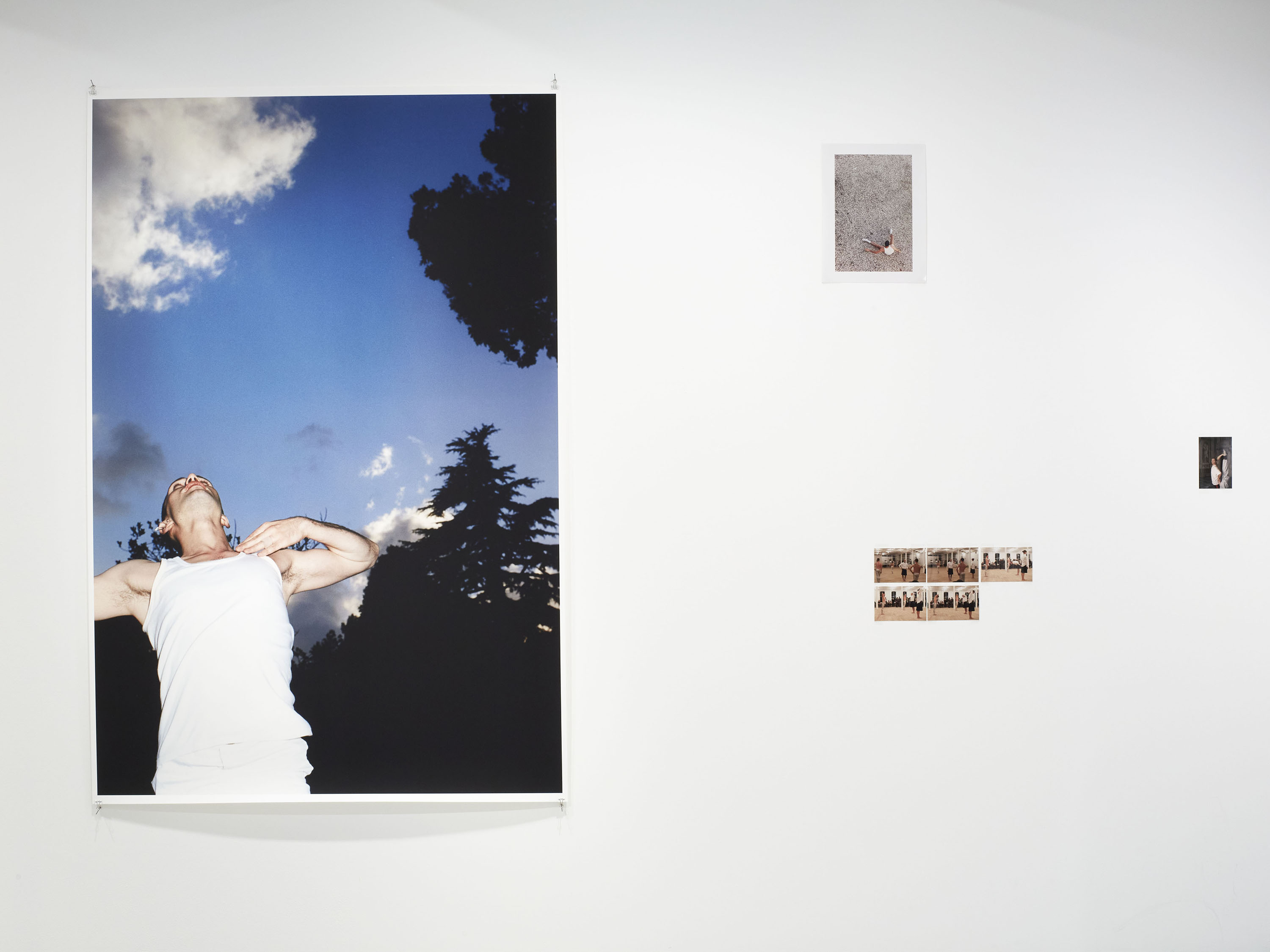
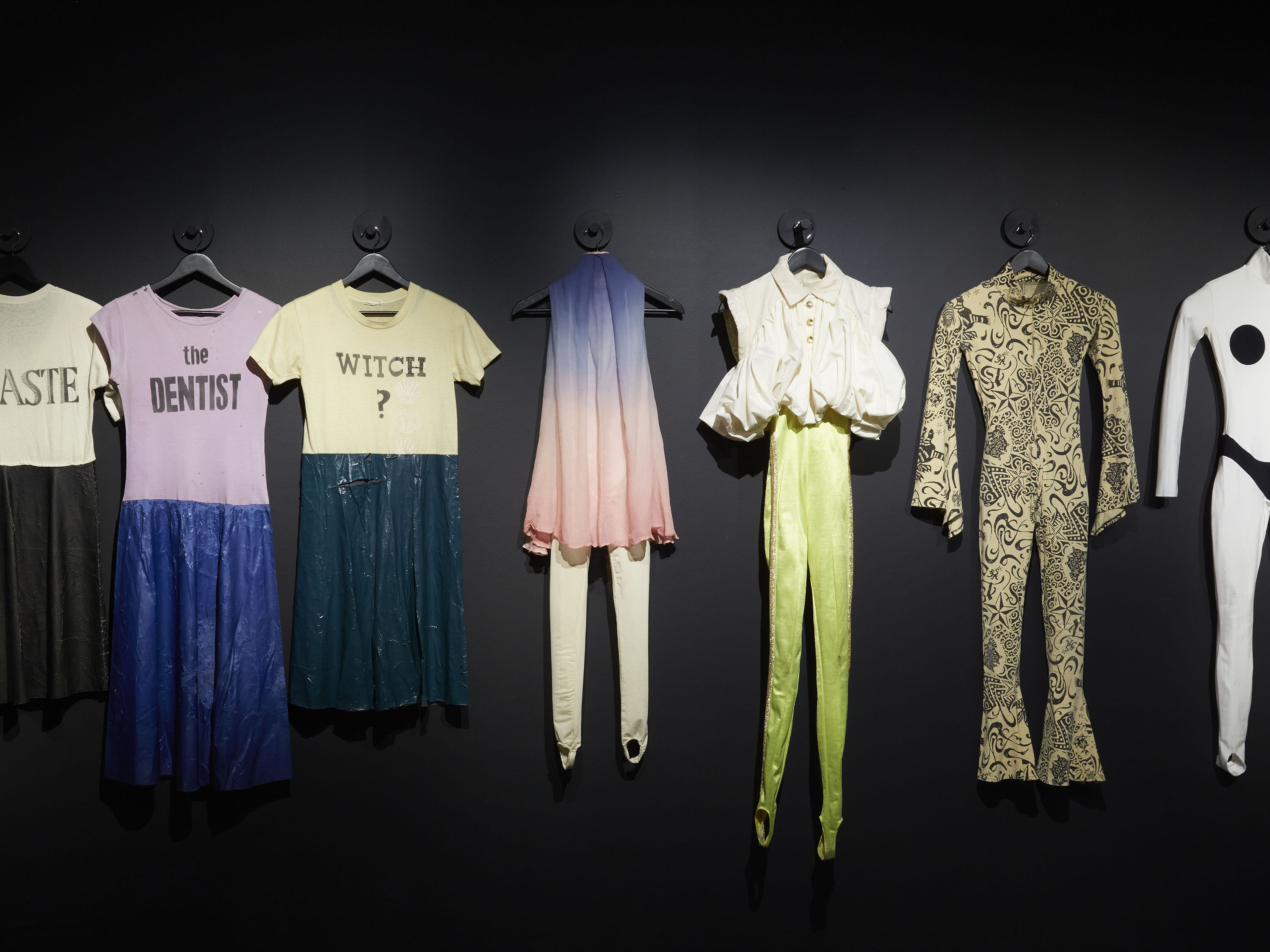
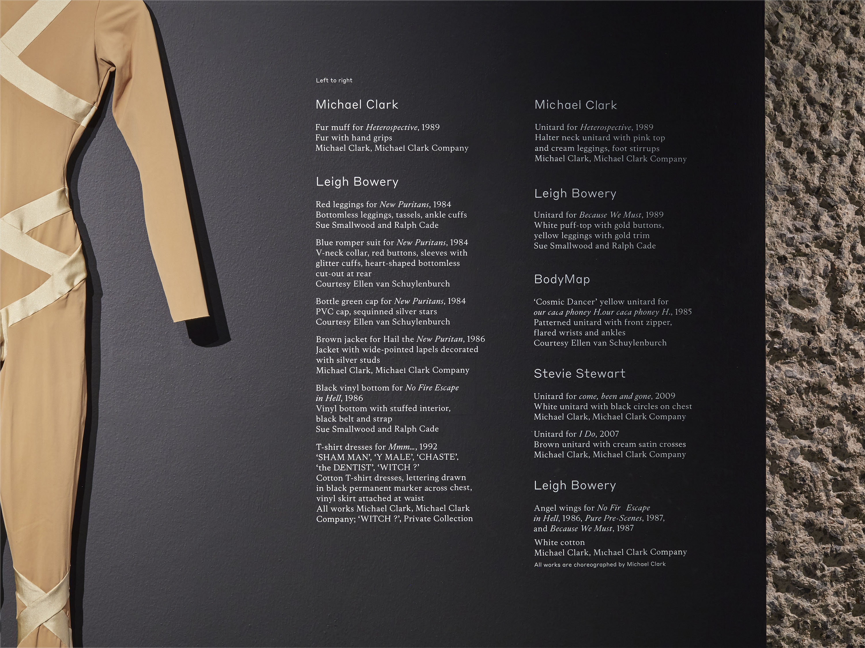
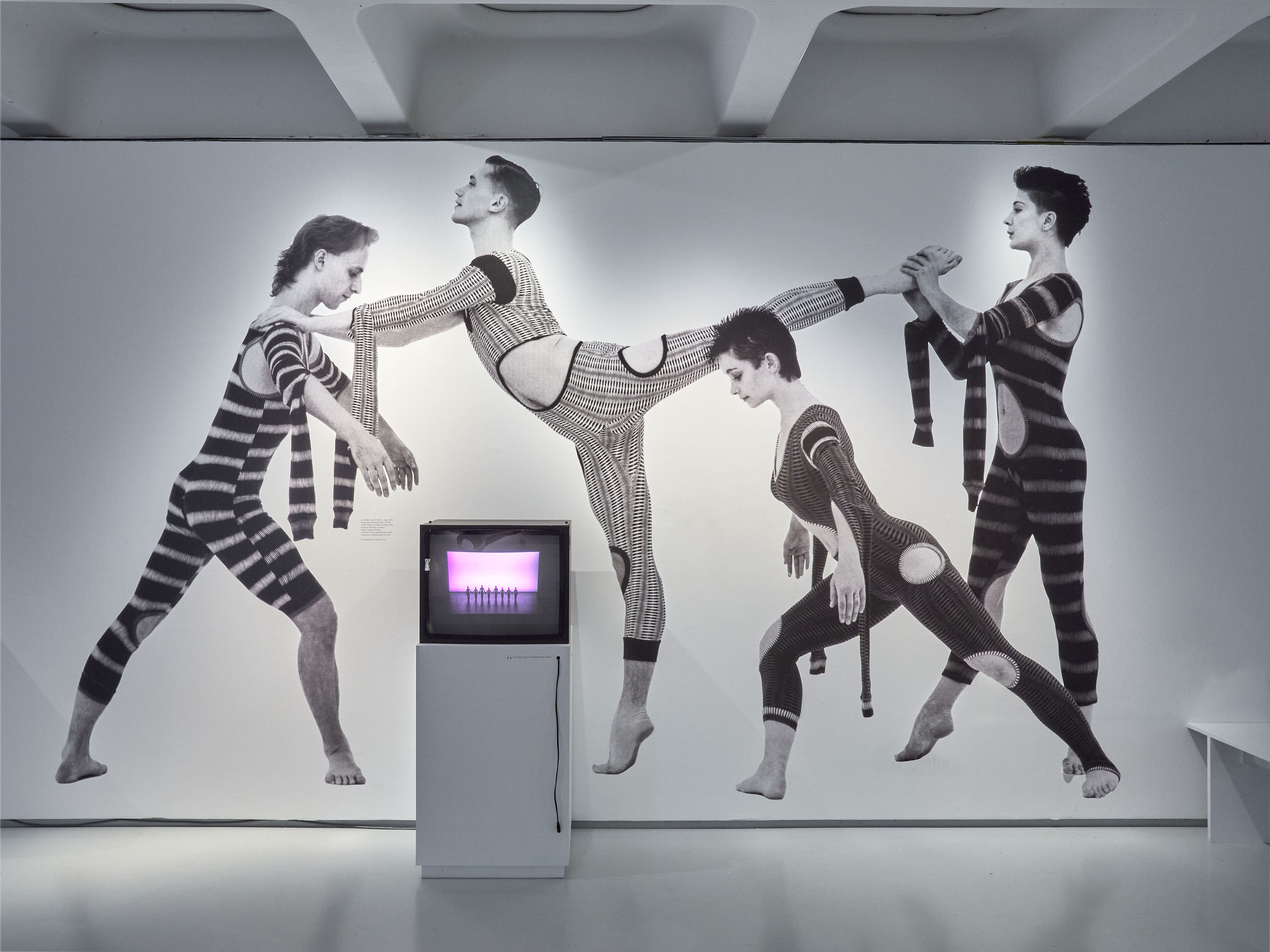

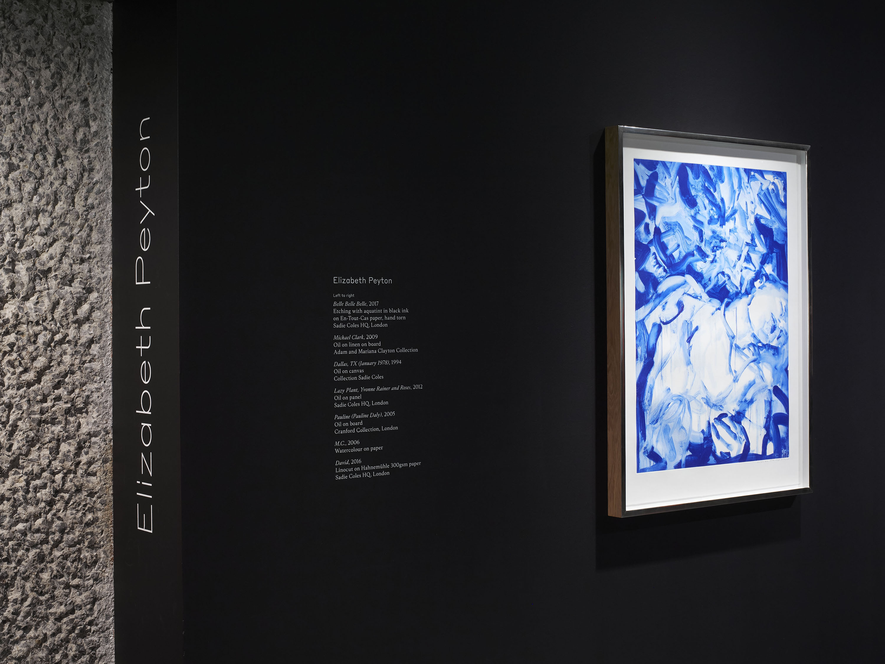
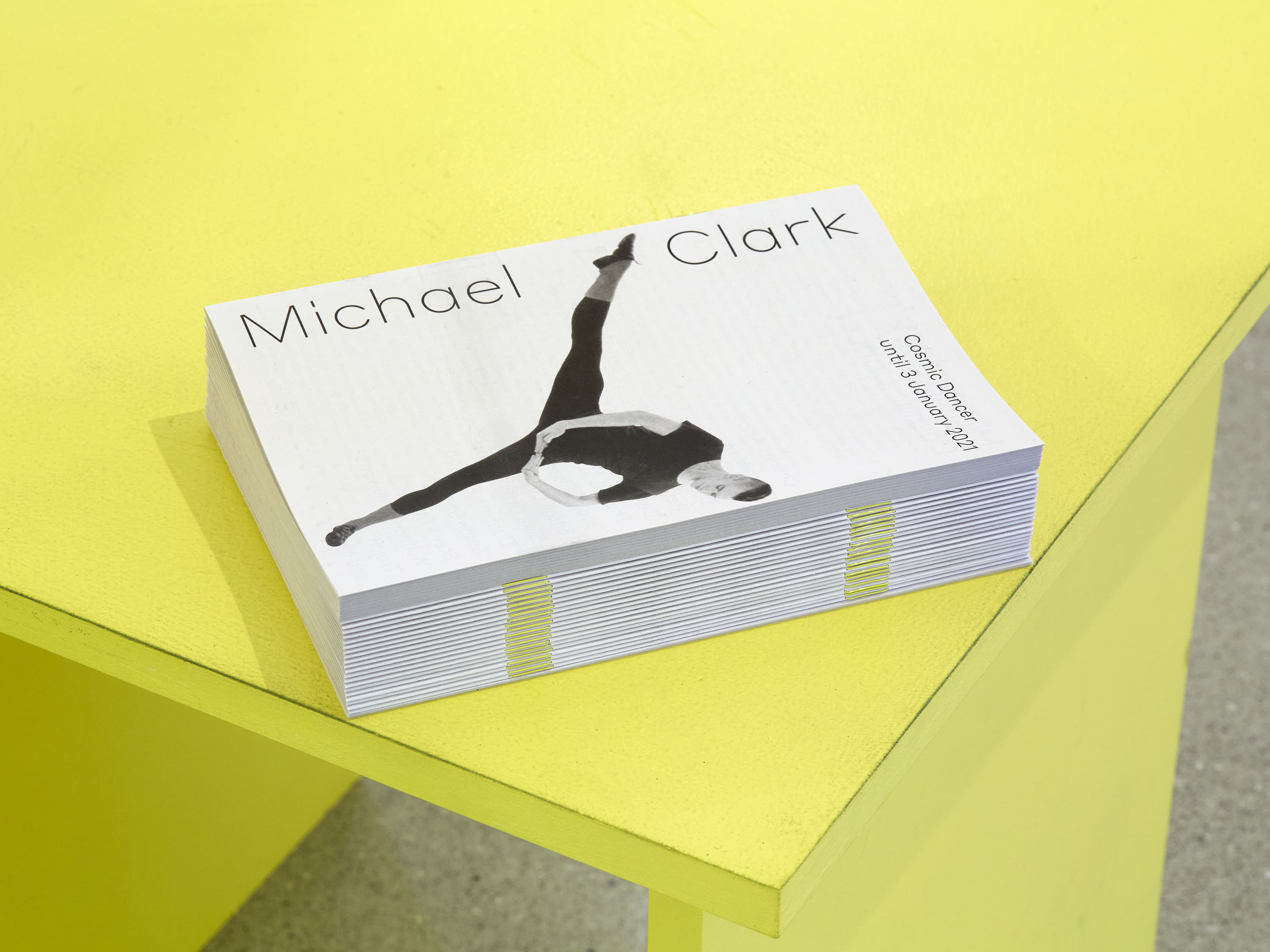
Held at the Barbican Art Gallery in autumn 2020, Cosmic Dancer was the first ever major exhibition to focus on the groundbreaking work of dancer and choreographer Michael Clark. It presented a series of portraits and interpretations of Clark and his work through the eyes of artists and collaborators including Charles Atlas, Leigh Bowery, Peter Doig, Cerith Wyn Evans, Sarah Lucas, The Fall and Wolfgang Tillmans.
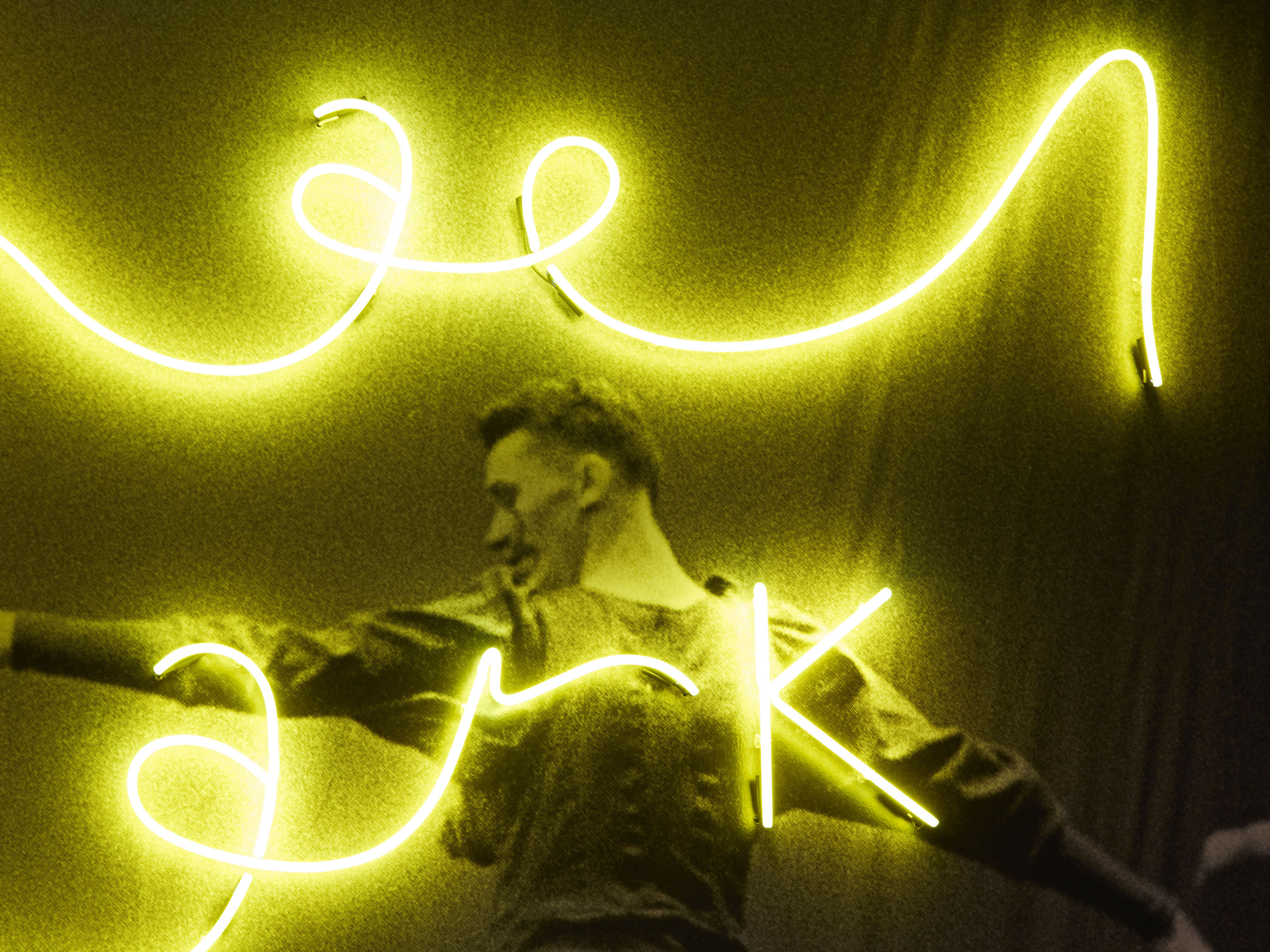
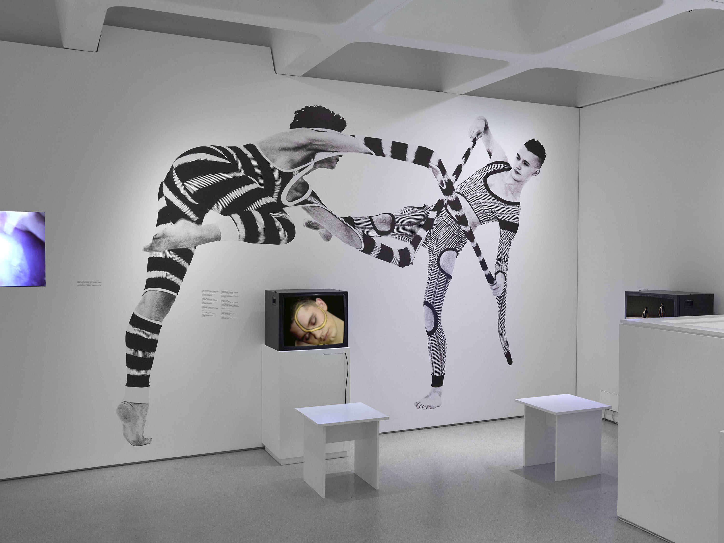
Our design for the exhibition opens with a five-metre-wide yellow neon of Clark’s signature, set against a supergraphic still from New Puritans (1984), featuring Leigh Bowery’s iconic cut-out costumes that reveal the dancers’ bare buttocks.
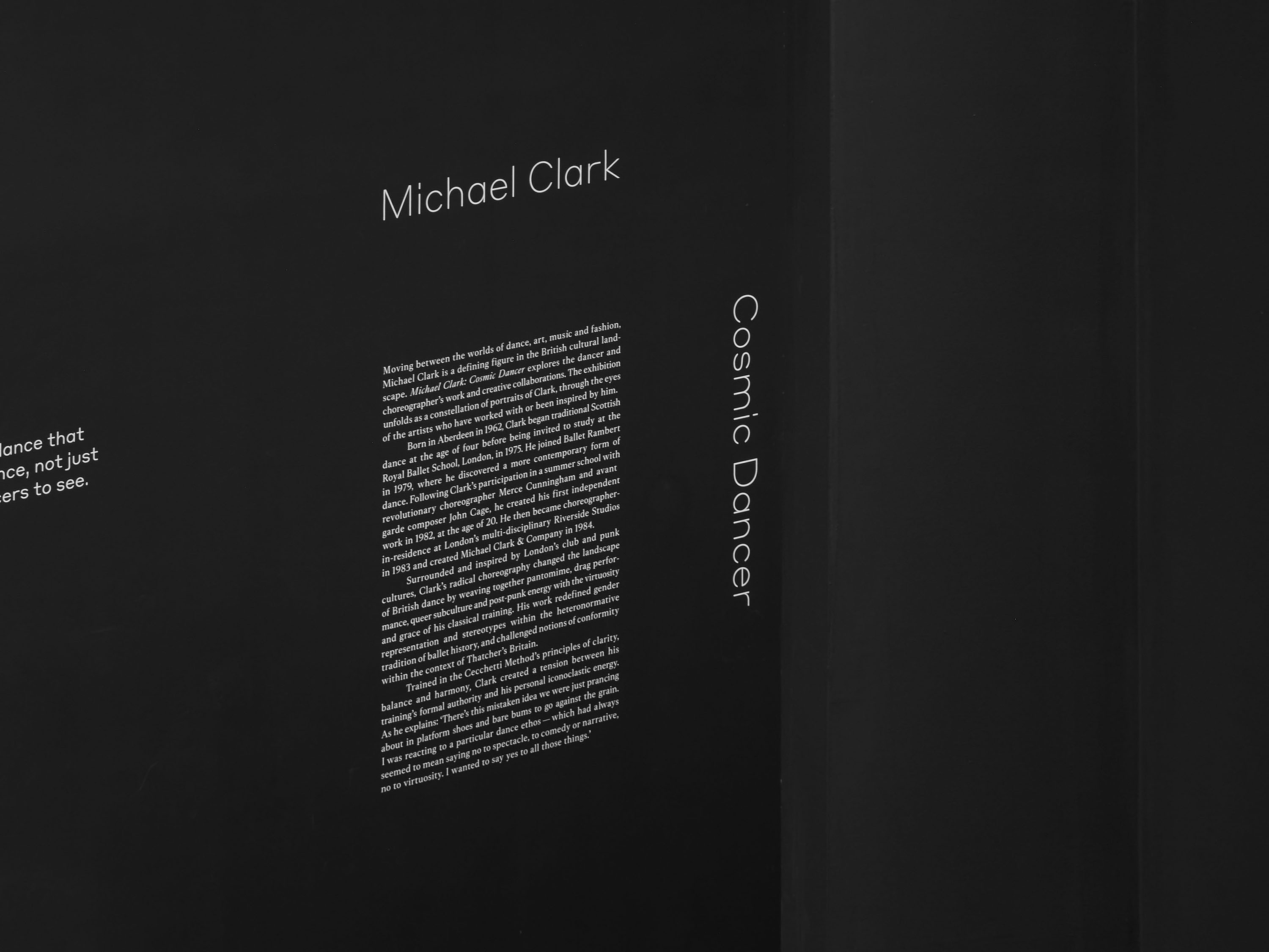
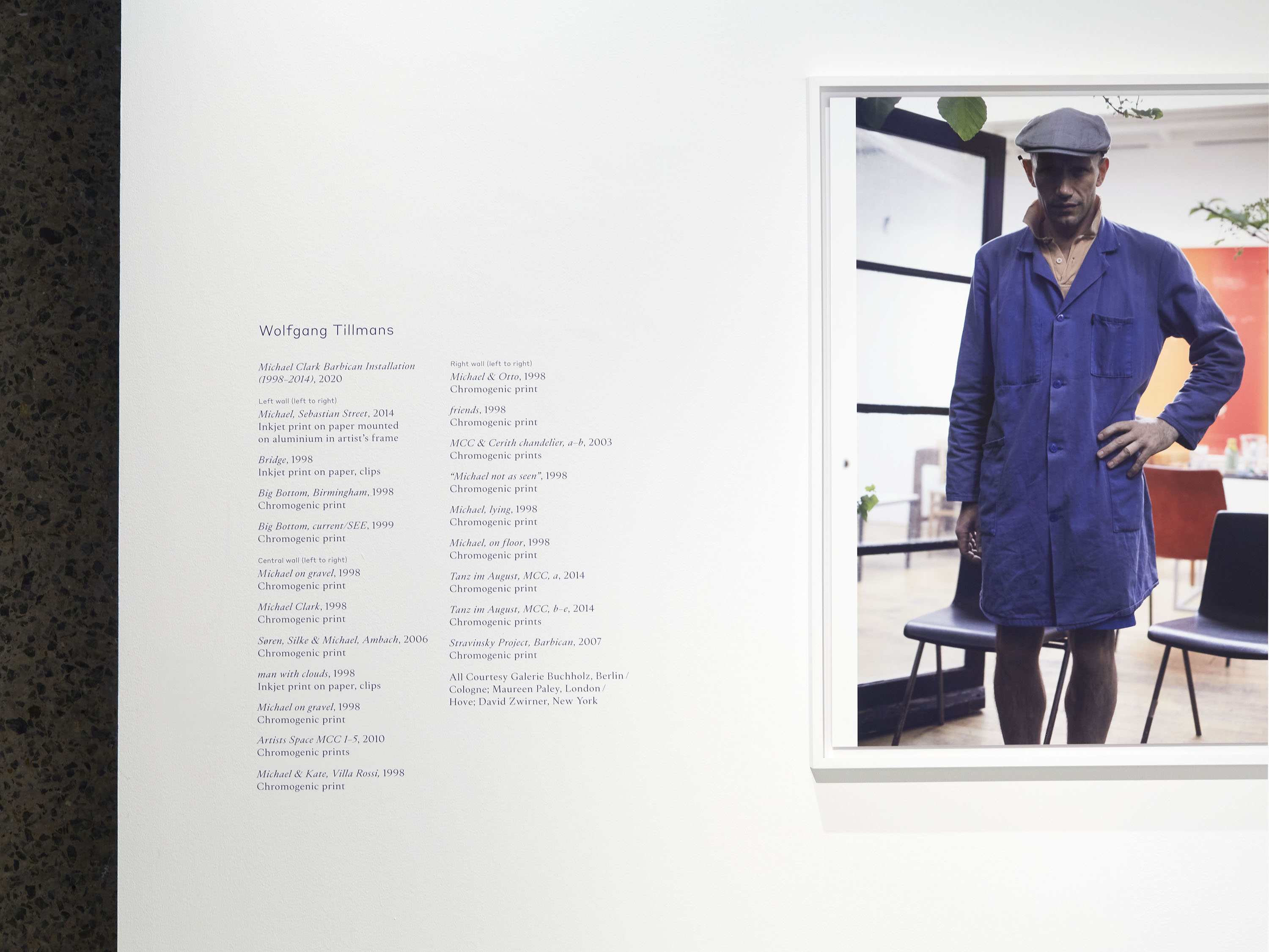
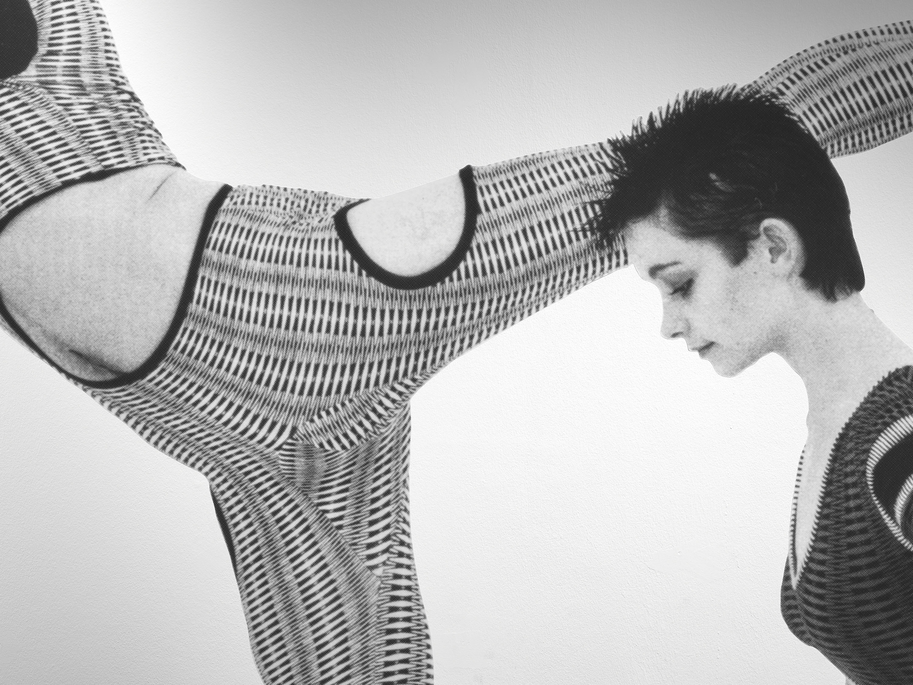
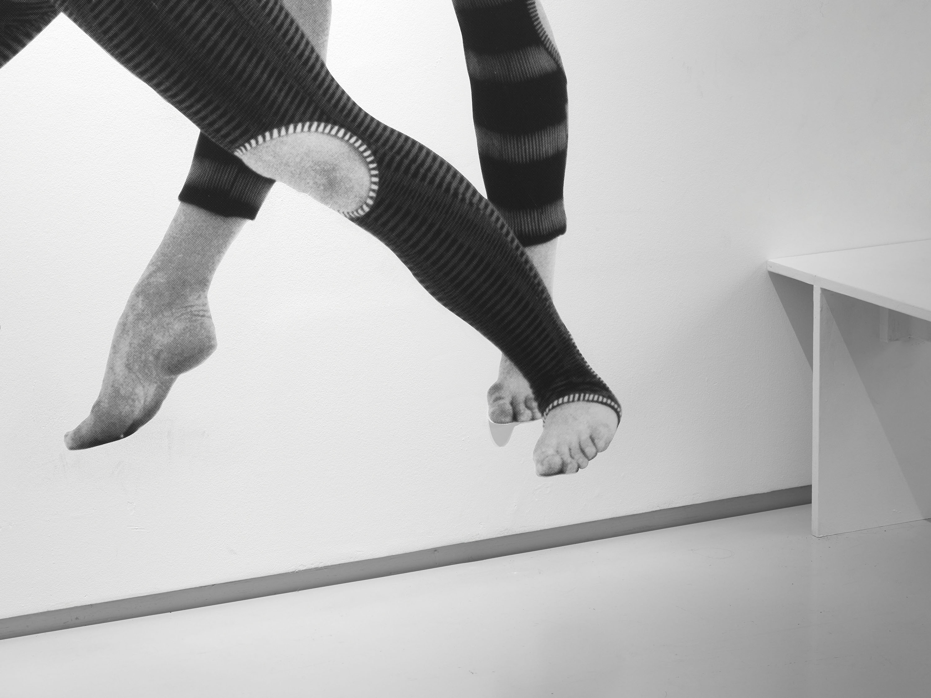
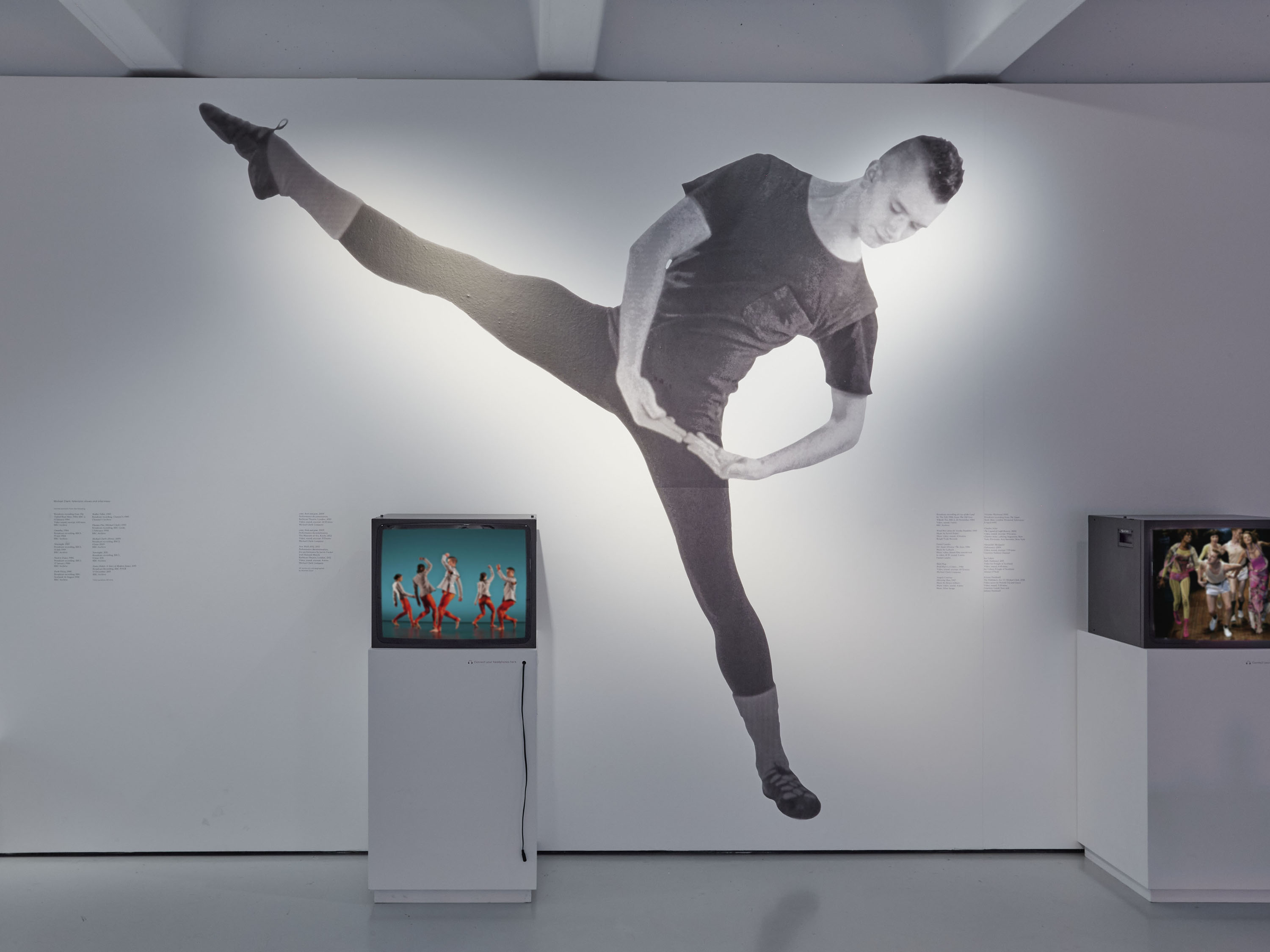
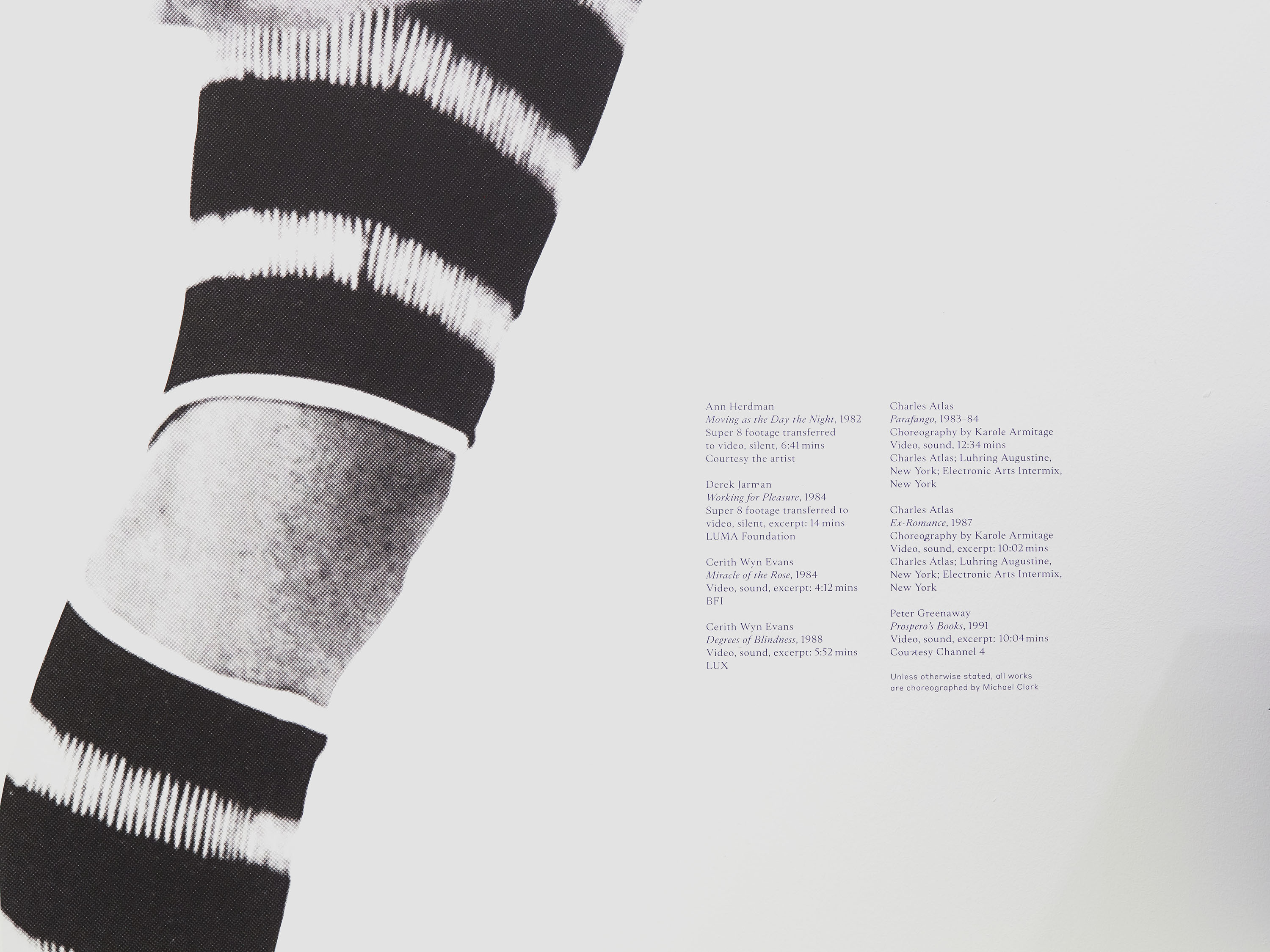
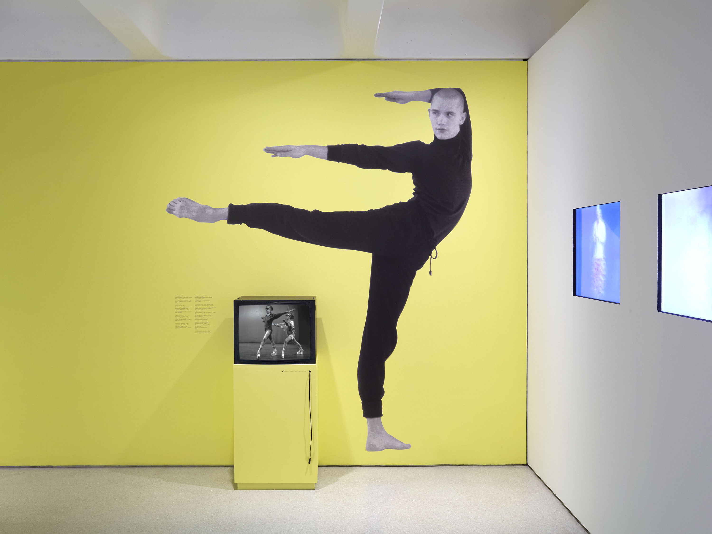
The graphic archive exhibit offers an alternative approach to the visual presentation of a timeline, showcasing Clark’s distinctive visual language. Within the video archive space, wall graphics of Clark and his dancers interact with the monitors, breaking out of their screens. Room captions throughout are oversized, using a combination of typefaces to create tension between the contemporary and the classical. For the exhibition invigilators’ uniforms, we designed a graphic reproduction of Leigh Bowery’s slogan T-shirts for Mmm… (1992) – the front reads ‘BORED?’, and the reverse ‘ANGRY’.
The neon light in the blacked-out space, with its soundtrack of The Velvet Underground and The Fall, gives visitors the impression of entering a nightclub – a setting featured within Charles Atlas’ film installation, which opens the exhibition.
Exhibition photography: Thomas Adank

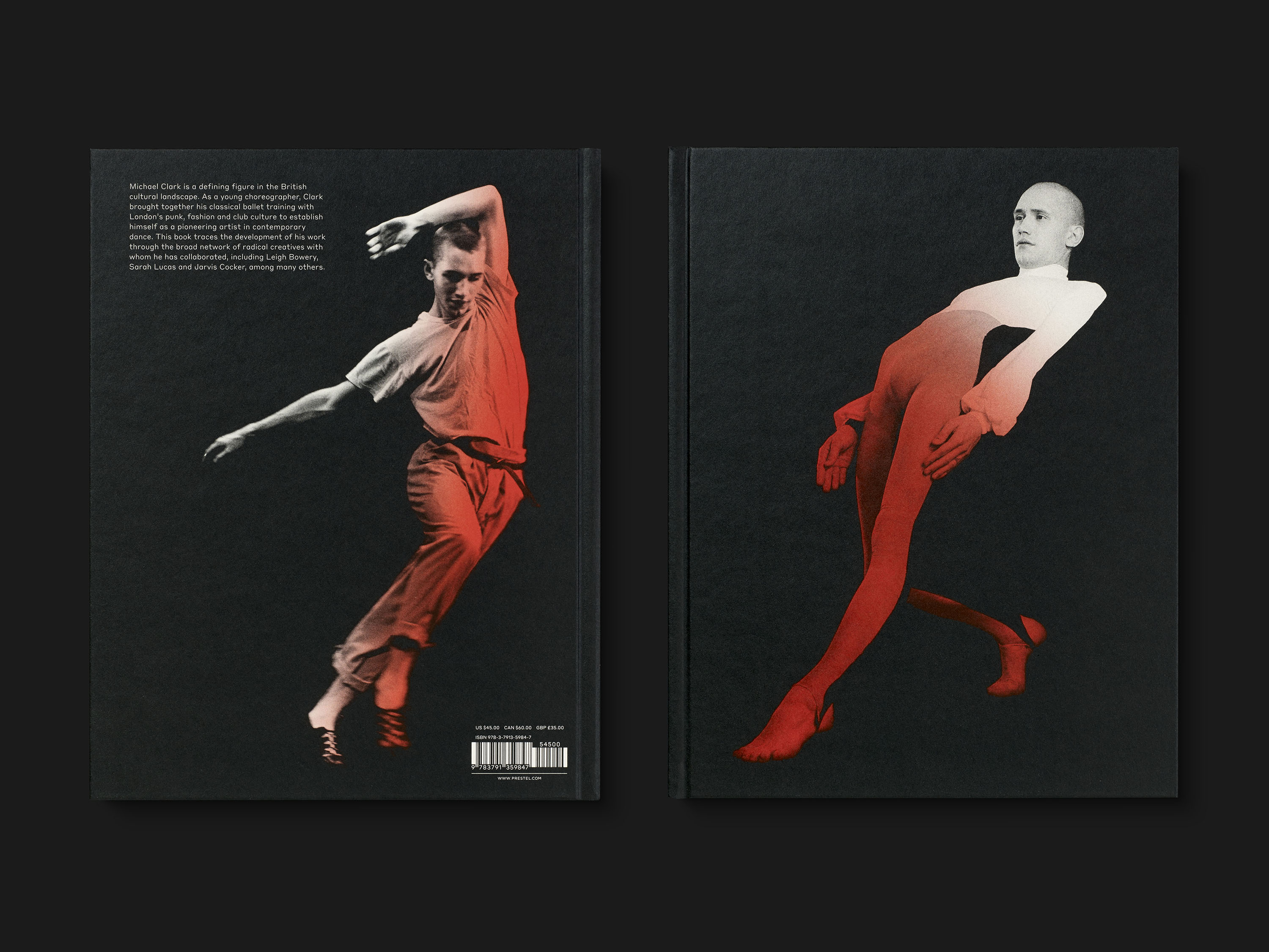
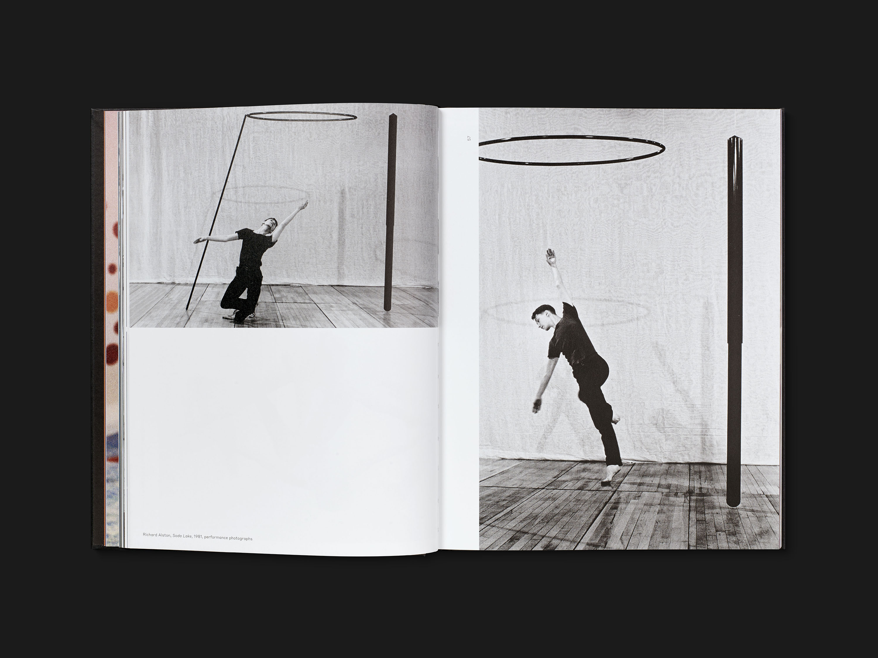
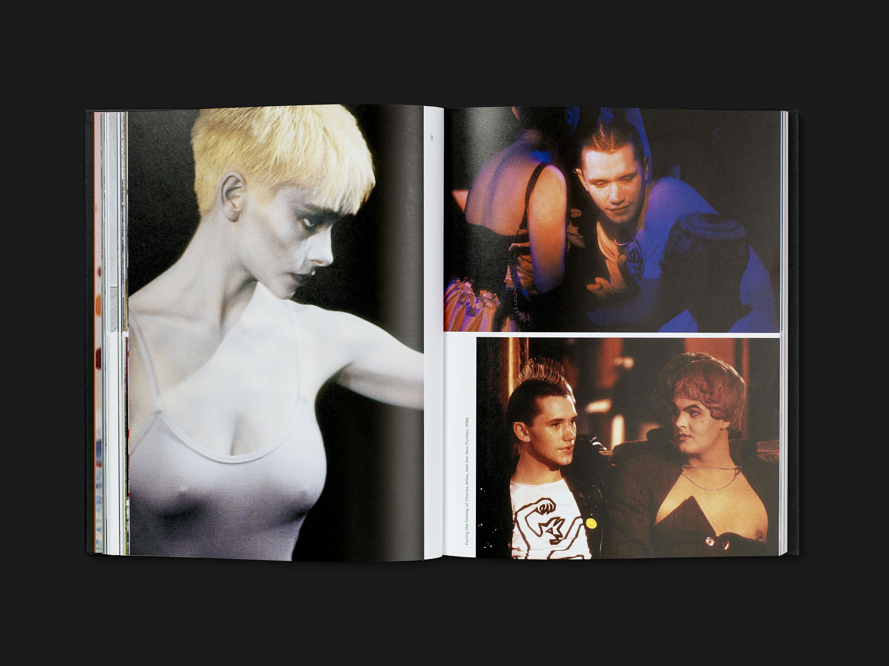
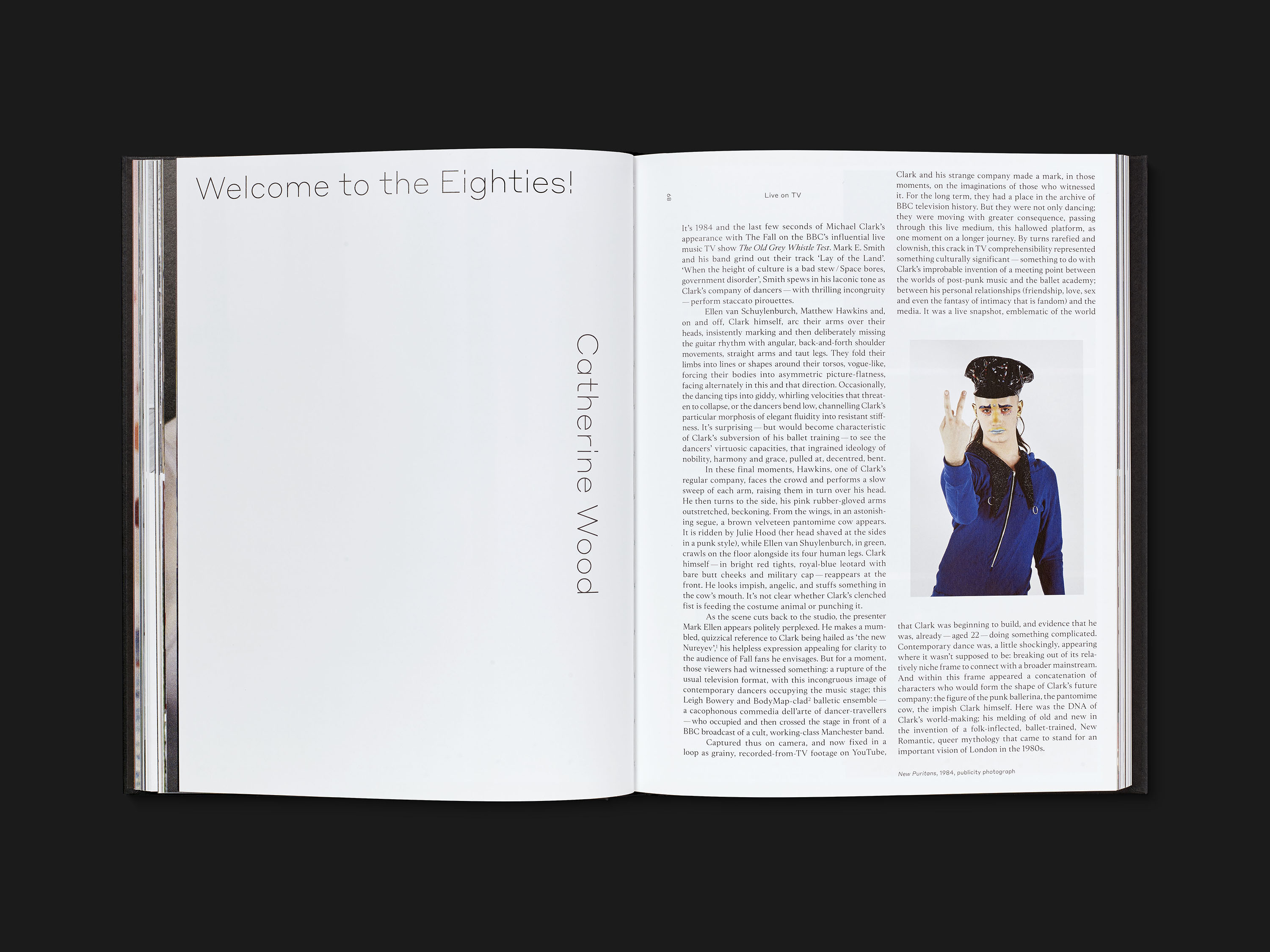
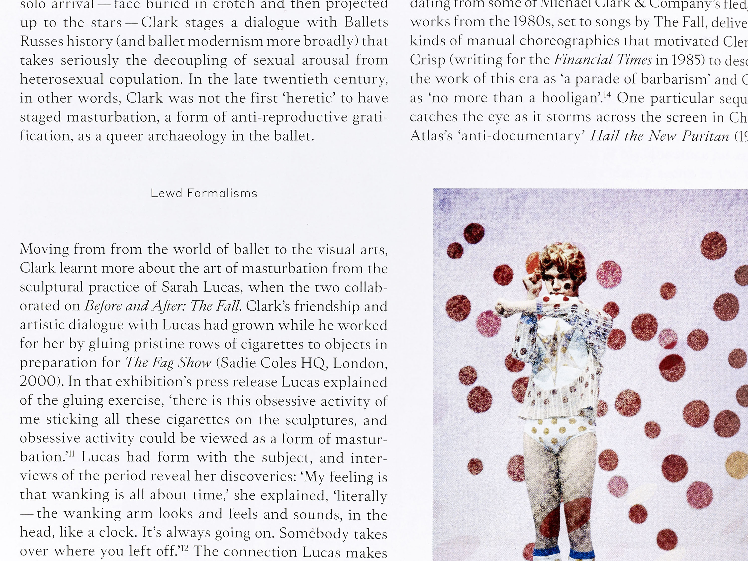
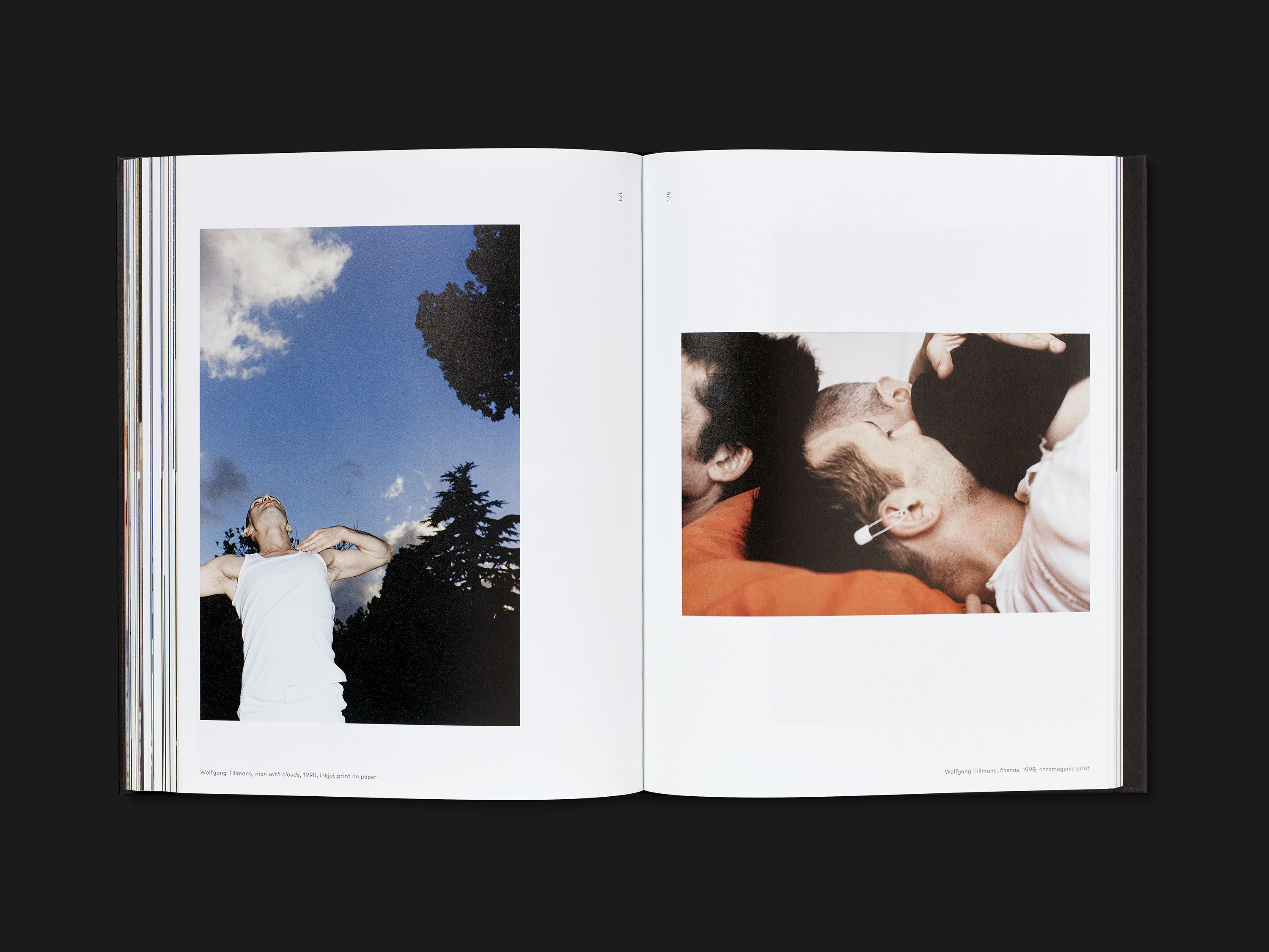
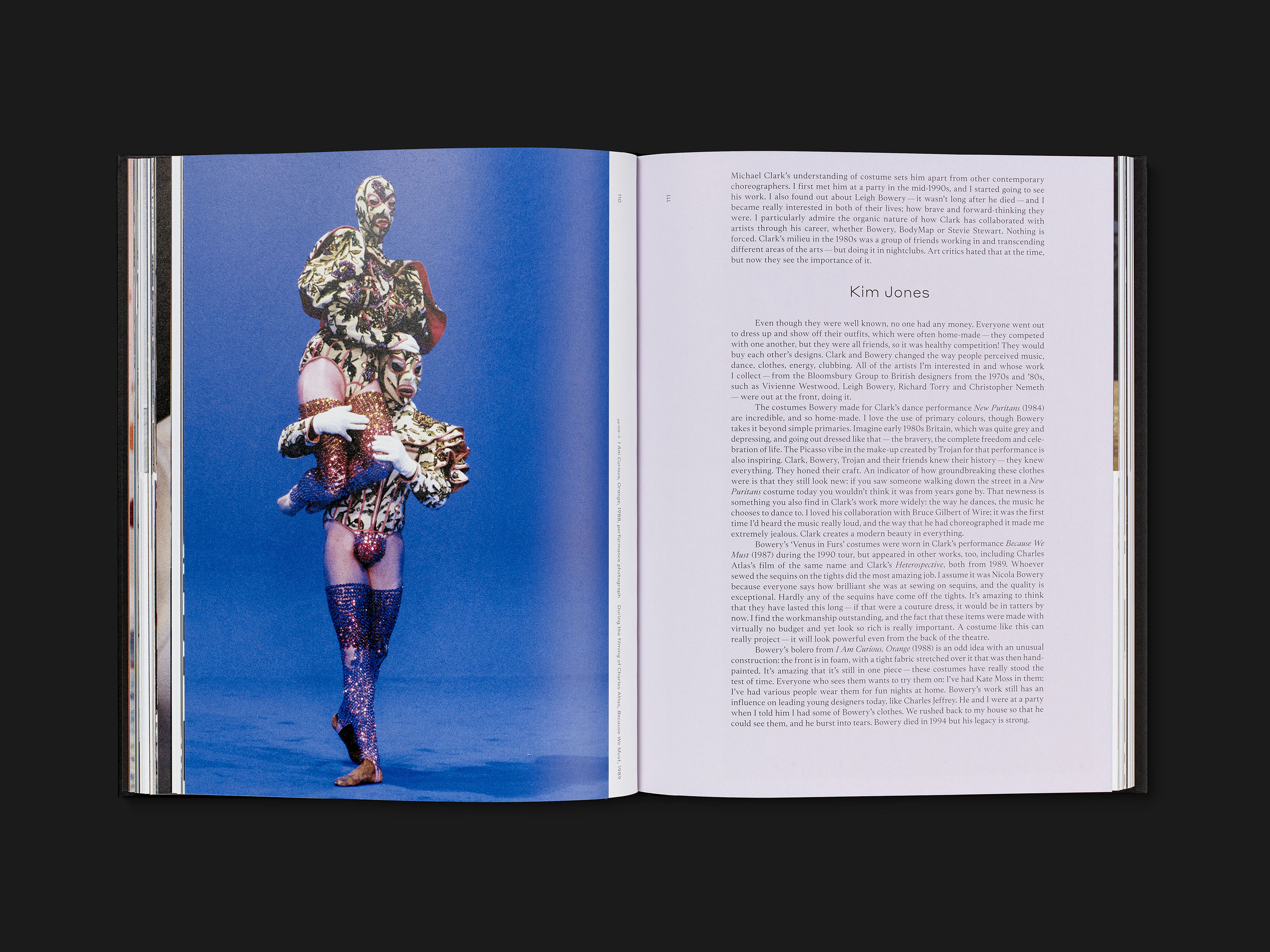
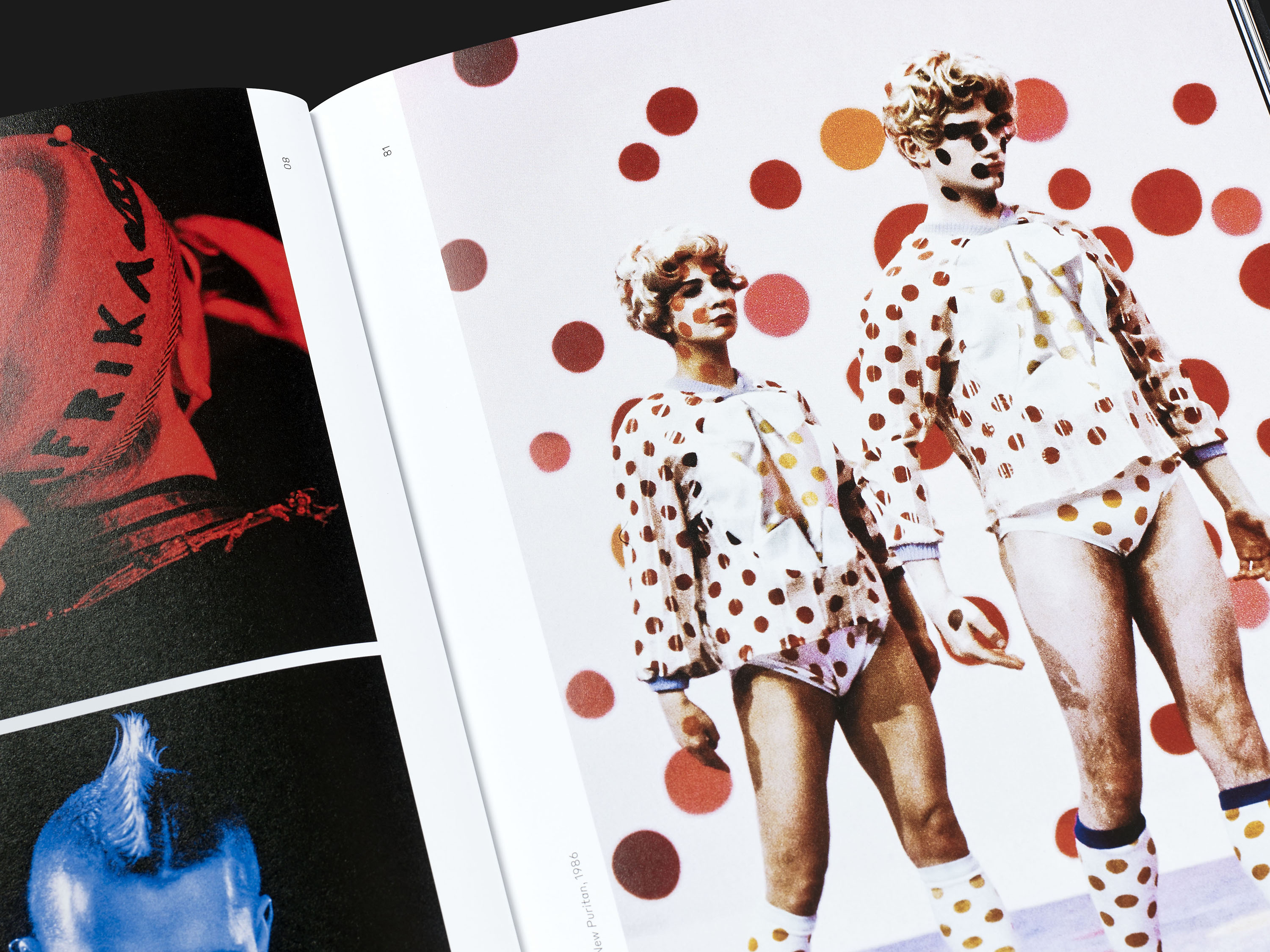
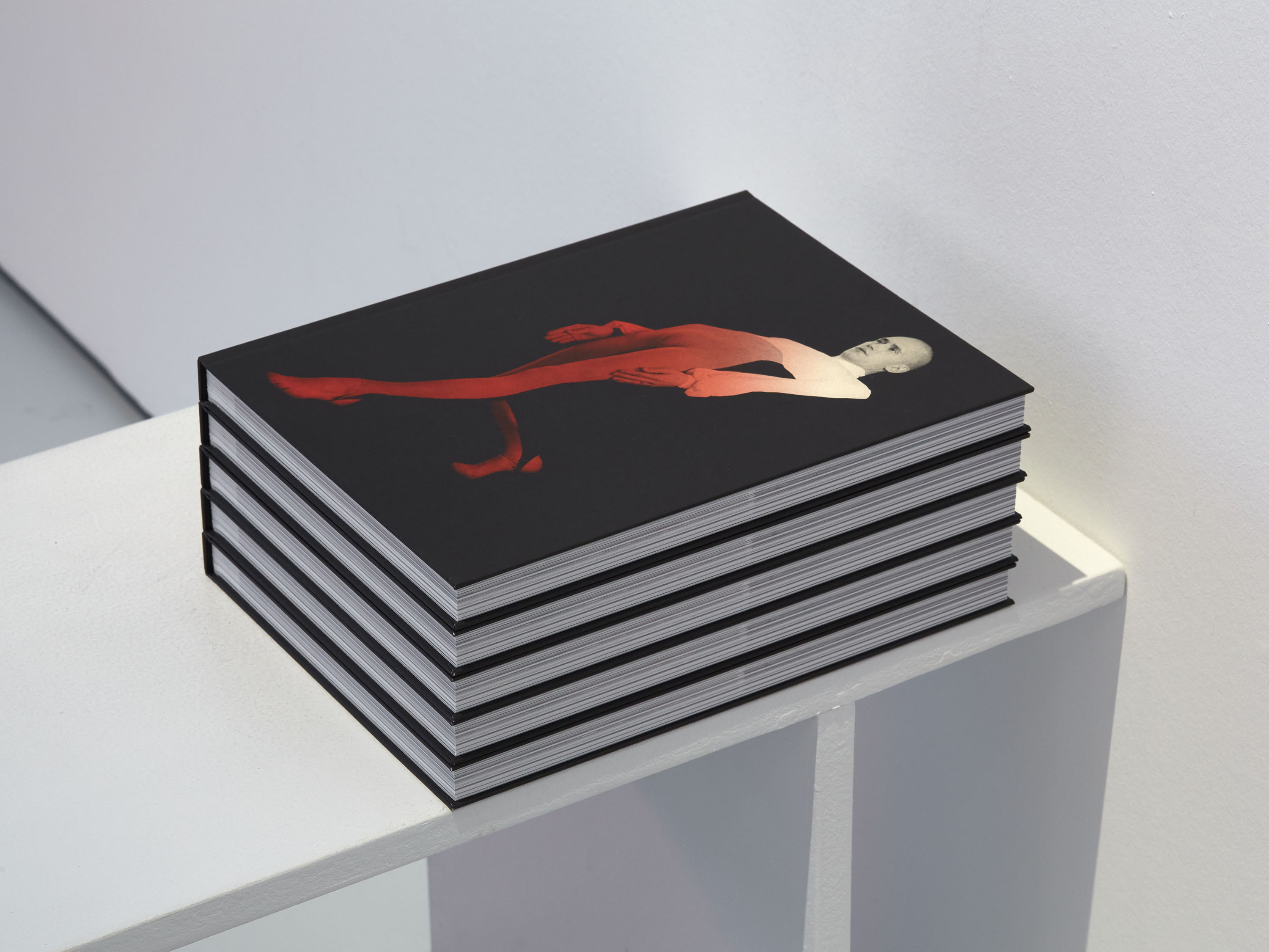
We were commissioned to design the large-scale monograph Michael Clark: Cosmic Dancer, co-published by Barbican and Prestel, to accompany an exhibition of the same name. The design of the cover focuses on the body, using performance photography on the front and reverse, with the title on the spine. A tonal gradient was applied to add a luminous quality, reflecting the thematic use of light within the exhibition design.
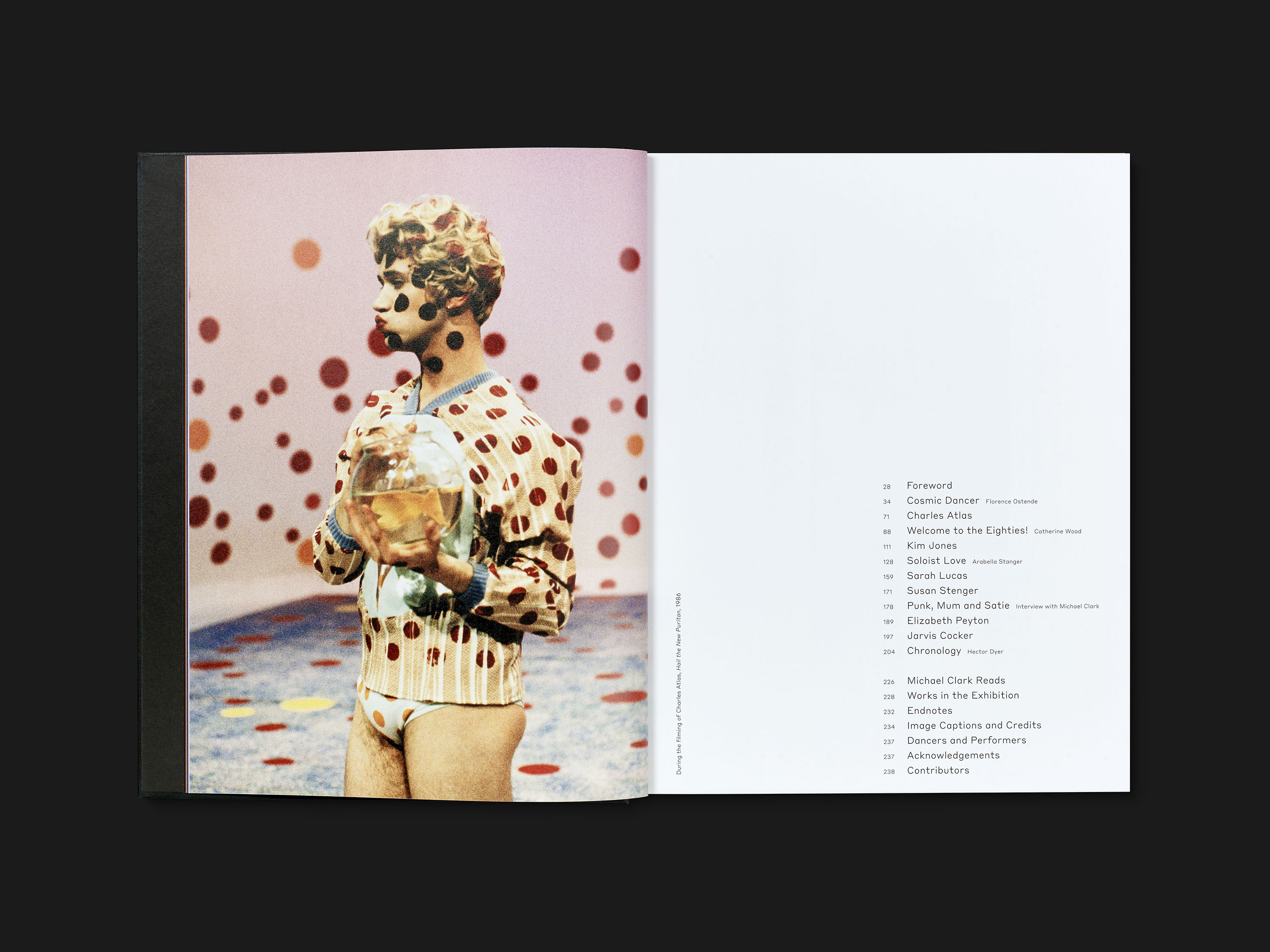
The layout of the book features generously proportioned images to capture the rhythm and energy of live performance, often bleeding off the page or butted up against one another. Inner margins are used for captioning and page numbers, subverting traditional approaches to layout. The typography throughout strikes a balance between elegance and dynamism, to capture the tension between classicism and the contemporary within Clark’s work; titles and headings are set in Styrene, and body text in Tesseract.
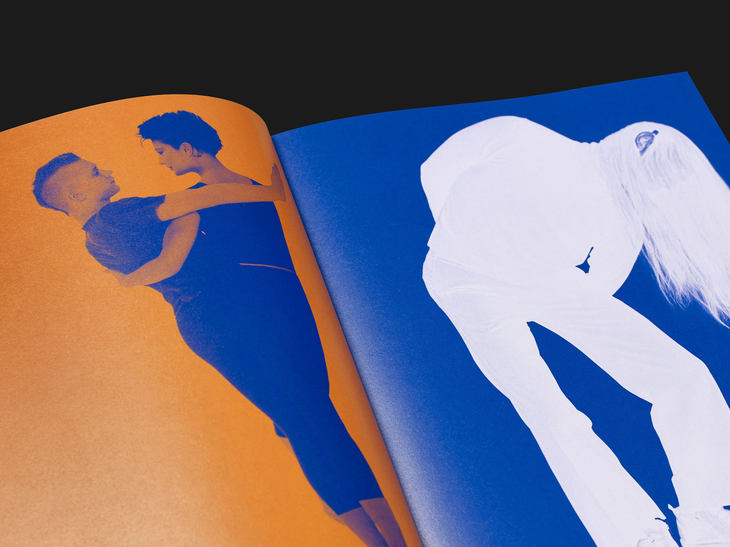
The book opens with an immersive, magazine-like section of full-bleed images, to which we applied a graphic colour treatment. This is followed by a visual essay combining publicity images, performance documentation and ephemeral materials spanning the full breadth of Clark’s career. The content then follows a chronological order, highlighting Clark’s self-referential approach, often repeating choreographic sequences, costumes and music across performances.
Styrene is a sans serif typeface which exhibits an ahistorical attitude to type design, with hyperextended characters like the f, j, r and t, and a synthetic feeling to its curves and geometry.
