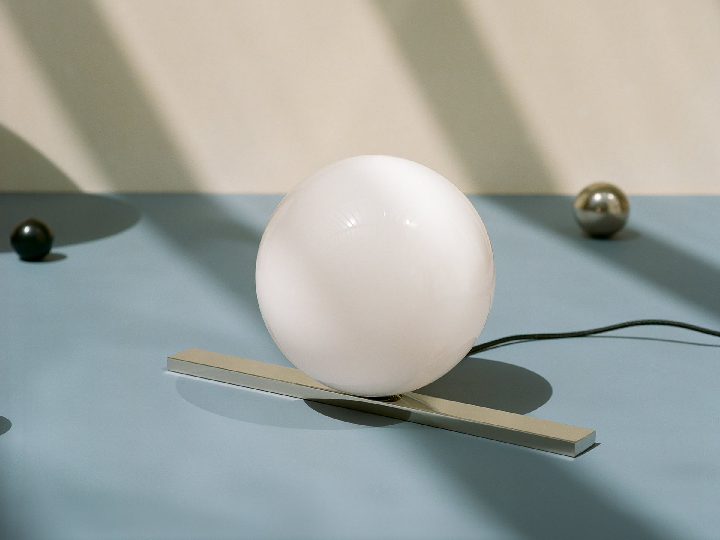
Michael Anastassiades’ design practice encompasses products, spatial interventions and experimental works, often transcending the distinctions between different creative disciplines.
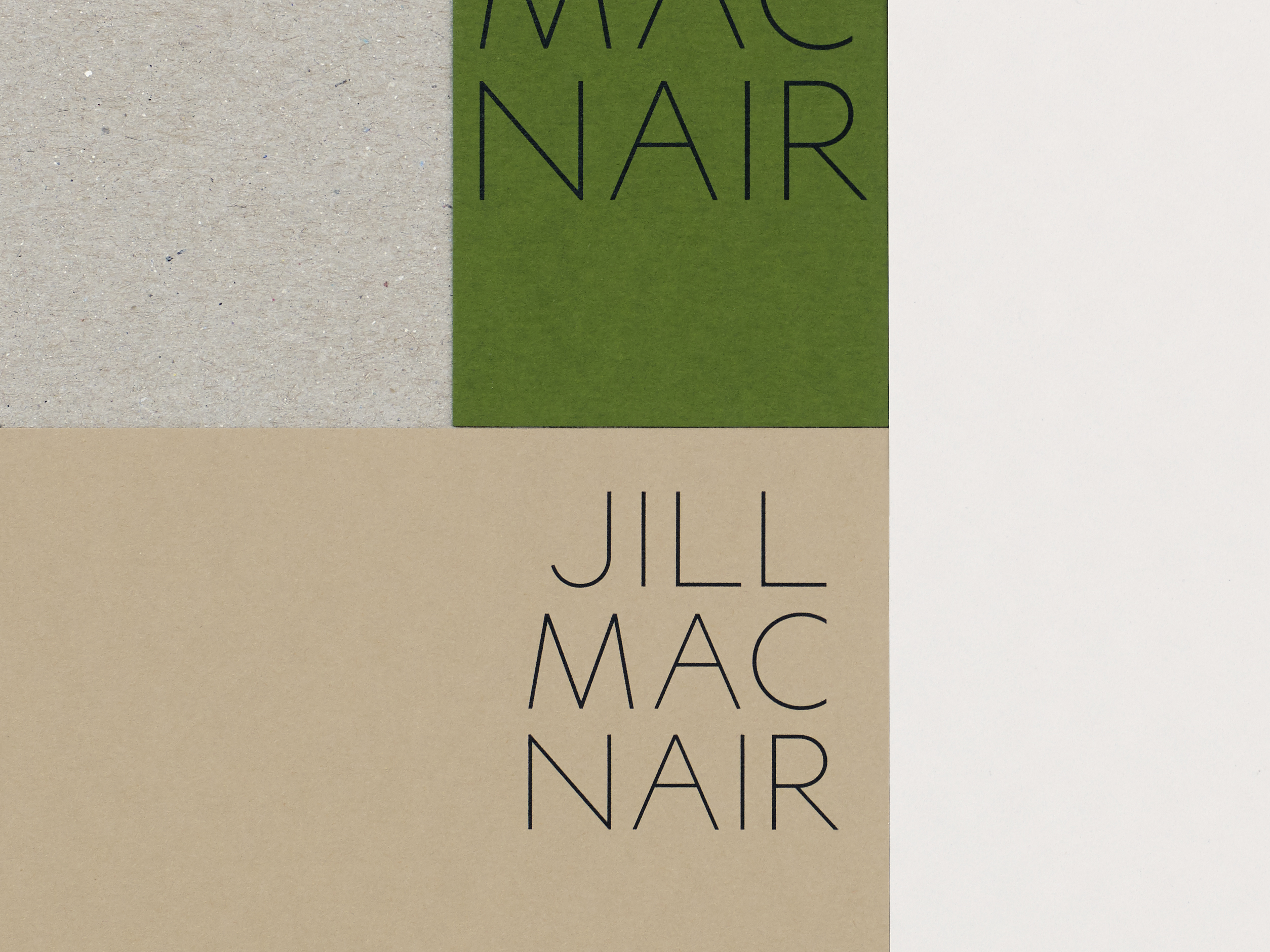
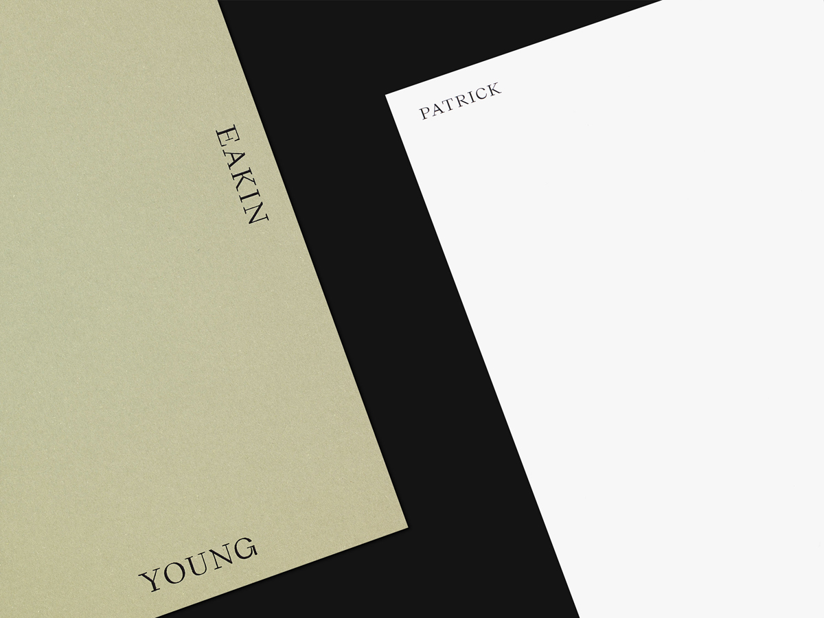
We were commissioned to design Anastassiades’ visual identity and develop a new website, bringing together his two existing sites to present a catalogue of products alongside commissions, exhibitions and other studio projects. We introduced new typography throughout the identity and a new logotype whose clean, functional and beautiful forms echo Anastassiades’ design philosophy.
Images and video were given visual priority throughout, built upon an underlying architectural structure that allows the site to adapt as new content is added. The homepage, featured collection view and limited editions page are designed to build upon one another and evolve, becoming progressively more dense and enticing in their design whilst maintaining a generous proportion of white space. The site also incorporates an extensive archive section within the About page, for which we designed and built custom audio and video players. The purity of form evident throughout Anastassiades’ work is reflected in the use of a single weight typeface throughout, with visual hierarchy established through the use of widely spaced uppercase.
