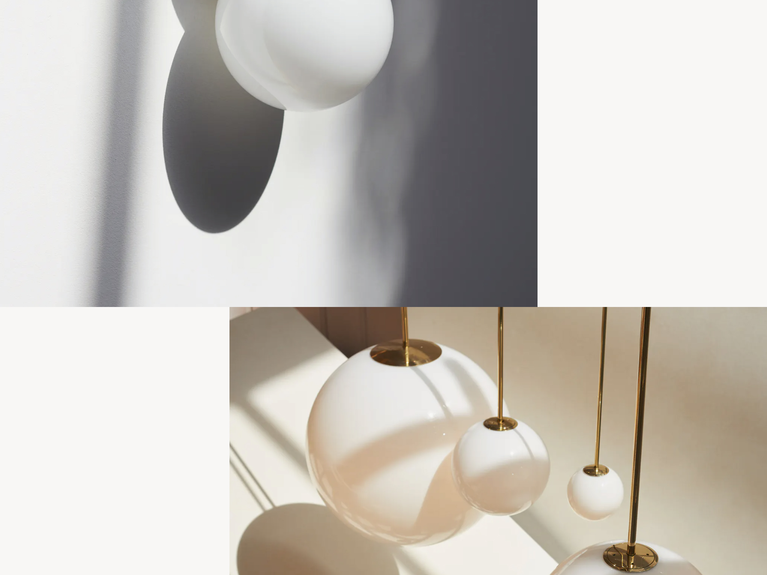
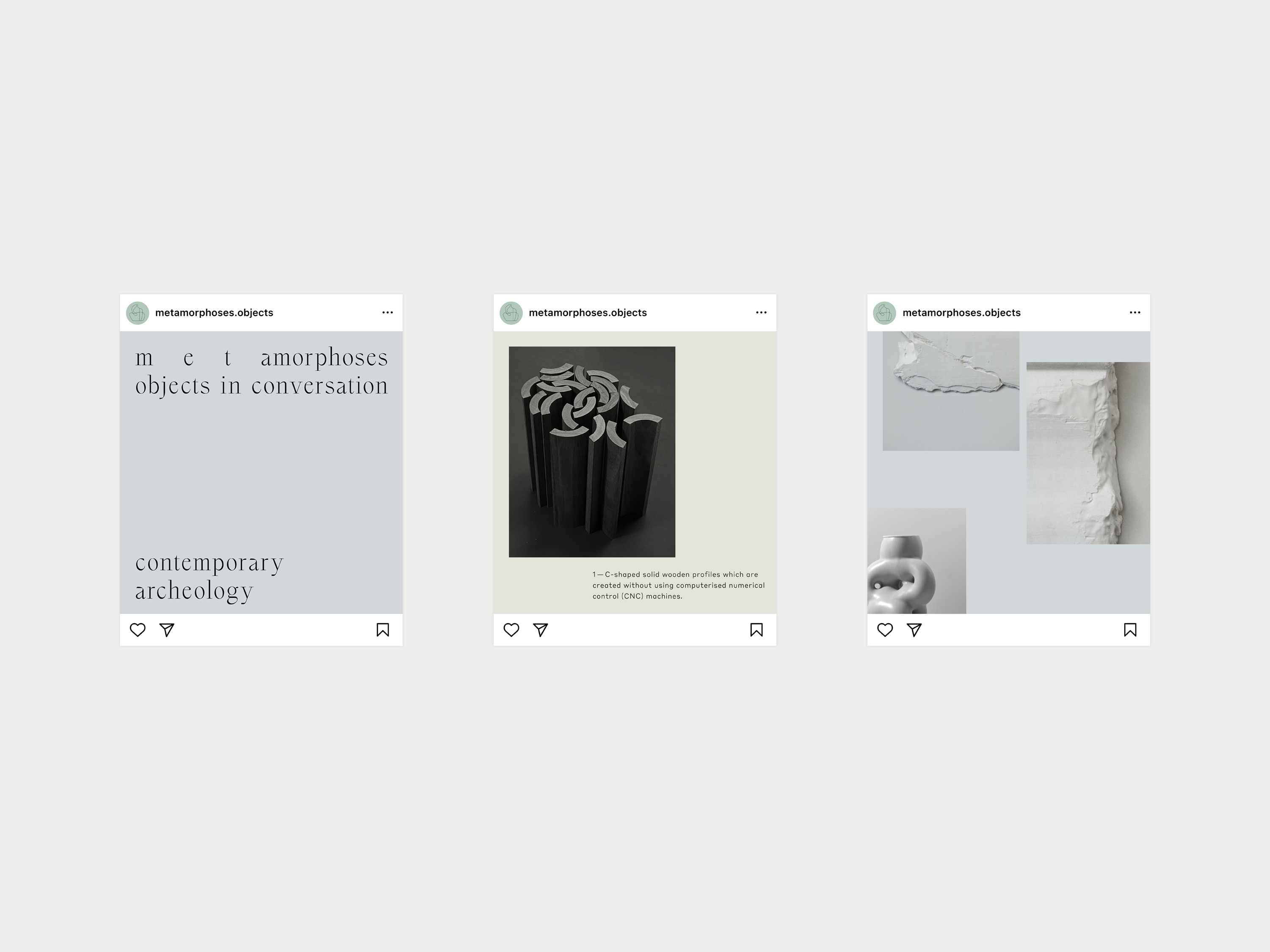
Metamorphoses is a gallery featuring unique pieces by makers who thoughtfully turn one thing into another. The tightly edited collection of pieces – many of which are special commissions – is unified by a preoccupation with transformation.
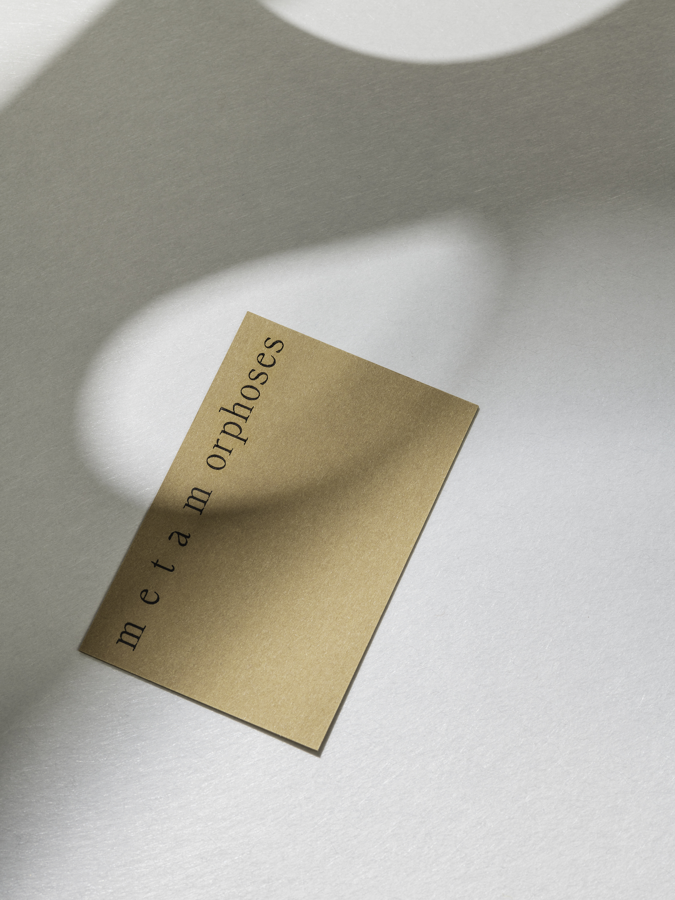
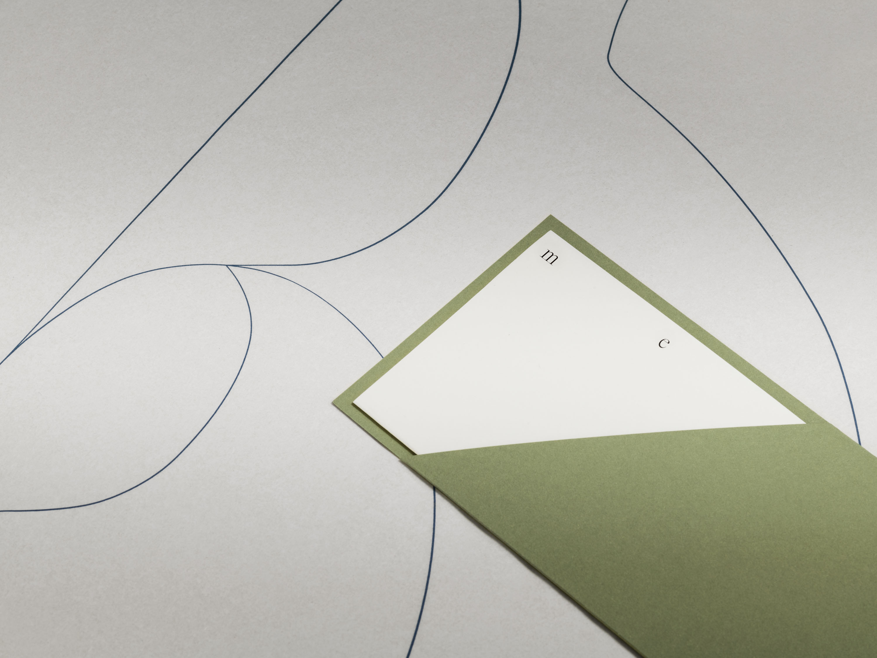
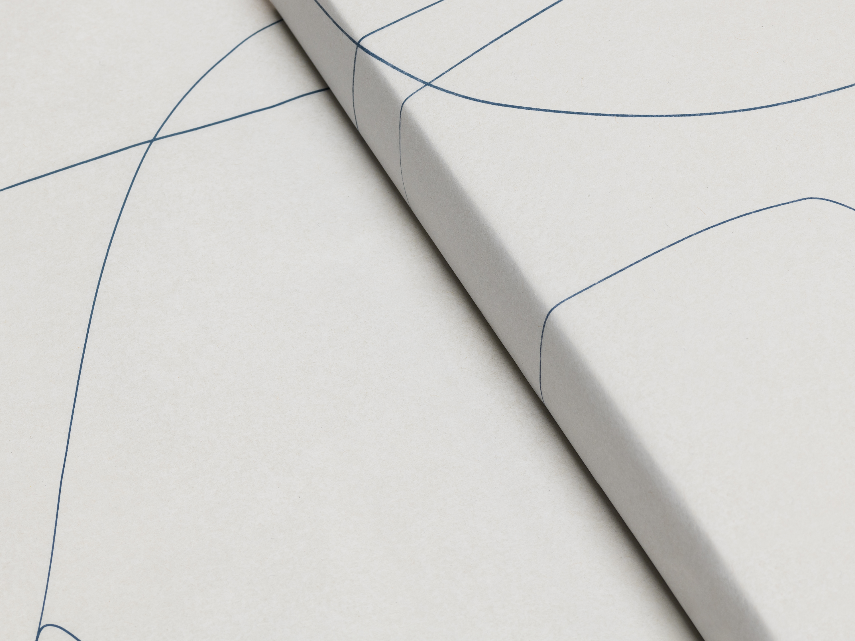
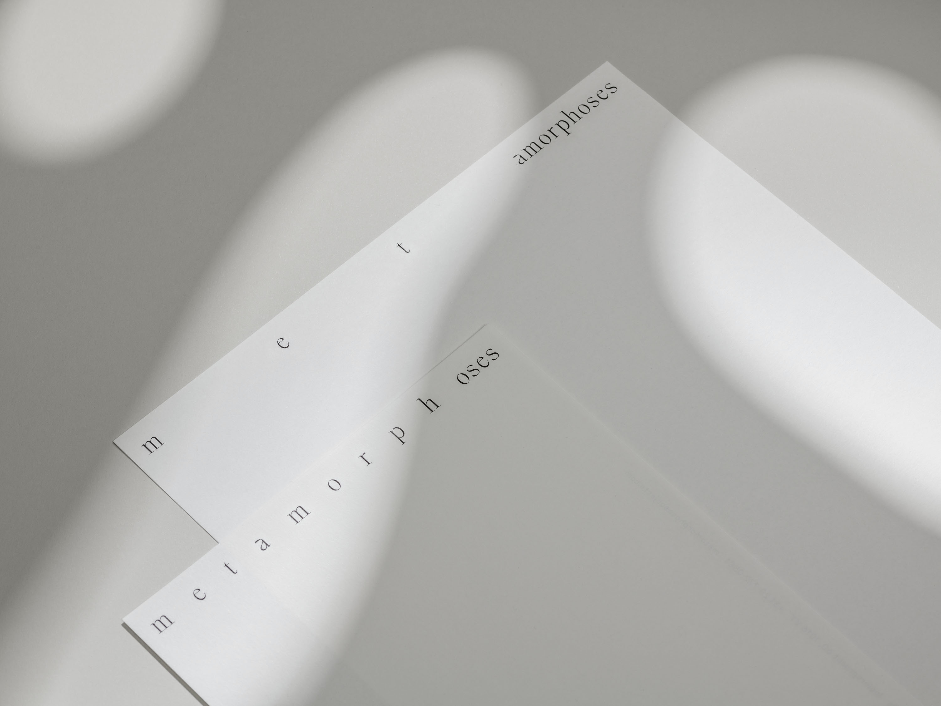
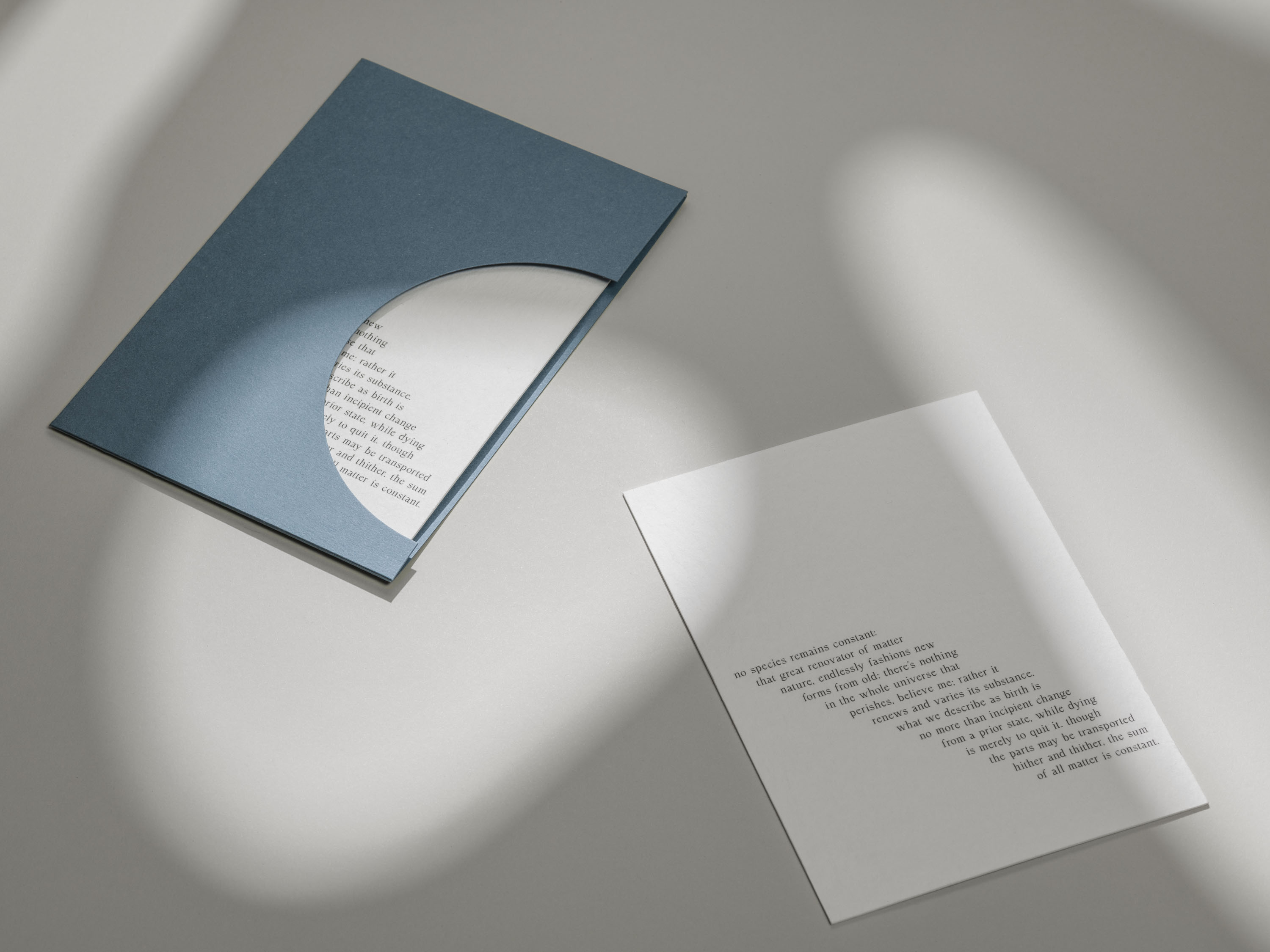
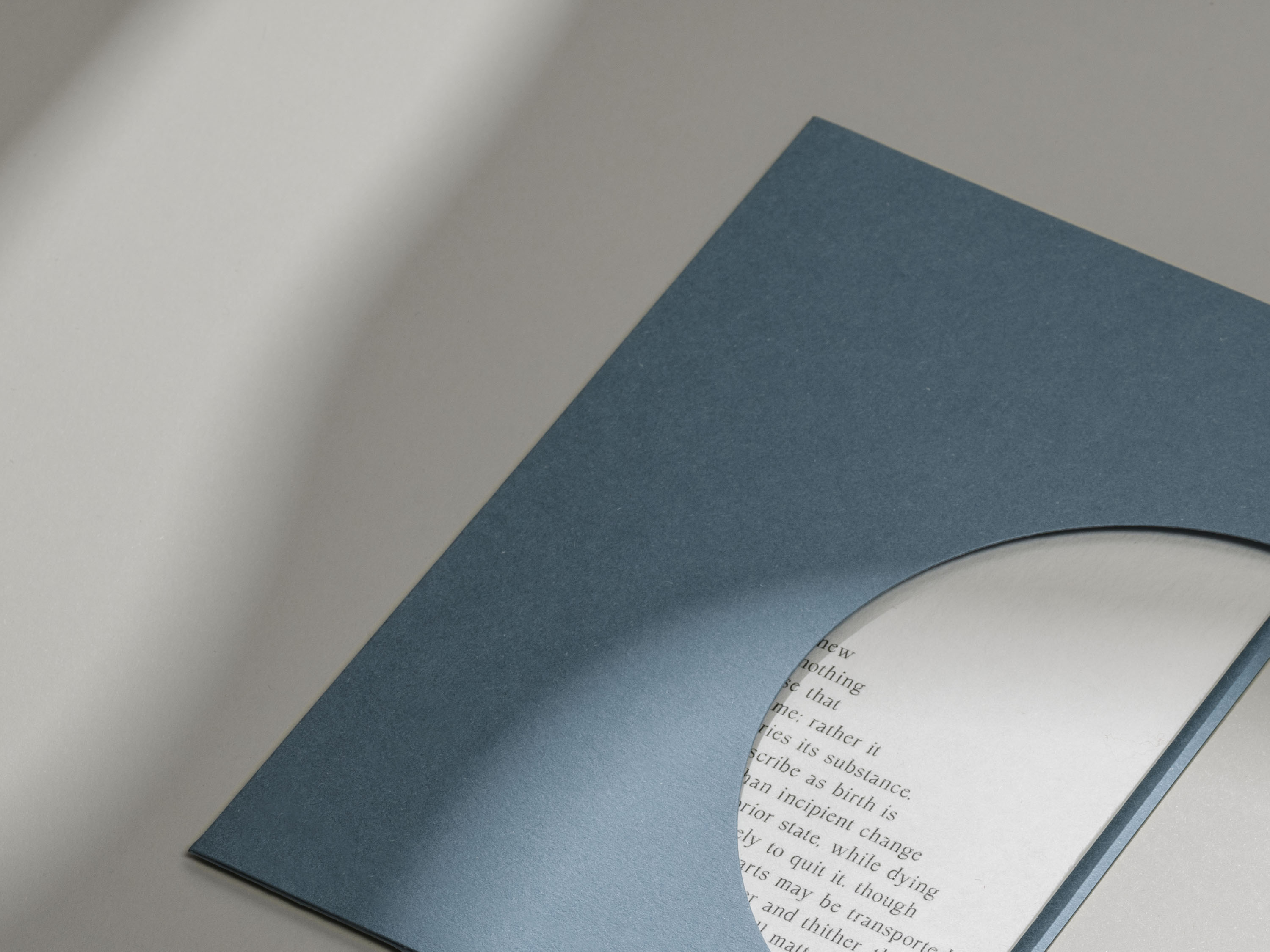
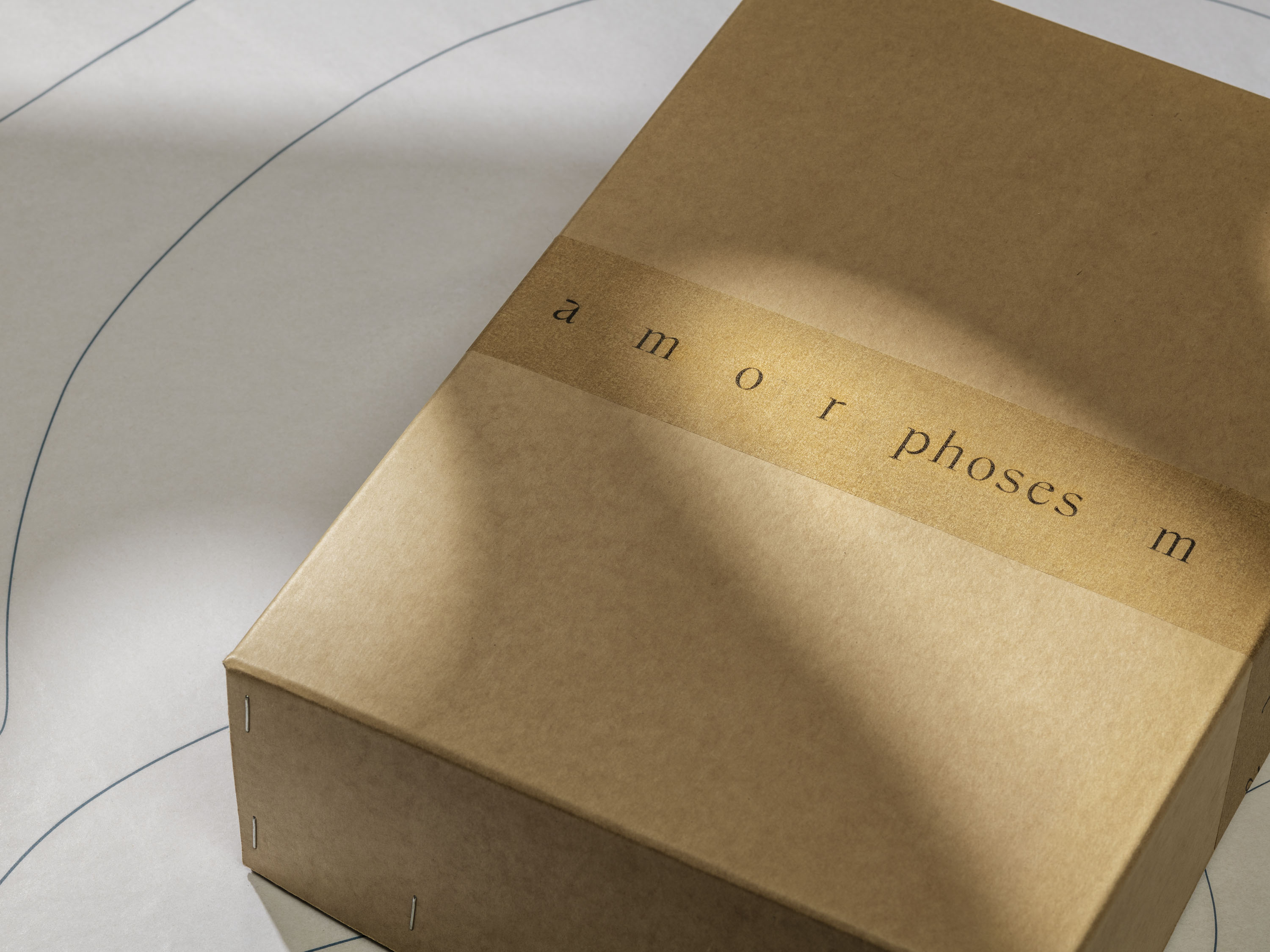
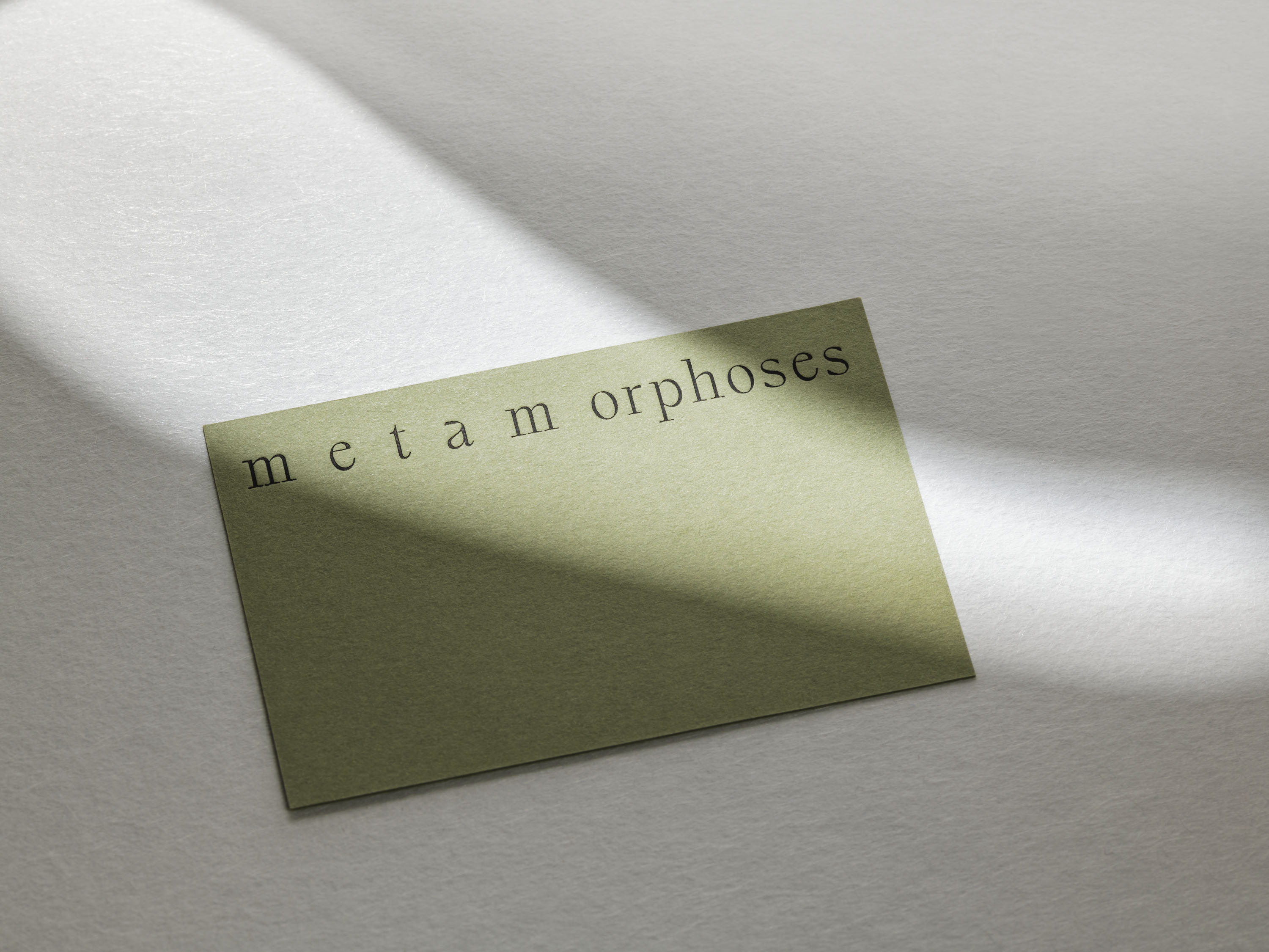
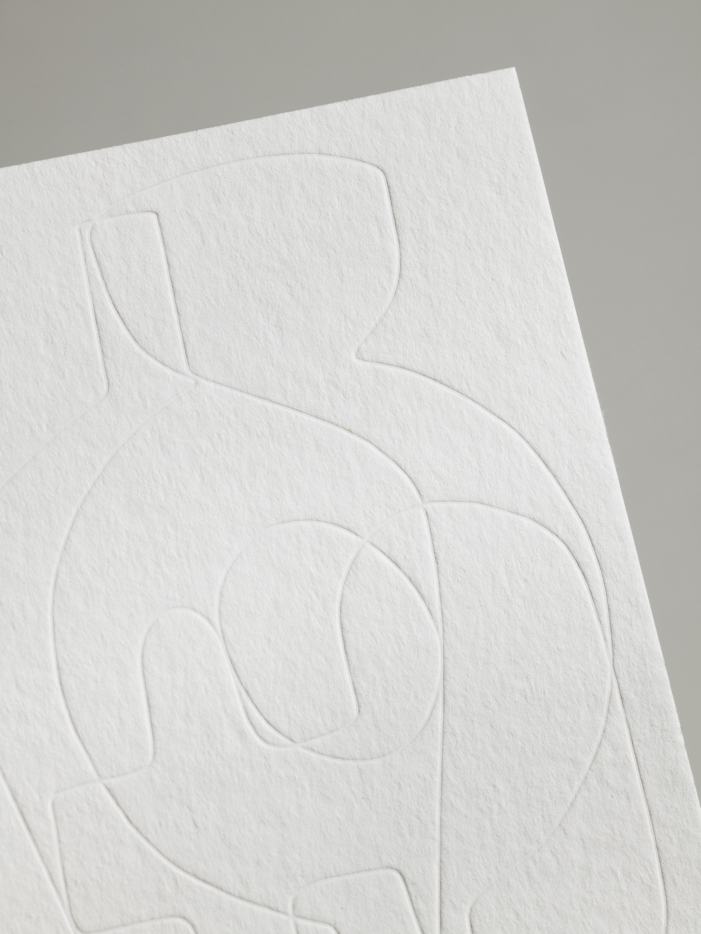
Our identity for Metamorphoses is itself transformative, with its logotype shifting from one form to another in response to its context. The type-led identity uses key passages from Ovid’s poem Metamorphoses as typographic interjections woven across the various applications. The packaging elements form a family of materials that create new compositions through the use of transparency, texture and line. Similar ideas are seen in the layered illustrations created for the gallery, where multiple objects intersect and overlap to create new forms.
Layering also forms part of our art direction, social media campaign and e-commerce website, with coloured overlays interplaying over imagery and editorial sections of the website layering over the object pages. The irregular grid of the gallery view creates a visual dialogue between the objects themselves, combining different photography by Myrthe Giesbers.
Photography: Ed Park
