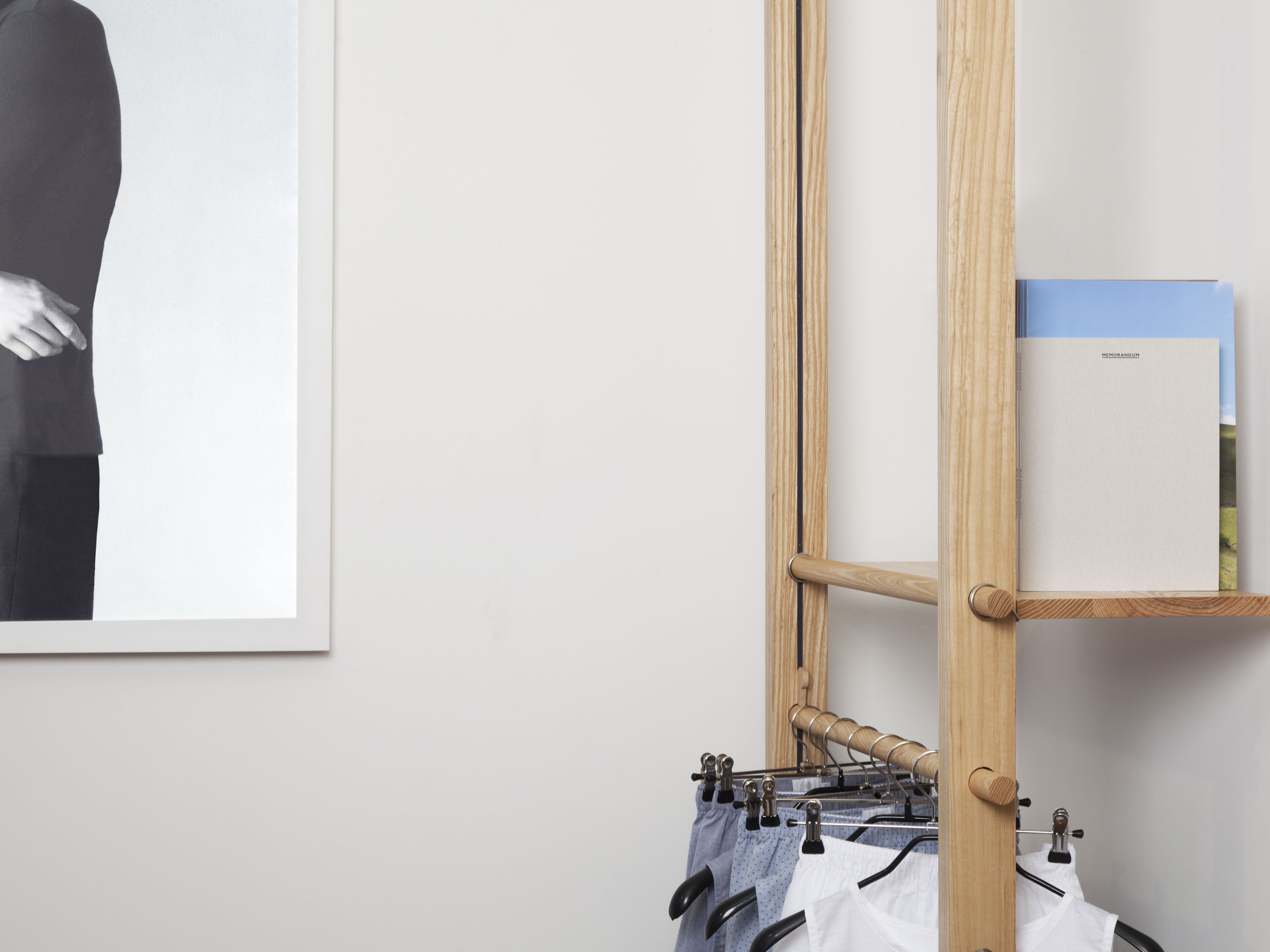

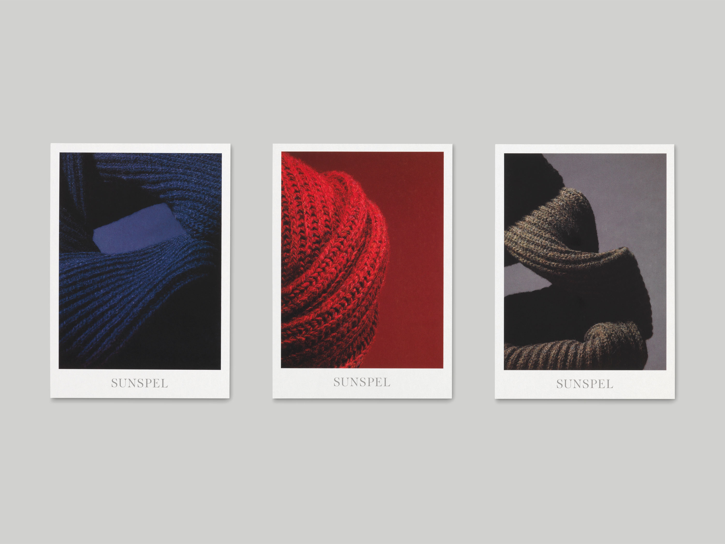
Sunspel is a British clothing company renowned for the quality of their cotton undergarments and wardrobe staples; all garments are handmade, much of it still in their factory in Long Eaton, Nottinghamshire. They approached us to design a journal which would explore and celebrate Sunspel’s heritage, as well as themes close to the brand, whilst maintaining a level of editorial independence and integrity.
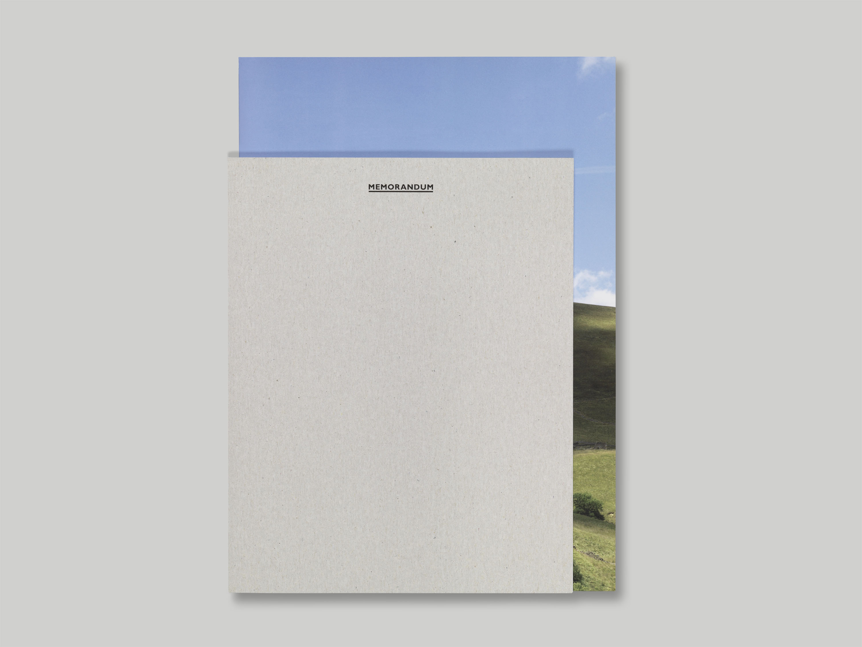
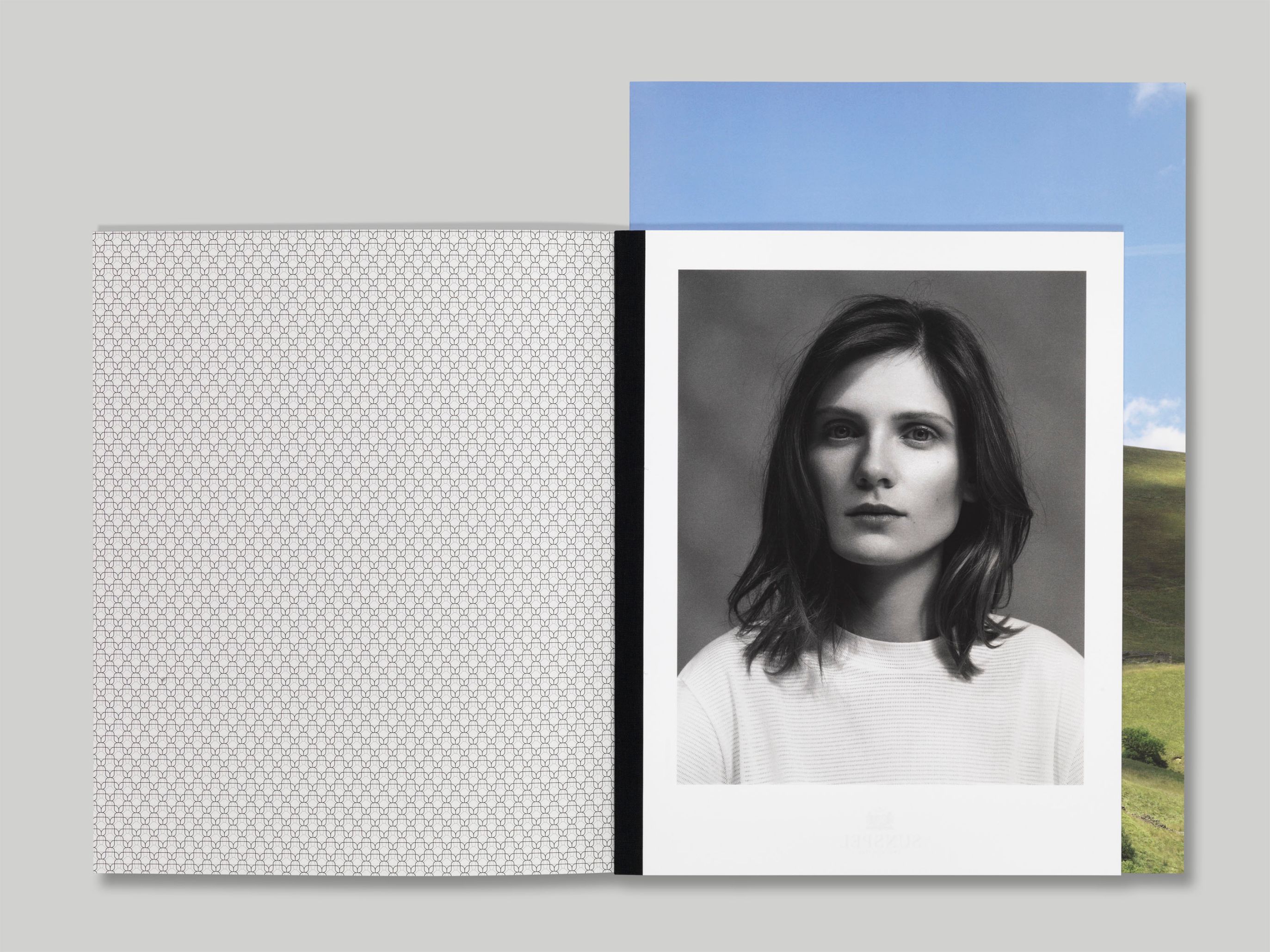
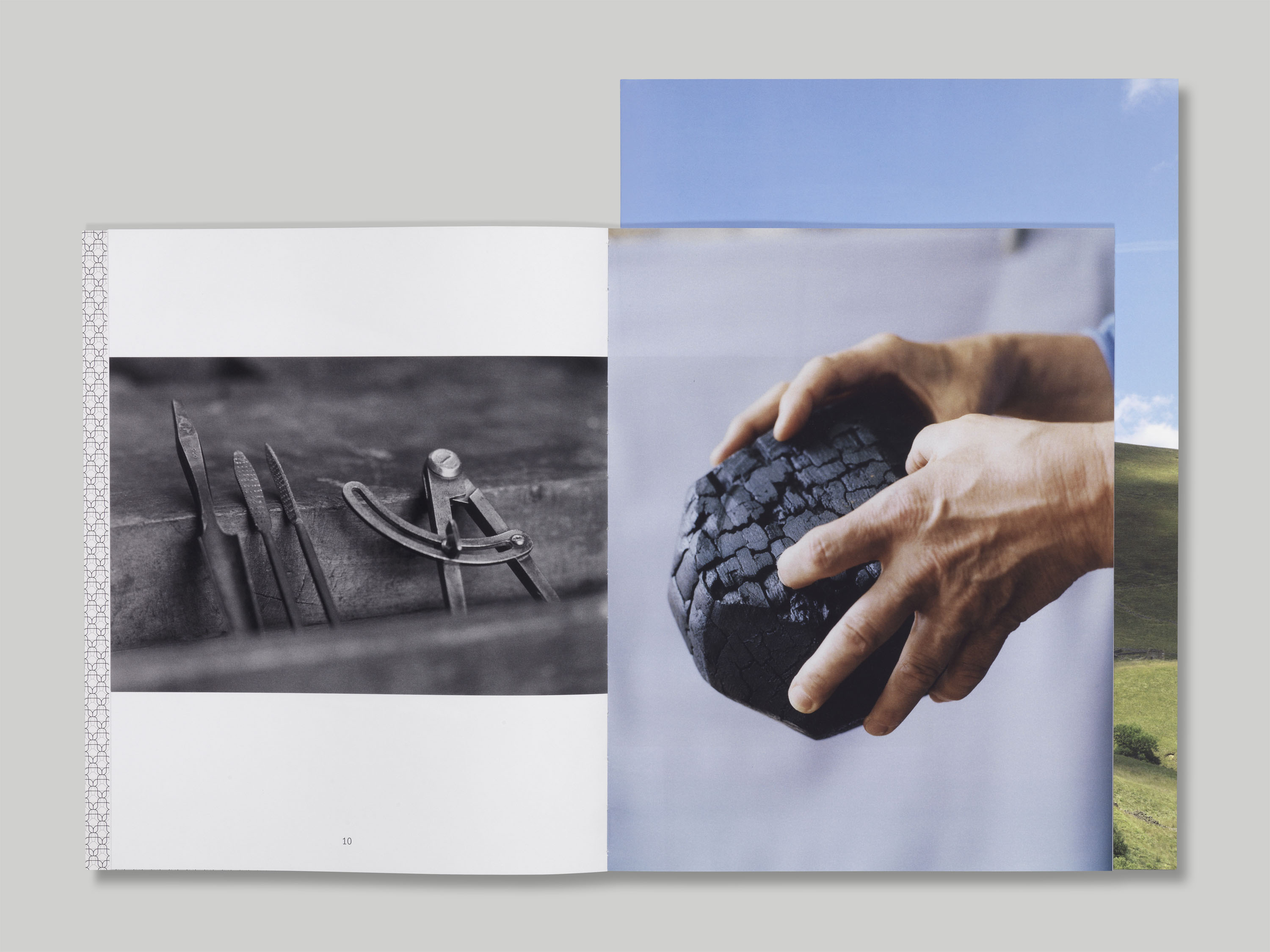
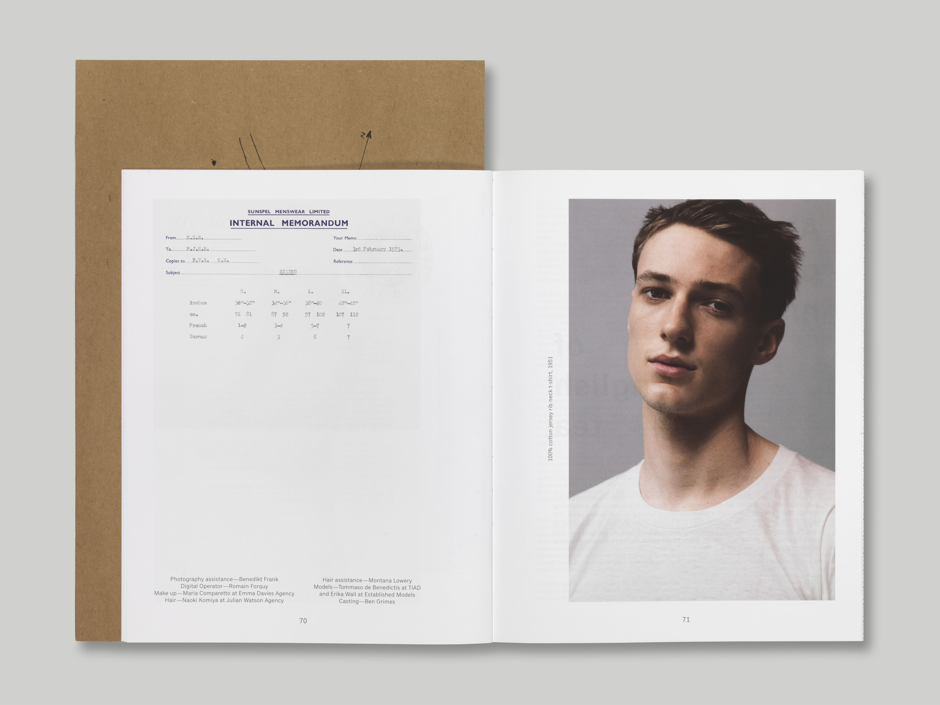
Research for the project included a comprehensive survey of the archival materials held by Sunspel at Long Eaton. The name Memorandum and the typeface for the masthead are both taken from items found within the archive, along with the lace knit pattern used on the inside cover. This archival sensibility extended to the choice of materials and formats within the journal; different paper stocks and outsized inserts create the impression of a collection of ephemera. The cover design is intentionally ambiguous, and layouts are tailored to each editorial feature, maintaining a quiet presence to highlight the content.
The masthead typeface is Gill Sans, with body text in Classic Grotesque Standard Book. Titling is in Grotesque MT Standard. The cover is printed on Uniboard S One-sided coated greyboard, main text pages on Regency Velvet, the outsized section on Symbol Freelife Satin and the card insert on Manilla Board.