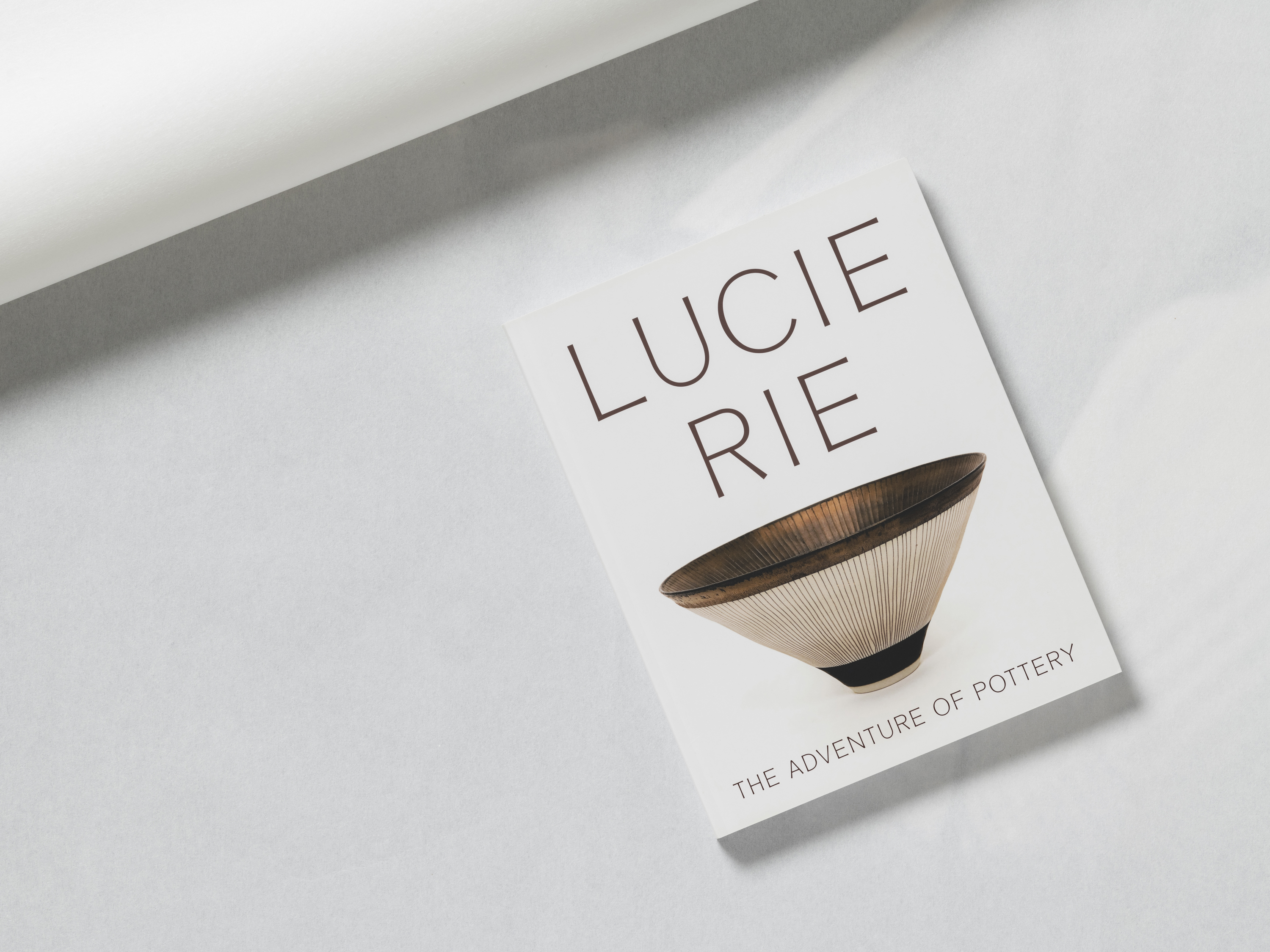
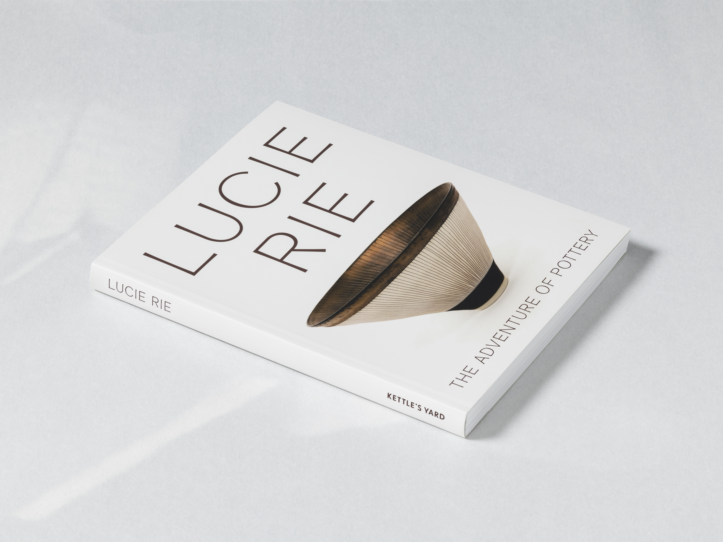
Regarded as one of the twentieth century’s most renowned ceramicists, Lucie Rie has become known for her hand-thrown vessels, use of the sgraffito technique, and choice of brightly-coloured glazes. We designed the publication, Lucie Rie: The Adventure of Pottery, and the graphics for the exhibition at Kettle's Yard in 2023, extending this identity to the accompanying campaign. Typography throughout is set in Piloti – a typeface designed by the APFEL Type Foundry, whose elegant blend of serif and sans serif sensibilities, with tapered stems and flared strokes, nods to Rie’s hand-thrown pottery.
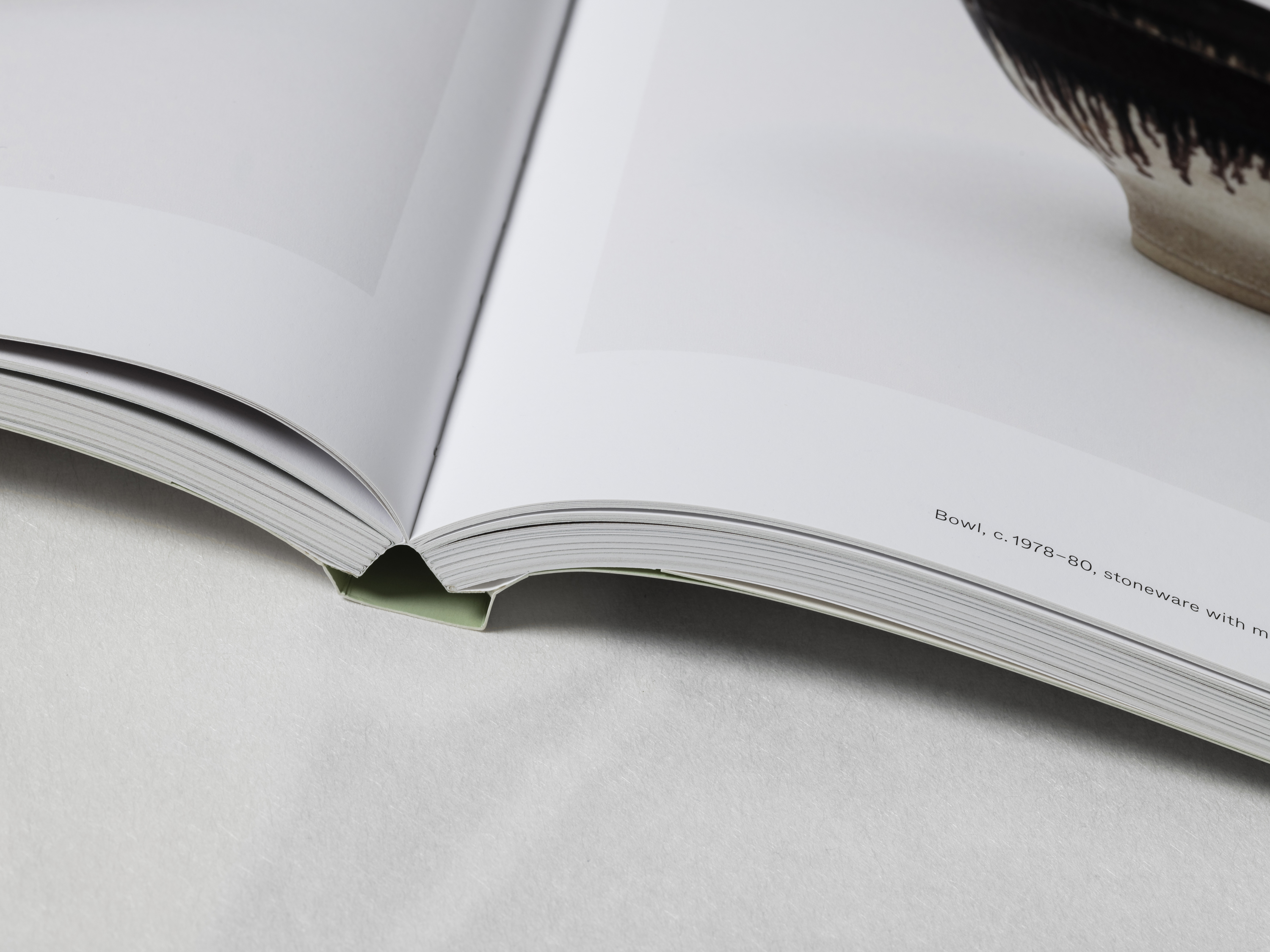
The monograph illustrates an expansive selection of works produced across Rie's career, accompanied by six essays, each generously illustrated with archival material. The layouts take cues from late twentieth-century ceramics publications, playing with conventions of page furniture from a contemporary standpoint. A selection of coloured divider pages, with a palette taken from Rie’s works, open sections of plates and essays alike, each juxtaposed against rich archival material and curated groups of ceramics. A fibrous and semi-translucent Japanese paper divides the volume between plates and essays, marked by an image of Rie working at the wheel.
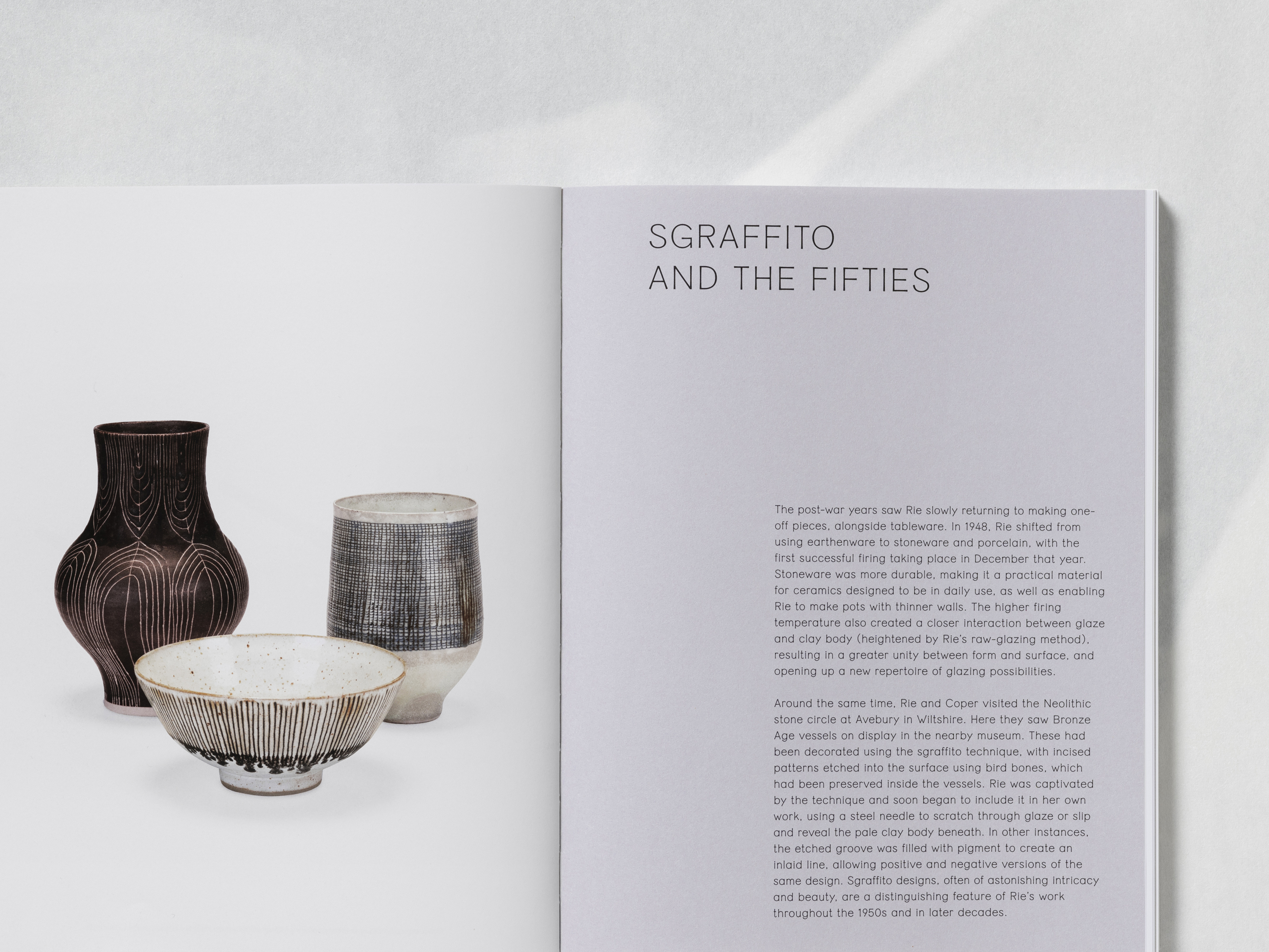
Sgraffito is a technique where layers of colour are applied to the surface of a pot, which are scratched away in patterns to reveal the tones beneath. Lucie Rie was a practitioner of this delicate technique, evident in the bowl on the book’s cover.
Body text throughout is set in ABC Whyte by Dinamo, a functional sans serif with subtle quirks, such as the flat base of the loop of the ‘g’ – further re-affirming the sense of craft and the importance of the hand in Rie’s works.