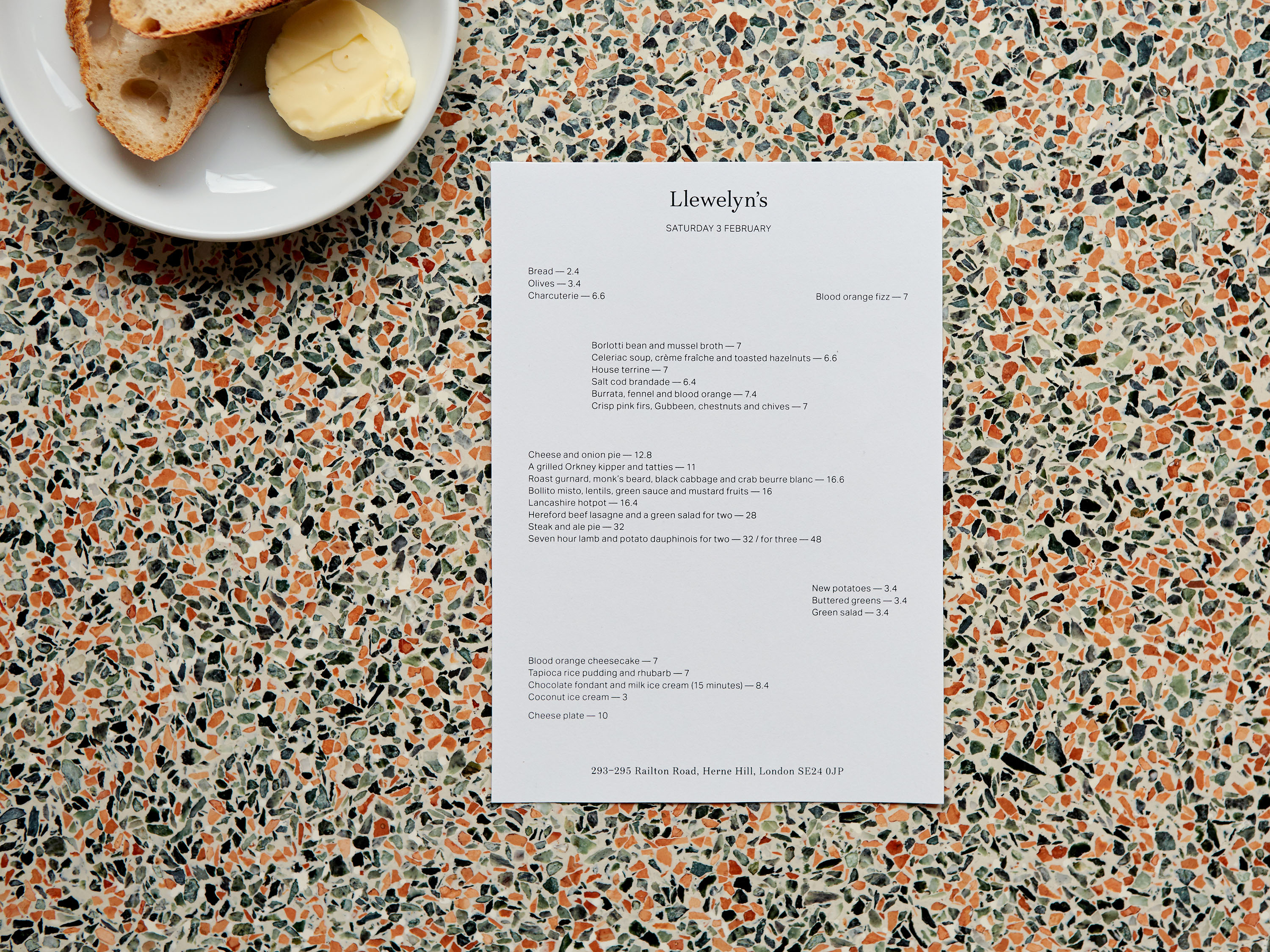


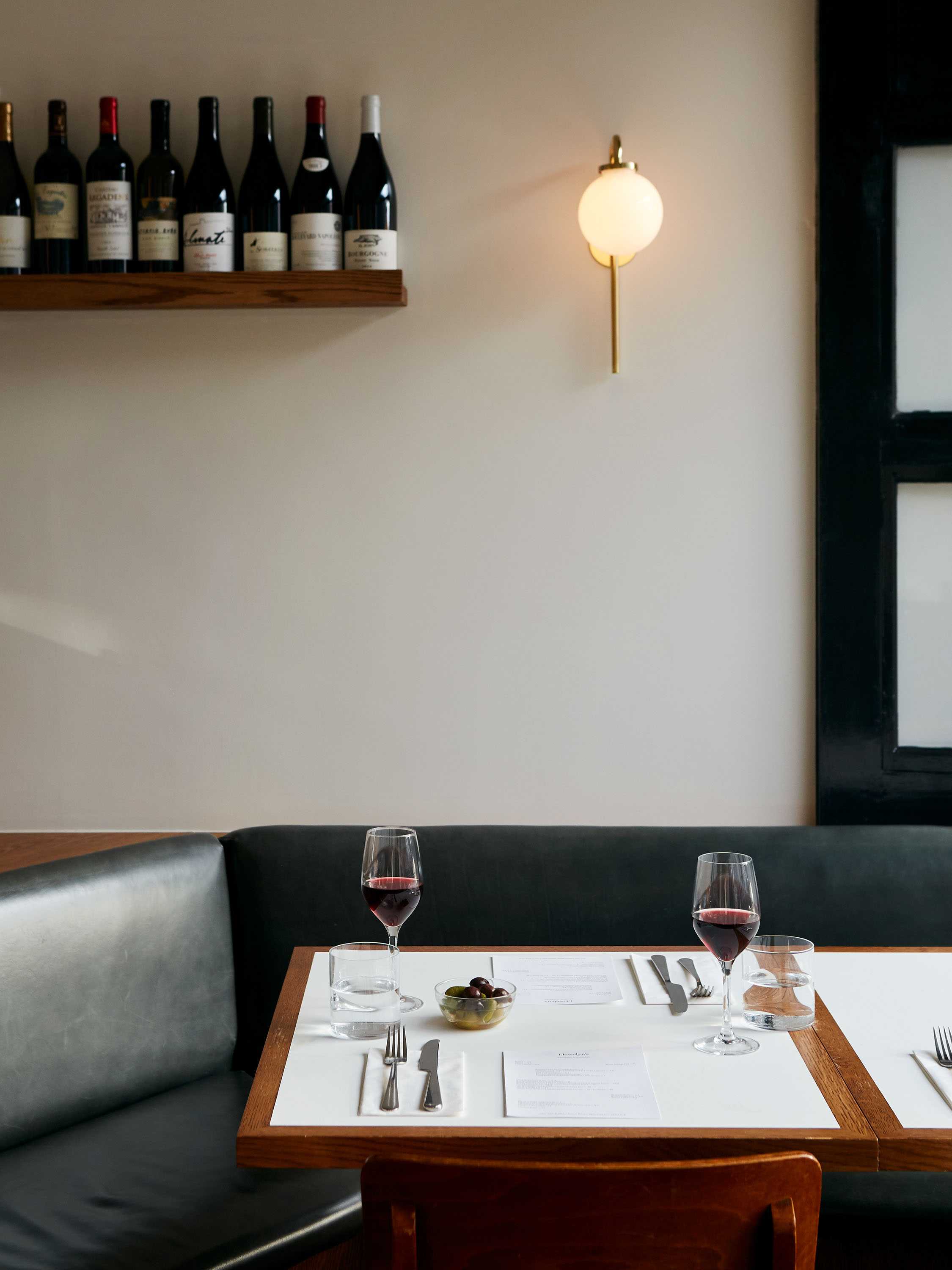


Located in Herne Hill, South London, Llewelyn’s is a neighbourhood restaurant offering seasonal contemporary British cuisine. The restaurant is housed in a beautiful, light space which retains its original curved glass shop-front windows; we wanted to reflect this lightness and elegance within the identity. The design pairs two typefaces: Bressay Display for headlines, and Aktiv Grotesk Light for body text. The logotype is a customised word marque based on Bressay Display, which we adjusted to lighten the serifs even further, rounding off the letterforms and extending the taller letters. The printed material for the restaurant was also designed with this feeling of lightness in mind, particularly within the layout of menu items and other information.