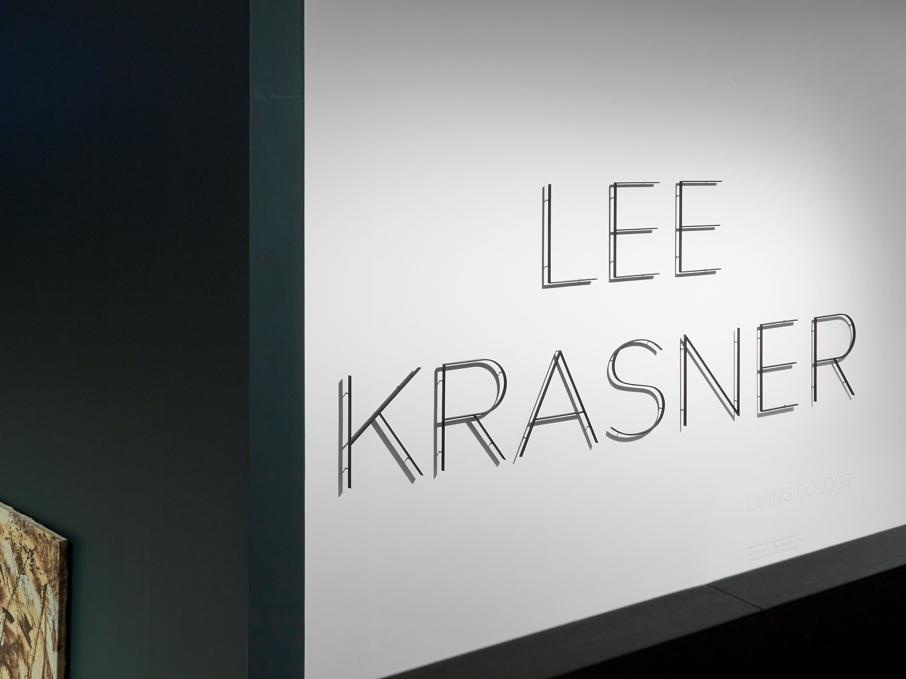
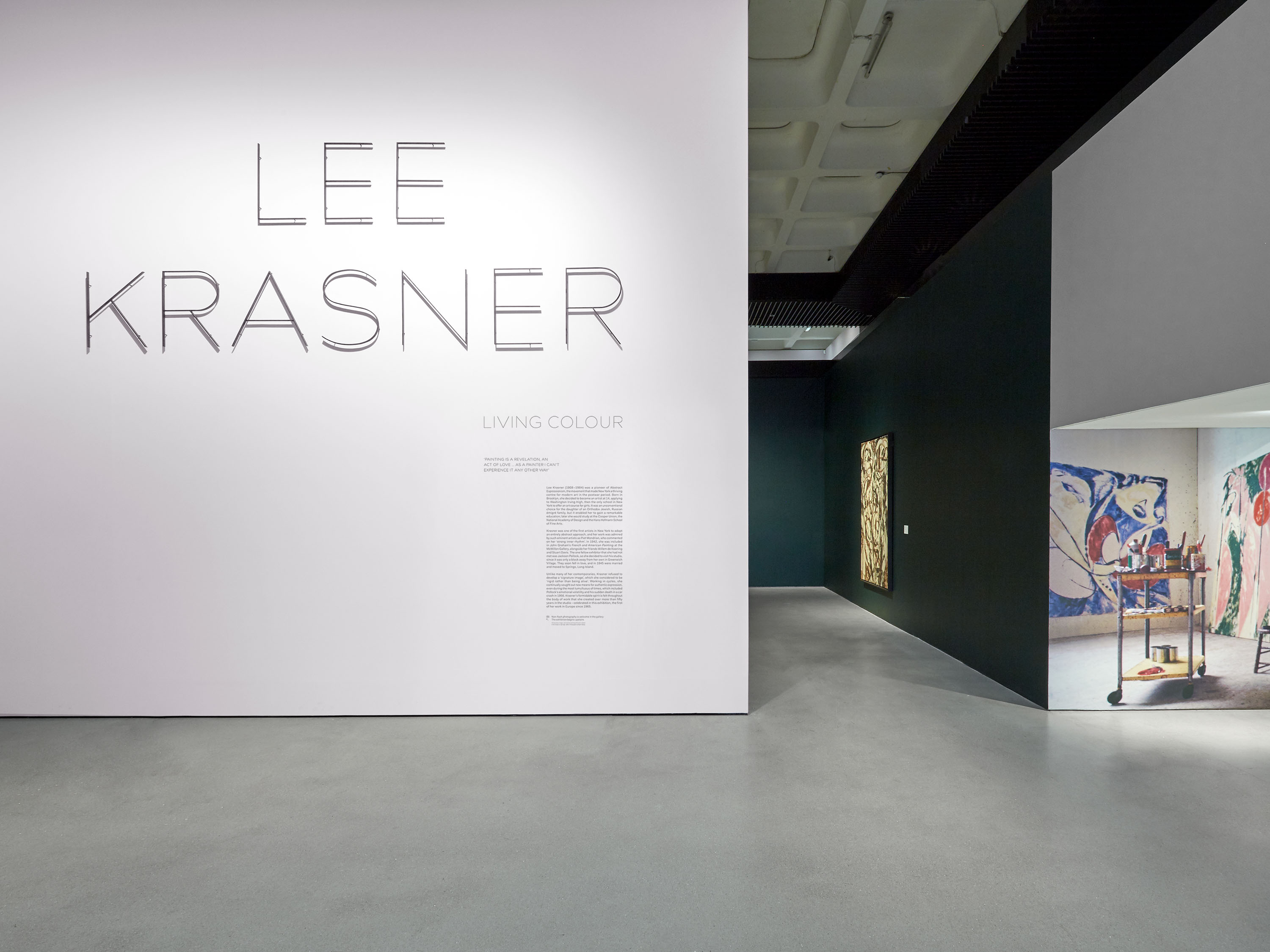
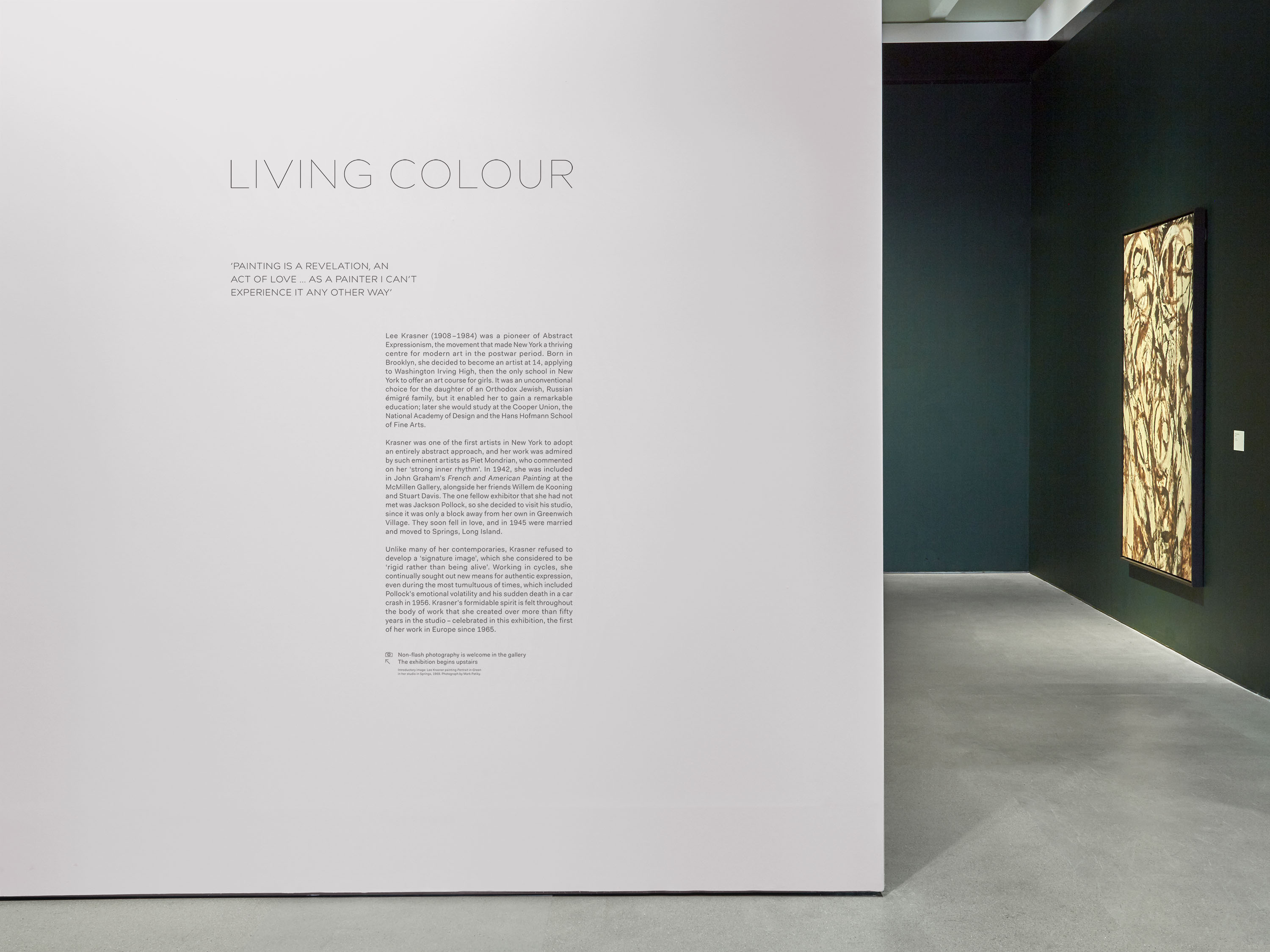
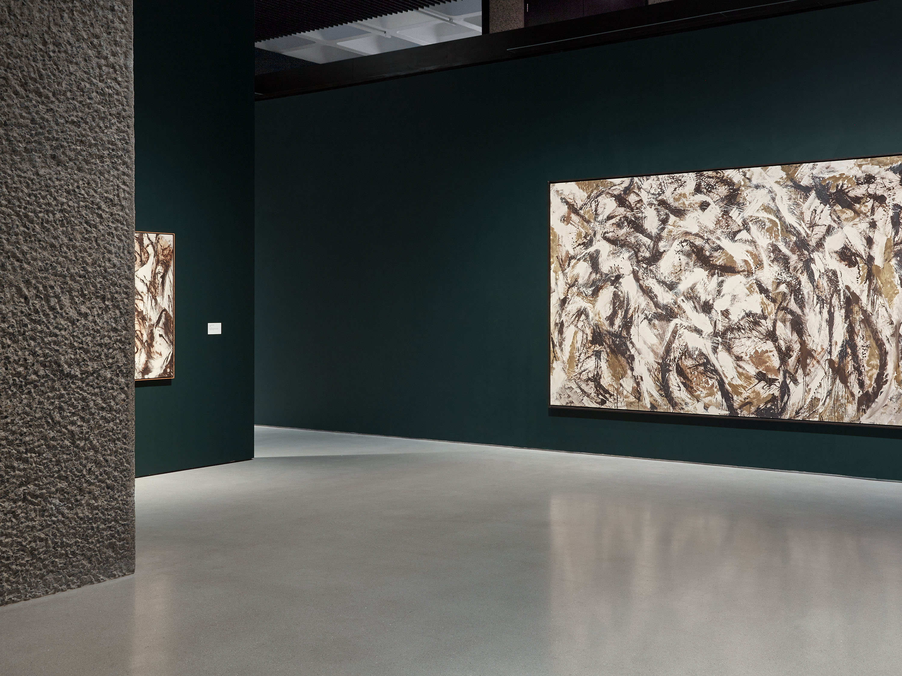
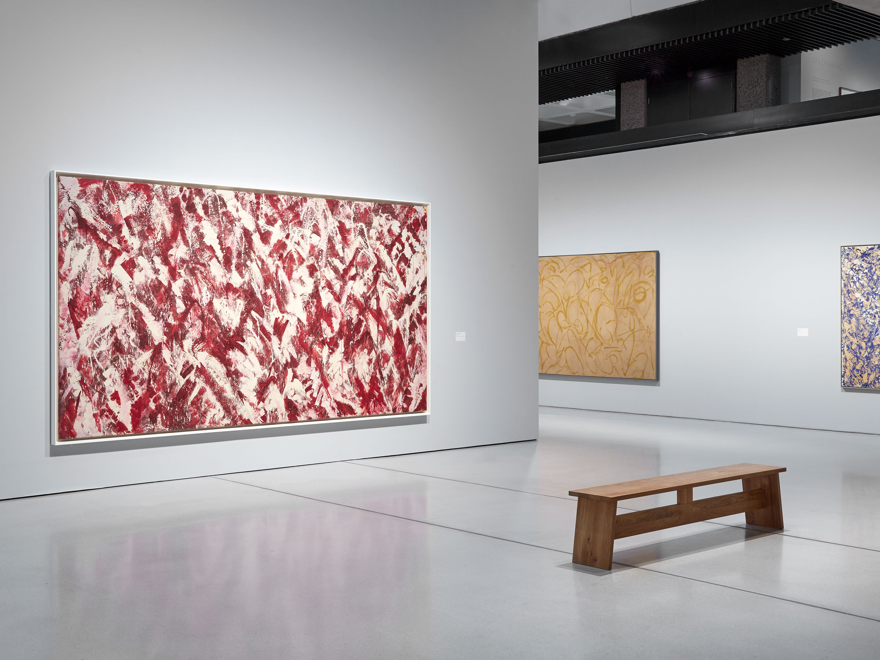
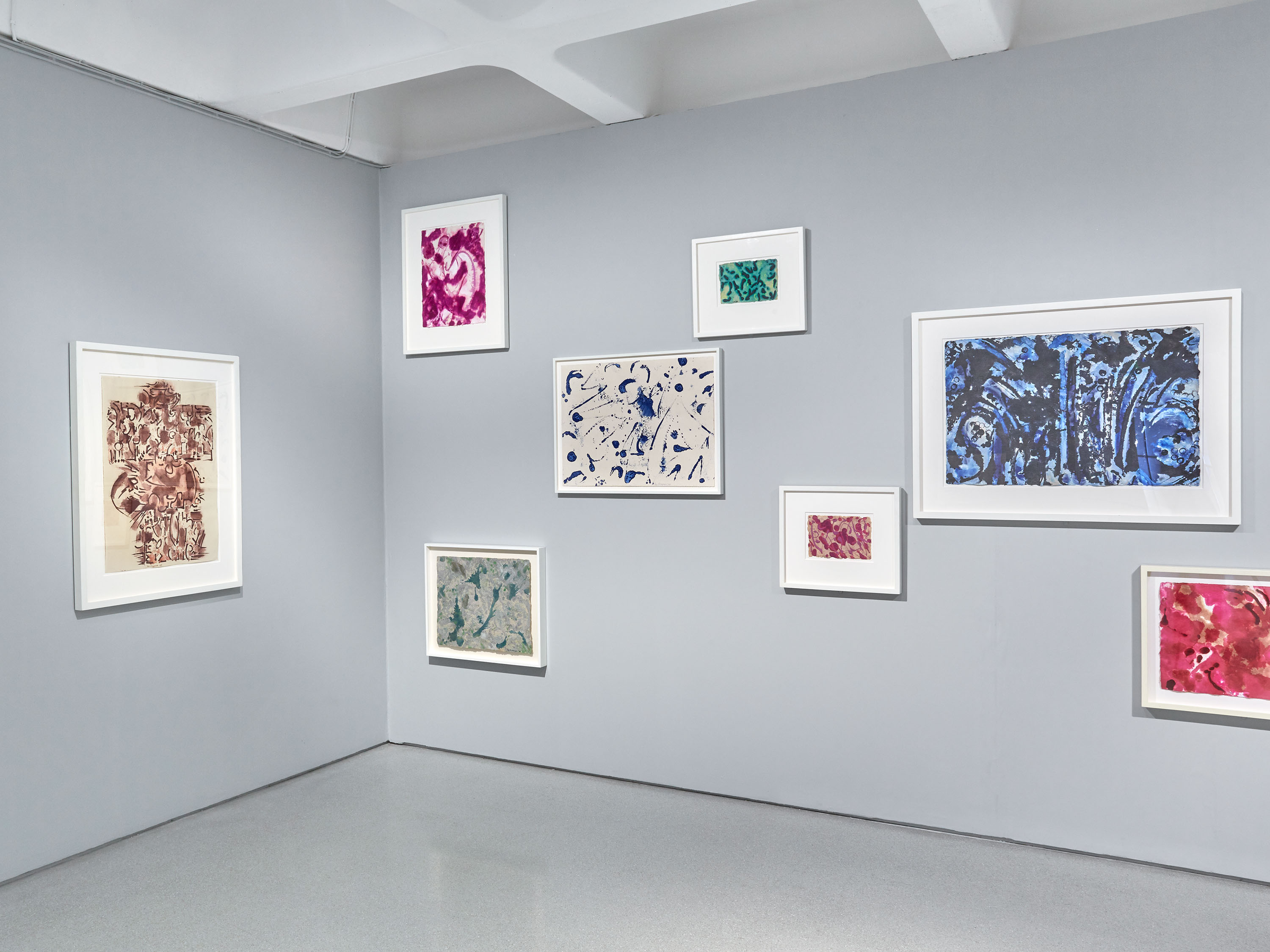
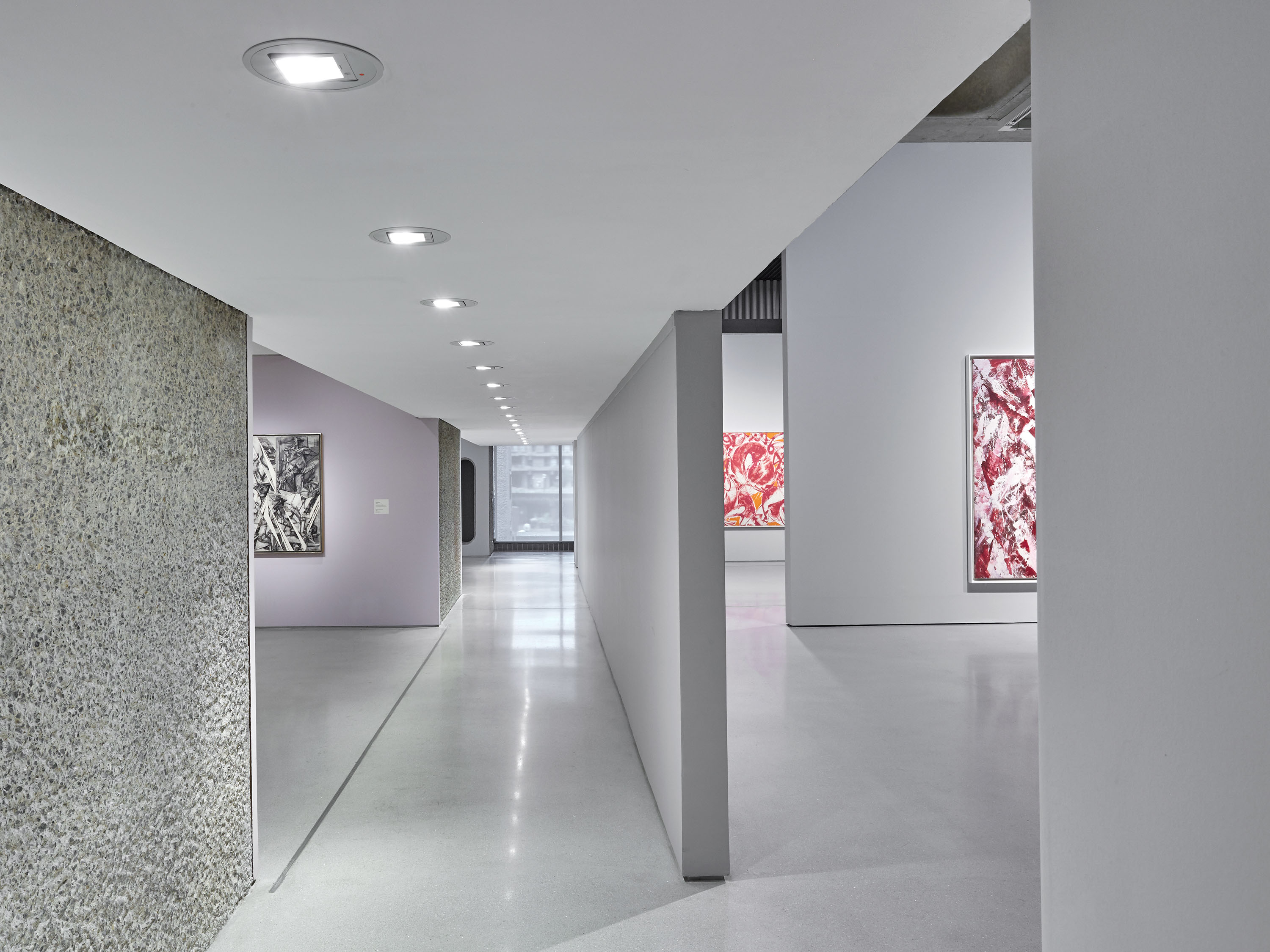
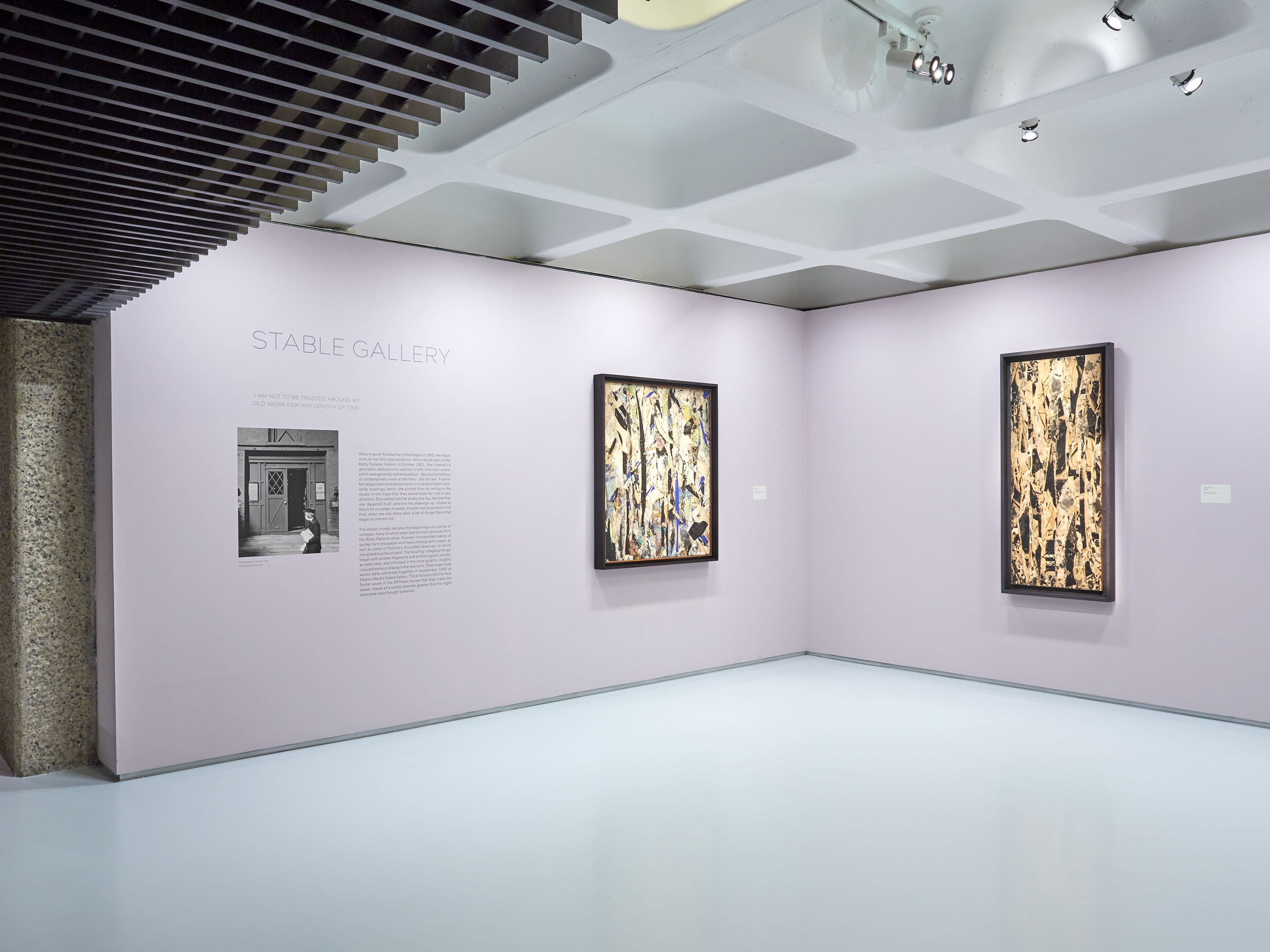
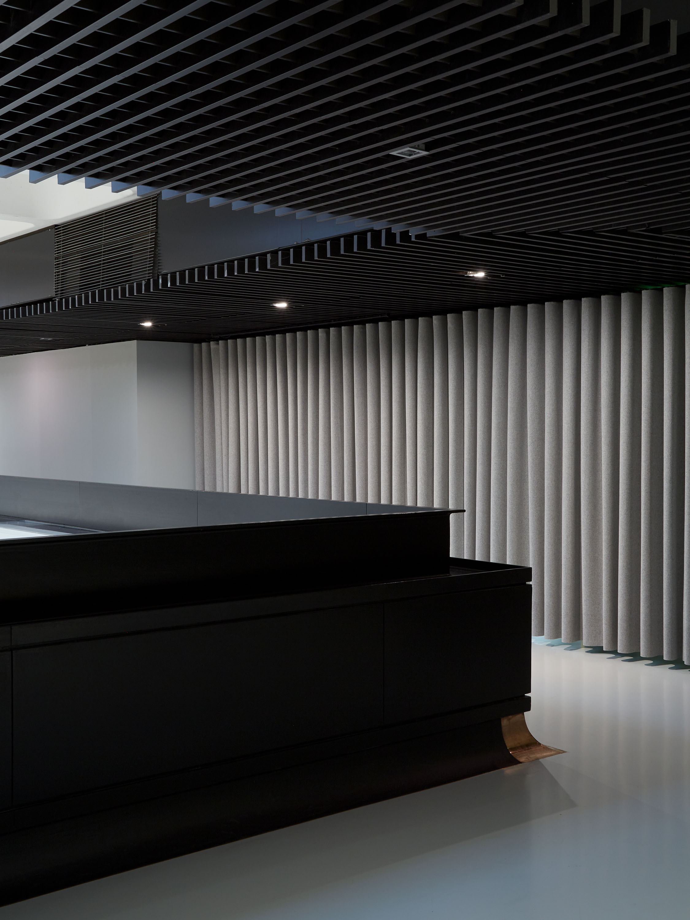
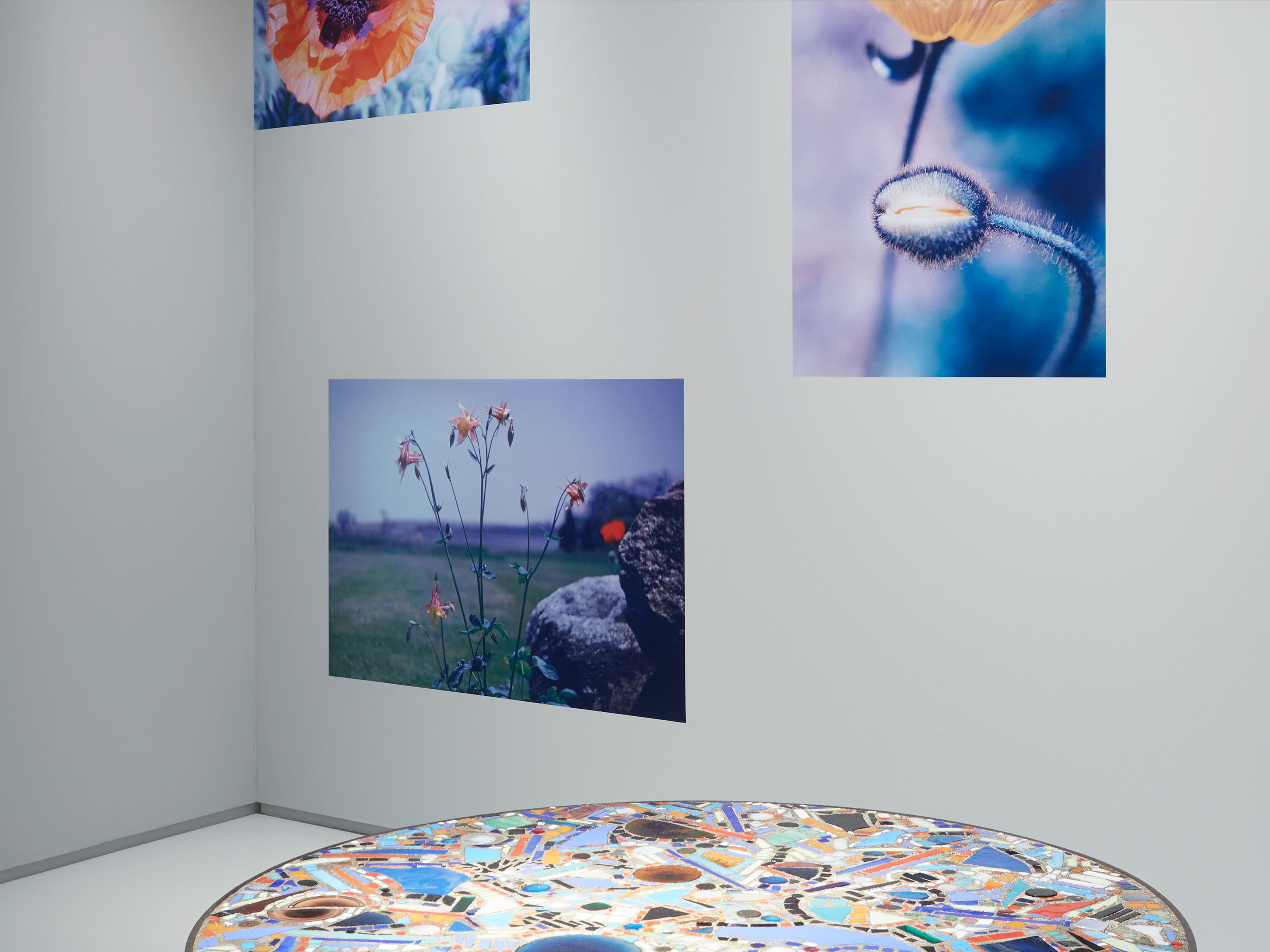
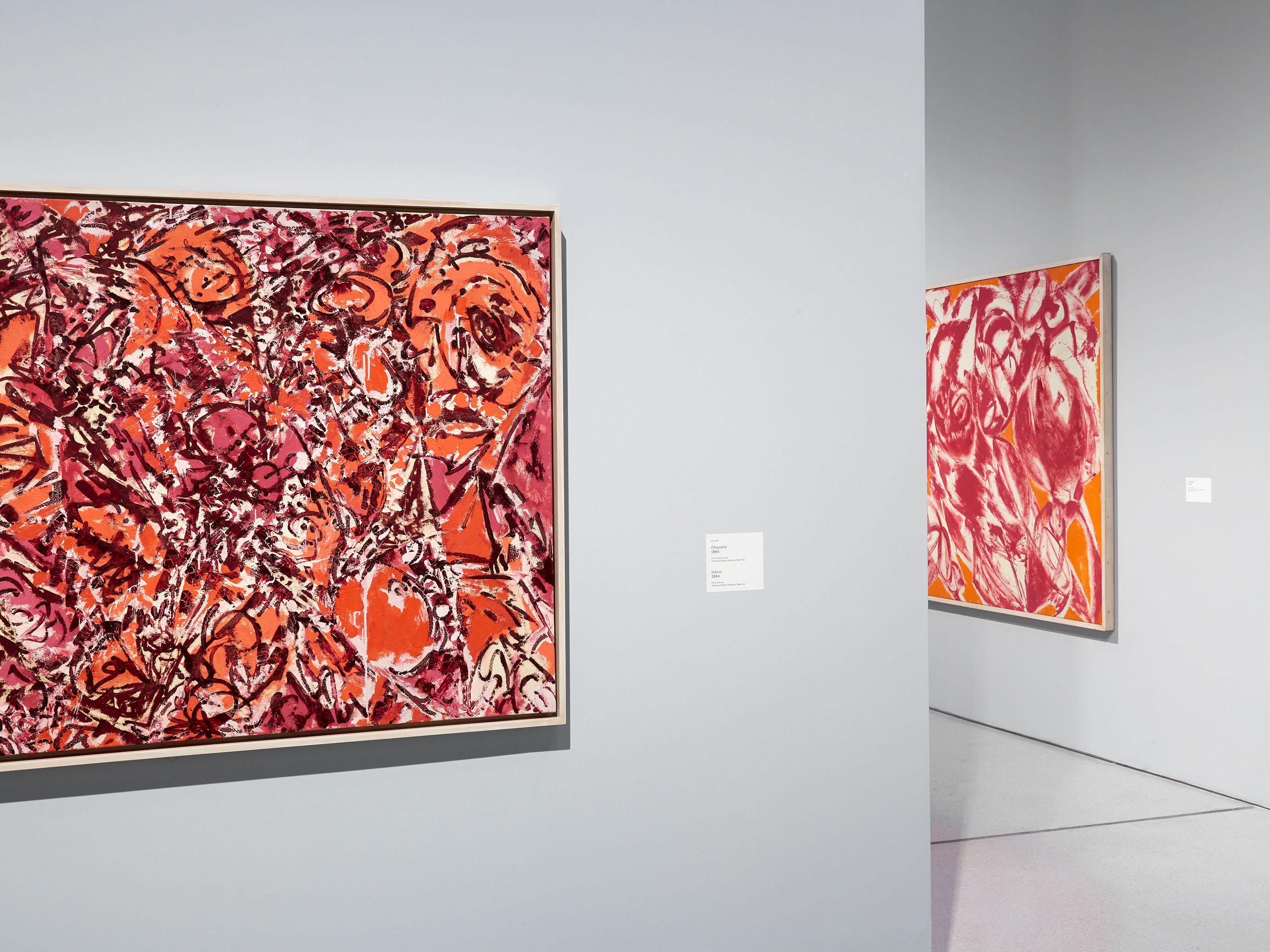
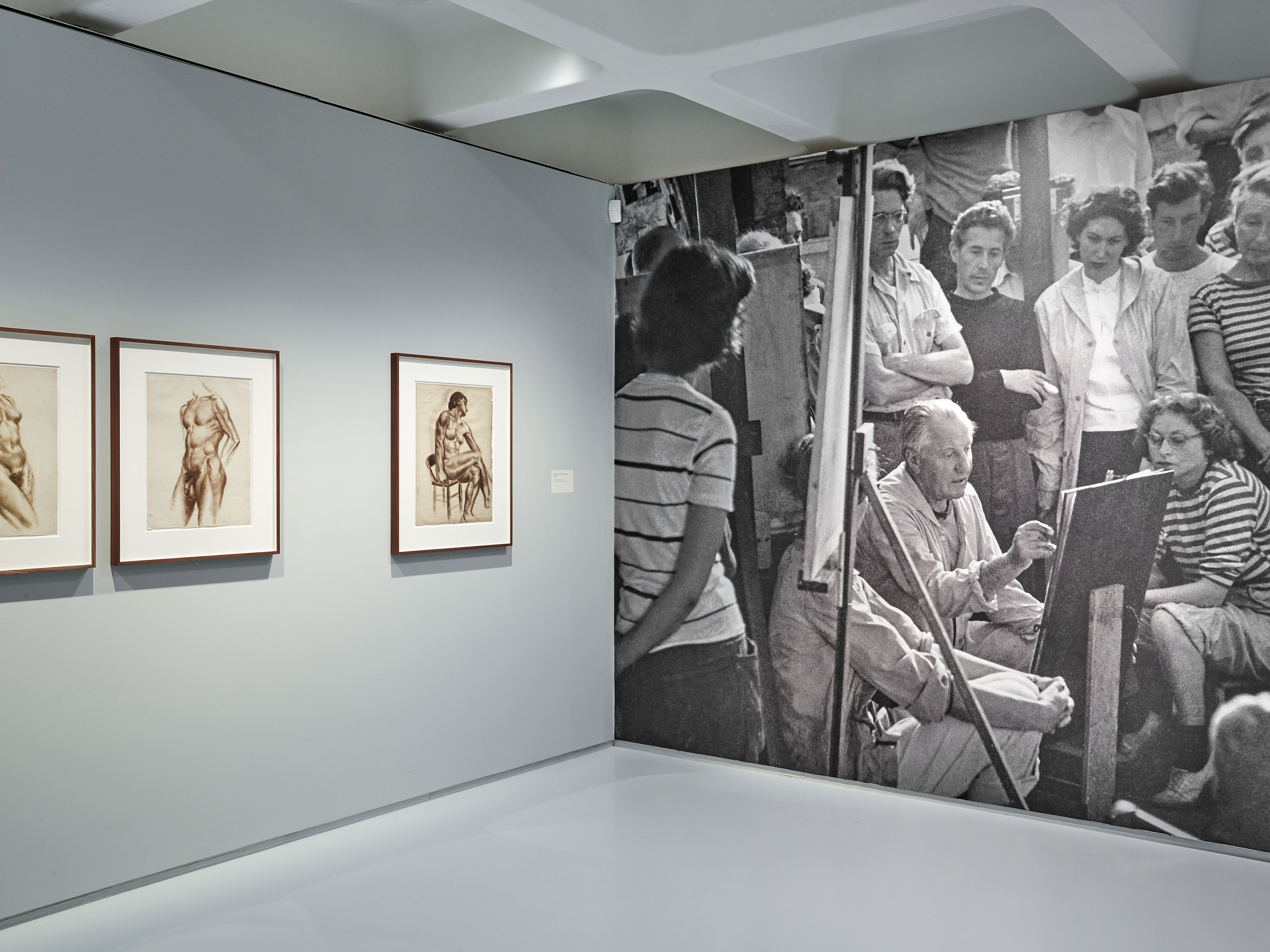
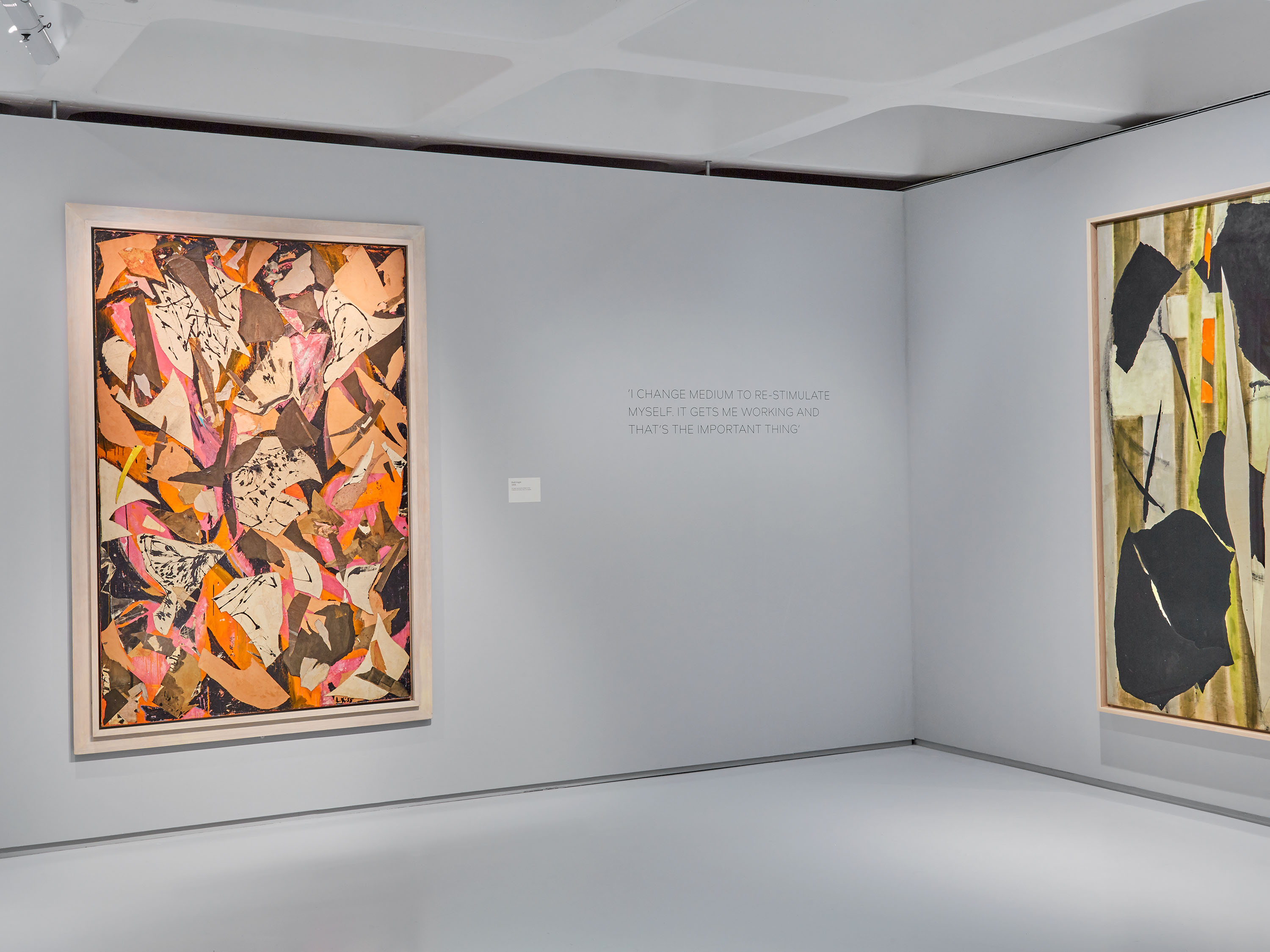
Lee Krasner: Living Colour is the first retrospective of Krasner’s work to be held in Europe for over fifty years. It explores the breadth of the artist’s pioneering, inventive practice, exhibiting almost 100 works from across Krasner’s career, including several that have never before been exhibited in the UK. The exhibition seeks to examine Krasner’s work in its own right, and celebrate her importance as an artist whose contribution to twentieth-century art transcends the significance of her marriage to Jackson Pollock.
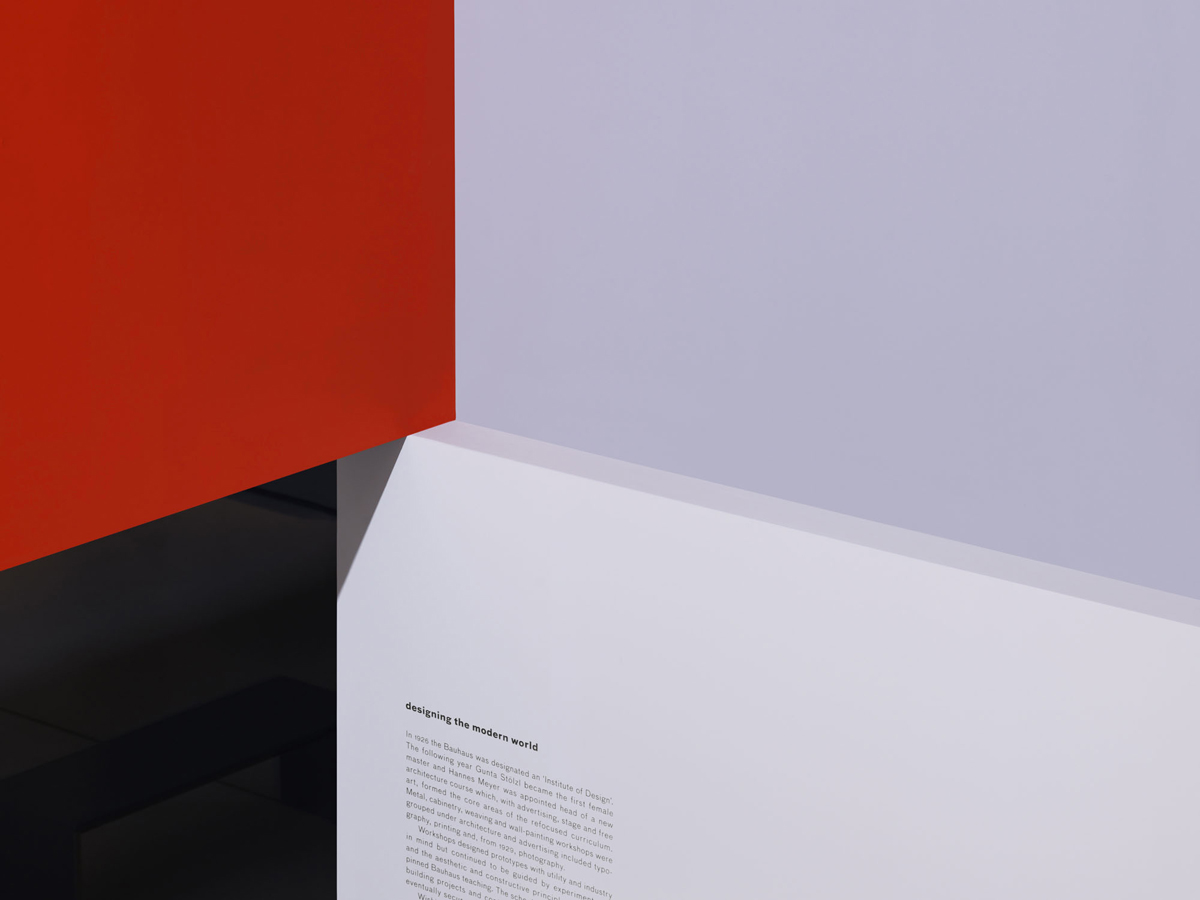
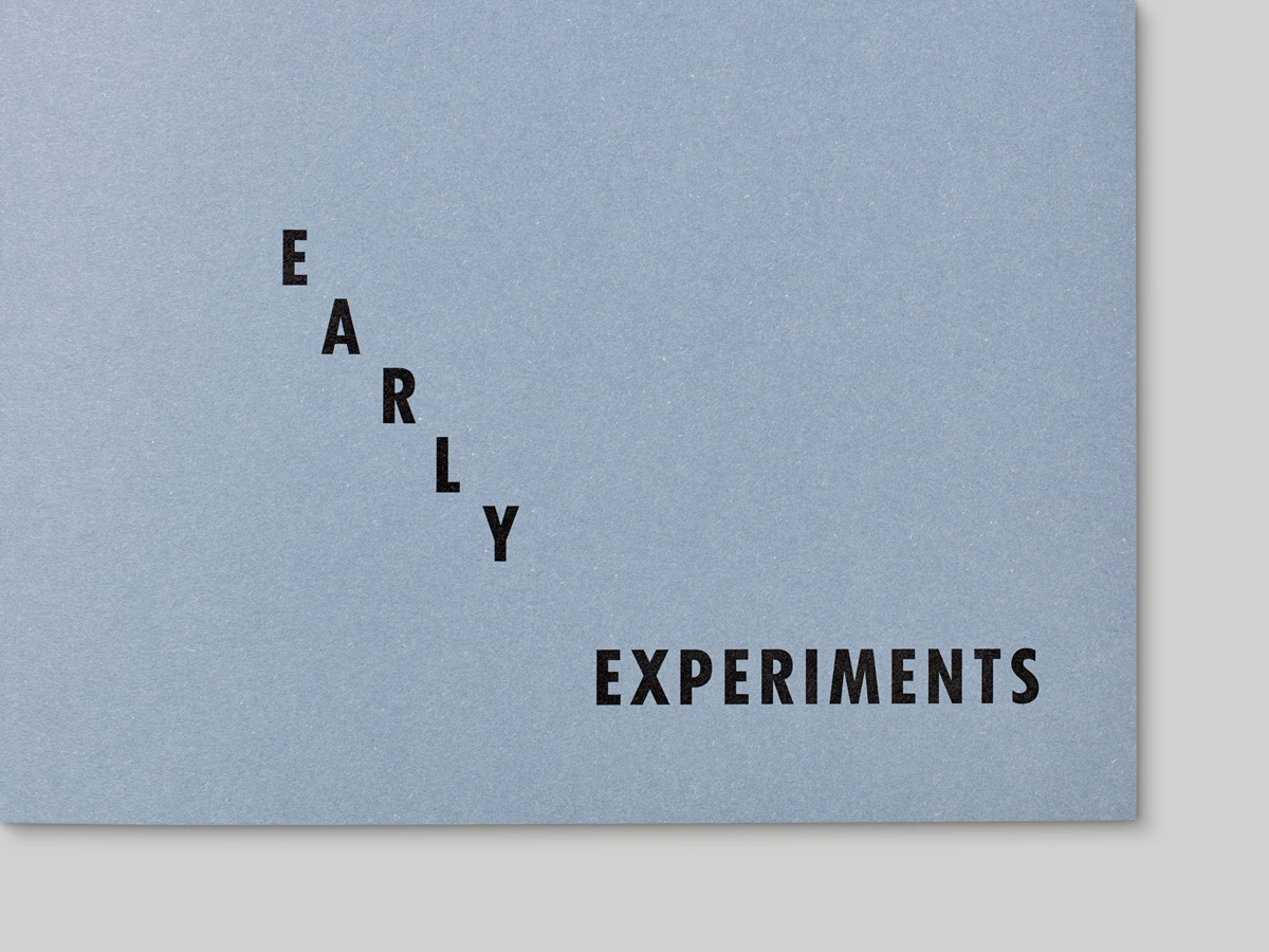
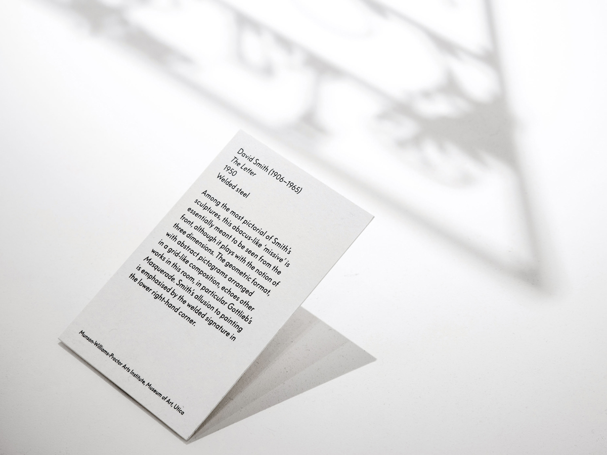
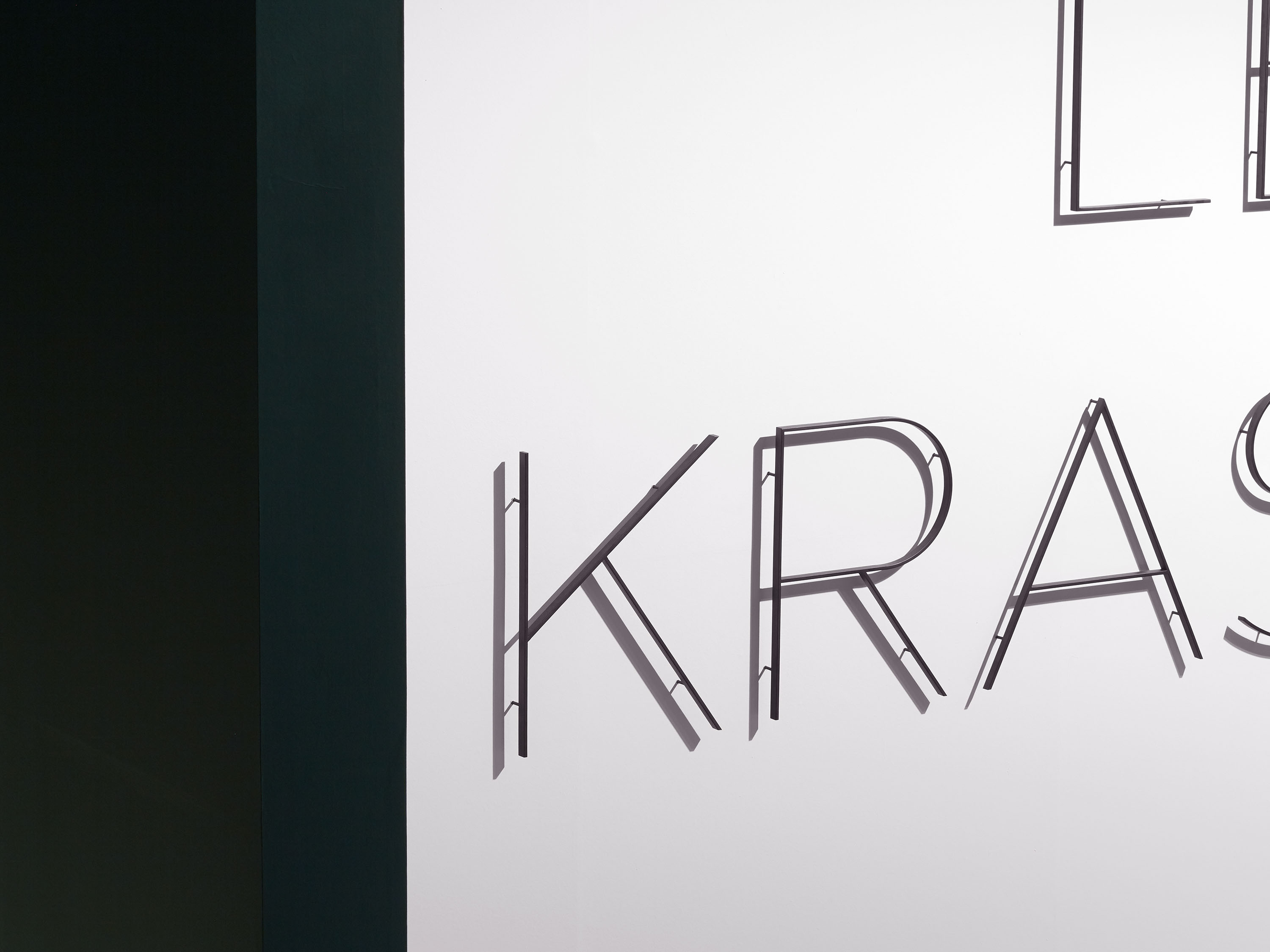
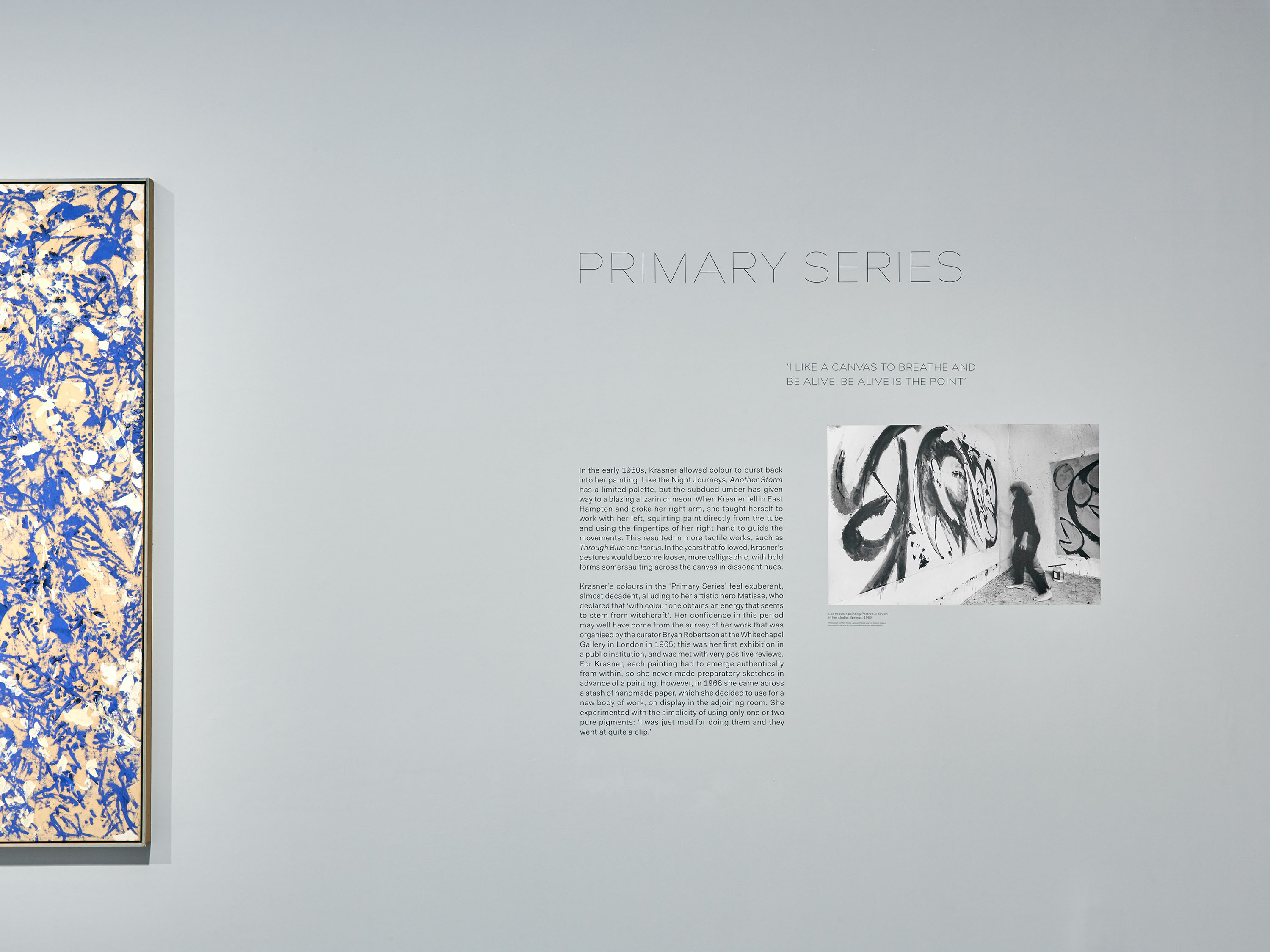
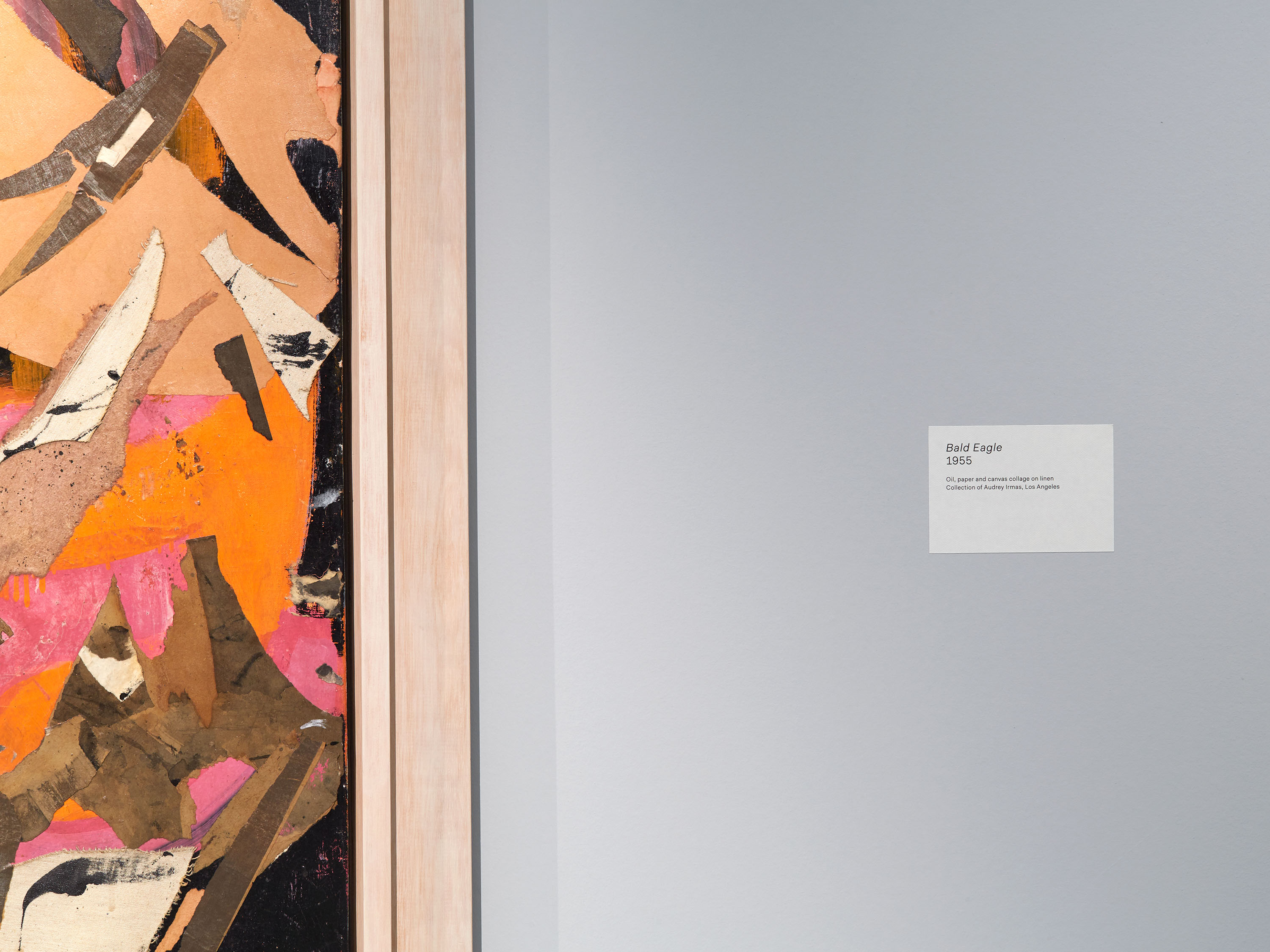
We collaborated with David Chipperfield Architects on the design of the exhibition, developing a graphic scheme characterised by clear, fine and formally robust typography. We chose Bill Corporate Hairline for headings, which was applied as pin-mounted metal lettering for the title of the exhibition; while section titles and interpretation texts were screen-printed directly onto the gallery walls. To complement the natural light that David Chipperfield Architects’ design introduced into the space, we chose tactile, textured paper captions, contributing a sense of softness and contrast with the large scale of the works on display.
Digitised by Oliver Jeschke of OGJ Type Design in 2015, Bill Corporate Hairline was informed by the work of polymathic designer Max Bill, one of the most profoundly influential Swiss designers of the mid-twentieth century.
Photography: Thomas Adank
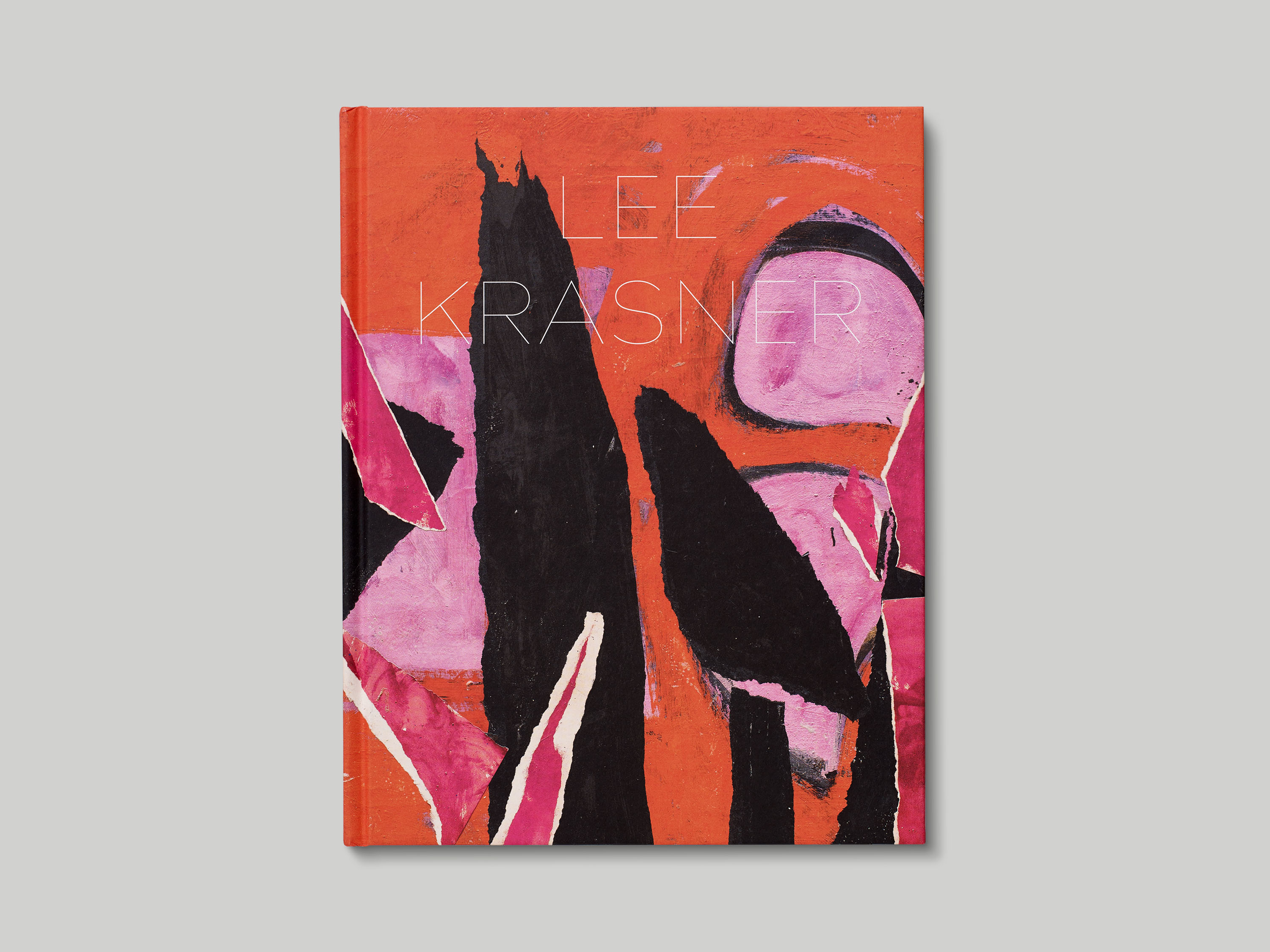
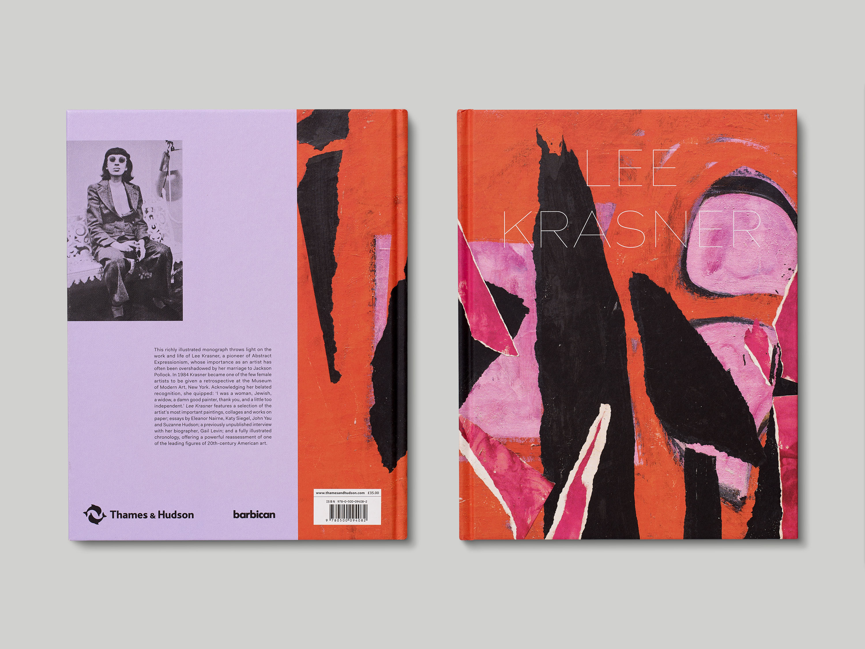
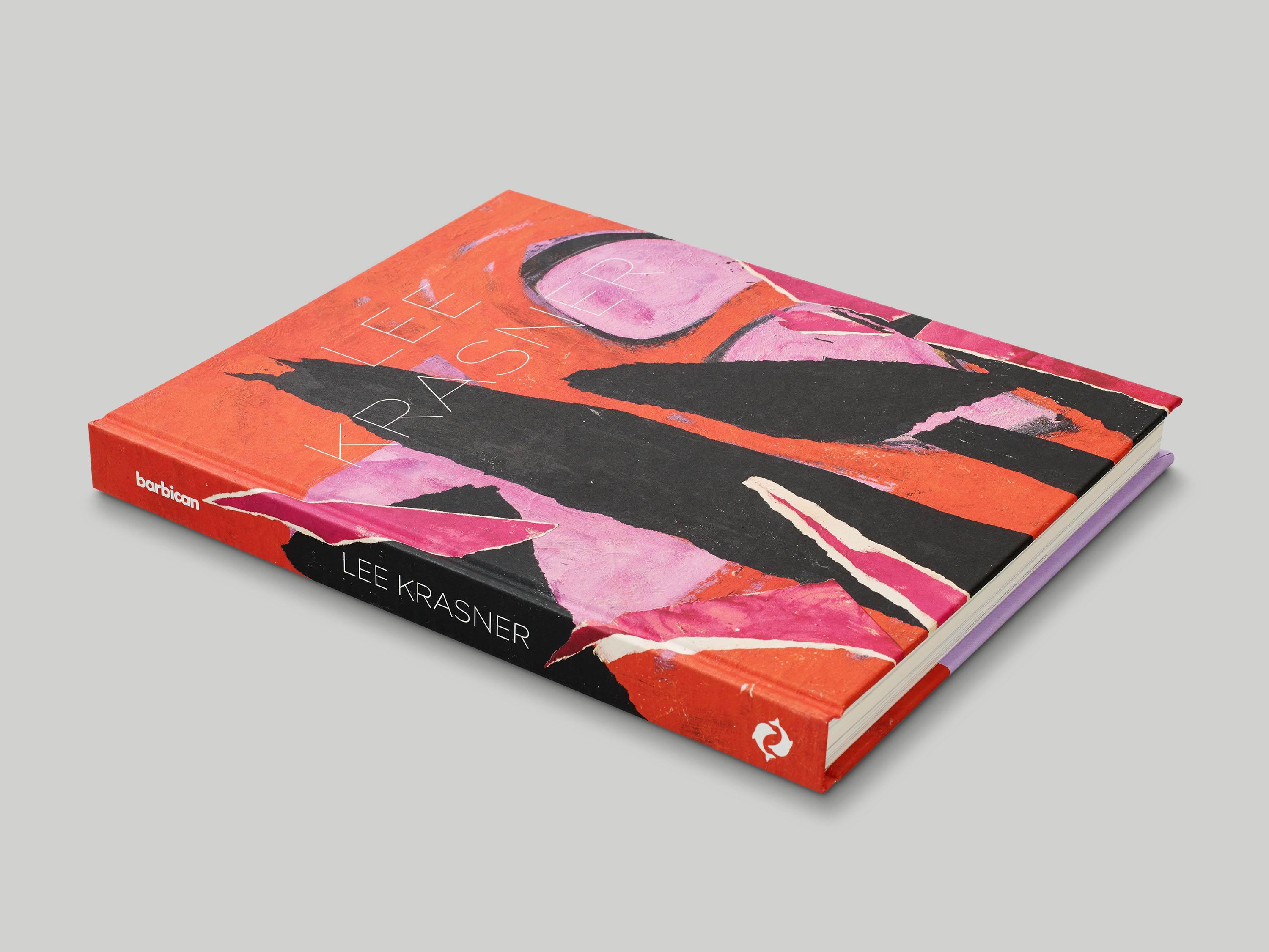
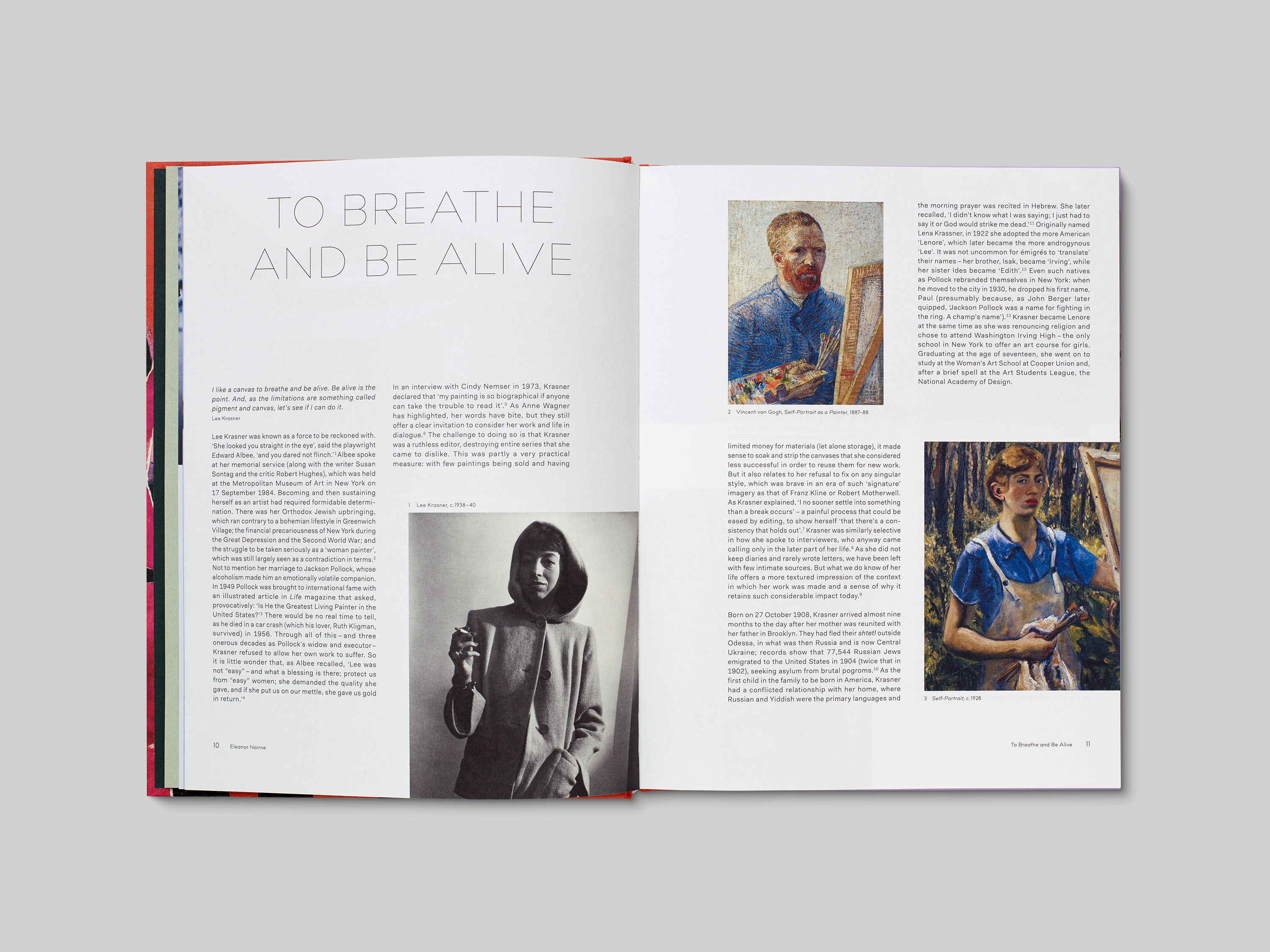
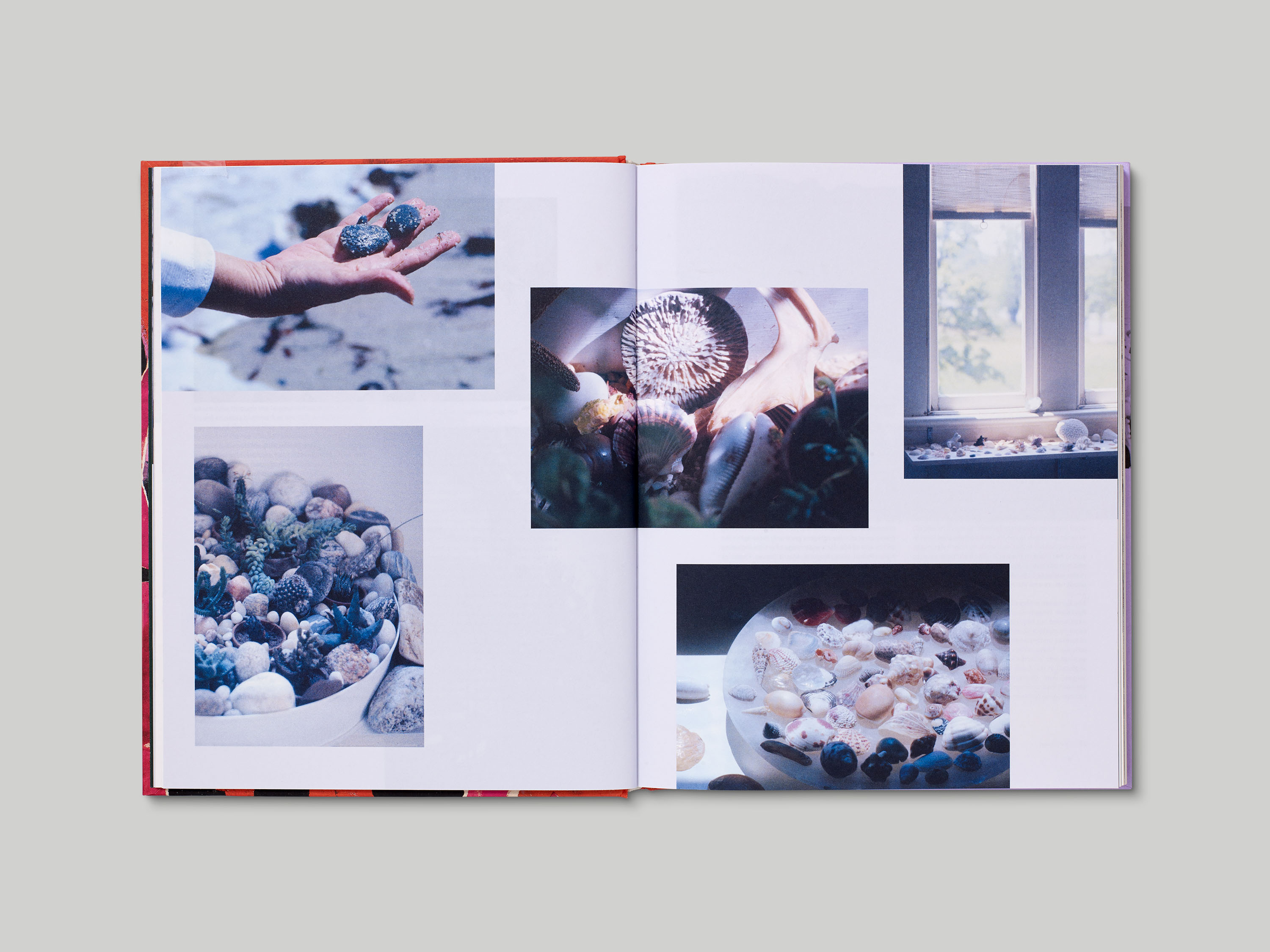
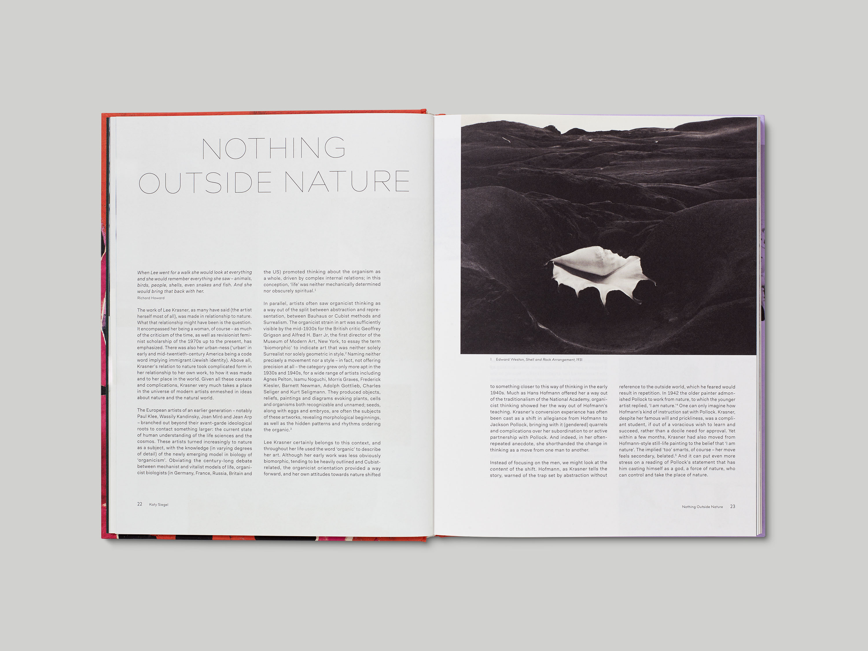
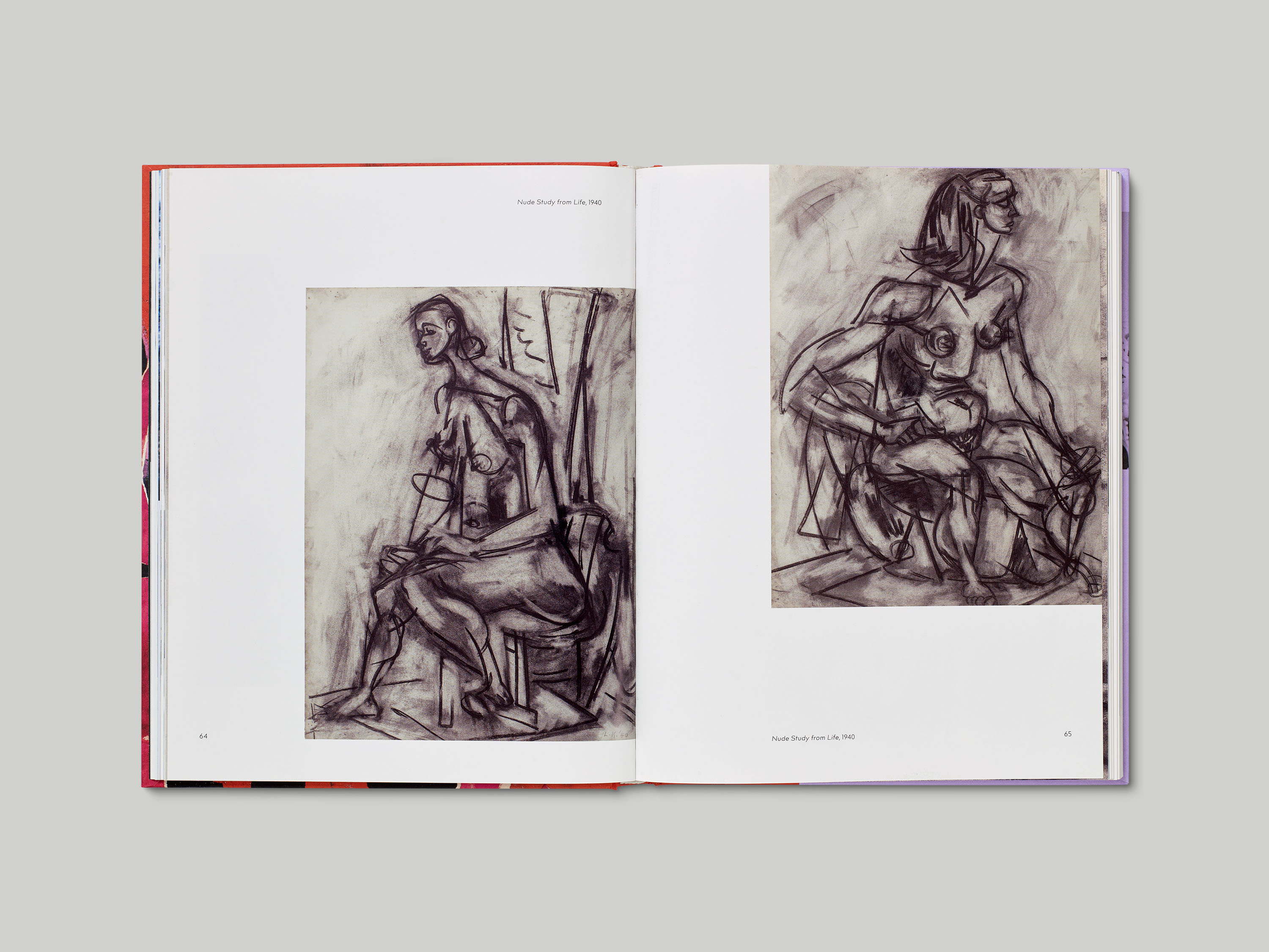
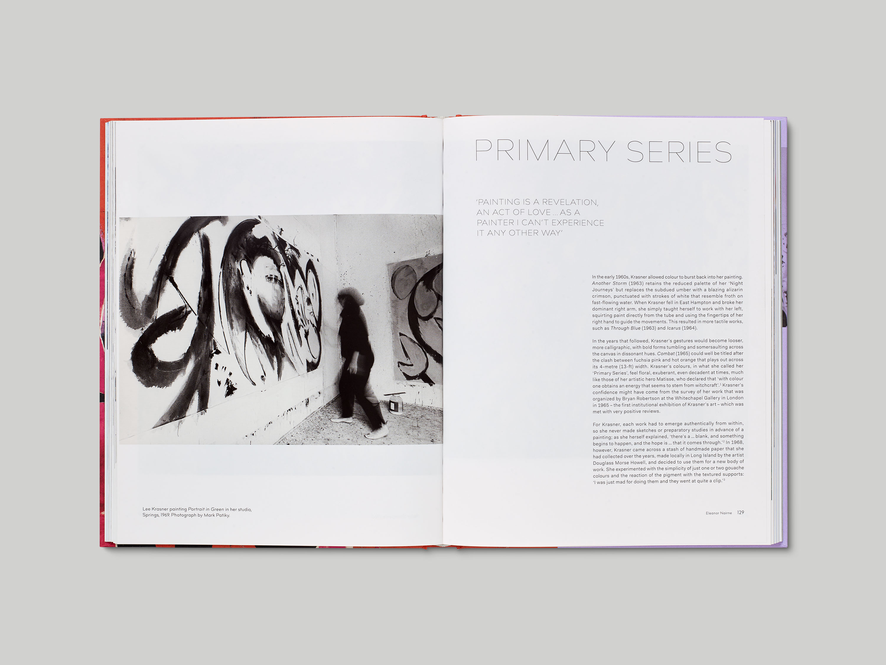
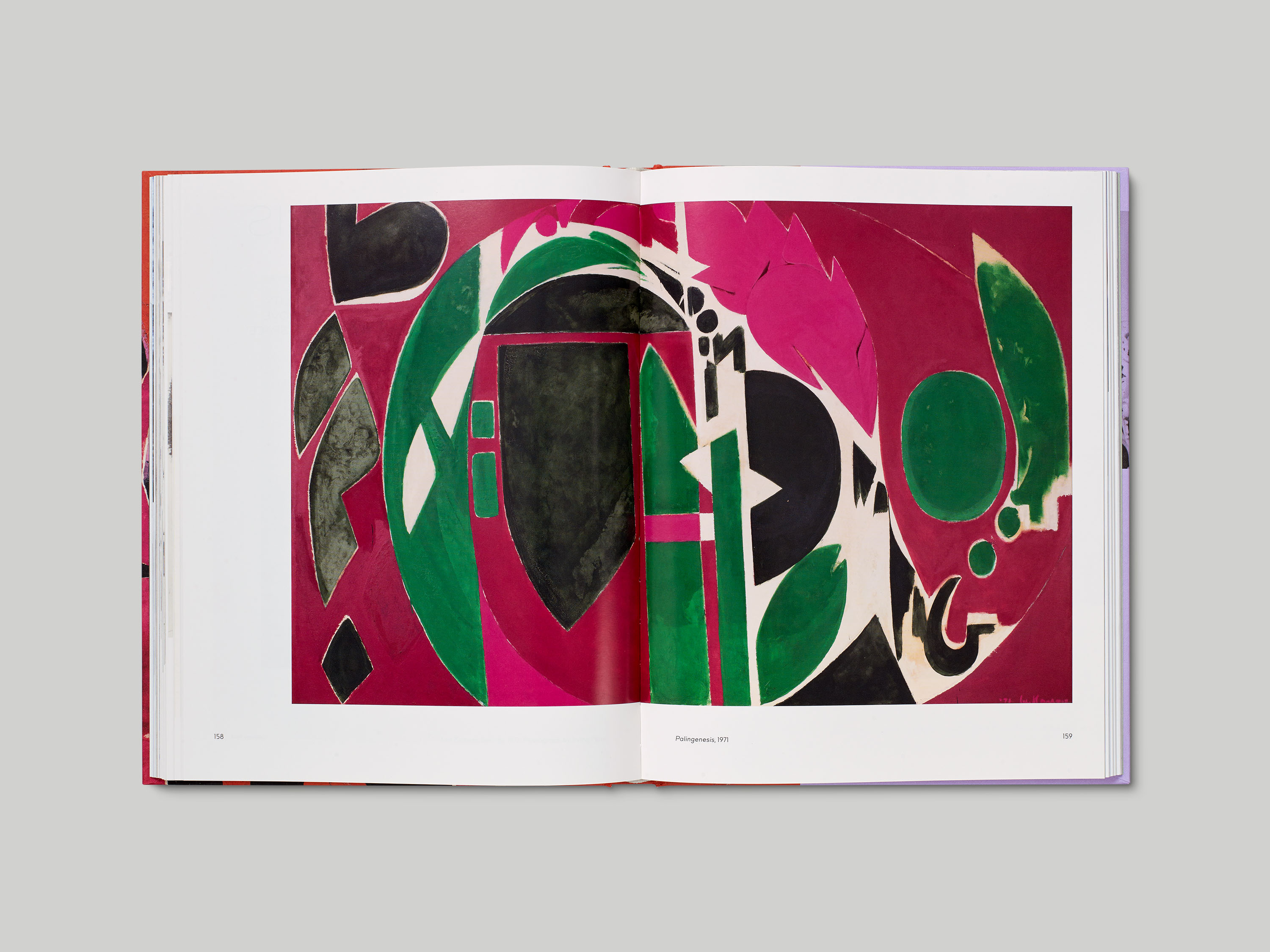
We were commissioned to design the large-scale monograph Lee Krasner: Living Colour, co-published by Barbican and Thames & Hudson, to accompany an exhibition of the same name. The typographic system we developed for the exhibition continues within the catalogue design, making use of Bill Corporate Hairline and Fakt, an unorthodox sans-serif which features both grotesk and geometric letterforms. The essays are interspersed with images set on an irregular grid, and with a generous use of white space, introducing a sense of liveliness that had been absent from previous publications about Krasner and her work. We also incorporated a number of portraits of Krasner at different points in her career, offering visual representation of an artist who has often, historically, been anonymised.
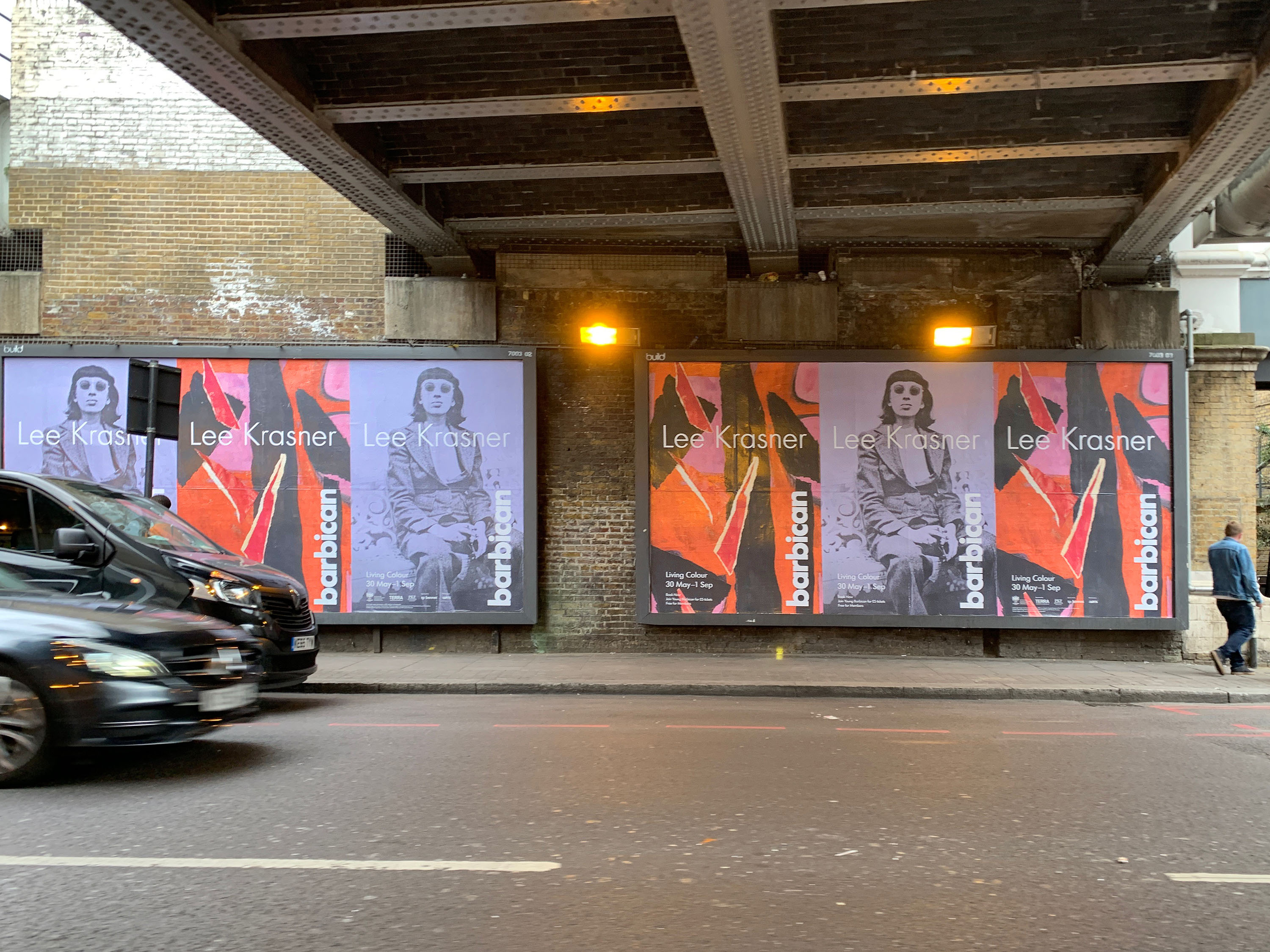
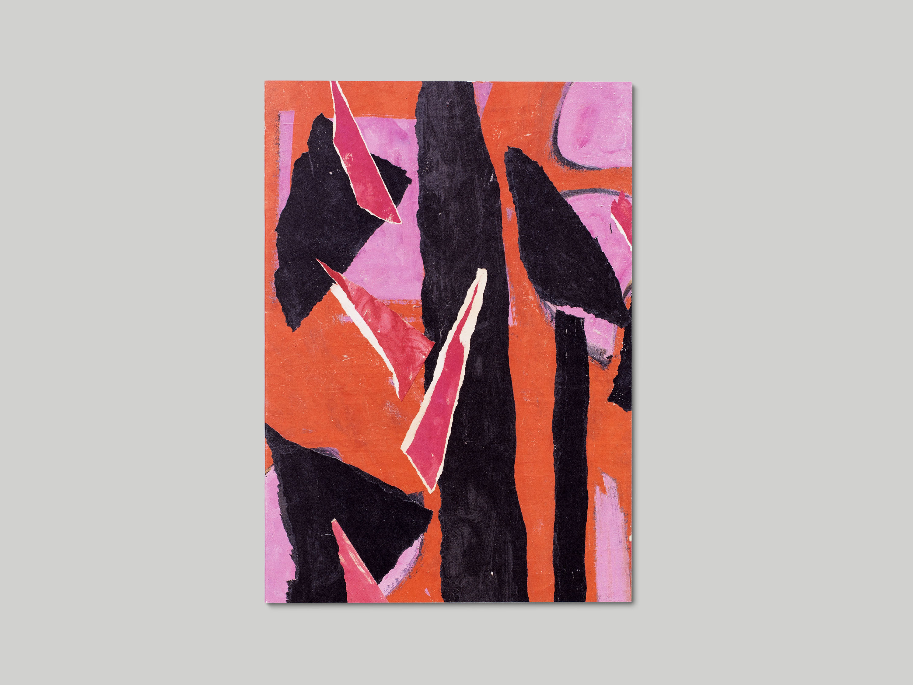
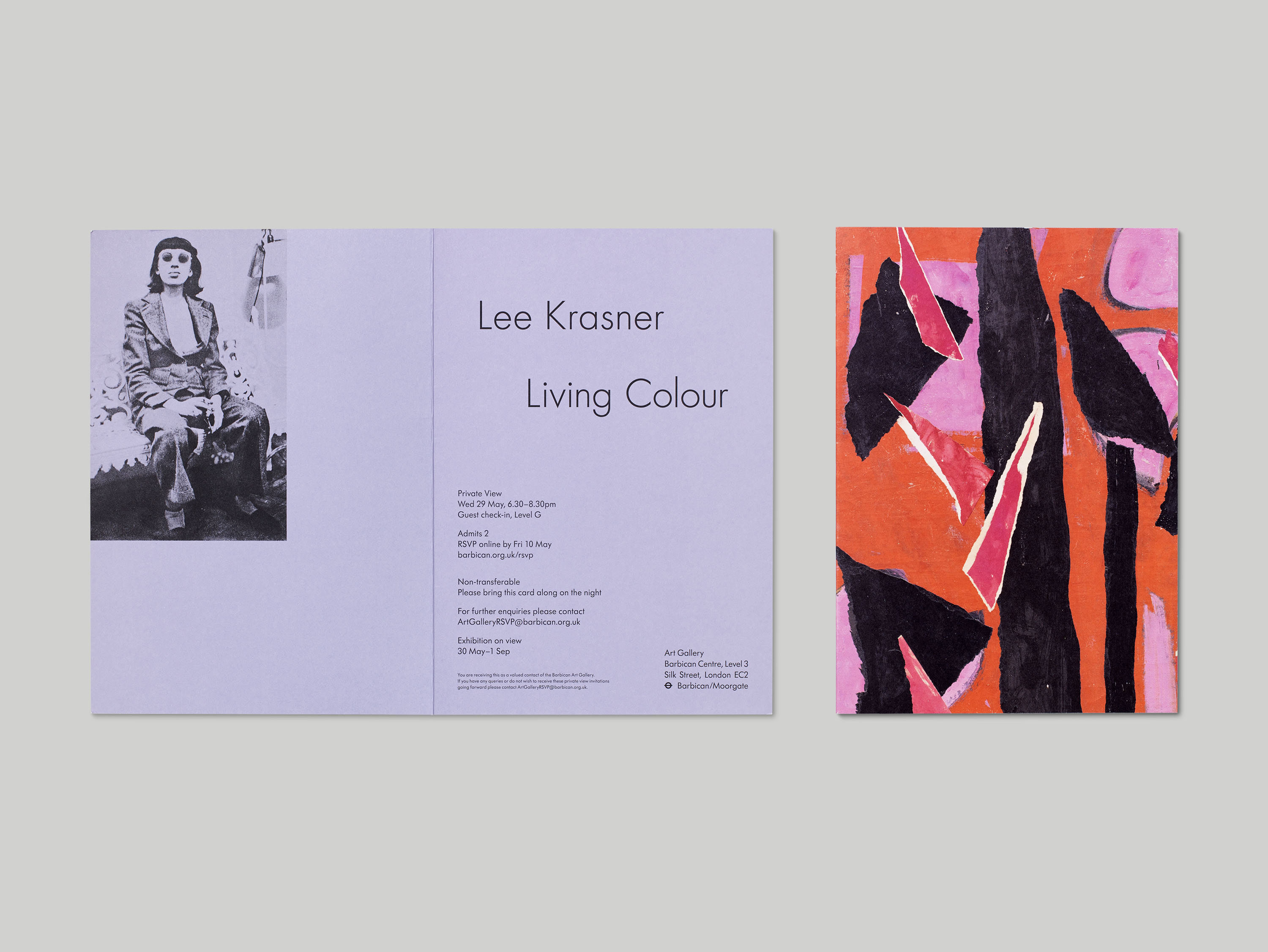
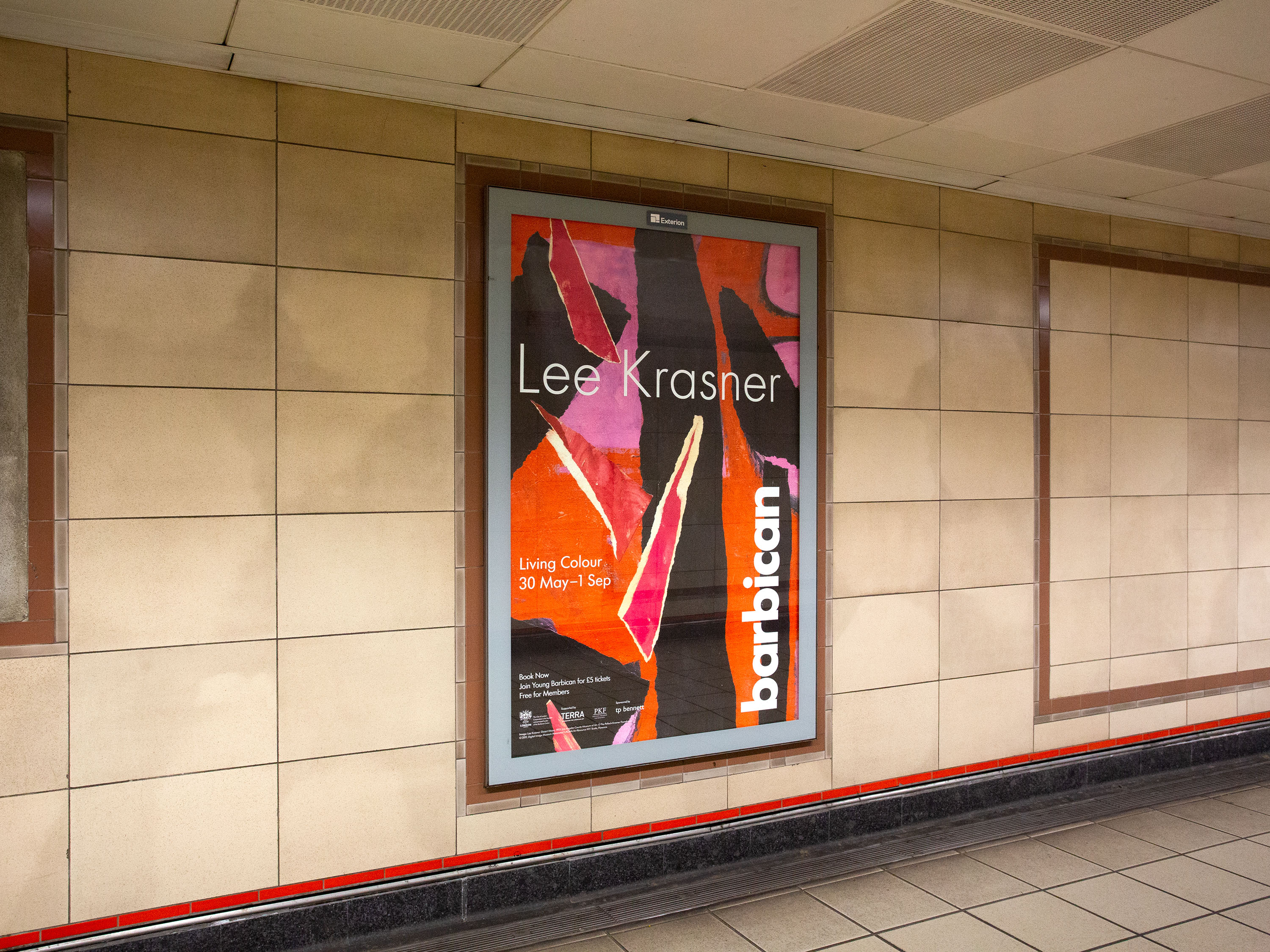
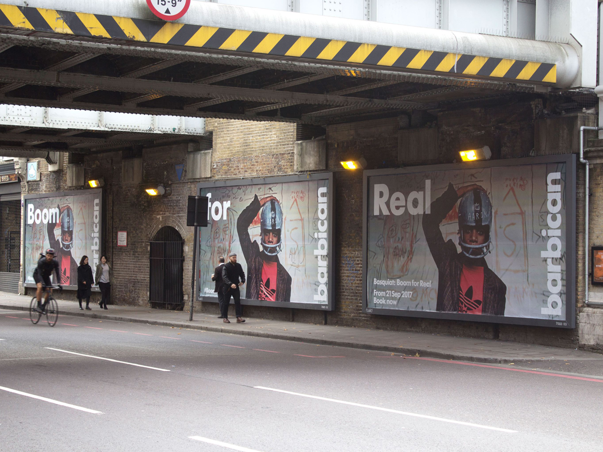
The marketing campaign we designed for Lee Krasner: Living Colour incorporated the key work used on the cover of the publication, alongside a portrait of Krasner which we felt captured a sense of her independent spirit. The use of this portrait as a central asset within the campaign, which appeared on billboards and posters throughout London, was intended to act as a further counterpoint to the anonymisation of Krasner throughout her career.

