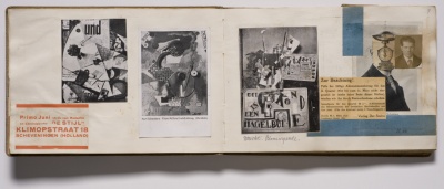


This book forms an extensive, retrospective catalogue of Hannah Höch’s work, brought together for a major exhibition at the Whitechapel Gallery in 2014. We wanted the design of the book to reflect the work of Höch and her contemporaries such as Kurt Schwitters, with their use of bold sans-serif type in contrast to the busy collages.
A bold weight of Classic Grotesque is used for titles and document texts, paired with Sabon for body type – an elegant and legible serif designed by German typographer Jan Tschichold. The thematic sections of the catalogue are divided using coloured pages, the tones of which derive from key works.