Erik Madigan Heck is an artist and photographer whose painterly approach blends photographic traditions with art historical references. His work is characterised by vivid colour palettes and intricate compositions. Across distinct bodies of work, his practice connects landscape, still life, fashion and portraiture.
We have collaborated closely with Heck on a range of multidisciplinary projects, shaped by a shared interest in experimenting with image making, materiality and production processes.
Photography: Ed Park


The Tapestry
Tracking the development of Heck’s practice, The Tapestry emerged from a period of reflection, as he revisited earlier work through colour manipulation, cropping and layering.
The book is published in two editions, each cloth bound and featuring a new work by Heck on the cover. For the special edition, the cover is printed and overlaid with intricate two-tone embroidery, then housed in a custom portfolio. Its distinctly tactile nature echoes that of Heck’s work.
Inside, semi-translucent bible paper divides the image sections, referencing nineteenth-century artists’ books that inspired Heck’s work. These historical influences also inform the typography, which uses William, a modern interpretation of Caslon.
New York, US and London, UK, 2024
Book published by Thames & Hudson


‘The Tapestry was created in collaboration with the visionary designers at London-based graphic design studio APFEL, and it is not just a vessel for his art but an artefact in itself – flowing, lyrical, and utterly immersive.’
SHOWstudio →
Identity and Website
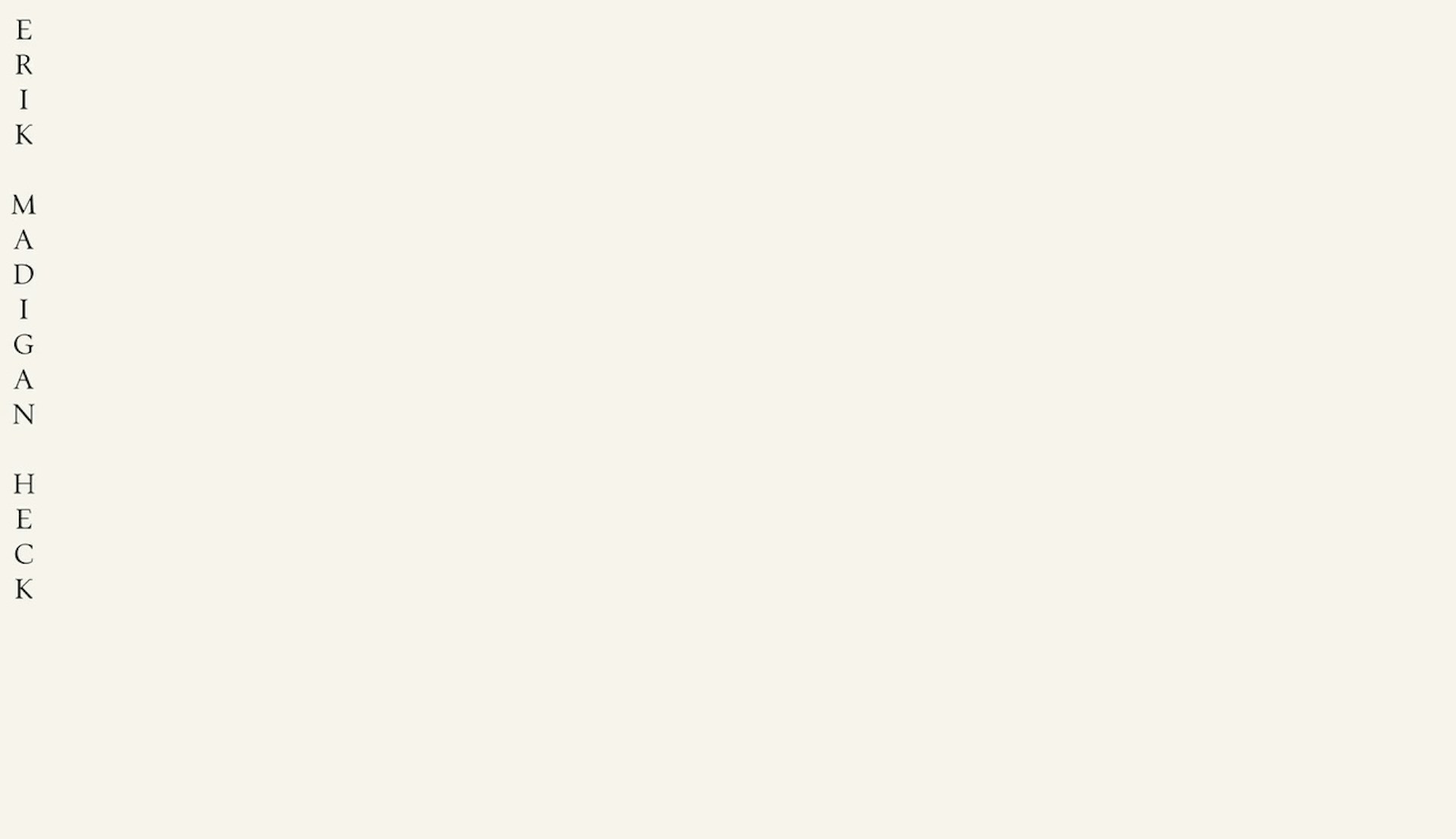
Working closely with Heck, we developed a new identity and website that brings together 25 years of his work. The identity reinterprets historical ephemera through its materials and motifs. The letterpress-printed stationery features surprising and playful details, from bespoke hand ornaments inspired by tarot cards to black ink with red highlights referencing medieval rubrics.
The website offers multiple ways to navigate Heck’s multidisciplinary practice, from an evolving overview to an extensive archive of projects. Drawing on museum collection archives, the interactivity creates connections between works and allows for closer exploration of projects.
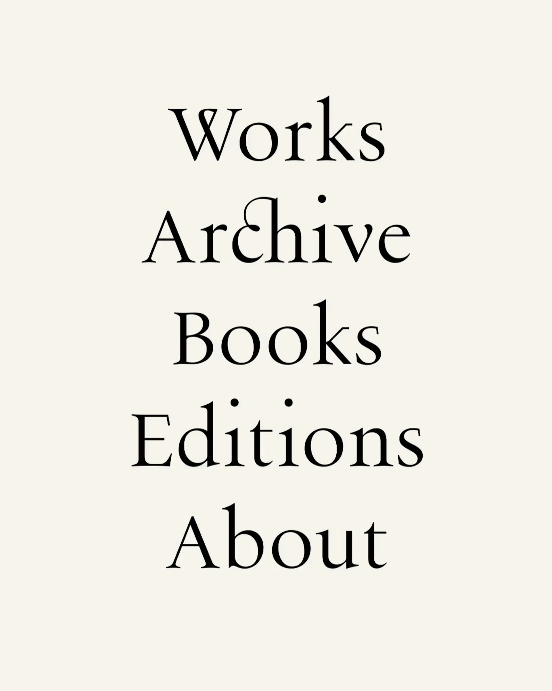

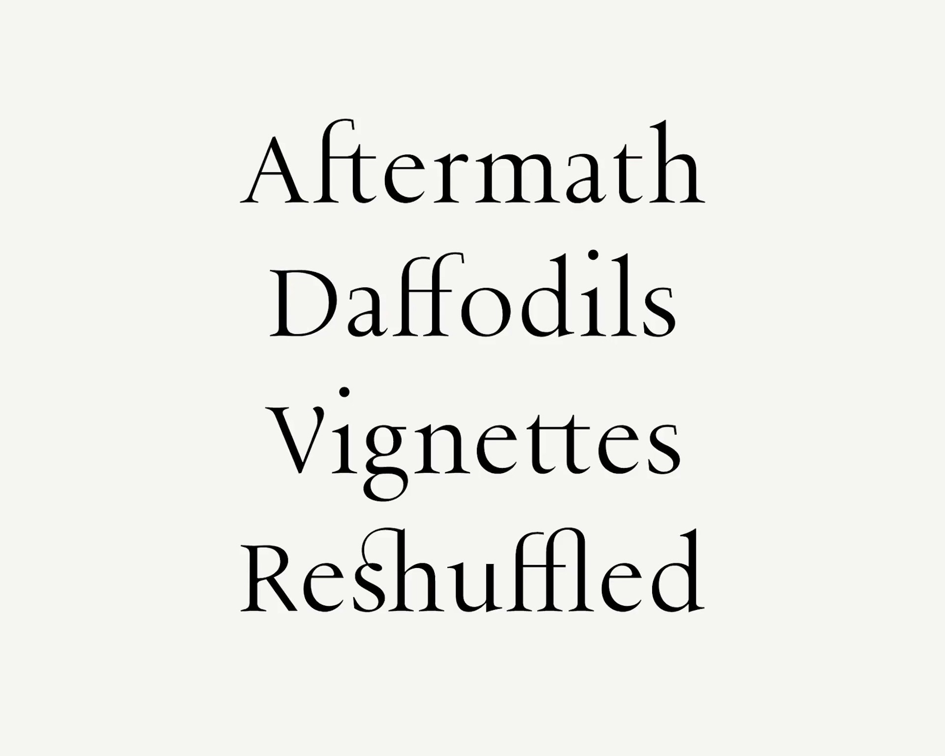
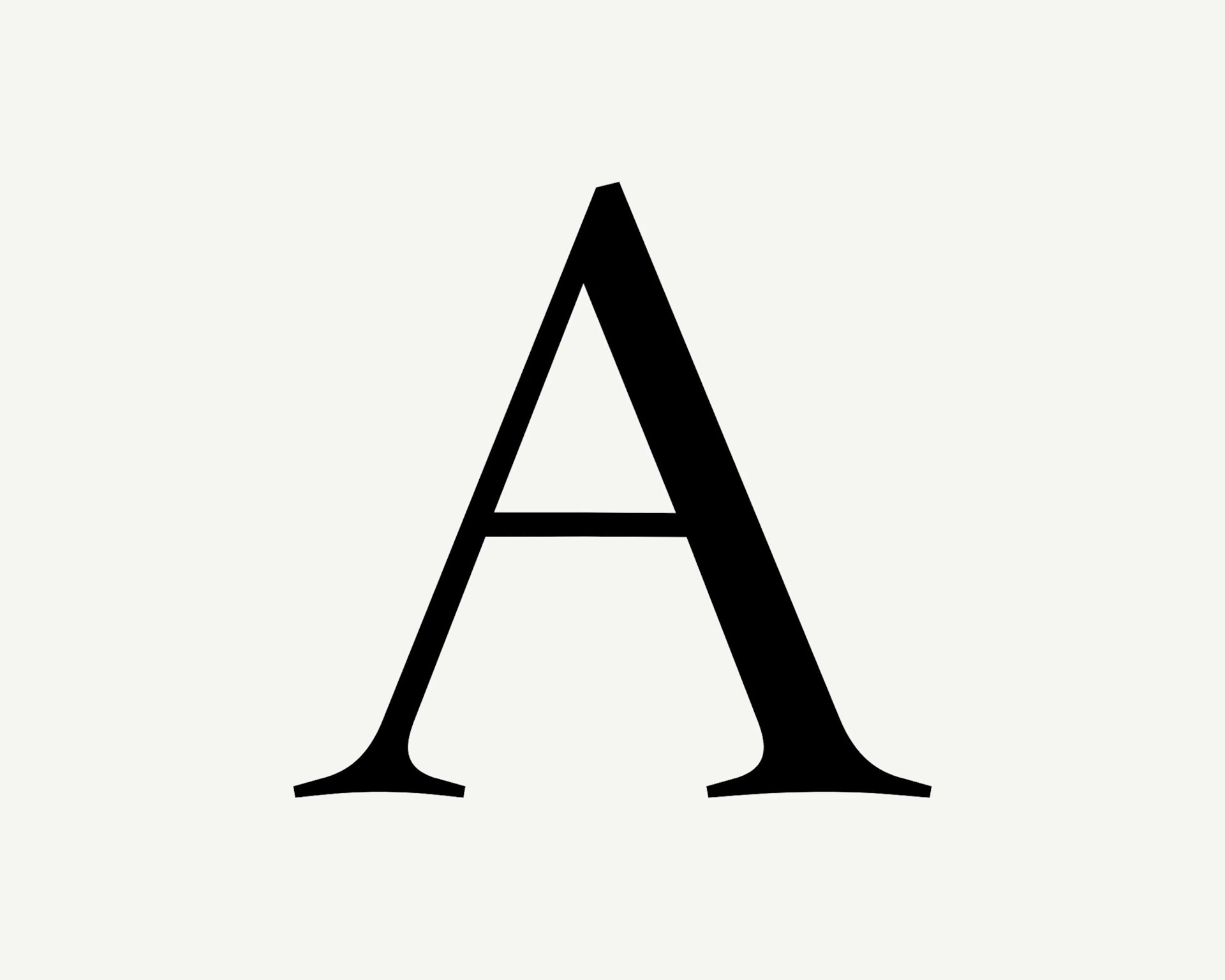


The identity is rooted in a bespoke typeface, Per Calvaria, whose proportions draw on sixteenth-century Garamond. From this historical starting point, the letterforms introduce idiosyncratic details that echo Heck’s process of manipulation and layering. Ink-bled corners, and unexpected serif placements suggest traces of the hand, while tall ascenders, raised tittles and an extended set of ligatures create a distinctive rhythm across text.
New York, US, 2026
Website build: Felix Steindl


Character set
Unicode 0041

Nomenus
Conceived and edited by Heck, the second issue of the limited edition arts journal Nomenus is titled ‘The Language of Flowers’. The issue brings together contemporary painting and photography by contributors including Rita Ackermann, Helen Frankenthaler, Anselm Kiefer and Nick Knight.
New York, US, 2021
Journal published in partnership with Van Cleef & Arpels


Early twentieth-century artist monographs informed the layout, with large plates, full bleed details and endpapers, alongside traditionally set typography. The bespoke Nomenus masthead features a ligature linking the N and U, while the expressive serif Sainte Colombe is used for body text and captions.
Developed with Heck, the image sequencing creates dialogue across fifteen paper stocks, from high gloss to uncoated. Coloured dividers mark each section, with related quotations printed on semi transparent tip ins. Additional elements include a double gatefold and a cut short, letter-like section. The OTA bound softcover is housed in a paper wrapped slipcase with foiled type and a debossed tip-on plate.


‘They have such elegance in their design (a trademark): refined, clear and simple.’
Wells Fray-Smith Curator, Barbican
Gestalten Veldt
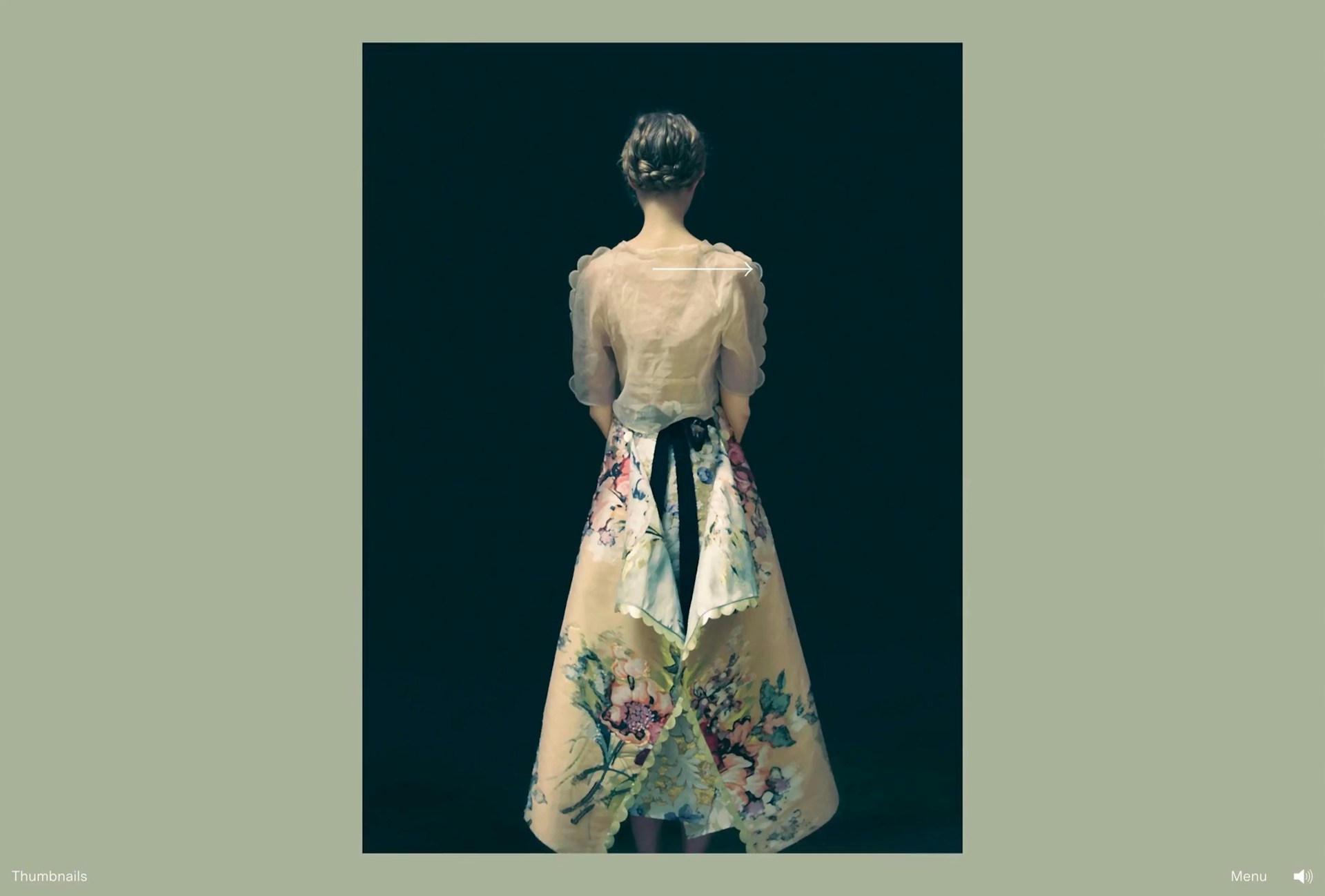
Gestalten Veldt brings together a multidisciplinary body of work by Heck. The project spans a publication, musical score, two fragrances, poems and writings, and a short film. Collaborators include Tilda Swinton, Leanne Shapton, Les Eaux Primordiales, Ben Grandgenett and Matthew Herbert.
We created a digital experience to present the full scope of the project. The website invites users to shape their own journey through inventive navigational tools, animation and transitions. Typography from the book is paired with a bespoke typeface, giving the site a clear and distinct visual language.
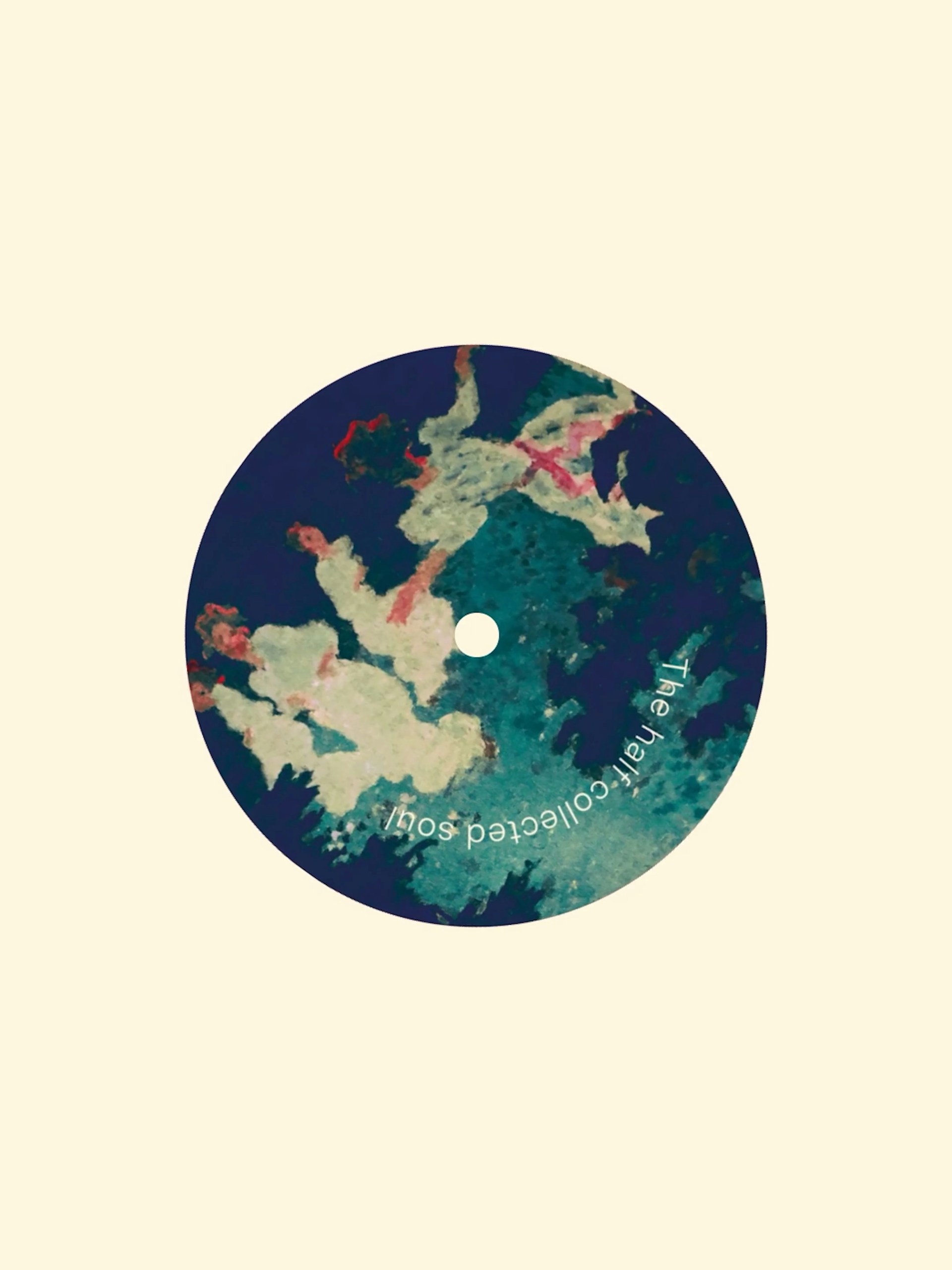
Imagery appears as an immersive slideshow on a horizontal axis, while essays run vertically, creating layered relationships between image and text. A custom media player was developed for the sound works, drawing on the visual language of vinyl through rotating imagery and type.
New York, US, 2020
Website