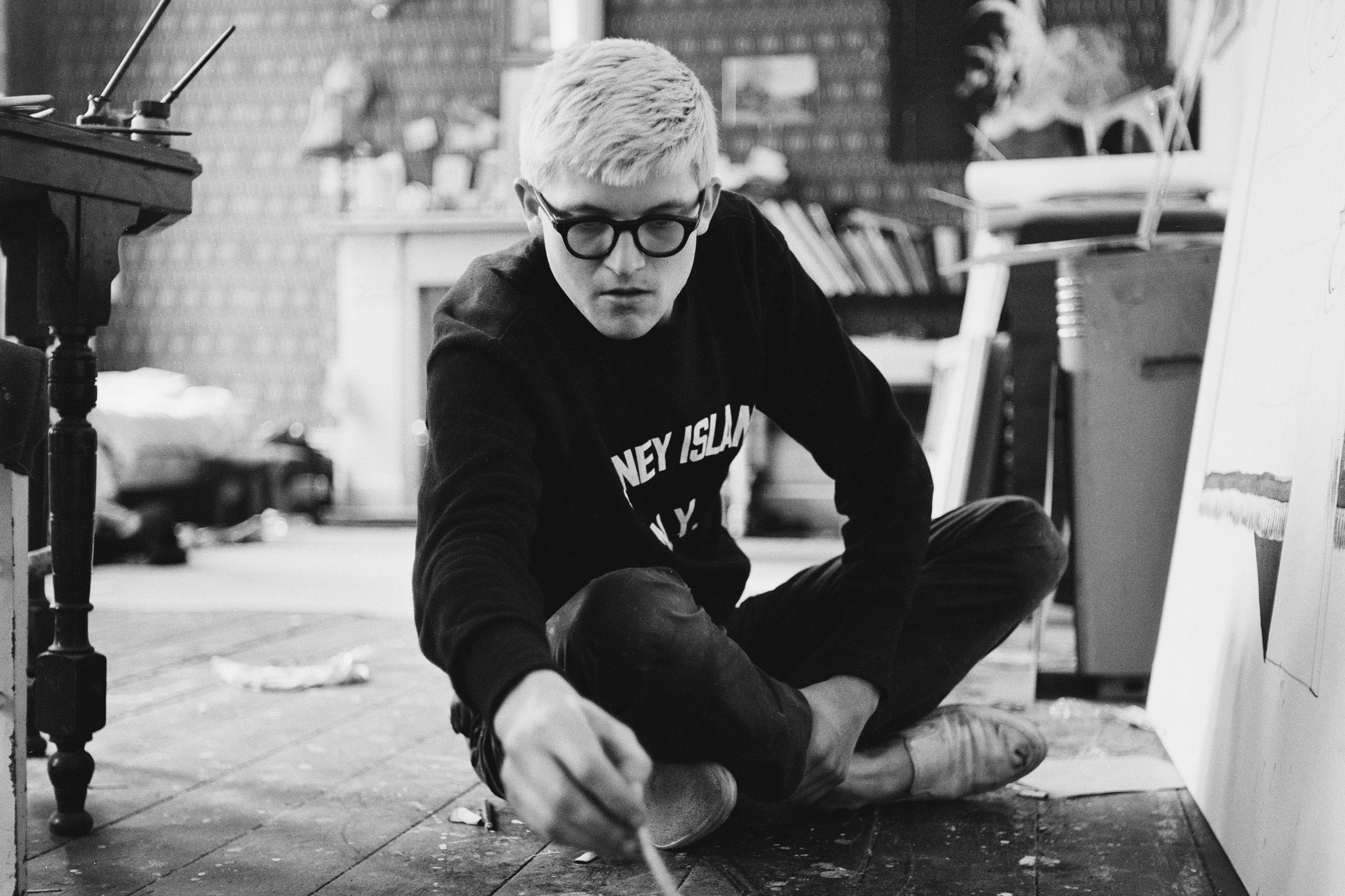
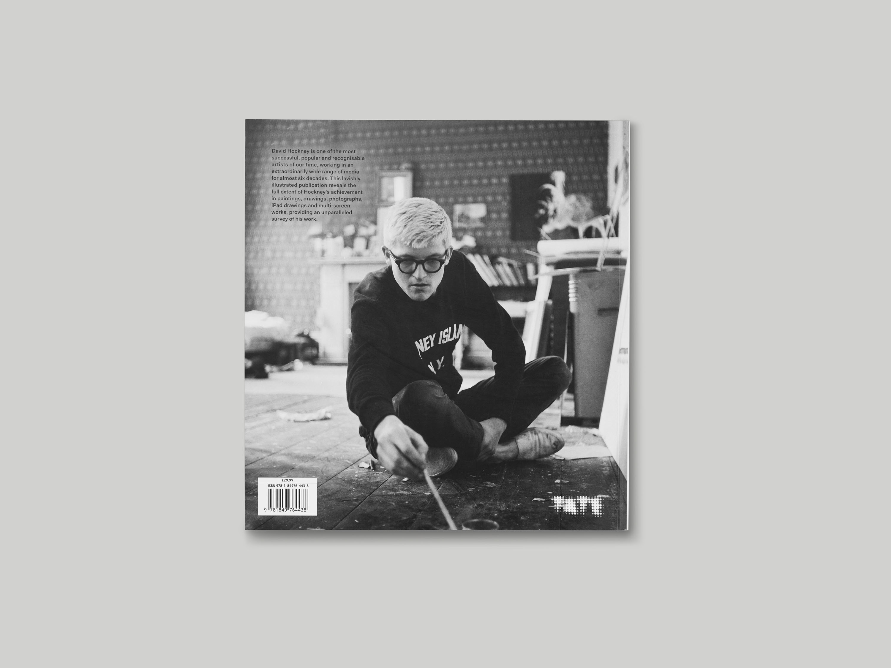
This monograph accompanied a major full-career retrospective of the work of David Hockney held at Tate Britain in spring 2017. Our initial design ideas for the book were born from black-and-white portraits of Hockney that are widely recognisable within the public realm, which shows his youthful energy. To reflect this, we used a photograph of a young Hockney on the back cover and in the book’s opening pages, and a more recent portrait between the plates section and the essays.
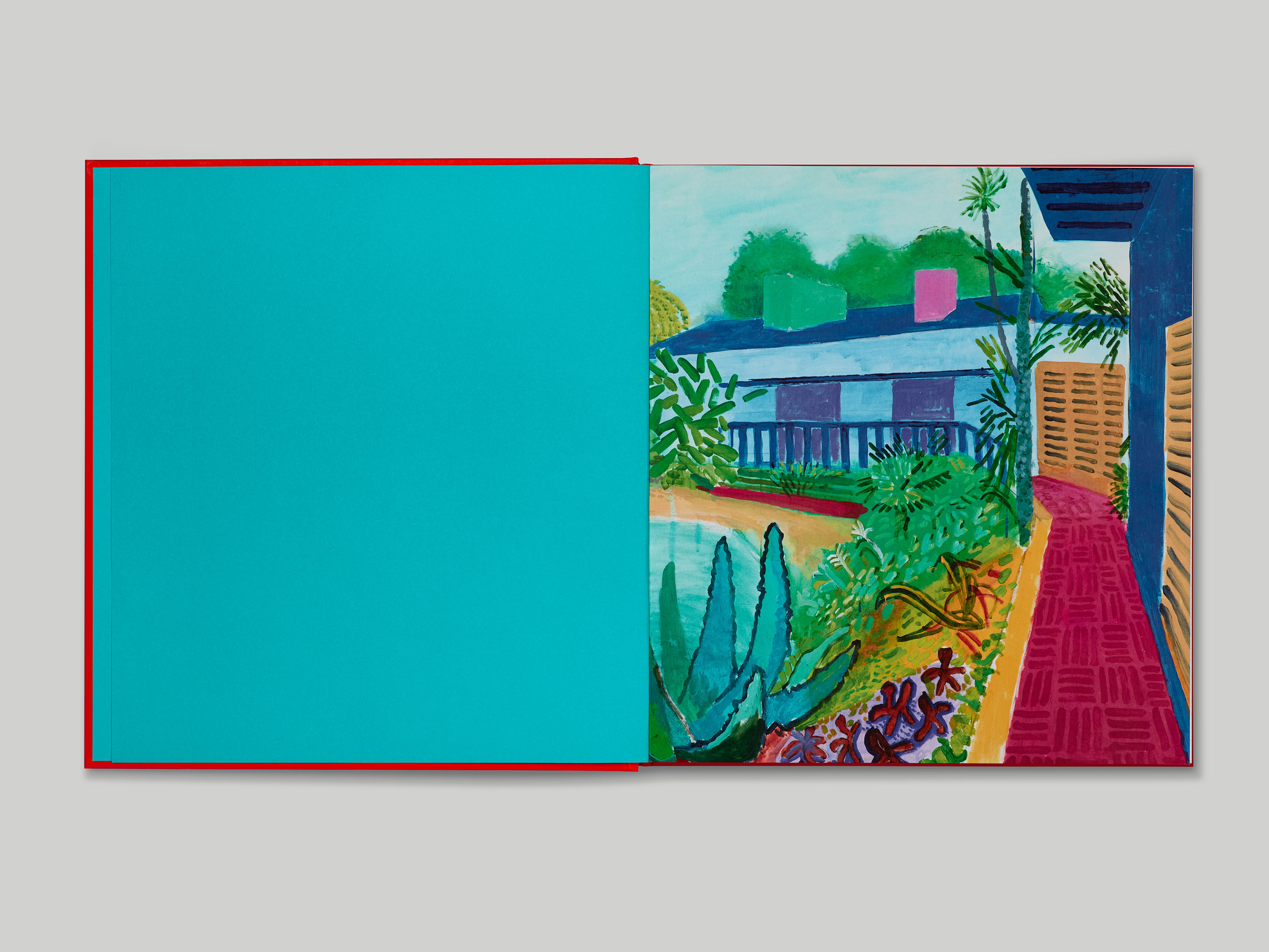
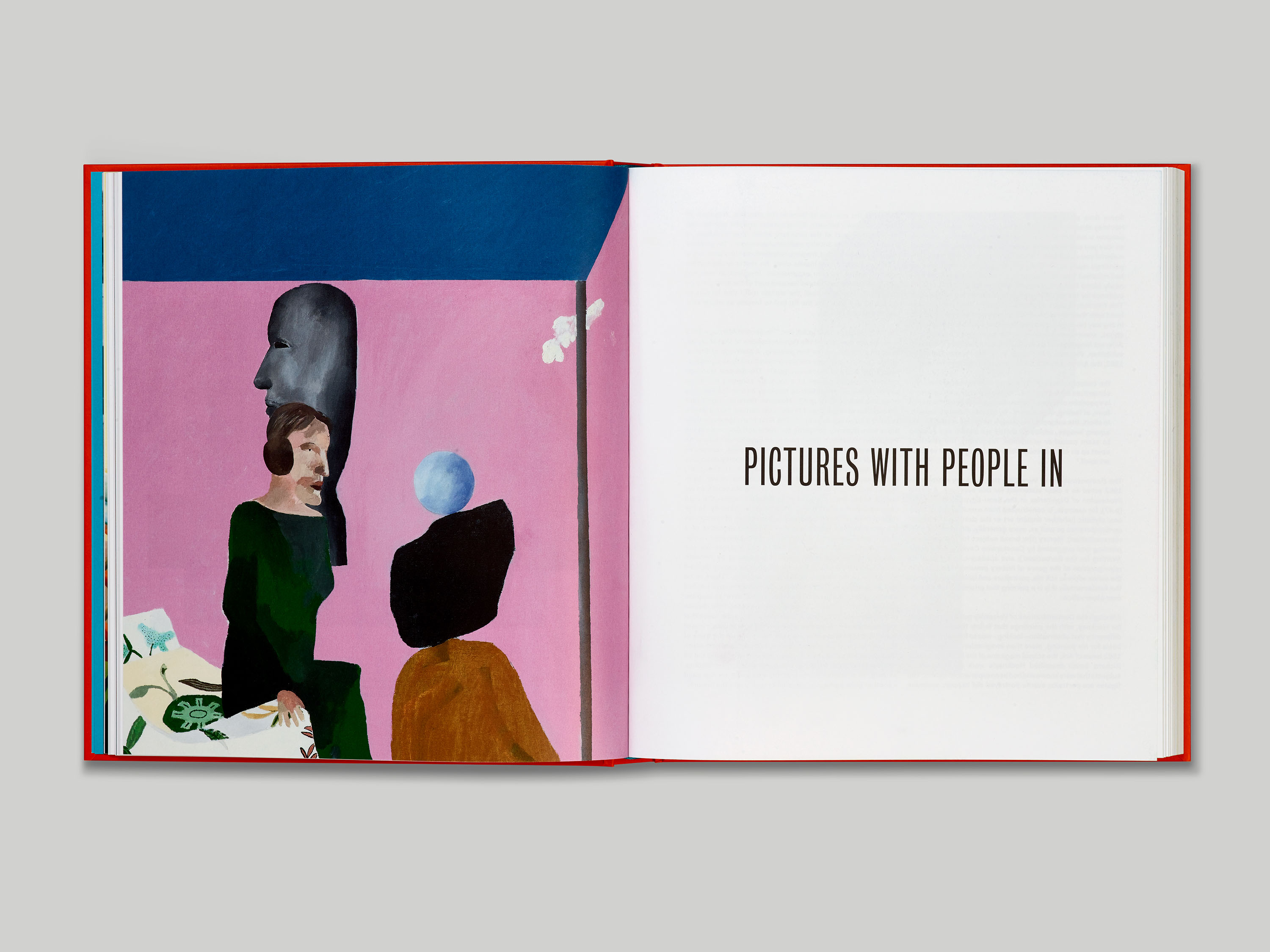
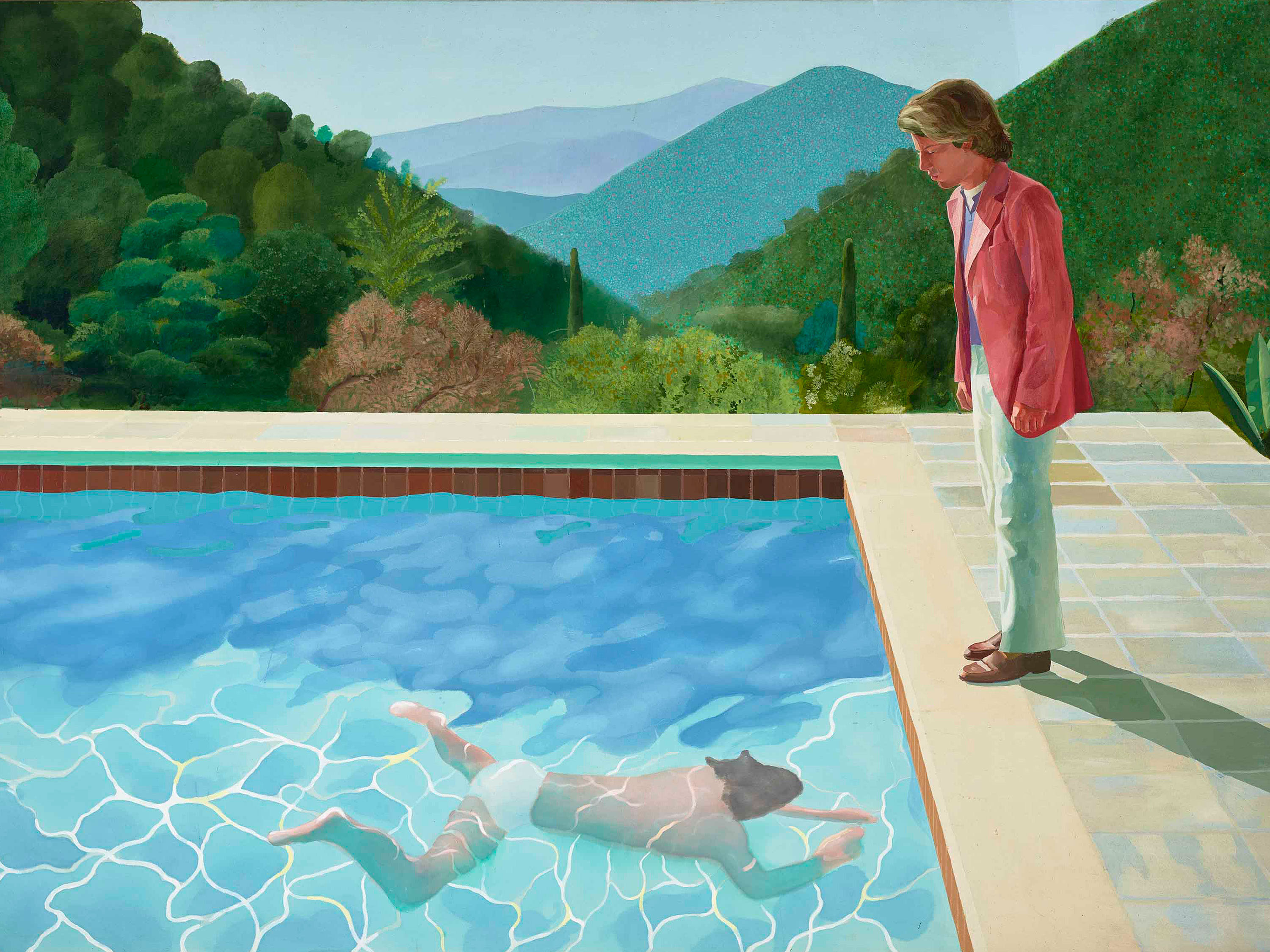
Large, full-bleed images of works feature throughout. The opening image is taken from one of Hockney’s most recent series of paintings, reflecting the fact that Hockney is still extremely prolific after over sixty years practising. Throughout the book, works have been laid out with a scale relationship to each other – a challenging approach to implement, due to the extreme diversity of scale within Hockney’s work. Typography plays an important role in both the hard and softcover editions. Type-only chapter headings have each been given their own page, creating breathing space between the plates sections, and the hardcover design features a type-only cover. The typefaces used within the book are Bureau Grot Compressed for the titling, and Fakt for body text.
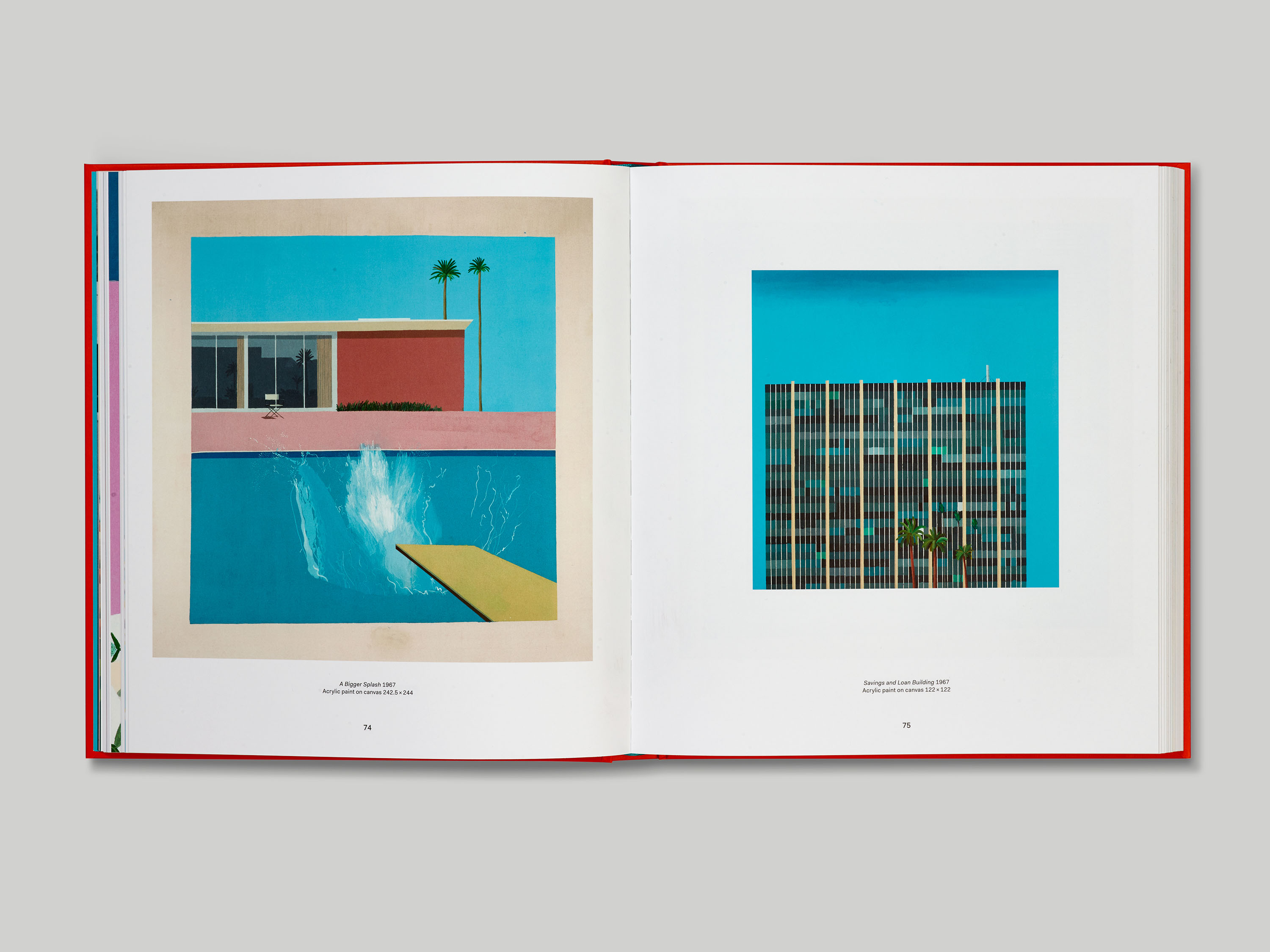
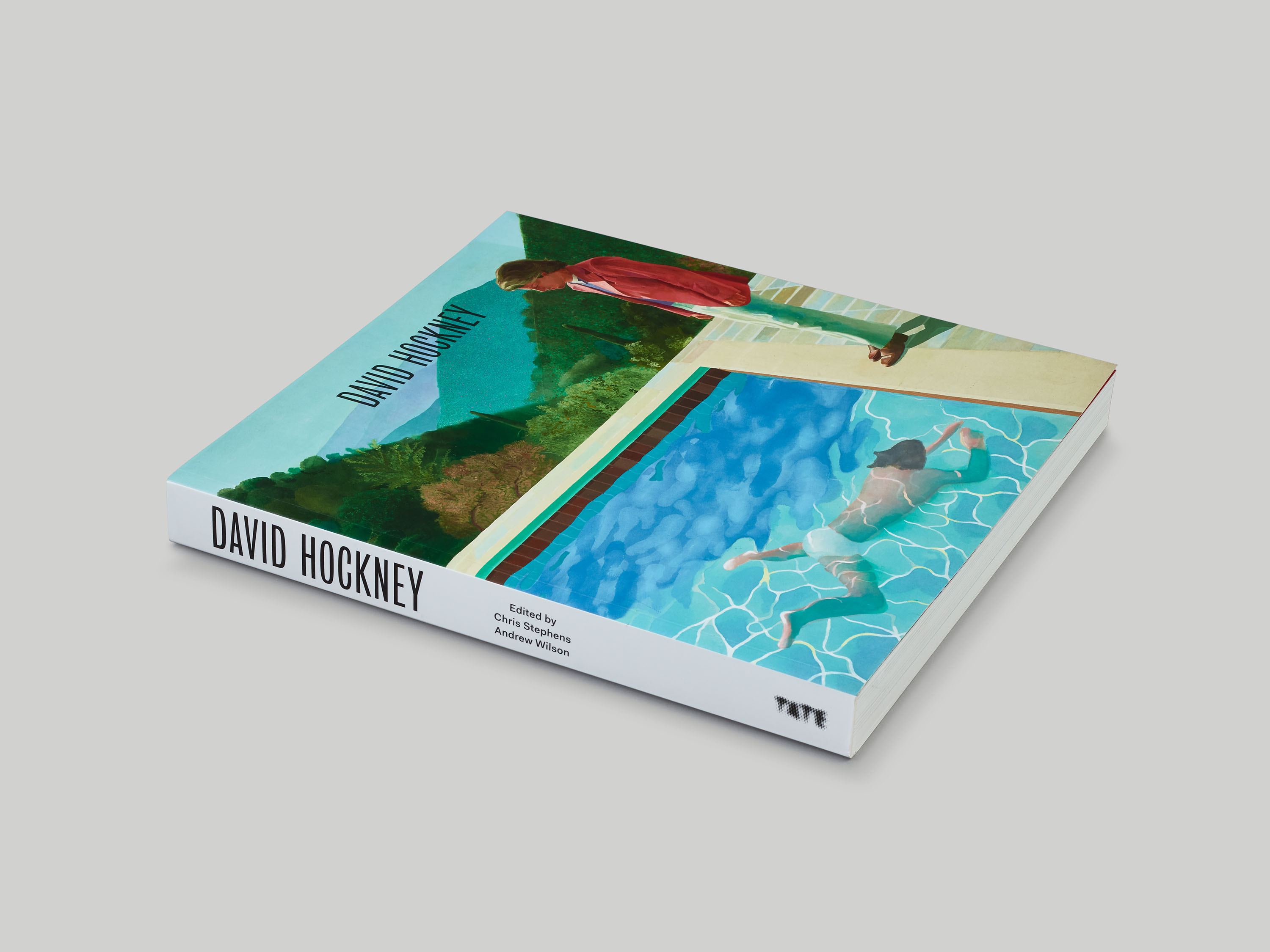
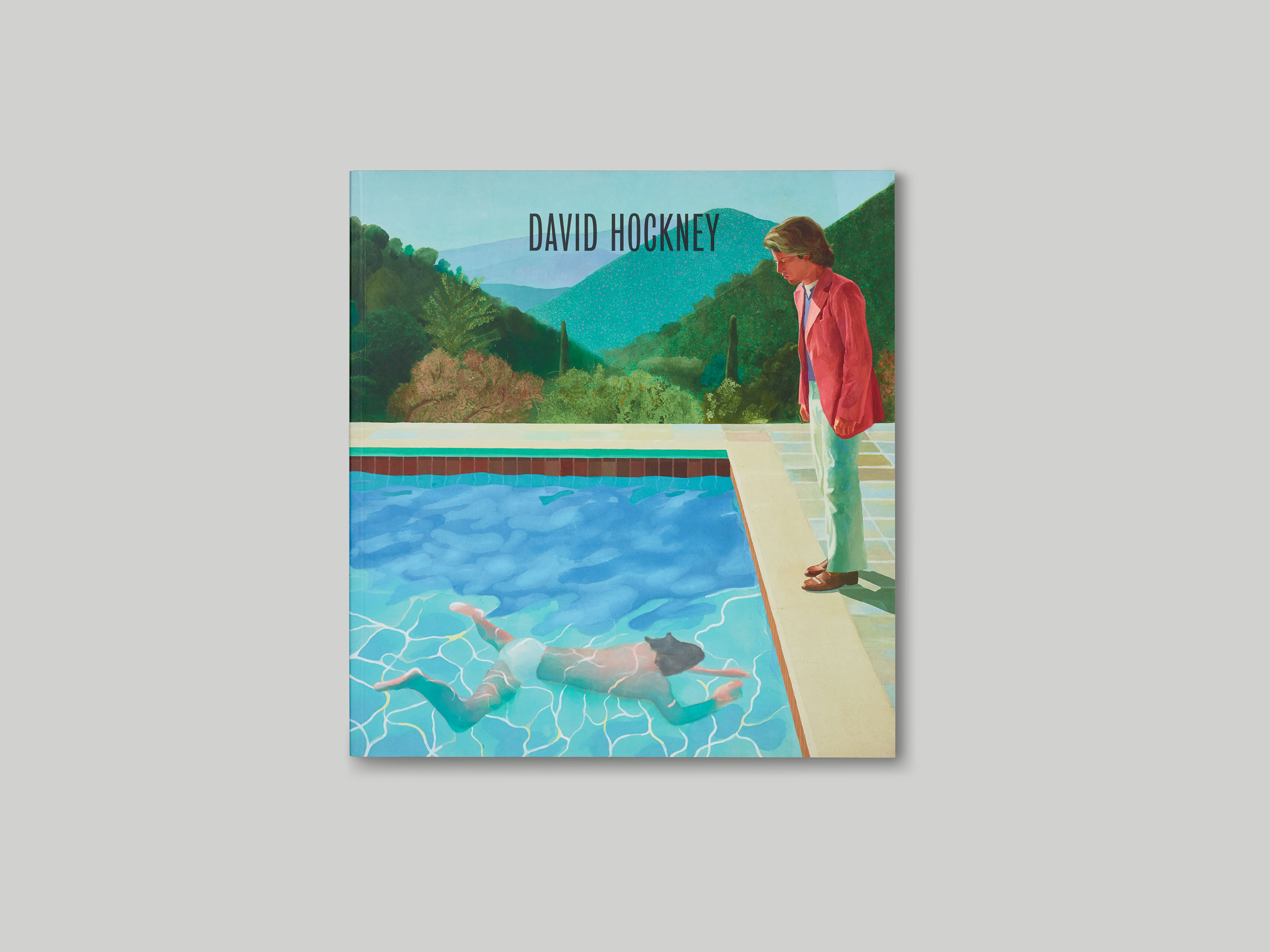
We chose this particular work as it had a great circular sensibility – the front cover of the softcover is one of Hockney’s well-known early works depicting California and a swimming pool, and we liked the idea that the next image you see when you open the book is a much more recent depiction of a similar subject.
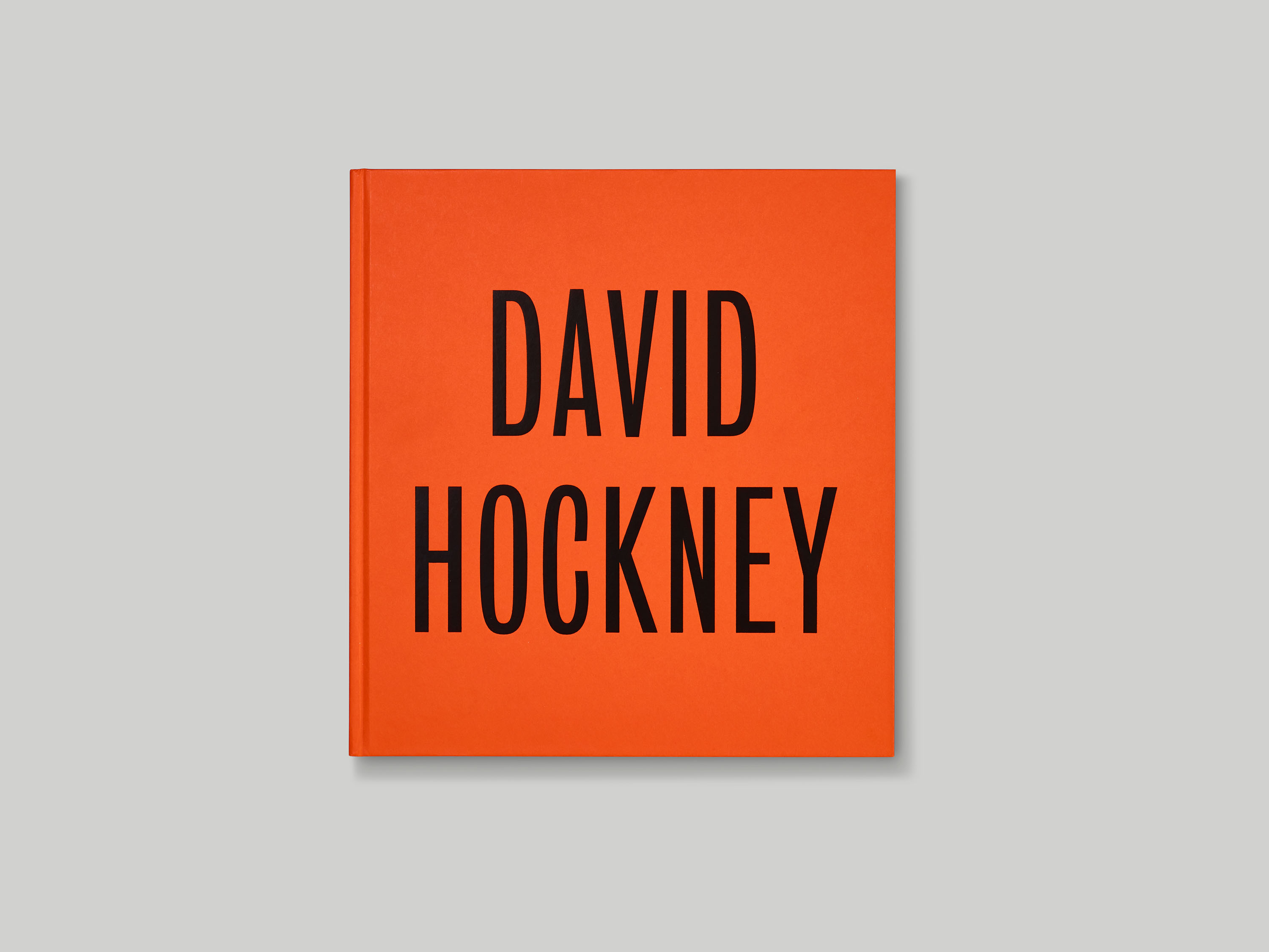
Bureau Grot is a typeface based on Stephenson Blake grotesques from the 19th century. It felt appropriate to celebrate Hockney’s largest exhibition to date with a typeface made by one of England’s most prestigious foundries. The Stephenson Blake type foundry was originally based in Sheffield, and this connection to Hockney’s home county of Yorkshire made it an even more appropriate choice for the catalogue.
Fakt is a recently-designed typeface by Thomas Thiemich. It’s a functional, humanist typeface that revisits archetypal sans serifs of earlier decades: Miedinger and Hoffmann’s Neue Haas Grotesk/Helvetica (1950s) and Renner’s Futura (1920s). It combines the best of both the grotesk and geometric sans-serif traditions.


