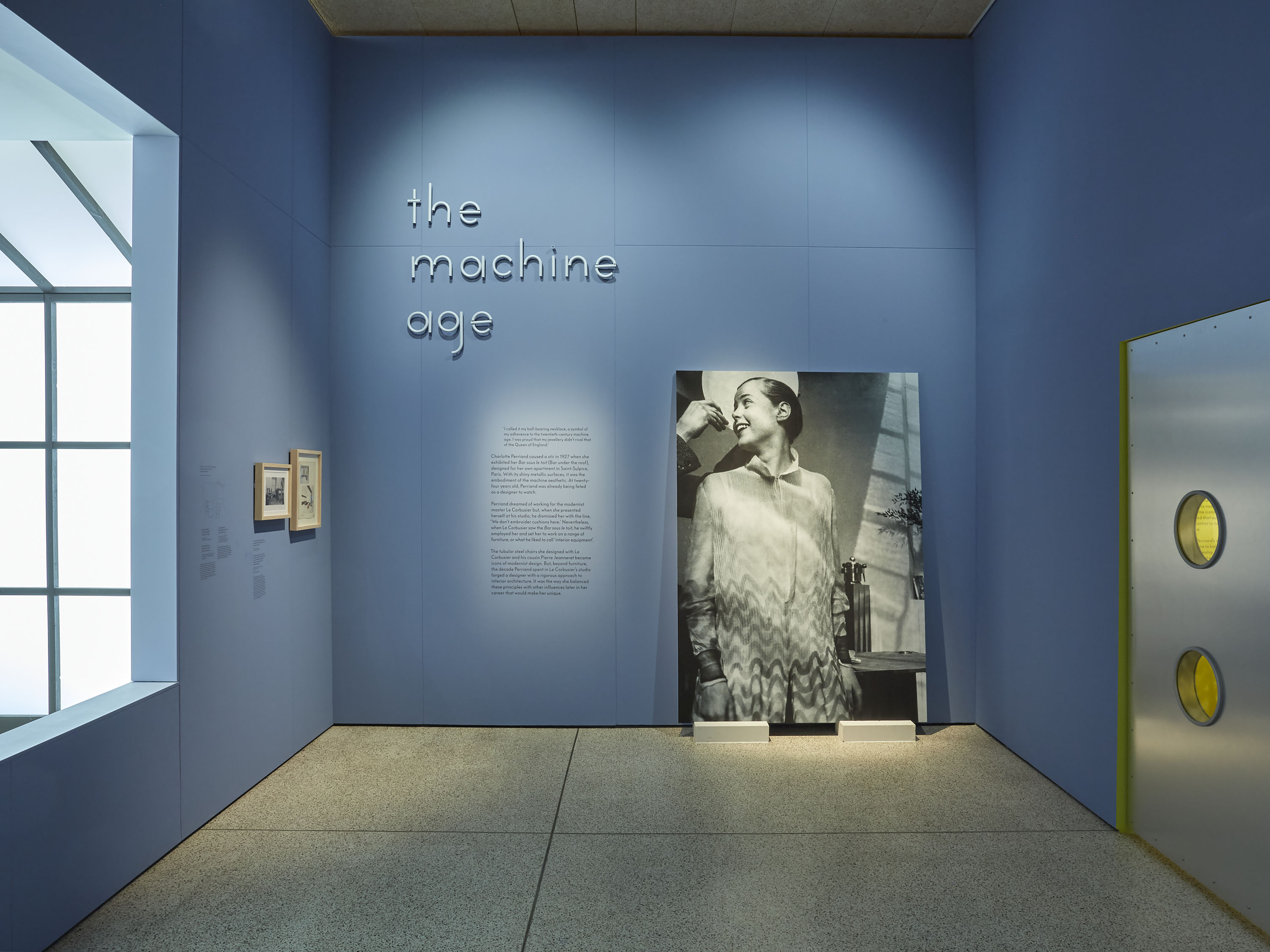
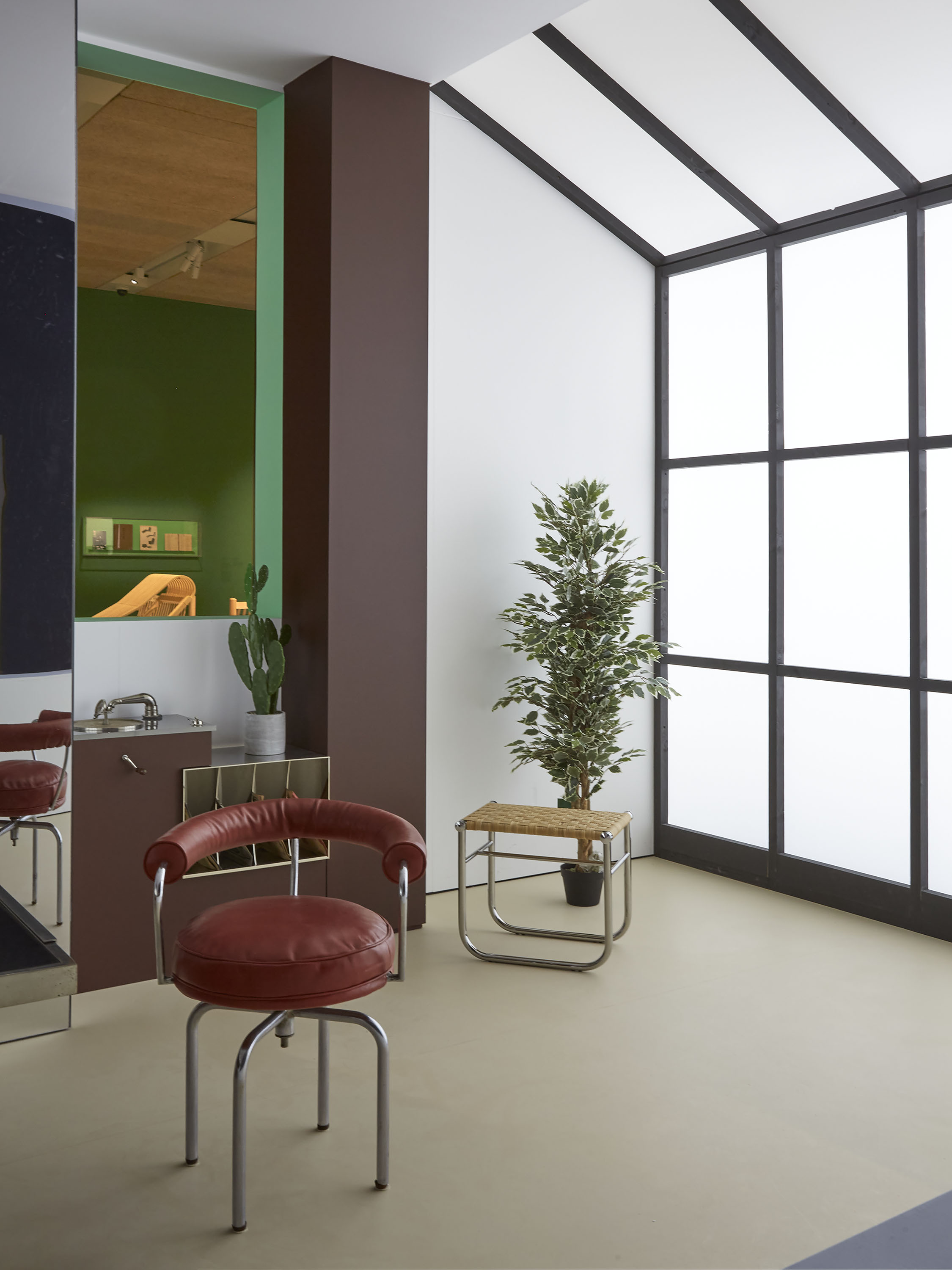
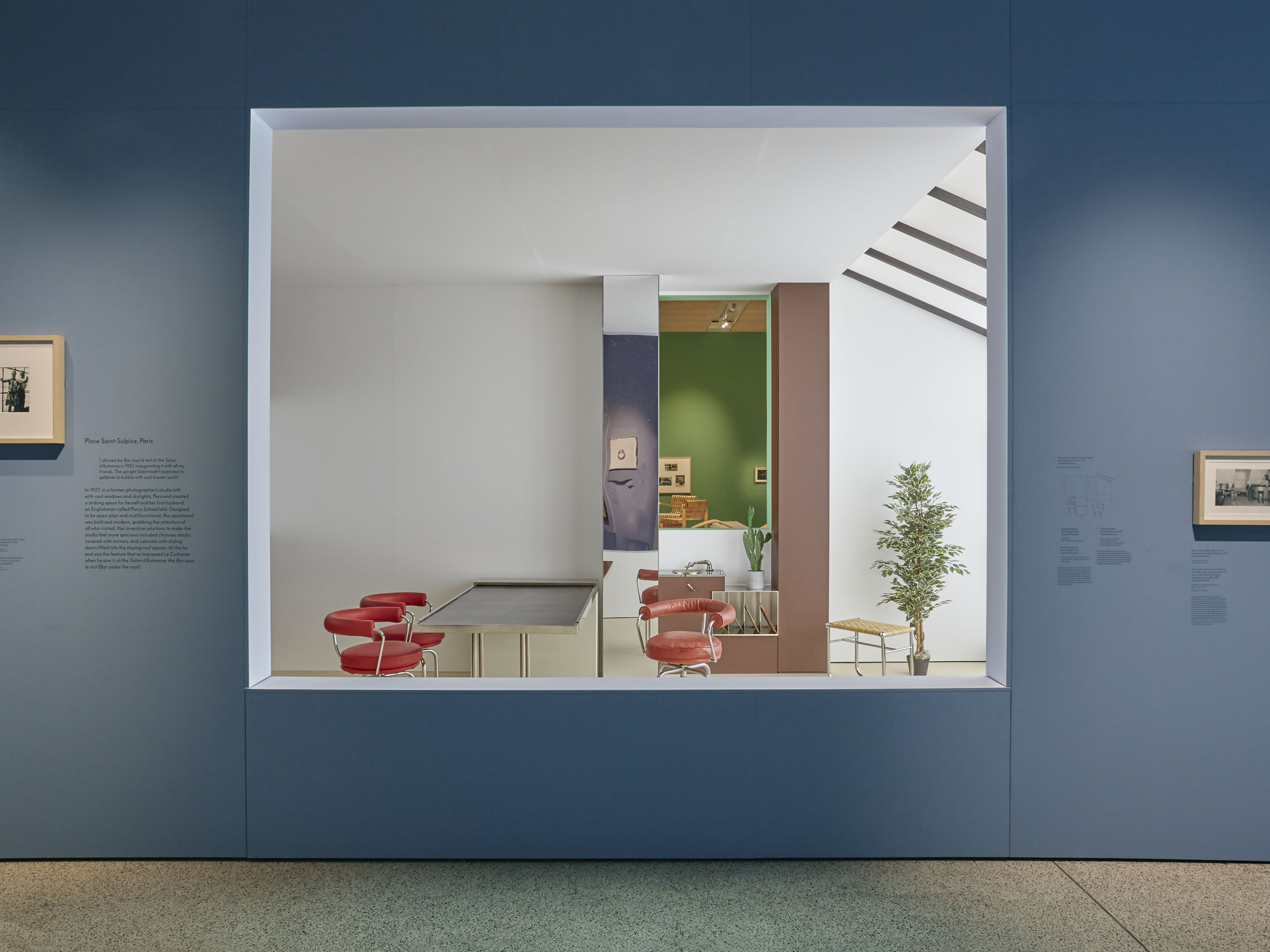
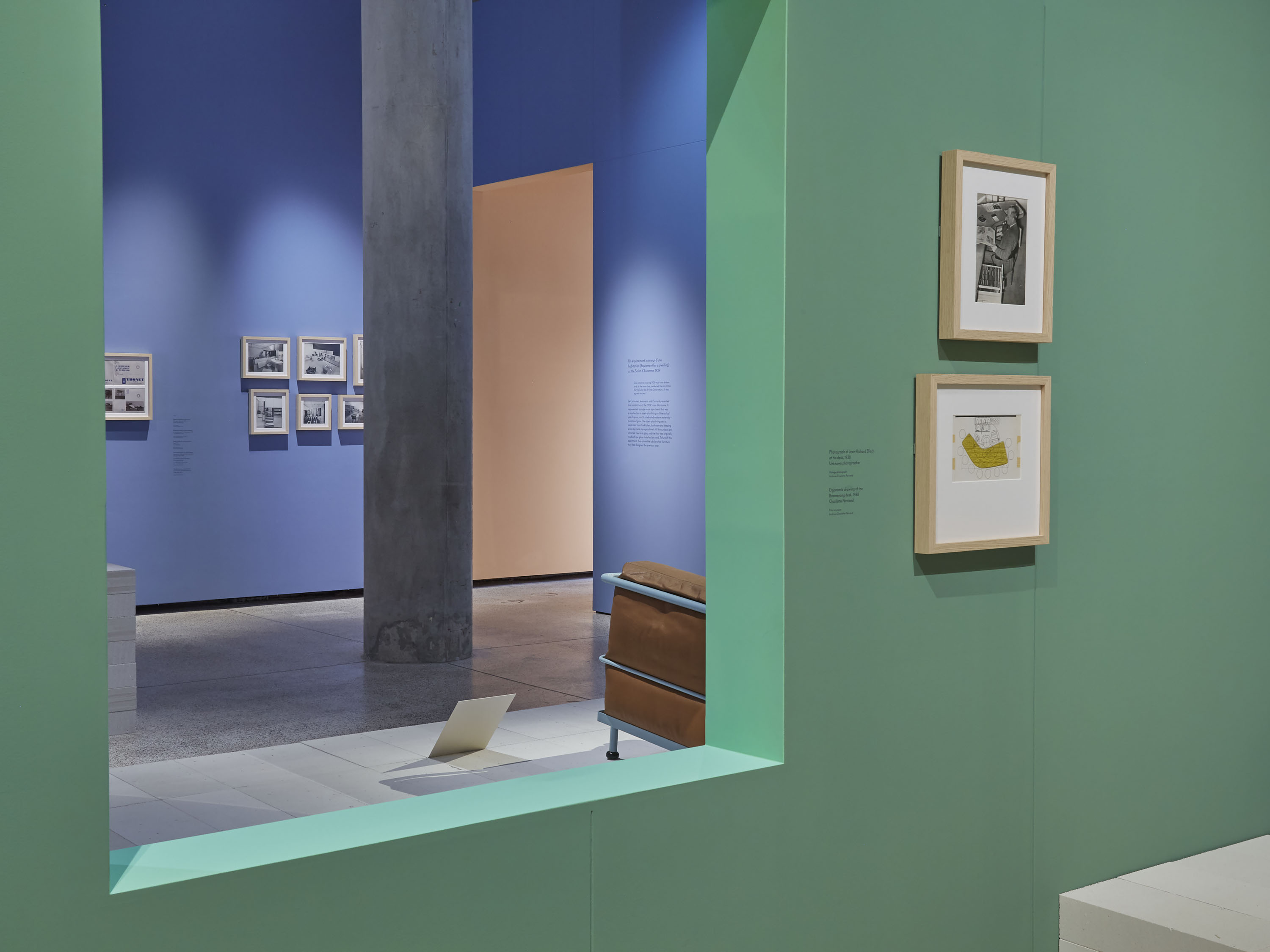
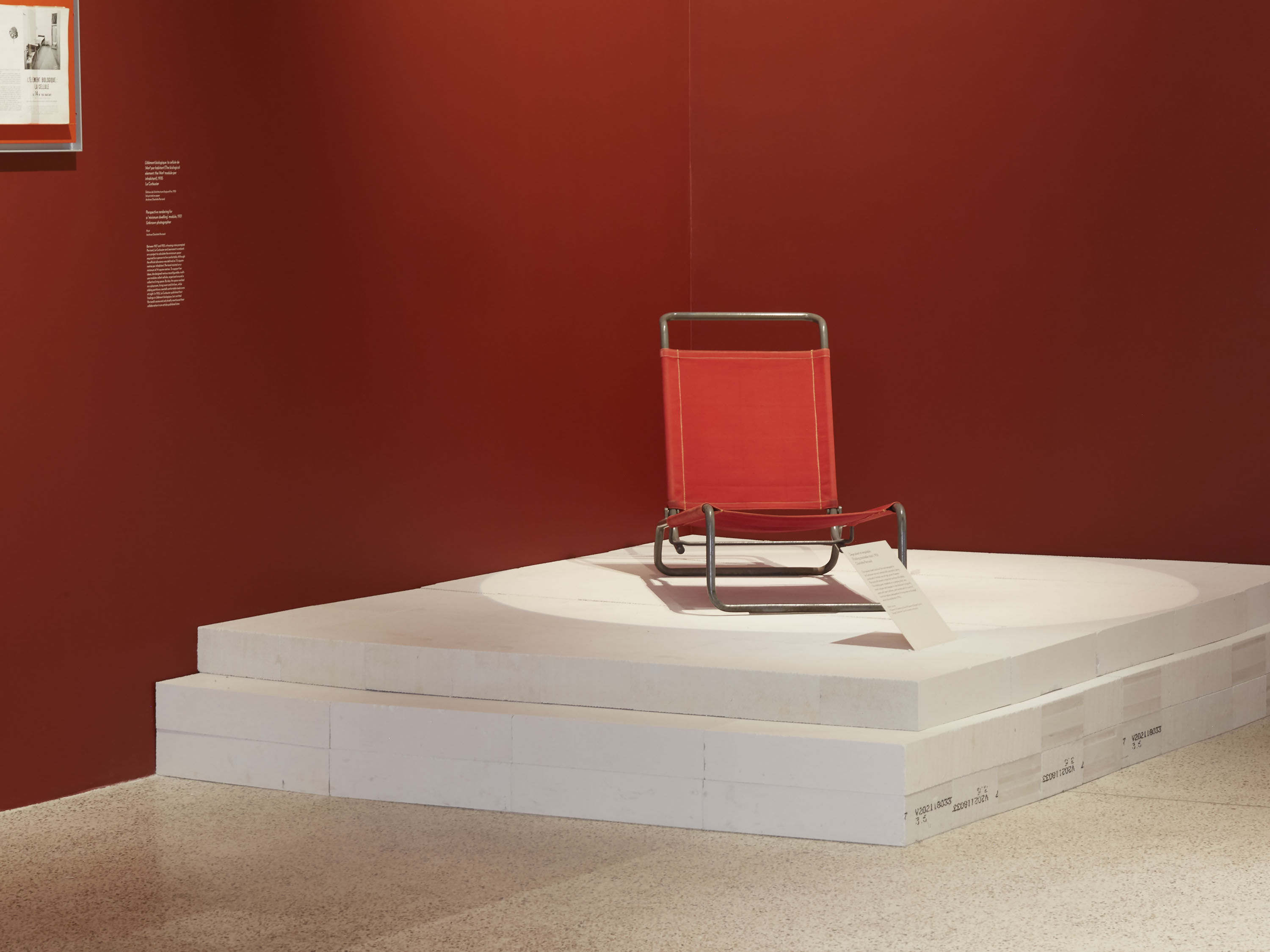
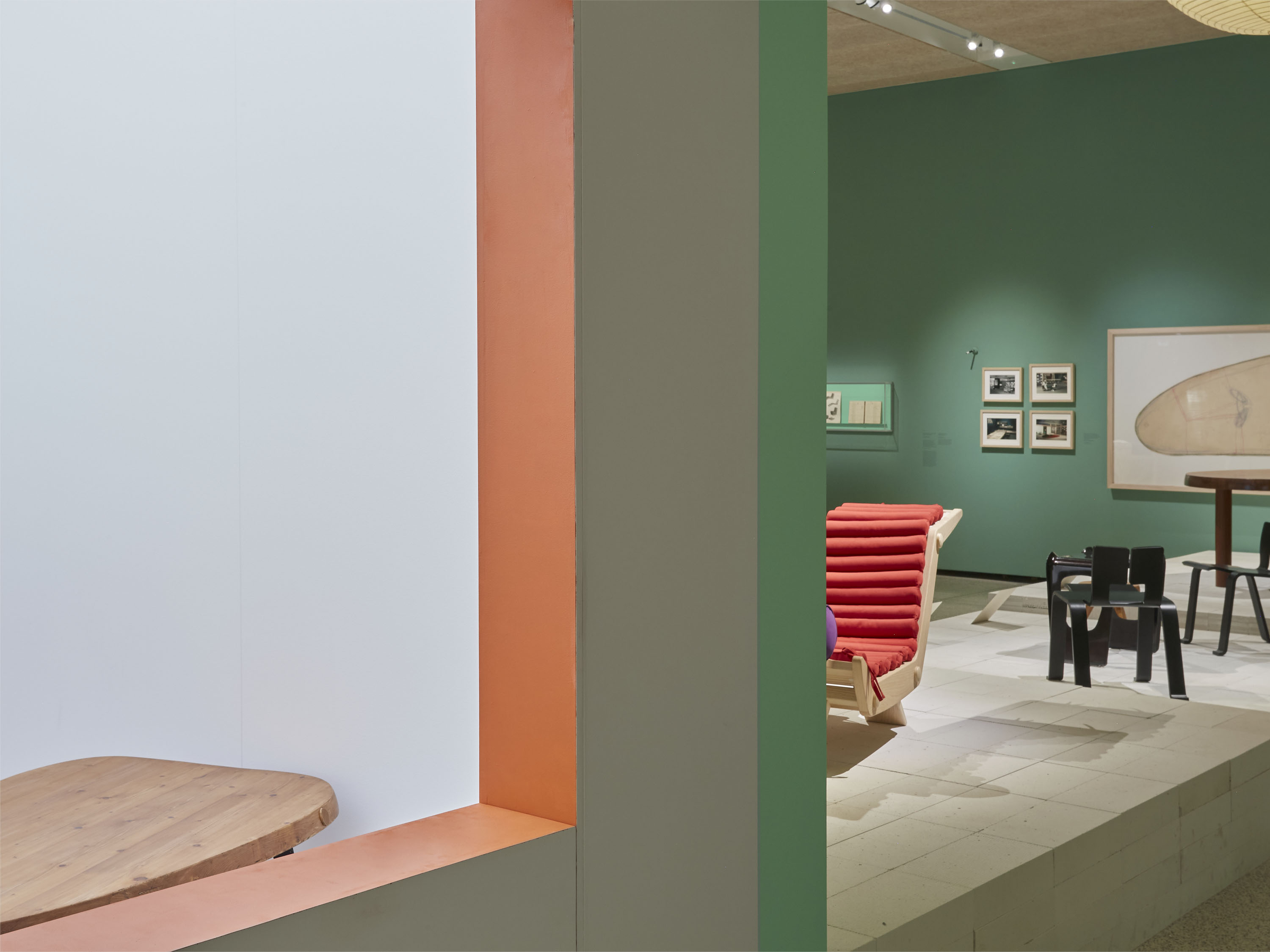
Charlotte Perriand: The Modern Life is a major retrospective of the pioneering designer’s work, held at the Design Museum in 2021. It presents the breadth of Perriand’s influential practice – spanning the modernist machine aesthetic, her exploration of natural forms, modular furniture designs and major architectural projects. Often overshadowed by her male counterparts, the exhibition celebrates Perriand’s pivotal work and demonstrates her skills as a natural collaborator and synthesiser.
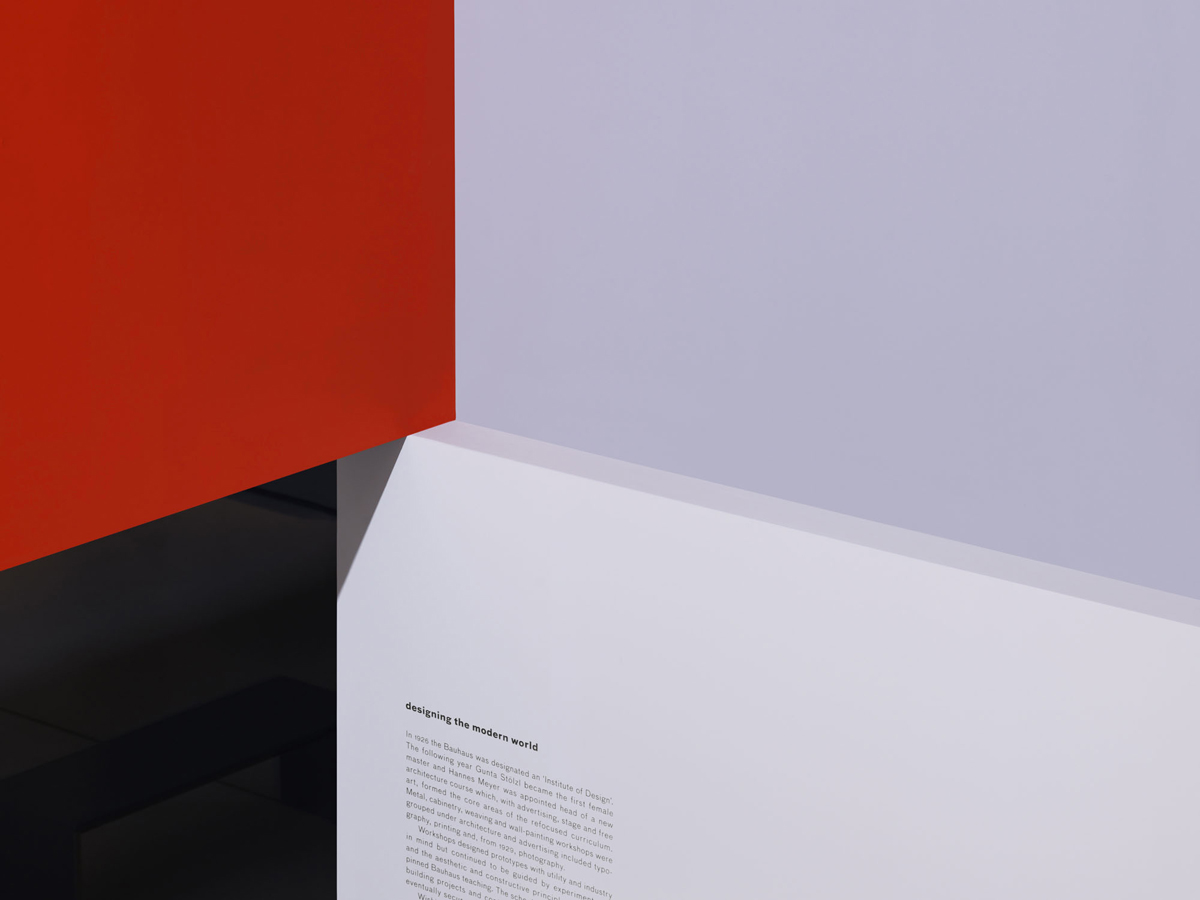
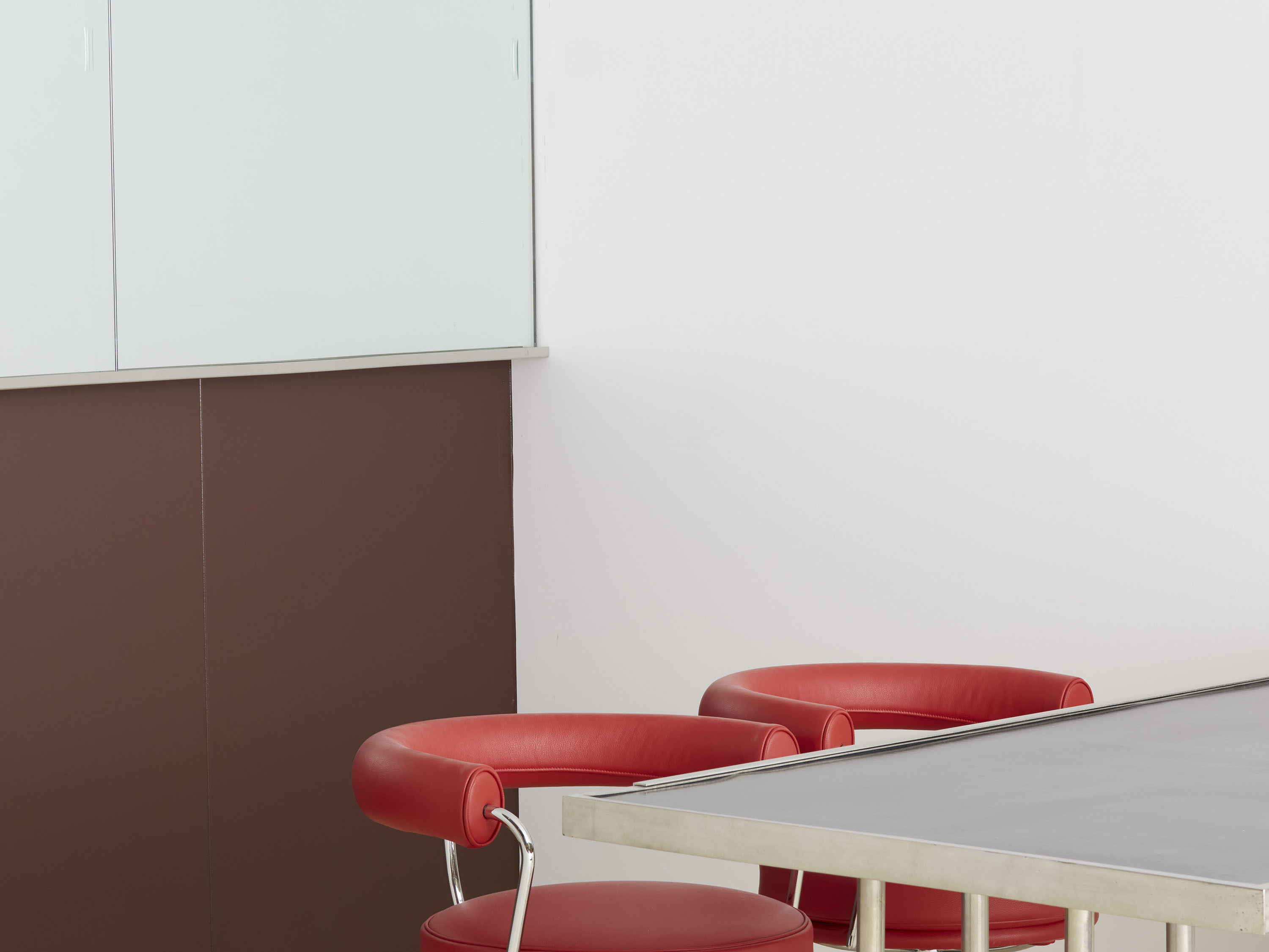
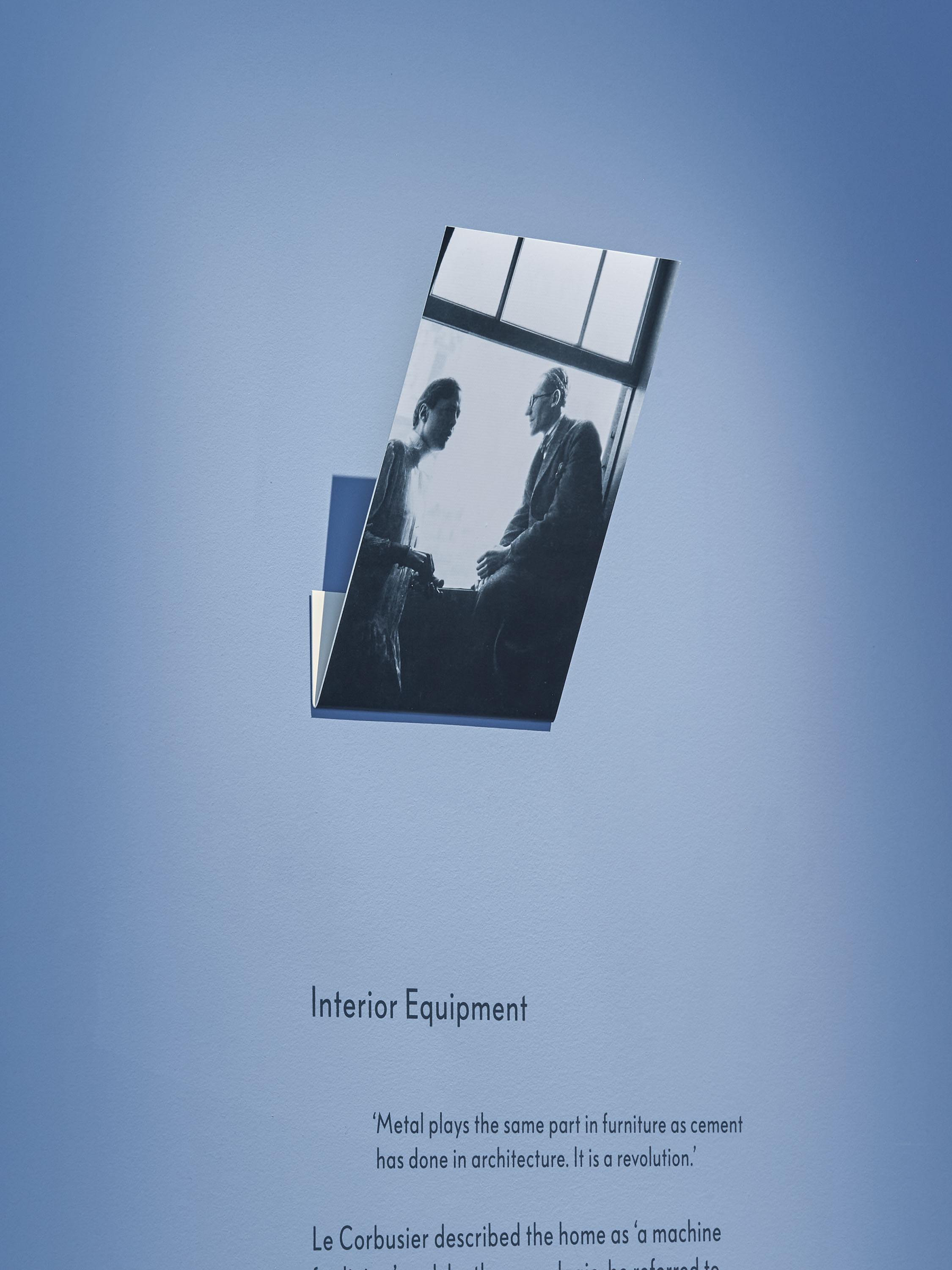
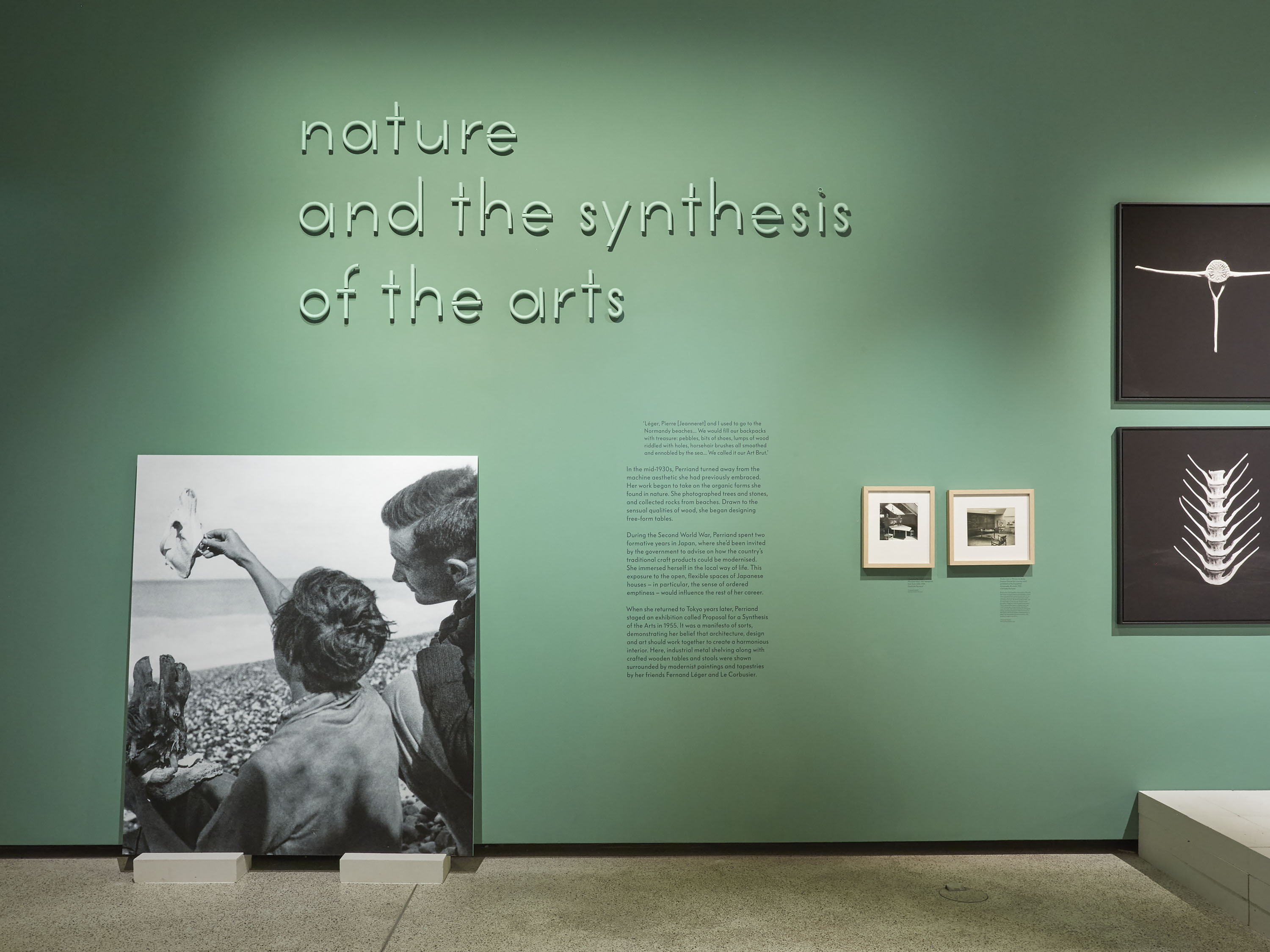
We were keen to develop a collaborative and integrated approach to the exhibition design, working closely with Assemble. We developed an unusual colour palette that reflected Perriand’s bold use of colour throughout her career. Views through the different rooms offer reflections on different times in her career, with colour used to form graphic compositions inspired by Perriand’s environmental design.
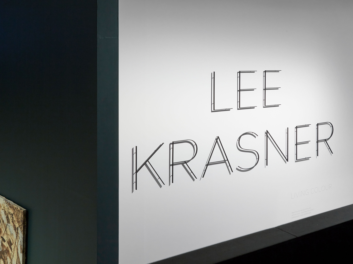
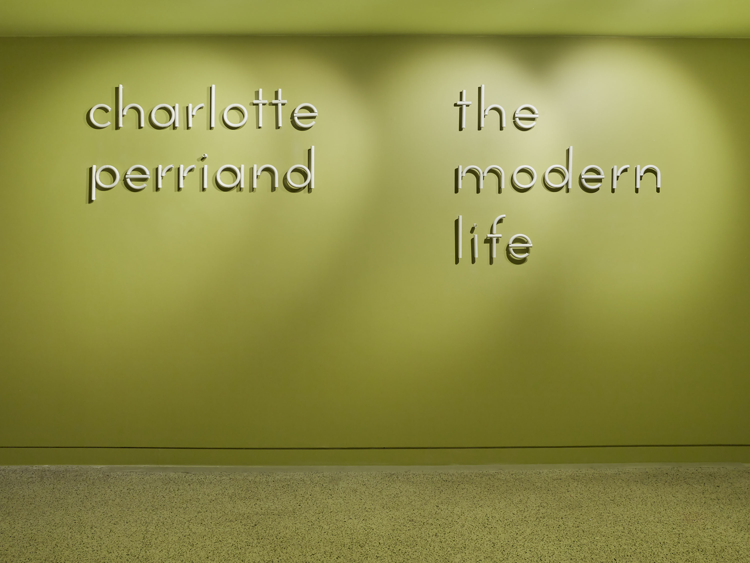
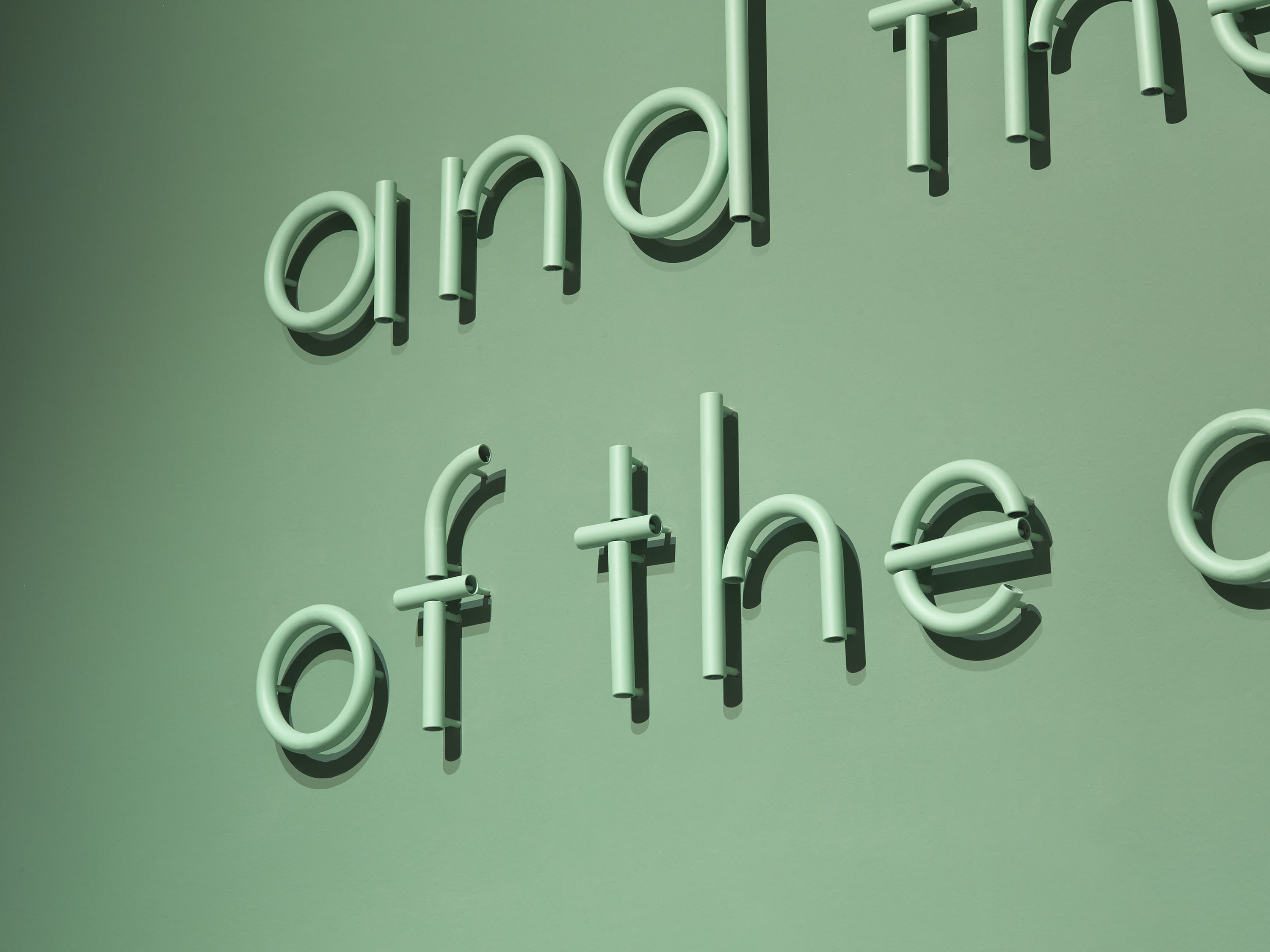
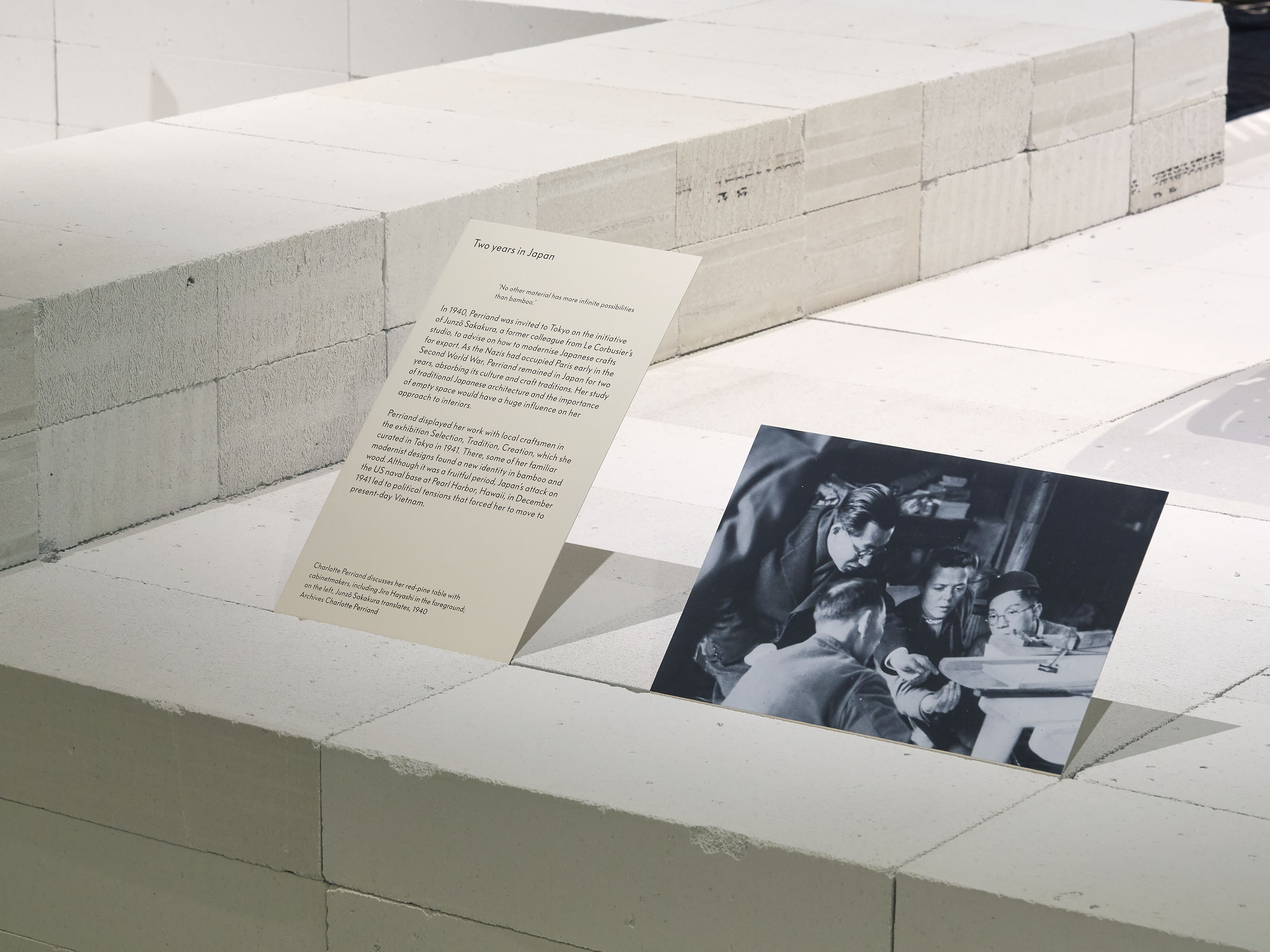
Custom modular lettering was created for the exhibition titles, produced in bent tubular steel – a material and process that Perriand worked with often in her furniture design. Section texts are screen-printed directly onto the gallery walls, while bespoke folded metal captions are integrated into surfaces and structures built up of large, concrete blocks.
Photography: Thomas Adank
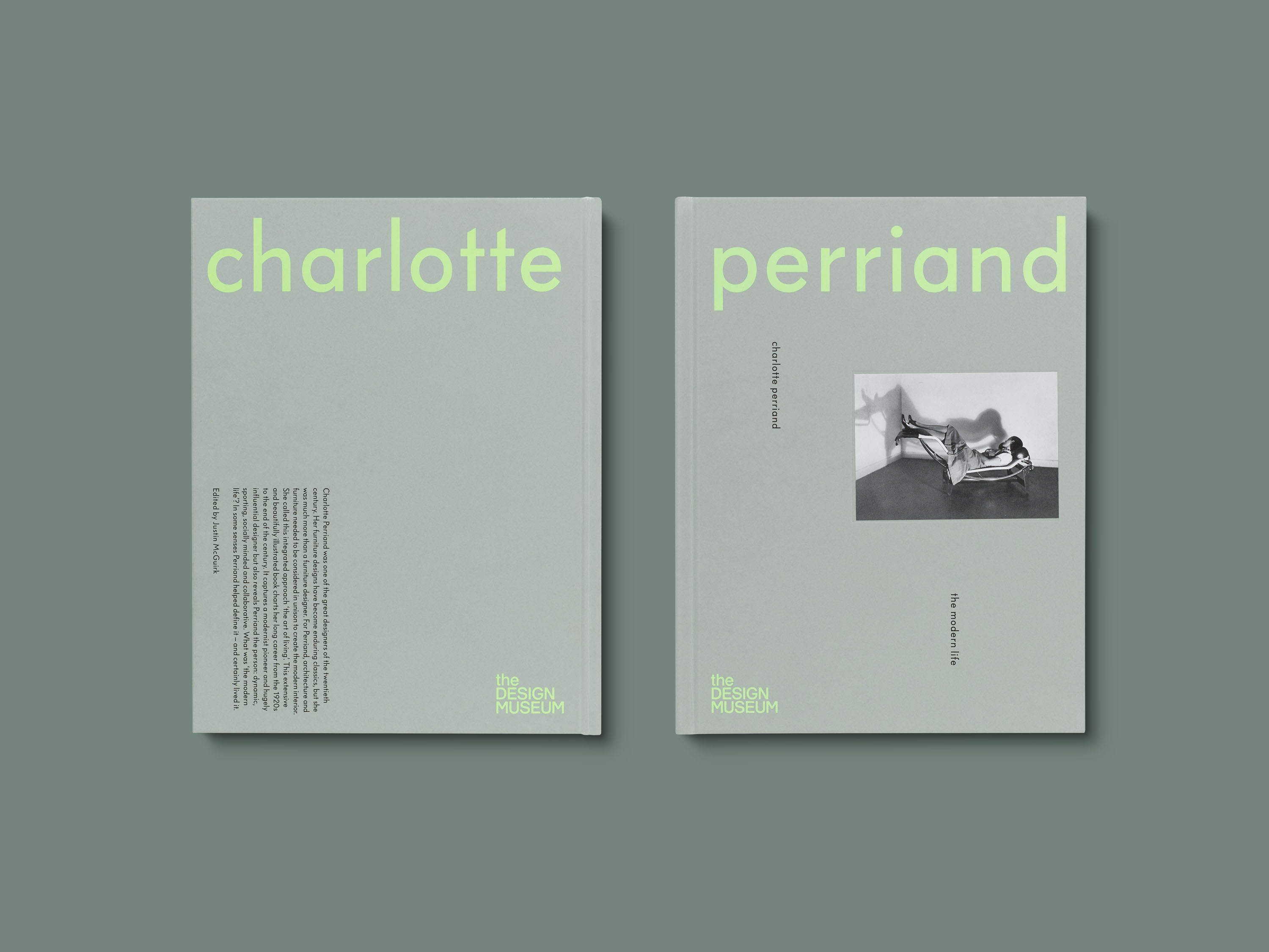
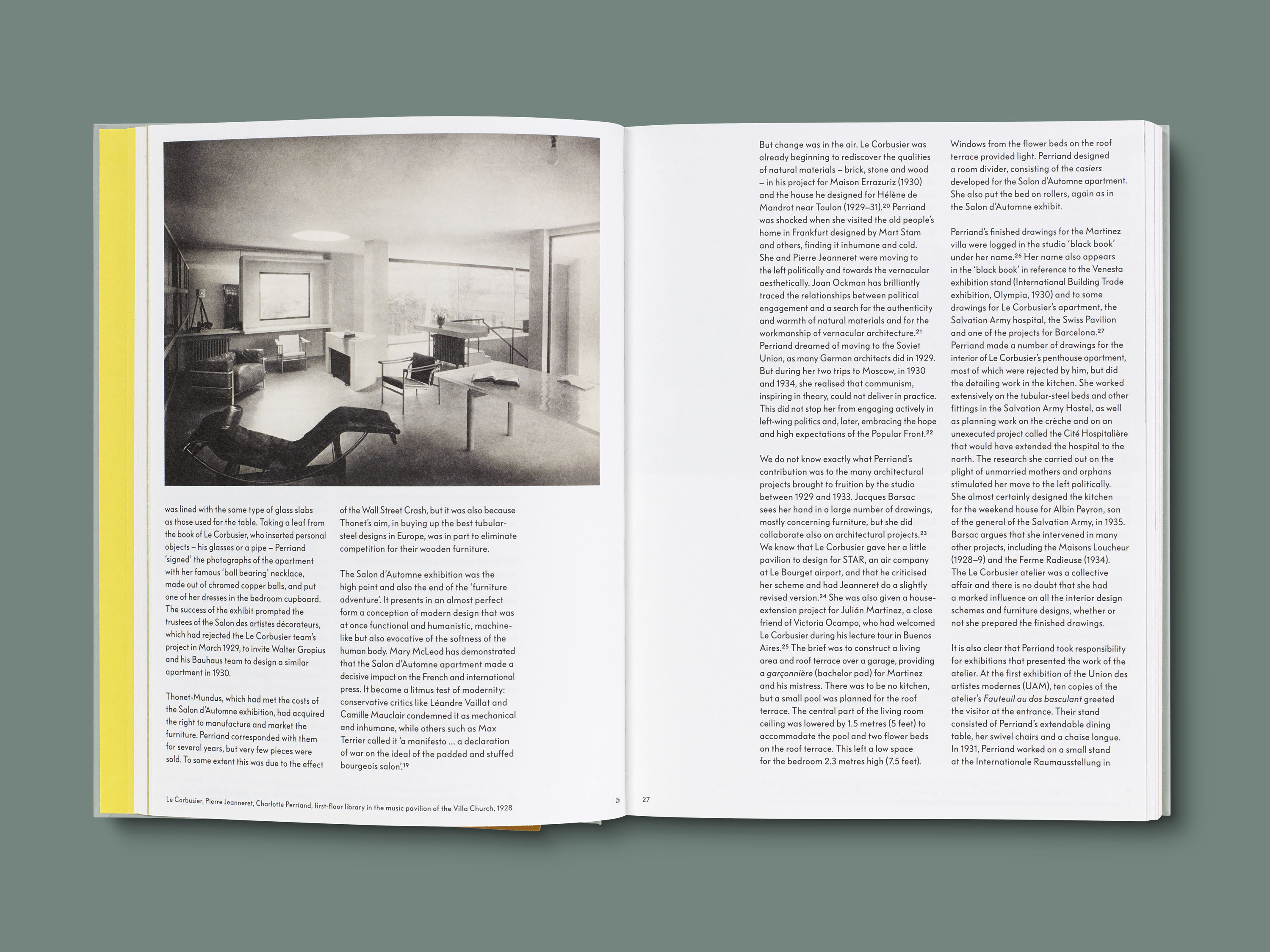
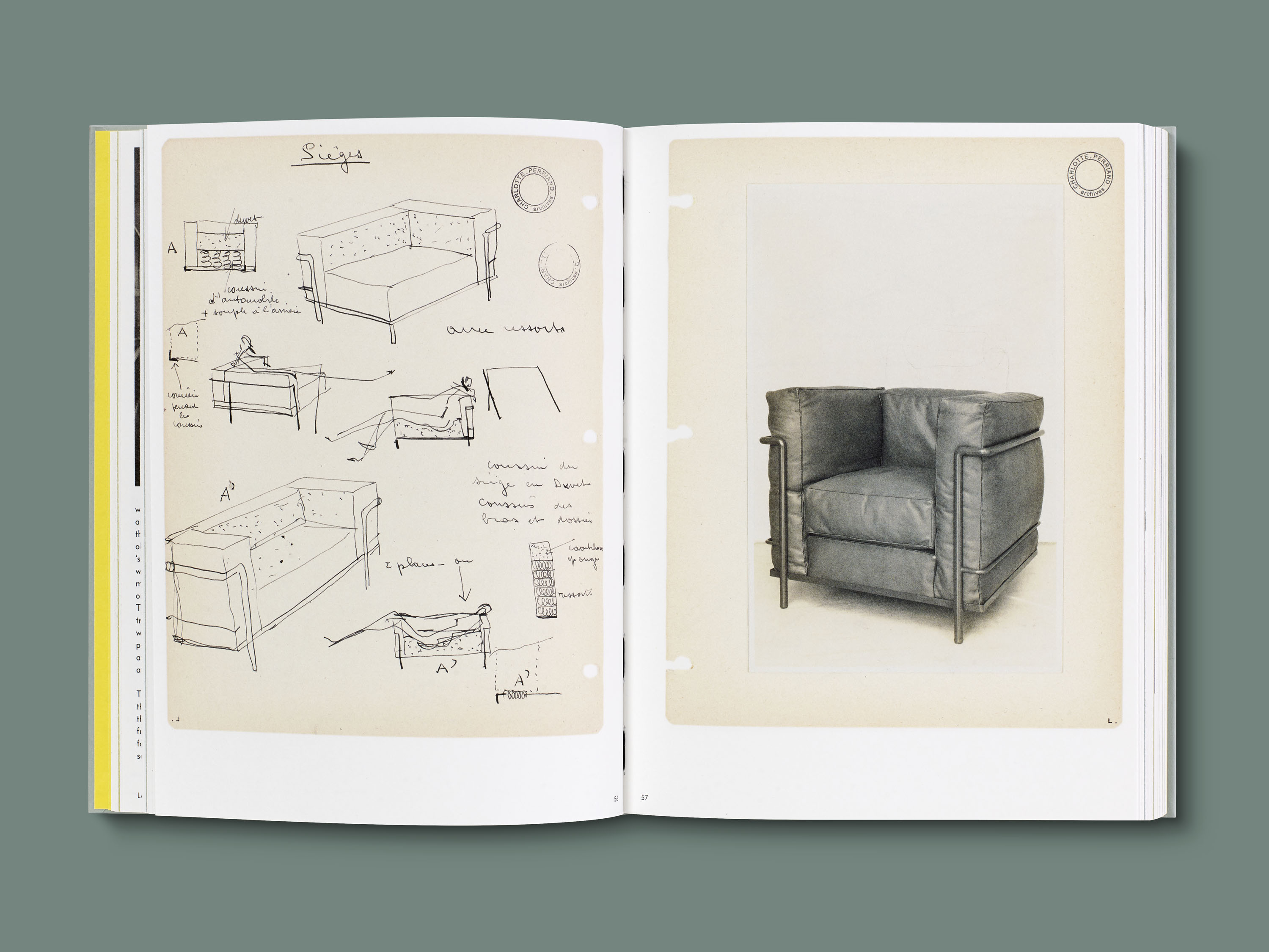
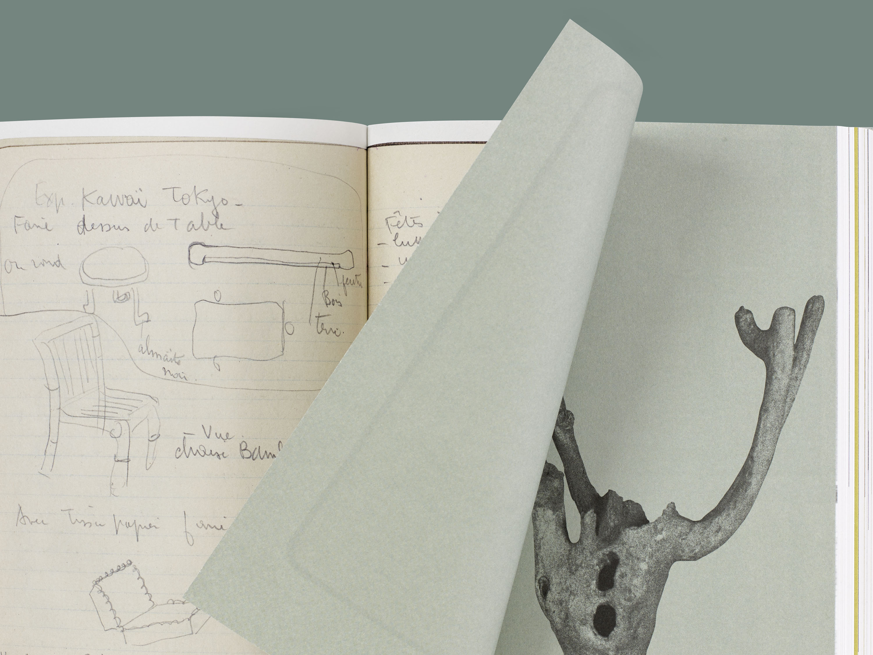
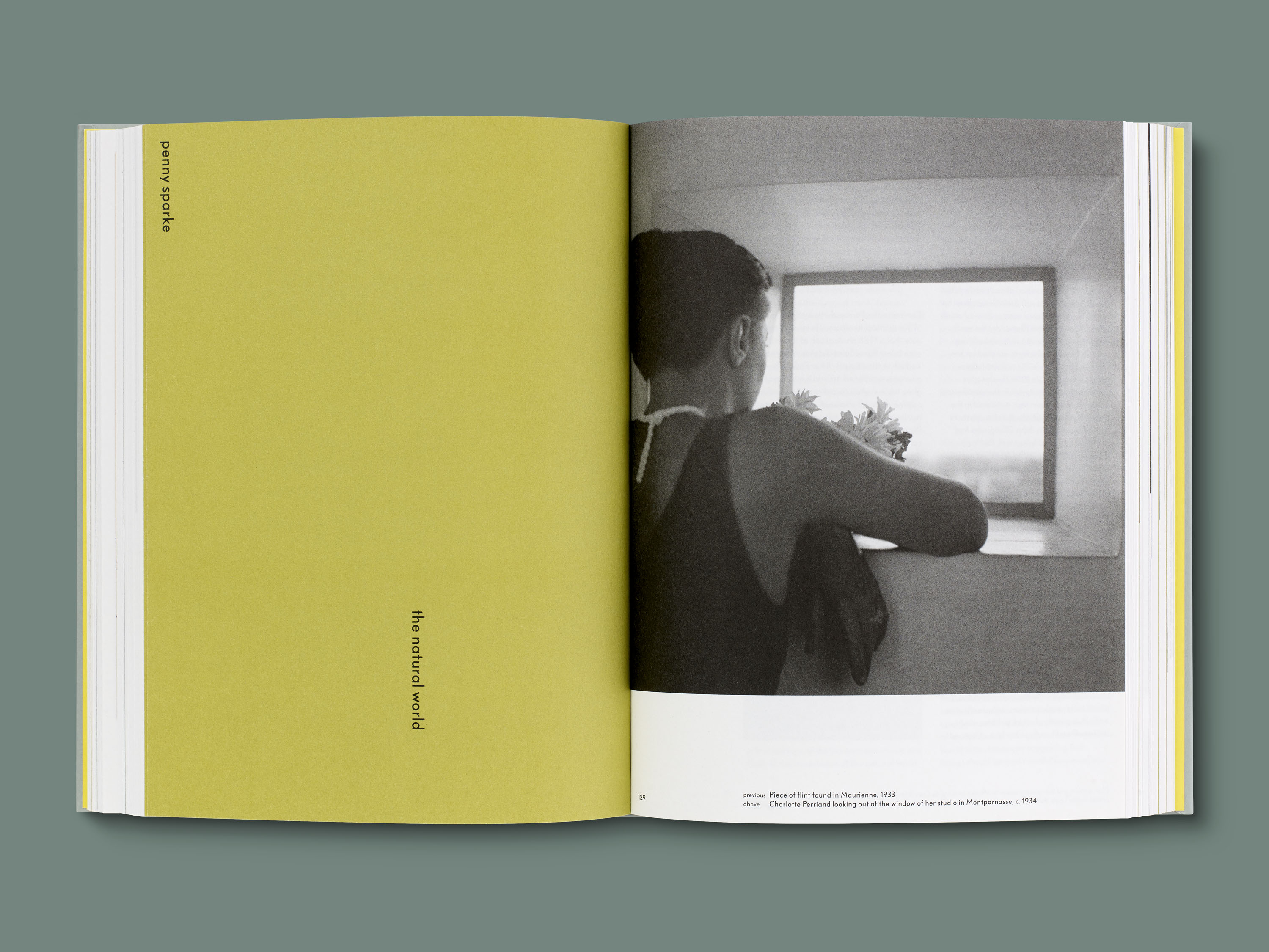
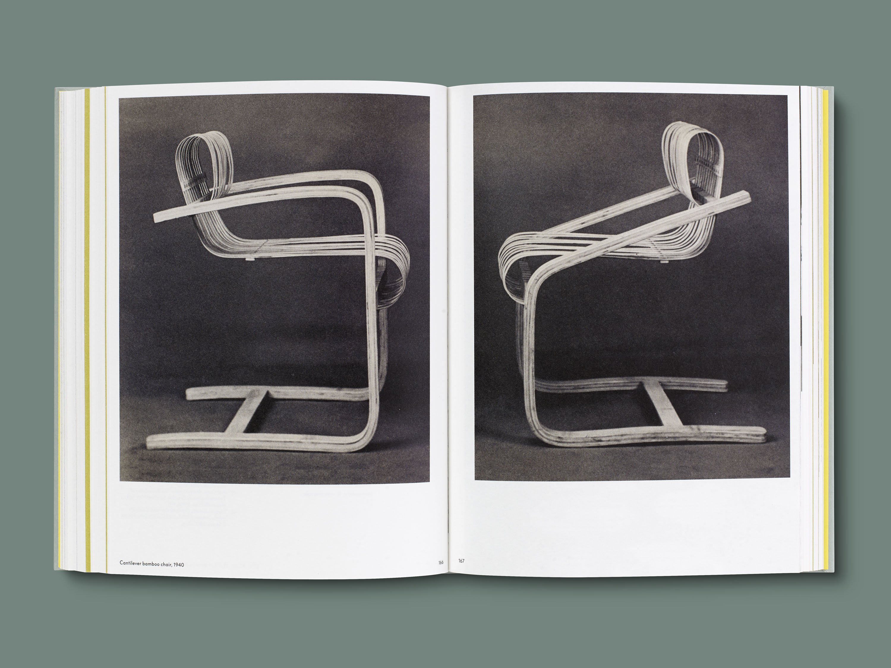
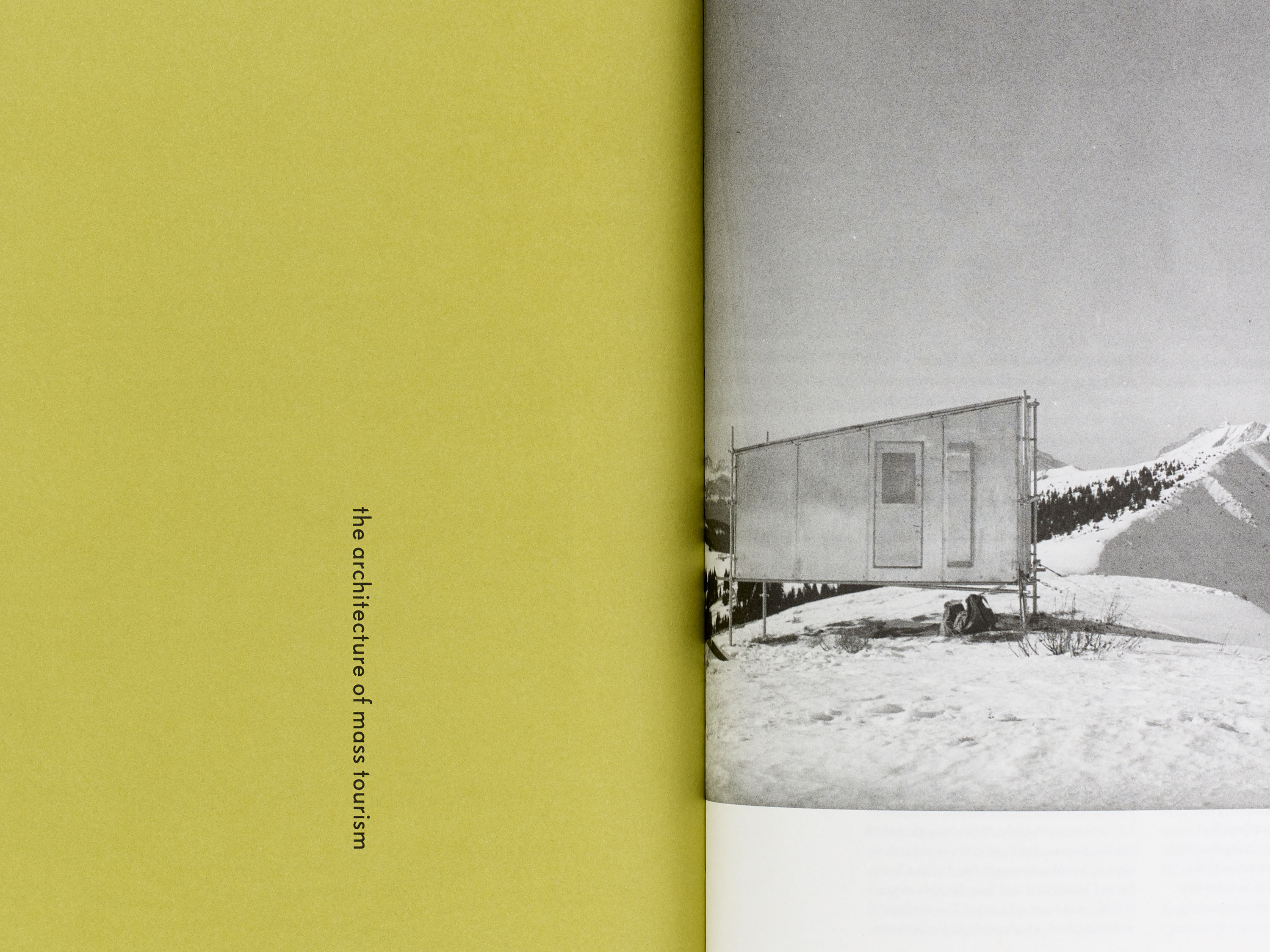
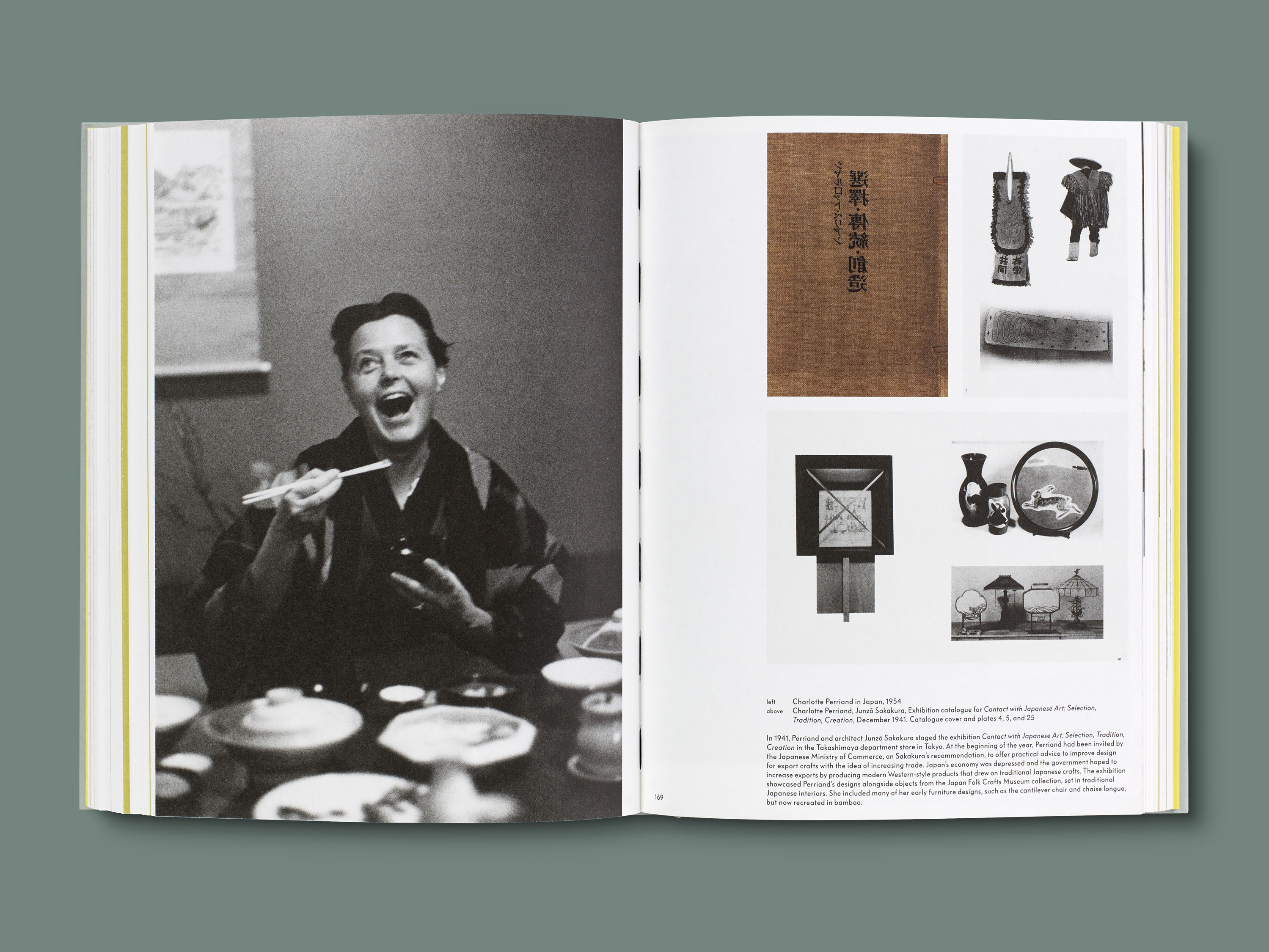
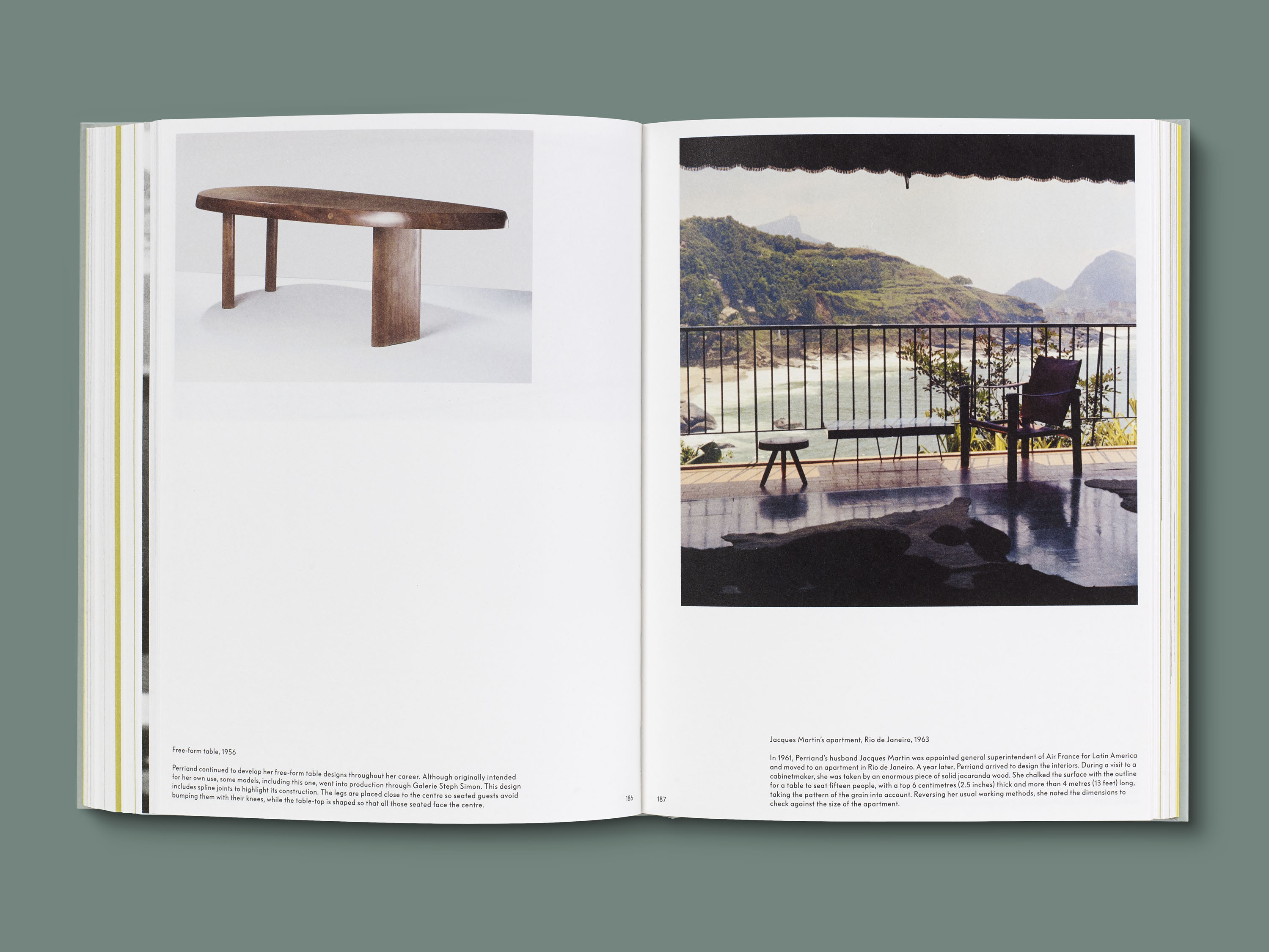
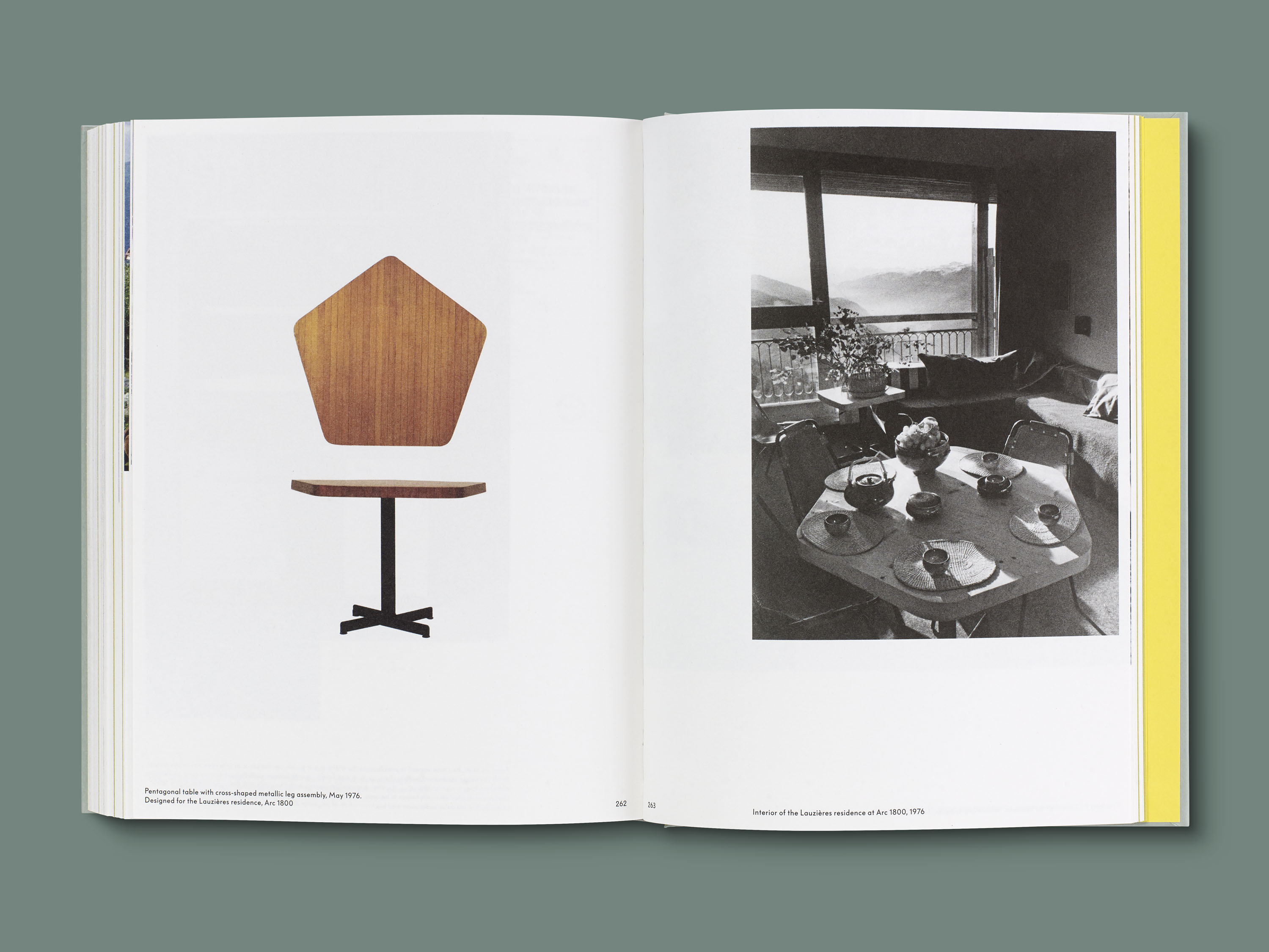
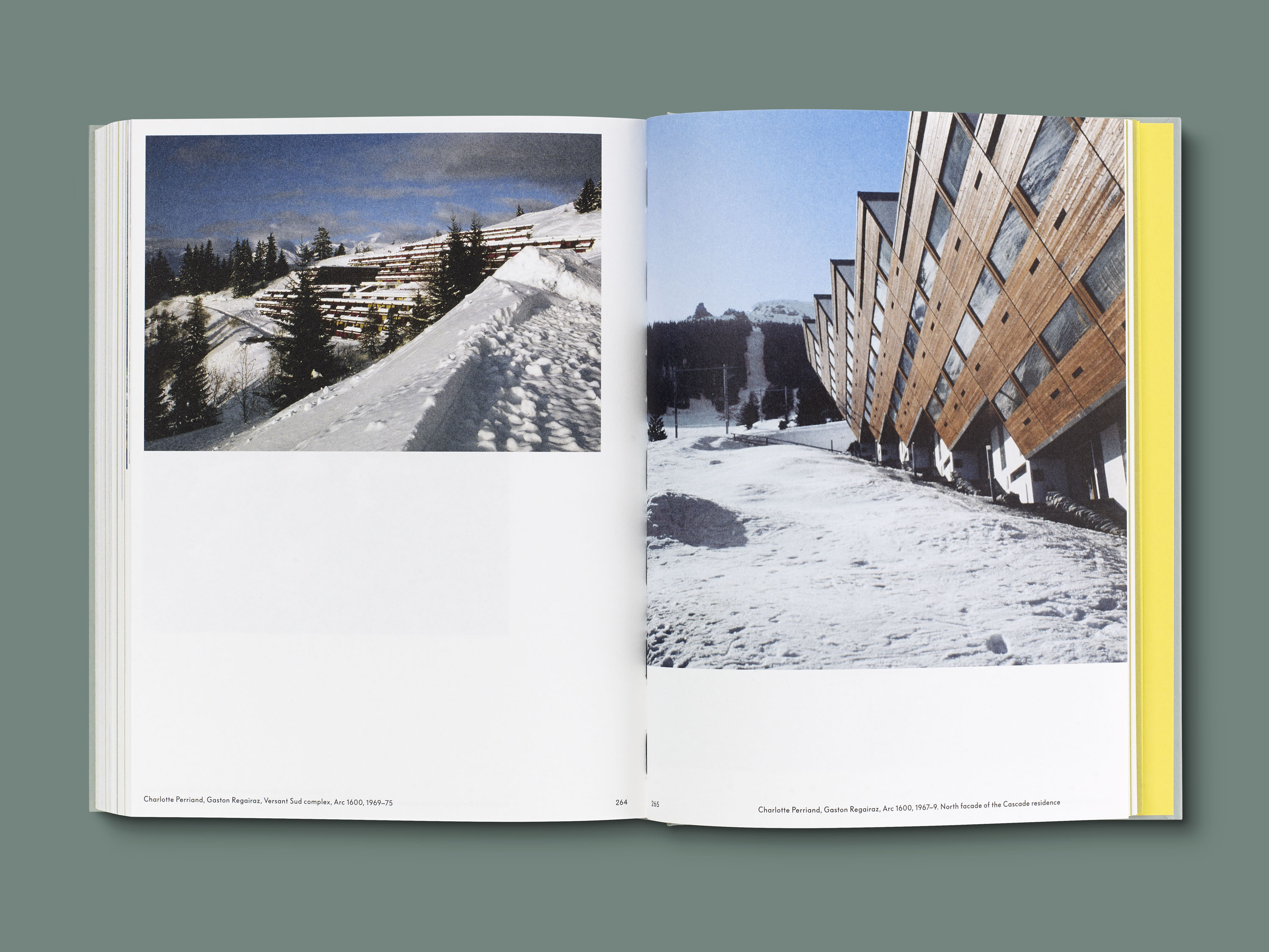
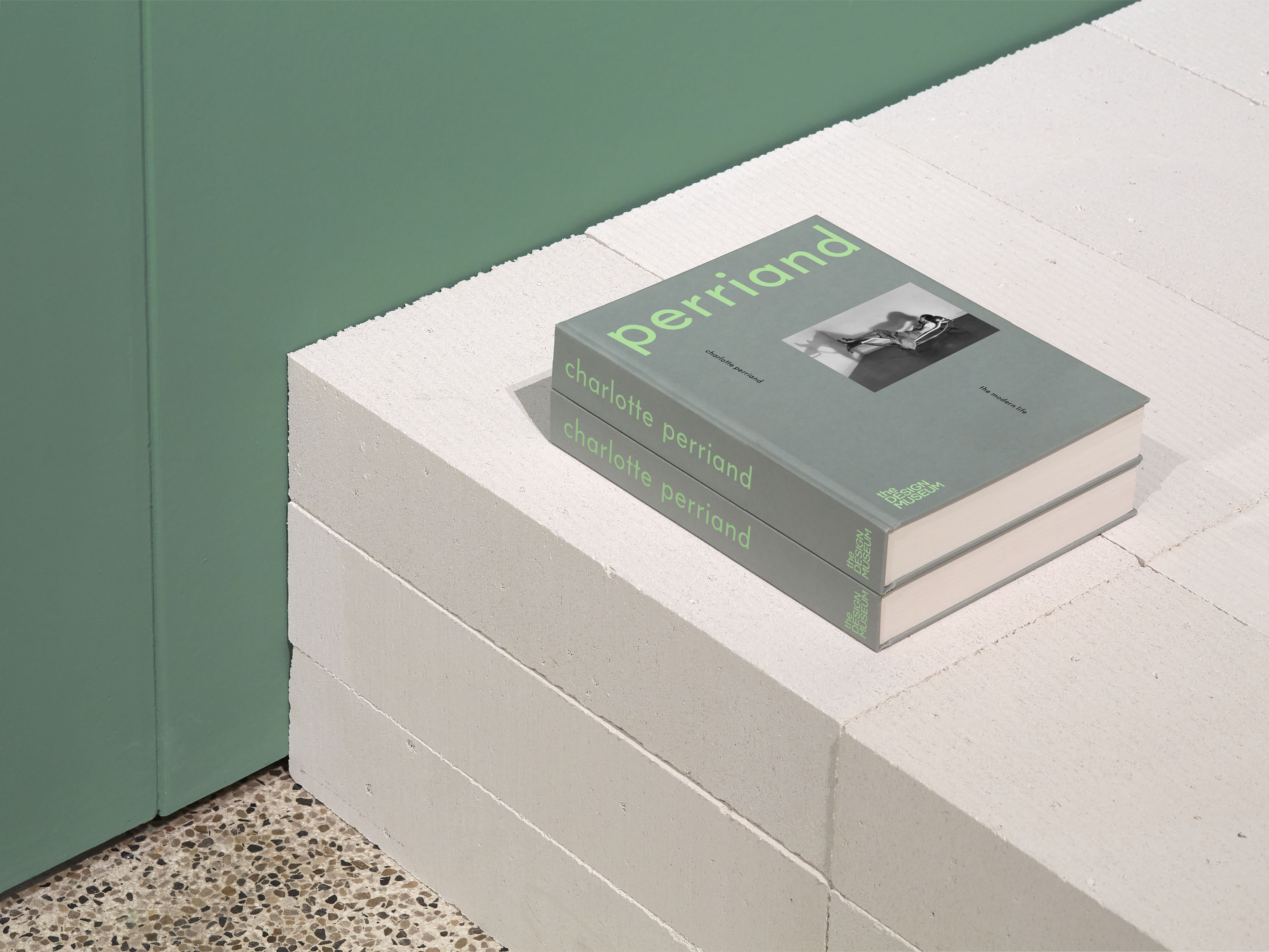
The monograph Charlotte Perriand: The Modern Life is an extensive overview of Perriand’s work and life, woven together to reflect her approach and what she termed as ‘the art of living’. It brings together archival photography, pages of Perriand’s beautiful notebooks and imagery of furniture and architectural design. Essays by Glenn Adamson, Penny Sparke and Jane Hall, among others, offer new understanding for Perriand’s work while revealing her dynamic, socially mixed and collaborative personality.
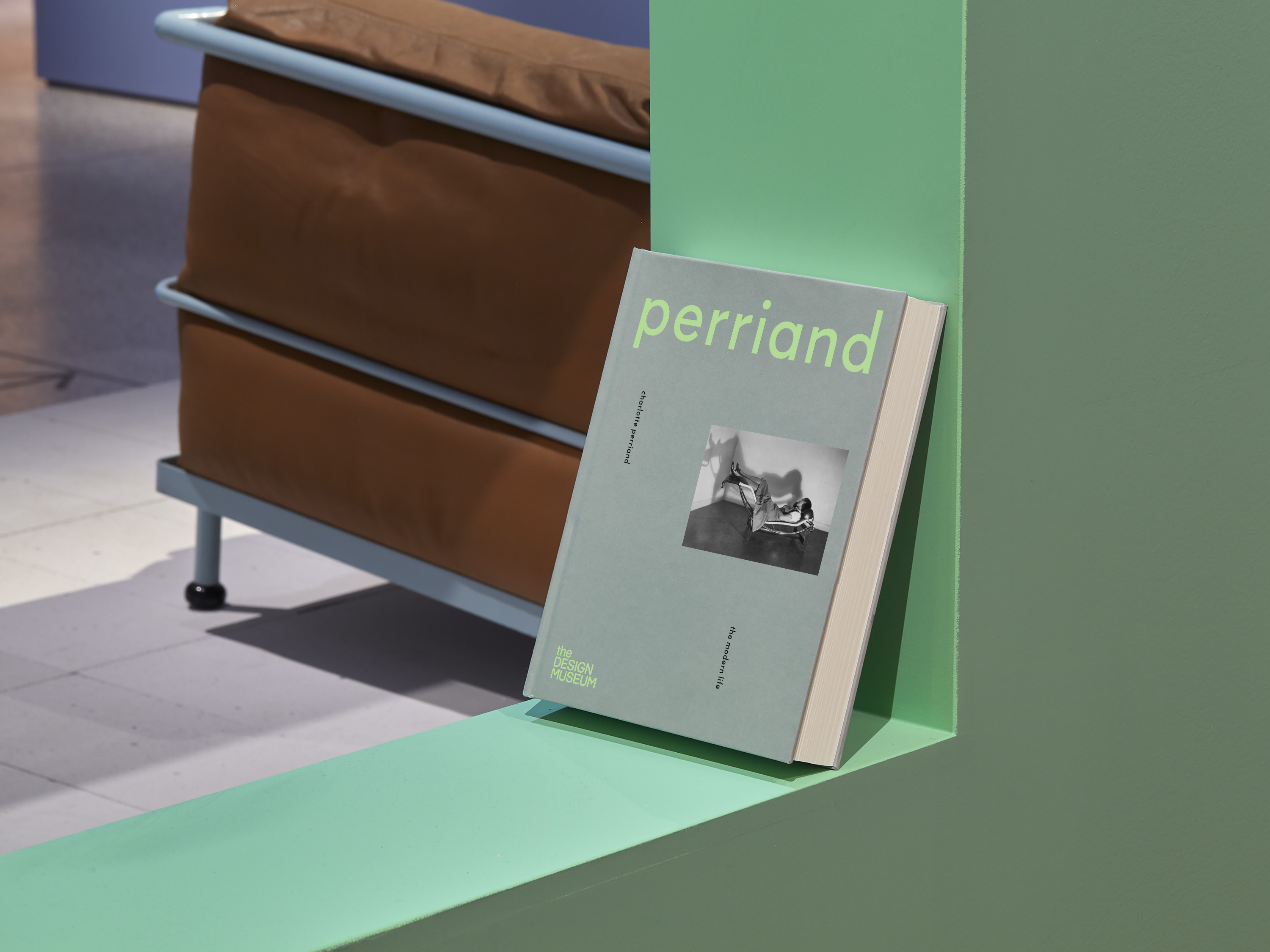
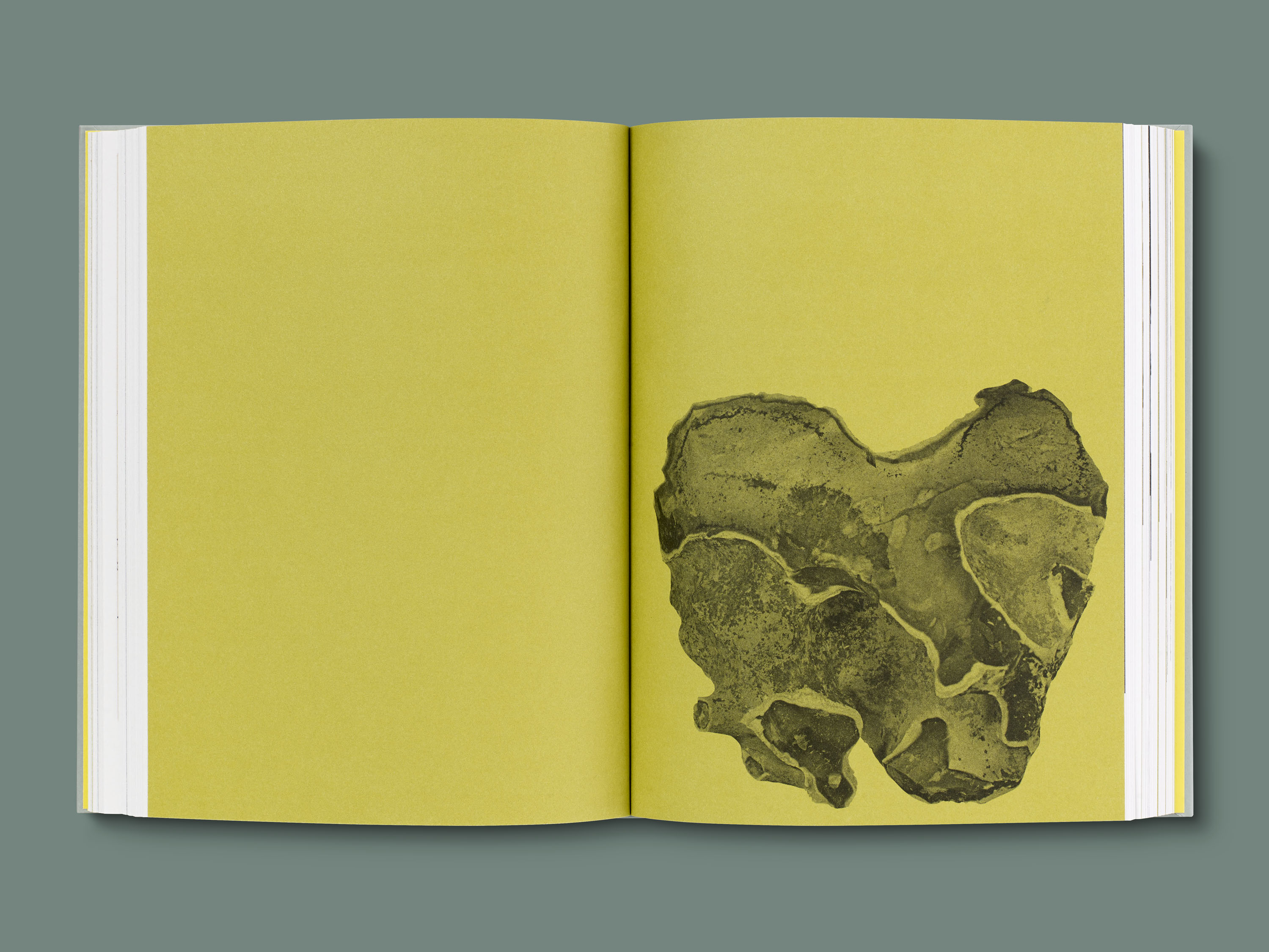
Designed to be a tactile object, the publication uses uncoated paper throughout, and the cover combines screenprinted text with a montaged image of Perriand on her Chaise longue basculante (1929). The book extends the exhibition’s colour palette and utilises a modernist democratic and dynamic approach to the typography. To structure the book, Perriand’s own art brut photography – cut out and overprinted on ochre – is used on title pages, creating a rhythm that helps navigate the different periods and materials across Perriand’s life and career.
