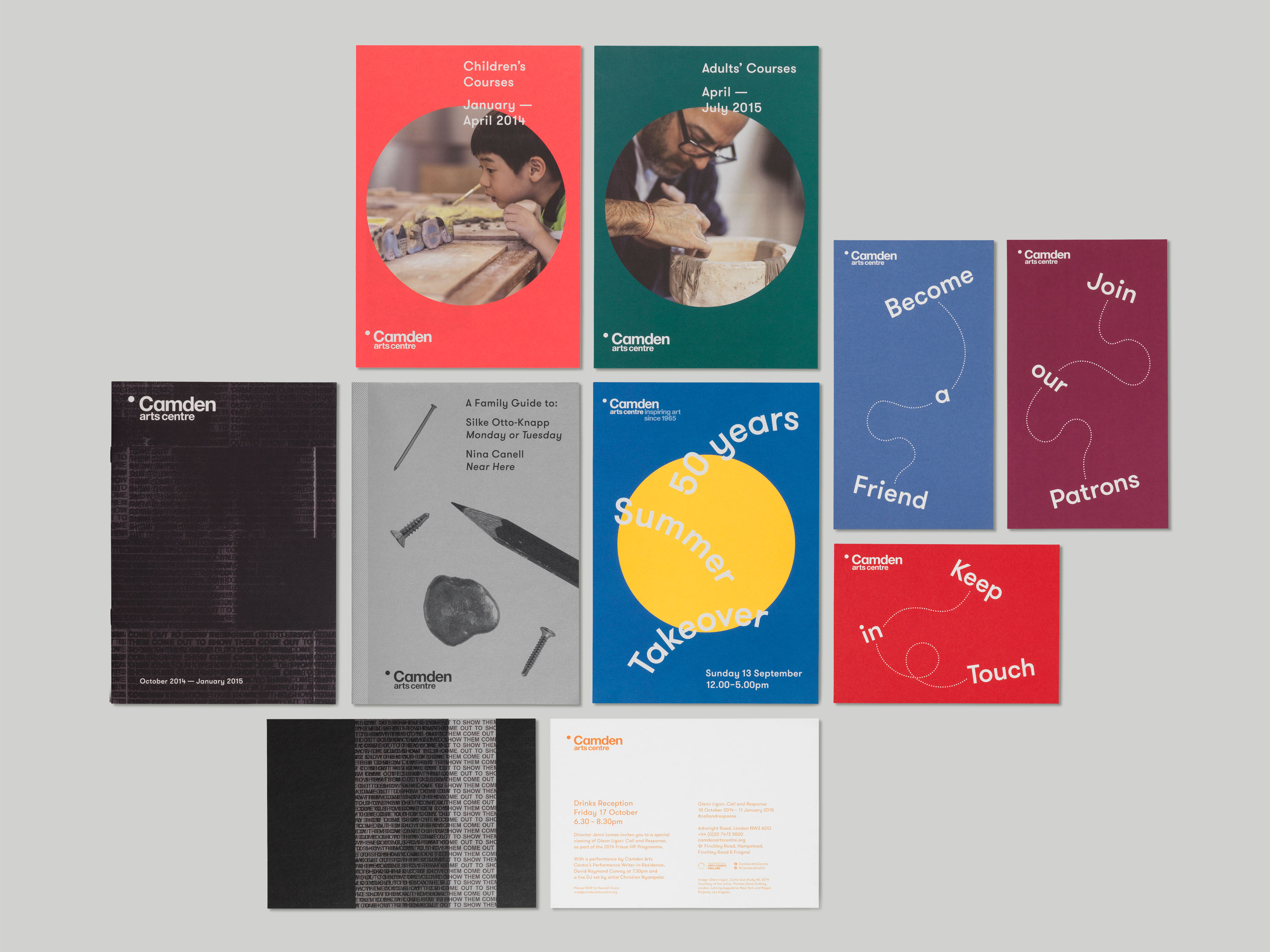

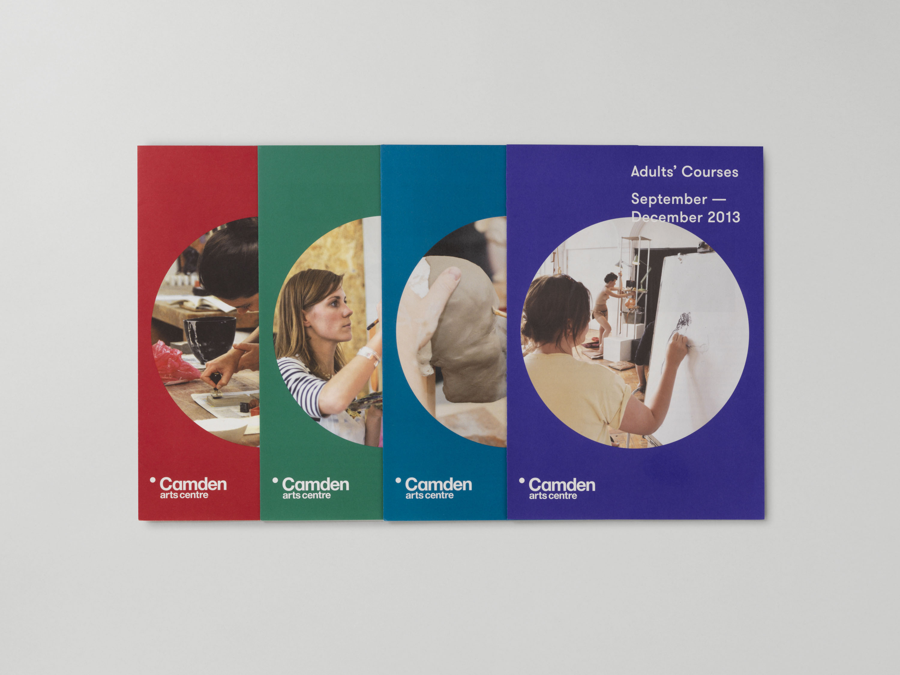
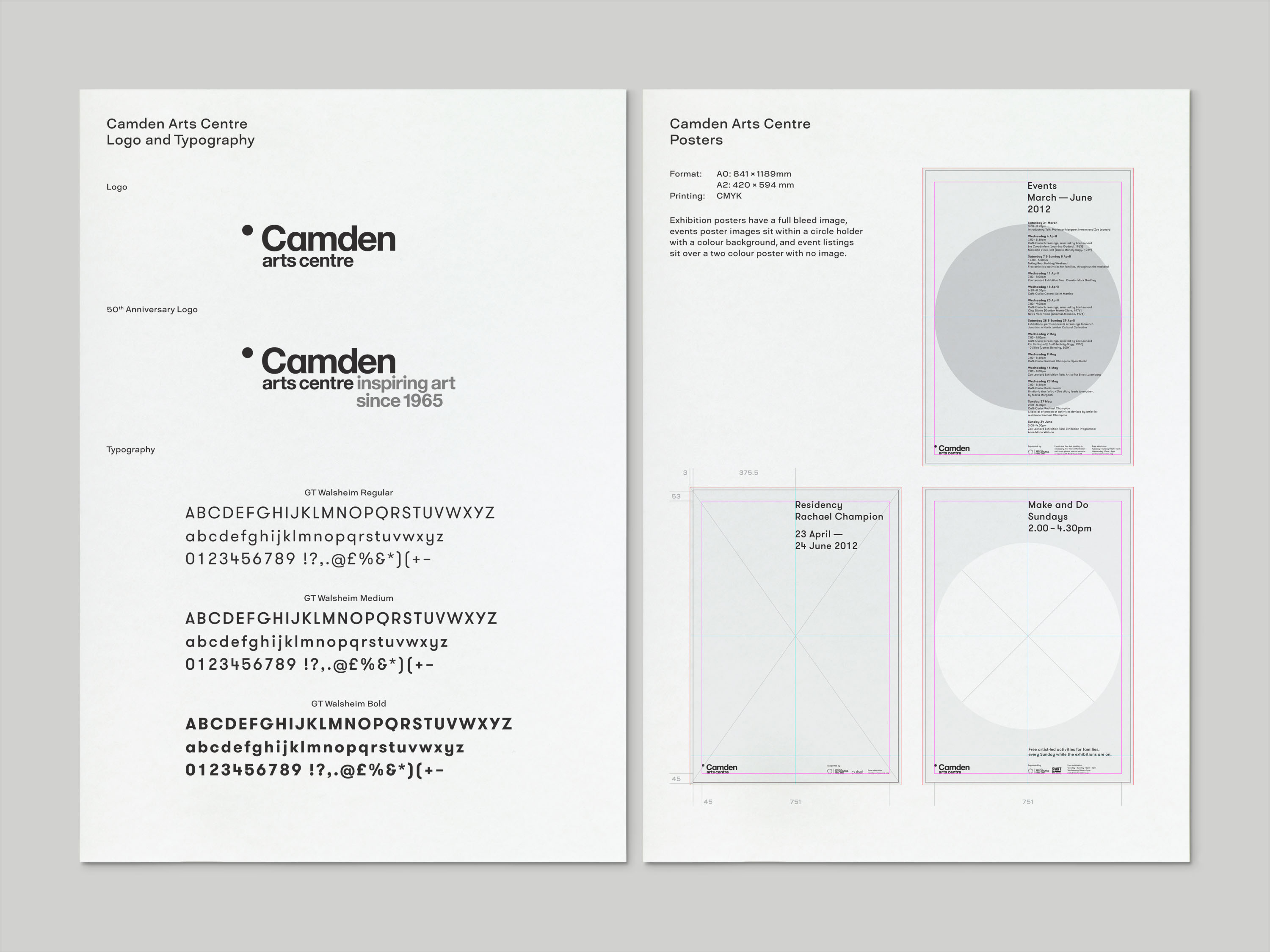
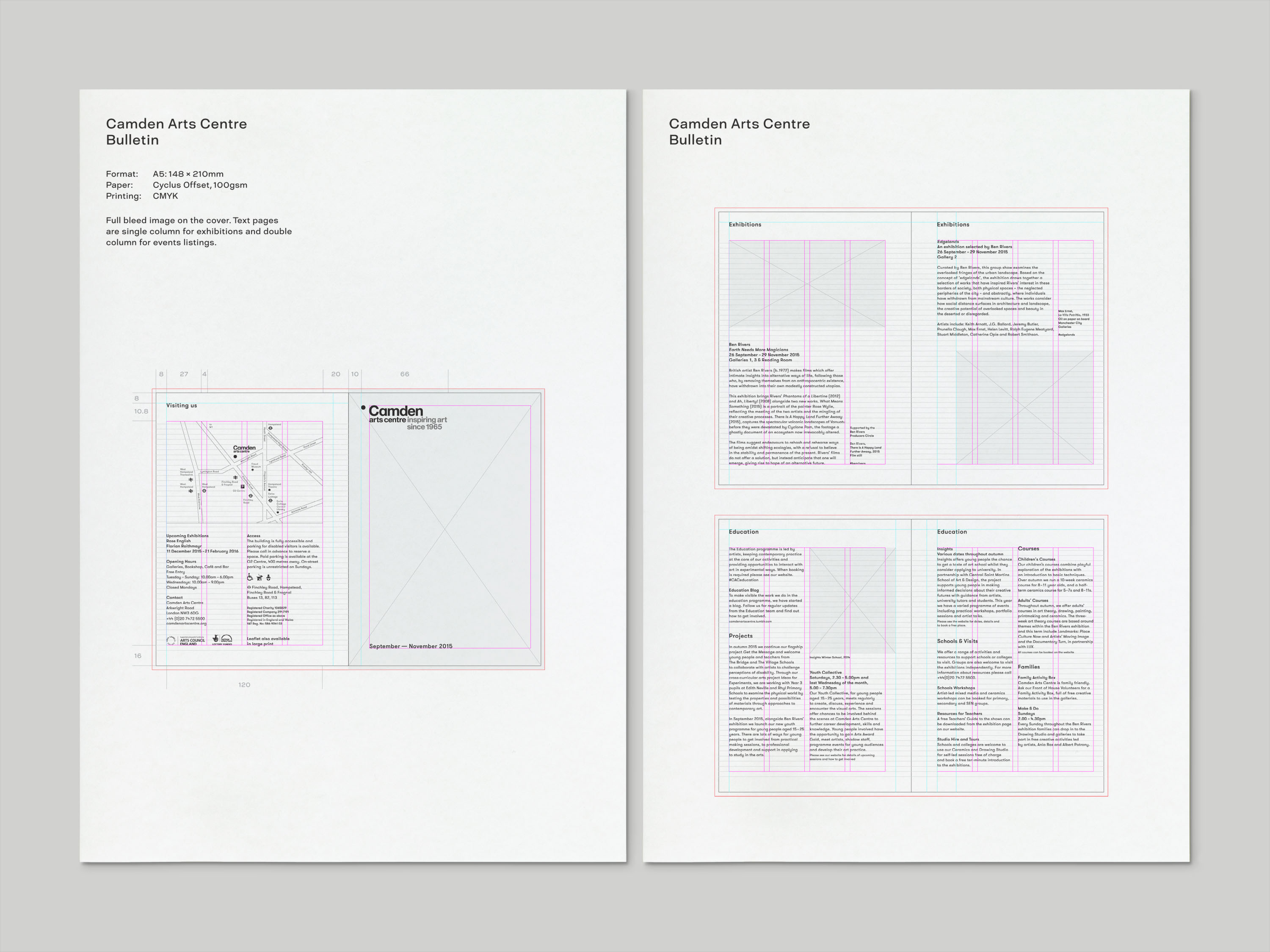

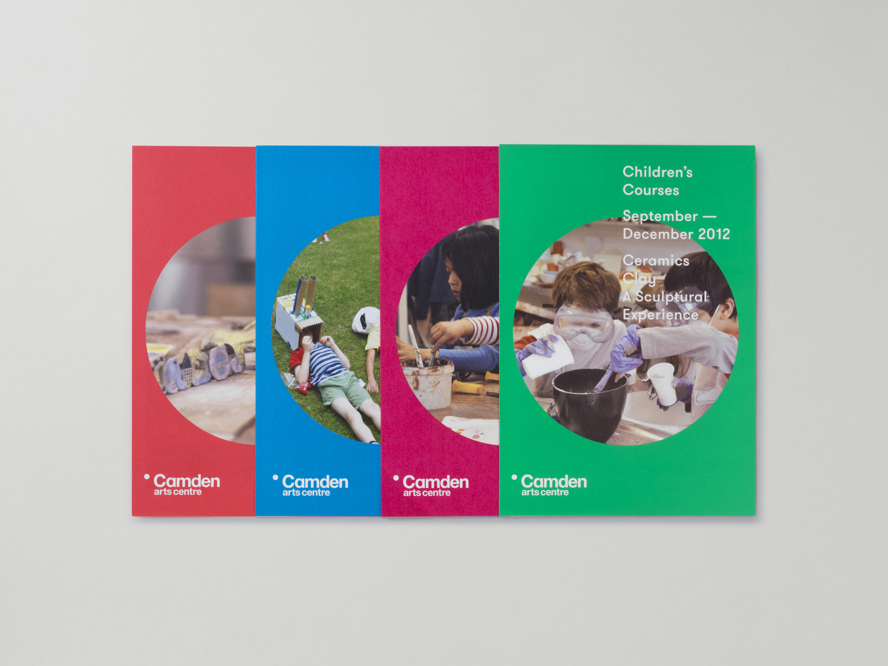

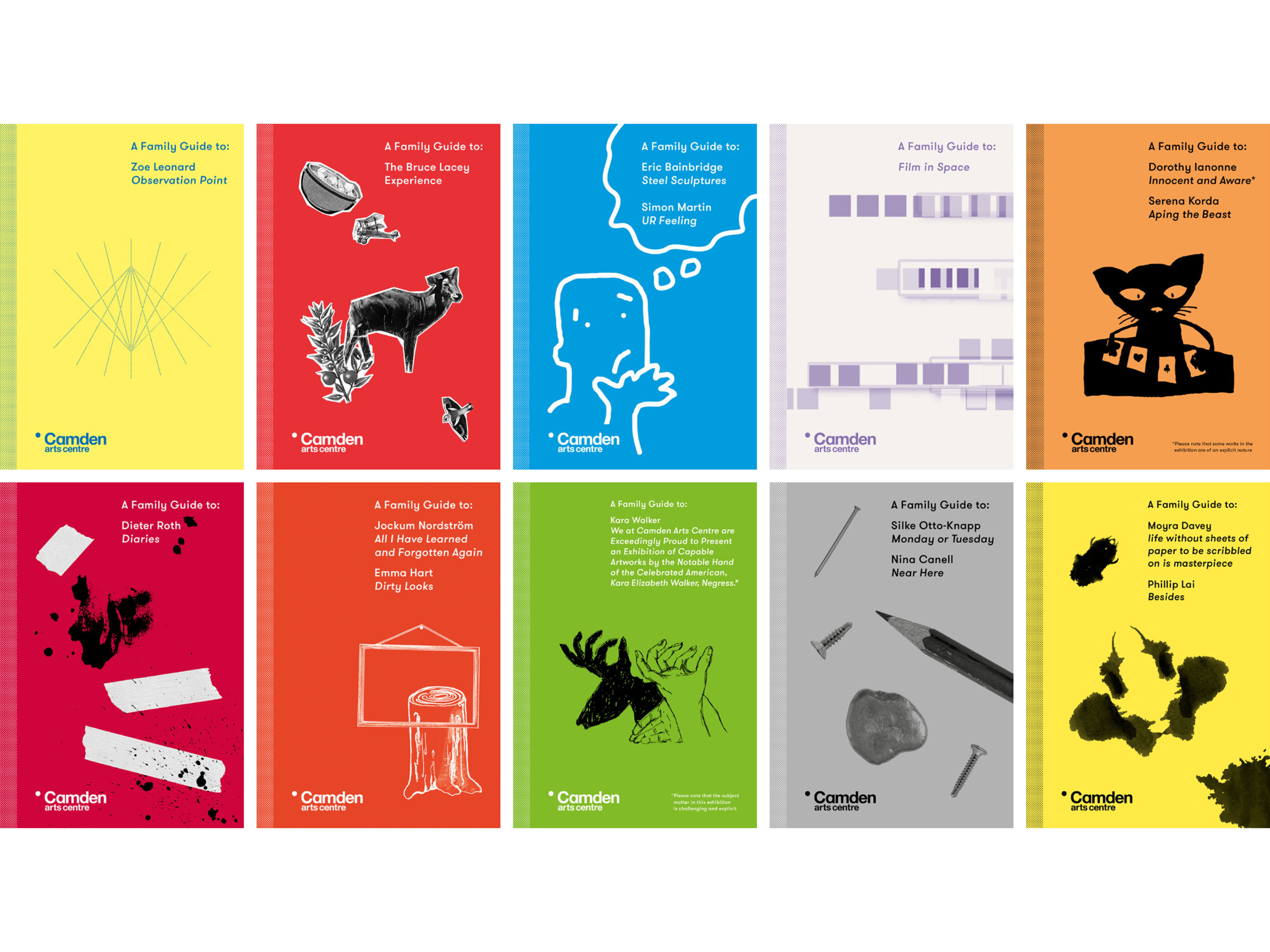
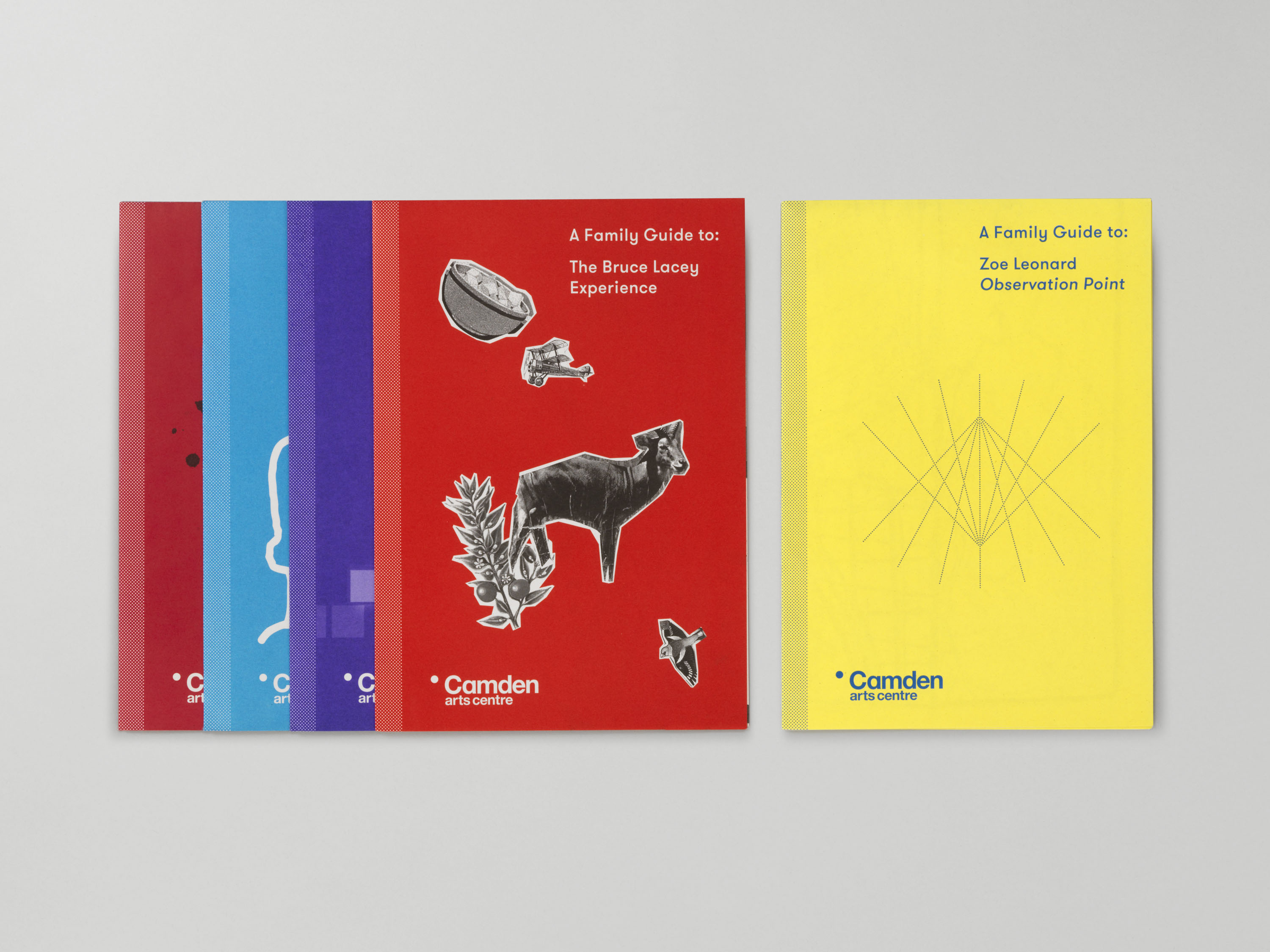
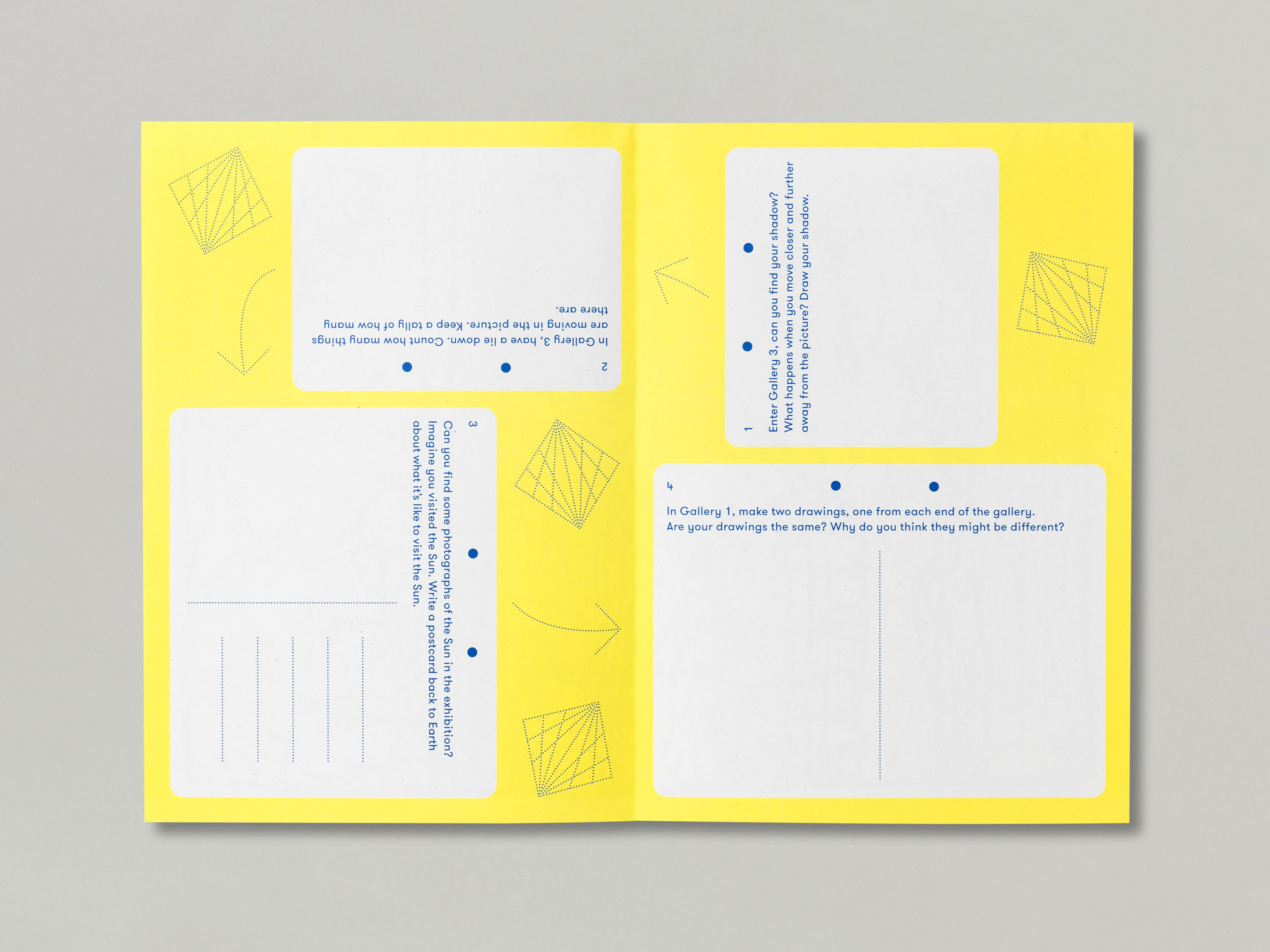
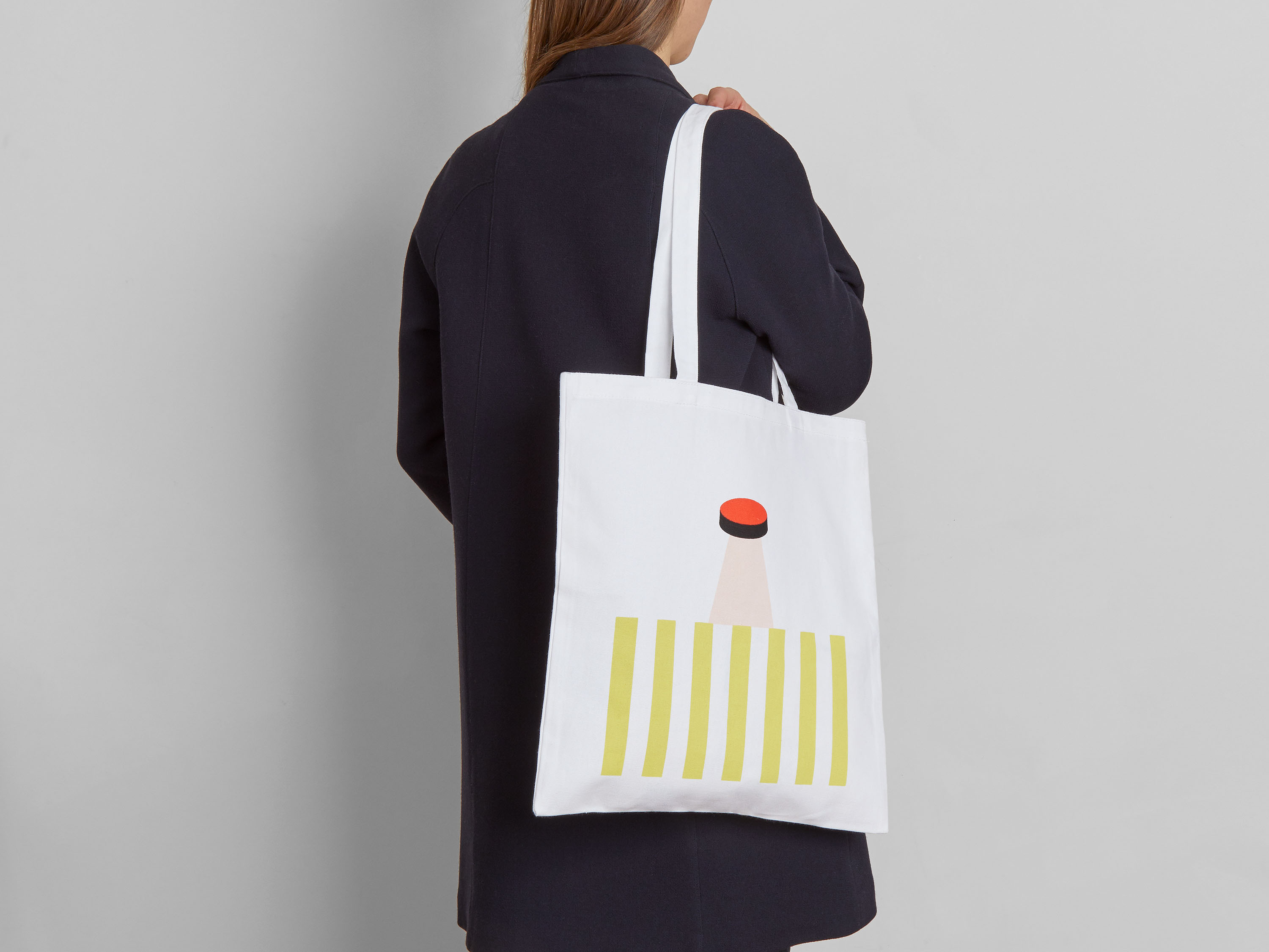
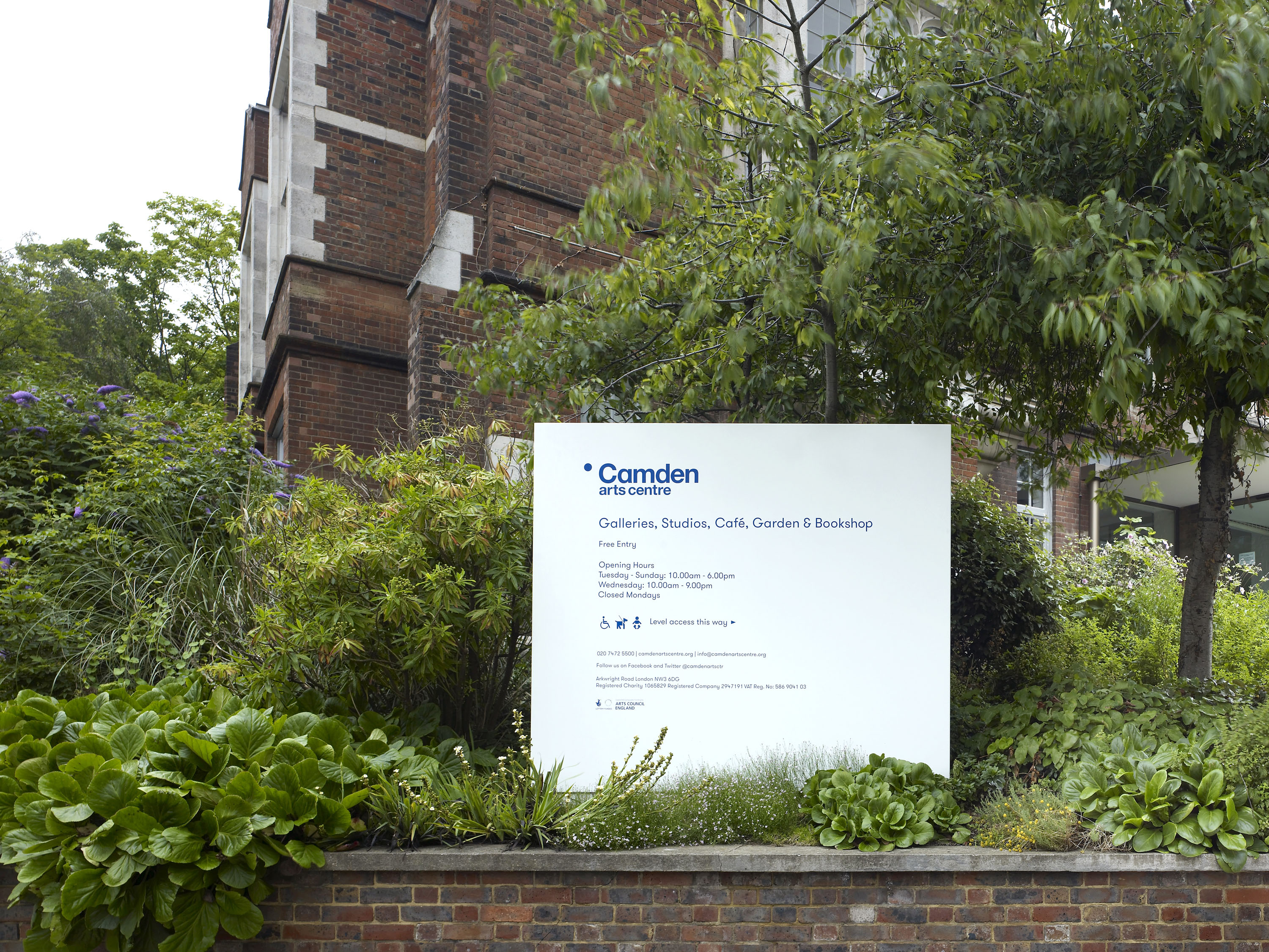
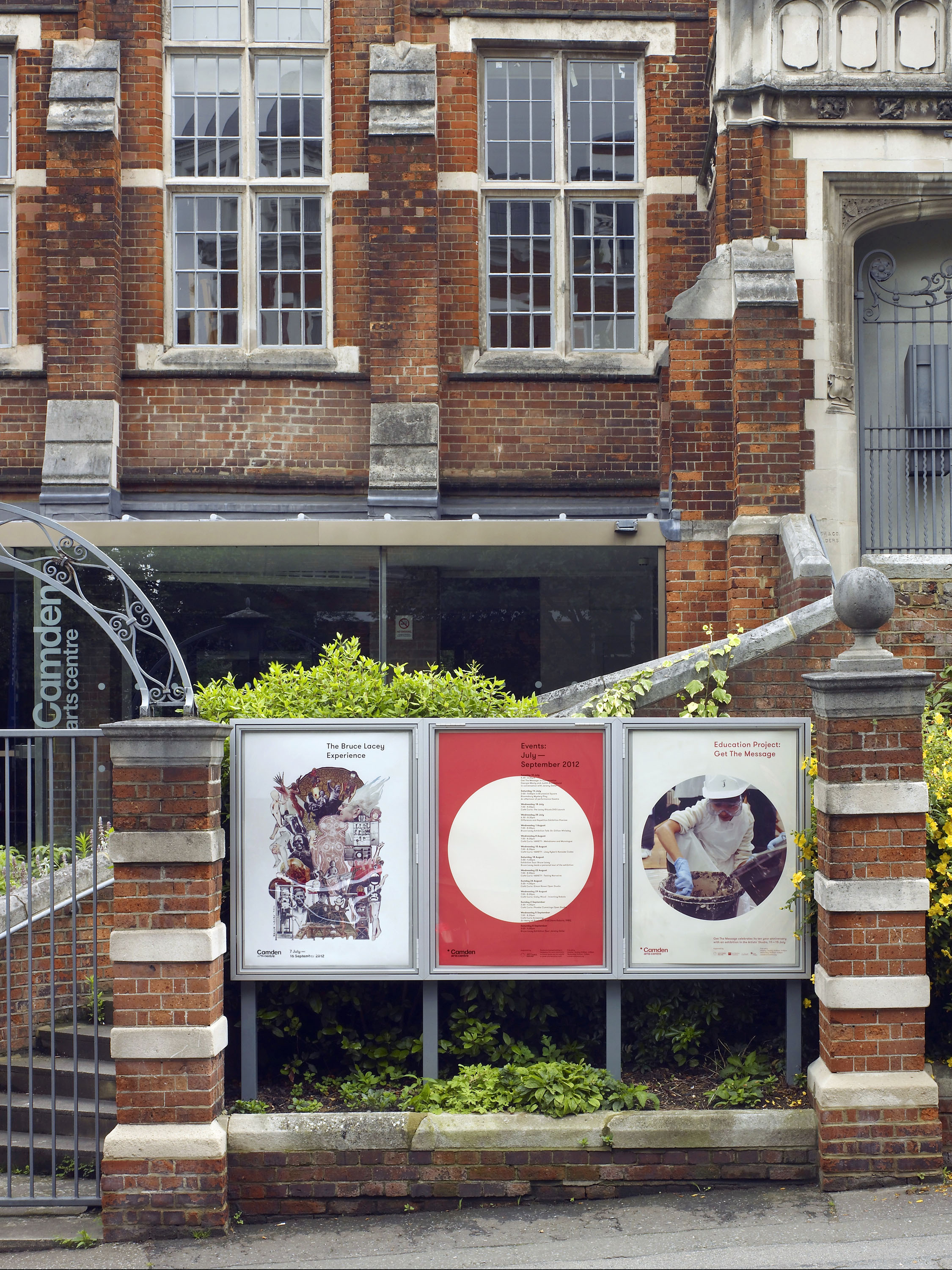
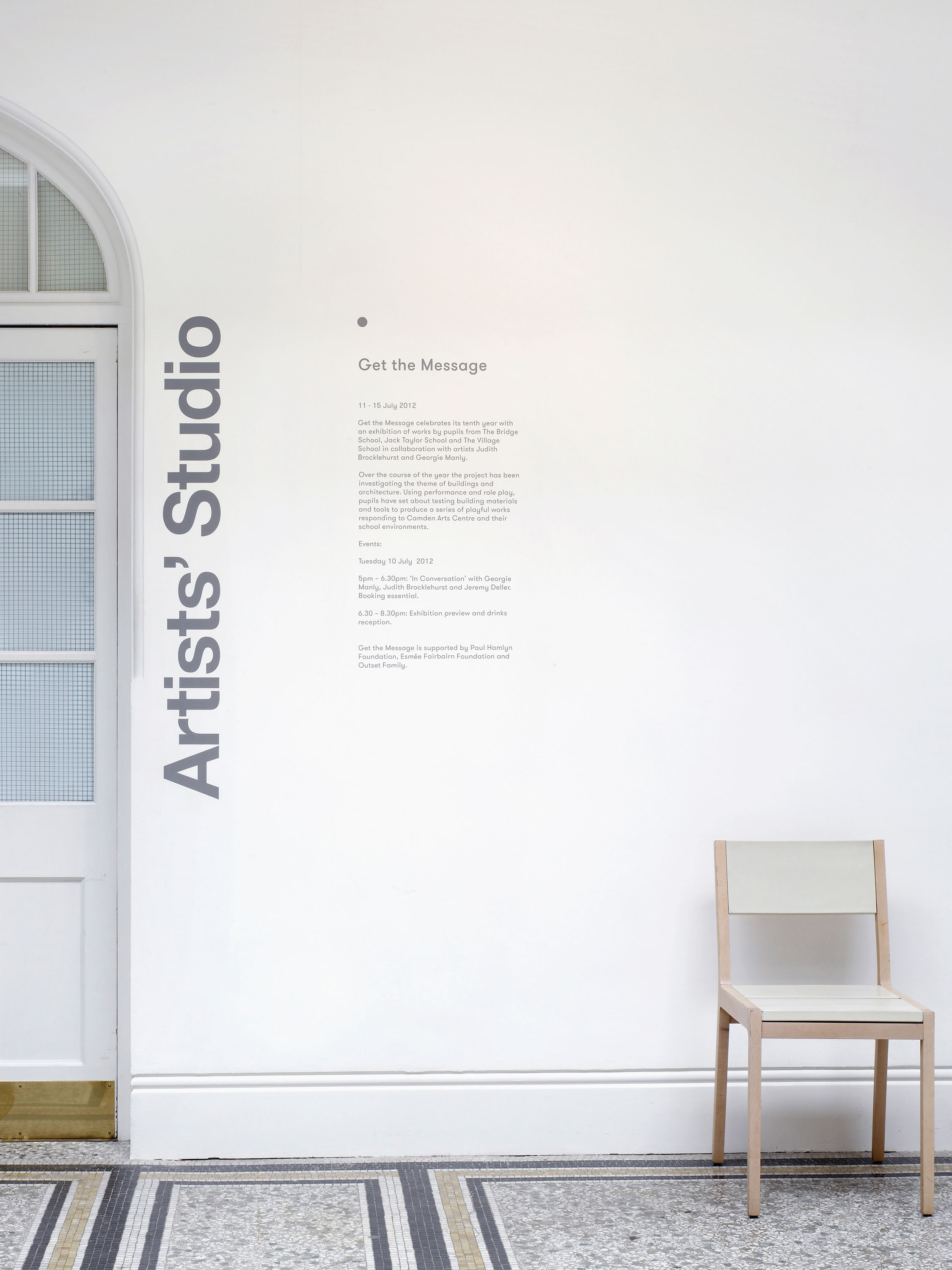
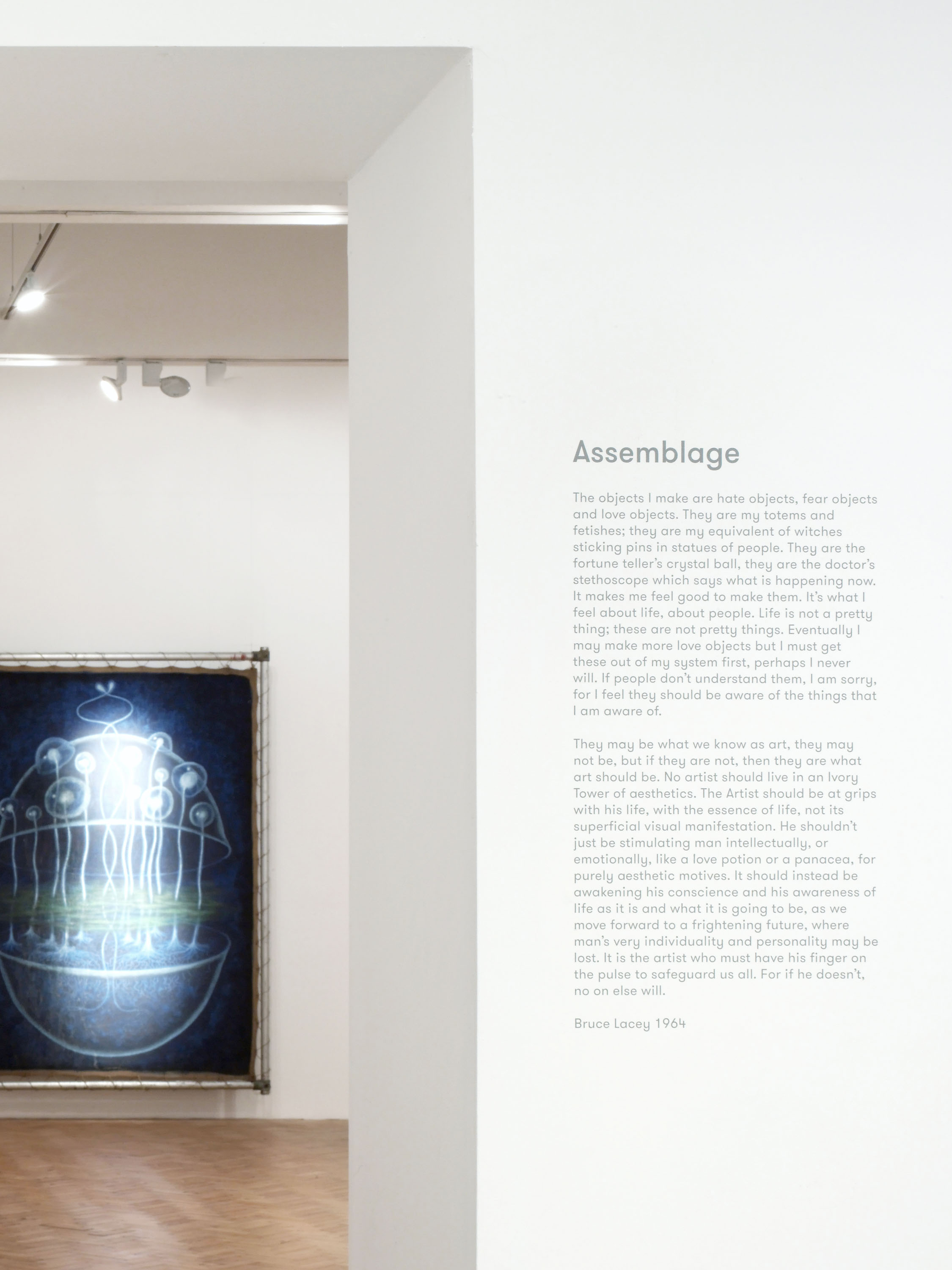
We were commissioned to update the visual identity for Camden Arts Centre, with a focus on printed materials and signage. The client was keen to keep the existing logo and dot emblem in place, but wanted to change the way in which it was used across the range of different printed materials the Centre produced. The new identity is direct, uncluttered and flexible. We advised on the content, structure and format of the various printed communications, creating an adaptable but consistent design system that carries through into the space itself, using Grilli Type’s Walsheim typeface. The new print materials appear friendly but also serious and elegant, and the logotype’s characteristic dot is enlarged and used as an image carrier for the educational and events programmes.
In 2015, Camden Arts Centre approached us to create an updated logotype celebrating the Centre’s fifty-year anniversary. This new logo is respectful of the original, whilst helping counterbalance the emphasis on Camden in the original wordmark.