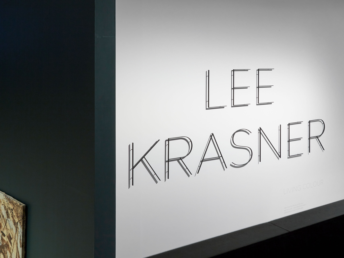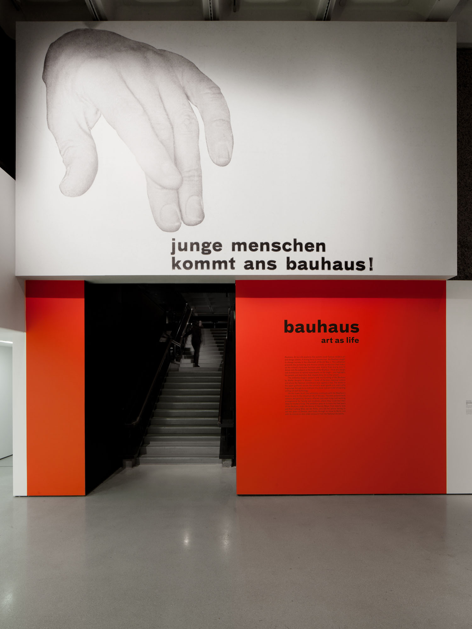
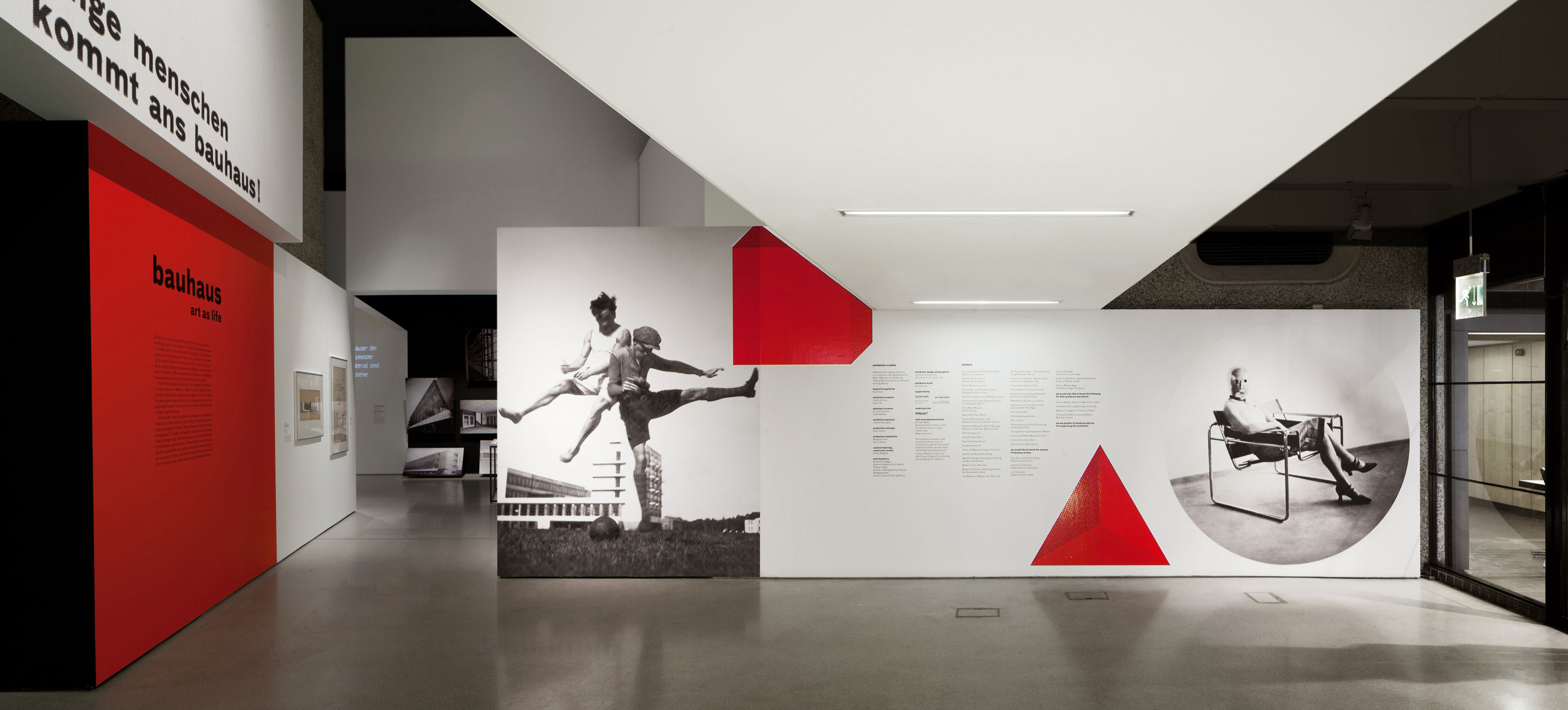
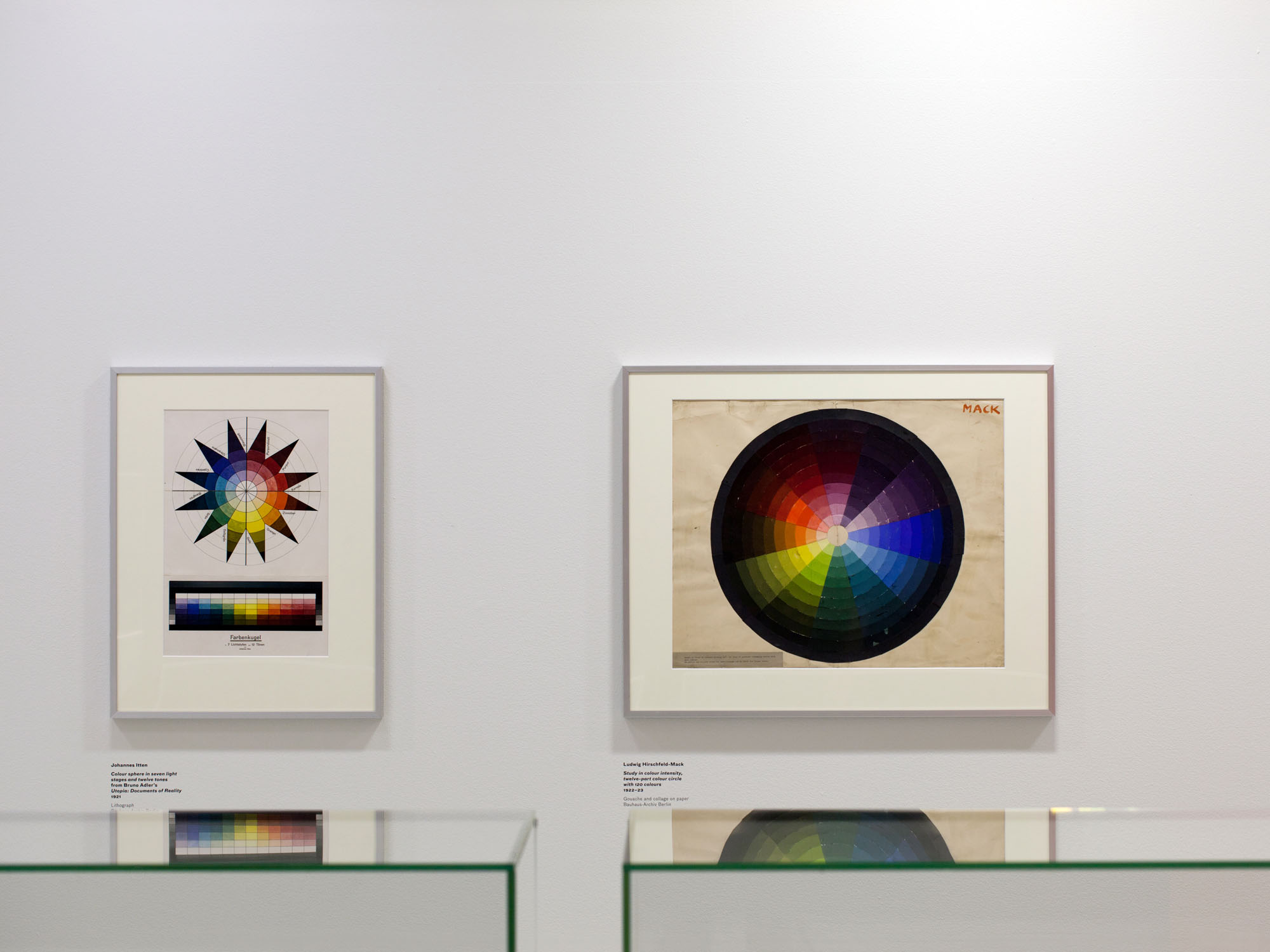
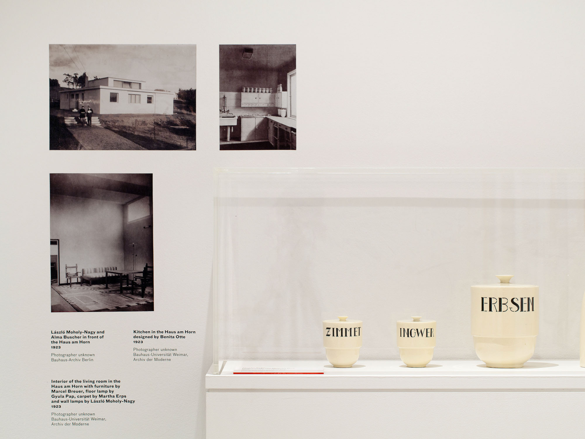
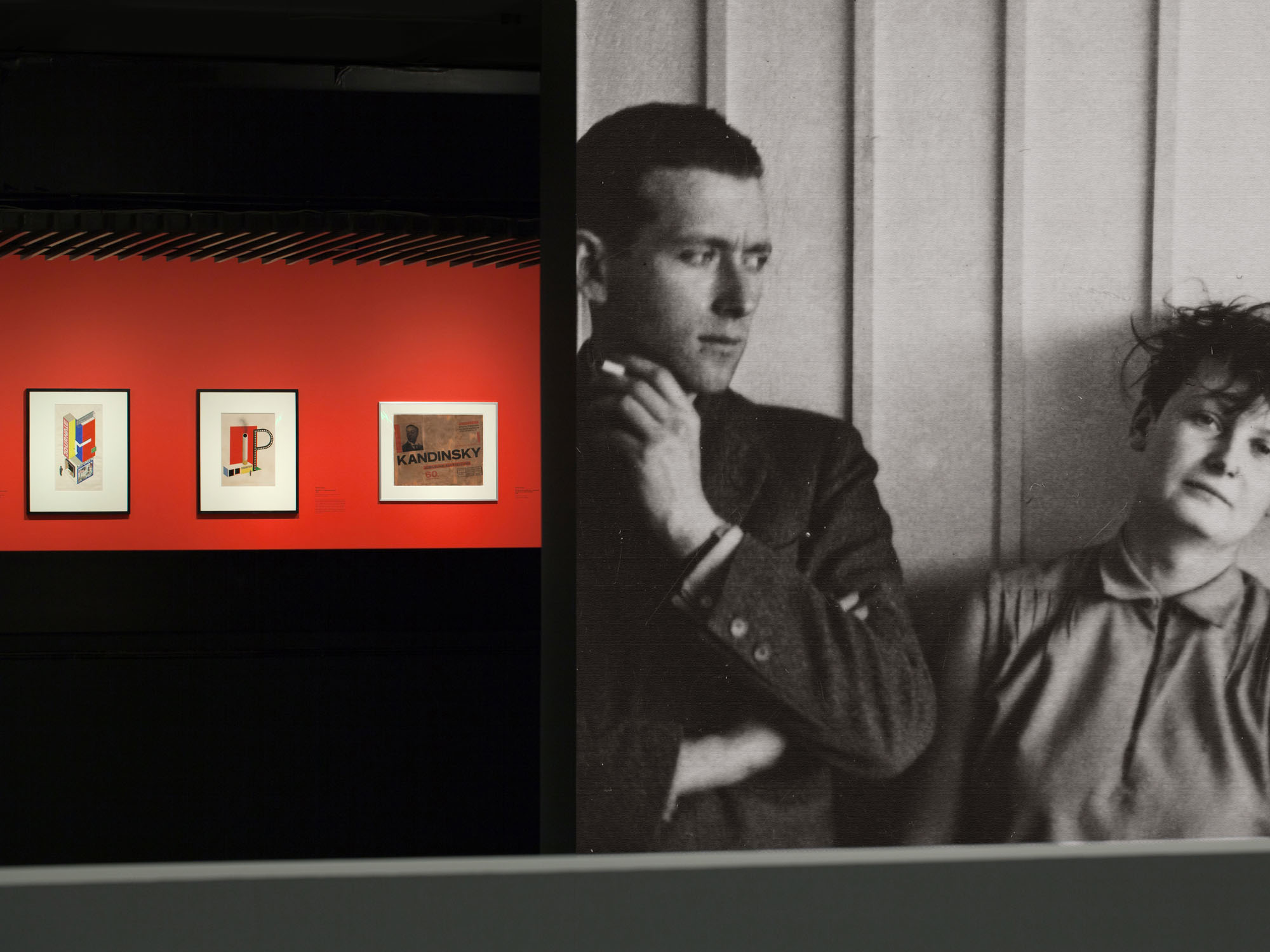
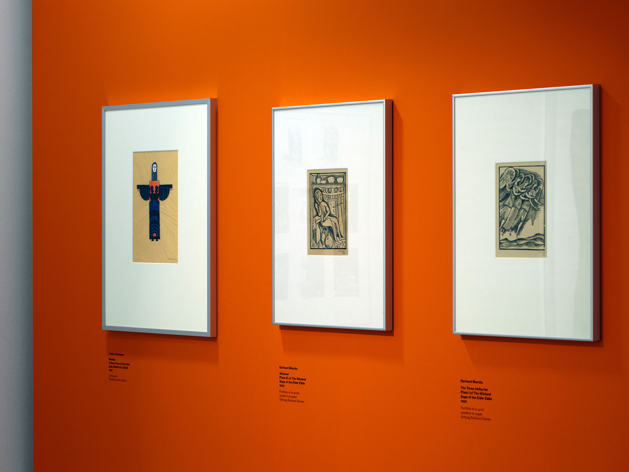
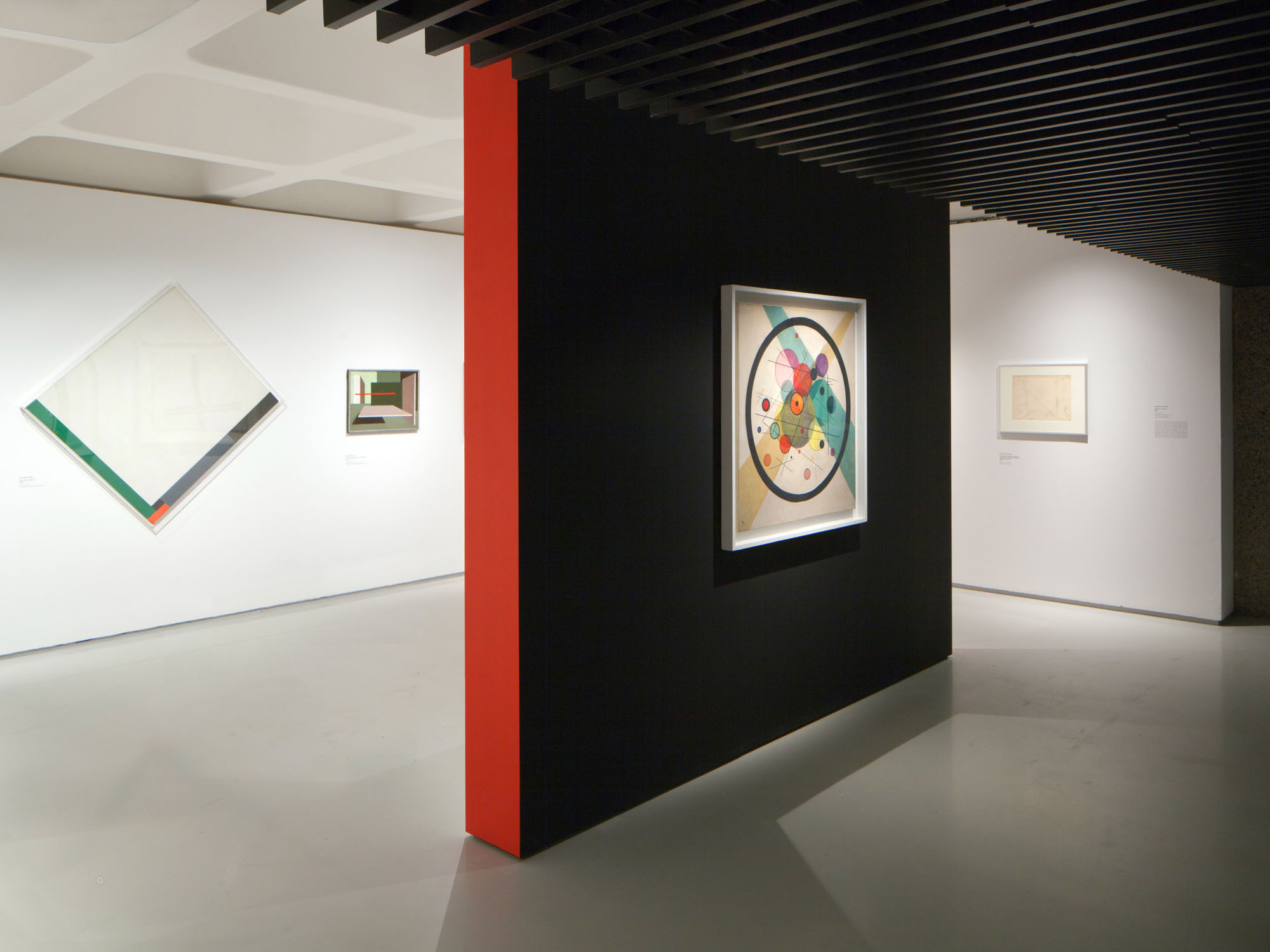
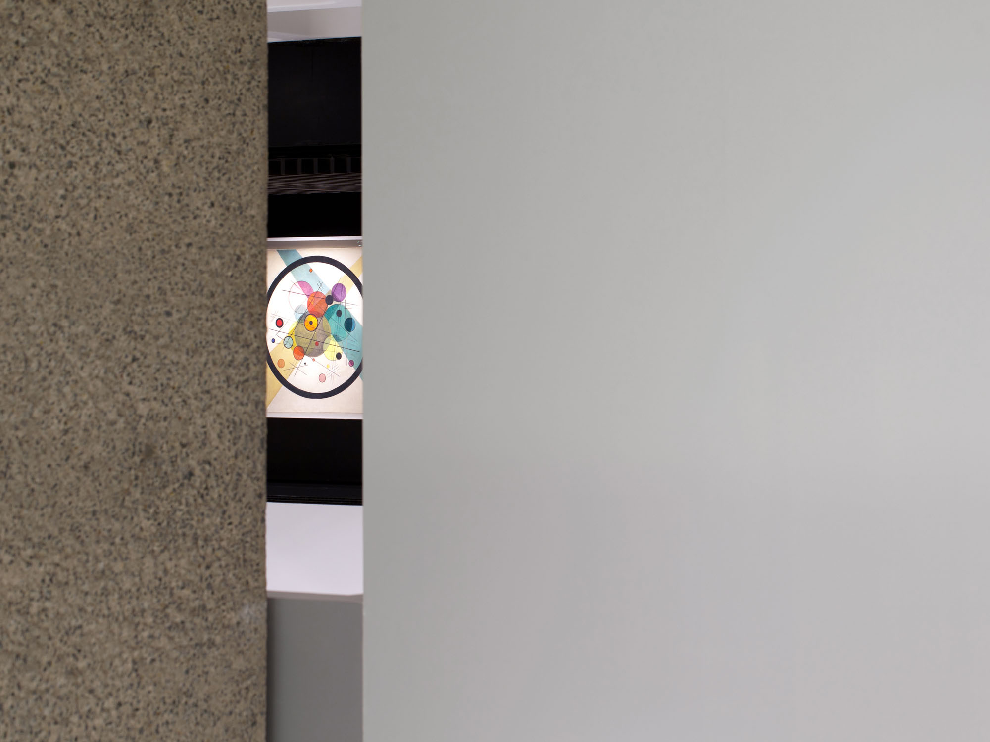
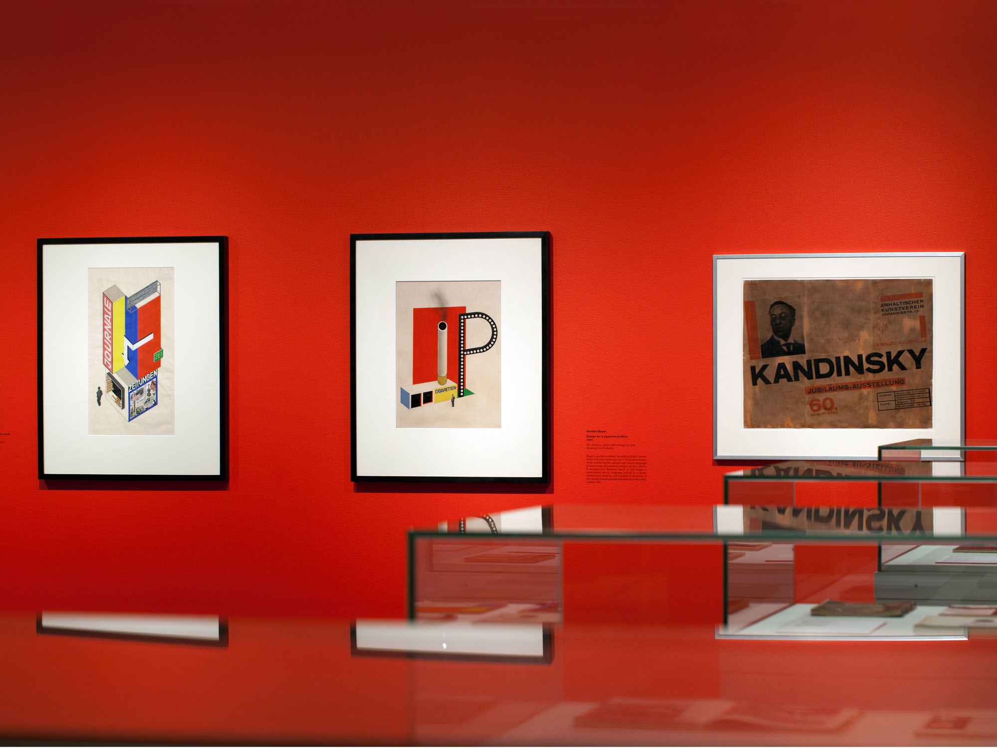
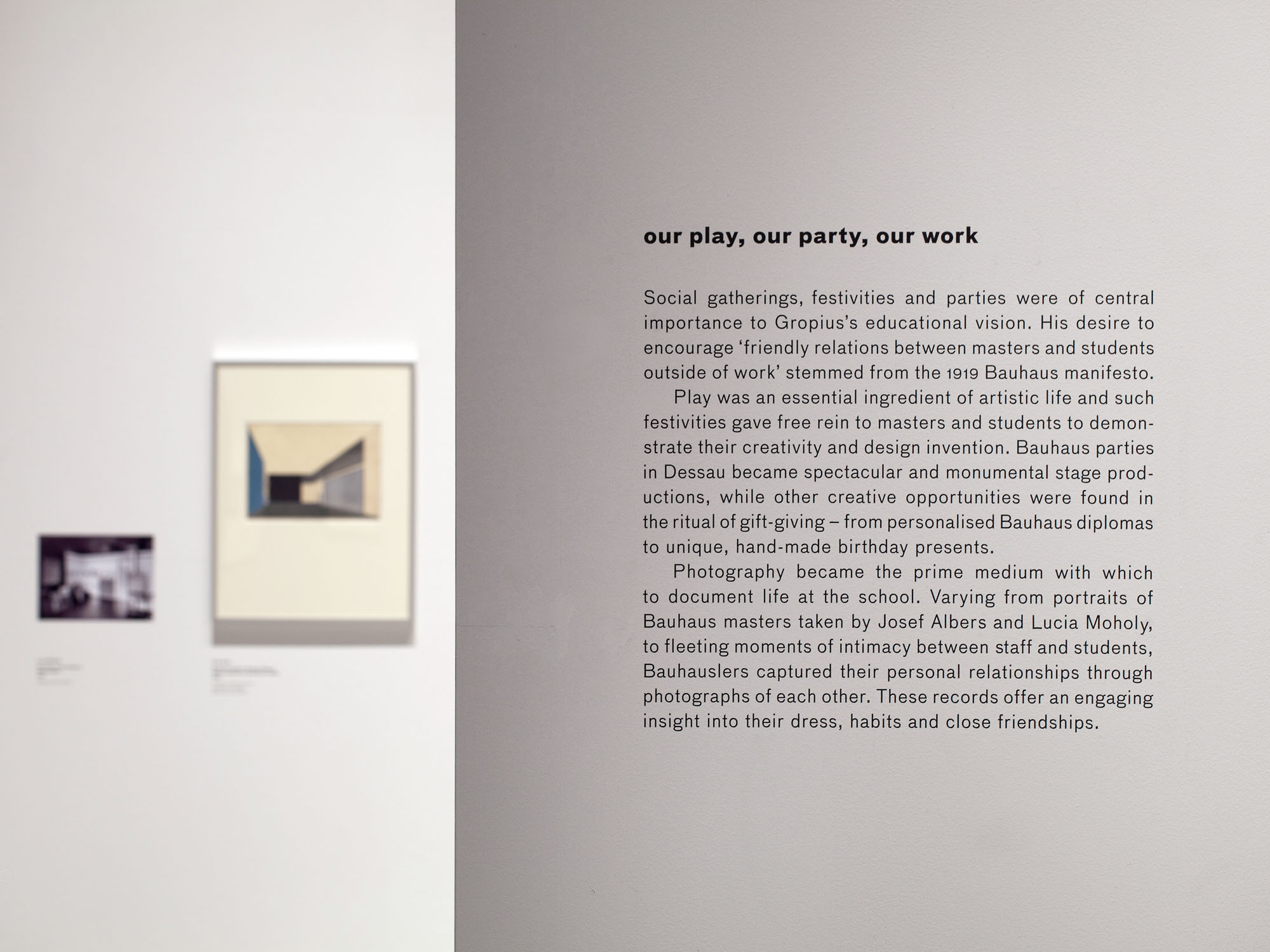
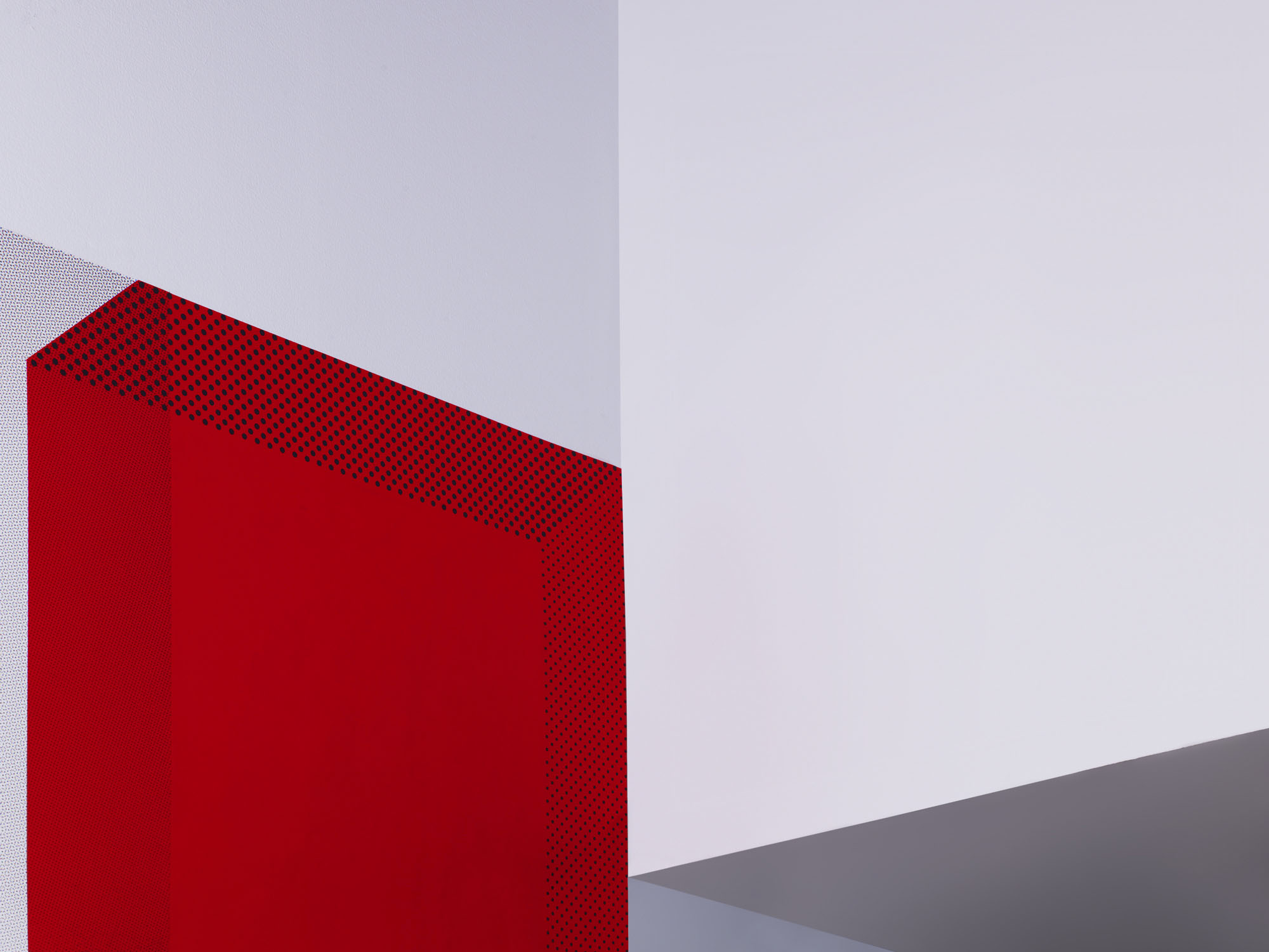
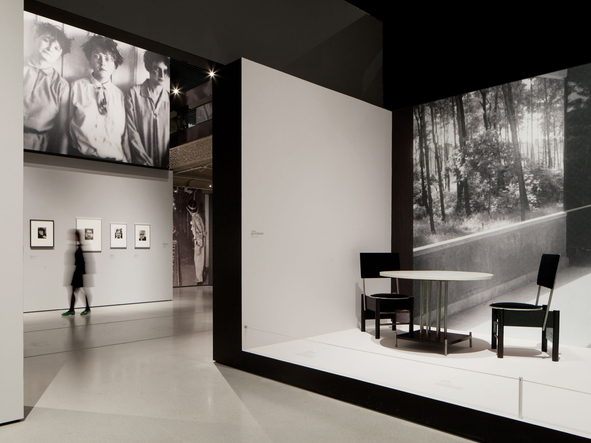
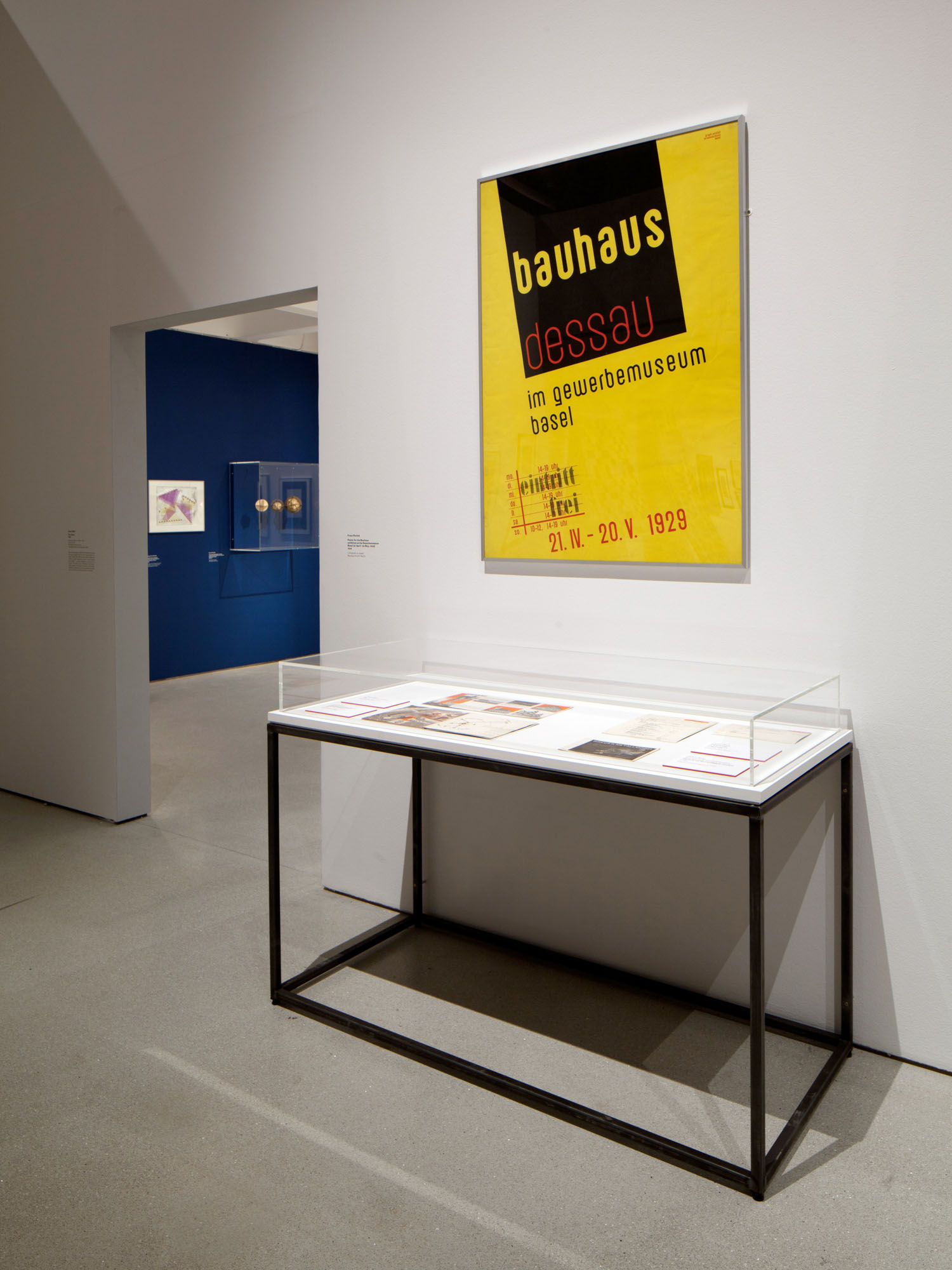
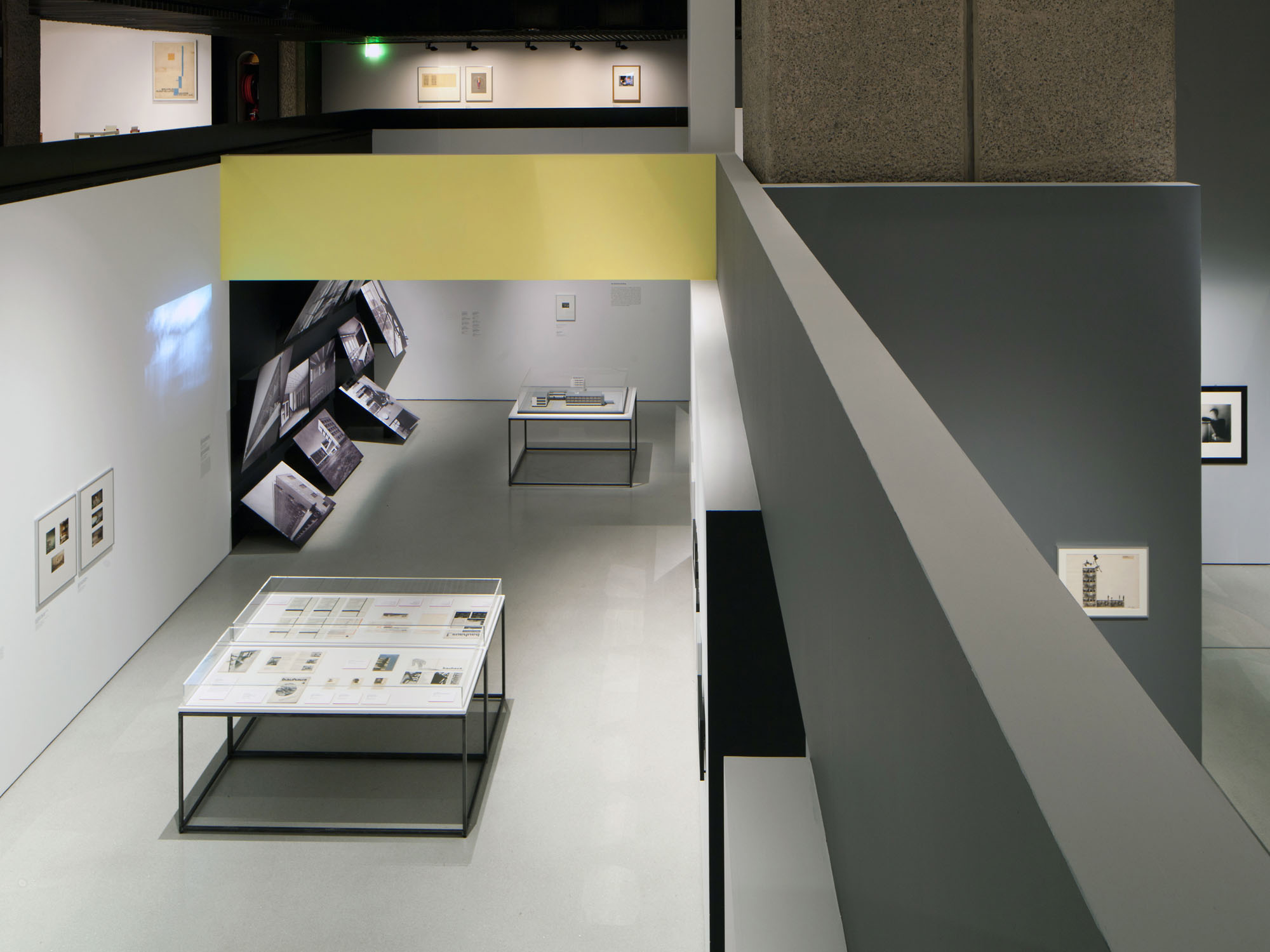
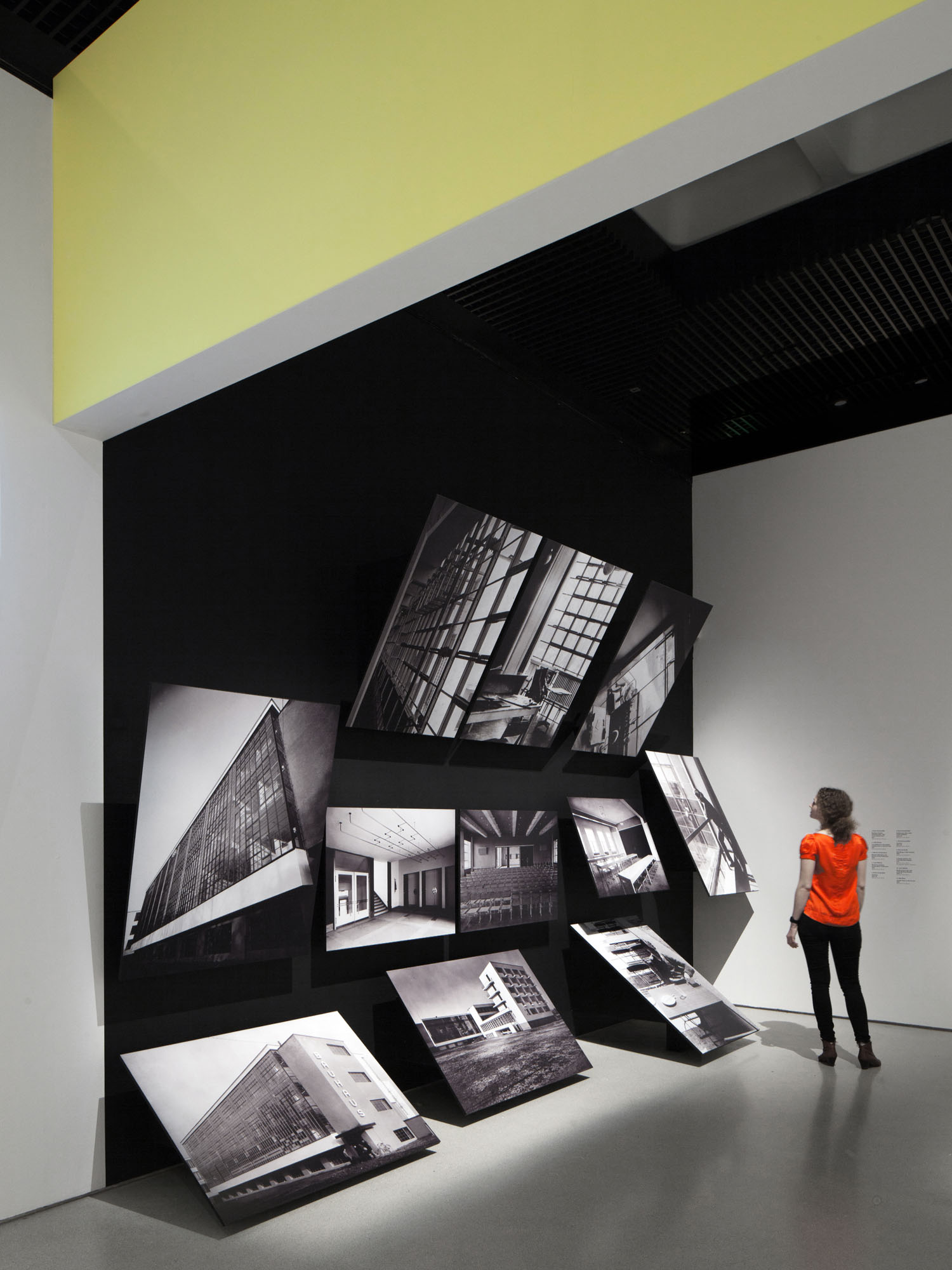
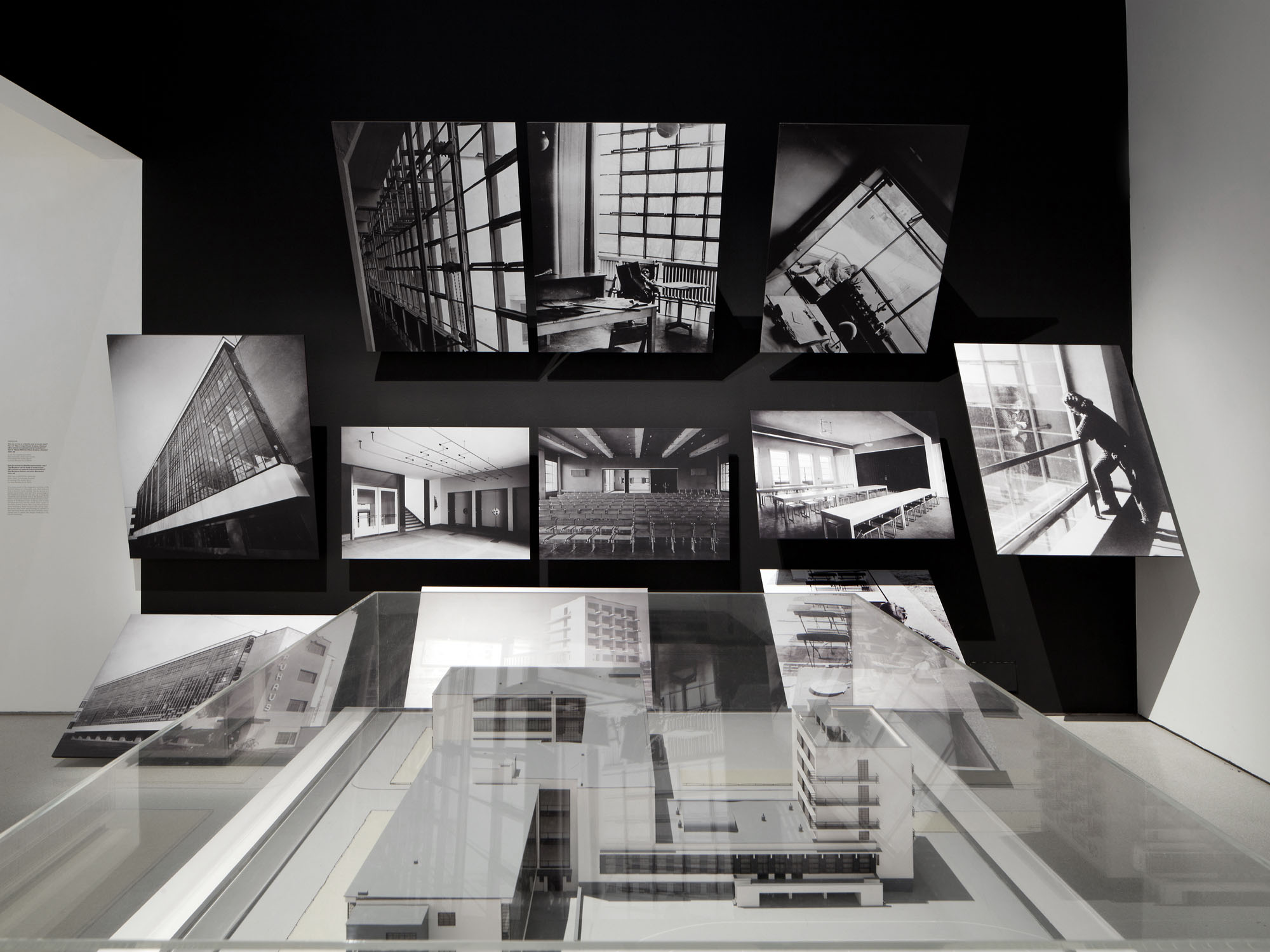
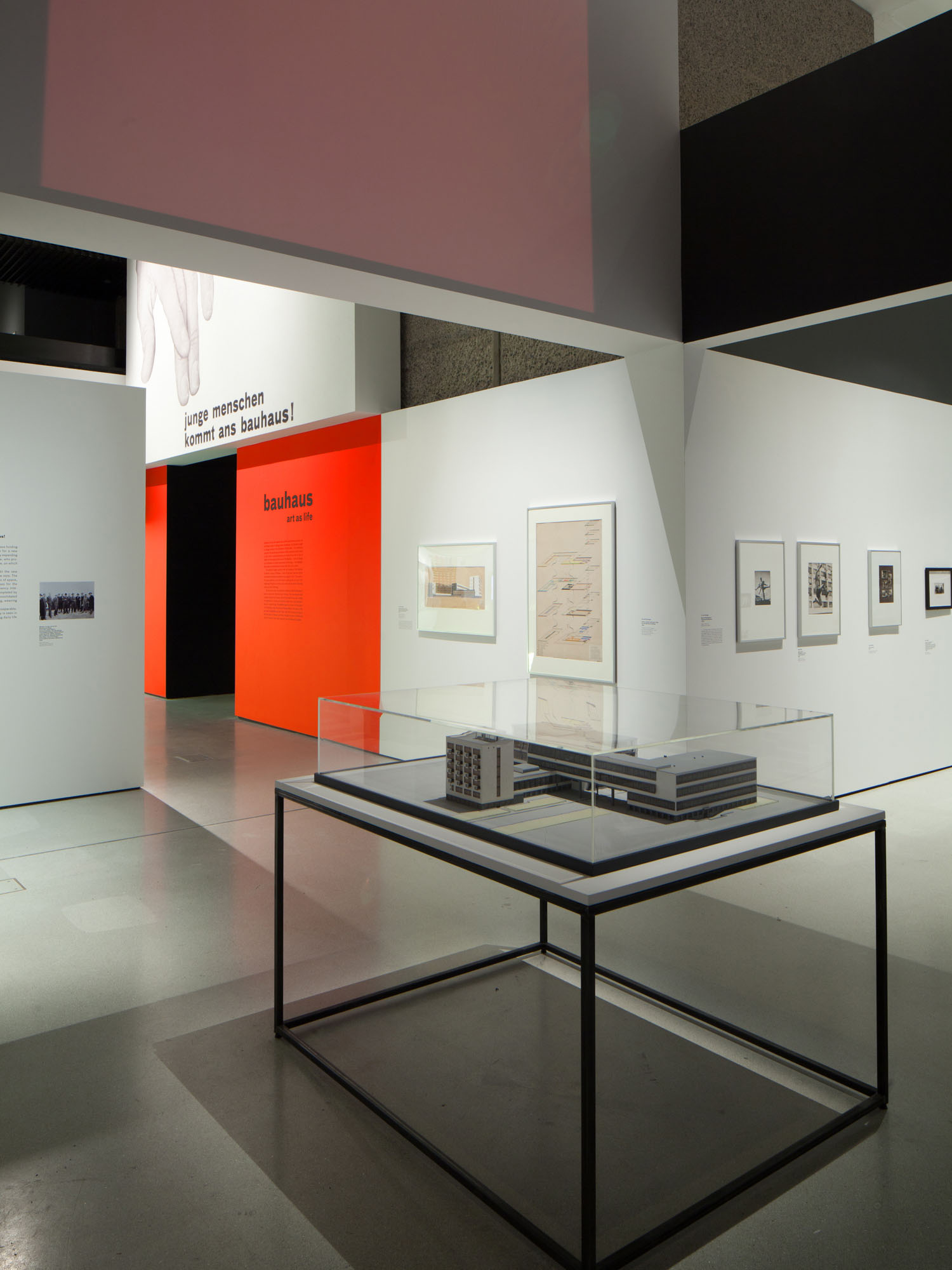
Held at the Barbican Art Gallery in May 2012, Bauhaus: Art as Life was the largest UK-based exhibition of works from the iconic art school to be held in almost 40 years. We collaborated with architects Carmody Groarke to design an installation of elemental forms, reinterpreting the spatial structure of the gallery to create a bespoke viewing experience for exhibition visitors. Graphically, the design was informed by an awareness of the Bauhaus’ own principles of colour, structure and typography – painted walls, bold panels and supergraphics drew together objects, themes and ideas. The images that were reproduced at a large scale on the walls of the gallery were carefully chosen to depict Bauhaus students and masters at work and at play, emphasising the exhibition’s focus on life at the school, rather than just its output.
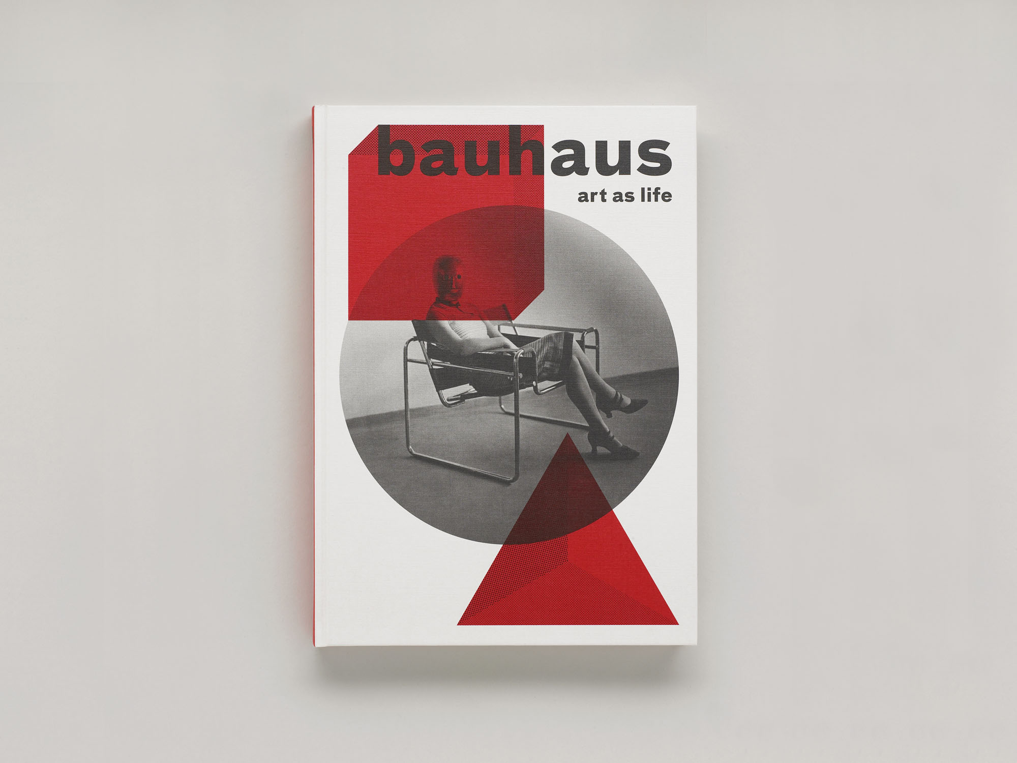
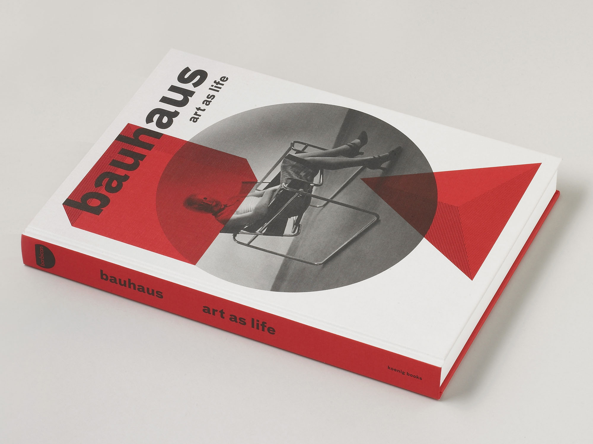
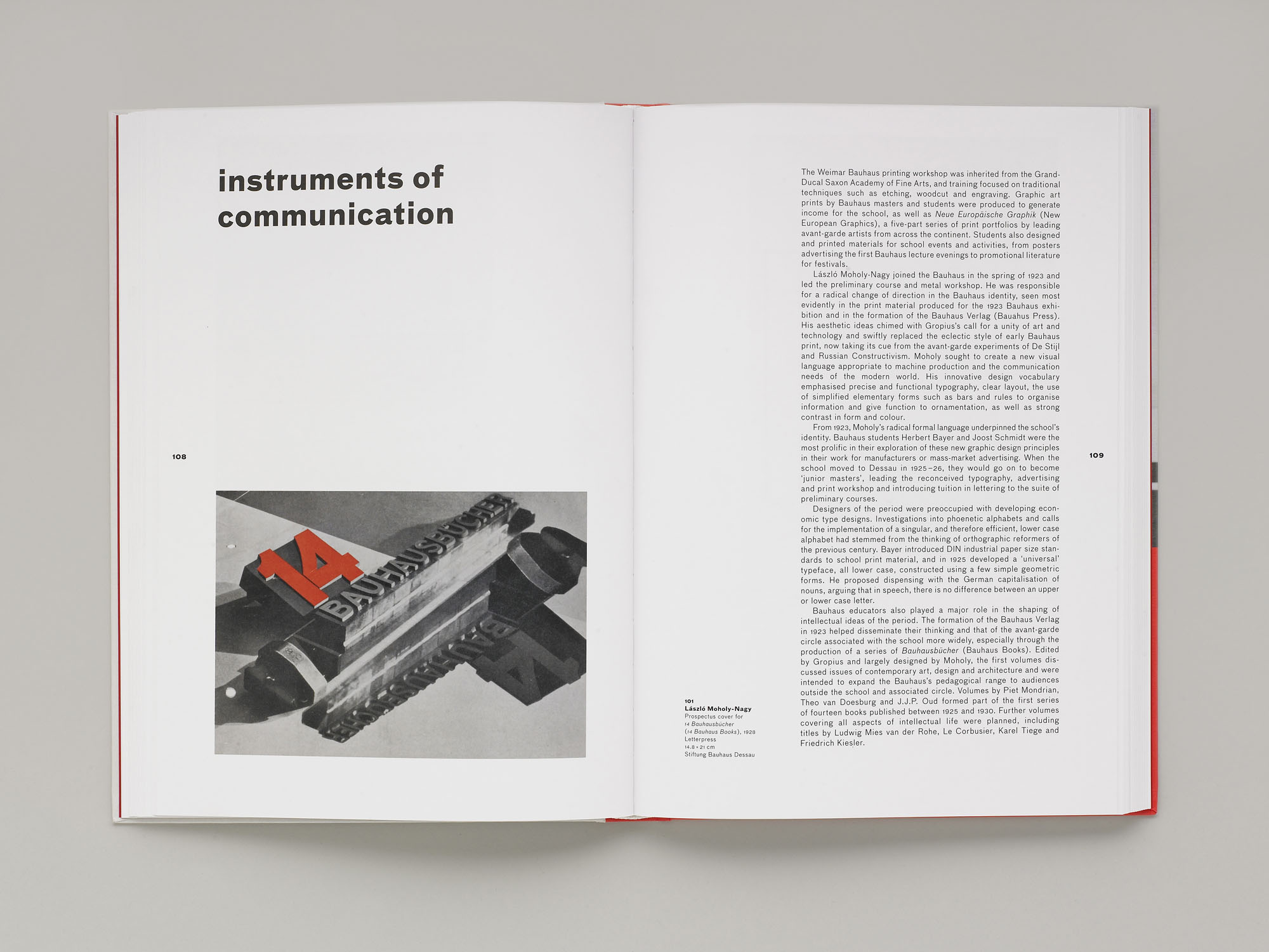
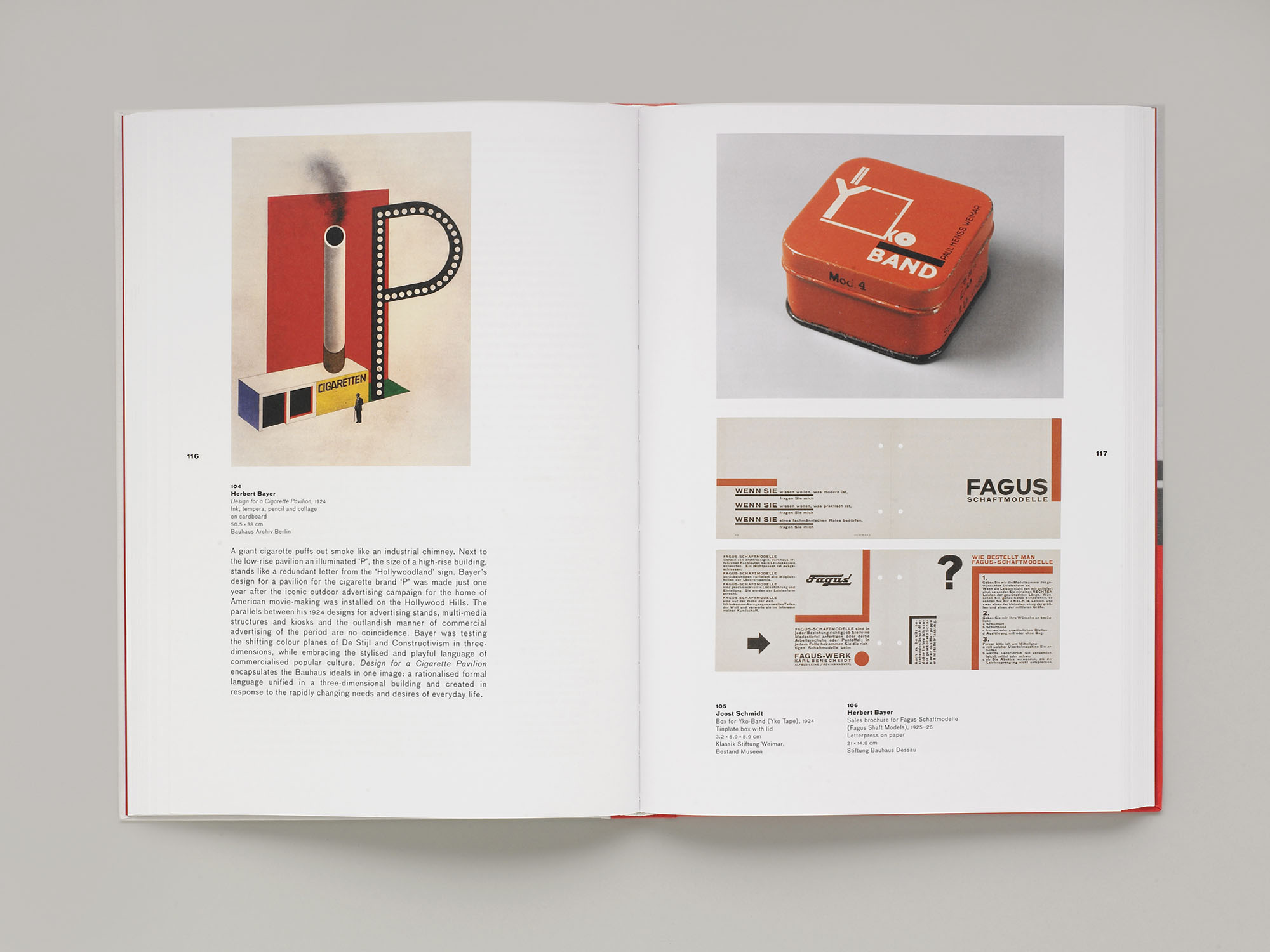
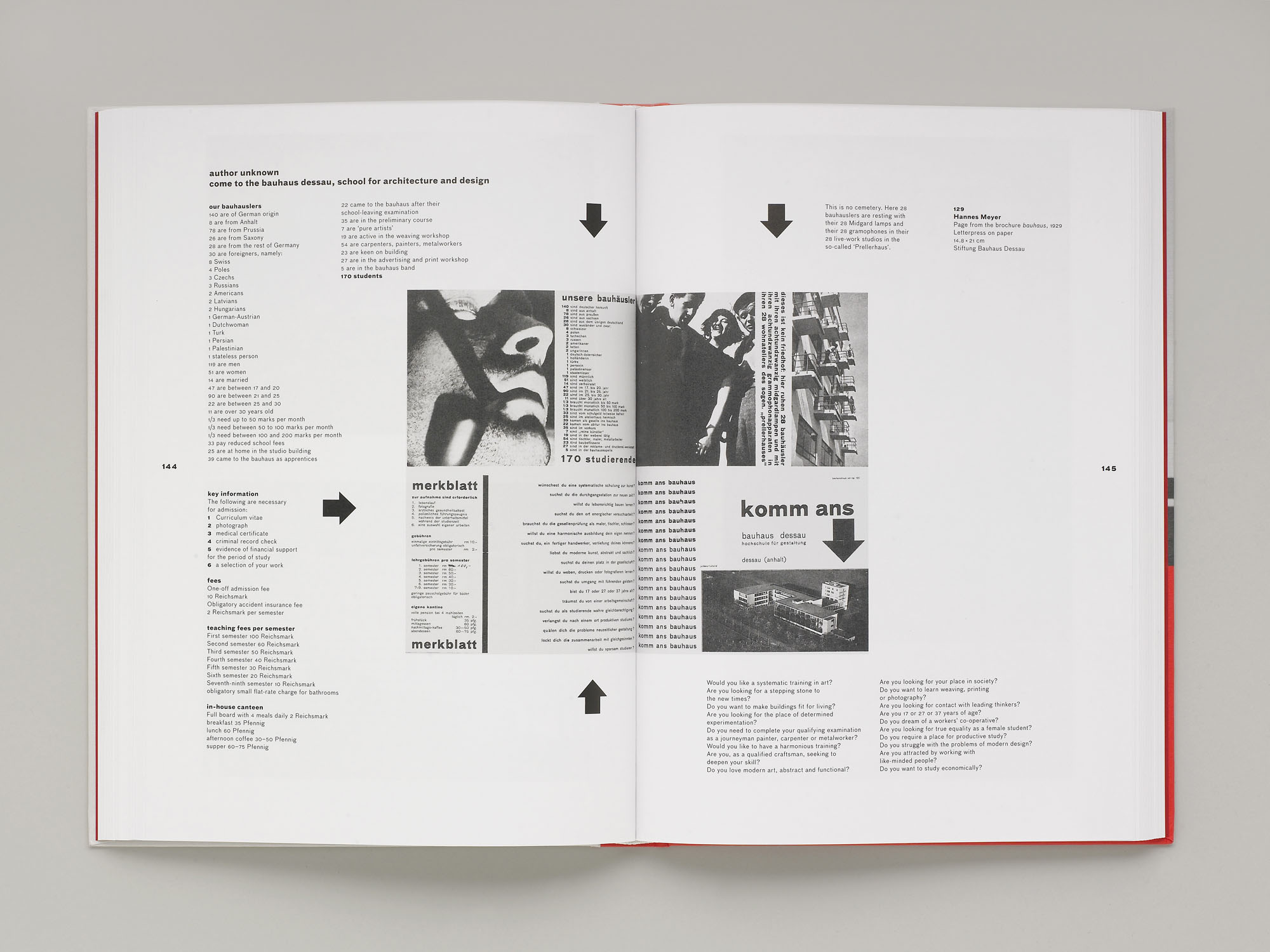
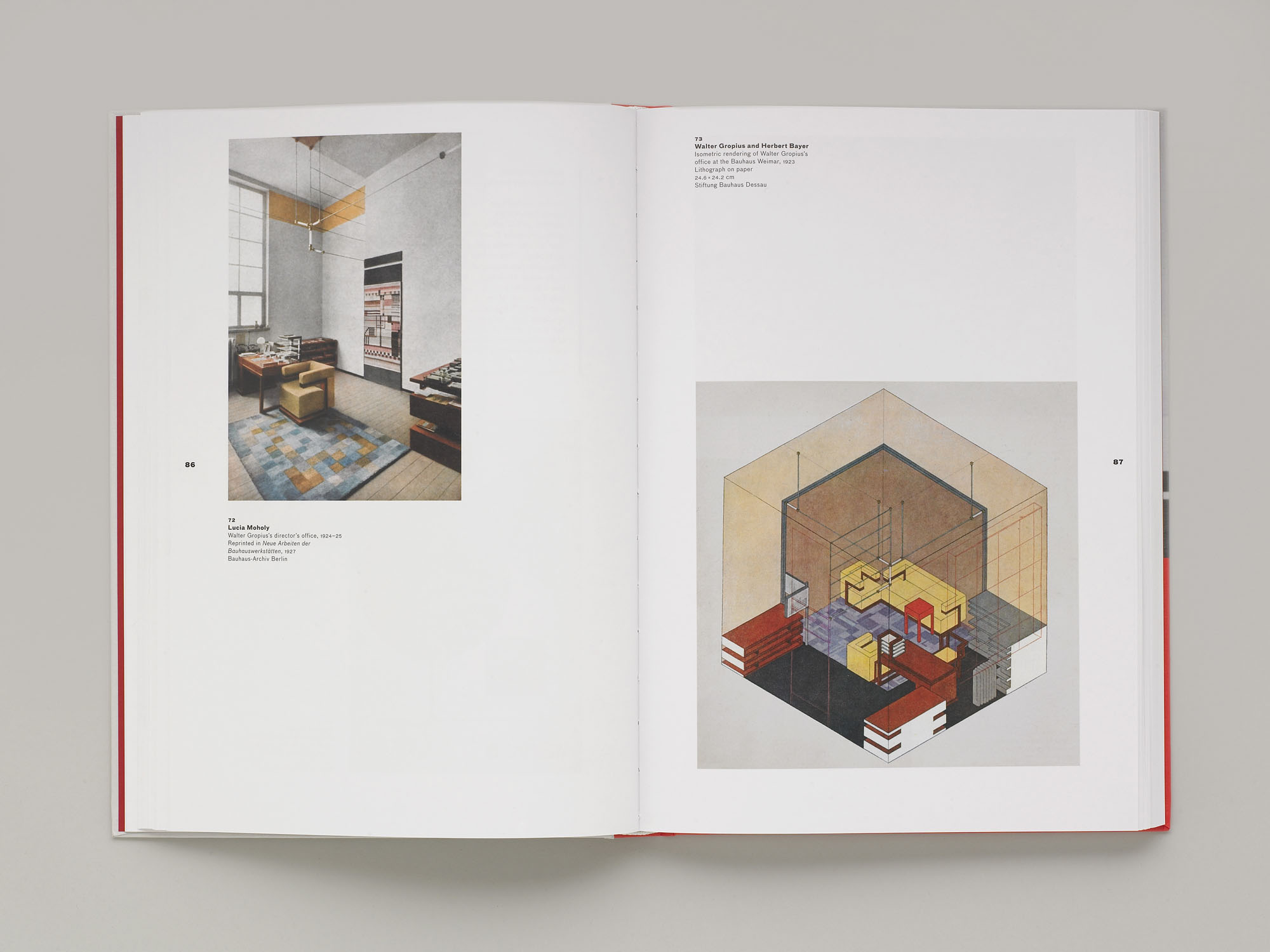
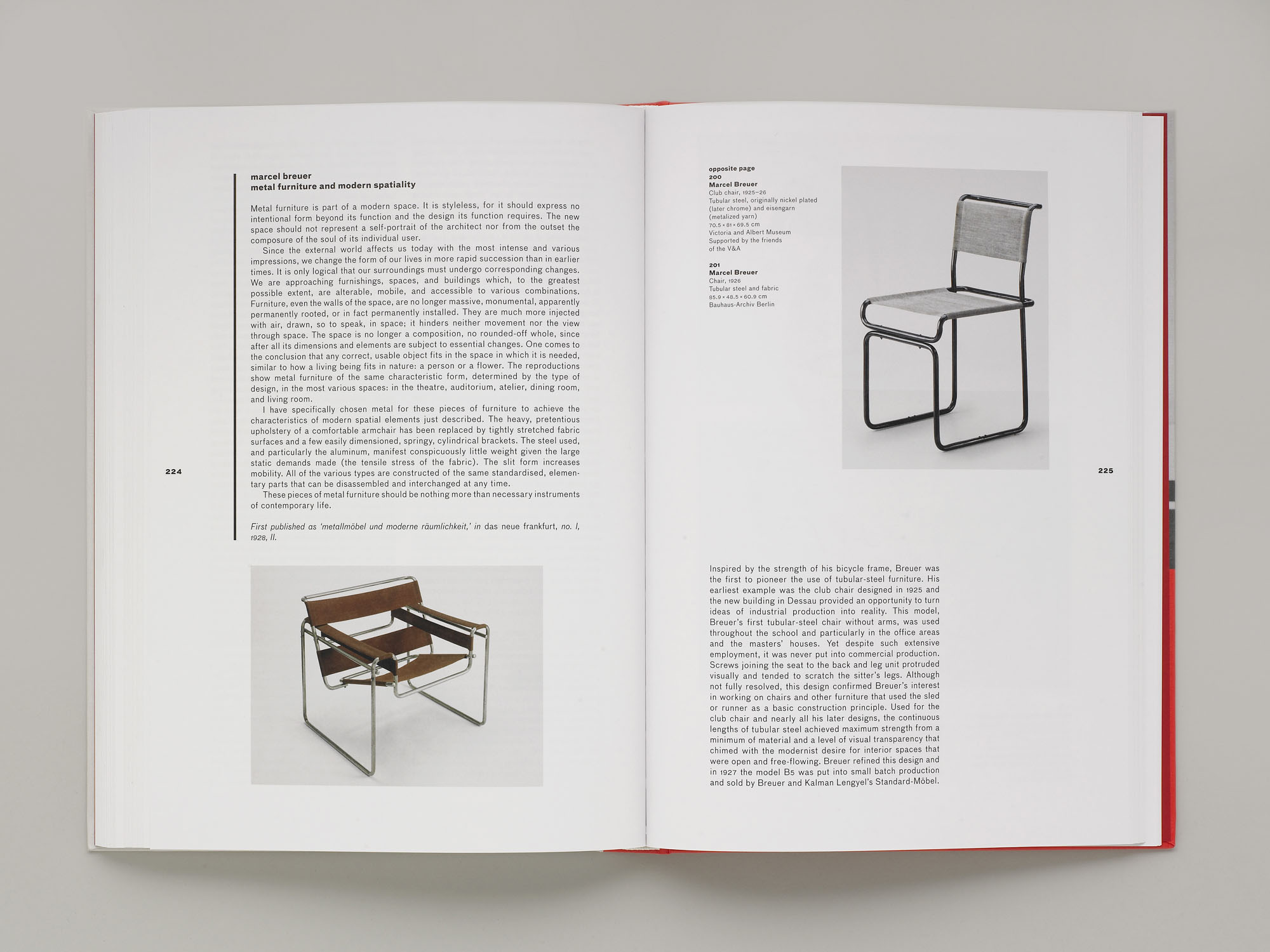
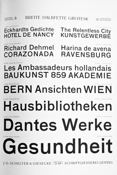
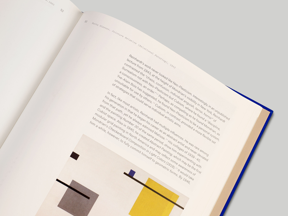
We were commissioned to design the catalogue that accompanied Bauhaus: Art as Life at Barbican Art Gallery, which was co-published by the Gallery with Walther König in 2012. Doing so allowed us to extend some of the typographic ideas used within the exhibition itself: the typeface used throughout, FF Bau, is a contemporary revival of the letterpress typeface used within the Bauhaus itself, Breite Grotesk, and texts were justified within the book in adherence to the Bauhaus’ own typographic rules. Containing a wealth of images from all three Bauhaus archives alongside contextual photography and essays from Barbican Art Gallery curators, the catalogue acts as both a companion to, and an extension of, the Bauhaus: Art as Life exhibition.
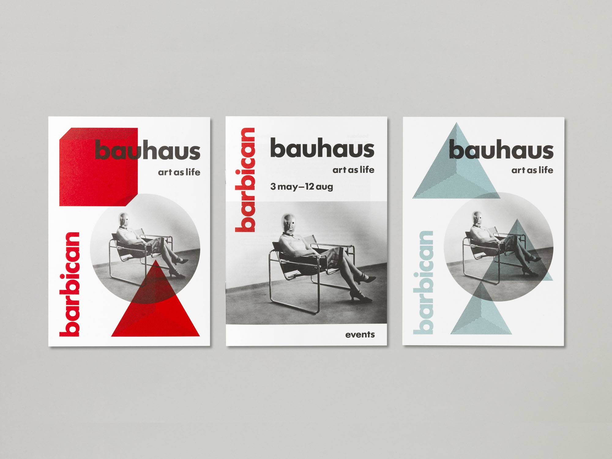
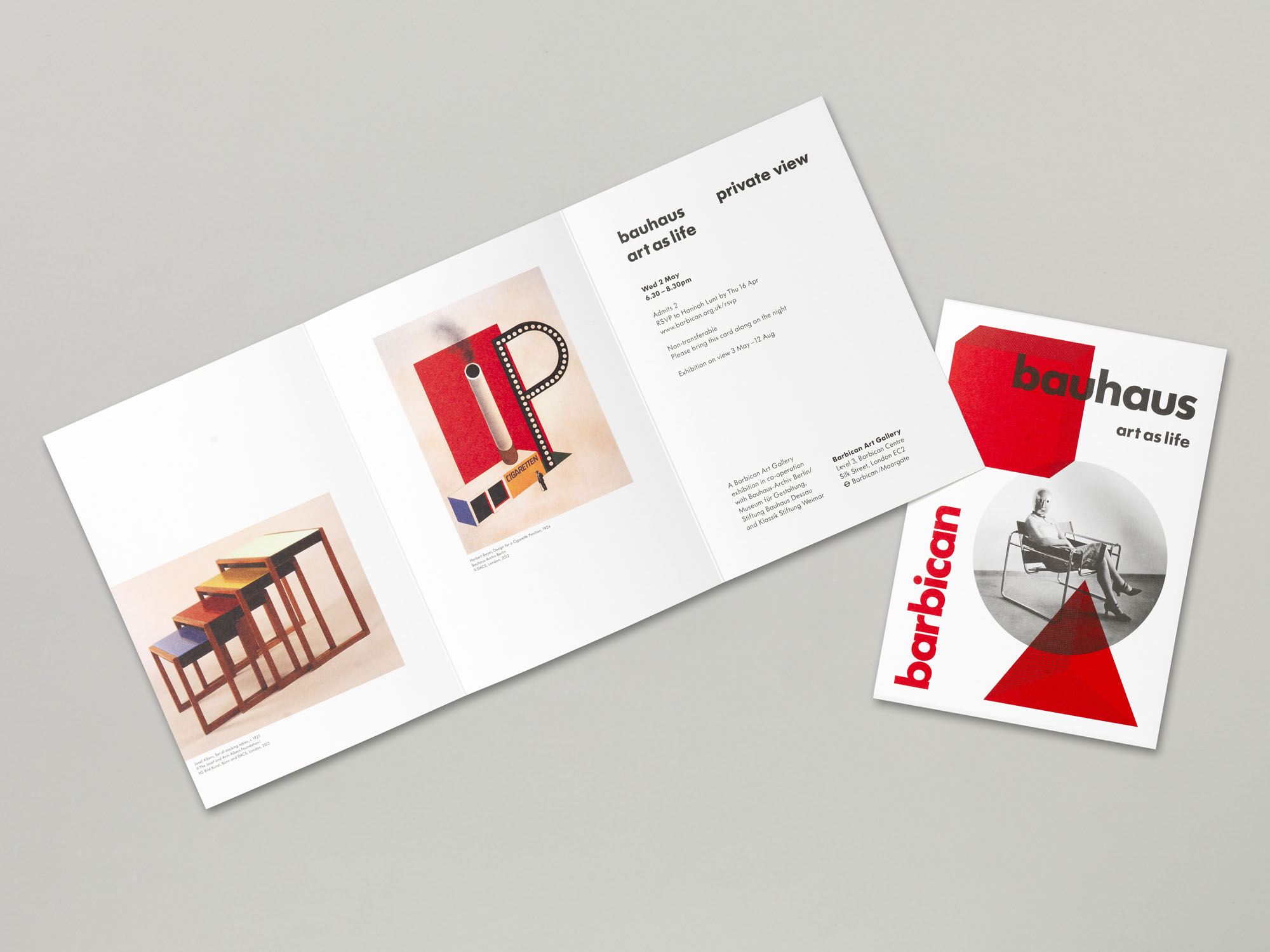
The marketing campaign for the exhibition was built around one key image – a striking photograph by Erich Consemuller of Lis Beyer or Ise Gropius, sitting on Marcel Breuer’s B3 club chair and wearing a mask designed by Oskar Schlemmer. The image appealed to us because it encompassed many of the Bauhaus’ disciplines in one image, and celebrated the role of women in what has historically been depicted as a rather male-dominated environment.
