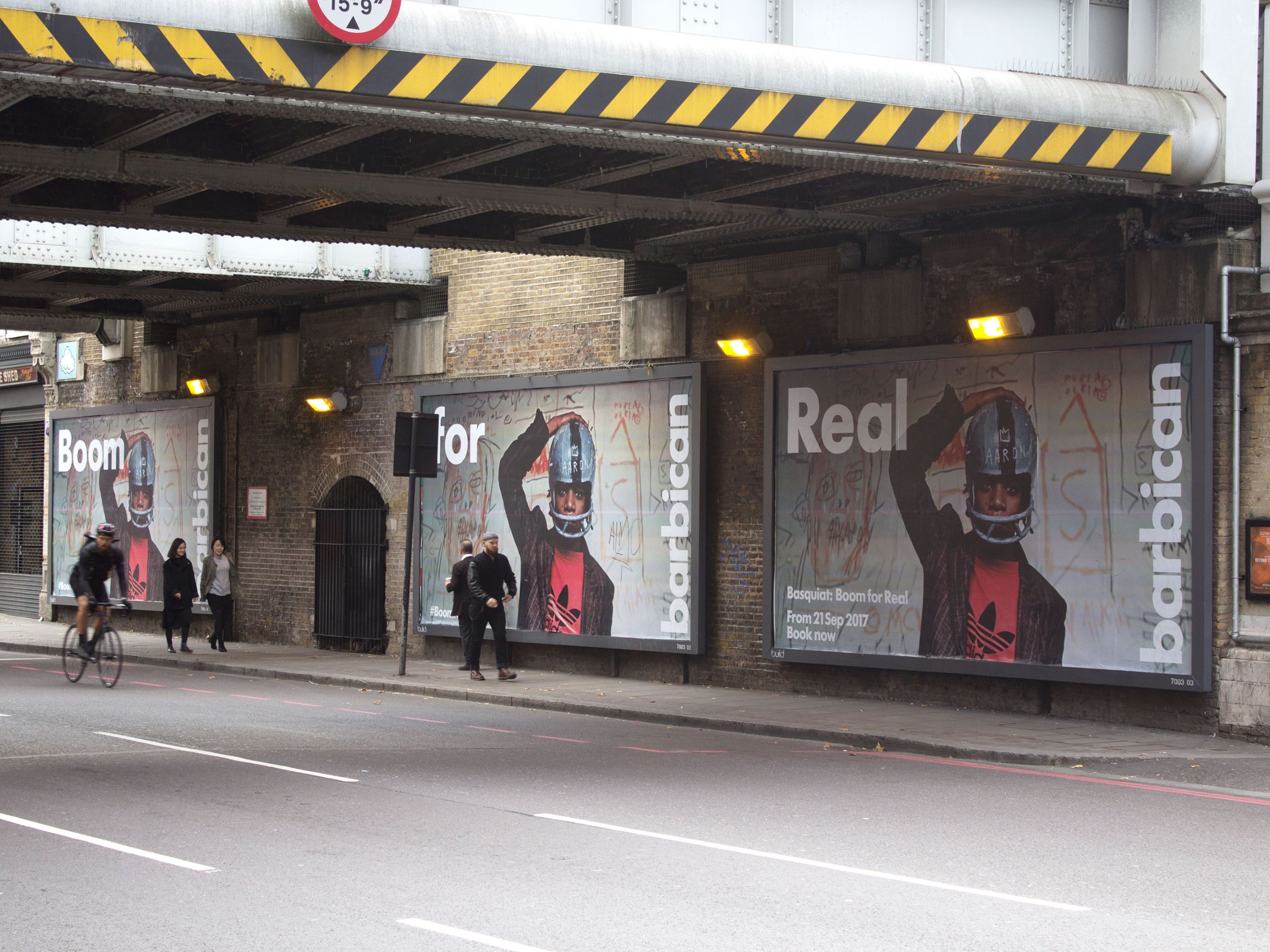

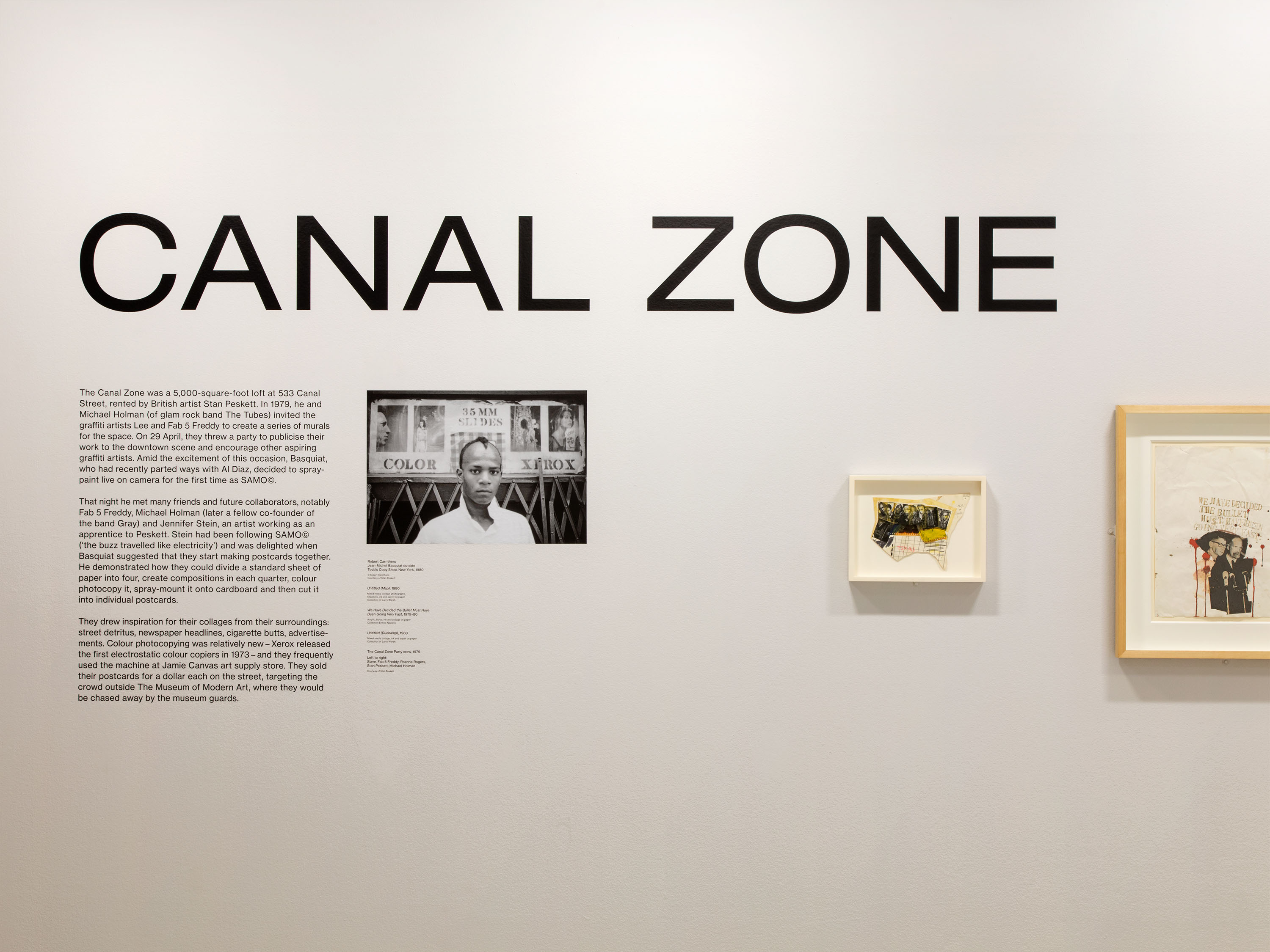
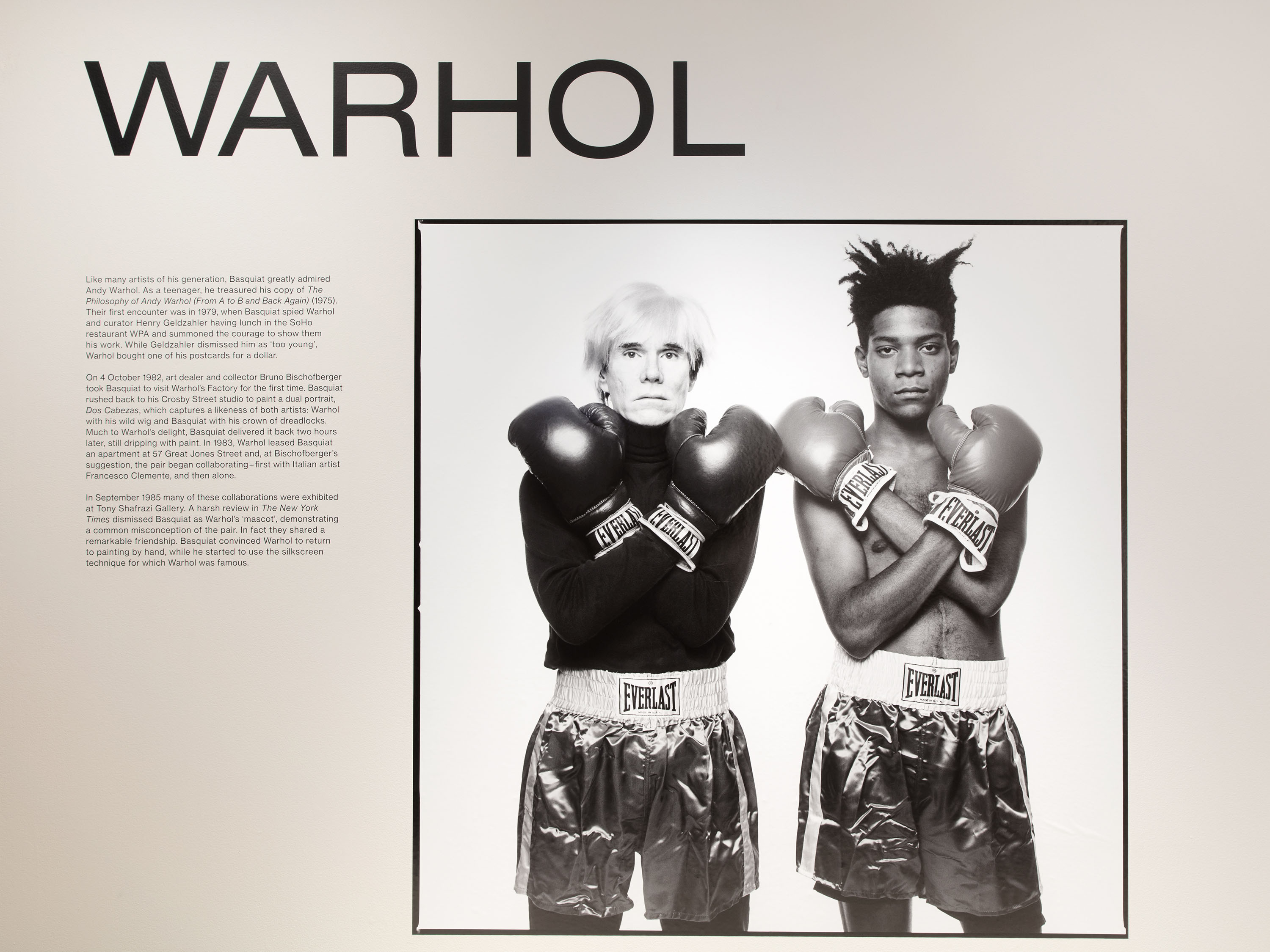
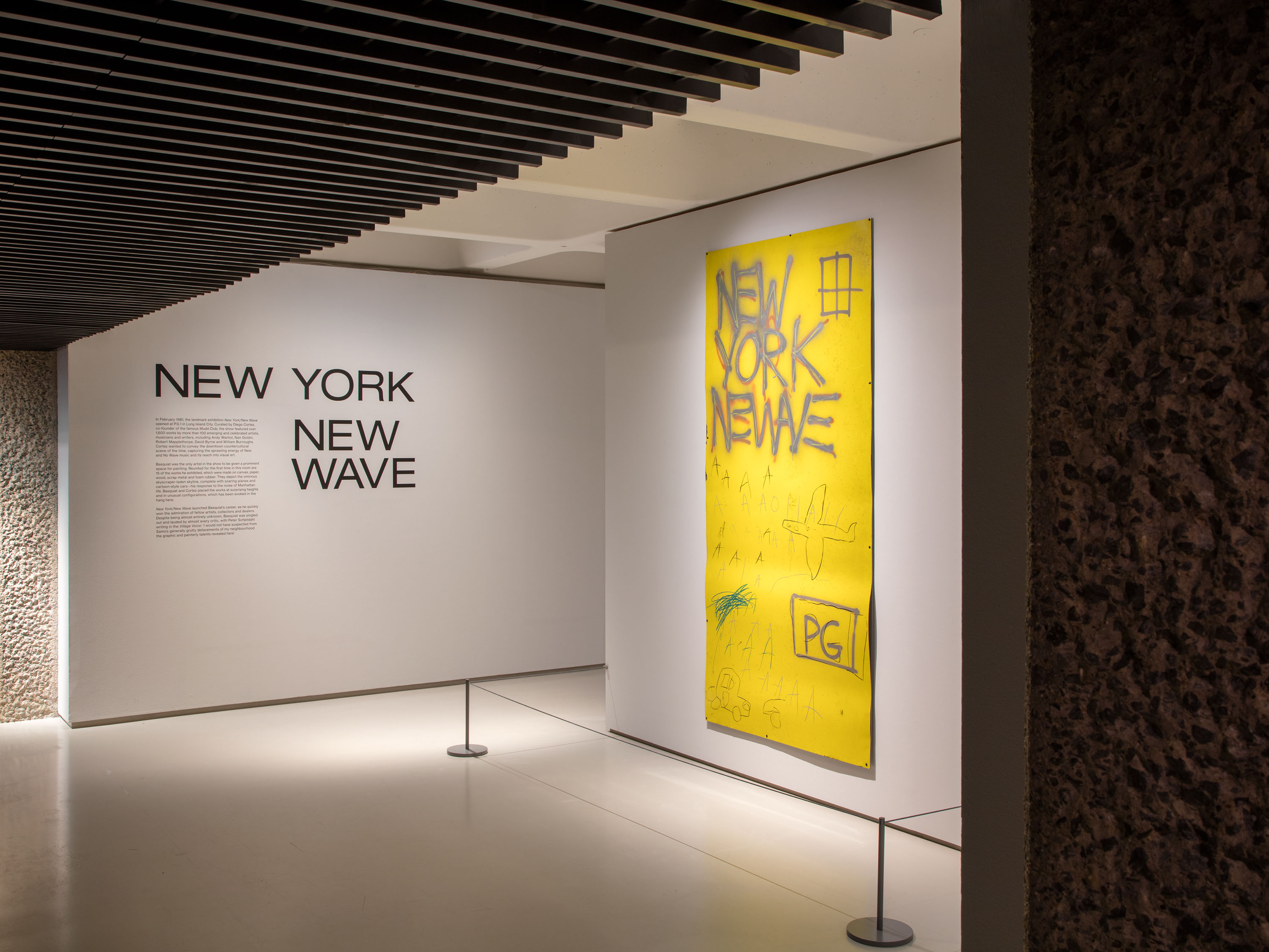
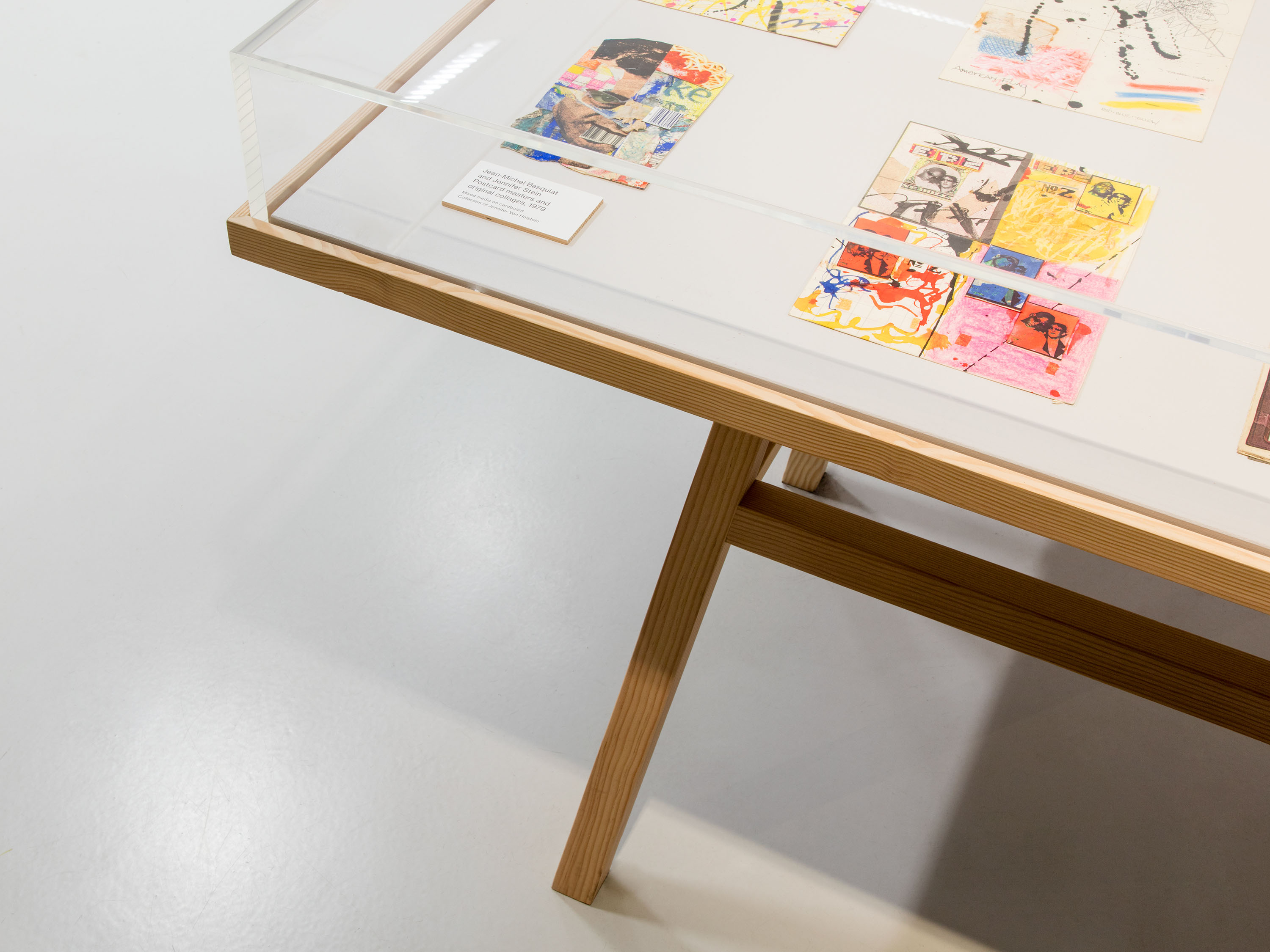
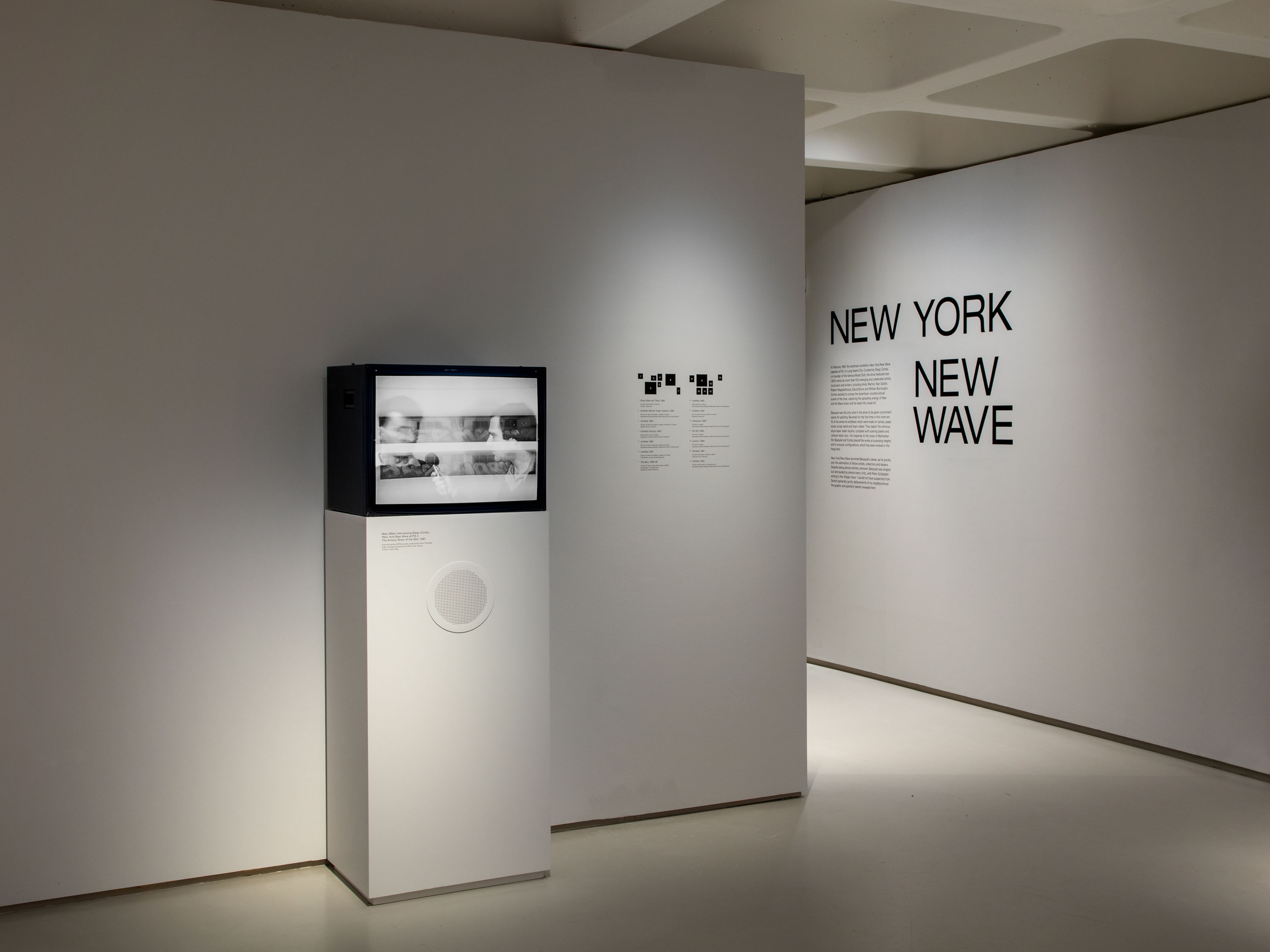
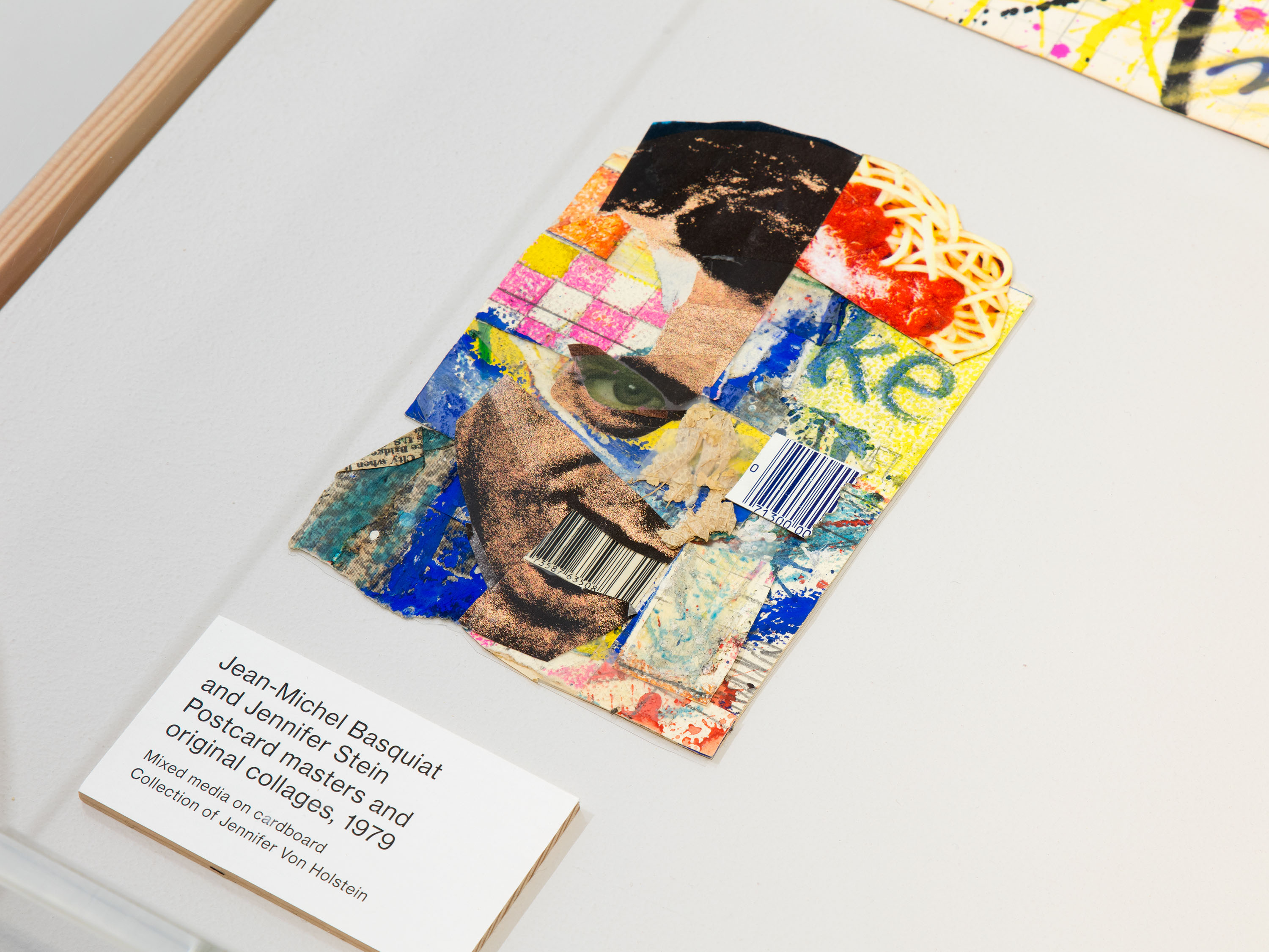
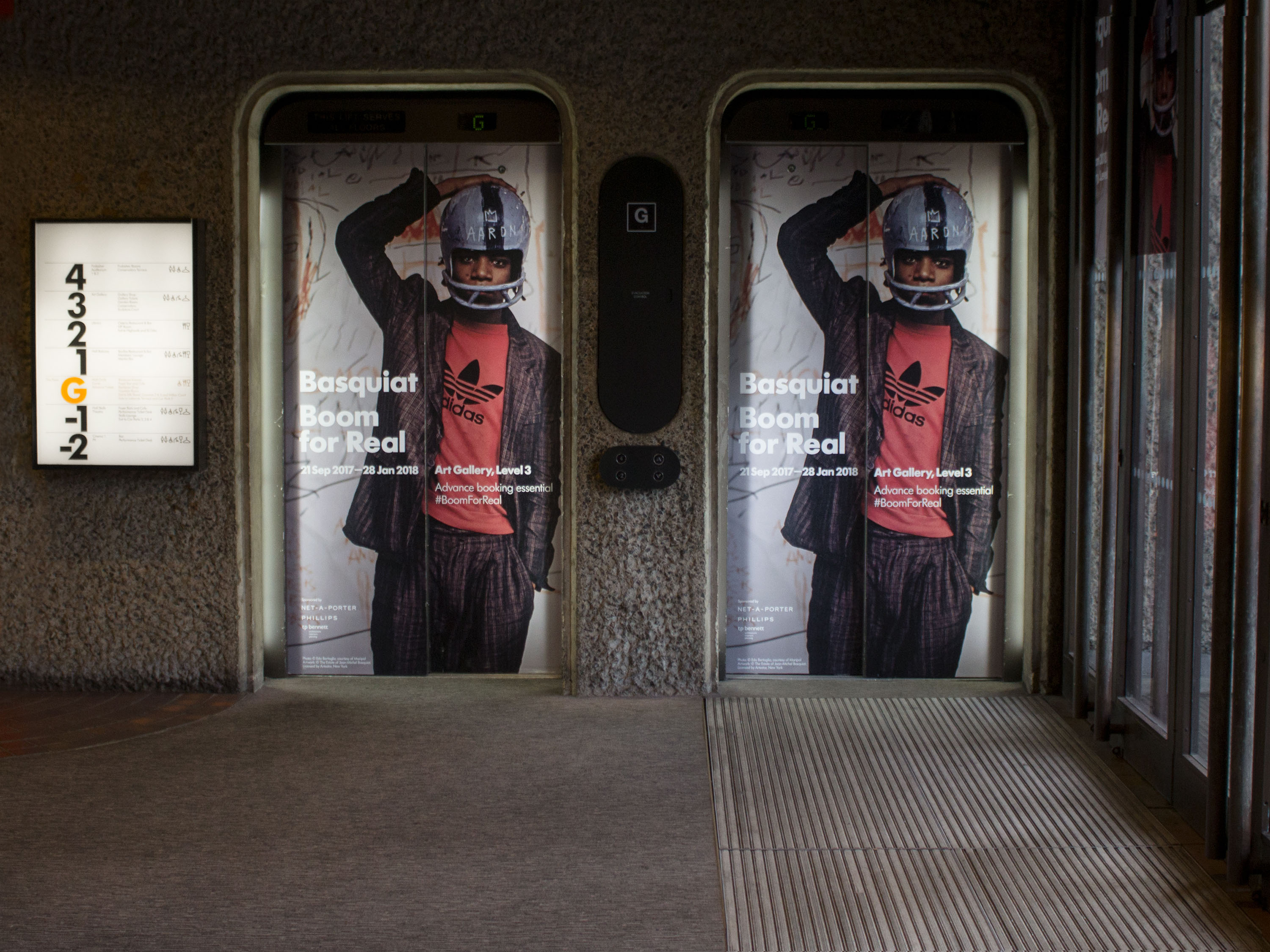
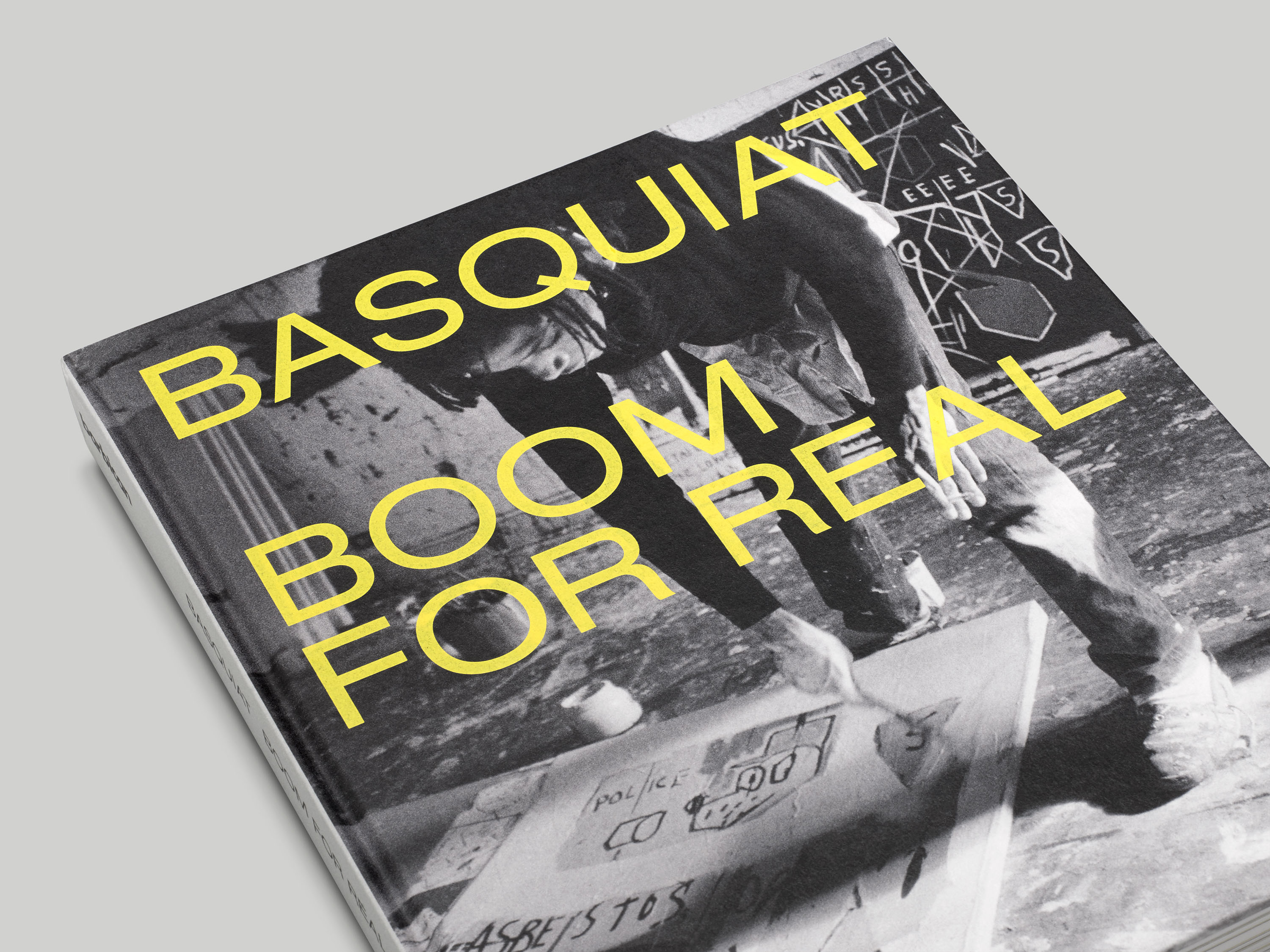
Basquiat: Boom for Real was the first major retrospective of the work of Jean-Michel Basquiat to be held in the UK, and brought together a selection of over 100 works from international museums and private collections from around the globe. The exhibition focused on Basquiat’s relationship to music, writing, performance, film and television, placing him within the wider cultural context of the time and capturing the range and dynamism of Basquiat’s practice over the years.
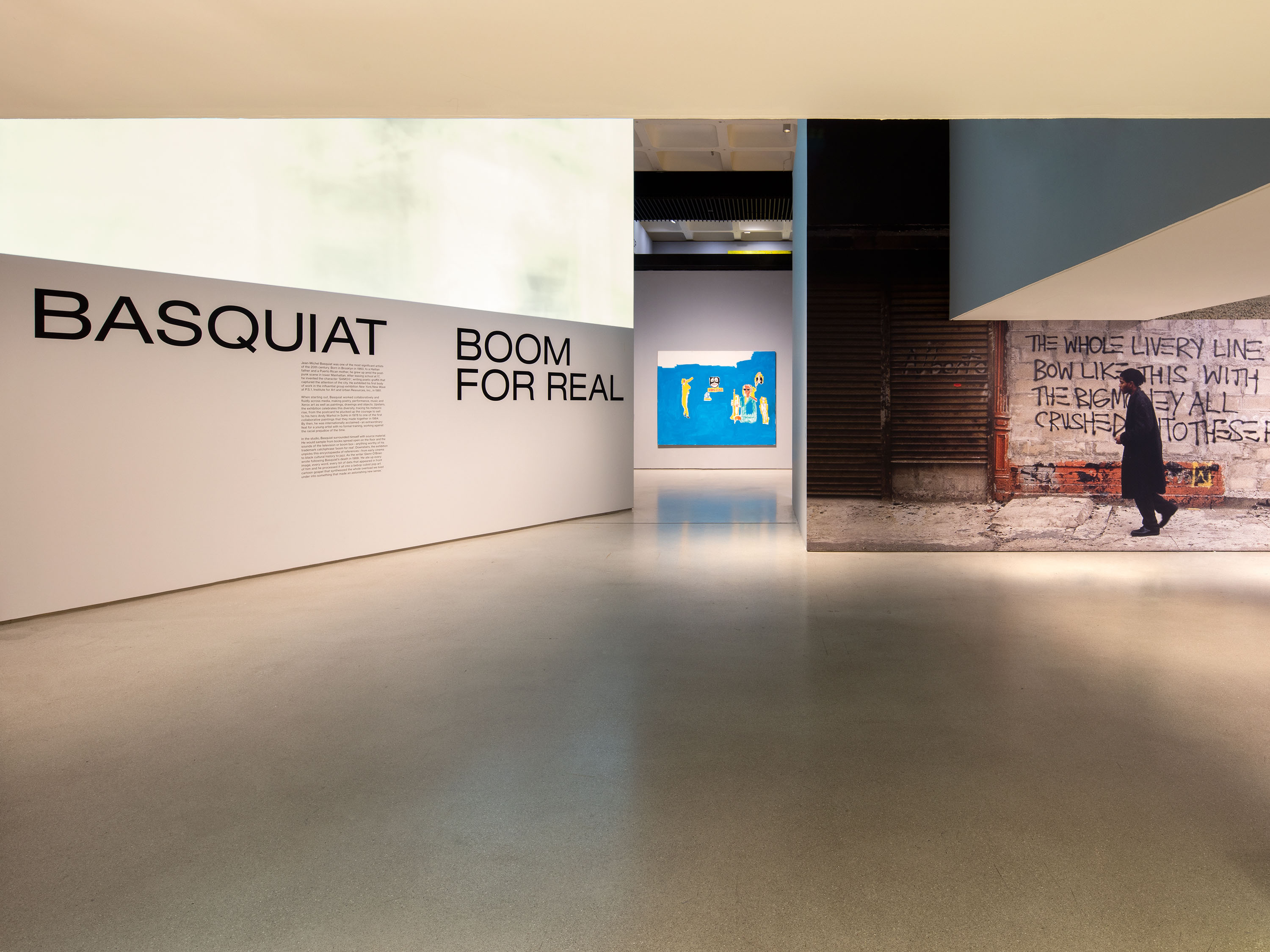
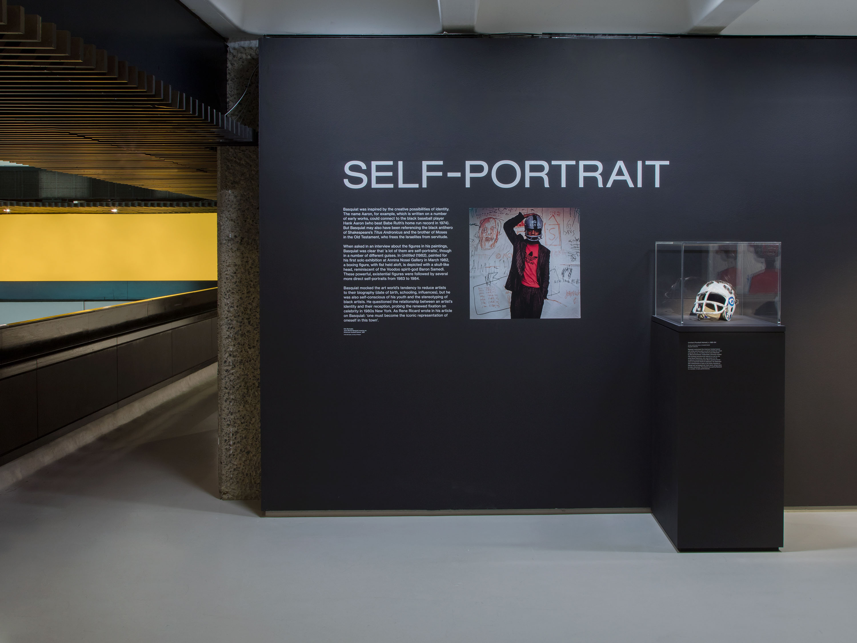
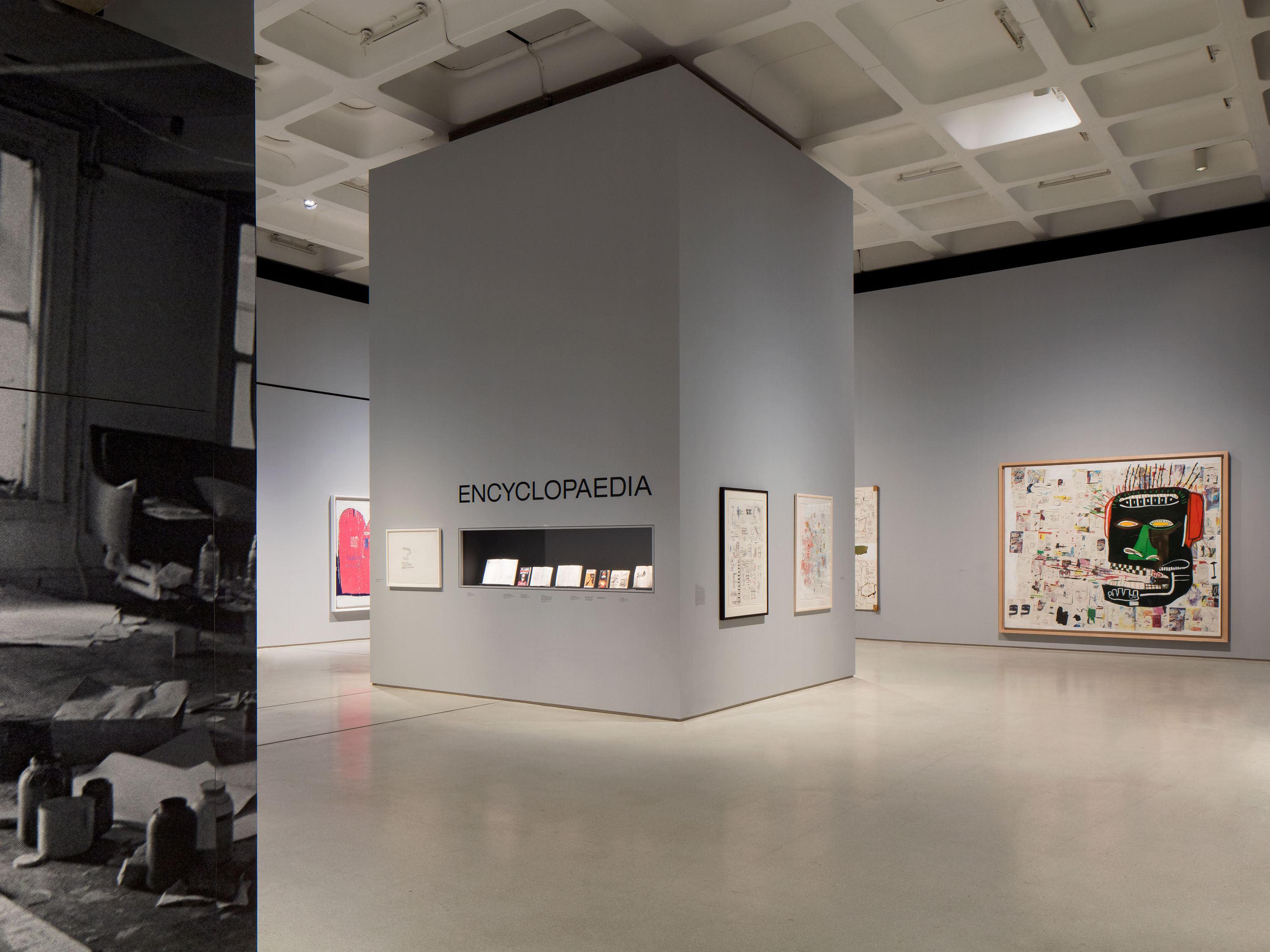
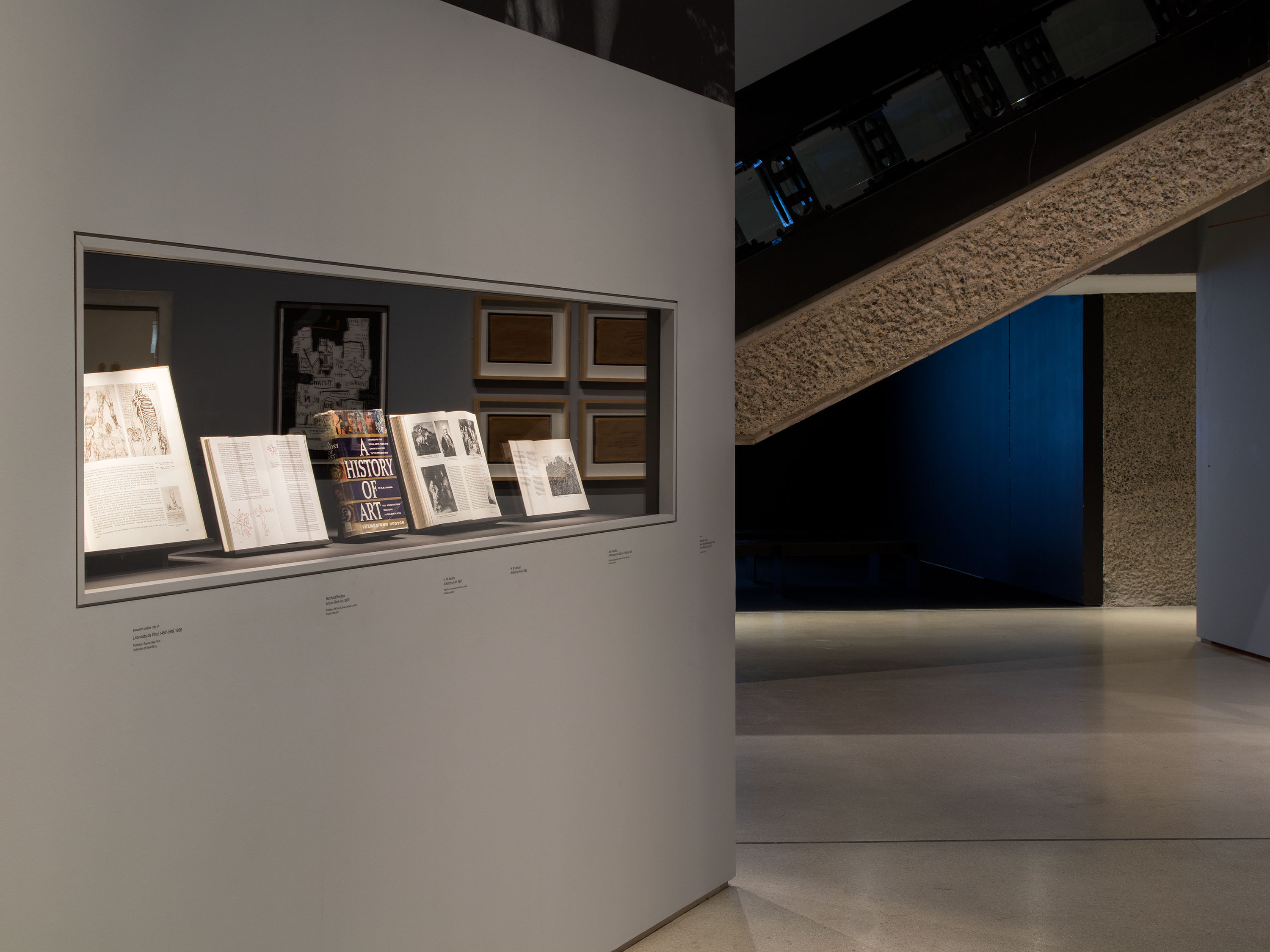
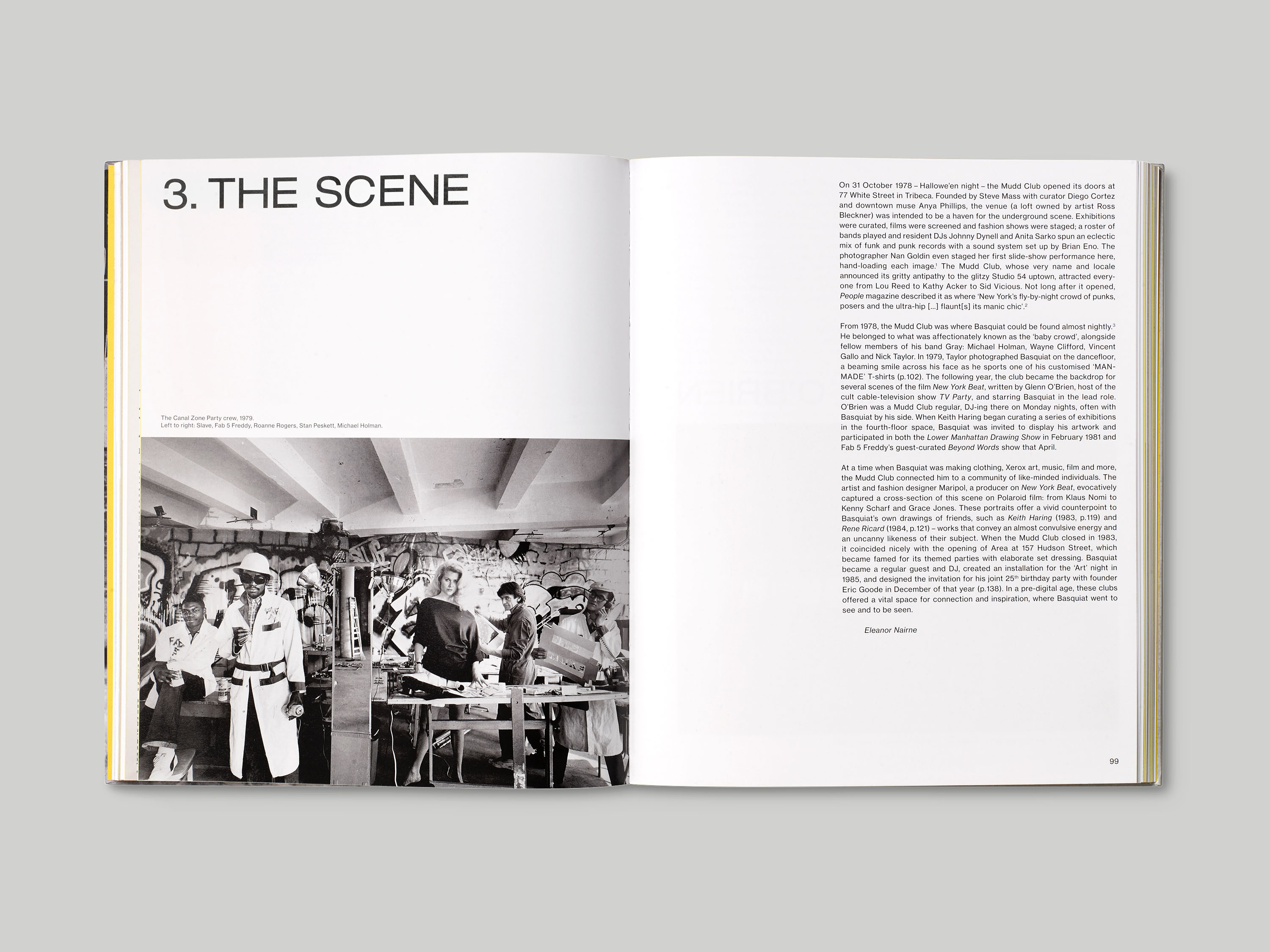
The extended sans serif typography we chose for the exhibition graphics balanced Basquiat’s strong graphic paintings, and reflected the proportions and scale of his SAMO© graffiti – Helvetica Extended was used for the section titles, and Neue Haas Grotesk for body text. To avoid a crowded white-wall hang, the works were presented on a background of muted complementary tones, which add emphasis to the colours within. The three-dimensional design of the exhibition, created by architects Carmody Groarke, featured monolithic structures used to offset and emphasise the size of works in the downstairs atrium spaces.
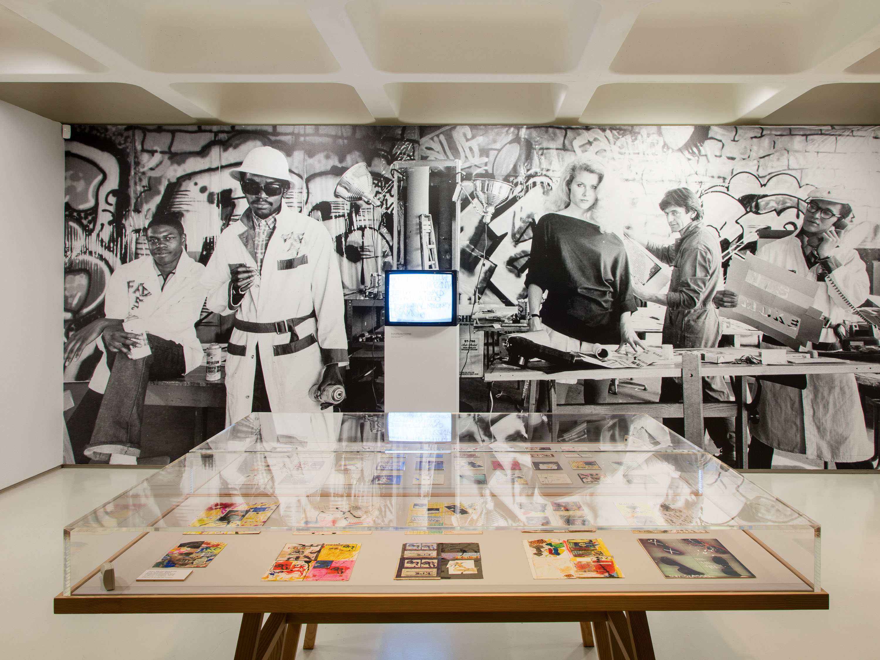
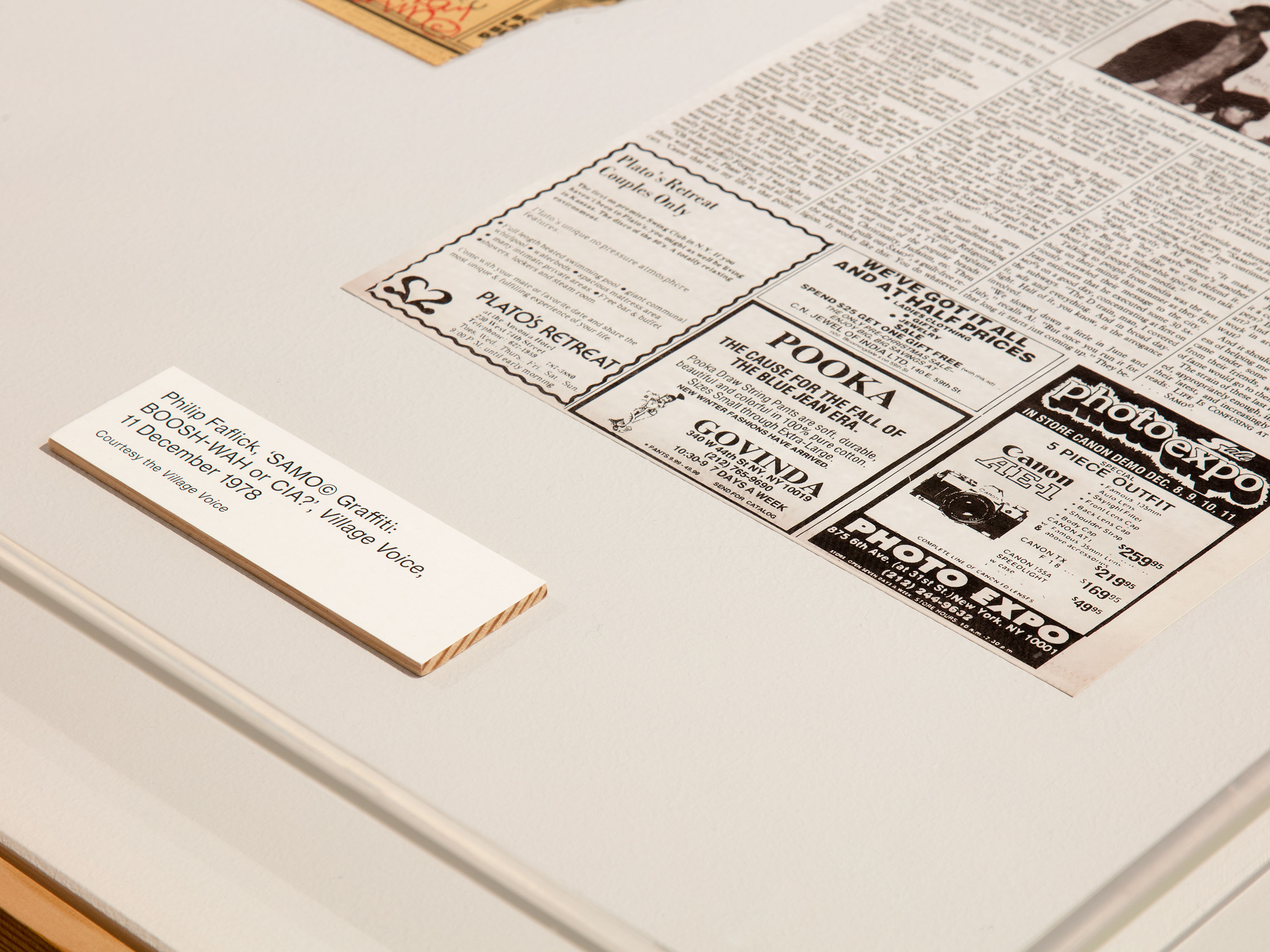
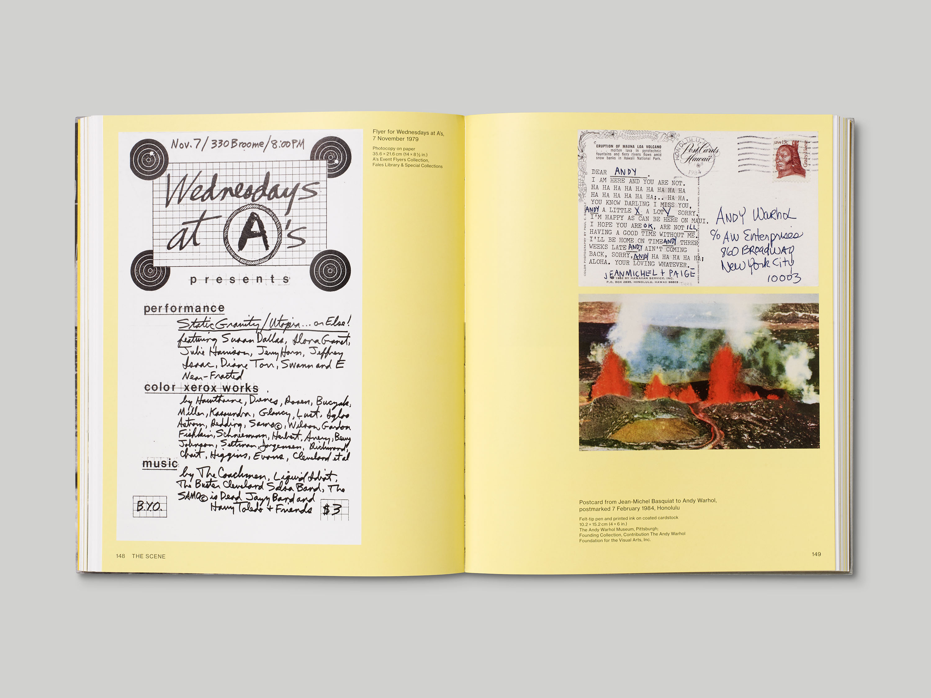
Examples of this typeface can also be found on the flyers and posters that Basquiat himself helped design for club nights and parties at venues like the Mudd Club in Downtown New York.
This palette, which includes a range of grey tones and a New York taxi yellow, also evokes the colours of the city itself.
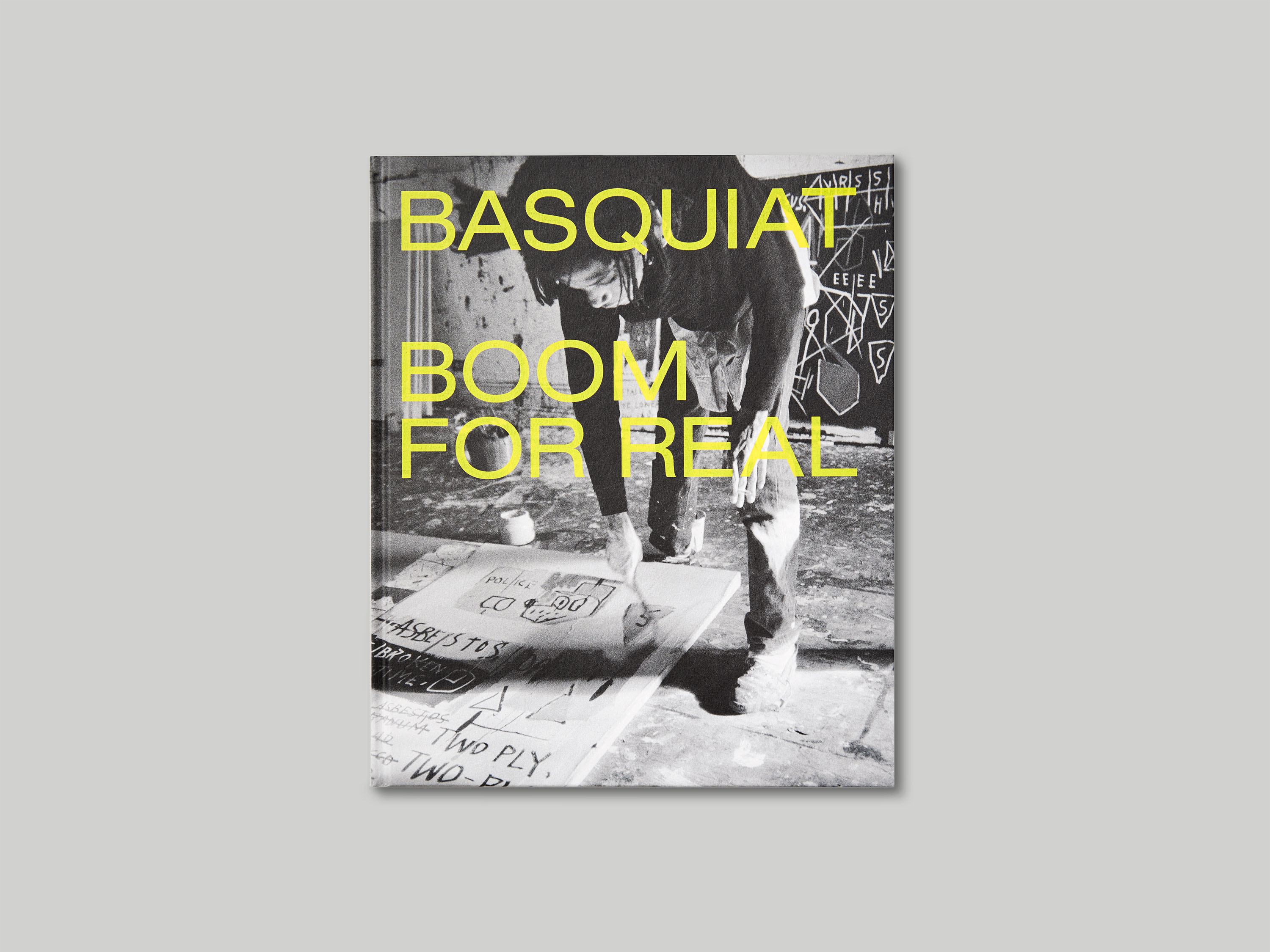
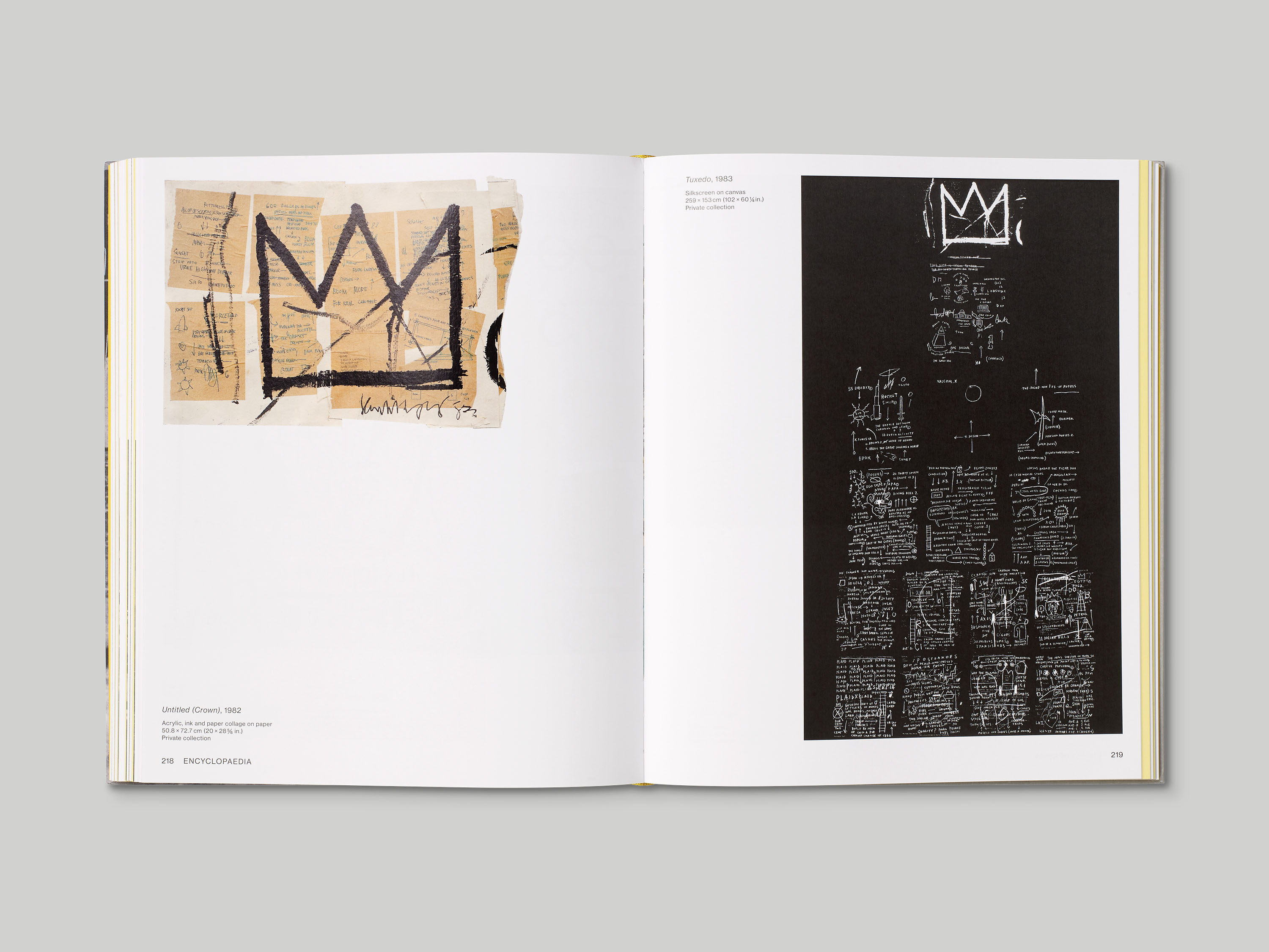
The major exhibition Basquiat: Boom for Real, held at Barbican Art Gallery in 2017, was accompanied by an extensive catalogue featuring rare photography and previously unpublished material; its design employs a similar palette of colours and typefaces to those within the show. Essays are set in Sabon, a legible serif typeface that emphasises their academic tone, and the book incorporates images of works alongside facsimiles of many of the documents, articles, notes and ephemeral content included in the exhibition.