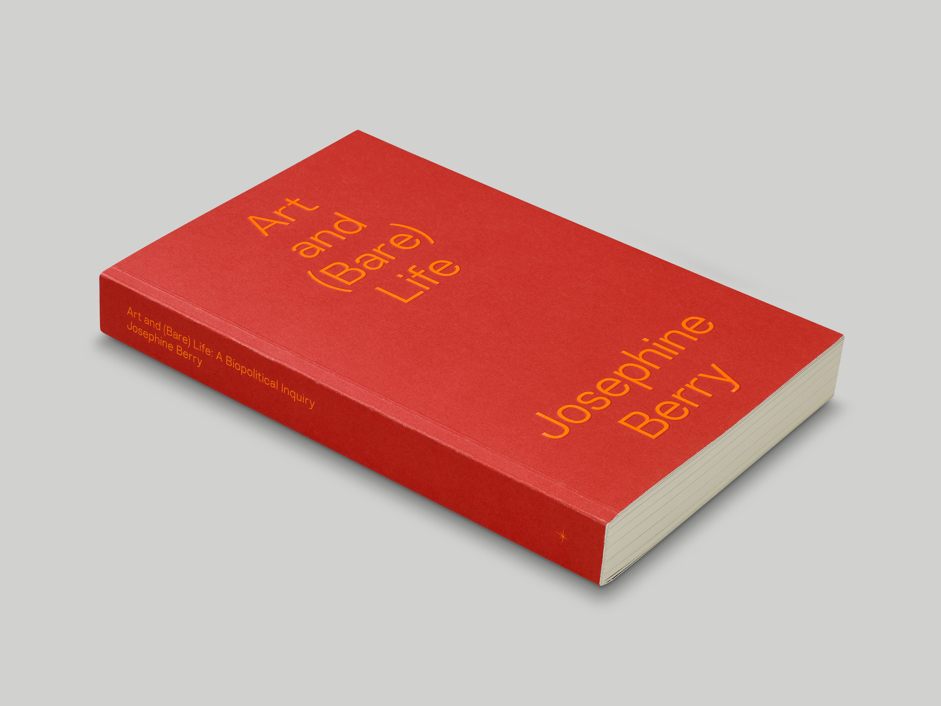
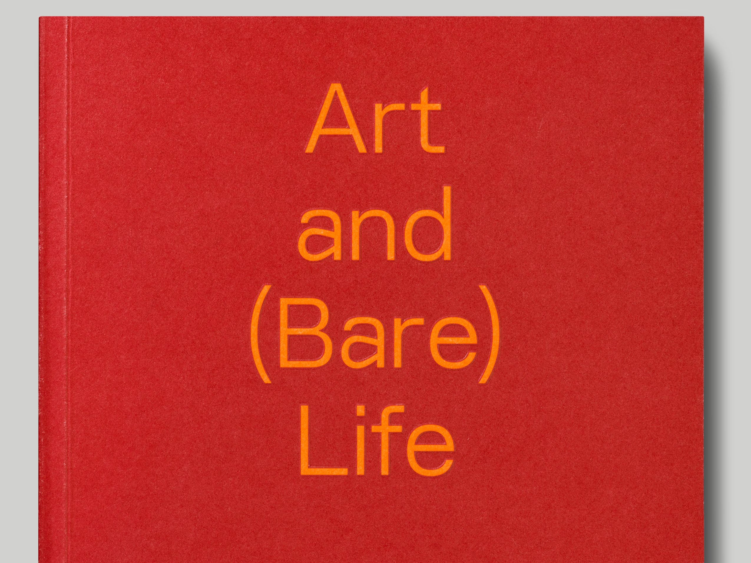

Written by Josephine Berry, Art and (Bare) Life: A Biopolitical Inquiry explores the intersection of political philosophy with contemporary art theory, analysing the connections between current biopolitics and art’s drive to blur with life. The design of the publication makes subtle and oblique references to the contrasts and conflicts Barry explores within the text. For titling on the cover and throughout, we chose Lining, a bespoke typeface we developed from an early 20th-century type specimen; its bold, square and mechanised forms belie its historic origin. Body text within the book is set in the parametric typeface Spectral, which was designed as a screen-first font but is equally well suited to long-form reading. The neon orange and blood red of the cover were chosen to feel slightly visually jarring, yet still contemporary.
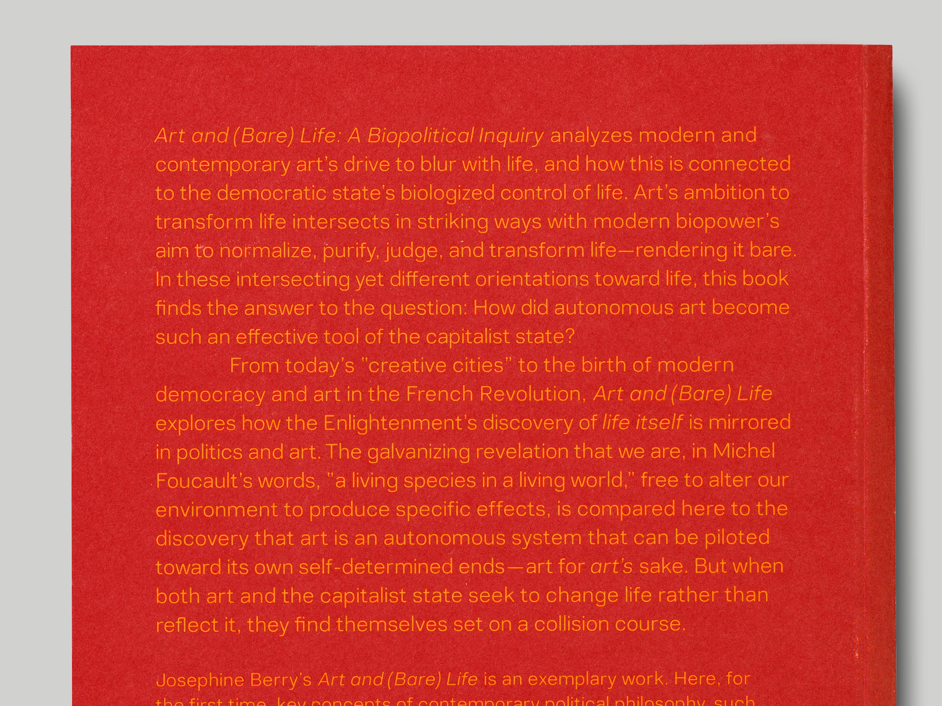
The design of Spectral references the French Elzevir genre of type design, which developed through late 19th-century revivals of Old Style typeface designs. The distinctive forms of this style were the result of type designers striving for a new modernism, distinct from the prevailing ‘modern’ type styles of that period.