The Roberts Institute of Art is a non-profit contemporary arts organisation, which commissions live performances, partners on exhibitions across the UK, and shares the David and Indrė Roberts Collection with the public. To coincide with a new name and direction, we developed a new identity and expanded website.
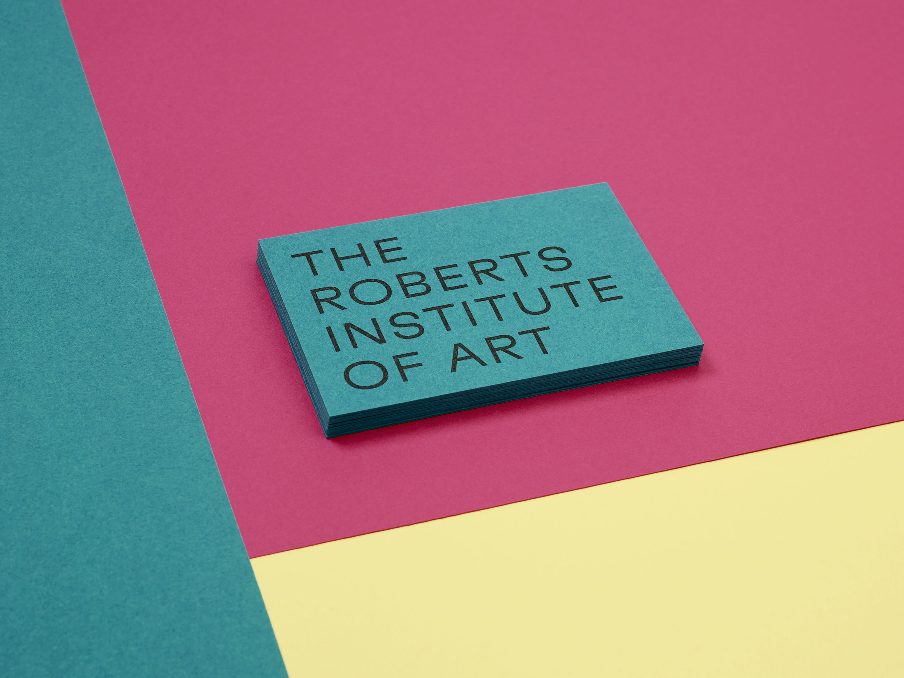
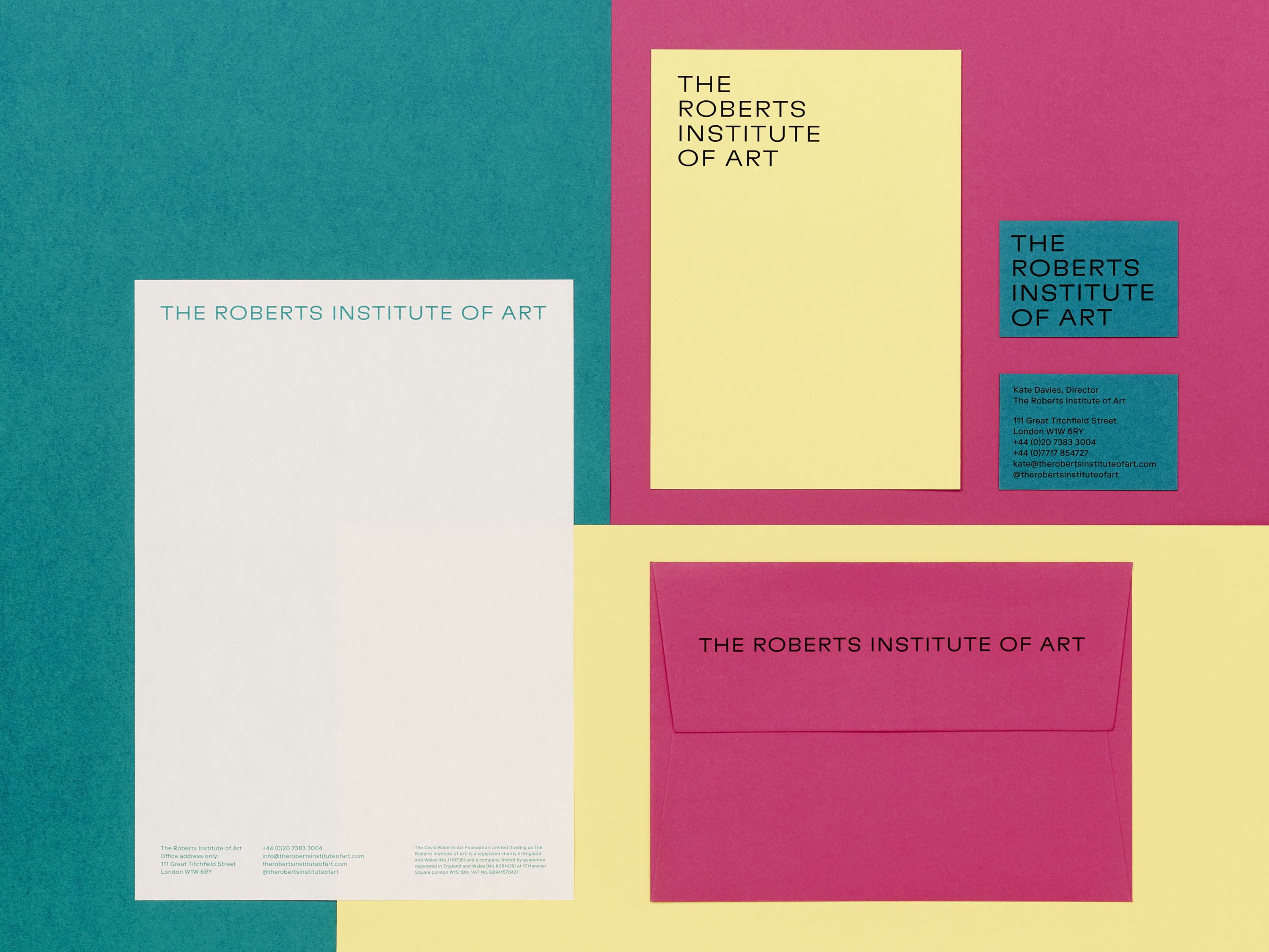
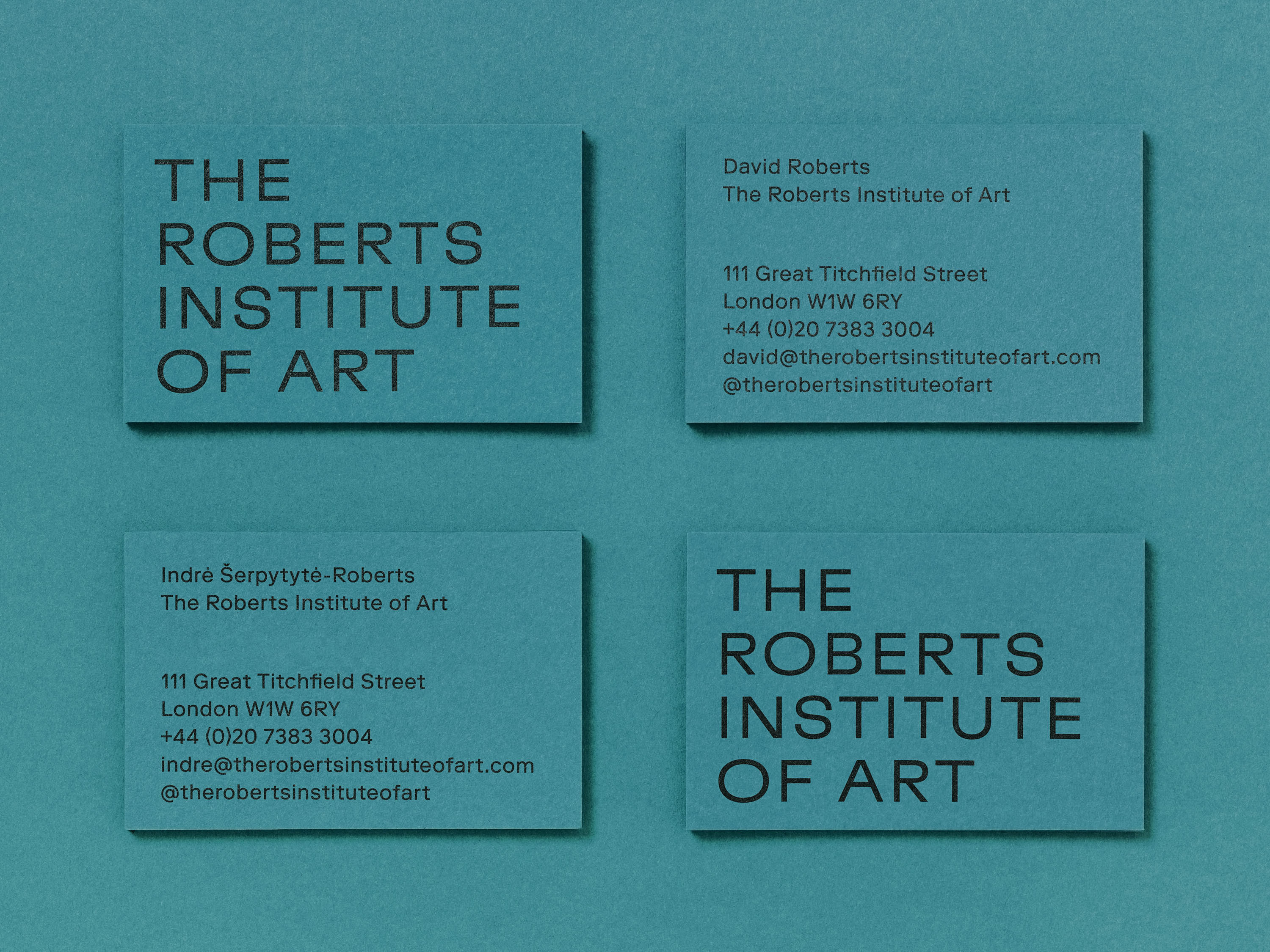
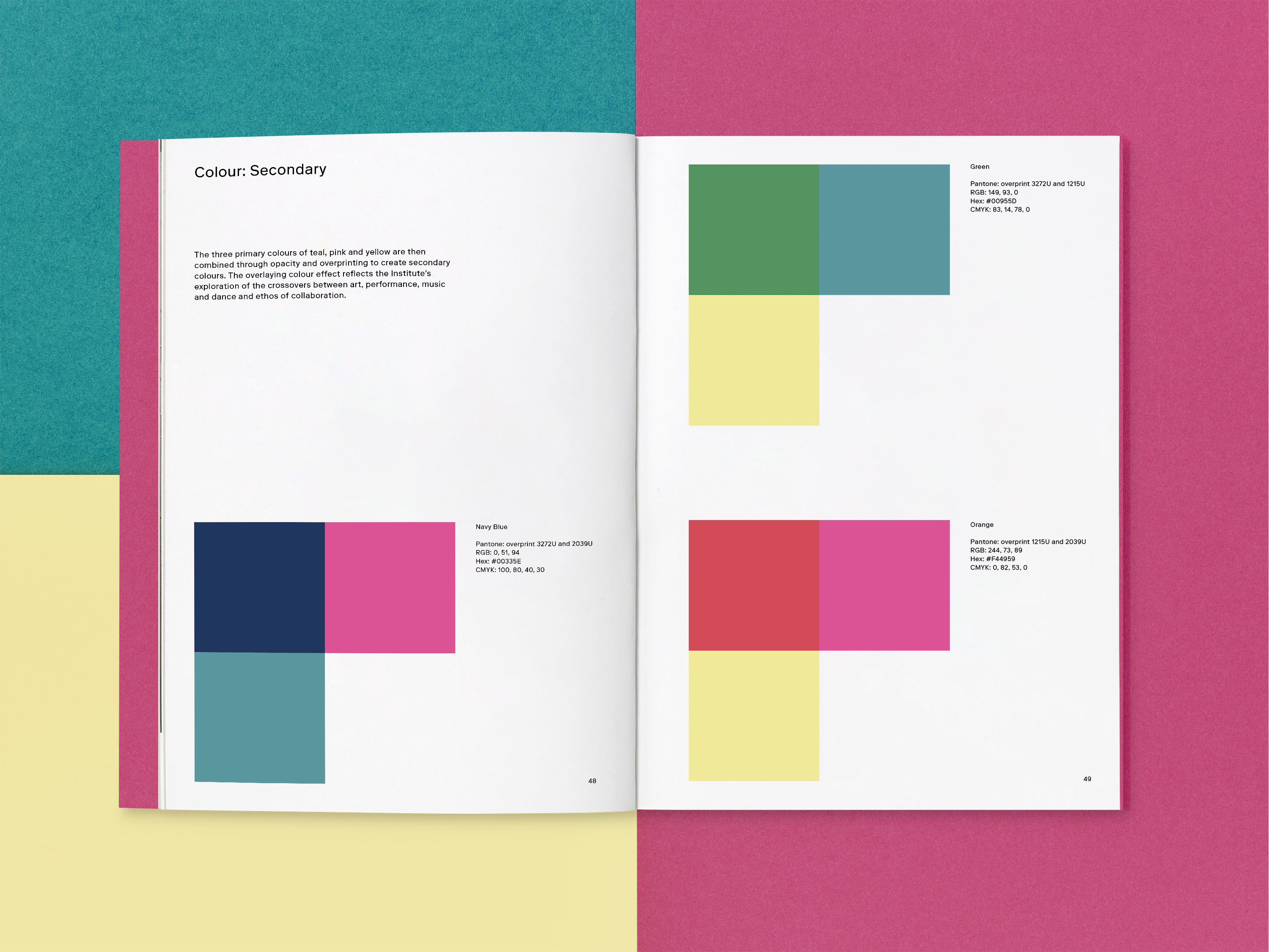
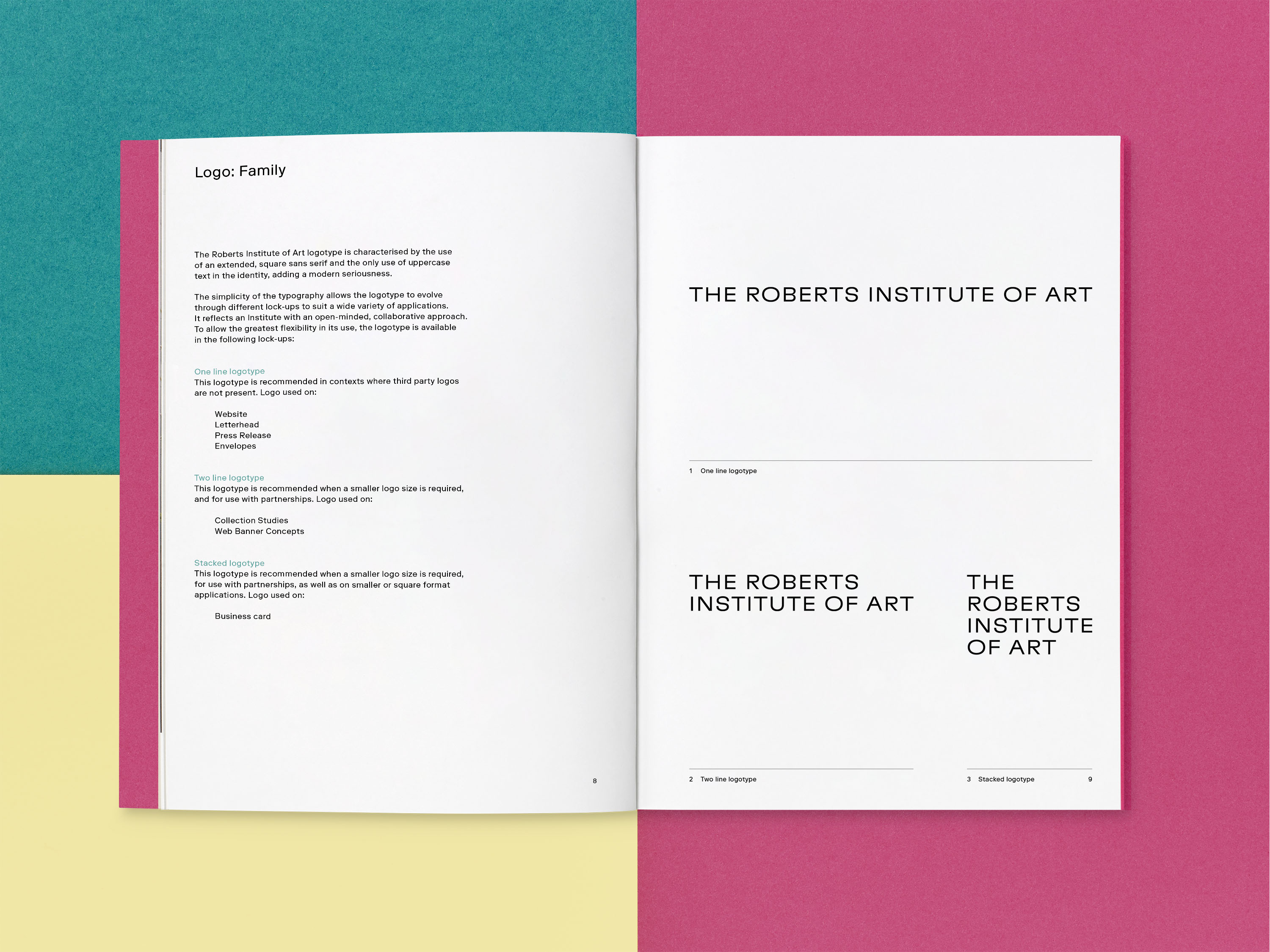
A bright colour palette adds vibrancy and openness to RIA's identity, used in bold paper stock for printed materials and as a distinctive digital language. The three primary colours of teal, pink and yellow are combined through opacity and overprinting to create further colours – an overlaying colour effect that befits an organisation with a focus on the intersection between performance, dance and art. The logotype is characterised by the use of an extended, square sans serif; its simplicity allows the brand architecture to be used informally, with three logotype lock-ups that respond to different partnerships and contexts.
The new website is designed to illustrate the breadth of RIA’s programme, foregrounding their partnerships. Visitors are encouraged to take multiple navigational routes across the site, as we developed a tagging system that connects the artists, programme and research. The website’s grid mixes images, audio and video with colour blocks that overlay as visitors scroll.
From 2007–21, the Roberts Institute of Art operated as the David Roberts Art Foundation (DRAF).