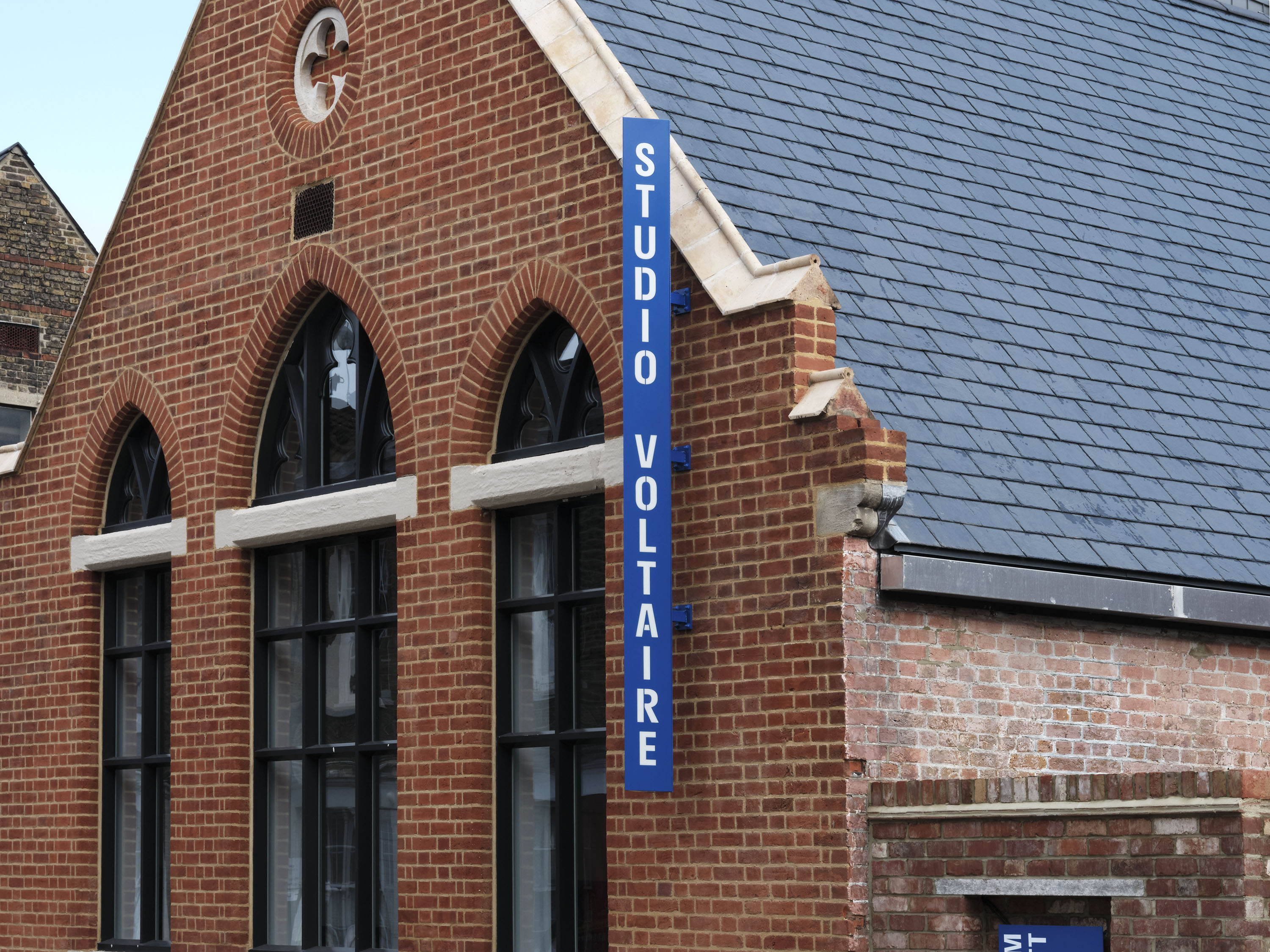
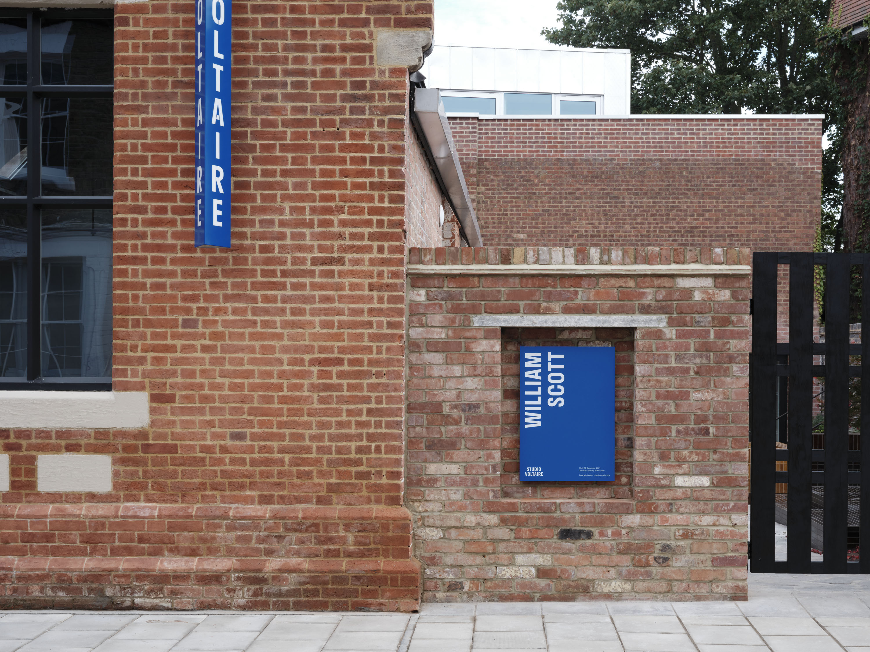

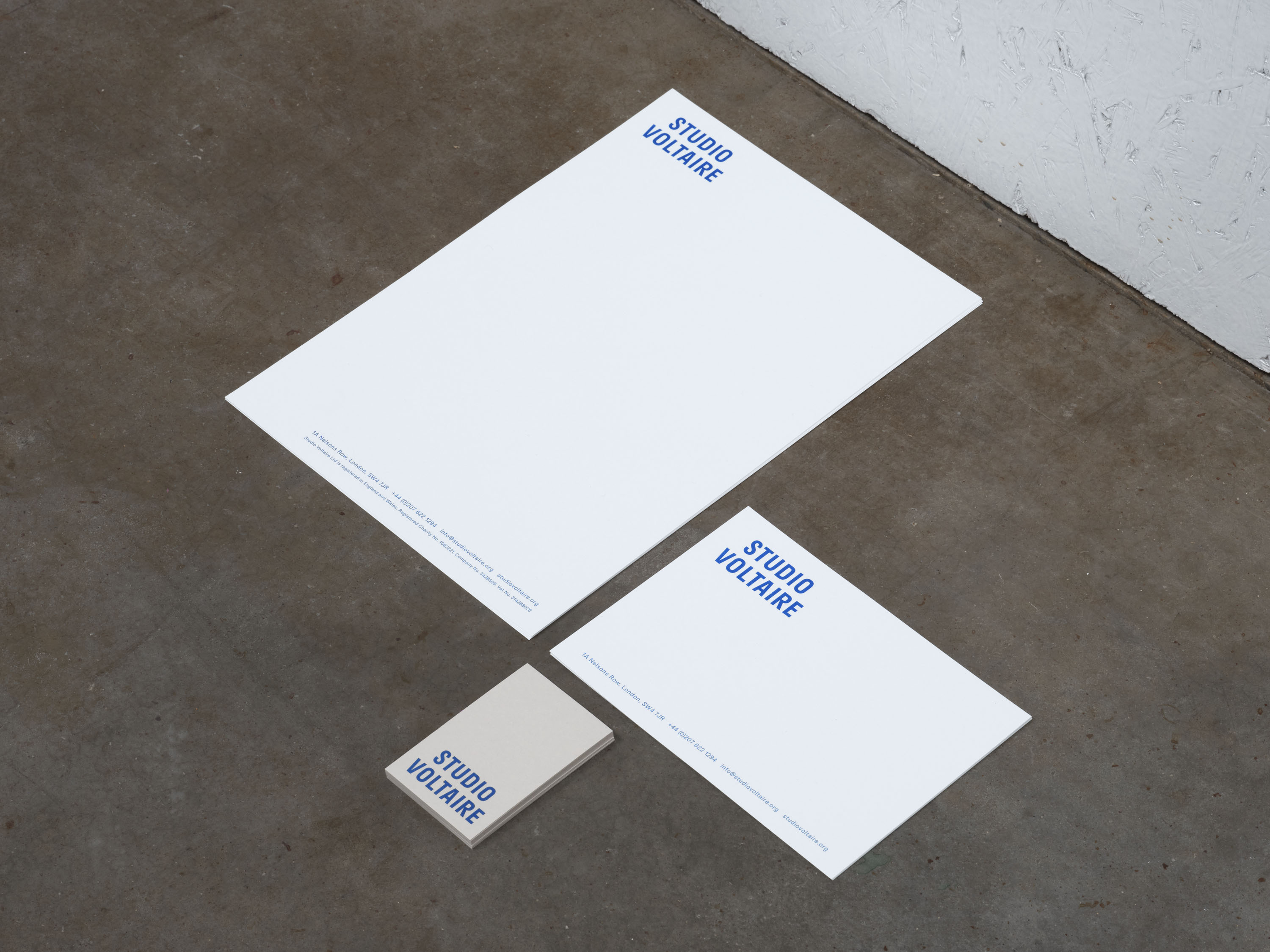
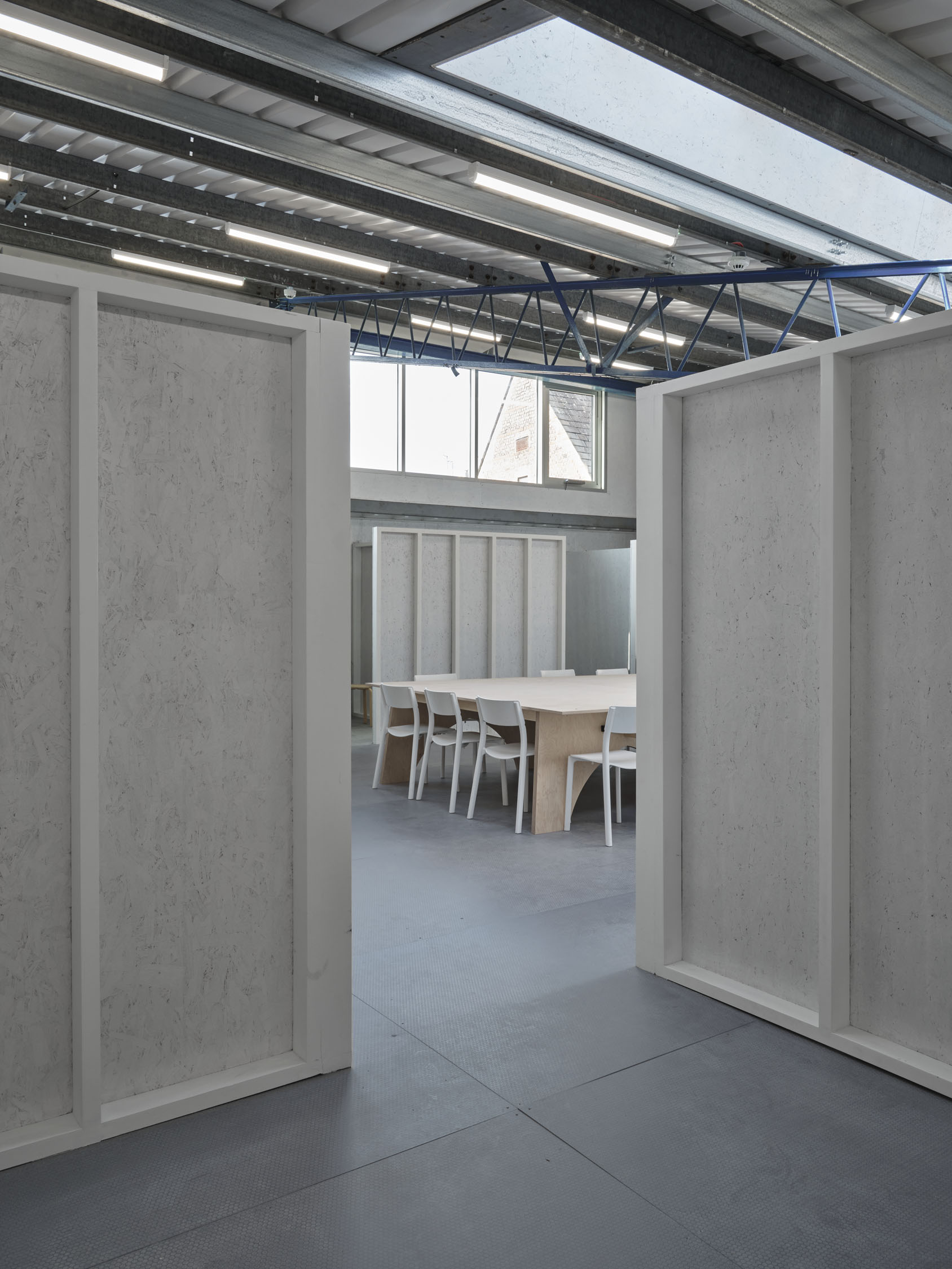
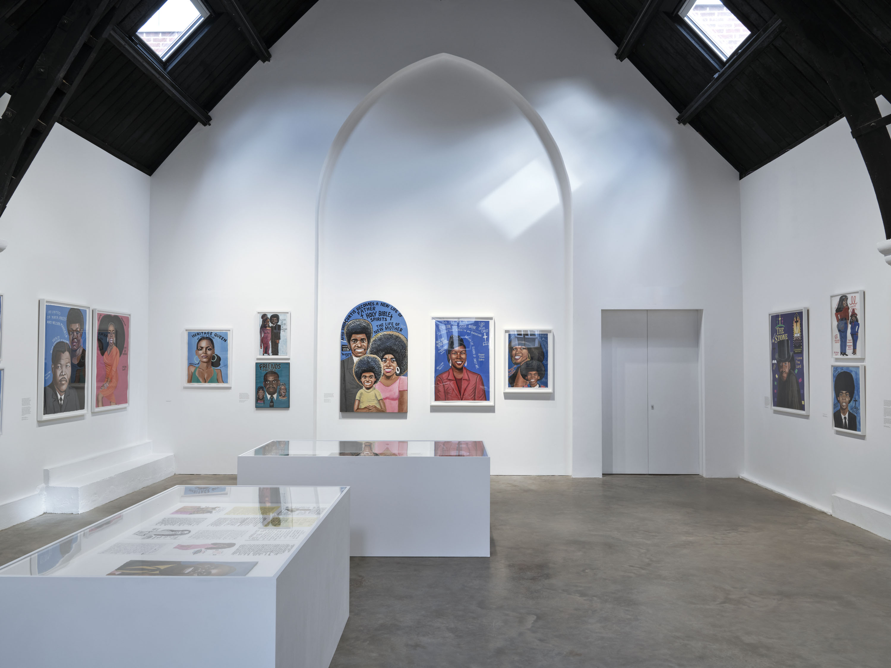

Studio Voltaire is one of the UK’s leading not-for-profit arts organisations, offering artists’ studios and a programme of exhibitions and events. We designed a new visual identity and comprehensive signage scheme for the organisation’s redeveloped site, as part of a landmark capital project designed by Matheson Whiteley.
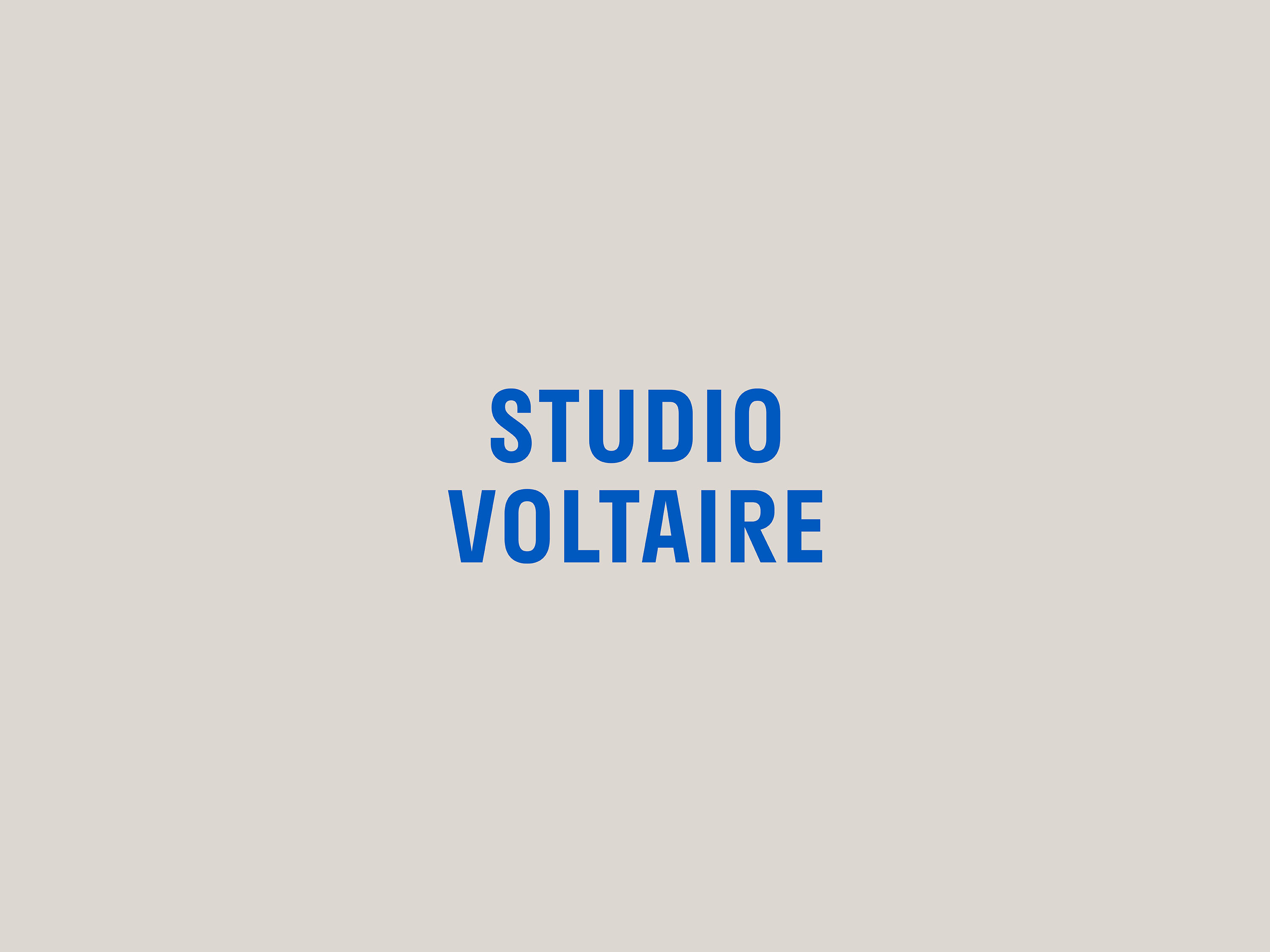
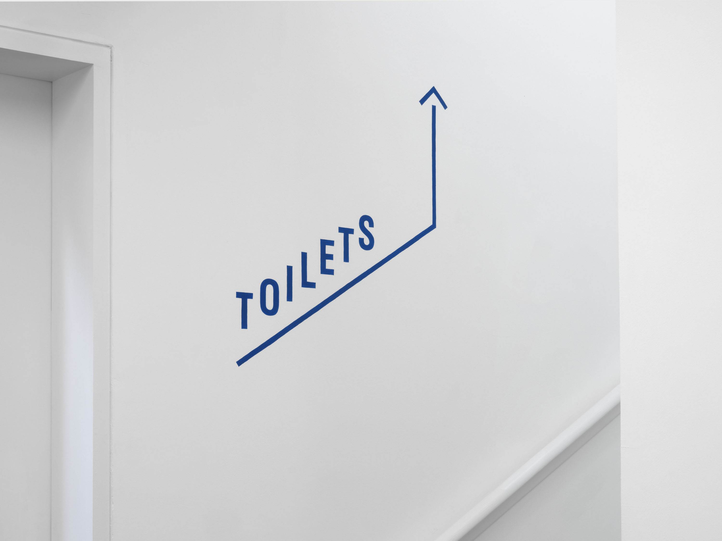
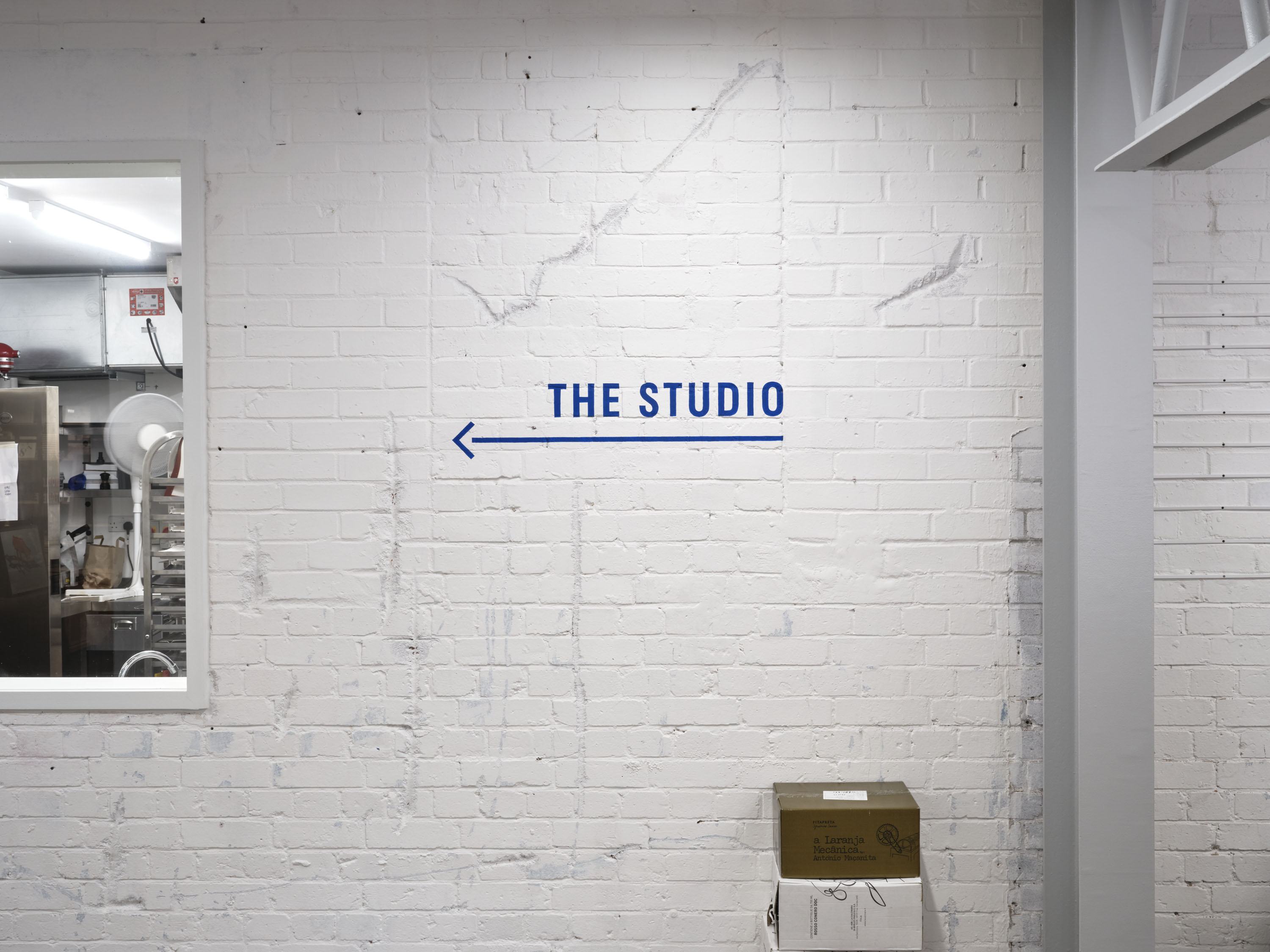
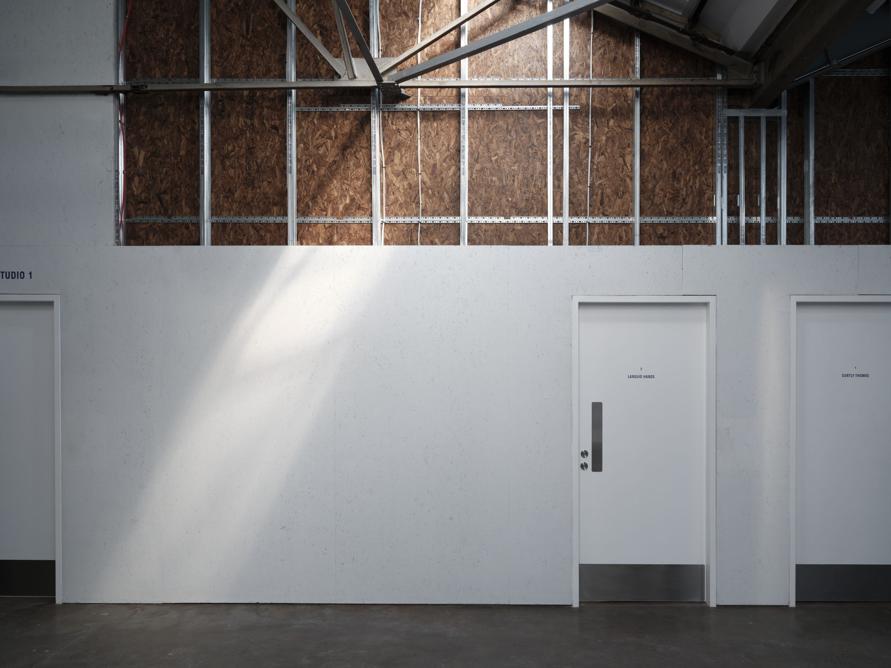
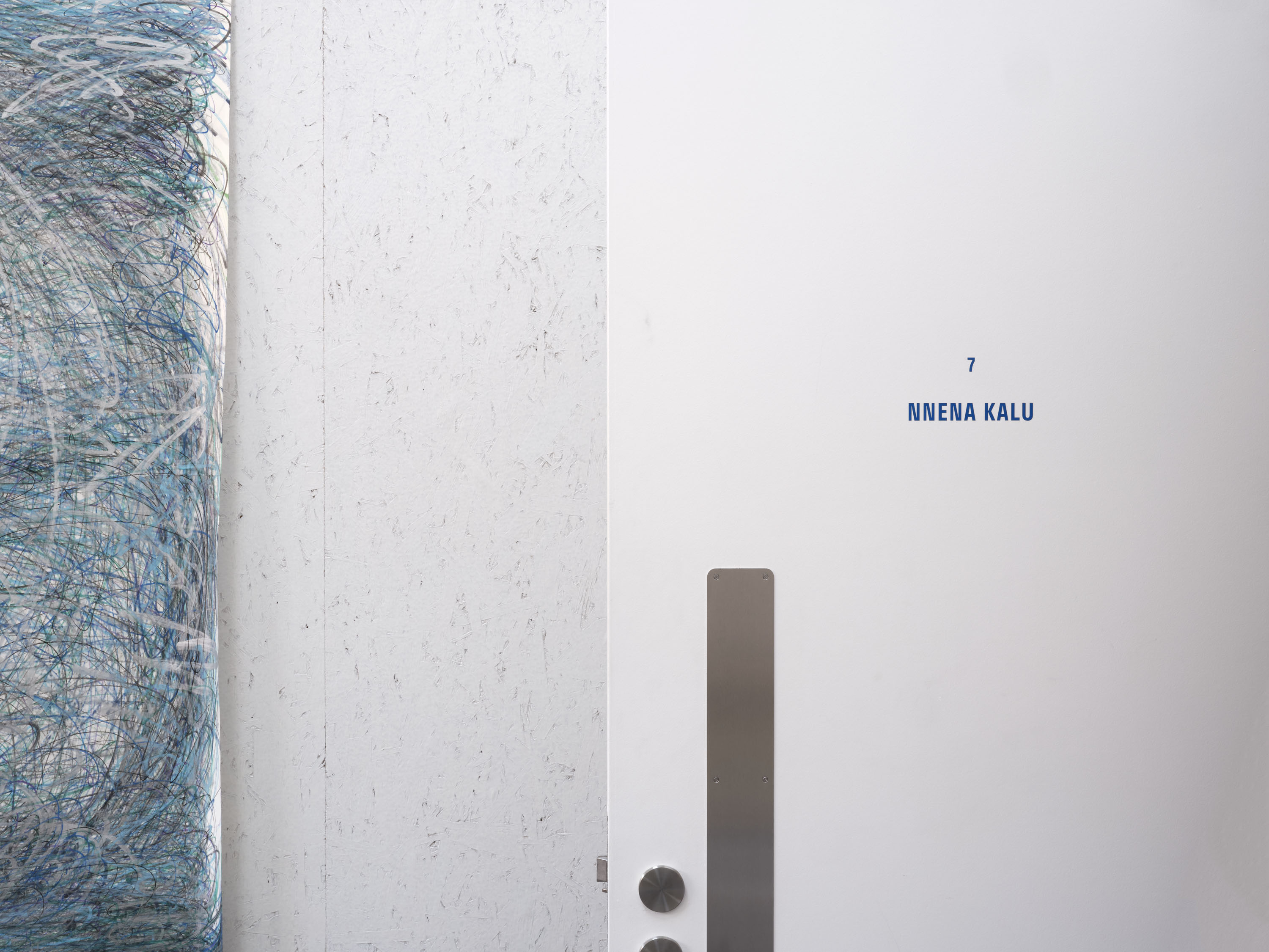
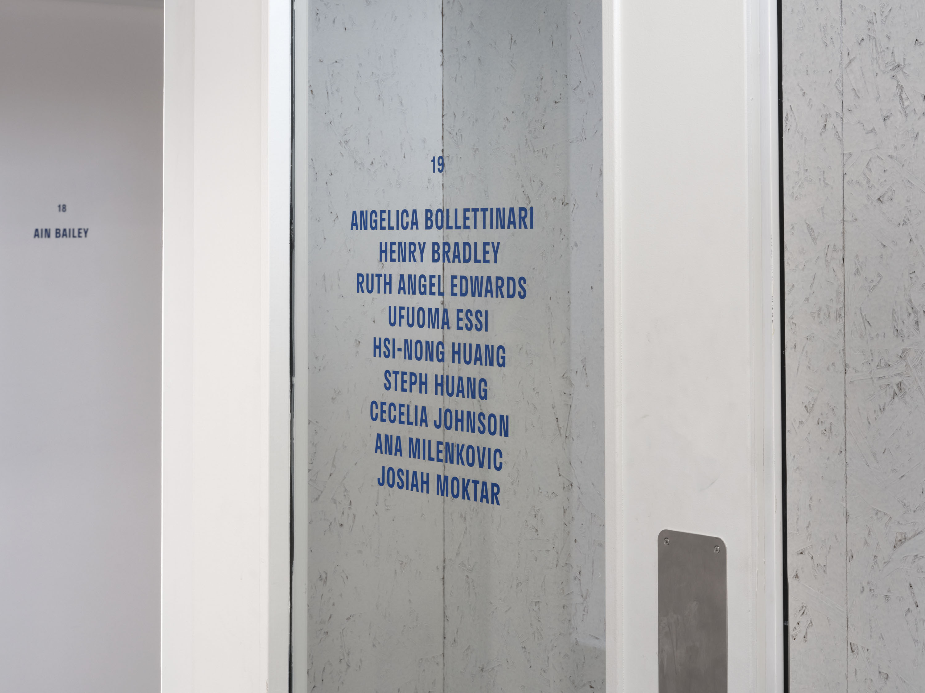
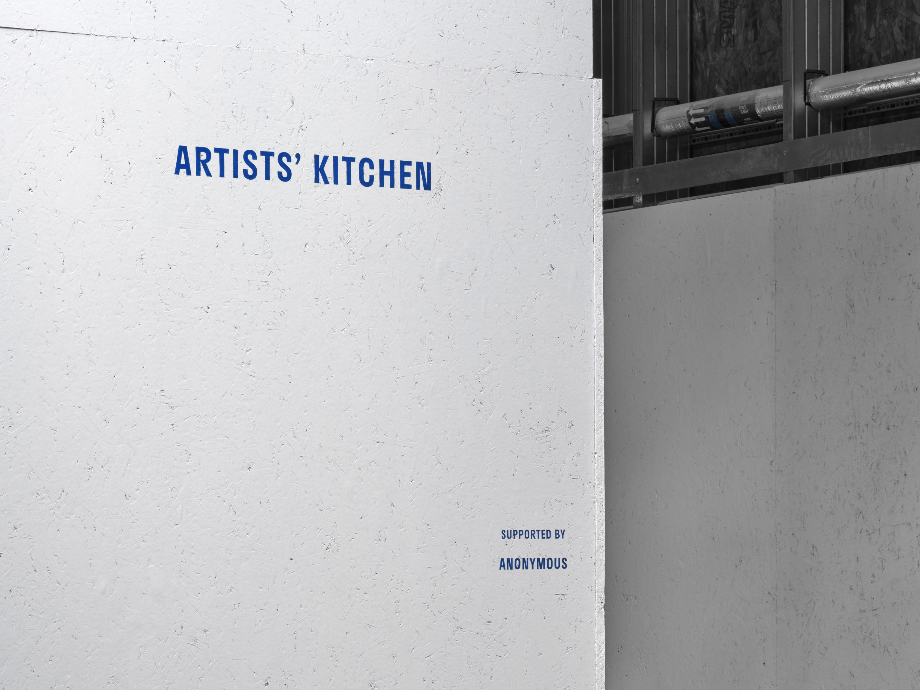
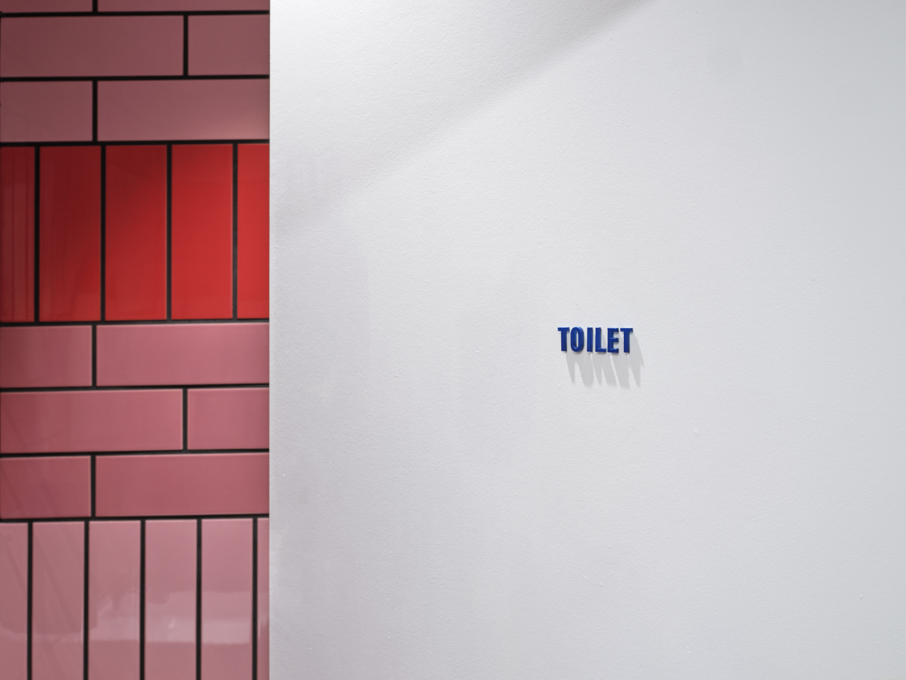
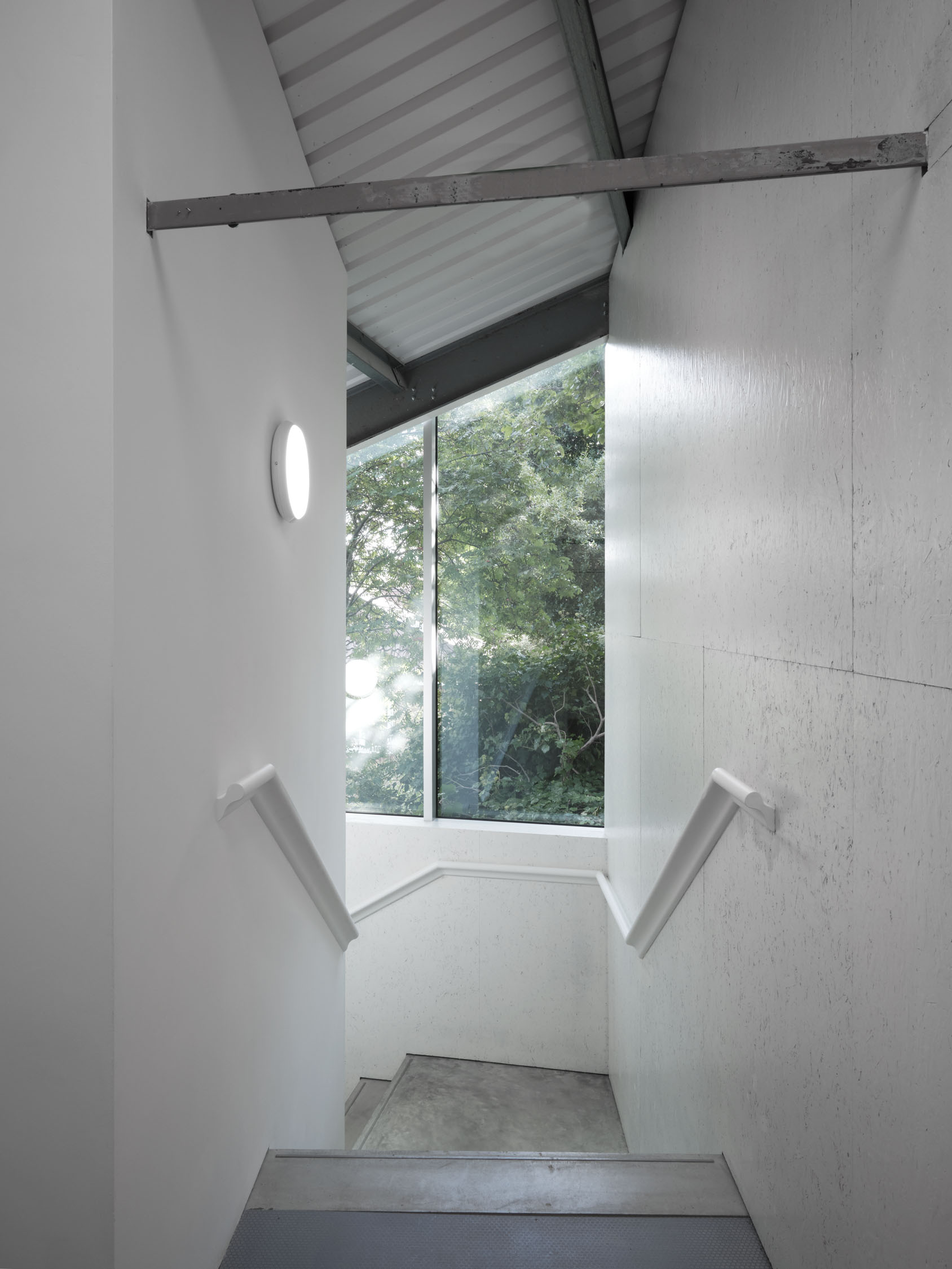
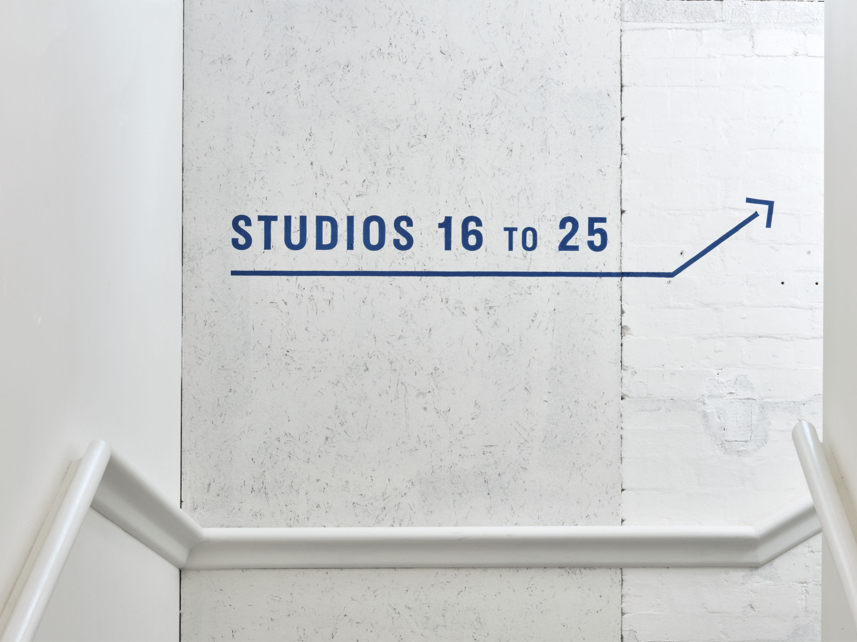
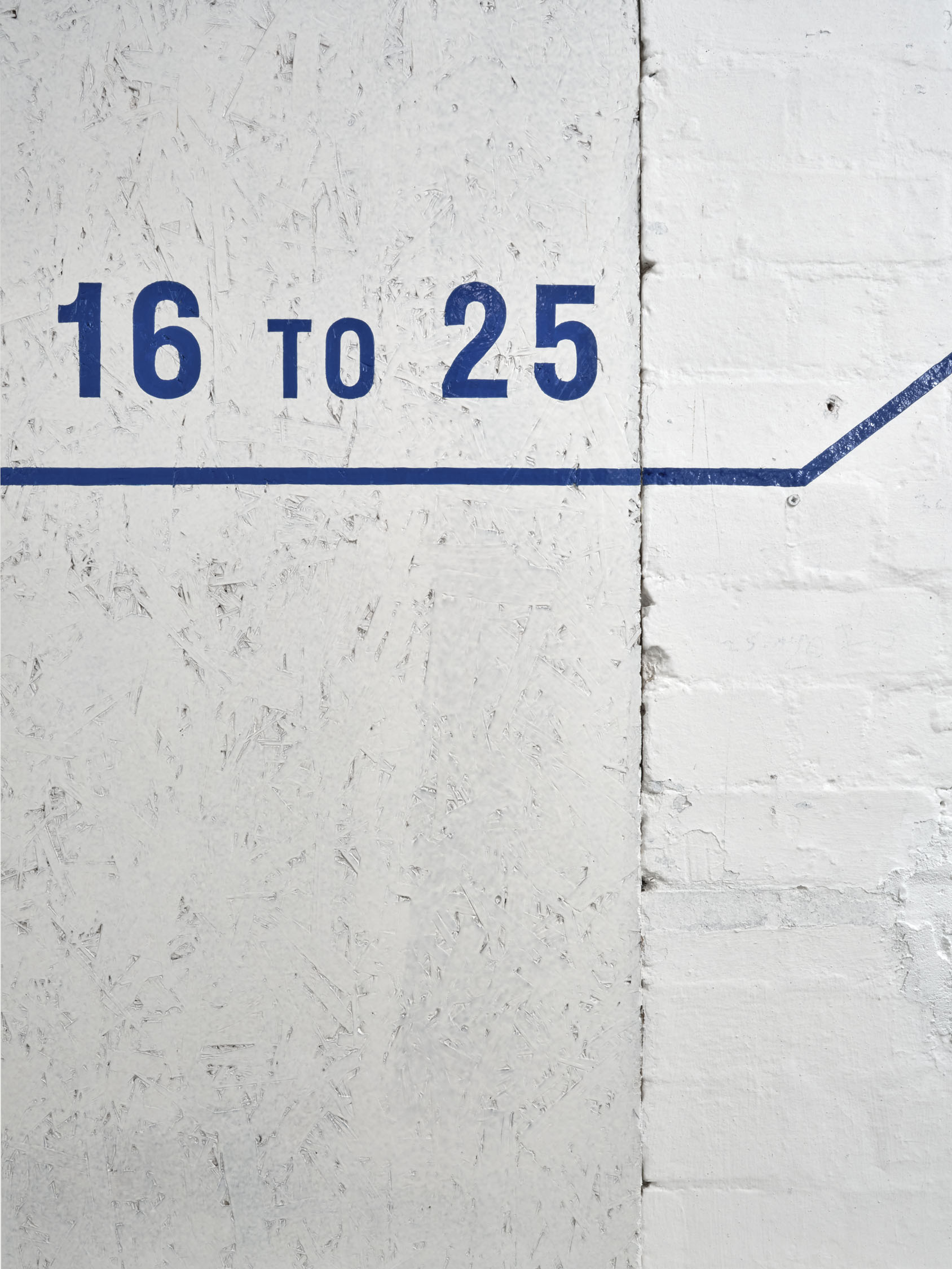
The new logotype evolved from the previous stamp-like marque, retaining the distinctive and tactile character of its condensed sans-serif typography. The use of upper-case letters in the logotype and the signature blue colour emphasise the connection between the identity and its former industrial building, with the blue referencing the painted steel structures found within Studio Voltaire. The identity’s subversion of vernacular language is expanded through applications on-site. Signage prioritises industrial materials and straightforward processes through the use of powder-coated metal and graphics hand-painted directly onto surfaces.
The website we designed for Studio Voltaire extends this visual identity into a digital context, using condensed san serif typography and a bright colour palette throughout. By prioritising large-scale imagery and multi-media, the website offers wider access to Studio Voltaire’s non-profit activities and resources. See the full site here.
The project continues a long-standing collaboration between Studio Voltaire and APFEL, which began in 2008 and also encompassed the design of the previous Studio Voltaire identity and the identity for House of Voltaire in 2010.
This project was recognised with a Royal Institute of British Architects London Award 2023.
Photography: Thomas Adank


