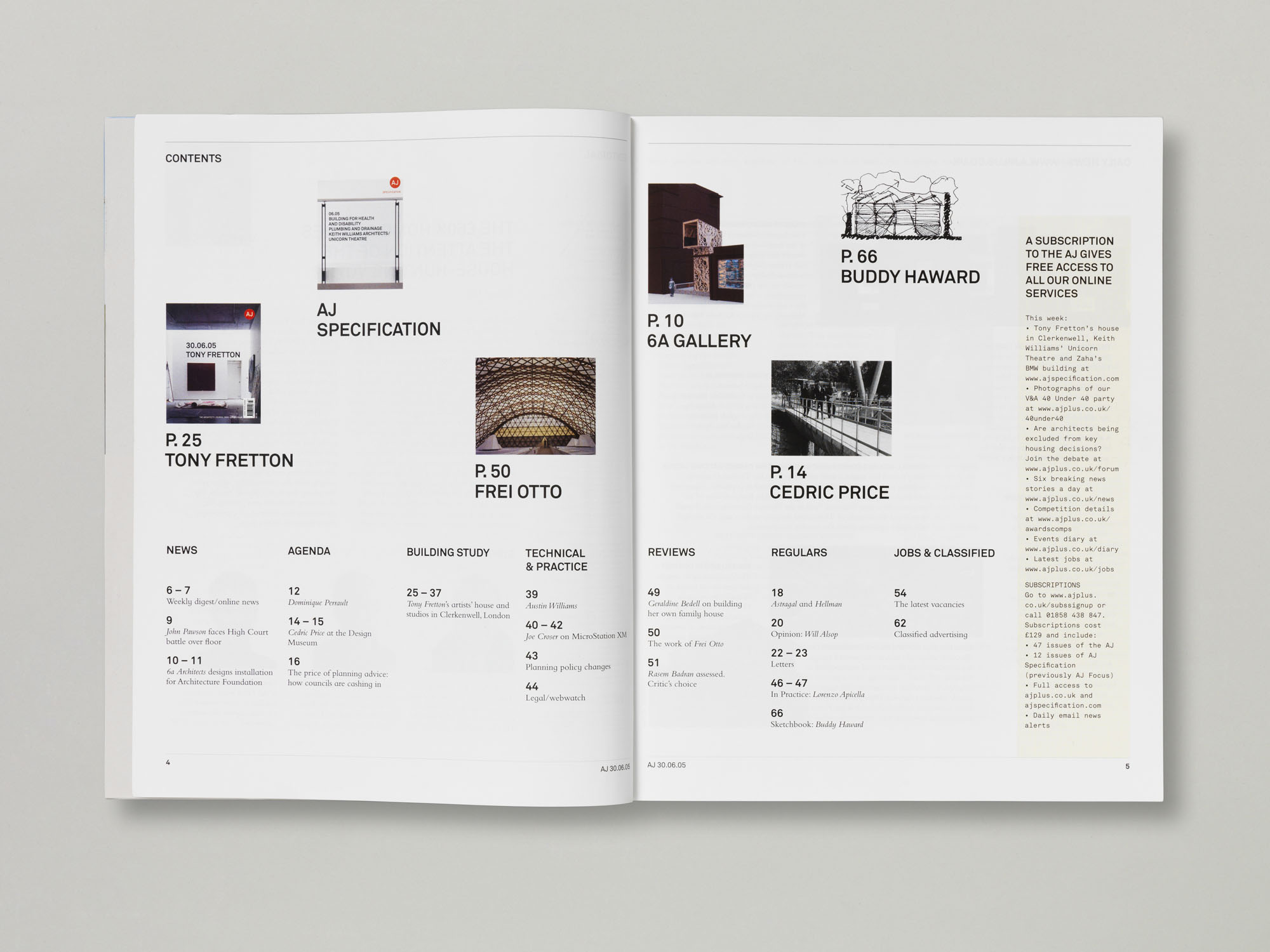

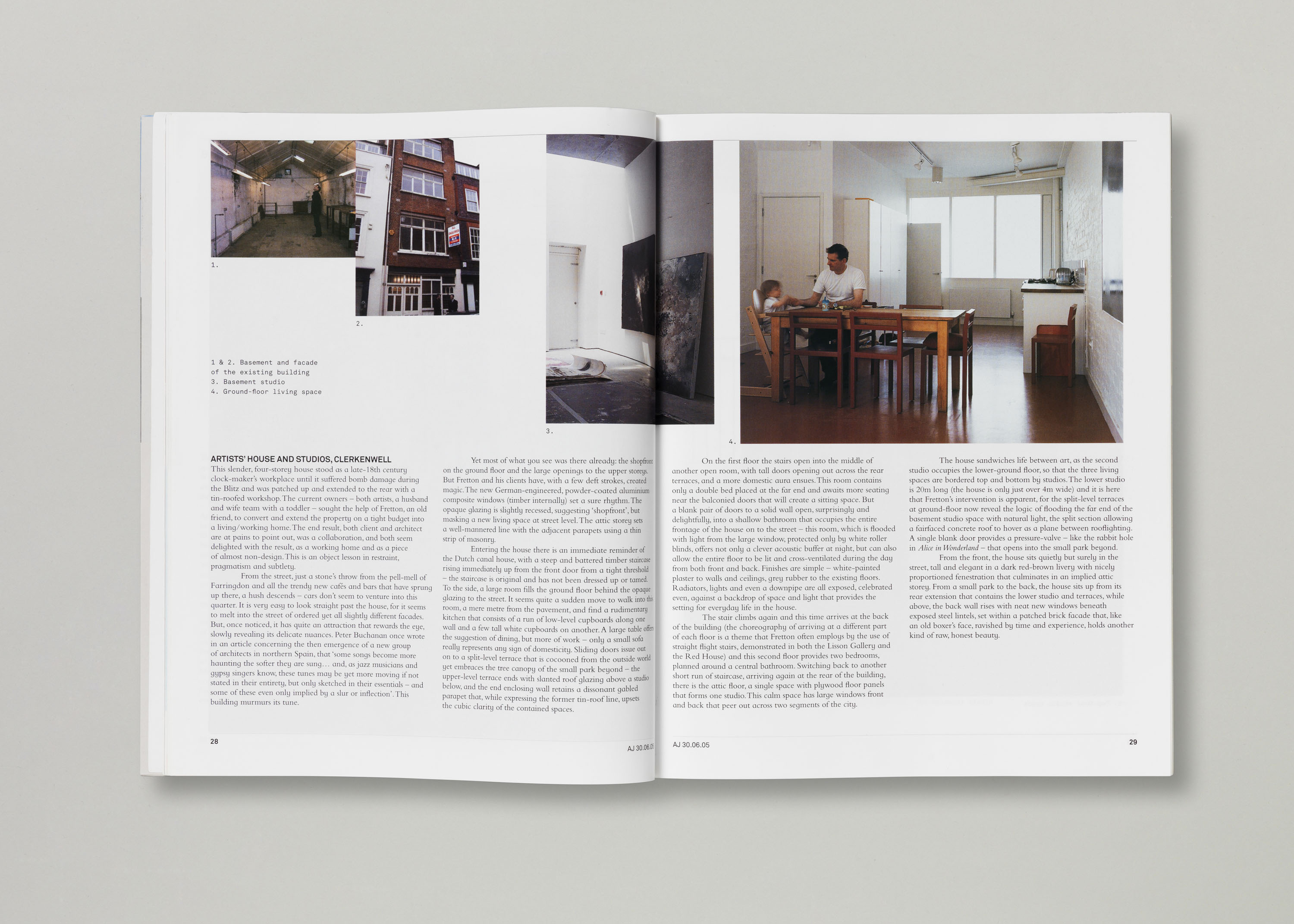
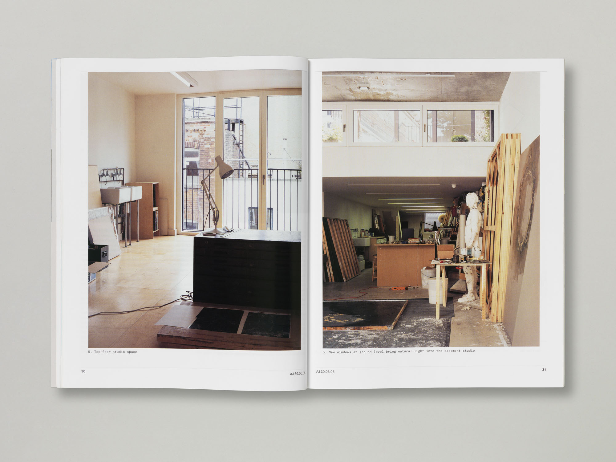
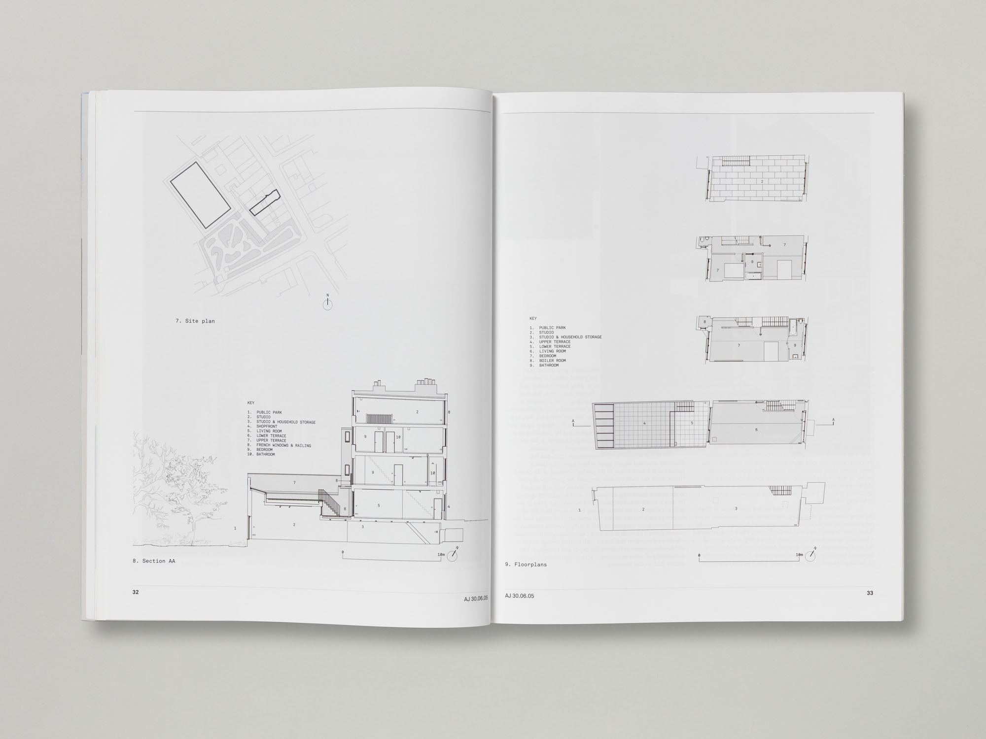
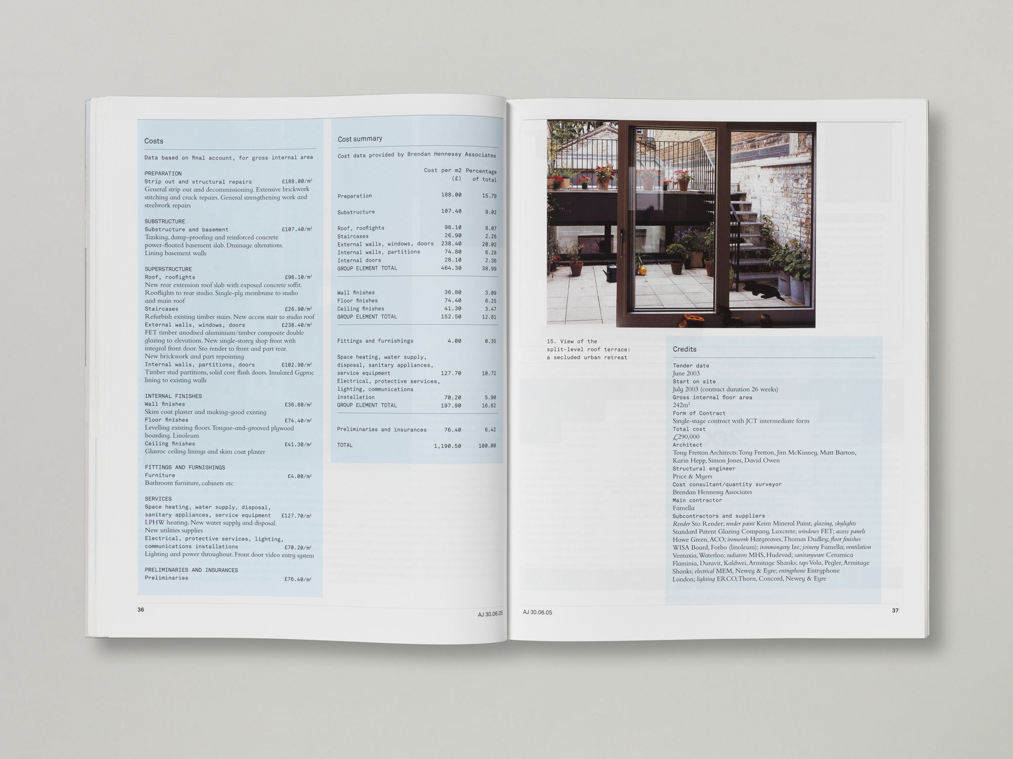
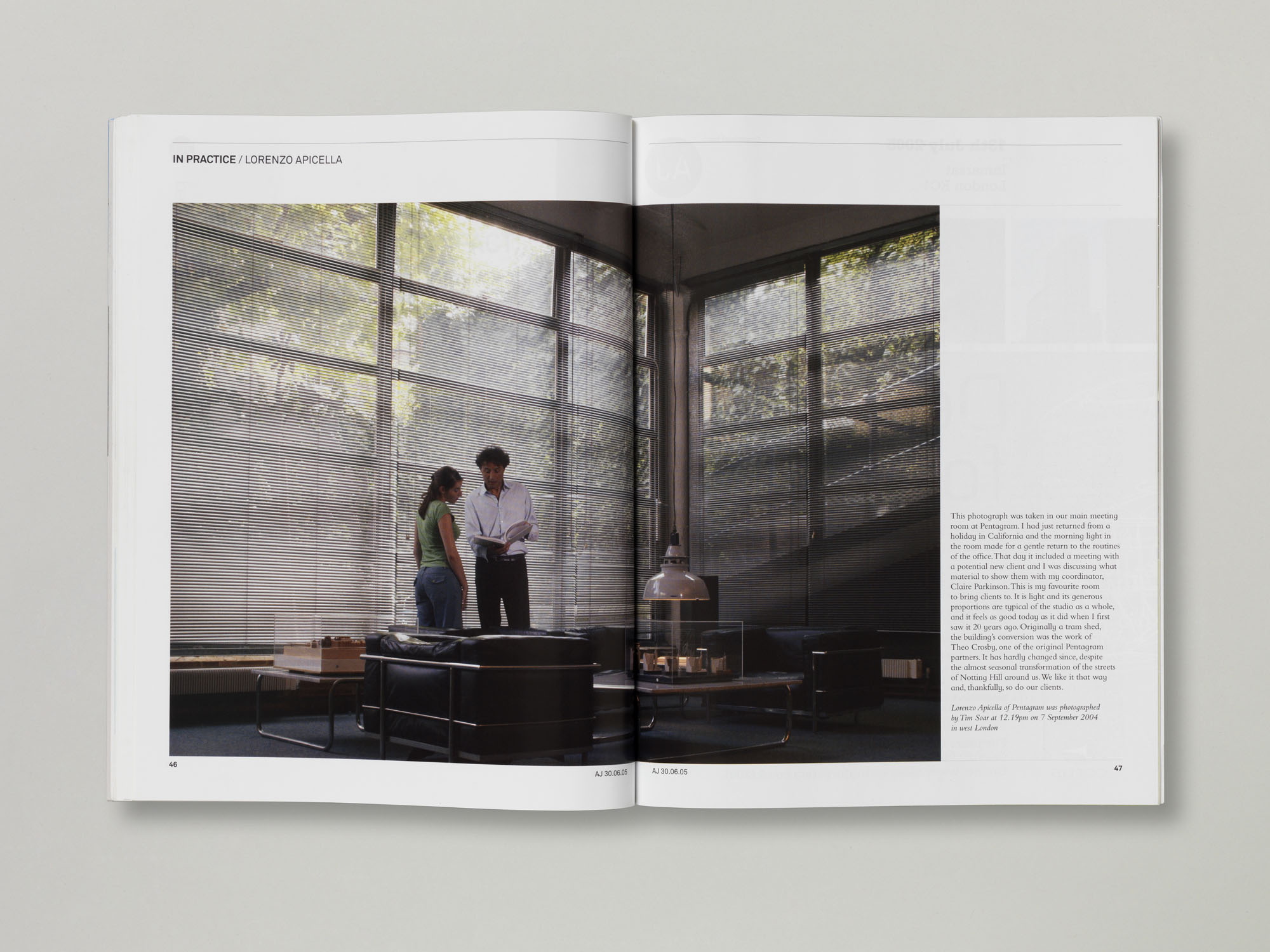

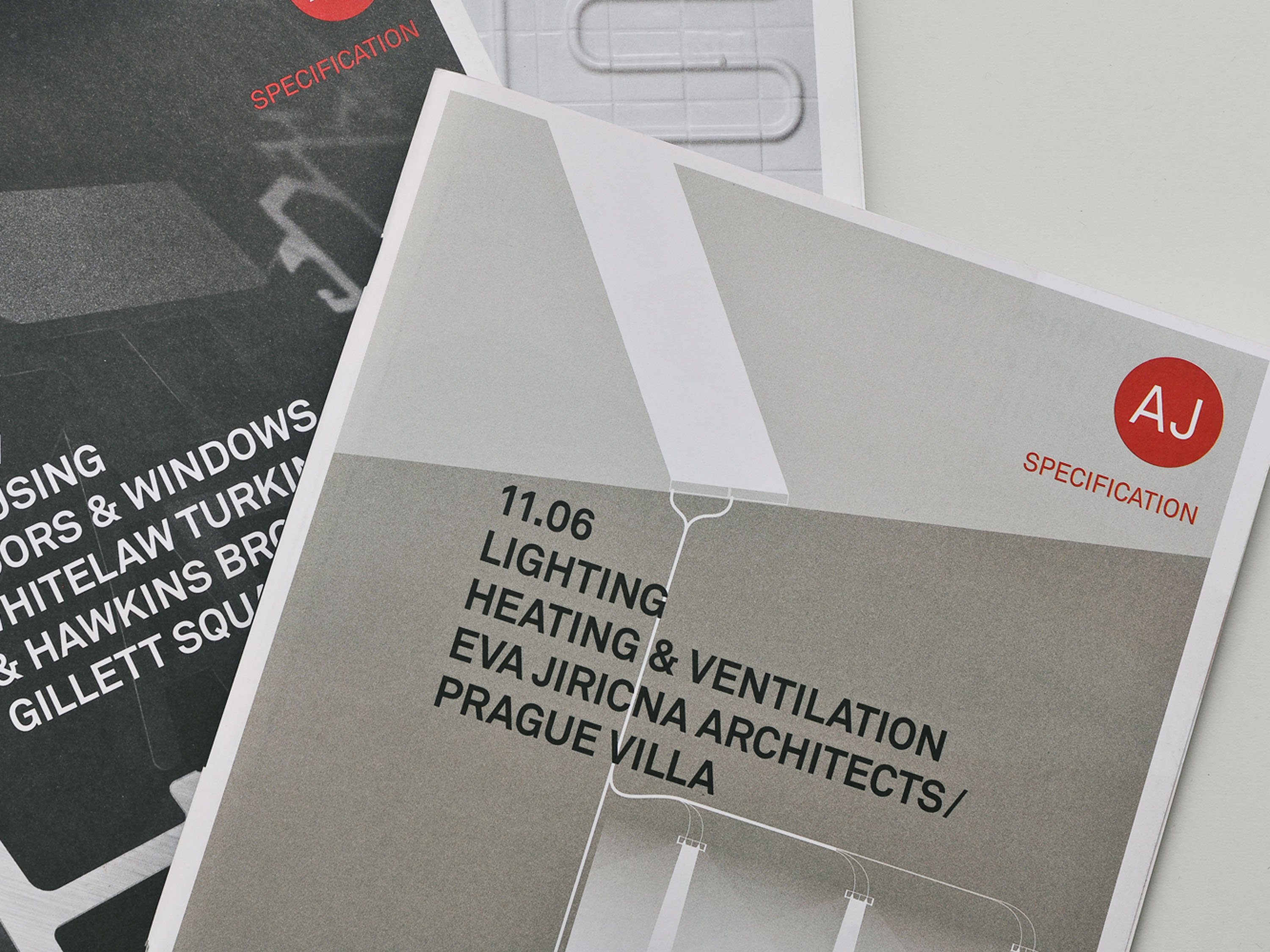
With the redesign of the AJ Magazine and AJ Specification, our ambition was to present the editorial content with a clarity and simplicity that it had previously lacked. We paired the journal’s straightforward language and tone with a clear yet random layout of images, creating an ephemeral look which complimented its overall editorial position. The design reflected several ideas that the Editor, Isabel Allen, was keen to foreground through the journal’s content – for example, showing a building in its progressive state from sketches and plans, through to the finished build.
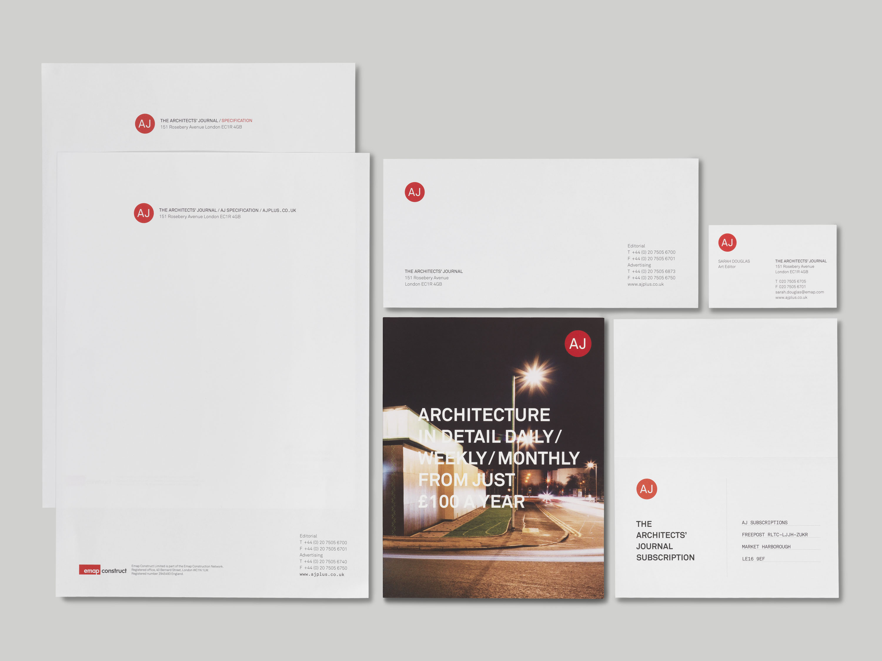
At some points, the images overlap each other, and at others they hang from a line as though pinned up on a wall. We chose a sans-serif typeface, Akkurat, for the logo and layouts, reinforcing the clean and unfussy character of all the elements. Together with Art Editor Sarah Douglas, we were nominated for the D&AD Best Redesign award in Magazine and Newspaper Design in 2006 for this project.
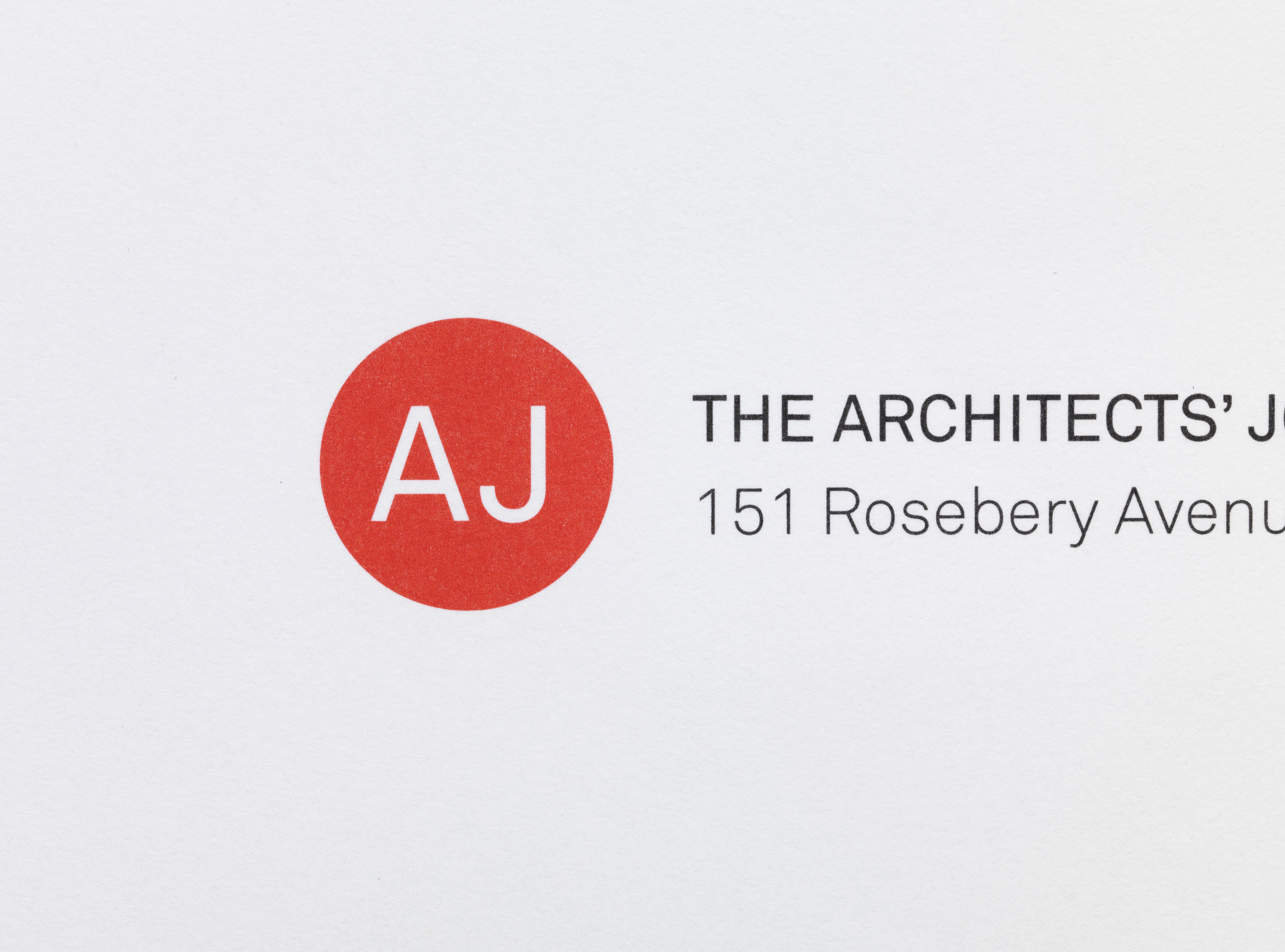
Akkurat typeface design by Laurenz Brunner. Newly released when the project was underway in 2004, our redesign of AJ was the first time the typeface was used in the UK.