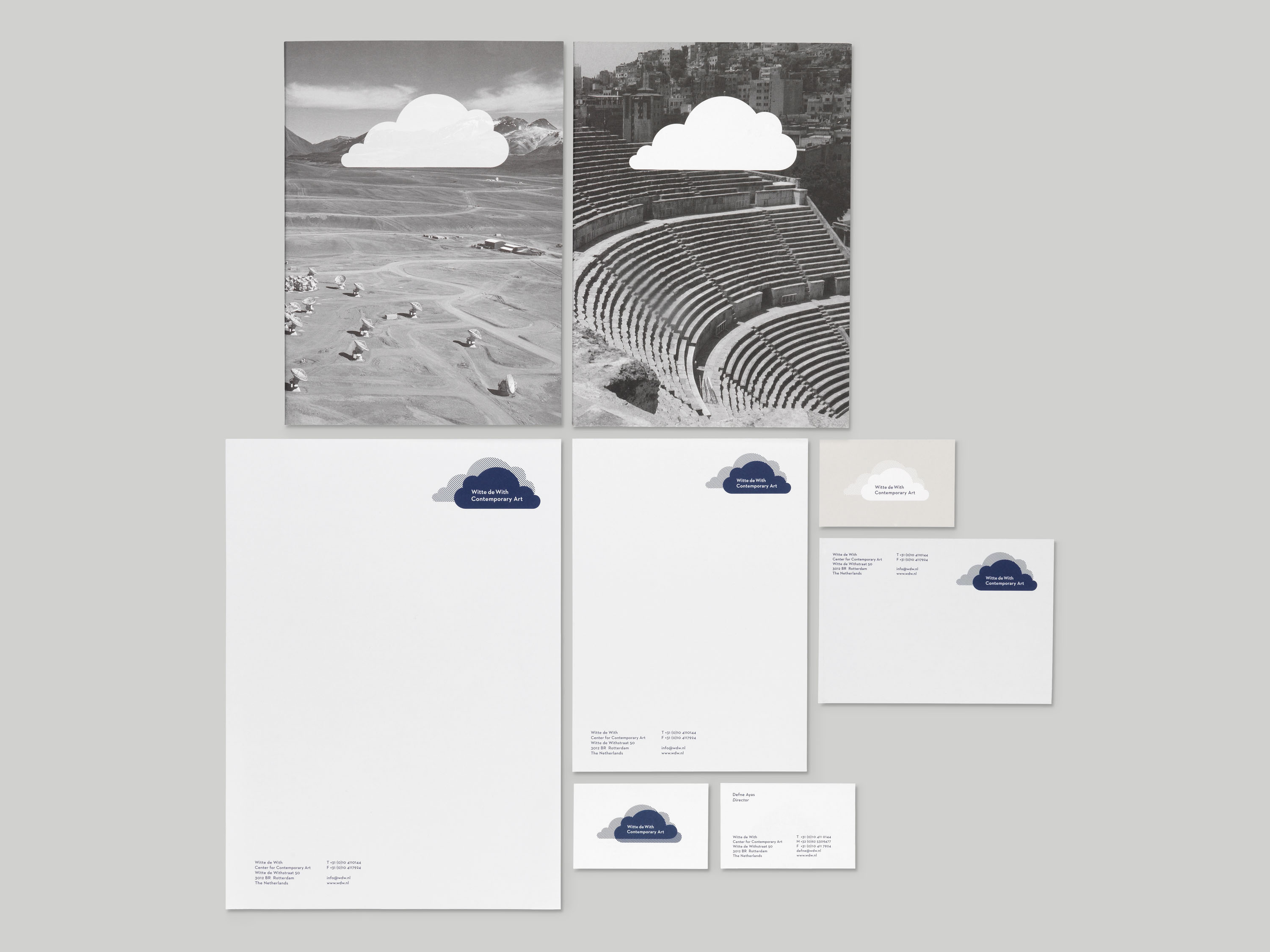
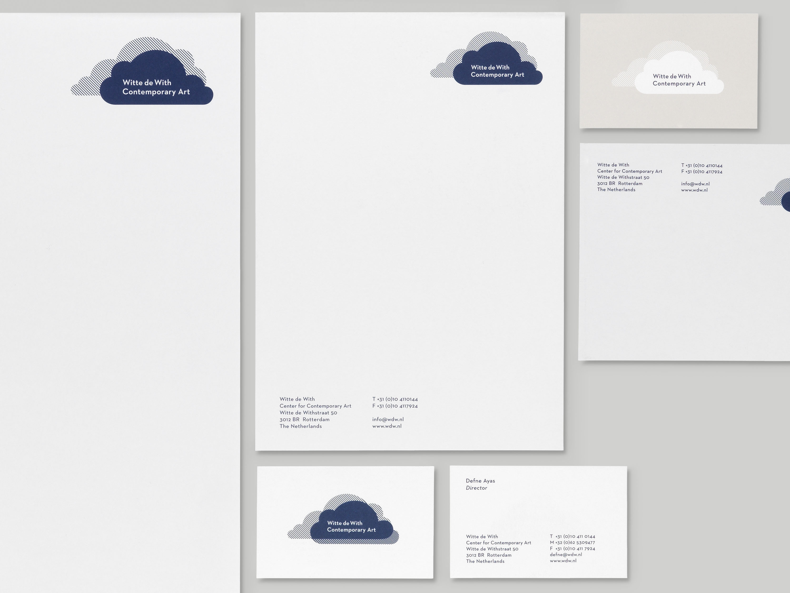
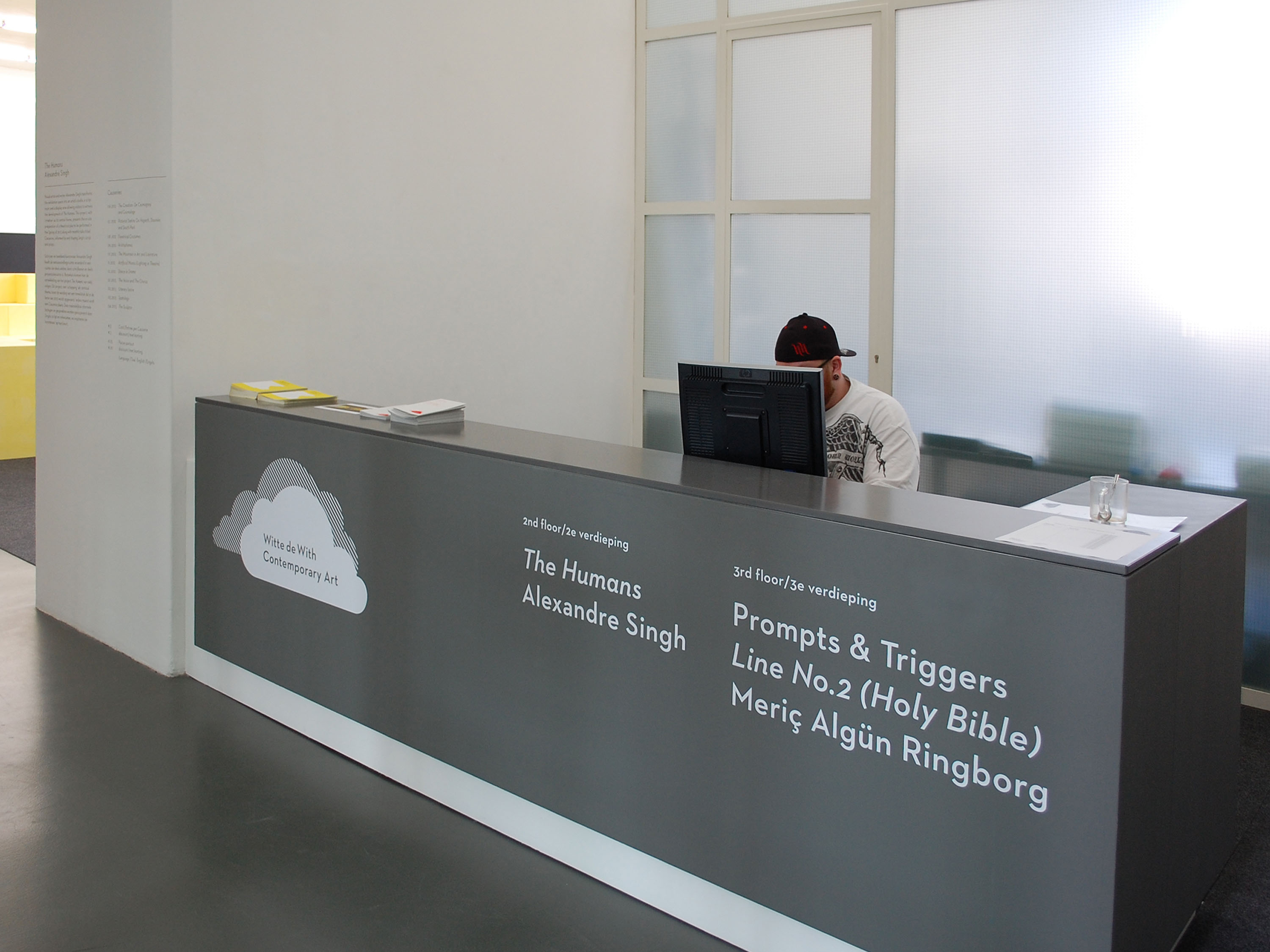
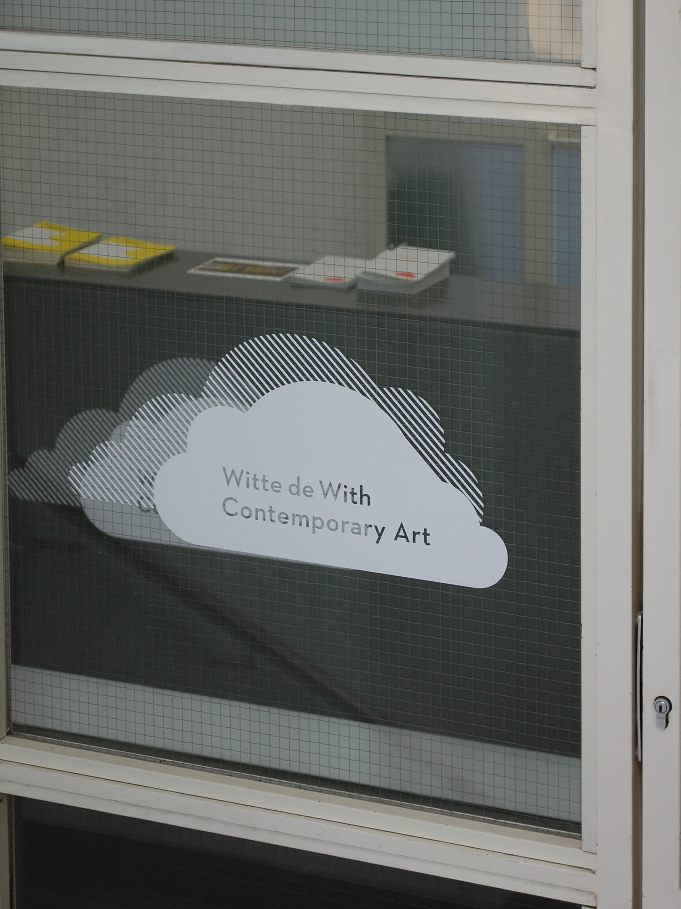
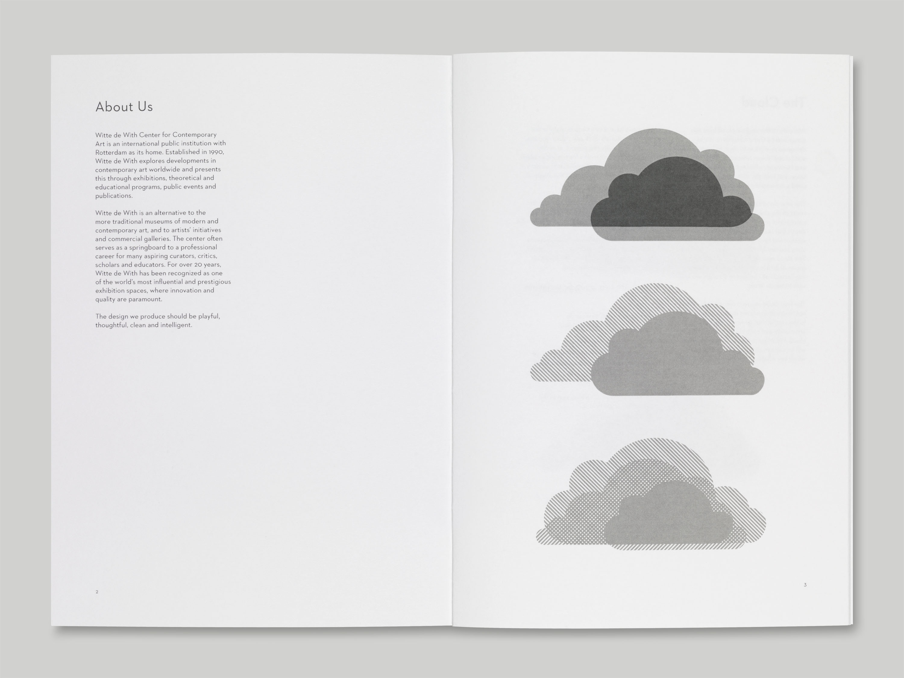
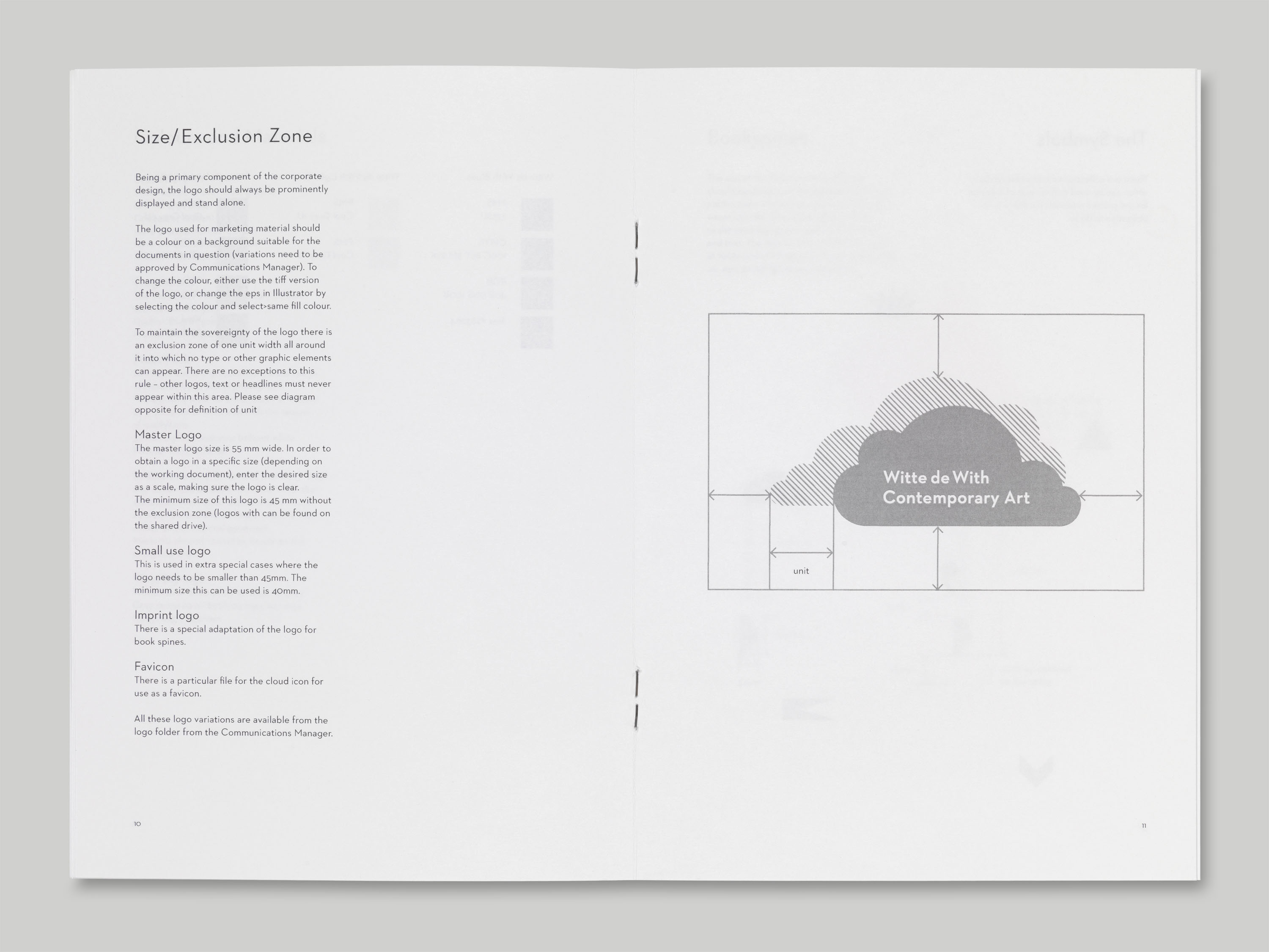
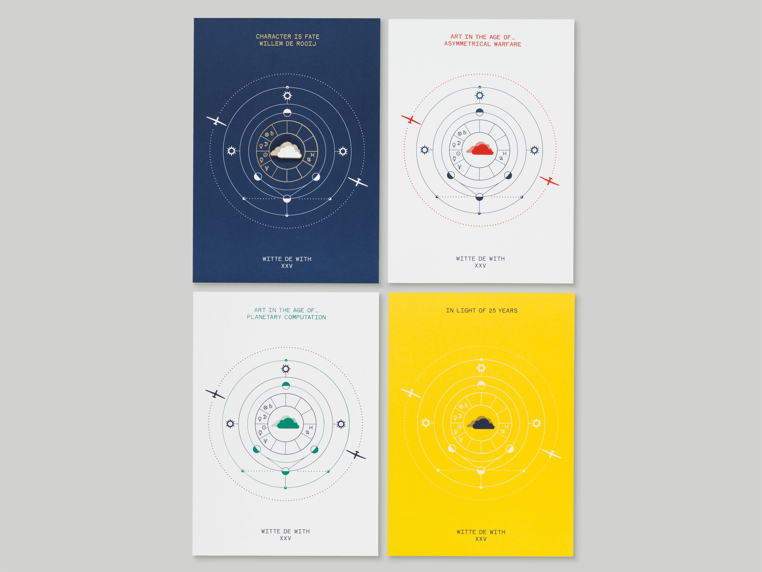
We were commissioned to develop a new visual identity for the Witte de With Center for Contemporary Arts in Rotterdam, after the appointment of Defne Ayas as Director in 2012. The new logotype represents Witte de With’s current role as both an institute and a wider cloud platform of artists, thinkers, writers, curators and designers. It is multi-dimensional yet legible, and works at multiple sizes.
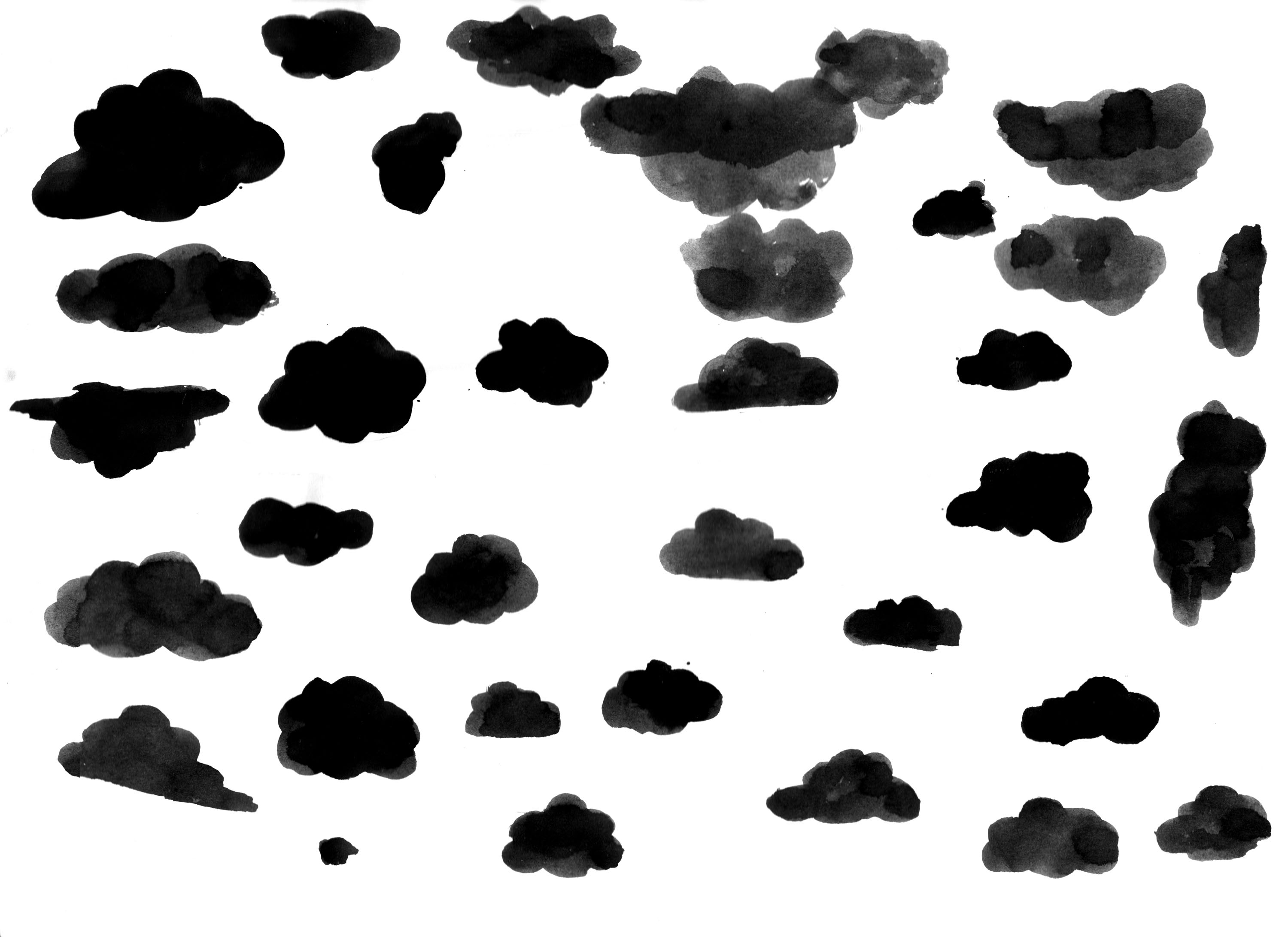
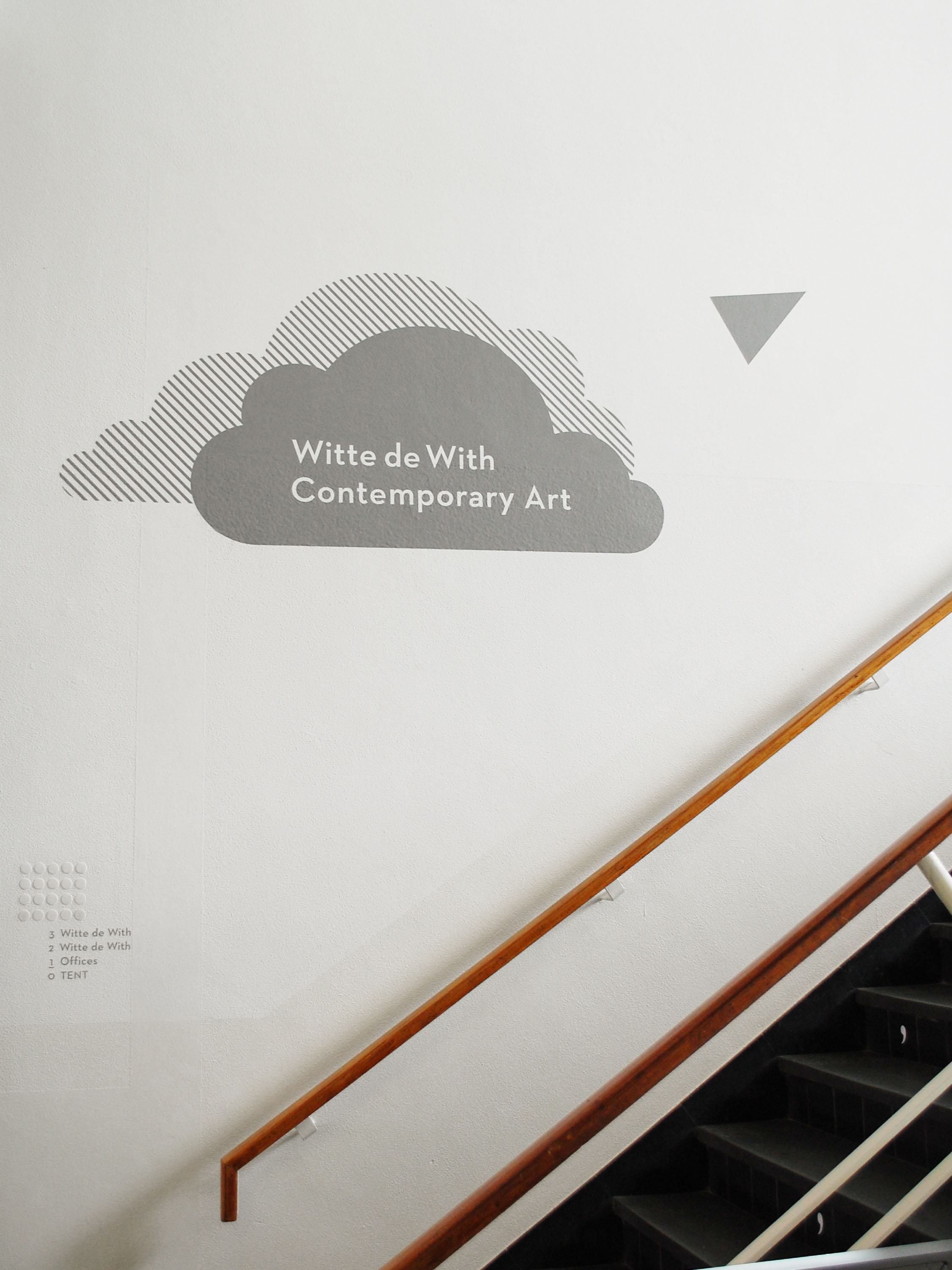
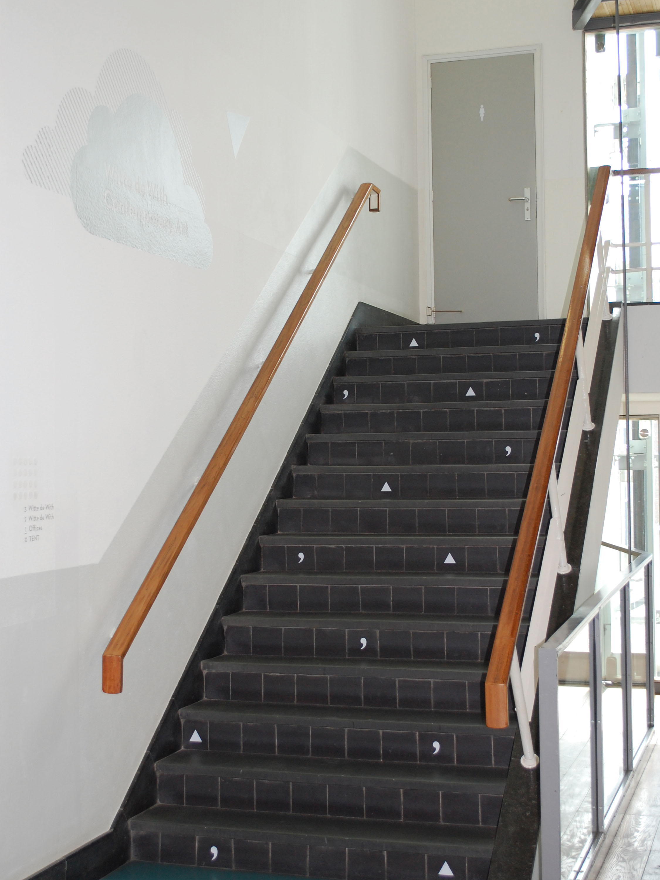
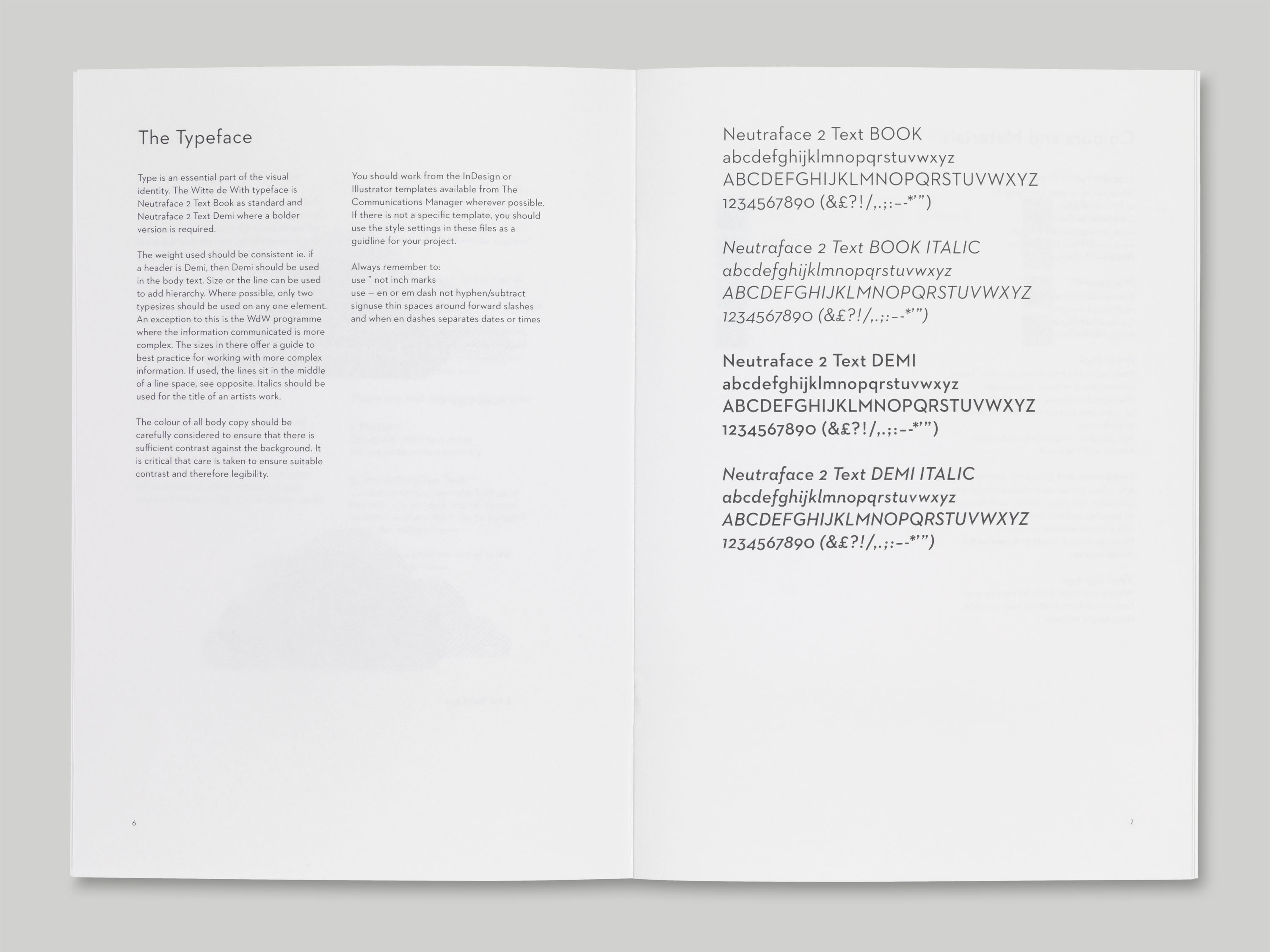
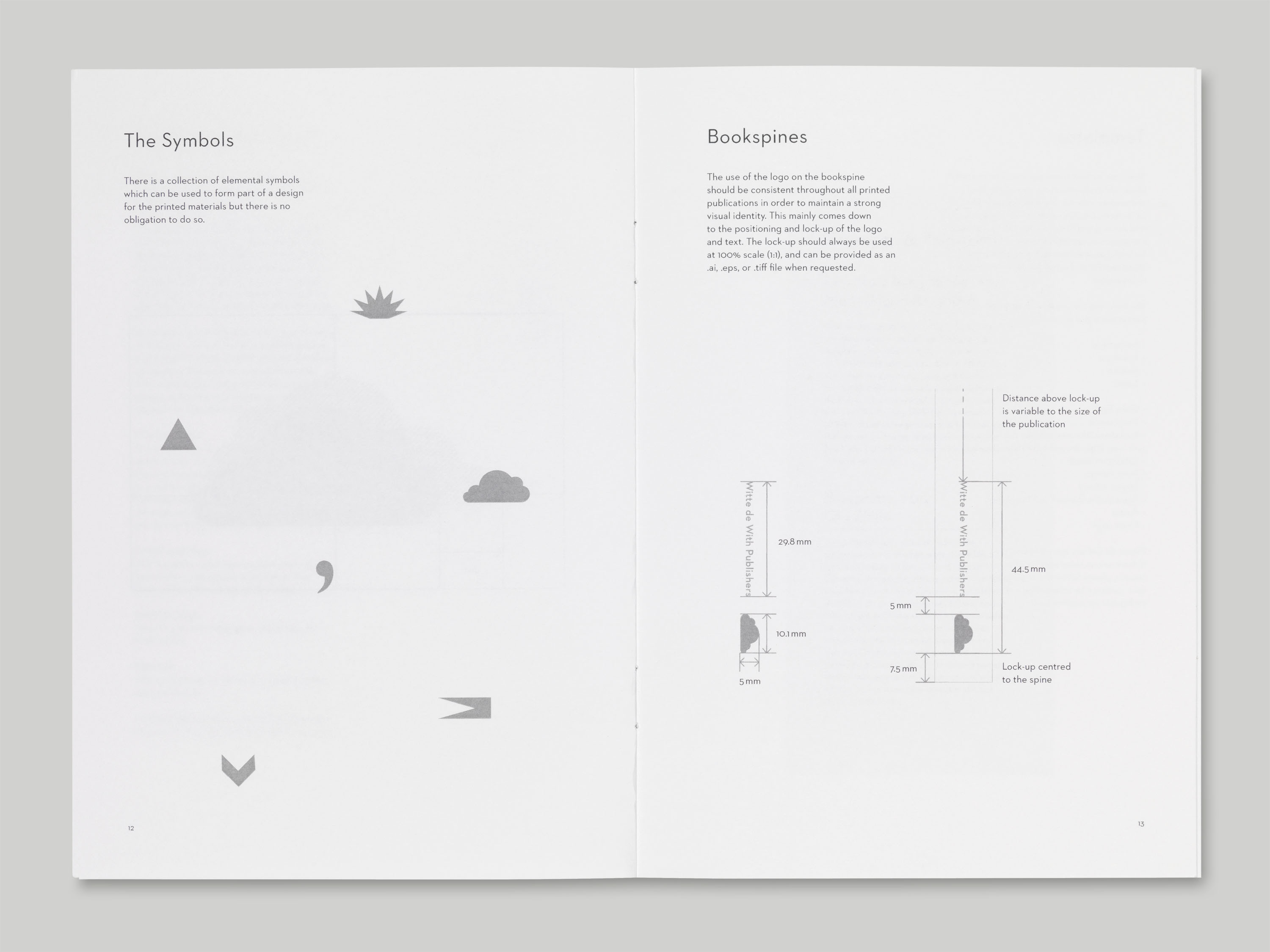
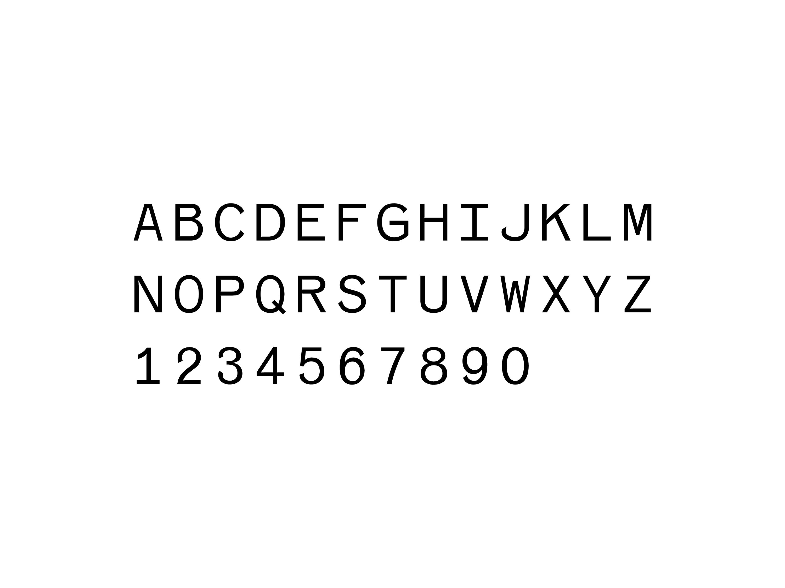
The layered design reflects the depth and atmosphere of clouds, and through this resemblance, alludes to the multidisciplinary aspect of the centre. The typeface used throughout, Neutraface, displays an appealing combination of linear geometry and an unmistakably warm and human feel. The signage we developed for Witte de With is formed of a collection of elemental symbols that lead visitors through the space. The symbols used throughout the signage grow throughout the architecture of the building and across the print and digital materials, functioning as abstractions of the cultural activities going on throughout Witte de With.
Our design is an evolution of Witte de With’s existing cloud emblem, which was originally designed by Gerard Hadders/Hard Werken in 1989.
Neutraface was designed by architect Richard Neutra and originally used for the signage of his buildings. The typeface supports over two dozen languages, which seemed appropriate for the forthcoming internationally-focused programme at Witte de With.