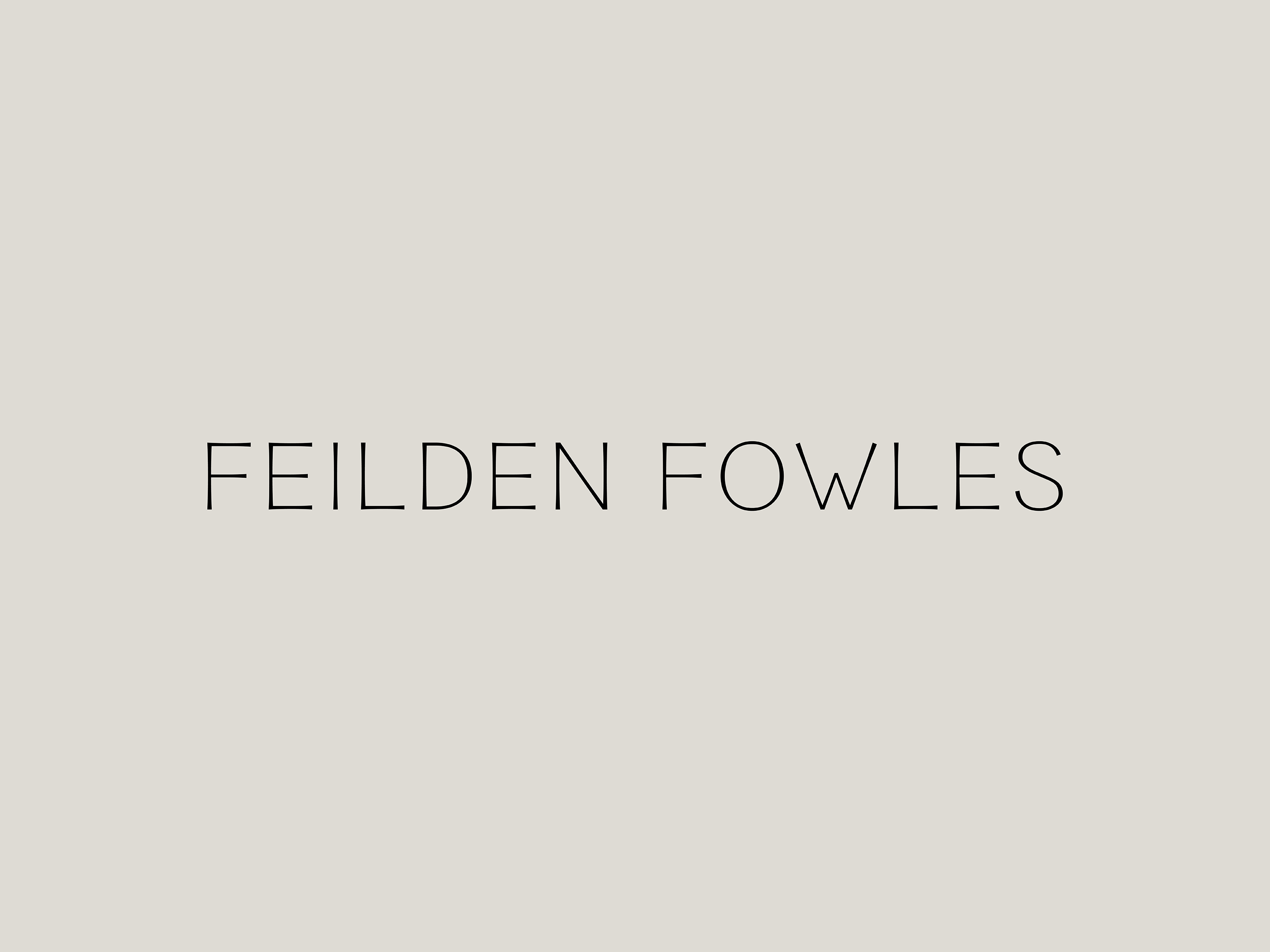
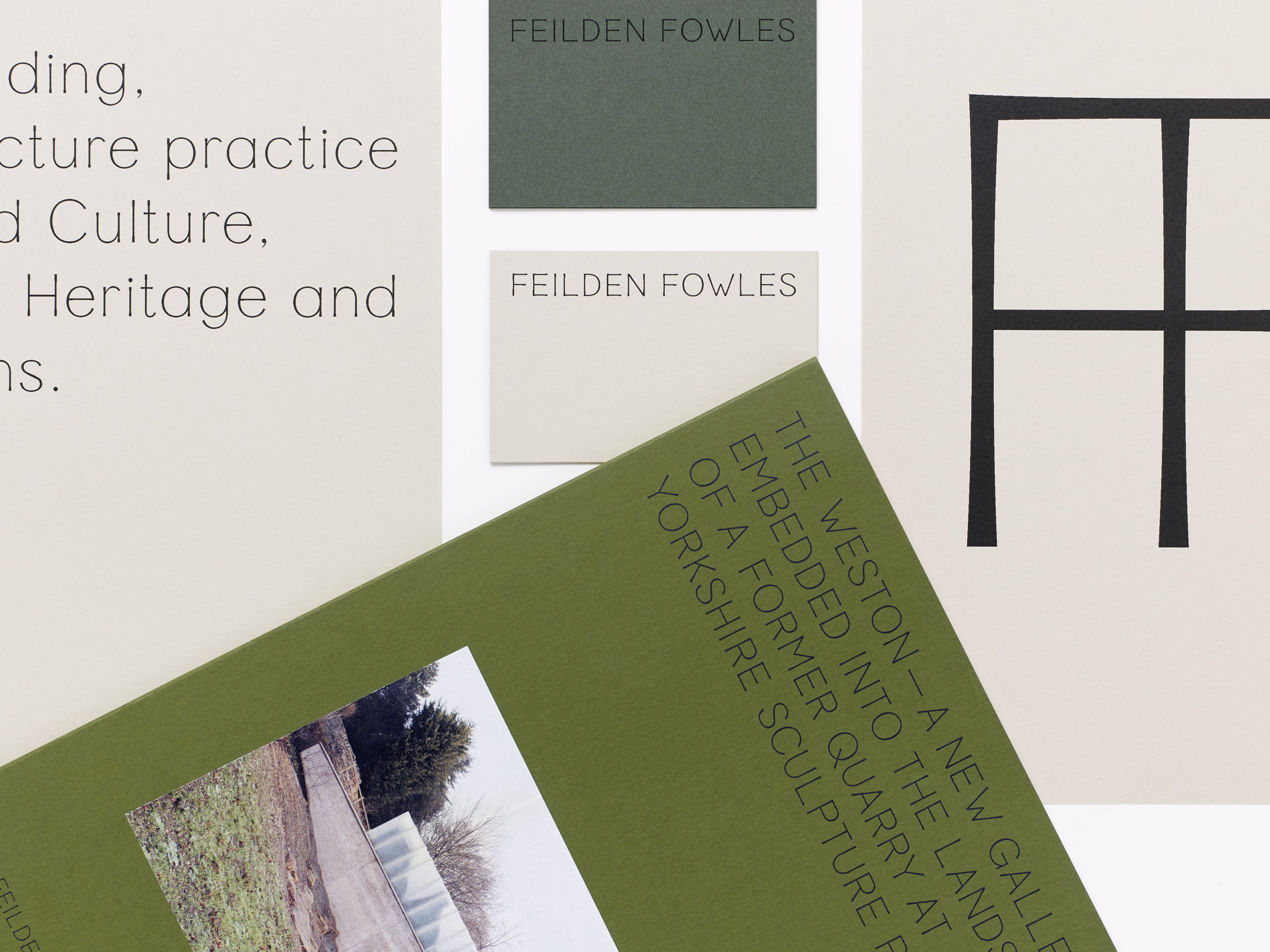
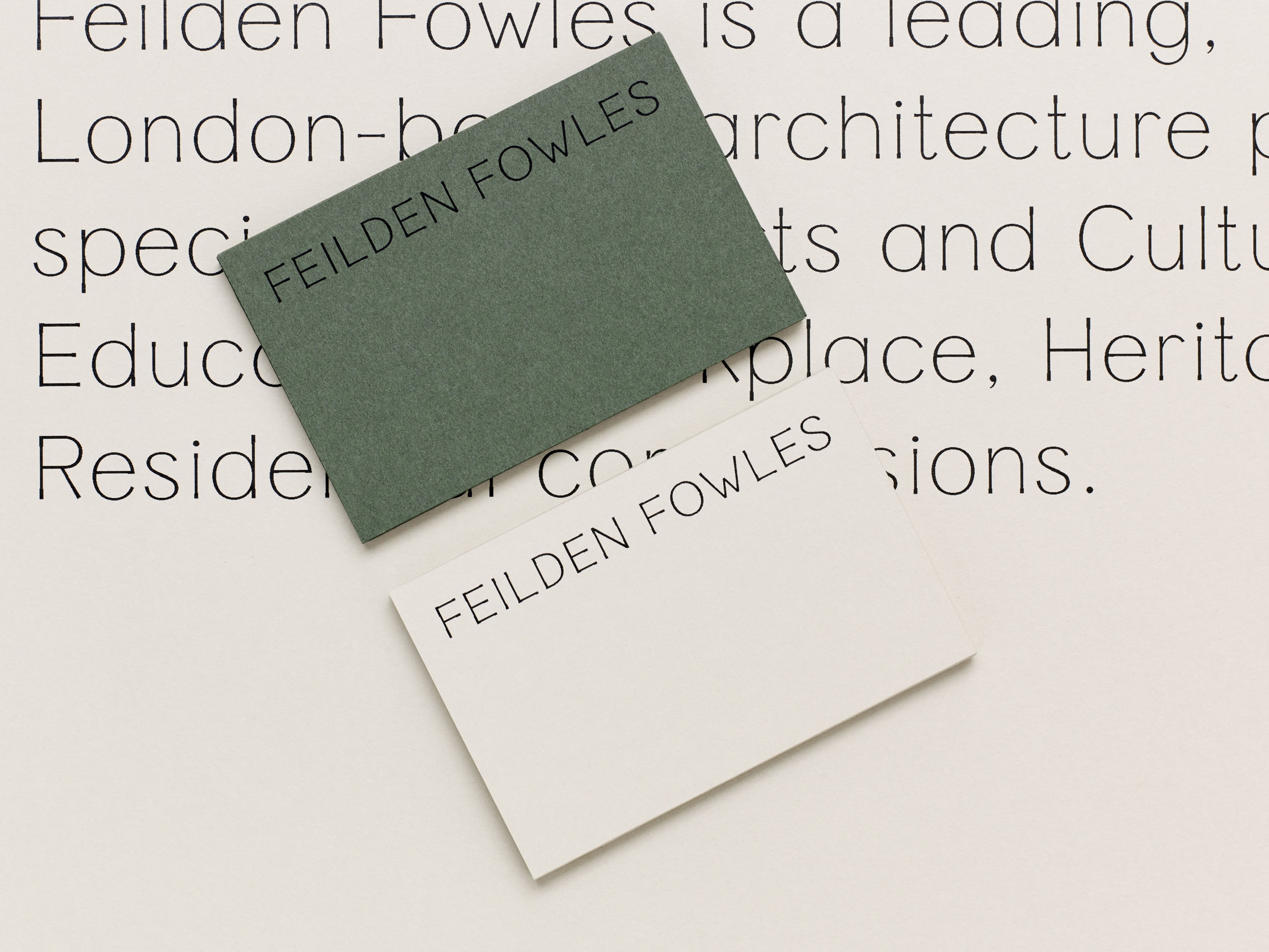
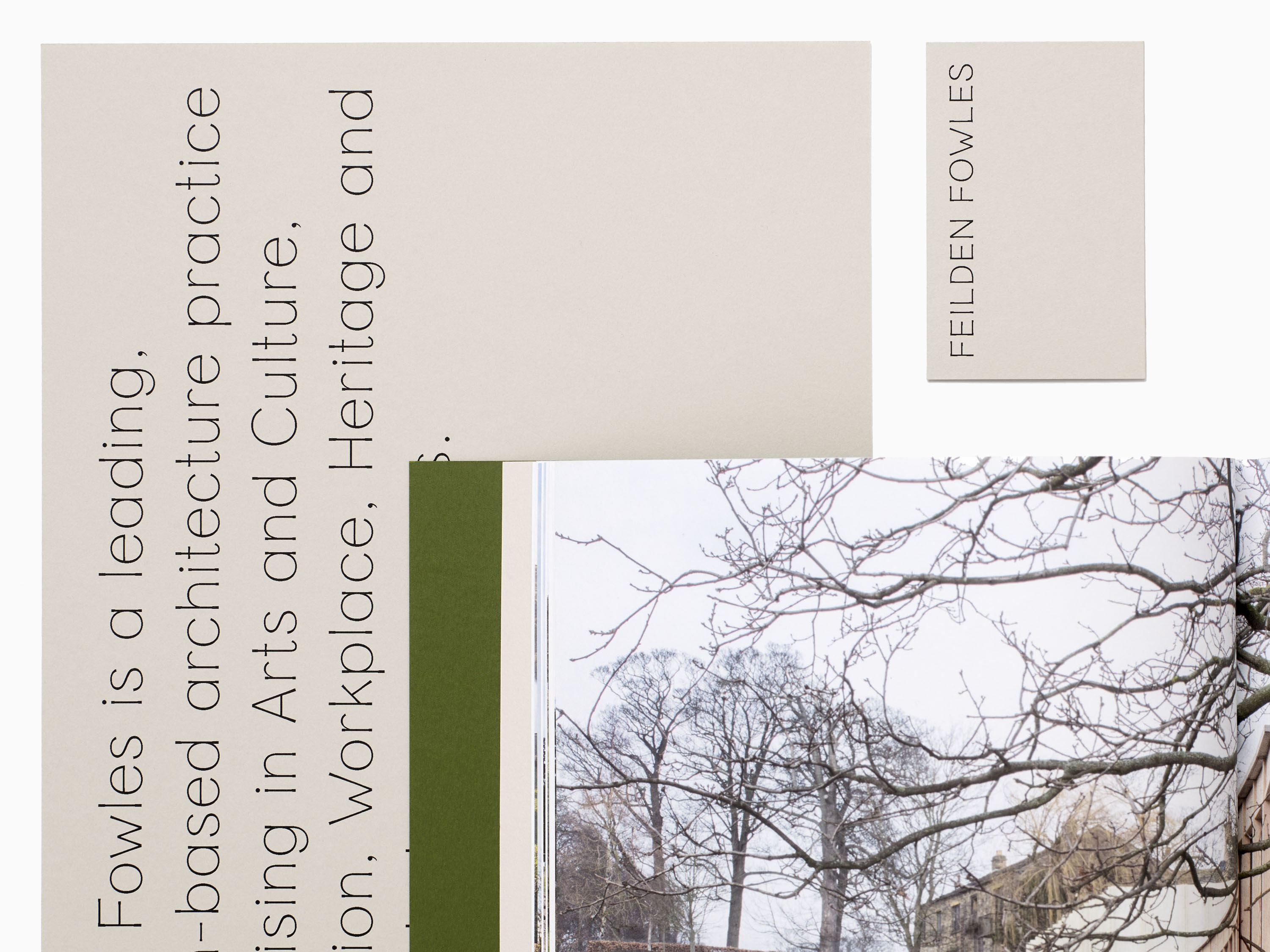
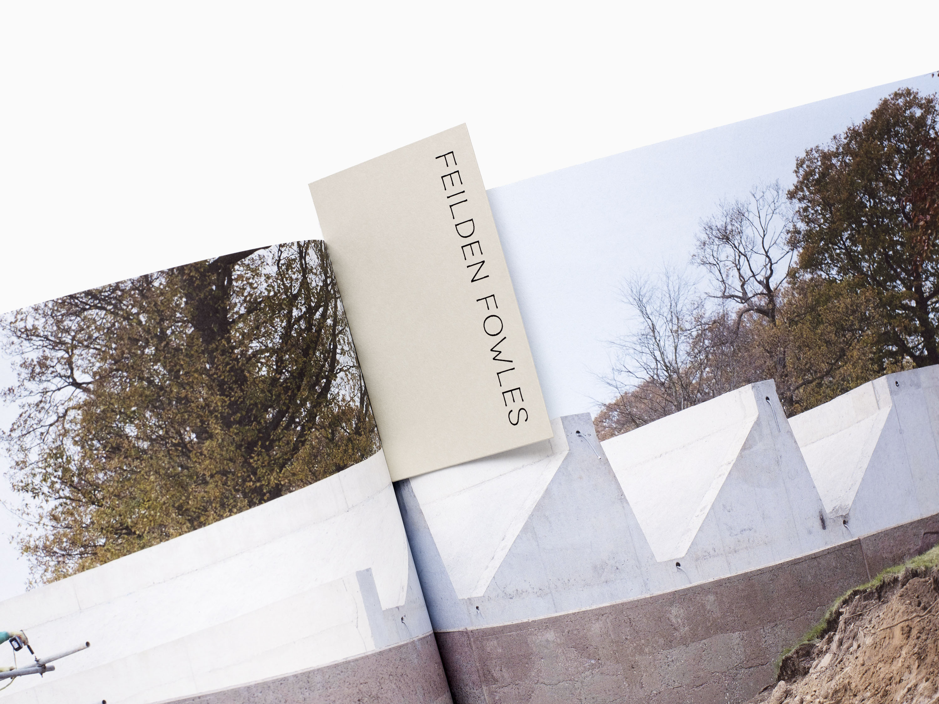
Feilden Fowles is a leading London-based architecture practice working within the culture, education, heritage and masterplanning sectors. We were commissioned to develop a new identity for the practice that would encapsulate their approach to design, with a focus on materiality and an emphasis on detailing and craft.
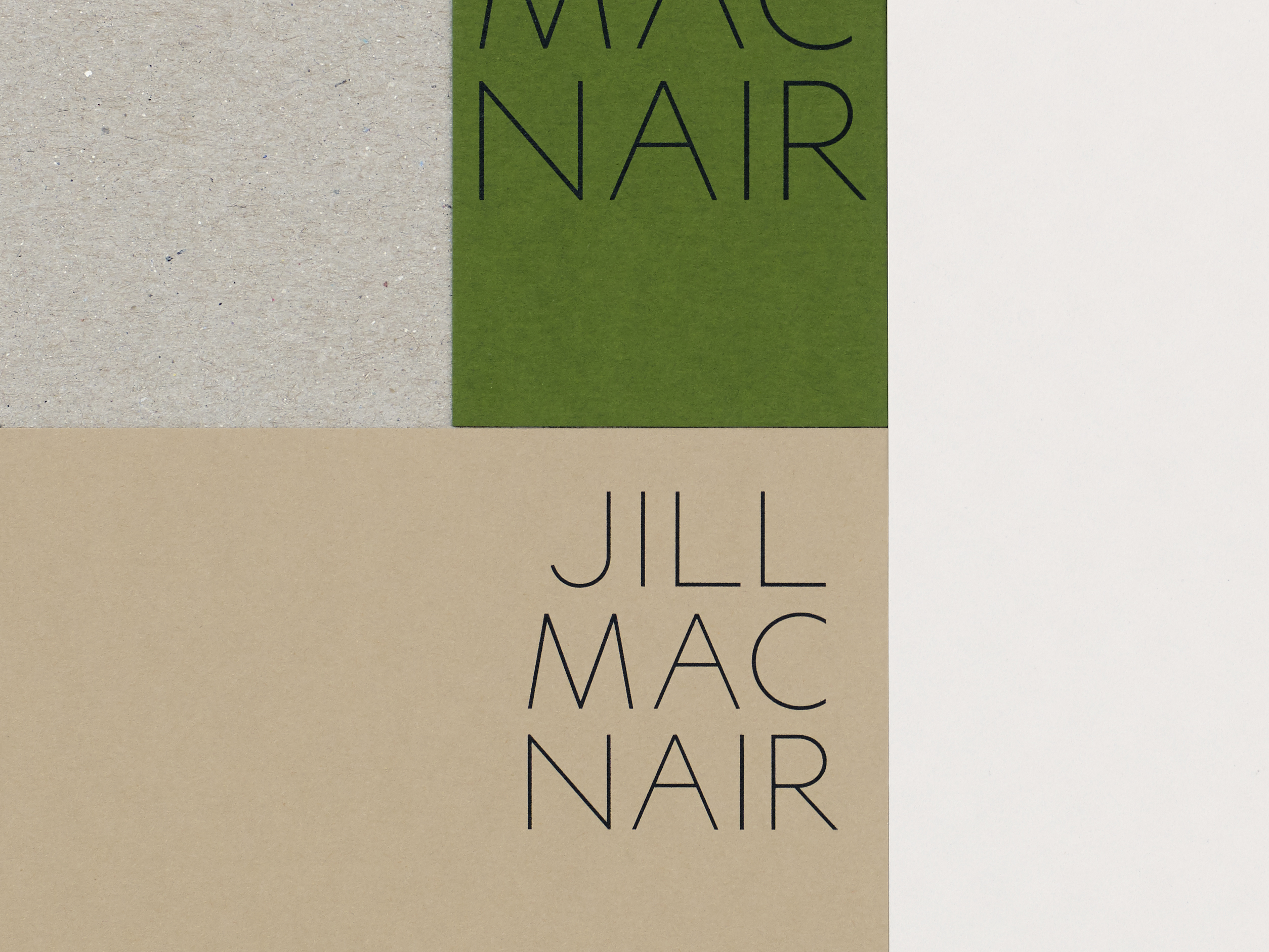
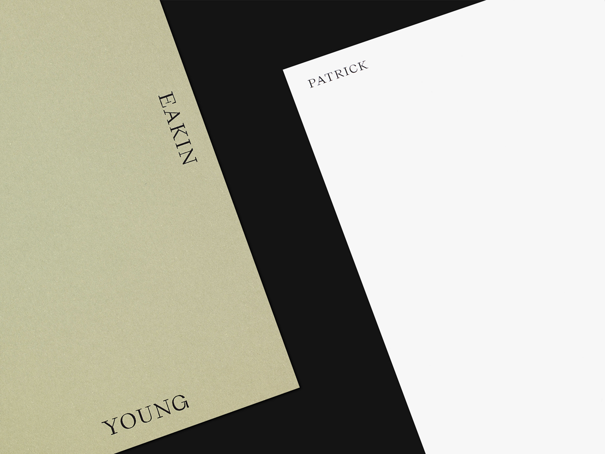
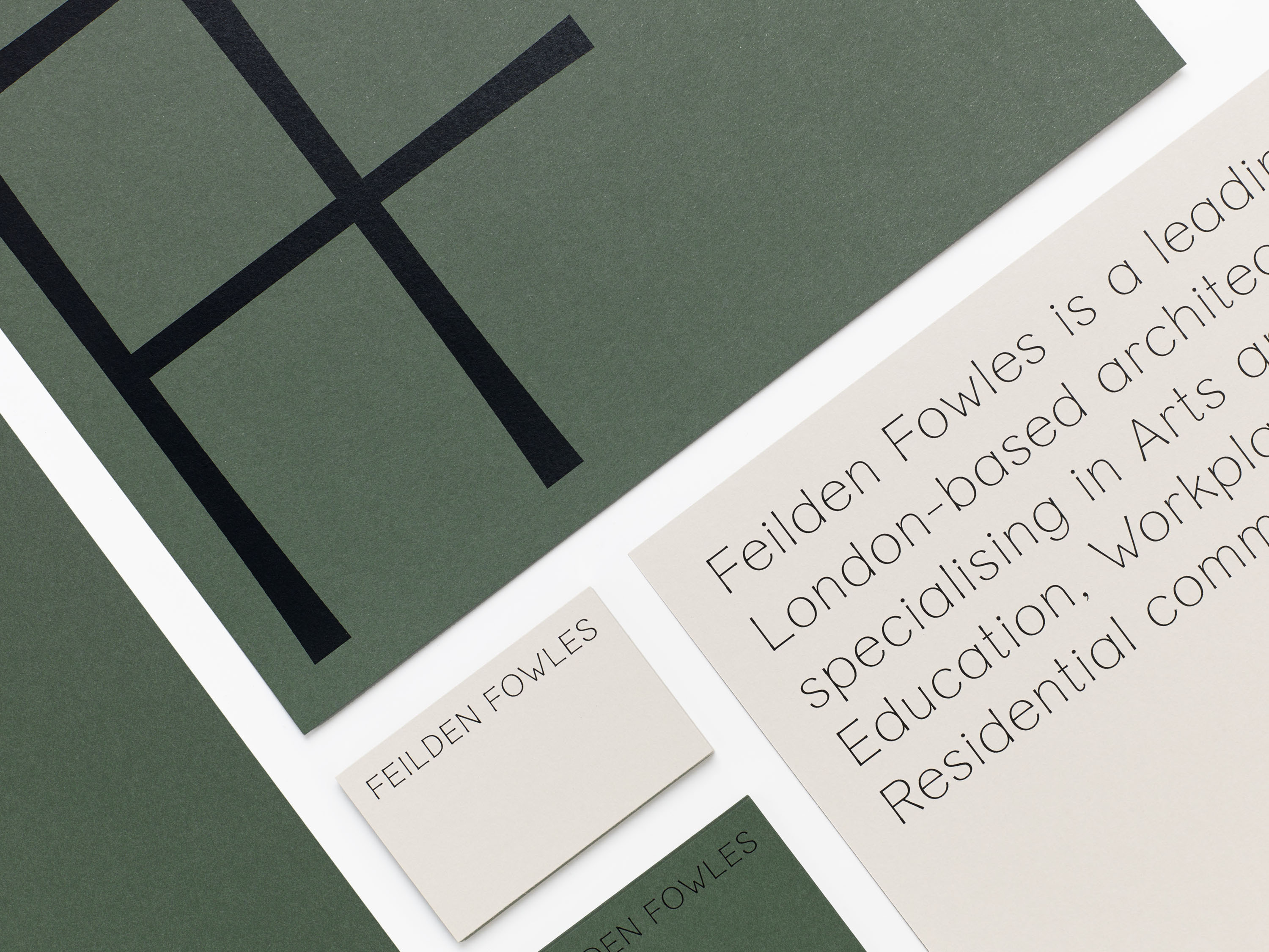
We designed a bespoke typeface that is central to the new identity. A light sans-serif typeface, its high x-height and curved forms offer a sense of softness and warmth, reflecting the practice’s ethos of fostering learning and collaboration. Tapered stems that flare at their ends add character to the diagonal strokes. This detailing is inspired by stone-carved letterforms and by Feilden Fowles’ focus on craft.
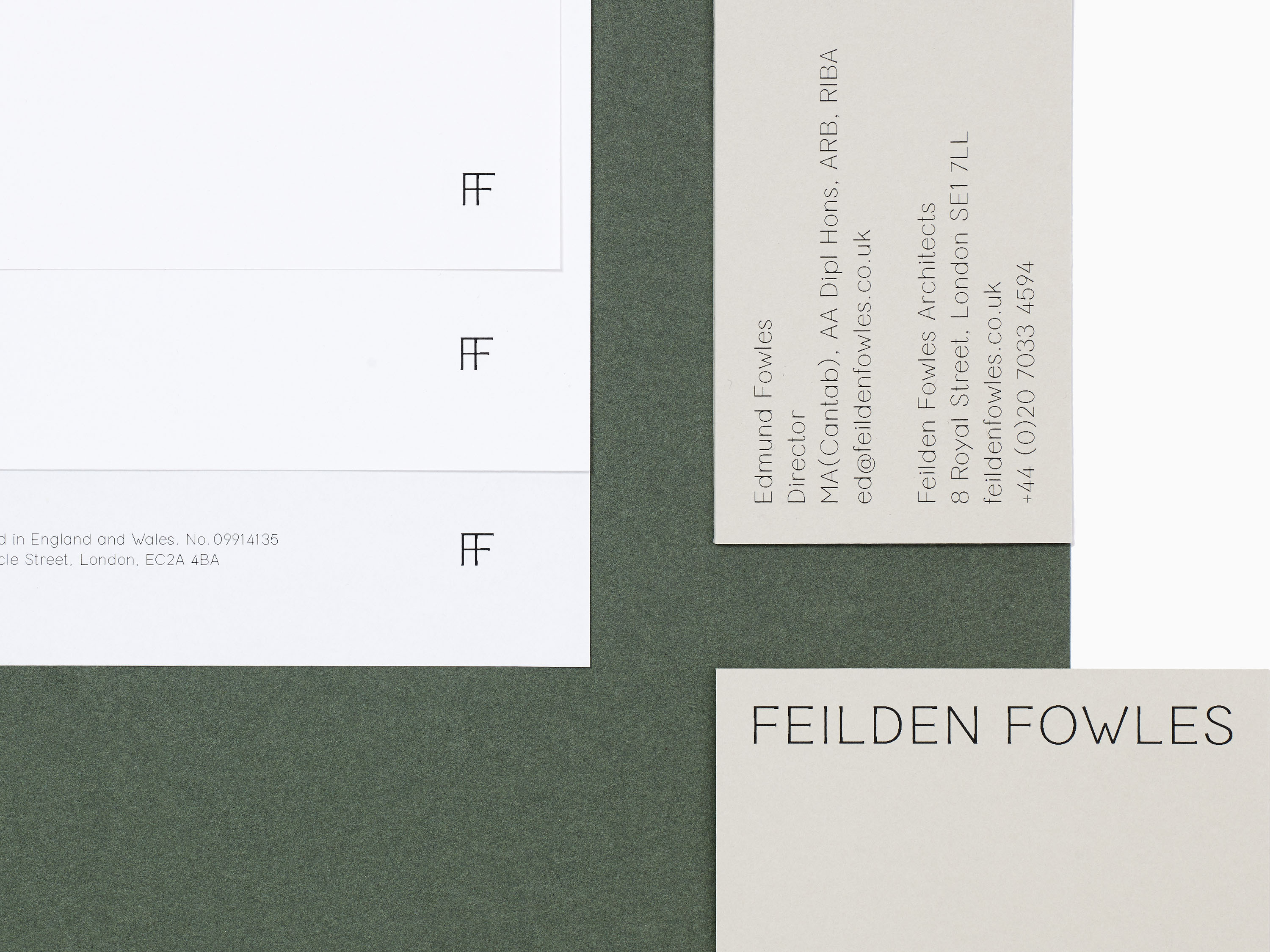
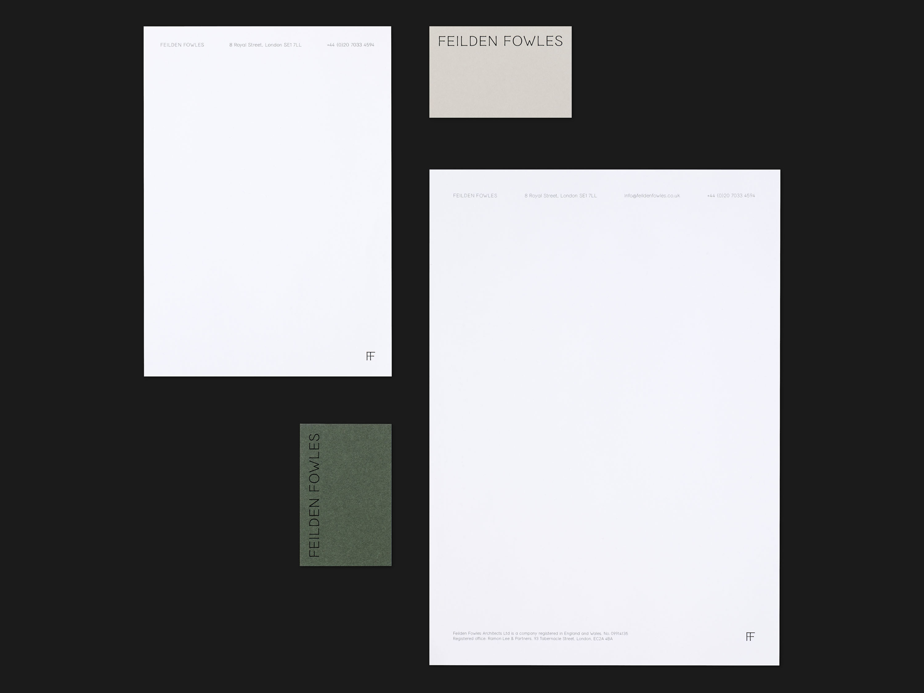
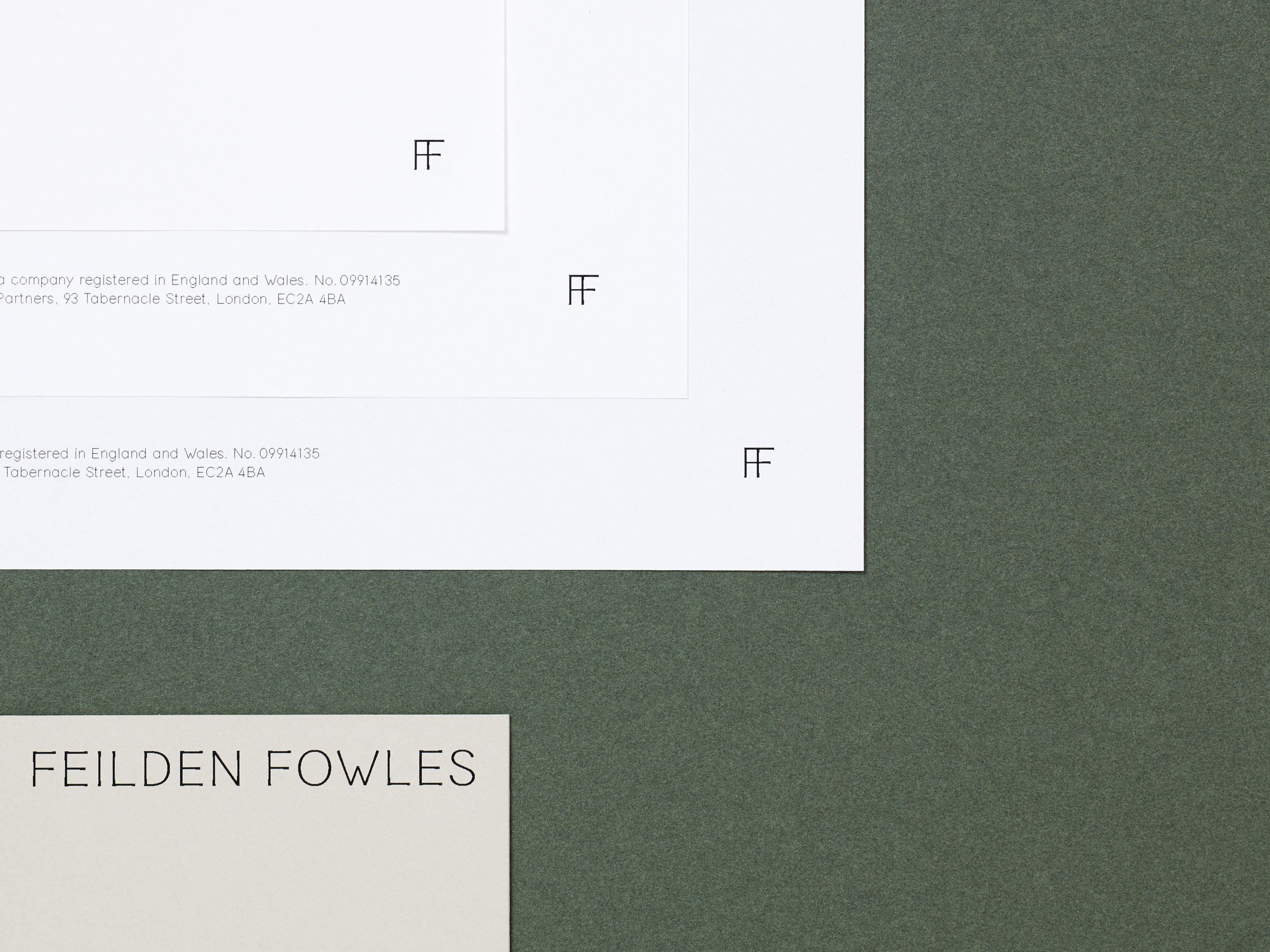
The new Feilden Fowles logo celebrates the new typeface and is available in a range of lock-ups, including a bespoke FF ligature reminiscent of a sash window or a maker’s mark. We also created a comprehensive set of digital and print templates, and oversaw a visual refresh of the existing Feilden Fowles website, previously designed by A Practice for Everyday Life, to apply the new identity in this context.